Exemplos Mais Recentes de Design de Web Moderno para Designers
Vamos apresentar 11 sites incríveis que não apenas usam formatação ousada e esquemas de cores coloridos, mas também layouts criativos.

À medida que todos nos envolvemos cada vez mais no mundo digital a cada segundo, seu site é mais provavelmente a primeira interação dos seus clientes potenciais com sua marca. Portanto, criar uma primeira impressão positiva é certamente essencial. Um site com design moderno pode ser tanto eficaz quanto atraente, mantendo os visitantes focados no seu conteúdo constantemente.
Quais eventos inspiraram o estilo moderno de design de sites nos últimos 20 anos?
- O lançamento do Instagram em 2010 transformou a forma como compartilhamos e vemos conteúdo visual.
- Em 2013, o ReactJS, uma biblioteca JavaScript para criar interfaces do usuário, surgiu, permitindo que os desenvolvedores criassem aplicações web complexas e interativas.
- O advento do material design da Google em 2014 marcou um marco importante.
- O Figma, introduzido em 2016, revolucionou o cenário de design ao integrar de forma fluida a acessibilidade na nuvem com a funcionalidade de aplicativos nativos.
- O lançamento do Flash foi um momento crucial na história do design online, sinalizando a transição para tecnologias web responsivas essenciais para atender às demandas modernas dos usuários.
Quais são os elementos comuns de um site com estilo de design moderno?
- Efeito de rolagem
- Cores fortes
- Fonte grande
- Consistência de equipamentos
- Layout de site limpo
- Navegação clara
- Imagens incríveis
11 Exemplos de Design Web Moderno
Neste artigo, apresentaremos 11 sites impressionantes e modernos para você, que todos representam criatividade e inovação. Esses sites não apenas adotam formatos ousados e paletas coloridas, mas também layouts criativos e animações fascinantes. Com a ajuda desses métodos de design moderno, os designers conseguem explorar e quebrar os limites do design de sites. Se você quiser reformar seu site ou simplesmente querer aproveitar as novas tendências, esses exemplos lhe darão inspiração diversificada.
Ao mesmo tempo, compartilharemos algumas habilidades criativas para o design de sites modernos para ajudá-lo a atualizar sua identidade online e se destacar no vasto mundo digital.
ToBeHonest
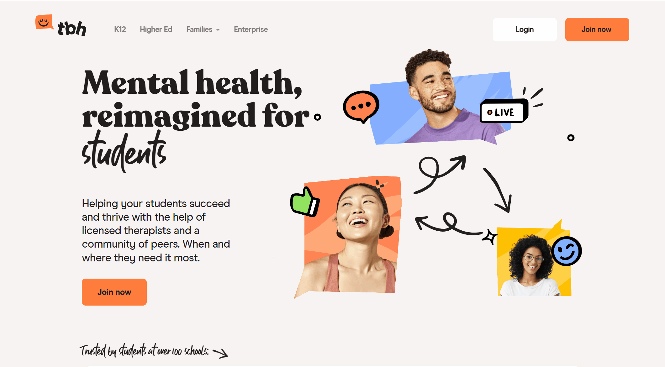
ToBeHonest é um site dedicado a ajudar crianças a superar problemas do dia a dia por meio da comunicação com especialistas em saúde mental credenciados e uma equipe composta por pares com interesses semelhantes.
Principais características do site ToBeHonest:
- Tipografia ampliada: O site usa tipografia ousada para seu título principal, que chama diretamente a atenção dos visitantes e mostra as informações da marca.
- Uso de cores vibrantes: Os designers deste site escolheram usar paletas de cores variadas, especialmente as cores claras. Elas destacam as imagens e os botões principais e adicionam energia para criar uma sensação visual estimulante.
- Melhorar as imagens: O uso de elementos ilustrativos, como ícones de aprovação, setas e balões de fala, melhora o tom lúdico do site todo. Quando os visitantes veem a página inicial pela primeira vez, podem se sentir bem-vindos e dispostos a explorar mais.
- Navegação fácil: O menu de navegação é direto e explica claramente os serviços da plataforma. Além disso, ele é rotulado para diferentes segmentos de usuários (K12, Ensino Superior, Famílias, Empresas). Por meio do menu, os visitantes podem encontrar mensagens relevantes rapidamente.
Skydweller

Skydweller é uma empresa aeroespacial transatlântica pioneira que desenvolve e fabrica uma frota de aeronaves muito grandes alimentadas por energia solar, capazes de realizar voos sem piloto contínuos com cargas pesadas e poderosas.
Principais características do site Skydweller:
- Imagem em tela cheia: Ele apresenta uma imagem impressionante de um avião, que chama imediatamente a atenção do espectador e estabelece um tom dinâmico e imersivo.
- Tipografia elegante: A tipografia do Skydweller é simples e elegante, com uma fonte moderna sem serifa usada no logotipo e nos links de navegação. O texto é mantido em quantidade mínima, enfatizando a natureza visual do design.
- Foco na narrativa visual: Este site depende fortemente da narrativa visual, usando a imagem do avião para transmitir uma sensação de inovação, tecnologia e exploração sem a necessidade de textos extensos.
- Estrutura minimalista: O design é minimalista, com foco na imagem de fundo grande e texto mínimo. Este layout limpo garante que o impacto visual da imagem não seja sobrecarregado por outros elementos.
Minna

Minna é uma empresa certificada B Corp localizada no norte de Nova York que projeta e cria artigos de decoração, tecidos e papel de parede feitos artesanalmente de forma ética.
Principais características do site Minna:
- Layout confortável: O design de tela dividida no site equilibra uma foto de vida de alta qualidade no lado esquerdo com texto no lado direito e um fundo de cor sólida no lado esquerdo. Isso resulta em uma aparência atraente e bem organizada.
- Esquema de cores: Os tons terrosos e o esquema de cores suaves e apagados transmitem sofisticação e serenidade. Isso é consistente com o foco da marca em decoração fabricada de forma ética.
- Um chamado claro para ação: o botão "Explore a Coleção" é fácil de encontrar e destacado, incentivando os visitantes a agir. A cor contrastante e o texto legível do botão de chamada para ação o tornam visível.
- Recursos sutis: Sem sobrecarregar o usuário, pequenos recursos como o anúncio de envio no topo e o símbolo de notificação no canto inferior direito são incluídos habilmente no processo de design.
- Ênfase na ética: Os ideais da marca são rapidamente comunicados pelo texto "Decoração, papel de parede e tecidos feitos de forma ética", atraindo clientes que dão grande valor à sustentabilidade e à produção ética.
NASA

NASA explora o desconhecido no ar e no espaço, inova para o benefício da humanidade e inspira o mundo por meio de descobertas. Em seus 20 centros e instalações em todo o país e com empresas comerciais dos EUA e parceiros internacionais, a NASA lidera o estudo da ciência da Terra, incluindo clima, nosso Sol, sistema solar e o universo maior. Eles realizam pesquisas de ponta para avançar tecnologia e aeronáutica e operam a estação espacial internacional, o laboratório espacial líder do mundo.
Principais recursos do site da NASA:
- Imagens de alta qualidade: O fundo da página é uma imagem espacial de alta resolução que dá mais apelo visual e contexto ao conteúdo.
- Esquema de cores simples: A cor preta domina o esquema de cores do design, o que faz com que as partes de texto branco e vermelho destaquem dramaticamente.
- Atualizações em tempo real: A indicação "NASA+" em tempo real indica a disponibilidade material, melhorando a experiência do usuário ao fornecer informações atualizadas.
- Iconografia: Pequenos símbolos que servem como pistas visuais para elementos interativos - como as setas vermelhas que aparecem ao lado dos links - ajudam os usuários a navegar.
Tesla

Tesla, Inc. é uma empresa americana de veículos elétricos e energia limpa fundada em 2003. A empresa é conhecida por suas contribuições para o desenvolvimento e comercialização de veículos elétricos, soluções de energia renovável e tecnologias automotivas inovadoras.
Principais recursos do site da Tesla:
- Design minimalista: O site utiliza um design limpo e minimalista com foco na simplicidade. A disposição é despojada, enfatizando elementos-chave e criando uma experiência intuitiva para o usuário.
- Marca: O logotipo da Tesla é colocado de forma sutil no canto superior esquerdo, reforçando a identidade da marca sem sobrecarregar o design.
- Espaço em branco: O uso adequado do espaço em branco permite que o conteúdo respire e ajuda a focar a atenção nos elementos principais, melhorando a legibilidade e a engajamento do usuário.
- Tipografia clara: O site usa fontes limpas e modernas. O título "Model 3" é exibido de forma proeminente com informações claras e concisas sobre preço e incentivos, facilitando que os usuários entendam rapidamente.
Wegic

Wegic é um designer e desenvolvedor de IA orientado para o futuro que completa todo o processo de design, modificação e lançamento de sites por meio de interação multimodal, como linguagem natural. Por meio de interação conversacional natural, qualquer pessoa pode criar e gerenciar sites facilmente nesta plataforma, quebrando a complexidade profissional da construção tradicional de sites.
Principais recursos do site da Wegic:
- Esquema de cores monocromático: O esquema de cores é principalmente monocromático, utilizando tons de preto, branco e cinza. Isso cria uma aparência sofisticada e profissional, enfatizando o texto e os elementos-chave.
- Alto contraste: O uso de alto contraste entre o texto e o fundo garante legibilidade e chama atenção para informações importantes e ações.
- Funcionalidade de chat interativo: A interface de chat ("Converse comigo...") foi projetada para engajar os usuários, fornecendo uma maneira direta de interagir com o designer de sites de IA. Essa funcionalidade é destacada e tornada convidativa com uma introdução amigável.
- Prêmios e reconhecimento: Os prêmios ("Produto do Mês", "Produto da Semana", "Produto do Dia") são exibidos prominentemente no topo, estabelecendo credibilidade e confiança.
Modern Muses

Modern Muse é uma marca dedicada à simplicidade, pureza e arte da natureza. Eles buscam transformar rituais cotidianos em momentos extraordinários de autocuidado por meio de artesanato feito à mão.
Principais recursos do site da Modern Muse:
- Esquema de cores: Esta plataforma usa rosa e bege como cores principais, ambas são cores suaves e quentes que criam um ambiente quente e acolhedor. O rosa é frequentemente associado ao romance, feminilidade e estilo, enquanto o bege adiciona um senso de elegância e simplicidade. Essa paleta de cores está alinhada com o tema "Modern Muses" e demonstra a importância da harmonia das cores e da expressão emocional no design moderno.
- Imagens e elementos visuais: As imagens do site são de alta qualidade, coloridas e com camadas, especialmente a imagem da vela no centro, que não só mostra a aparência do produto, mas também melhora o efeito visual geral por meio do efeito de luz e sombra. Ao mesmo tempo, as flores como elementos complementares não apenas aumentam a riqueza das imagens, mas também formam uma boa relação complementar com os produtos. Além disso, o site usa de forma inteligente a tipografia do texto e o design dos botões para guiar o próximo passo do usuário.
- Interatividade: O botão 'compre agora' e a funcionalidade de login/cadastro de um site são ambos interativos. Com alguns cliques simples, os usuários podem completar facilmente o processo de compra ou cadastro. Este feedback instantâneo e simplicidade do processo é um dos objetivos do design moderno.
Korty EO

Korty é uma diretora de filmes. Ela ama música e histórias, e estou fazendo filmes de forma mais lenta, aprendendo fazendo.
Principais características do site da Korty EO:
- Estrutura de navegação clara: Do lado esquerdo, há uma barra de menu chamativa, incluindo "Home", "Sobre Mim", "Parceiros", "Instagram", "YouTube", "Twitter" e "Contato", permitindo que os usuários encontrem a informação que precisam de um só olhar.
- Declaração personalizada: O slogan "Eu tento não fazer tudo, mas me certifico de tentar tudo." no topo da página reflete a personalidade única e atitude do proprietário do site, e esse tipo de expressão personalizada é uma característica comum do design moderno, criada para atrair usuários que compartilhem os mesmos valores.
- Incorporação de vídeo: Abaixo da navegação, há duas referências a "Flow, With Korty" e "My Random Videos", sugerindo que o site pode conter conteúdo em vídeo. Vídeo é uma forma de mídia moderna e popular, e sua inclusão não só enriquece o conteúdo do site, mas também melhora a experiência interativa para os usuários.
Oatly

Oatly é a empresa original e maior de leite de aveia do mundo. Seu compromisso com a aveia resultou em avanços técnicos fundamentais que nos permitiram explorar a diversidade da linha de produtos lácteos, incluindo alternativas ao leite, sorvete, iogurte, cremes para cozinhar, cremes espalháveis e bebidas para viagem. Com sede em Malmö, na Suécia, a marca Oatly está disponível em mais de 20 países ao redor do mundo.
Principais características do site da Oatly:
- Reconhecimento da marca: O logotipo "OATLY" aparece várias vezes em materiais promocionais, incluindo sacolas, canecas e camisetas com personagens, reforçando a identidade da marca. Essa exposição repetida da marca é uma tática comum no design de marcas modernas e ajuda a aprofundar a impressão dos consumidores sobre a marca.
- Contação de histórias e interatividade: Os materiais promocionais mencionam textos como "THE ORIGINAL OATLY!" e "STUFF WE'LL SELL", sugerindo a história por trás da marca e os produtos futuros. Ao mesmo tempo, "GOT OATLY?" e a foto de pessoas se reunindo na rua criam um ambiente interativo e participativo, fazendo com que os consumidores sintam a vitalidade e proximidade da marca. Esse tipo de elemento de contação de histórias e design interativo é respeitado pelo design moderno e ajuda a aumentar o apelo da marca e a retenção dos usuários.
Copper&Brave

Copper&Brave é uma loja online que vende cervejas principalmente na Alemanha.
Principais características do site da Copper&Brave:
- Design do logotipo: Seu logotipo foi projetado em um estilo moderno e minimalista, com uma forma de escudo em tons de cobre combinado com texto azul e dourado, mantendo um sabor vintage enquanto incorpora uma estética moderna. Essa abordagem de design reflete a fusão de elementos tradicionais e modernos no design contemporâneo.
- Uso de cores: A paleta de cores geral do site é dominada por cores escuras, como a paisagem urbana à noite e o escudo em tons de cobre, mas os toques azuis e dourados adicionam destaque à página. Essa combinação de cores não apenas combina com o clima misterioso e antigo, mas também mostra o cuidado do design moderno com a combinação de cores e a busca por uma sensação de luxo.
Lancaster Brewery UK

Lancaster Brewery é uma cervejaria regional premiada, que produz belas cervejas, nascidas e fabricadas no noroeste da Inglaterra.
Habilidades criativas para criar um site moderno
Abrace o minimalismo
O design web minimalista se concentra na simplicidade, removendo elementos desnecessários, criando uma interface do usuário limpa e direta. Essa filosofia de "menos é mais" melhora a experiência do usuário, a legibilidade e a profissionalidade. Os benefícios incluem tempos de carregamento mais rápidos, uma experiência do usuário mais intuitiva e um design atemporal adaptável a vários dispositivos.
Adote uma abordagem mobile-first
Com o uso generalizado de smartphones, é crucial projetar sites com dispositivos móveis como foco principal. Essa abordagem garante a usabilidade em telas menores antes de escalar para telas maiores. Utilizando design responsivo com grades fluidas e imagens flexíveis, ou design adaptativo com layouts pré-definidos otimizados para tamanhos de tela específicos, garante uma experiência ideal em todos os dispositivos.
Utilize o espaço em branco de forma eficaz
O espaço em branco, ou espaço negativo, entre elementos em uma página da web contribui para uma aparência limpa e simples. Ele destaca o conteúdo importante, melhora a legibilidade, cria um layout equilibrado e melhora a experiência do usuário reduzindo a bagunça. Minimizar os elementos na página também acelera os tempos de carregamento, mantendo o engajamento do usuário e melhorando a usabilidade geral.
Priorize a tipografia
Tipografia, a arte de organizar o texto, é crucial na design web moderno. Seguir princípios como tamanhos de fonte apropriados, comprimento de linha e espaçamento melhora a legibilidade, estabelece hierarquia e melhora a acessibilidade. Os designers também podem experimentar fontes incomuns e tipografia criativa para criar visuais únicos e expressivos que chamem atenção.
Experimente Layouts
Um layout de site intuitivo guia os usuários naturalmente pelo conteúdo. Ao experimentar diferentes layouts, os designers podem criar experiências de usuário dinâmicas e envolventes. Técnicas como layouts mistos para cada seção, layouts de grade não padrão para um sentimento inovador e telas divididas verticalmente para apresentar conteúdo diverso simultaneamente, podem tornar um site mais envolvente e incentivar a exploração.
Conclusão
Ao ver esses 11 exemplos de sites impressionantes e criativos, esperamos que você possa se inspirar e incorporar técnicas de design contemporâneas para elevar sua presença online. Seja focando na tipografia, aproveitando o espaço em branco ou adotando uma abordagem mobile-first, a integração desses princípios garantirá que seu site permaneça único no cenário digital.
Leitura relacionada:Tendências de Design Web Sustentável Reconfigurando
Escrito por
Kimmy
Publicado em
8 de abr. de 2026
Compartilhar artigo
Leia mais
Exemplos
12 Exemplos de Sites de Rolagem Paralaxe Inspiradores (Atualizado em 2025)
13 de abr. de 2026
Nosso último blog
Experiências
25 de mai. de 2026
Guia do Viajante: Os 10 Melhores Sites de Hotéis para um Planejamento Perfeito
Prédio de IA
25 de mai. de 2026
Os 10 Melhores Criadores de Portfólio para Designers de UX: Mostre Seu Trabalho
Páginas da web em um minuto, alimentadas pela Wegic!
Com a Wegic, transforme suas necessidades em sites impressionantes e funcionais com IA avançada