Log in
Build Your Site
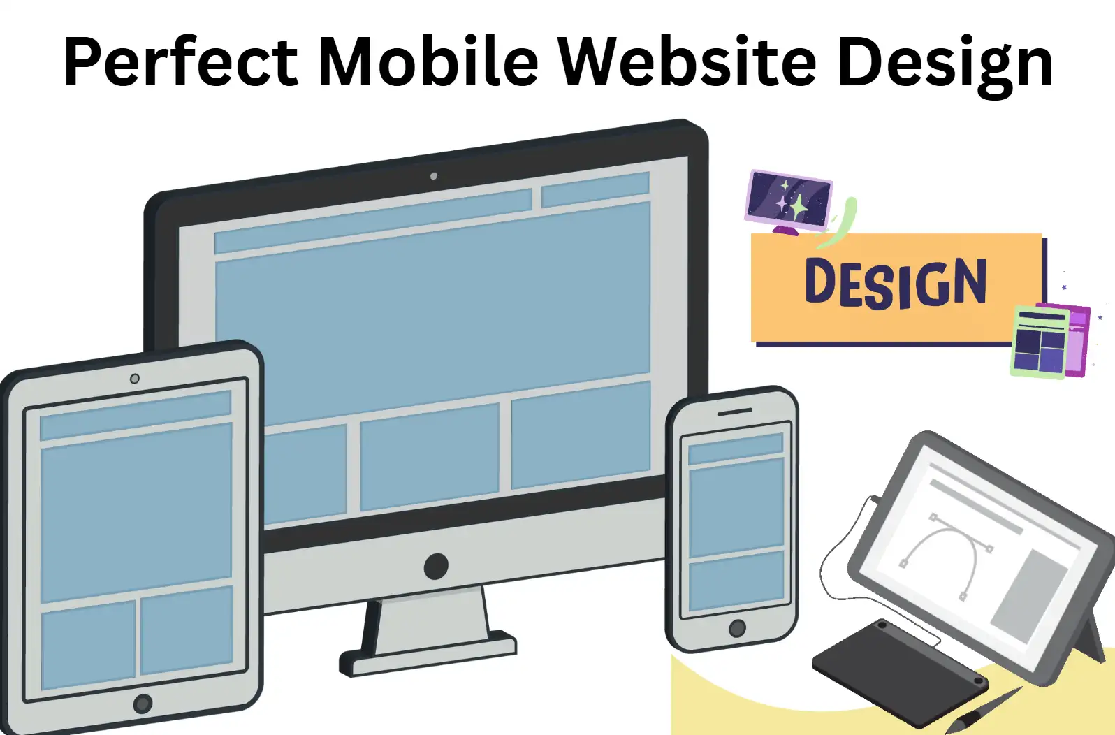
How to Perfect Mobile Website Design for Users
Learn how to master mobile website design with proven strategies that improve usability, speed, and visual appeal for mobile users across all screen sizes.

Your phone display presents websites that cause instant frustration to visitors.
Website text appeared too small for viewing, while buttons were hard to press, and pages took too long to load. As a business owner, I used to think mobile website design was just a buzzword—until I realised 57% of my visitors were bouncing off my site within seconds. Why? Users on mobile platforms avoided my website due to the choice of designing for desktop-first users only.
Here’s the truth: mobile web design isn’t optional anymore. Every business depends on this distinction to either maintain visitor engagement or watch them choose competitors instead. But let’s be honest—terms like mobile web page design, mobile site design, and mobile-responsive website design can feel overwhelming. How do you even start? Do you need to code? What tools actually work?
If you’re struggling to:
-
Understand what mobile web design truly means.
-
Create a mobile site design that’s fast, intuitive, and visually appealing, or even 3D?
-
Find a tool that handles mobile-responsive website design without costing a fortune…
You’re not alone. I’ve been there. Years of experimentation followed by countless restless nights finally led me to find the solution for transforming mobile users into devoted customers. Let me show you how to perfect mobile website design—no jargon, no guesswork, just actionable steps and a game-changing tool (hint: it’s Wegic) that’ll make your life easier.
What is Mobile Web Design?
Mobile website design is the art of creating digital experiences tailored to the screens we hold in our hands: smartphones and tablets. To optimise responsiveness, website designers go beyond scale adjustments because they transform site designs to focus on swift performance, together with effortless understanding and optimised usability. Mobile user optimisation requires designing homes perfectly suited to their requirements through optimal layouts of hallways (menus) and doorways (buttons) leading to rooms (pages).optimisation
Adaptability, Speed, and Intuition
At its heart, mobile web design revolves around three pillars.
-
First, adaptability. The first important factor is adaptability, which enables text components and images, and buttons to scale properly for all smartphones and tablets. This is where mobile-responsive website design shines, using flexible grids and CSS media queries to resize content based on screen dimensions automatically. Unlike older methods (like creating a separate mobile site design with its own codebase), responsive design maintains a single site that morphs to fit any device. Such awkward gestures and horizontal motions are unnecessary to use the system.
-
Second, speed. Mobile users are often on the go, and 53% will abandon a page that takes longer than three seconds to load. Efficient mobile web page design minimises heavy elements, like uncompressed images or complex animations, that drag down performance.
-
Third, intuition. User intuition demands that menus accommodate thumb operation, while forms should propose automatic completion answers, and vital action buttons must possess effortless discoverability.
Common Pitfalls in Mobile Website Design
The major error arises from treating desktop and mobile users identically. For example, a sprawling desktop layout might showcase ten product categories, but cramming them into a mobile site design could overwhelm users. The navigation needs to be optimised because collapsible menus, priority enhancements for top-selling items, and straightforward headings produce an effective design.
Another mistake?
Ignoring touch interactions. The interaction of buttons that require clicks using a mouse may cause mobile users to get frustrated due to small button sizes or crowded placement on the screen. Mobile users need buttons with dimensions greater than 48 pixels in width that resemble fingertip size.
How Mobile Website Design All Works
Creating a mobile web design typically involves two approaches. The first involves responsive design through HTML and CSS protocols that adjust content layout. The second is dynamic serving, where the server detects a user’s device and delivers a tailored version (like a simplified mobile web page design for older phones). People prefer responsive design over other methods mainly due to its straightforward nature and reduced maintenance requirements.
Why Mobile Website Design Matters for Your Business
Many businesses have noticed the term “mobile-first” while remaining uncertain about its specific definition. Mobile-first is a philosophy that prioritises mobile web design from the start rather than treating it as an afterthought. Google's move towards mobile-first indexing requires search rankings to be determined by mobile site versions, thus supporting this approach. Mobile-responsive website designs that prioritise mobile users obtain better search rankings because they attract higher numbers of visitors and decrease bounce rates.
A well-executed mobile web design isn’t just about aesthetics—it’s a revenue driver. Mobile users dedicate their time to websites that maintain fast page speeds and present content in logical layouts, choosing such websites 70% more often. The checkout process of a mobile-responsive website design leads to improved sales by 64% since users experience simple transactions when it is optimised. The requirement of mobile design emerges from being essential to maintain market competitiveness in modern business scenarios.
By focusing on adaptability, speed, and user-centric layouts, mobile web design transforms frustration into engagement. The right time to achieve perfect mobile design results has arrived as new development tools make the process simpler than ever before.
6 Mobile Website Design Real Examples for Inspiration
Different brands display their online content with specific alterations for smartphone displays. The following section presents six authentic instances which demonstrate outstanding mobile design through different design choices and implementation styles.
1. Apple
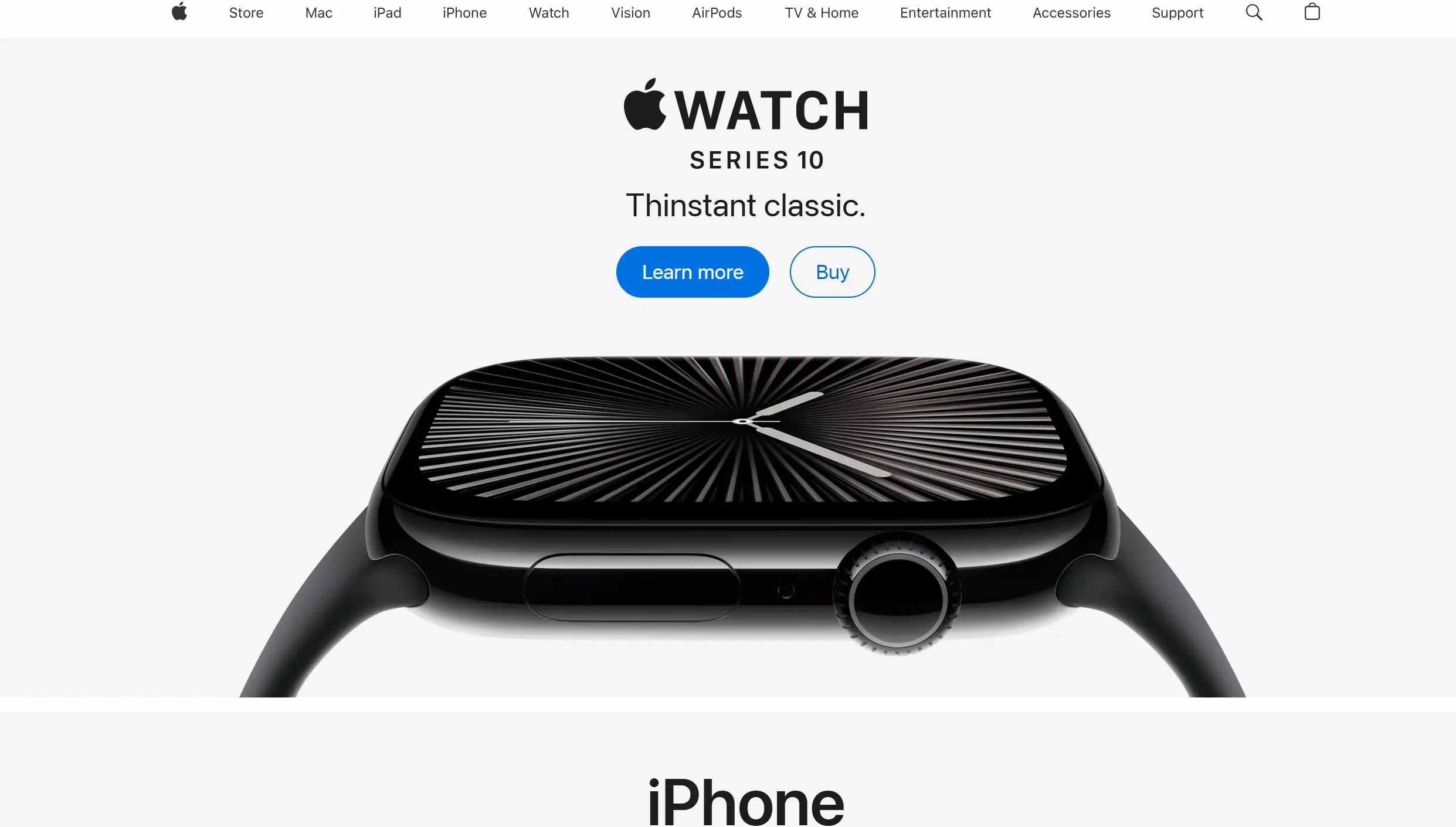
The mobile presentation from Apple represents an optimal demonstration of minimalist design practices. Their website presentation follows two main principles through elegant visuals of products with empty space and easy-to-read text elements. The interface has a straightforward navigation menu which collapses when needed. The site presents crucial product information by combining scroll functionality with visual image carousel systems. The website displays large professional images alongside videos which convert smoothly to mobile platforms and produce an engrossing viewing experience.
2. Airbnb
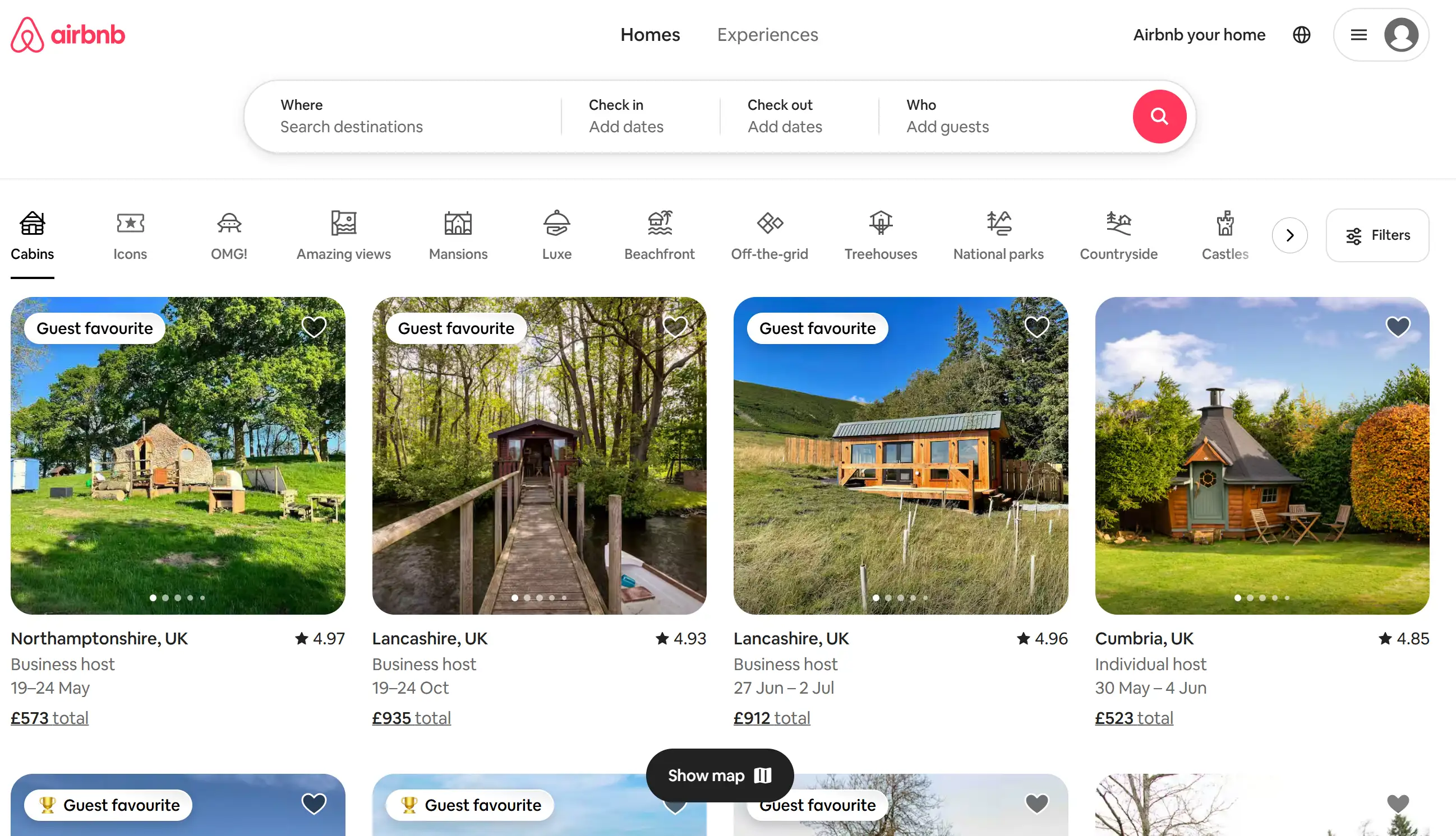
Airbnb achieves fantastic usability for its primary features of accommodation and experience discovery through its mobile platform. The search interface presents itself prominently due to its user-friendly design that incorporates clear filtering components and a map integration feature. Users find essential information on listing pages prior to images and review content. The footer navigation sticks to the bottom of the screen, allowing users to access essential sections such as the inbox and profile at all times.
3. The New York Times
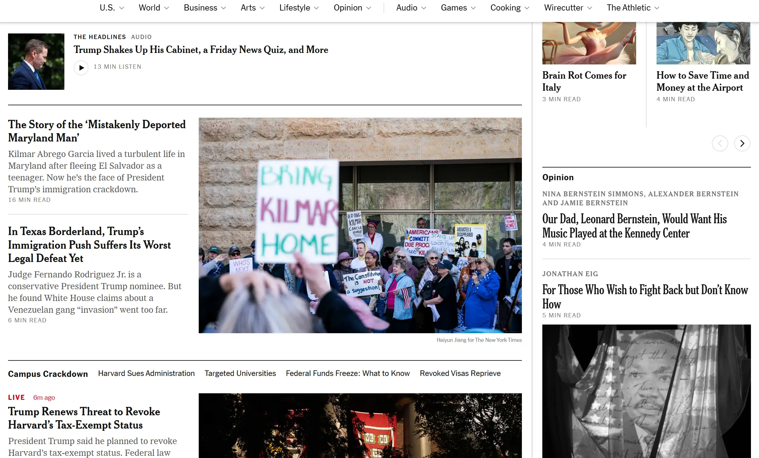
Among its content-dense format, The New York Times mobile site places an emphasis on interface simplicity and user-friendliness. The website adopts a straightforward rate-based structure while displaying prominent headings together with brief overviews. The website menu system allows users to expand different sections through a collapsible interface. Different areas of content are evenly distributed and easily understandable due to competent application of vertical spacing and typographical elements.
4. National Geographic
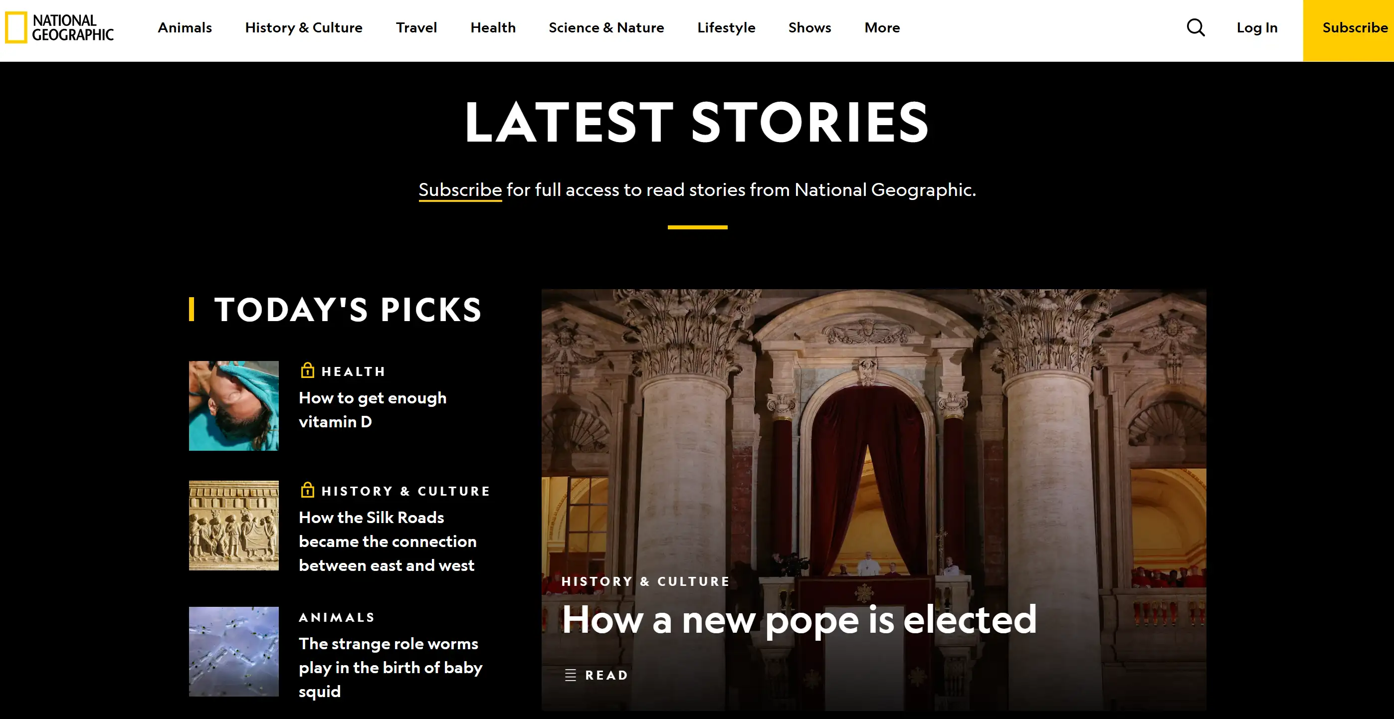
National Geographic draws viewers in with extensive full-width visuals and maintains user-friendly navigation that lets people quickly browse articles, together with videos and gallery sections.
5. Shopify

The mobile site platform of Shopify exists to serve the needs of its business and entrepreneurial user base. Their website presents their essential offerings while maintaining focus on what they provide to customers. Users can navigate effortlessly since the interface guides them properly through all the different plans and features of the site. Their website communicates powerful calls-to-action together with understandable value propositions, which enable users to grasp their service offerings during mobile usage.
6. Google Store
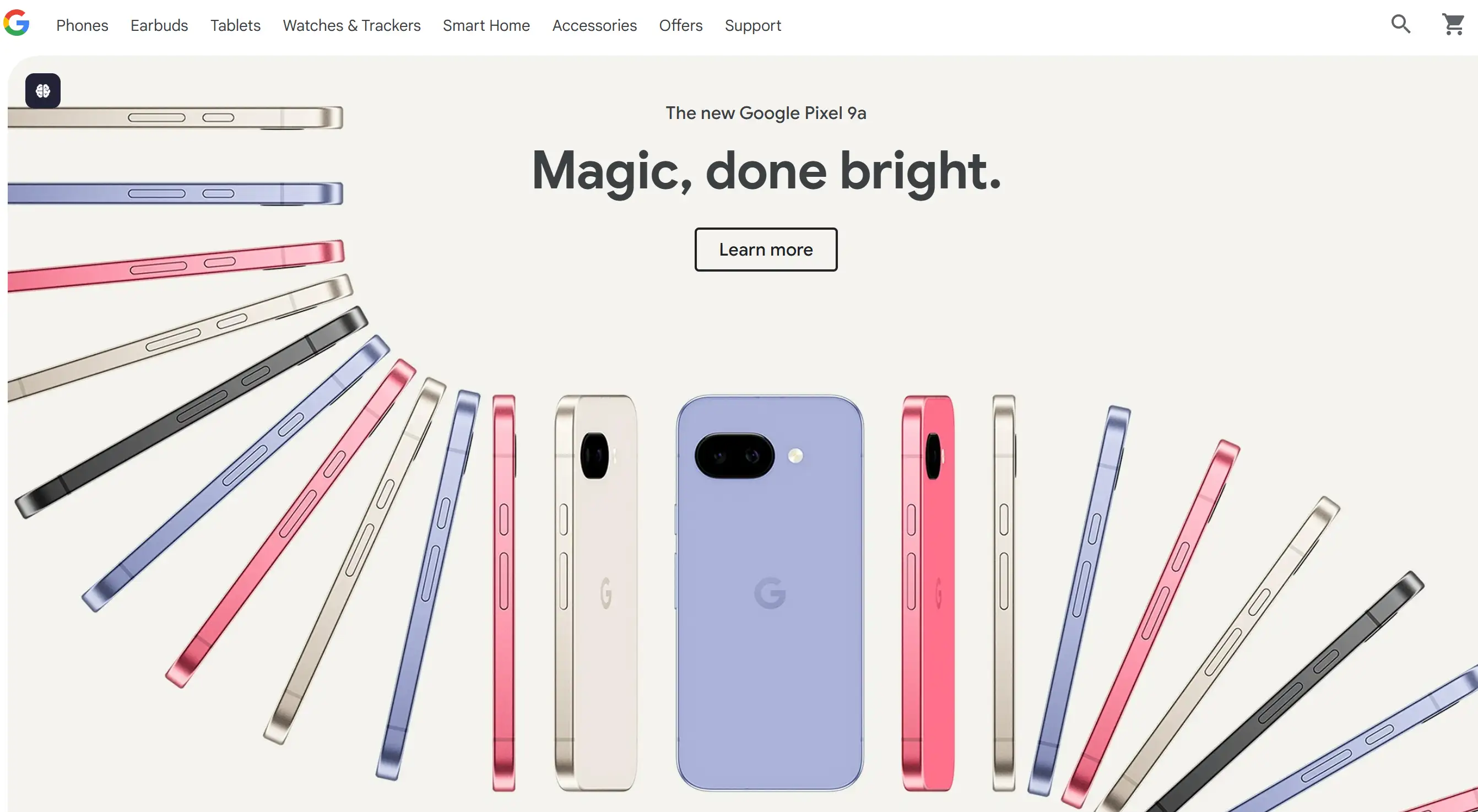
Google Store enables mobile customers to experience quick and effective online shopping through its website. The web page showcases visually attractive product displays, which include buttons for direct user engagement and easy-to-read price information. The website offers well-structured, intuitive options to sort and filter products, allowing users to discover specific items easily.
These examples showcase different approaches to mobile website design, but they all share a focus on user experience, clear navigation, and responsive layouts that adapt beautifully to various screen sizes. I hope this gives you some great ideas for your own projects.
How to Create Mobile Website Design: A Step-by-Step Guide
Crafting an effective mobile web design requires balancing aesthetics with functionality. The following guide will help you construct a mobile web design either through new development or current site enhancement.
Step 1: Prioritise User-Centric Planning
Do they shop on the go? Read blogs during commutes? Use analytics tools to identify which mobile web page design elements (like quick-loading product pages or sticky navigation bars) align with their behaviour. Before beginning code development, designers can use software programs Figma or Adobe XD to produce layout visualisations.
Step 2: Adopt Responsive Frameworks
For mobile-responsive website design, leverage frameworks like Bootstrap or CSS Grid. Such frameworks help websites maintain proportionate modifications between different screen sizes for all textual and image elements and menu layouts. Web designers should employ proportions rather than pixel-based rules when determining sizes because “viewport width” (vw) units and percentages deliver better results. A button operating at 90vw stretches across 90% of the screen area, regardless of the device used.
Step 3: Simplify Navigation
Extended menus are impractical on mobile device display spaces. Instead of traditional dropdown menus, adopt either a hamburger menu symbol (☰) or a tab bar design. Internet shops should present “Search”, “Cart”, and “Deals” as prominent on-screen elements at first glance. Ensure every mobile site design element serves a purpose—if it doesn’t enhance UX, remove it.
Step 4: Optimise Media and Typography
Since mobile device screens operate with reduced space, you need to select fonts which maintain clear presentation between different device types. For example, a desktop at 16px needs 18px on mobile screens for optimal visibility. Your body text should utilise the sans-serif font styles Roboto or Open Sans since they maintain clarity during small screen displays.
Step 5: Test Across Devices and Scenarios
Use emulators (Chrome DevTools) and real devices to test your mobile website design. Touch targets must be no smaller than 48x48 pixels, since sizing them properly prevents accidental clicks. Verification processes should work effectively between the form and autofill, and error message functions. Pay attention to landscape mode, since horizontal navigation shouldn't cause layout issues.
Step 6: Iterate Based on Feedback
Launching isn’t the finish line. Monitor user feedback and metrics like bounce rate or time-on-page. A/B Test variations: Does a green “Buy Now” button outperform a dark red one? Does a single-column format lead to greater conversion rates than a grid layout? Gradually improve your mobile adaptive website layout to make it more suitable for practical applications.
Step 7: Stay Updated on Trends
Mobile standards switch rapidly. Foldable phones, 5G speeds, and voice search are all redefining expectations of what mobile web pages should look like. Follow guidelines from Google’s Mobile-Friendly Test or Web.dev to keep your site compliant and competitive. Maintaining usability, efficiency, and flexibility in mind will ensure that your mobile site design captures your customers’ attention and gets things done. Tools like Wegic’s AI-powered builder can streamline this process, automating responsive layouts and performance optimisations—so you can focus on creativity, not code.
Tips to Build a Mobile Website Design
All of this is to give your guests a smooth and comfortable experience when using their mobile phones. Here are several critical considerations:
-
Prioritise Responsiveness: Your website needs to adapt smoothly to a variety of screen sizes and orientations. Using CSS for adaptive design, like fluid grids, elastic images, and media queries, can ensure that its layout can be displayed beautifully on various devices.
-
Simplify Navigation: Since mobile devices have limited screen space, keep navigation simple and clear.
-
Use a clear and concise main menu: Usually, it will be neatly hidden behind the navigation bar with a 'hamburger' menu (three horizontal lines).
-
Keep the number of components of the main navigation as small as possible: Focus on the most important sections.
-
Make sure buttons and links are gigantic enough to be easily clickable: Avoid using small, clustered elements.
-
Make the navigation bar more "sticky": Fix critical navigation menus to the top or bottom of the screen so that users can see them at any time. This design will make the entire interface more usable.
-
-
Increase Speed: Mobile phone users are always on the go, so they definitely want web pages to refresh quickly. If a website loads too slowly, it will likely cause users to leave the page directly.
-
Optimise images: Make the image smaller, but don’t drop the quality too much. If it is widely accepted and supported, use new image formats like WebP.
-
Minify CSS, JavaScript, and HTML: You can just remove all useless characters and whitespace.
-
Use browser cache to store: Let the browser save static resources locally.
-
Consider using a Content Delivery Network (CDN): It can place the website's resources on some servers, so that users in different locations can open the web page faster.
-
-
Design for Touch: Remember, customers interact with their fingers, not mouse arrows.
-
Make touch targets (buttons, links, icons) large enough and spaced adequately: Aim for a minimum touch target size of around 48x48 pixels.
-
Avoid hover effects: It is recommended not to use hover effects, as they do not work on touch-screen devices like phones and tablets.
-
Consider using gestures where appropriate: Think about it, and gesture a few times in a convenient place, but make sure people can understand what you mean at a glance.
-
-
Prioritise Key Content: Mobile users generally have little time and limited attention. Put the most critical information in the most conspicuous place so that people can grasp the crucial points at a glance, and it is easier to read.
-
Use clear titles and subtitles.
-
Use pictures, charts and other visual effects to separate enormous blocks of text, and add appropriate white space to make it look less crowded.
-
Consider the usage scenarios of mobile users: what do they want to do most when they visit your website on their mobile phones?
-
-
Streamline Forms: Filling out forms can be cumbersome on a small screen.
-
Keep forms short and only ask for essential information.
-
For different types of input content, they need to choose the corresponding input approach. For example, phone numbers are entered using the numeric keyboard, and email addresses are filled in using the email-specific input box.
-
Offer clear error messages.
-
Consider using auto-fill features where appropriate.
-
-
Use High-Quality Visuals: While optimising for speed is crucial, don't compromise on visual appeal. Use high-resolution images and videos, and scale them appropriately to make them suitable for handheld devices.
-
Test Thoroughly on Multiple Devices: Content that looks good on this phone may not be so pleasing to the eye on another device. When reviewing your Blueprints, run them on a variety of devices and test sizes, both physical devices and emulators/simulators, to ensure the user experience is consistent and great.
-
Consider the Mobile Context: Think about the mobile scenarios in which the platform will be used: for example, when people want to browse content while riding in a car or waiting in line, how will they interact with your platform? This may impact their design choices and the details they prioritise.
-
Iterate and Improve: Mobile design is an ongoing process that is constantly being tweaked and improved. Use analytics to see how users interact, identify what’s not working well, and then use the data to enhance your blueprint over time.
By maintaining these tips in mind, you can create a mobile site that not only looks good but is also easy to use and performs efficiently. Best wishes!
Hassle-Free Websites All at Wegic

Now that you’ve honed in on mobile website design, let’s talk about how to build a website that actually works, without worrying about coding headaches, constant switching, or existential worries.
Meet Wegic: the AI tool that lets you chat your way to a polished, mobile-responsive website design. It allows you to easily create an aesthetic website, such as chatting, and it can also perfectly adapt to the mobile screen. Think of it as a shortcut to having great content online without stimulants. Don’t ask your tech-savvy relatives for help or figure out what “CSS breakpoints” mean. Just state what you want and let Wegic, powered by GPT-4o AI, do the rest.
Whether you want to design a personal portfolio, a wedding website, or a travel agency to display your professionalism, Wegic makes the process easier. Its chat-like interface is just like brainstorming ideas with a friend. Besides, this friend is very smart and patient. Even if it sees that you have spelt something wrong, it will never find fault with you. Want to make your mobile site look superior on tablets? Is there a web page that opens faster than your morning coffee? Just say it directly. Wegic turns your ideas into beautiful and easy-to-use designs, and multi-language functions- you don't need to study code to use it.
Want to turn the headache of “mobile site design” into something as easy as a stroll in the park?
Written by
Kimmy
Published on
Mar 17, 2026
Share article
Read more
Our latest blog
Webpages in a minute, powered by Wegic!
With Wegic, transform your needs into stunning, functional websites with advanced AI
Free trial with Wegic, build your site in a click!
What kind of website do you want to build?