Log in
Build Your Site
Best 15 Login Page Examples That Prioritize Intuitive Design
Do you want to design a perfect and unique Login webpage for your brand? You can check out this guide to find the inspirations from these Login page examples!

In today's digital era, the Login page is often the initial interaction between a website or application and its users. Not only a "gating" page that one uses to access the site, the Login page also serves to express brand personality, communicate information, and secure it. 86% of sign-up users are frustrated, reports Briclabs, and an effective Login page design can determine whether the user will use your service within seconds. Thus, a Login web page example is aesthetically pleasing and achieves the holy grail of user experience: easy, user-friendly, seamless, and smooth. A good login web page example may then lead you to design better.
But achieving such a design is not easy. You are designing your application or website login page and optimizing the user experience, which is an art and a practice. Here are 15 intuitively designed login website pages. Not only do they make an excellent design impression, but they also carefully optimize all steps of the user process.
Regardless of whether you are a freelancer or an employee of a large platform, you will learn and receive useful design tips to enhance the Login page design from this article. We will learn from the concept and best practice of these excellent samples and design a more user-friendly and assistive Login interface. Let us start from the user perspective and create an awesome and effective login page website to welcome every potential user.

The essential elements of the Login page website
A nicely designed Login page is more than "username + password" and combines design, user experience, and security. By following the best practices below, it is simple to identify which designs consider the user perspective:
A clear differentiation between Login and registration
First-time site visitors are more likely to confuse the two roles of "Login" and "Register." A nicely designed page will differentiate between the two using opposite colors, button shape, or textual cues to avoid click errors and needless loss.
Use the "Stay logged in" option carefully
Although this option is easy, it is not always the best. It may make the website more user-friendly on regular social or content websites. Still, on websites that have to handle confidential information (such as online banks or healthcare websites), it would be best to disable this option to avoid account security breaches.
Enable social Login
Social log-in provides the user with a faster log-in path. A survey revealed that 88% of US users would log in via Facebook or Google, even if they fear their security. But that option again won't be suitable for sites handling sensitive data.
Action buttons
The "Login" button needs to be conspicuous and easy to click. Good color contrast against the background and a hover or click effect can help the user believe the action more. Secondary links, such as "Forgot your password?" must also be available but not intrusive.
Illustrations and Images
A proper graphical element may enhance the brand's impact and create an ambiance. Remember that the image, however, should be within the brand tone and not detract from the overall mood. Good-quality blurred background images may shift the user's gaze towards the input area.
Matching the brand logo, colour scheme, font type, etc., on the login page is an important trust builder. Consistency of brand experience can subtly say a lot about professionalism and can put users at ease.

Image by Canva
Top 15 Login Web Page Examples
1. Gong
Gong's sign-up page is designed to highlight the product's value. The headline declares it to be the "ultimate sales platform" and describes how it can grow your company using a to-the-point list of advantages.
The "Book Your Demo" button on this site is lively and encouraging, and the row of recognizable customer logos towards the bottom subtly confirms the user's sense of trust. It is an excellent example of a login webpage.
2. InsideBox
Justinmind created InsideBox's Login page website, and its design concept is neat and simple. The page's composition is clean and uncluttered, without any extraneous items to divert the eye so that users may recognize the log-in window instantly. The two main input areas—email and password—are placed centrally and of medium size so desktop and mobile users can use them easily.
It is particularly crucial that the first greeting message at the top, "Start your journey," conveys warmth and makes the user feel valued and motivated. The pre-filled sample email address reduces user errors to a minimum, and even new users who pass by and visit can begin immediately.
Additionally, to alleviate frustration from entering an incorrect password, InsideBox kindly offers a "Show Password" button that users can switch on at any time to avoid repeated retries from input errors, thereby adding to security and user satisfaction.
Overall, this is a series of Login page designs that marry sleek appearances and functionality, pinning down just how to execute the best user experience with the absolute minimum of interface elements.
3. Netflix
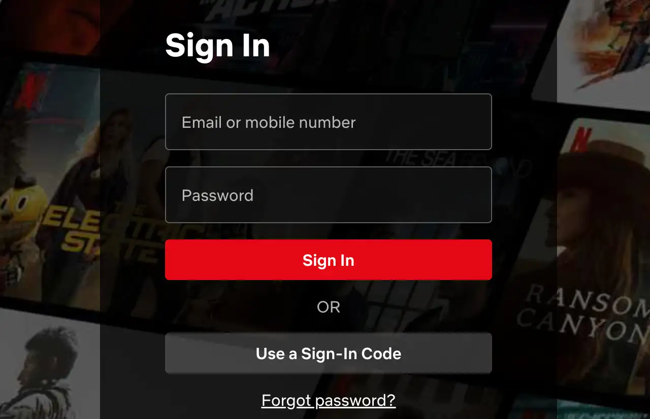
Netflix is a good Login web page example of using minimal design to create an enjoyable user experience. The world-leading streaming platform is not designed on an emotional basis but relies on its massive user behavior database and longitudinal studies to optimize everything.
From the instant you land on the page, you are immediately engaged and intrigued by Netflix's distinctive red LOGO, which gives instant brand recognition. The entire log-in form is aligned to the center of the screen and bordered by a lightly opaque black background, keeping the look great without being overly oppressive.
It is not an accident. Netflix has repeatedly tested the best way to quickly lead users through the identity verification process so that they can transition smoothly to watching movies.

Image by Netflix
4. Slack
Of all the communications platforms used at an enterprise level, Slack's login design is the industry benchmark. Its best feature is the equilibrium between security and user friendliness. It is attuned to the heightened need for data protection of large enterprises and to the smooth user experience of casual users in normal usage. From page design to the authentication mechanism, all details reflect the dual commitment to security and user interface.
In addition, Slack also supports third-party identity providers (i.e., Azure AD, Google Workspace, Okta, etc.), making the management highly effective by integrating the single sign-on feature while also making signing in easier for workers. It is the best example of an enterprise-level communications platform for the Login page.
5. Airbnb
User-platform trust is the lifeblood of home-sharing. Airbnb certainly knows this and applies it to all facets of the log-in process. From a multi-factor authentication system to an identity verification badge to an aggressive scrubbing of fraudulent listings, log-in for Airbnb is not only the entry to the platform but the beginning of the trust process.
The Login page design is brief and calming, and the essential factors are organized to eliminate the initial log-in nervousness of the users. The users only need to give their mobile number or email to go to the regular two-step verification. The system will deliver a one-time verification code via SMS or email so that only the actual users can log in to the account.
6. Expensify
Expensify offers an array of Login methods to suit personal preference or usage mode: email address, phone number, Google account or Apple ID. On a visual basis, Expensify focuses on its user reputation: a 4.5-star rating and numerous online testimonials are displayed very obviously on the page. This social validation element is both an indicator of brand reputation and psychological "collective affirmation." Potential users viewing these testimonials are more likely to feel trusted and complete the sign-up process more comfortably.
7. Amplitude
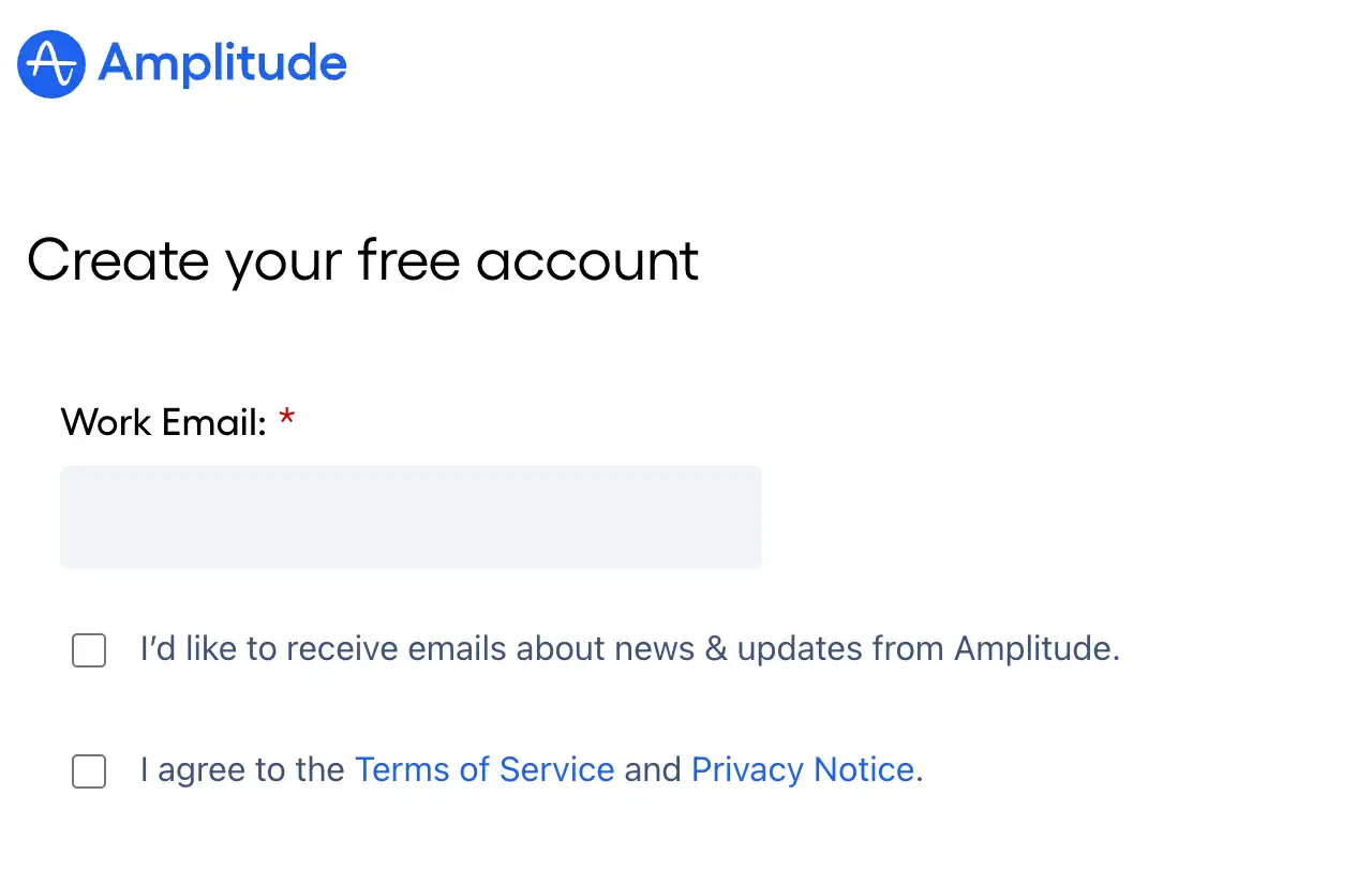
Amplitude avoids flashy visuals and animation, returning to sensible, logic-based product appeals. It makes the sign-up process a key launch point for users to move towards "data-driven product growth" via the functional highlights on the right and the backing of big customers below. This approach is especially suitable for professional B2B websites and a good Login web page example.

Image by Amplitude
8. Hubstaff
Users are also more likely to pose themselves this question before signing up: "Is this tool for me?" Hubstaff uses a user-written sentence to express the most natural answer, which helps various backgrounds and various needs of users to use time and team productivity wisely. This is more convincing compared to a headline that asserts itself. It tells people who have used this tool and achieved success. This contextual recommendation practice makes the tool authentic and makes signing up more like joining an effective worker community than signing up for a new account. It also has a design for the log-in page.
9. TheCube
CubeFactory's Login page website not only fully utilizes all of the functionality to enable the user to choose the appropriate mode for Login but also considers the user experience to make the process easy and speedy. Whether the user is a regular or irregular user, the page provides a respectful solution. It is an excellent Login web page example.
10. Kryptonite
Kryptonite's Login page design is definitely a perfect mix of functionality and minimalism. Keeping it simple and with fewer steps, the user can sign up fast and use the platform without stress. For apps nowadays, such a design goes a very long way and can be extremely effective in maximizing user sign-up and retention rates. It is an excellent Login web page example.
11. Instagram
The Instagram login site is sleek and user-friendly. It makes a clean trade-off between security and user-friendliness and allows users to log on quickly and securely using any device. Instagram employs a mobile-first design strategy, a streamlined interface, and smart verification capabilities to deliver a clean and effective login experience. Most other companies emulate Instagram's design guidelines to give their users a seamless experience, too.
12. Unbounce
Unbounce's signup page efficiently reflects the product's important benefits and builds the users' trust by using a simple form design and customer reviews. Maintaining the simple Gmail signup button, Unbounce also maintains the simplicity of the user experience so that potential users can use the platform right away. By using such a simple and effective signup design, users' usage behavior is directed, and conversion rate and user interaction are increased.
13. Zapier
The Zapier sign-up process effectively attracts and convinces potential customers using its clean and simple design, clear and prominent form fields, and excellent trust factors. Emphasizing how easy the platform is to use, that one doesn't require coding knowledge, and that free usage for a period is provided, Zapier makes signing up very fast and builds trust from the users for the platform. The design makes signing up and utilizing it very simple, attaining very high conversion rates.
14. CubeFactory
CubeFactory Login page provides an effortless log-in experience with a clean and minimal design. The website provides several easy methods to log in and streamlines the overall experience using a clean design and serene visuals.
15. Calendars
Calendly strategically includes recognizable logos of well-known brands on the sign-up page, which not only makes the site more legitimate but also facilitates easier trust from potential users. When people spot large companies or brands they know are being used, they are more confident that the site is legitimate and can be trusted. Calendly also offers a 14-day free trial to woo potential users. It is an excellent Login web page example.
Conclusion
The essence lies in intuitiveness and simplicity in making an effective and user-friendly login page. Out of the above 15 Login web page examples, we learn how to maximize user experience from a simple design, practical functions, and trust signals. Not only do these pages maximize log-in efficiency for the user, but they also build credibility for the site. Simplified form filling, accelerated social log-in, or discernible value proposition are the experiences these designs give the user. If you wish to design a quality login page for your company, you can use Wegic. Wegic's AI will cater to all your queries for you.
Click here for more information about Wegic, website design:
Written by
Kimmy
Published on
Mar 17, 2026
Share article
Read more
Our latest blog
Webpages in a minute, powered by Wegic!
With Wegic, transform your needs into stunning, functional websites with advanced AI
Free trial with Wegic, build your site in a click!
