Log in
Build Your Site
A Step-by-Step Guide to Creating a Stunning Footer Design
Discover what footer design is, why it matters, the best design principles, and how to design a good footer that enhances your website’s user experience and engagement.

Many web designers pay less attention to designing footers. However, a helpful footer improves the experience users have on a website. It further communicates the brand’s ideas, increases revenue, and allows people to easily get crucial details. It’s important to add a footer to any website, business, online store or personal blog. It describes what a footer design is, as well as its importance. It will provide the basic principles for making a website footer. We will give you detailed instructions for creating a good footer in design.

What is a Footer in Design?
Across web design, the footer is the part that stays fixed at the bottom of a page. They typically hold things like copyright data, contact info, navigational links, and icons for social networks. Even though the footer in design is at the end of the page, it is a key element of how the website works. It directs users through the site, boosts user experience, and enhances how credible the brand feels.
Essential Elements of Footer Design
The first thing to do when making a footer is to know what information should be included. An efficient and professional website footer usually has these key features:
-
Copyright information: Show the year the website was copyrighted and the name of its company. Show how the website is organized and legally valid.
-
Contact information: Giving the address, email, and phone number allows users to get in touch with the website’s operator at any time.
-
Website navigation links: Make sure there are other ways users can reach pages. Commonly use site maps and show columns for categories to support faster and easier user navigation.
-
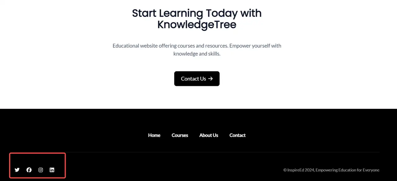
Social media icons: Encourage users to join the brand’s social profiles, increase how much people interact with the brand, and make the brand more noticeable.
-
Subscription function: Gather information about users by offering subscription forms via email to support both retention and sharing of content.
-
Privacy policy and terms of use: Put legal information on the website to make users trust its compliance.
-
Multilingual support: Make access possible from various languages and locations.
-
Brand logo: Add logos or memorable mottos to link the branding and make a stronger impression on users.
The combinations of these elements should adjust to the place in the industry and intended audience for a website. Through proper typography and visual guidance, you can improve the functionality and user experience of your footer design.
Key Principles of Footer in Fesign
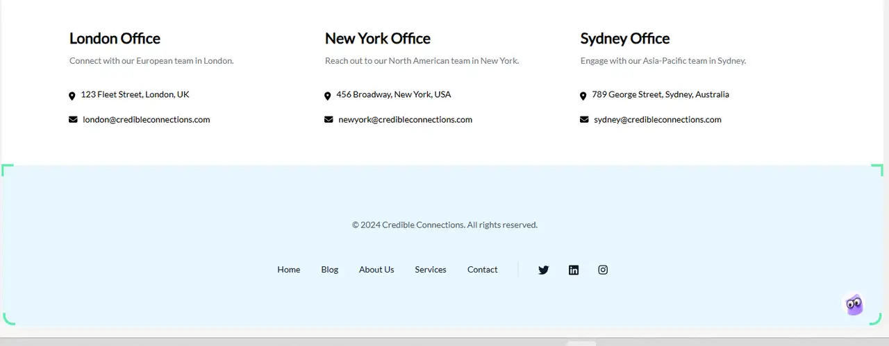
A good footer design should be simple and clear, ensuring that users can quickly find the information they need. A well-organized layout should make sure that essential information, such as contact details, quick links, and copyright details, can be seen easily on the page for anyone visiting. Ensuring the design matches the website completely, with matching colors, fonts, and icons, and checking its display on various devices (responsive design), are key points to improve user experience.
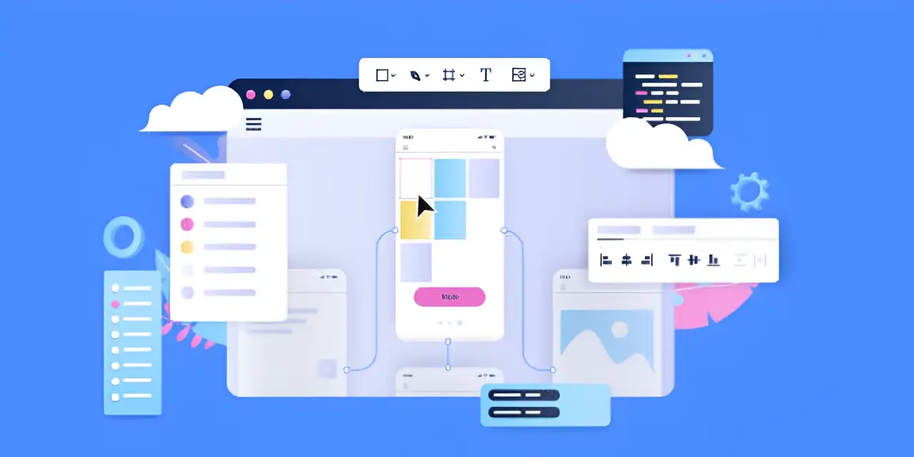
Image by Istock
All websites should have practical links to their privacy policy, terms of service, and social media pages in the footer. This way, users will trust the website more and be more active. Try to add only a little content on each page and make it simple for people to read. Decide on easy-to-read fonts and the right amount of white space to help users easily use your website. To enhance ease of use, you might also put a back-to-top button or a subscription form on your website. Improving the footer can both offer a better user experience and improve your brand’s reputation. Sometimes, links in the footer may not work, or they may point to the same location. Verify this often to avoid this.
How to Create a Stunning Footer Design?
A well-written footer gives people easy access to key information and adds credibility to the site. Adding a well-designed footer to any website, online shop, or portfolio can enhance the whole user experience. These are the detailed instructions for making a website footer:
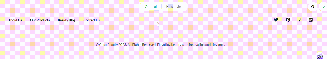
Step 1: Clarify the core content and functions
Before designing the footer, you must first plan the content. Divide the footer content into the following three categories:

Image by Istock
-
Basic information category: including copyright statement, filing information, and company registration information.
-
Navigation assistance category: website map, return to top, main column quick links, etc.
-
Interactive conversion category: contact information, social media, subscription form, online customer service, etc.
Then, choose how important the content is, based on what kind of website it is. Contact points and certifications should be featured on company websites. Websites for e-commerce should underline the policies for changing or returning products and the security of payments. Websites built around content need to emphasize subscription and sharing capabilities. To help people distinguish the content’s nature, each part should look different, yet it should still be connected within the whole. Users are able to recall the most if the information displayed on the screen does not exceed 7±2 items.
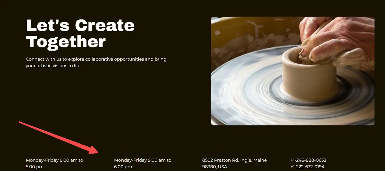
Step 2: Optimize layout structure and visual hierarchy
Grouping content using columns (like 2 or 4 columns) will provide an easy-to-follow structure:
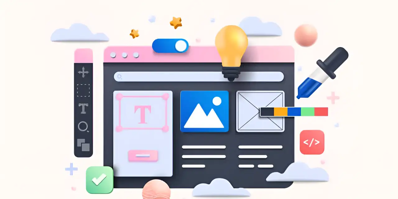
Image by Istock
-
Important details, such as how to contact or actions to take, can be highlighted separately to make them easier for users to spot.
-
Do not add the logo or introduction in the header row; place them in the column on the left (30% width), showing only the brand name.
-
Put important links in the middle of the page (this takes about 40%) and more complex user actions on the side (this takes about 30%).
-
Keep the most important things in the upper left and lower right parts of your design, as these are the most likely to be read first.
-
Pay attention to spacing all content using the 8px multiplier. 16- 24px is the recommended space for the title to be apart from the section content. Columns are spaced out by 32- 48px.
-
Use a thin (1px) line or a light block as a border between areas of your application.
When designing for mobile, change the original multi-column layout to a simple, vertical setup in the app and only present the important bits on first display. The "More" button gives you access to secondary information.
Step 3: Visual Design
The elements of the footer in design (for example, color, website fonts, and icons) need to be consistent with the rest of the website. It should also be built in a way that makes it visible and easy to use on various devices (computers, tablets, mobile phones).
-
Colour the background dark (such as #222222) and write the text in a light tone (such as #FFFFFF or #EEEEEE).
-
The contrast ratio should be no less than 4.5:1 so that the website meets accessibility requirements.
-
The title of the page should be bold (for instance, size 16), whereas the rest of the text should be in medium weight (such as size 14).
-
Having 1.5rem icons is best for the site’s icon system.
Subtle animation effects could include making an icon’s colors change when hovered (for 300ms) and using a gentle background animation. Don’t go too heavy on design.
Step 4: Add interactive functions
Integrate useful interactive tools like hover effects, a button to go to the top of the page, or a subscription form to allow users to take the next step on the site.
-
Position a “Back to Top” button at the base of long pages. It is only shown once you have scrolled more than 3 screens in the lower right corner.
-
Making the contact info a clickable link will allow people to quickly dial or email the company.
-
Lessen the steps of filling the subscription form and add responses that immediately confirm registration.
-
If social media icons have real links, adding the noopener attribute is necessary for security.
-
Include an online live help channel or an easy-to-find FAQ area for customers.
For mobile users, the contact number can be made into a striking click-to-dial button. Any user interactions should change the way the element looks to make responses obvious (such as hovering or clicking).
Step 5: Streamline content and avoid overload
Design a good footer by using simple fonts and spacing so the information isn’t too close together:
-
You can remove secondary areas (like expanding menus) to assist with simpler mobile browsing.
-
The footer element can hold your content and be linked to ARIA landmark roles to help with accessibility.
-
Set up your page using Flexbox or Grid layout in CSS to make it adjust for different viewports.
-
Opt for WEBP images and make sure to set loading to "lazy".
-
Using the SVG format gives you better icons.
-
To lessen how frequently a page is redrawn, give each fixed-positioning element a will-change: transform property.
-
JavaScript should deal with scroll events and set up loading non-essential resources so they do not interrupt the user.
-
Use the LightHouse tool testing to check that the CLS of the footer in design has a value less than 0.1.
-
TTI should stay below 3 seconds.
-
Store all the static pages in advance and then load the dynamic parts right when needed with AJAX.
Step 6: A/B test optimization
Try different ways of displaying pages, such as rearranging links or buttons, to see which one will most effectively improve user interaction time and clicks. Going on, improving the footer can help it become more useful to users:
-
Try out various ways to display the information (3 column, 4 column or vertical).
-
Check the appearance of the links (are they just text or do they feature images as well?)
-
Test out different button visuals and how they function
-
Choose the best ways to order and label links.
-
Oversee important information: check click-through rate, dwell time, and conversion rate.
-
Differentiate between test results for someone never seen before and for users you have seen before, as well as on various devices.
-
Set up a consistent process for optimizing and keep testing and enhancing your product.
-
Testing just one or two things at a time and gradually improving your website after looking at the data is what’s recommended.
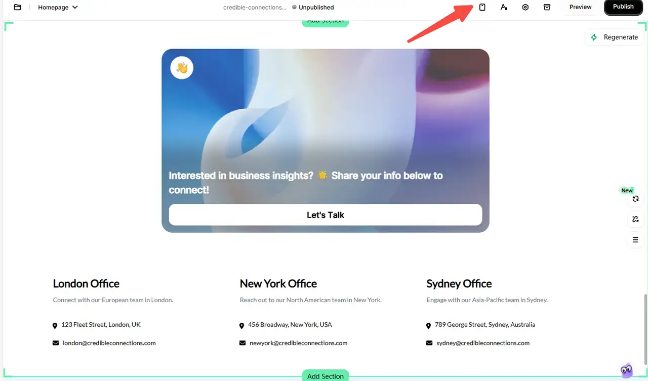
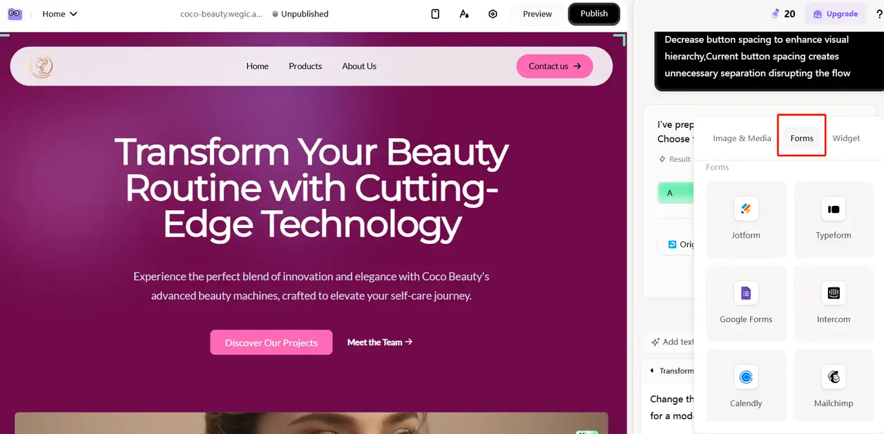
Should you feel that the steps above are too advanced for you, you may want to try Wegic. Wegic is a no-code website builder. You can build and change pages by simply dragging and dropping items with the interface. People can explain design requirements easily in natural language, such as "My site needs a current footer showing contact details and links to social accounts." A design will be formulated by the system to meet all the requirements.
It shows you how your design will change with each new input. Minor changes can be applied instantly. You can build a stunning footer design that matches your brand in only a short amount of time. All sites built on Wegic work well on any device. You no longer need to spend time and money hiring developers and designers to coordinate website design effects.
Wegic: AI Web Developer &Designer
Wegic makes it simple and quick to build a website. It relies on AI to guide people to make websites quickly and easily. Not having coding or design skills is fine. Simply enter your requirements, and Wegic will build a nice, professional website for you. Whether you have a business, make sales online, design something, or blog, it is useful for all. Building a modern website on Wegic is simple for anyone.
1. Intelligent content layout recommendation
According to the website content structure and industry type, Wegic can automatically determine the information module suitable for display in the footer. Such as your contact information, information about the company, links to your social media profiles and your privacy policy. This step guarantees the project covers all necessary information.
2. Style automatically matches brand style
The footer taking on the colors, typeface, and icon style of the rest of the page keeps the whole style unified.
3. Integrate multiple functions
Can add quick “call-to-action” modules like subscription forms and signs to all of your pages to help them work better and interact.
4. Visual editing
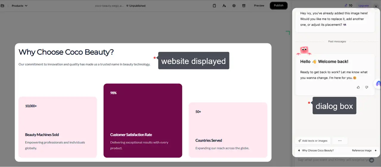
The page editor allows users to see and edit their web pages as they go. Updating photos, revising text, improving the look, or moving page items does not trigger refresh or recompile, so you skip many repetitions and can fix issues faster.
5. Maintain brand visual style
Wegic inspects and reviews things like color, the arrangement of elements, open areas, and computer animation. It is able to style the photos in a way that matches the feel of the brand. Requirements from the user are easy to pick up by the system, and the output remains easy to grasp and orderly.
If you want to watch Korean romance movies, click the article: ⬇️
Conclusion
Footer design helps gather and display data and steer users in the right direction. A well-made footer can increase how usable the website is and the rate at which users complete important actions. How websites were usually built in the past often required knowing how to code. A good level of time and effort is needed for this. It costs a lot to make appropriate changes. You don’t have to code when using the AI website builder, Wegic. Whether it is a corporate website, e-commerce platform, or personal portfolio, you can complete professional-level footer development in minutes through simple drag-and-drop operations and AI-assisted design. Register today using Wegic to begin a fresh journey in smart design!
FAQs
What is the difference between a header and a footer?
At the top of the page is the header, which typically has both navigation and branding. The footer covers the area at the bottom, and it includes more details and tools.
Should I include a sitemap in the footer?
It allows users to get to pages fast and move smoothly throughout the site. It is very beneficial for large websites that have a great amount of content.
Can a good footer improve conversions?
Of course, having clear CTAs, trust signals, and easy-to-find support helps customers move forward.
Is it okay to repeat navigation links in the footer?
Yes, adding important links multiple times improves how simple and pleasant it is for users to get around your site. It gives users an extra method to navigate your website.
Should a footer include social media links?
Yes, they promote people to interact and make your brand more noticeable. Adopt easily understood icons to keep the site orderly.
How do I match my footer with the site design?
Make sure the colors, fonts, and spacing are the same as your primary design. Match it to the visual style of your brand.
Is it okay to use animation in footers?
Subtle animations like hover effects can enhance interaction. Avoid anything too flashy that might distract or slow down the pages.
Written by
Kimmy
Published on
Mar 17, 2026
Share article
Read more
Our latest blog
Webpages in a minute, powered by Wegic!
With Wegic, transform your needs into stunning, functional websites with advanced AI
Free trial with Wegic, build your site in a click!
What kind of website do you want to build?