Log in
Build Your Site
How to Design an Effective FAQ Page: A Step-by-step Guide
Want to know how to create an effective FAQ page? This step-by-step guide helps. Improve customer satisfaction and website navigation with practical tips.
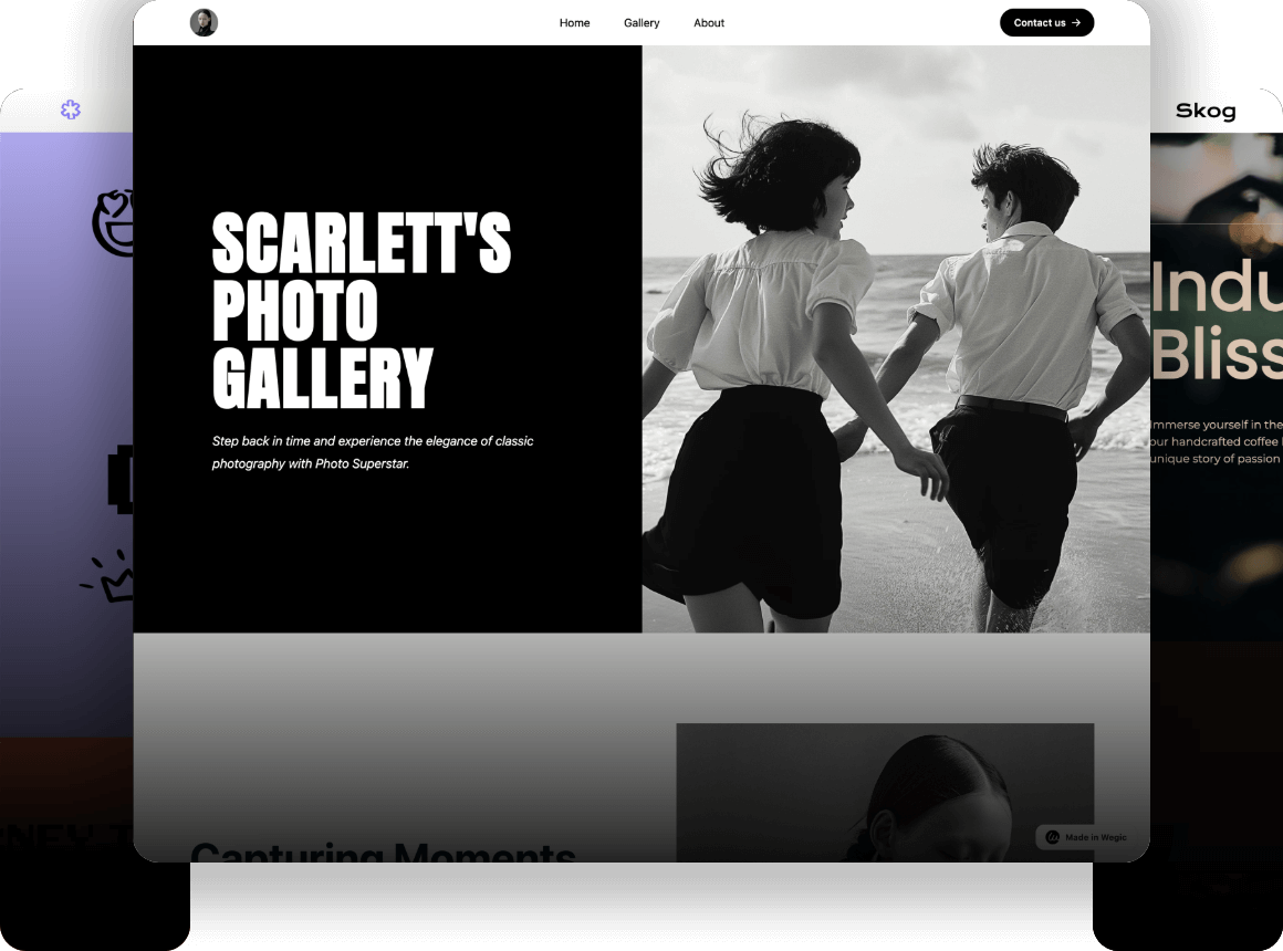
Have you ever visited a website, spent a few minutes searching for answers, and then just left feeling not helpful? It happens more often than you'd think. Studies show that 40% of website visitors abandon a site when they can't find the information they need. For many businesses, an FAQ page could be the key to keeping users engaged and reducing bounce rates.
An FAQ page isn’t just a nice-to-have; it’s essential. It’s where your visitors go to find quick answers, understand your products or services, and trust that you value their time. When designed well, an FAQ page can not only enhance your site’s user experience but also improve your search engine ranking. Google and other major search engines love content that answers people’s questions directly professionally (EEAT principle), which means a well-organized FAQ page can help your site appear higher in search results.
Buckle up as Wegic walks you through the steps to create an FAQ page that does more than just answer questions--an FAQ page that helps build trust with your visitors, improve your website’s usability, and boost your SEO efforts.
What is an FAQ Page?
Definition and Purpose:
An FAQ (Frequently Asked Questions) page is exactly what it sounds like—a section on your website where you answer common questions visitors might have about your products, services, or policies. But it’s more than just a list of questions and answers: it's your website’s help desk—always available, providing clear answers to eliminate confusion and make the user experience smoother. A well-designed FAQ page can save your visitors time, reduce frustration, and even cut down on customer support inquiries.
Why is it so important? People hate wasting time searching for answers. According to HubSpot, 80% of consumers prefer to find answers on their own rather than contacting customer support. A well-designed FAQ page is just what visitors need to get the answers they need quickly, which builds trust and makes your site feel more user-friendly.
-
Wrap-up: an FAQ page is where users can quickly find concise answers to common inquiries.
Common Mistakes to Avoid:
While an FAQ page can be a powerful tool, many businesses make a few key mistakes when designing it. Here are the most common ones:
-
Too Much Text, Not Enough Clarity: Writing long paragraphs instead of clear, concise answers is a big mistake. Visitors want quick answers, not an essay. Keep your answers short and to the point. For example, instead of explaining how a return process works in a long paragraph, use bullet points or numbered steps.
-
Overloading with Questions: An FAQ page shouldn’t be a massive list of everything you think people might ask. Too many questions overwhelm users. Keep it focused on the most common or crucial questions that genuinely matter to your audience. If you have a lot of questions, consider categorizing them into sections like "Shipping" or "Product Details."
-
No Search Function: If you have a large FAQ section, make sure to include a search bar. Without it, visitors may struggle to find specific answers. A simple search tool can make the FAQ page feel more interactive and accessible.
-
Ignoring SEO: Many businesses overlook SEO when creating their FAQ page. Google loves content that answers specific queries, so including relevant keywords in your questions and answers can boost your visibility in search results. Don't just write for humans—write with search engines in mind.
How to Design FAQ Page--Step 1: Identify Common Questions

Know Your Users Well
To create an FAQ page that truly meets your audience’s needs, you first need to really know what they’re asking. This means digging into the questions they’re already asking about your product or service. A great way to do this is by conducting customer surveys, which could be simple polls or forms sent out to existing customers, asking what they wish they knew before making a purchase or what issues they often encounter.
Additionally, your support team is a goldmine of information. They are the ones answering customer inquiries every day, so their insights can help you pinpoint recurring questions. If you don’t have a support team, look at your competitor analysis--check out their FAQ pages, see what questions they address, and think about whether those same questions apply to your business.
Examples of Common Questions
Every industry has its own common questions. Here are some examples to help guide your brainstorming:
E-commerce Store:
-
“How do I track my order?”
-
“What is your return policy?”
-
“Do you offer free shipping?”
Software/Tech:
-
“How do I install the software?”
-
“What happens if I forget my password?”
-
“How do I upgrade my plan?”
Restaurant:
-
“Do you accept reservations?”
-
“What are your hours of operation?”
-
“Do you offer gluten-free options?”
How to Design FAQ Page--Step 2: Categorize the Questions

Create Clear Categories
Once you’ve gathered a list of common questions, the next step is to group them into clear, easy-to-understand categories. This is to help visitors find what they’re looking for without scrolling through long paragraphs of text. For example:
-
Shipping: "How long will my order take?" "Do you ship internationally?"
-
Returns: "How do I return an item?" "What’s your refund policy?"
-
Technical Support: "How do I reset my password?" "What do I do if my app crashes?"
Creating categories makes the FAQ page much more organized and user-friendly. Visitors should be able to skim through the questions and easily find the section they need.
Best Practices
When organizing, use headings and subheadings to break up content. This isn’t just good for navigation; it also helps with SEO. Clear headings allow search engines like Google to understand what the page is about and can even lead to rich snippets appearing in search results. For example, a question like “How do I return an item?” could show up directly in Google’s search results with a brief answer.
How to Design FAQ Page--Step 3: Provide Clear, Concise Answers

Answering with Clarity
The key to an effective FAQ page is providing answers that are straightforward and easy to digest. Avoid long, rambling explanations—your visitors are looking for quick solutions. Think of your FAQ page as a map and your answers as the directions. Get to the point quickly. For example:
-
Bad Answer: "To return an item, you need first to check our returns policy to see if the item qualifies for return, then fill out a return form, and after all that, send the item back to us."
-
Good Answer: "To return an item, please fill out our returns form and send the item back within 30 days. You'll receive a full refund once we receive the item."
Tips for Effective Communication
Use bullet points or numbered lists to break down complex processes. People like to scan text rather than read long paragraphs. Here’s a quick example:
-
Fill out the return form on our website.
-
Please pack the item securely in its original packaging.
-
Ship it back to us within 30 days.
If you can, include visuals like images or videos to explain the process further. This can be especially helpful for complex steps or technical instructions.
How to Design FAQ Page--Step 4: Optimize for Search Engines

SEO Best Practices for FAQs
When creating your FAQ page, it’s important to remember that search engines need to find and understand your content too. To do this, naturally include your target keywords in the questions and answers. For example, if you’re trying to rank for "how to create FAQ page," make sure it’s included in your questions like “How do I create an FAQ page for my website?” But don’t overstuff your content—keep it natural and readable.
Also, consider adding schema markup, a special code that you can use to help Google better understand your FAQ content and show it as a "rich snippet" in search results. This increases the chances that your FAQ page will appear at the top of search results when people ask similar questions.
How to Design FAQ Page--Step 5: Make Your FAQ Page Visually Perfect

Design Considerations
A cluttered, hard-to-read FAQ page will drive people away. Choose easy-to-read fonts, keep your layout simple, and use white space to avoid overwhelming your visitors. If your FAQ page is on a larger site, make sure it matches the overall design so it doesn’t feel out of place.
Interactive Elements
Consider adding features like collapsible sections or dropdown menus. These allow users to click to reveal answers without scrolling through long text blocks, making your FAQ page cleaner, faster, and easier to navigate.
How to Design FAQ Page--Step 6: Incorporate Links to Relevant Pages

Internal Linking
Don't forget to link to other important pages on your website, such as product pages, blogs, or the contact page. These links encourage visitors to explore your website more and provide further value.
Encourage Further Engagement
You can also include CTA buttons like “Contact Us” or “View Our Full Support Page” to guide visitors to take the next step after reading an FAQ. This keeps users engaged and can lead to better conversion rates.
How to Design FAQ Page--Step 7: Test and Refine Your FAQ Page

User Feedback
Once your FAQ page is live, gather feedback from your visitors. What questions are they still asking? Are there sections they find hard to navigate? Use this information to improve the page.
Analytics
Track your FAQ page’s performance through analytics tools. Look for patterns in bounce rates, time on page, and click-through rates. If visitors are leaving quickly, it might mean your answers aren’t clear enough or that the page isn’t easy to navigate.
By following these steps above, you’ll learn how to create an FAQ page that’s informative, easy to use, and optimized for SEO. Whether you’re wondering how to create an FAQ page in HTML or using an AI-powered platform like Wegic, these tips will help ensure your FAQ section becomes a valuable resource for both your visitors and your business.
Start to Design the Best for Your FAQ Page on Wegic
Designing an effective FAQ page has never been easier. With Wegic, the conversational AI-powered website builder, you can create a FAQ section that not only looks great but also works perfectly for your visitors. Here’s how you can start designing your perfect FAQ page:
Start with the Chat Bar

Begin the process by interacting with Wegic's chat bar. Simply describe what you want your FAQ page to look like, and Wegic will guide you through the design process, offering suggestions and steps to create a tailored FAQ section clearly.
Use the Circling Tool
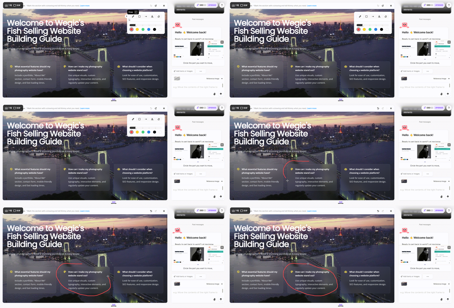
Wegic’s circling and drawing tools let you highlight sections of your FAQ page that you want to change. Just circle and type the changes you want to make at the chat bar. You can see and modify everything in real time, making it easy to make adjustments as you go.
Customization Made Simple with Sketches and Reference Pictures
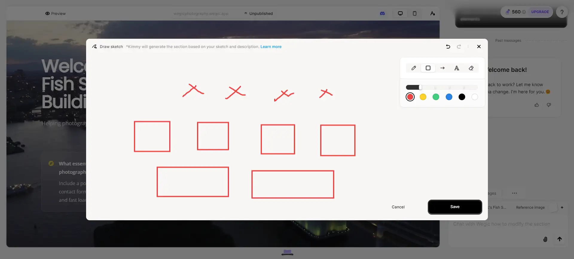
Wegic offers full customization options to match your brand’s visual identity--empowered by its sketch drawing feature. Adjust the layout of your FAQ page based on your sketches and the designs that you like chat by chat to align with your website’s design—all without needing to write a single line of code. Whether you prefer bold, eye-catching fonts or a more minimalist style, Wegic lets you express your brand’s personality effortlessly.
Add Interactive Elements

Enhance your FAQ page by adding interactive elements like collapsible FAQ sections, search bars, or even video answers. Wegic’s easy drag-and-drop interface lets you add these features with no technical expertise required, making your FAQ page dynamic and engaging.
Start Out to Perfect Your FAQ Page Now
All in all, to build an effective FAQ page, start by identifying your audience’s common questions and categorizing them for easy navigation. Then, provide clear, concise answers and optimize your page with SEO best practices to improve its visibility on search engines. Don't forget to use tools like Wegic to customize your design, add interactive elements, and ensure your FAQ page is both visually appealing and user-friendly.
Now that you know the essential steps, it’s time to take action. Whether you're creating a new FAQ page or refining an existing one, start building today!
Written by
Kimmy
Published on
Mar 17, 2026
Share article
Read more
Our latest blog
Webpages in a minute, powered by Wegic!
With Wegic, transform your needs into stunning, functional websites with advanced AI
Free trial with Wegic, build your site in a click!
What kind of website do you want to build?