Log in
Build Your Site
15 Effective Ecommerce Checkout Page Designs for Inspiration
Transform your online store with these 15 innovative e-commerce checkout page designs. Learn key strategies to improve customer satisfaction and increase sales!
When did you leave an online shopping cart behind? Perhaps you were simply fed up with too many fields to fill in, or worried about the site’s security. We have learned that the e-commerce checkout page design is very important for any online store to be successful. Well-optimized checkout pages are essential to the nuts and bolts of your business. They are a key moment in the process when a visitor becomes a customer. In this guide, we’ll walk you through everything you need to know about checkout pages: their purpose, their importance and how to design one.
What Is a Checkout Page?
The not-so-happily ever after.... more like an e-commerce checkout page design, the virtual equivalent of the cash register in a store. Instead of having to find your money and talk to the cashier, you can easily use a special screen that helps you quickly pay for things. In simple terms, the checkout page's meaning boils down to one thing: completing a transaction.
But its real significance lies beyond that surface-level definition. It's like choosing a movie. You might like the look of a few, but you only really decide which one to watch when you go to the theatre and buy your ticket. They may also second-guess their choices here. A poorly executed credit card checkout page UI design can send customers running, even after they’ve invested time adding items to their cart. In contrast, a sleek and intuitive payment page UX can turn casual browsers into loyal buyers.
Even if something works perfectly, it doesn't matter if it's hard for customers to use. How easy it is to buy something is the most important thing.
Imagine going to a store to buy something. You get to the cashier, but they make you fill out a lot of papers and give you confusing instructions. That would be annoying, right? A good checkout page for online stores should be like a friendly cashier who makes it easy and fast to buy things.
You’d likely walk away. The same applies to website checkout processes online. Clear, well-organized checkout forms ensure buyers know exactly what’s expected at every step.
And what’s fascinating is how much psychology goes into crafting these pages. Sometimes, websites have special signs to show they are safe. These signs might look like locks or shields.
Also, some websites help you shop faster. For example, they might remember your address so you don't have to type it every time. They also show you a picture of what's in your shopping cart, so you know exactly what you're buying. This makes shopping online easier and more fun!
And let’s not overlook the creativity involved in order page design. Some e-commerce checkout page designs use fun words and pictures or change how the page looks, to make shopping feel more like a game instead of just buying something. But others keep it laser-focused, anything that takes attention away from that coveted “Place Order” button.
In essence, the e-commerce checkout page design process steps boil down to balancing simplicity with persuasion. Imagine you're buying something online. The website should only ask you for the information they need, like your address. They should also give you lots of ways to pay, like using a credit card or a special online wallet.
If the website is easy to use, you're more likely to buy something. This is true whether you're buying something small like socks or something big like a new toy. The people who made the website thought carefully about how to make it easy for you to finish your shopping.
In retail, they say, ‘the sale isn’t over until the money’s in the till.’ That magic happens online on the checkout page.
Why E-Commerce Checkout Page Design Optimization Matters
The checkout page is that final hill in an e-commerce marathon that either makes or breaks your revenue. You might think it’s just a formality, a series of checkout forms to fill out and submit. It’s a high-stakes negotiation between your site and the customer’s wallet. It is this delicate phase that can help you win your customer’s love or disloyalty.
A thoughtfully optimized e-commerce checkout page design process can make all the difference. Imagine spending hours shopping online, adding items to your meticulously curated shopping cart design, only to hit a clunky, slow-loading, or confusing checkout interface. Cart abandonment—the term that makes e-commerce managers shiver—is that. Studies reveal that nearly 70% of carts are abandoned, often due to poor payment page UX. Simply put, an unoptimized checkout page is like locking the door right when they’re trying to get in.
So, why does order page design optimization hold so much weight?
First, it builds trust. Imagine you're buying something online. The website should look safe and trustworthy. You should see things you recognize, like the logos of the places where you pay with your card. The instructions should be easy to understand. All of this helps you feel safe giving your important information to the website. When you pay, the website should make it easy and simple. You shouldn't get confused or lost while trying to pay. If shoppers don’t feel speedy or secure during the transaction, they become sceptical.
Optimization isn’t just about input, it’s about output too. Sometimes websites give you little hints to help you buy things. For example, they might tell you how much more you need to spend to get free shipping. Or, they might say that a special offer is ending soon, so you should hurry up!
These hints encourage you to buy something. Also, websites can make things easier for you. For example, some of the information you need to type might already be there. Or, they might say "thank you" in a nice way after you buy something. This makes the website feel more friendly and encourages you to start shopping. Of course, we can’t forget mobile responsiveness with more people shopping on their phones than ever before.
Ultimately, optimizing your checkout forms ensures a win-win scenario. Customers have a good shopping experience, and businesses have upsides to higher conversion. This reflects the shift from intent to action, bridging the chasm between people who ‘just go by’ and people who become committed customers.
Every click in the e-commerce world is important. Refining checkout design helps close sales, but it also builds trust, cuts time, and puts you in a position to repeat customers. After all, isn’t that what we all like, a predictable, painless way to find our next great find?
One-Page vs. Multi-Page Checkout: What’s the Difference?
The point where the checkout page is designed is choosing between a single page and multiple page layout. Each has its pros and cons:
One-Page Checkout: Displays all checkout forms (e.g., shipping, payment, and confirmation) on a single screen. It’s quick and simple but can be overbearing with too much on display.
Multi-Page Checkout: It breaks down the process into smaller steps -- such as entering shipping details on the first page and paying during the next. The approach is less cluttered but less pleasing for users who may not know how long this process will take.
It depends on your target audience and the device usage. Sometimes, simple websites look best on computers. But when you're shopping on your phone, it's usually better to take a few steps to check out your order.
15 Effective E-Commerce Checkout Page Designs for Inspiration
It’s the grand finale of an e-commerce trip: the checkout page. It’s where the action is, it’s where a customer is going to click “purchase” or not. Whatever project you’re working on: revamping an existing page, or starting from scratch, these e-commerce checkout page design ideas will give you a smooth, streamlined, and engaging checkout experience. And now, let’s look at some design ideas that will help you with your next checkout page redesign!
1.Streamlined One-Page Checkout: One-page checkout makes it easy to buy things. All the information you need is on one page. You can put in your address, choose how to pay, and finish your order without clicking too many pages. No more endless clicking around, it’s convenient and efficient. It also reduces distractions and encourages the user to make a purchase.
2.Sticky Cart Summary: Keep your shopping cart design visible throughout the entire checkout process. This sticky cart summary gives customers exactly what they’re buying, meaning they’ll never lose track of their items or their final cost. They’ll have a constant reminder of their order, whether they’re filling in their address or selecting the payment method. This transparent approach diminishes anxiety and prevents users from deserting the cart thanks to surprise fees.
3.Returning Customers Autofill: Customers should be able to save their shipping addresses without further information. This simple, yet effective feature saves time, removing friction for the checkout process. Users will appreciate the automated completion of their shopping details and are more likely to buy.
4.Real-time Shipping Calculators: Showing users an accurate real-time calculation of the shipping cost before they navigate to the payment page. It is transparent to the customer, which they will like, and it automatically avoids abandonment due to unexpected shipping fees. Be sure that these shipping calculators integrate smoothly into your order page design. Also, show estimated delivery times, nobody likes to wait for far too long.
5.Trust: Security is a top priority for making online purchases and security Badges. Put your security badges, SSL certificates, and trusted payment icons front and centre on your checkout page. This signals to users that their sensitive information will be protected during the credit card checkout UI process. After all, simply putting a little security icon next to the payment form is enough to increase trust by several per cent.
6.Clear and Concise Refund Policy: Make sure your order page design includes a brief, easy-to-find refund policy. Showing how happy our customers are lets them know we are trustworthy and safe. This makes them feel better because they know they can get their money back if something goes wrong. When you buy something expensive, having a clear return policy near the place where you pay can help you feel more confident and less likely to leave the website without buying.
7.Discount Code Field: Don’t put the discount code box out of sight, rather, put it where customers can find it and use it easily. A lot of customers search for promo codes when they are about to check out, so give them a field to type their discount and watch the price decrease in real-time. Maybe it makes this field dynamic – show users the discount as they type in the code.
8.Exit-intent Popups: Popups offer a great way to keep the customer engaged by reminding them that when they leave the page, they will get a discount or free shipping offer. Here — they can significantly reduce checkout abandonment rates and help push a shopper over the edge to make a purchase.
9.Make It Mobile: With mobile shopping growing, make sure your checkout page is fully responsive to the mobile experience. When you shop on a phone or tablet, the shopping cart needs to look good and be easy to use. The screen is smaller, you use your fingers to tap, and you want to look at things quickly. Make it easy for people to put in their information, choose how they will pay, and finish their order without any problems.
10.Social Media Login Options: Options for customers who prefer convenience over filling out forms, offering social media login options (like Facebook or Google) can make the website checkout process faster and easier. But just make sure to make that social login button visible and unobtrusive. One especially useful use of this is for the customers that have returned and may not remember their account credentials.
11.Minimalist Design: Easy-to-read fonts and a clear hierarchy of information. You should try to keep the e-commerce checkout page simple and avoid adding unnecessary images or text. Your e-commerce web page design should focus only on the important parts, such as the order summary, shipping options, and payment forms. A simple and elegant checkout page makes it easier for customers to complete their purchases without feeling stressed.
12.Order Confirmation Page: When an order has been paid for, create an order confirmation page that will make customers confident of their purchase. Bring the order summary, track info (if needed), and a thank you note. This is an opportunity for a cross-sell or discount of a future order to come back.
13.Multiple Payment Options: Offering multiple options, such as credit card checkout page UI design, PayPal, Apple Pay, or even cryptocurrency, will make your checkout page more appealing to a wider audience. Make sure the payment page UX allows users to easily toggle between their chosen methods without feeling confused. The more payment options, the heavier the drip payoff for your customers.
14.Guest Checkout Page: Not all of our customers want to create an account before buying. A guest checkout option makes it easier, faster and more flexible. Take the friction out of the process by eliminating the need for users to fill out long registration forms. For users who are in a hurry or lack confidence about giving out personal information, this approach is just great. After the purchase is complete, for those who are going to make an account later, offer to let them do it.
15.Enhancing Payment Page UX: We deconstruct the checkout form into smaller, manageable sections of information. Instead, break it down into steps, rather than showing one giant intimidating form. First, ask for shipping details and then get to payment options. It employs the kind of progressive form design that lets customers breeze through the fields without drowning in them all at once. It’s a great way to enhance the payment page UX by offering a clean and easy flow, one step at a time.
If you're trying to design a great checkout page for your online store, or if you just want to see how other stores do it, these ideas will help. The most important thing is to make it easy and safe for people to pay, so they don't leave their shopping carts and keep coming back to buy from you.
E-Commerce Checkout Best Practices
Amazon

Amazon’s e-commerce checkout page design is a masterclass in minimalist checkout process steps. It is straightforward and clear with clear buttons for payment options, addresses for shipping, and delivery times. Its simplicity allows users to remain focused and don’t get distracted.
Apple
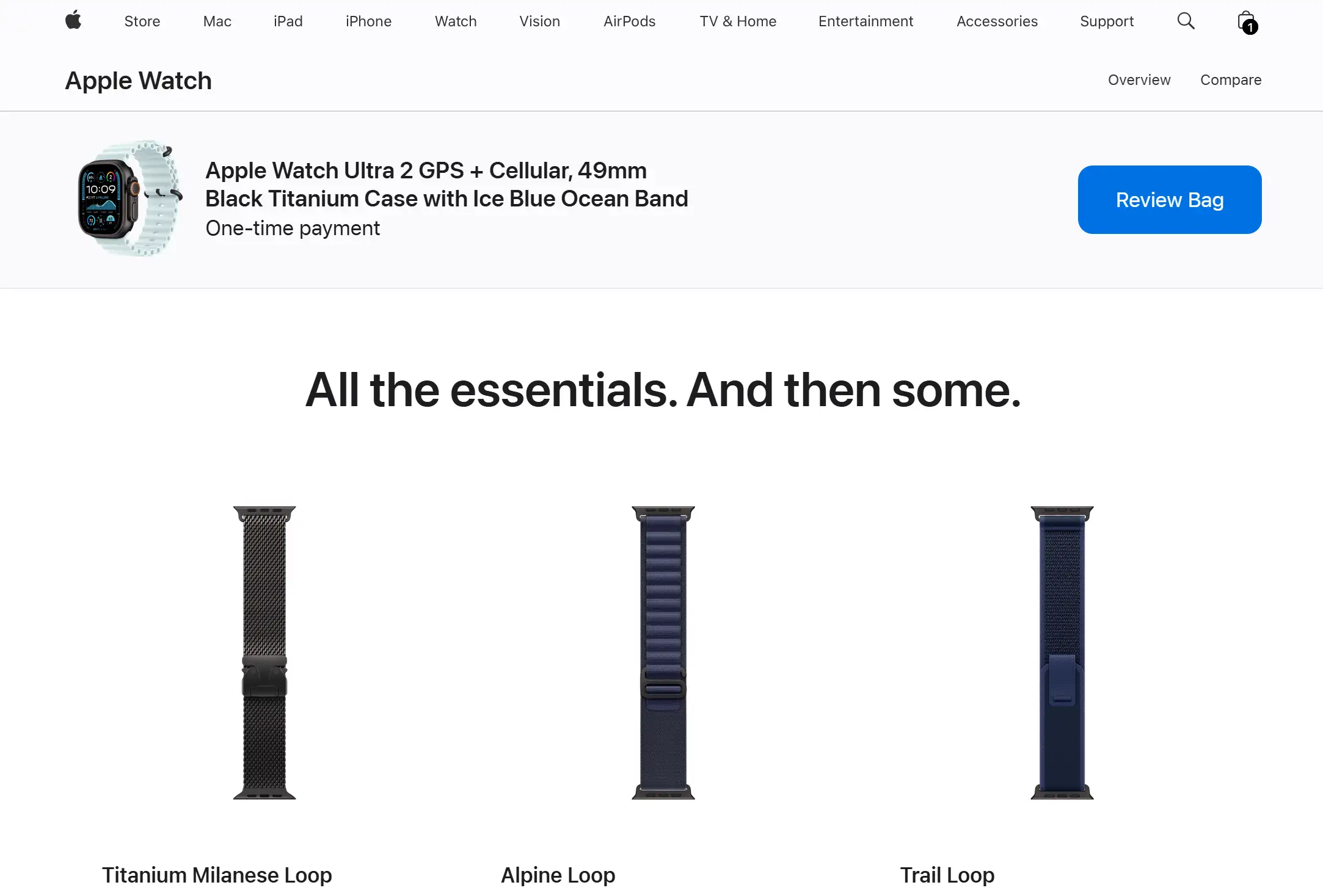
Apple integrates its signature sleek design into its order page design. Buffeted in an intuitive layout, combined with autofill for Apple ID users, it’s quick and feels friction-free. And, of course, the option to use Apple Pay enhances the credit card checkout page UI design simplicity.
Etsy
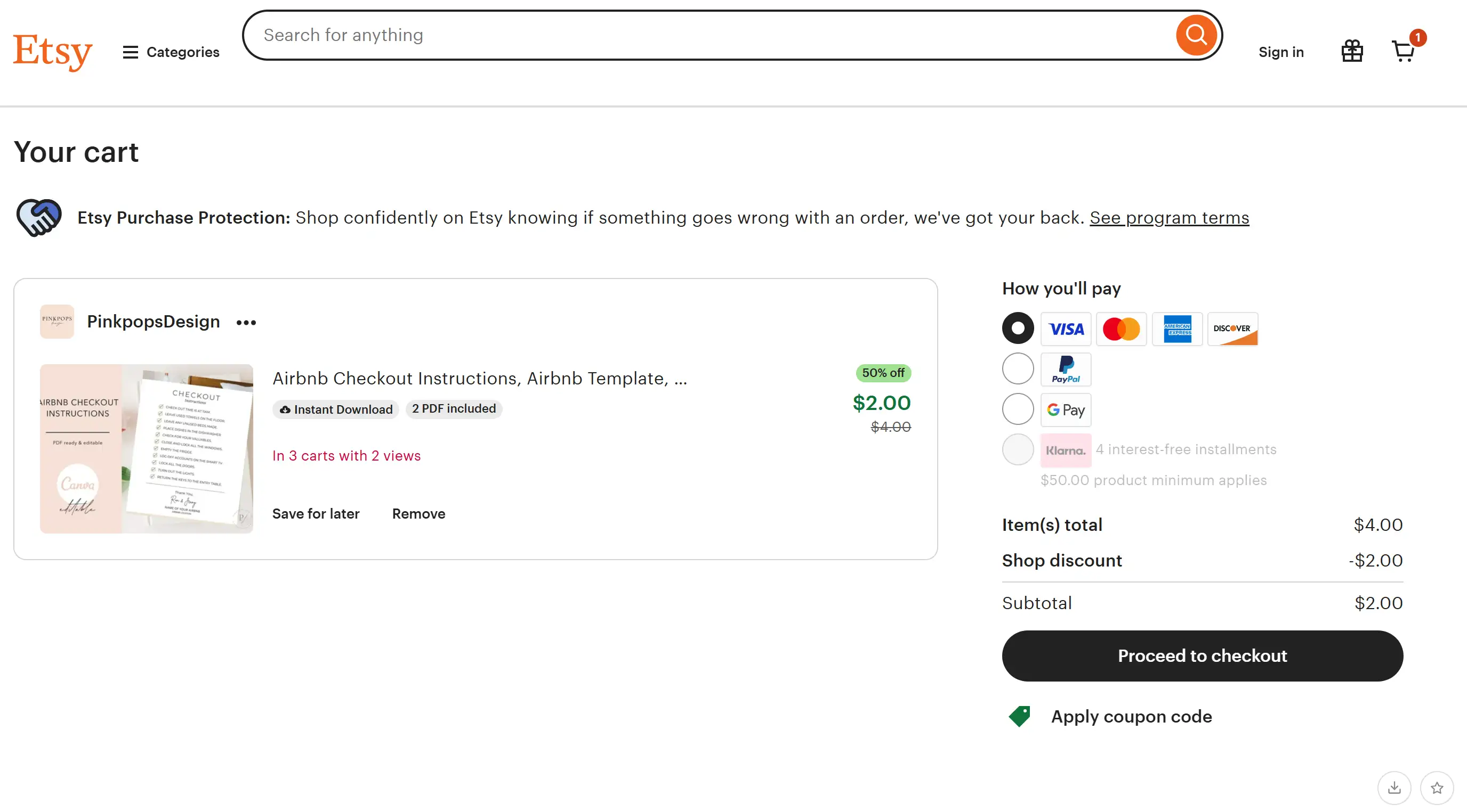
The focus of Etsy's e-commerce checkout best practices, like most things, is to make the buyer feel at home. From personalized messaging to user-friendly shopping cart design, it feels more like a chat with a friendly seller than a rigid e-commerce form.
Nike
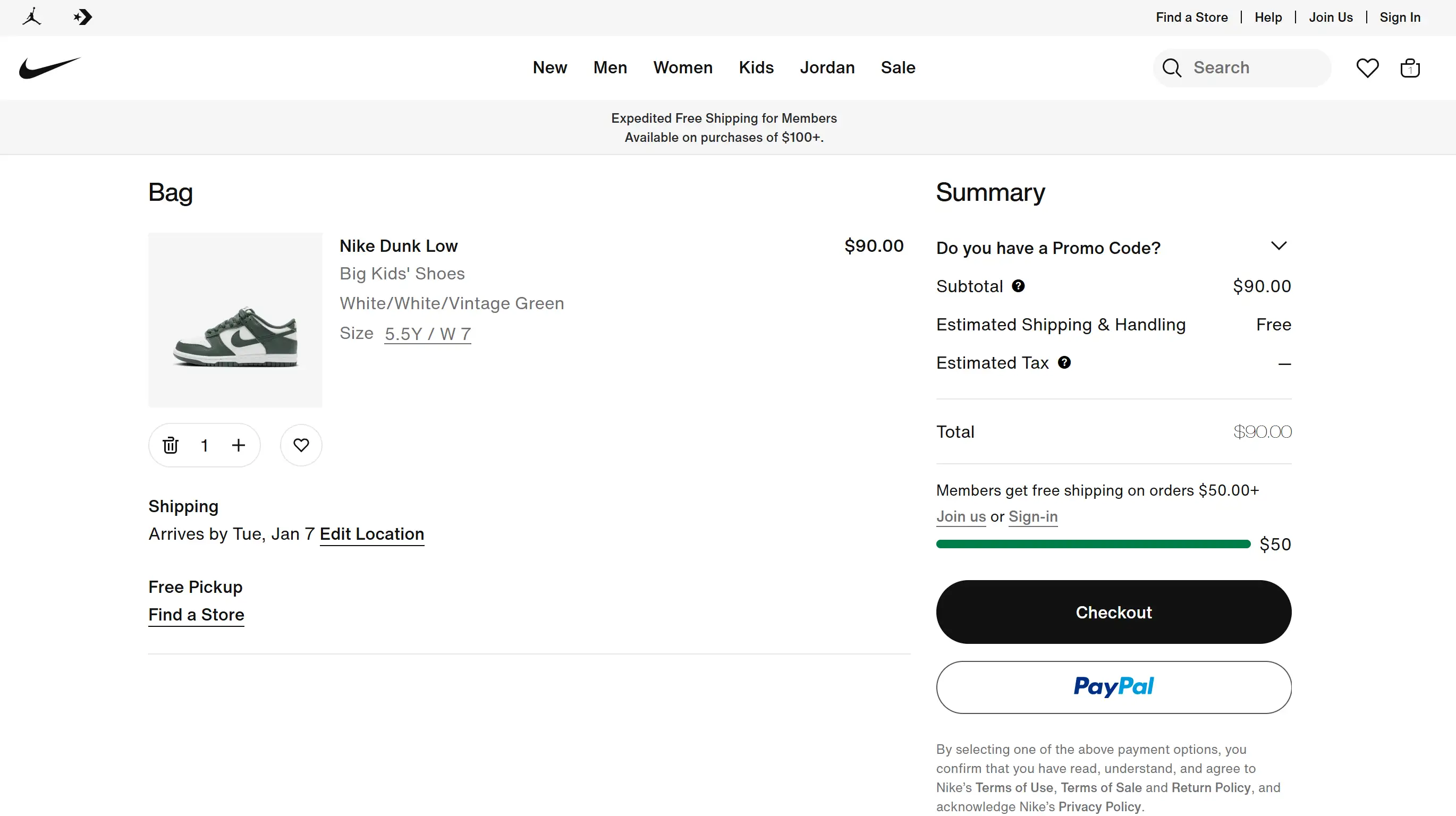
The e-commerce checkout page design on the Nike site is confident; its branding is bold and the security is promoted. Its checkout page design inspiration lies in the way it builds trust through clear payment details and a progress tracker.
Ready to Build Your Perfect Website Without the Headaches?
You've learned about e-commerce checkout page design and other great ways to make online shopping easy. Now, let's think about how to build the best possible website for your business or personal brand. Even if you want to become an entrepreneur and sell things online or simply build a solid online presence, having a no-code website shouldn’t be an intimidating process. Stop messing around with complicated code and web design terminology that leave your head spinning – welcome to Wegic.
Wegic's AI website building based on chat makes websites a piece of cake: no need for complexity. Whether you're creating a sleek shopping cart design or designing a professional payment page UX, Wegic’s intuitive process allows anyone to create stunning aesthetic websites effortlessly. Imagine it—even your very own personal web designer in your pocket... no endless revisions, no crazy bills.
Written by
Kimmy
Published on
Mar 17, 2026
Share article
Read more
Our latest blog
Webpages in a minute, powered by Wegic!
With Wegic, transform your needs into stunning, functional websites with advanced AI
Free trial with Wegic, build your site in a click!