Log in
Build Your Site
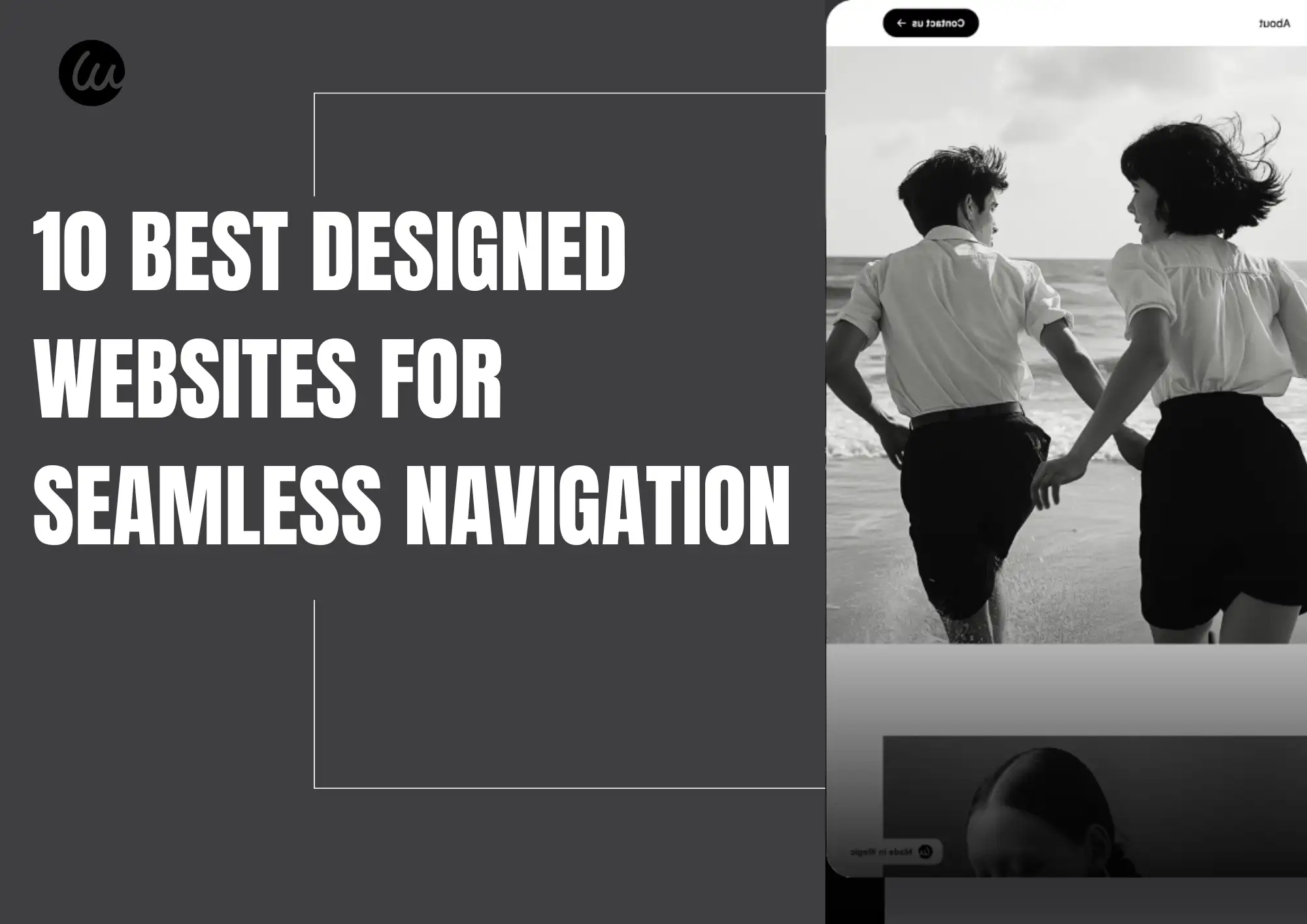
10 Best Designed Websites for Seamless Navigation
Are you trying to find the website with the best design? This guide will provide examples of the best websites that have seamless navigation design!

Have you ever clicked on a website and felt overwhelmed after just a few seconds? Or do you feel like you're browsing the same website design over and over again? A website's layout can make or break the user experience. We often find that some websites ignore the design completely, resulting in a mess of content that loses originality. It is hard to find a well-designed website.
This is when a well-designed website, which combines seamless navigation with an eye-catching design, is crucial! Mastering this is essential to improving the aesthetics and usability of your website and making it stand out from the crowd.
In this post, we'll explain why layout design is so important and, of course, provide good website examples with unique website design and easy navigation for your reference and inspiration. Let's get started and build the best-designed website!
What is website navigation?
Website navigation refers to the system that guides users through and accesses different website pages, products, and services. It includes the structure of the layout and design, and elements such as graphics, icons, text, menus, and buttons. These features work together to help users find what they are looking for efficiently. For example, a navigation menu at the top may contain icons or text that display the main products and services of the website. Through these visual elements, users can easily access specific pages.
Why is website navigation important?
Website navigation is crucial because it directly affects the user experience. A good navigation system allows users to easily find what they need, thus simplifying the entire browsing process. A clear and smooth navigation design will satisfy users, increasing their stay time on the website and reducing bounce rates. When visitors can quickly find the information they need, the website experience becomes pleasant and efficient.
In addition, the smoothness of website navigation is essential for business value. It can enhance the brand image. A simple, easy-to-use navigation system can improve user satisfaction and make visitors feel good about the brand. When they decide to buy products or services, they are more likely to choose brands with a pleasant experience. Therefore, a reasonable navigation design is the key to improving conversion rates and customer loyalty. That's why website navigation is an integral part of a best-designed website.
10 best-designed websites for seamless navigation
1. Rapha
Rapha's design scheme guides users to locate items and persuade them to purchase items with basic white links and pleasant images. It is excellently designed and possesses distinctive styles. The excellent layout lets users locate what they want without becoming disoriented by convoluted menus or navigation. It is even simpler for users with the search bar and menu positioned on top right, and the breadcrumb navigation on top will guide users on how to return to category pages and remind them where they are on the website.
This makes customers happier and ensures the site performs better and sells more. To enable customers to easily find what they are looking for, website design should also be clear, readable, and useable. eMarketer research has shown that e-commerce sites tend to have a conversion rate of 1.6%, and users spend this amount of time on various devices: desktop/computer: 9.4 minutes, mobile: 7.5 minutes, and tablet: 9.9 minutes. Good navigation on the site and a pleasant shopping experience are vital to drive e-commerce revenues.
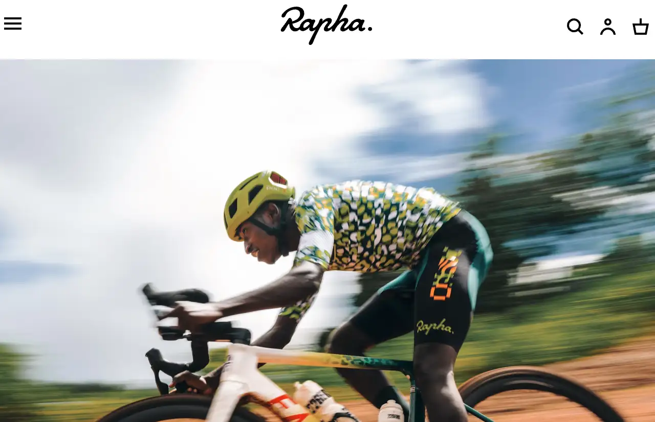
Image by Rapha
2. The Honest Company
You should use an adequate number of categories when navigating a website. Having very few or an excess of categories will alter how people locate what they require, particularly on mobile devices. The Honest Company's website is a perfect model to emulate.
As Baymard Research states, 38% of mobile sites have too few, too many, or confused categories, making it difficult for users to navigate. With insufficient categories, users have to click or hover over several categories to get what they seek. With excessive categories, users may become confused and find it more challenging to choose.
This design issue irks users when they search on this website. It also leads them to believe there are few items on this website, and thus, they will not search anymore. The objective is to have a means of categorizing goods that will not confuse or irritate people.
The navigation system at The Honest Company is also quite transparent, with eight categories. The users can then view all product types with ease. For instance, users who click "Personal Care" end up on a clean page with personal care products. When they click on a product such as "Conditioner," users are directly taken to that product's information page to learn more about it, including ingredients and how to use it. The entire process is also straightforward, making it easy to discover what users seek.
3. Loctote
When people visit your website, they typically have one thing in mind: they need a particular product. At this point, they do not wish to browse through numerous pages or sift through products. Rather, they wish to search immediately, view in-depth details, and, if it is what they need, then purchase it.
Loctote is a good website example, with its pleasant website offering anti-theft bags for sale. On its website, there is an open call to click on an icon of a plain magnifying glass to search. Customers merely enter what they want, such as "backpacks" and click on the enter key to instantly get information on a whole lot of anti-theft backpacks. This convenient search facility enables customers to discover products with less effort and makes shopping more comfortable and hassle-free.
The internal search functionality is critical. Go Media research indicates that at minimum, 50% of customers enjoy utilizing the internal search functionality on online stores to locate products faster. The functionality makes it easier for users to find what they require and provides a better shopping experience.

Image by Loctote
4. What Is Missing
The "What Is Missing" website employs small visual cues to aid users. The most indispensable cue is the hover effect. Whenever the mouse passes over an icon or a tab, the interface shifts and becomes colorful. This aids users in seeing better. Users can easily navigate different tabs and icons and zoom in and out to view details better. This website has an exceptional design and is an excellent source for a well-designedwebsite.
5. Cartier Time Project
The Cartier Time Project website reflects the brand's luxury through its minimalist and functional design. It is perfect on every device, ensuring visitors can load it quickly and navigate without difficulty. The menu has various product options that become visible when you move over them, and users can swap out content and return to the front page at will, making navigation a breeze.
This website has only a moving background video. Few words and colors are used to create a fancy and modern website. The video is suitable for the luxury company's brand and has less distracting effects. This allows users to concentrate on information without getting confused by complicated aspects. The unique website design makes Cartier Time Project one of the best-designed websites and a good website example.
6. Drunk Elephant
Drunk Elephant is an easily accessible beauty company website due to its clever hamburger menu. From this menu, users can view all product categories at a click. When users move the mouse over each category, they can view in-depth information such as product photos, review scores, and product names to ensure that they have all the information required when shopping.
By clicking on a product category, customers navigate to a basic product page to obtain product information. Easy clicking allows customers to get the information they require without having to navigate complicated steps, thus making online shopping a pleasant experience for them.
7. ASOS
In contemporary web design, the initial glance at the homepage is crucial. You merely have a few seconds to capture visitors' interest and indicate your website's concerns. You will likely lose visitors Unless you promptly tell them what your website is about.
Consider ASOS, the best-designed website, for instance. It immediately indicates to visitors that it's a men's and women's fashion clothing brand through a concise homepage design. Although the name ASOS does not provide explicit information, visitors can instantly tell that this is an excellent site to buy fashion clothing without having to scroll or click excessively.
The ASOS website is clean and concise, and it demonstrates what the company offers: new, fashionable, and different. It is a good website example. Men's and women's clothing are both easily viewable, and users can instantly recognize that they are on the correct page without getting confused.
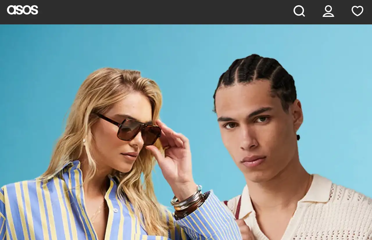
Image by ASOS
8. Terra Outdoor
The navigation system on Terra Outdoor's website is simple to use and comprehend. It has a drop-down menu that will guide users to what they are looking for. The design is kept organized, and as a result, it is easier to locate products.
Terra Outdoor menu displays products in various categories, materials, and series. Clicking a category breaks down the products into sub-groups so that users can easily and fast find what they are looking for. This method of categorization enables users to navigate to the correct pages despite numerous products without confusing them. The website design is not novel, but it is an excellent website.
9. Patagonia
Patagonia's website is not only attractive, it is also very easy to use and organized. This makes finding information a breeze. Whether you are a first-time visitor or a returning customer, Patagonia ensures that all customers enjoy using the website.
The Patagonia website is user-friendly because it has an uncluttered hamburger menu, concise audience groups, and a stable layout. This allows users to get the information they require and provides an easy and seamless experience.
10. Frank Body
Search suggestions are a handy feature that assists users in locating products they desire more quickly. They simplify searching and reduce the amount of time users spend thinking. Let's examine Frank Body to determine how they enhance the user experience with new search functionality.
Frank Body specializes in natural skin care and is famous for its coffee scrub. On its homepage, a search box at the top makes it very convenient for users to search for the desired products.
When users click on the search box, suggestions appear on the page to assist them in finding what they are looking for. Such a unique website design will enhance the appearance of your website. It is a good website example.
Conclusion

In this article, we explore 10 best-designed websites that greatly enhance the user experience through intuitive layouts, clear categories, and innovative interactive features. Whether it's an e-commerce website, a brand website, or a content platform, excellent navigation design can improve the user experience and directly affect the website's conversion rate and user retention rate. Through these design inspirations, we can see that seamless navigation is not a technical challenge but the result of a deep understanding of user needs and innovation.
If you consider redesigning your website or want to improve its usability, borrowing these design ideas will help you create a more attractive and efficient online experience. You can try using Wegic to design. No matter what kind of web design you want, you can tell Wegic's AI assistant, and it will help you answer all your questions.
Click this article to view: Wegic Tutorial: Absolute Beginner Guide
Written by
Kimmy
Published on
Mar 17, 2026
Share article
Read more
Our latest blog
Webpages in a minute, powered by Wegic!
With Wegic, transform your needs into stunning, functional websites with advanced AI
Free trial with Wegic, build your site in a click!
What kind of website do you want to build?