Designing Your Freelance Website: Top Tools for Beginners
Enhance your efficiency with these tools when build your freelance website, improve your design better, faster.
If you're a freelancer, you may be wondering if you need to build a website of your own. The answer is obviously yes. Because of the fierce competition in today's marketplace in all industries, newcomers have fewer resources of their own and have to put some effort into marketing if they want to stand out. This is especially true for newcomers who are just starting out in freelancing and have a lack of resources, unlike veterans who have accumulated enough client resources. New freelancers also have fewer channels to show their strengths and expertise. Considering all these reasons, it is very necessary to establish a personal website of your own, and it will be very helpful for the establishment of your personal brand and the long-term development of your career.
The Benefits of Designing a Website for a Freelancer
Creating a professional website plays a vital role in attracting more clients. A good website helps freelancers to emphasize their professionalism and personal branding, which makes it more impressive and memorable for clients. Moreover, you can put your portfolio on your website or market your services, which will make potential clients visualize your strengths and professionalism more. Not only that, but you can also write blogs on your website, share industry information, exhange ideas with others, and so on. This can also show your customers your professionalism and let them know more about you, building confidence among your customers, boosting your website rankings and gaining more opportunities. In this article, we'll go over some tools to help newbie freelancers create a website of their own.
Define Your Style
The first thing you need to do before using some of the website-building tools is to think about the following questions: what is the goal of your website? Who is your audience? What kind of work or services do you want to showcase? For instance, if you are a freelance translator, then your website goal is obviously to show your professionalism, attract more quality clients and get more translation jobs. Your audience may be direct clients or third-party intermediaries offering translation services. What you want to show is your portfolio and what you can offer your clients, especially what you specialize in and how well you translate.
Then, you have to decide on the style of your website. The style of your website varies from person to person, and depends mainly on your content and what kind of brand image you want to create? For example, if you are a freelance lawyer, then you'd better choose a more professional and calm style due to the rigor and professional features of this job, and try to use dark and cool colors as the main color scheme rather than some vibrant and lively color like red or orange. Such a design will make it easier for your customers to build up their trust in you.
In addition to all of the above, you also need to consider the layout of your website and the user experience. The navigation should include your homepage, services, portfolio, blog, contact information and so on. In order to provide a better and more pleasant user experience, you need to care about how the website is designed to be more usable, how the navigation layout looks clearer, and how fast it loads. In a word, make the website easy for your clients to get to know you better.
First Step: 3 Tools for Building a Website Quickly
Designing a website can be divided into several parts, including building a website, design your website looks, and checking the website performance once your website goes live. During this process, you probably need to use different kinds of tools to meet your requirements. The first step is to build a website via the following tools, such as Wegic, Wix and Figma.
Wegic
- AI assitance
- customization
There are lots of website builders to choose from. Wegic is one of them with AI assistance, so it will be very simple and easy to use for new beginners. What you need to do is simply enter your requirements in the chat box, such as the theme, style, color scheme or font layout of the website you like. As long as you clearly describe your requirements, Wegic will build your personal website based on your personal needs in a few seconds. If you don't have much idea or experience in building websites, it will also provide you with some alternative choices for your reference.
Not only that, if you don't like the website it generates, or you are not satisfied enough with a certain part of the design, you can continue to further modify your needs in the chat box until it create a website you are satisfied with. This customization service can help you build a website that is more in line with your career features and meets your personal needs.
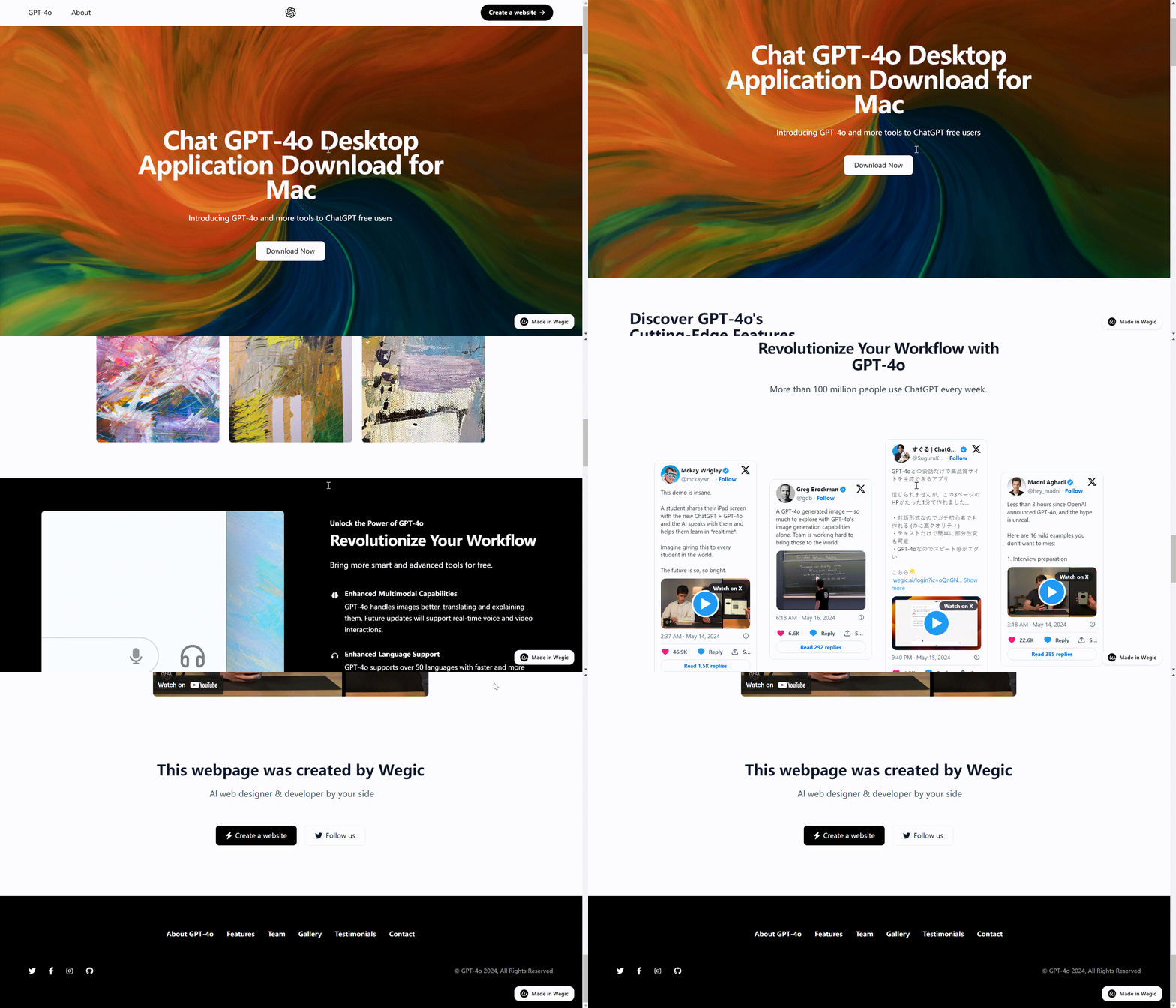
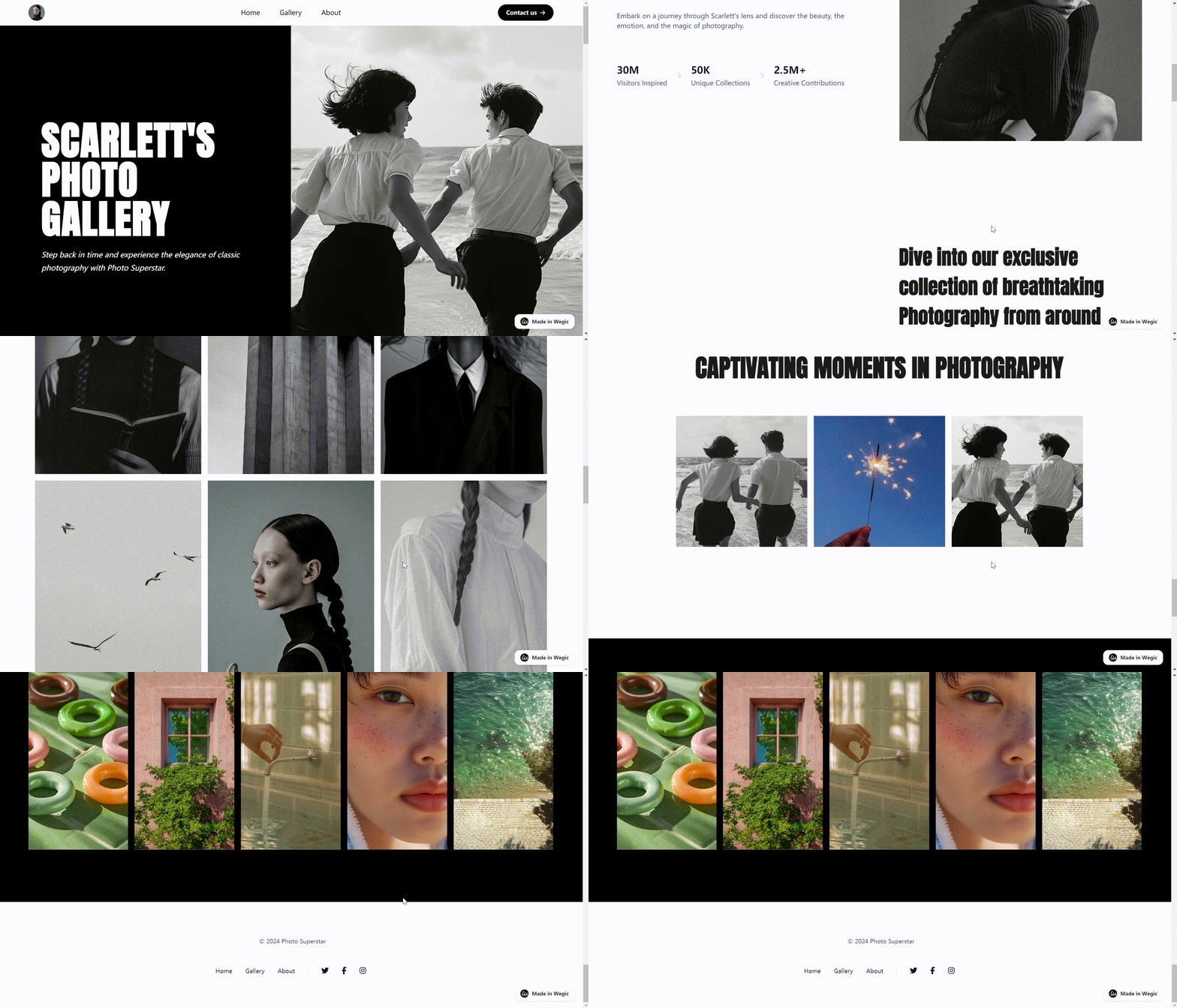
Here are some examples generated by Wegic.

Wix
- drag-and-drop interface
- easy to use
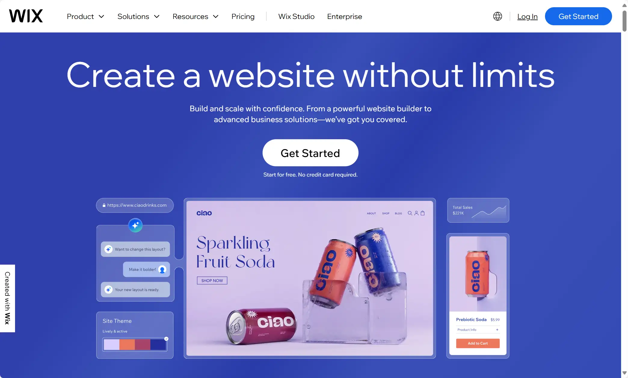
Wix is very user-friendly, especially with its intuitive drag-and-drop interface, which makes designing websites very easy and fast. As a novice user you can also design your own favorite software, and it doesn't require you to have any coding experience. Wix has now become the top website builder in the market with rich features and various templates. It has more than 800 professionally designed templates available for users to choose from, covering most of industries, which can satisfy a wide range of users' needs. But its disadvantage is that once you choose a website, you can not switch to another template unless you re-establish a new site.
WordPress
- plugins ecosystem
- diverse themes
- extensive support community
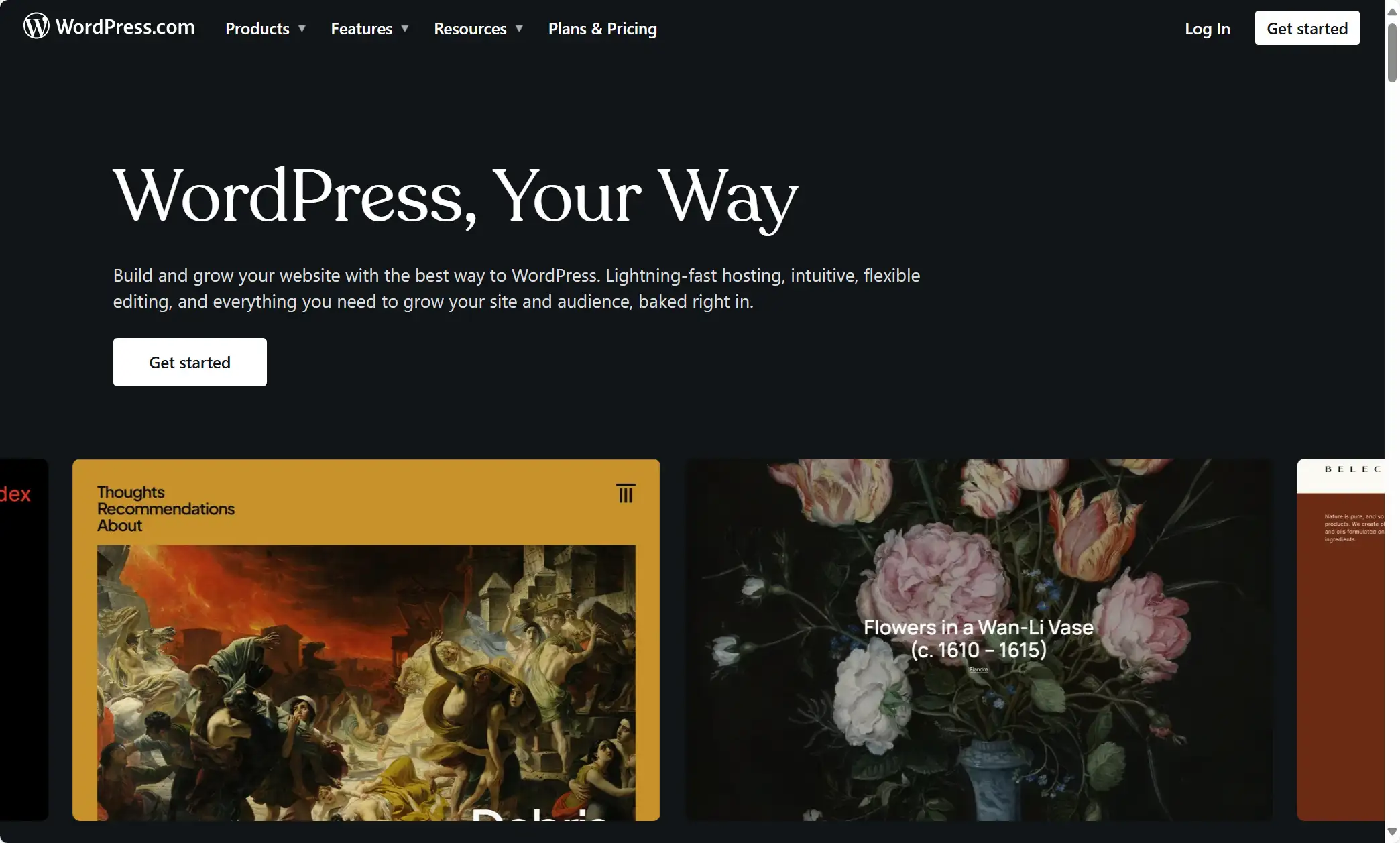
WordPress is an excellent CMS system. There are tons of plugins and themes to choose from. WordPress provides users with more than 60,000 plugins that contain a wide variety of features to meet the needs of most users. If you want to add a special feature to your website or change a certain design of your website, there is always a plugin that can fulfill your requirements.
In addition to this, WordPress offers a wide variety of themes to choose from. Each freelancer has a different purpose for setting up their own website. Some may be to show their portfolio, some may be to sell their services, or simply out of the need to write a blog. A large number of diversified themes can meet the different needs of the user to provide customized services. Themes provided by WordPress are divided into two categories. One is free and the other is premium. You can choose the proper theme and service based on your needs. Another big special feature is the extensive support community, which will give you answers when you have any questions. You will have a strong sense of engagement in the community.
Second Step: 4 Tools Making Your Website Appealing
When you have already built a website, you need to further optimize and improve your website's visual appearance because an appealing look will attract a more targeted audience. You can use the following graphic design tools, like Figma, Canva, Pexels, and A1.art to make your website more brilliant.
Figma
- real-time collaboration
- simple intuitive interface
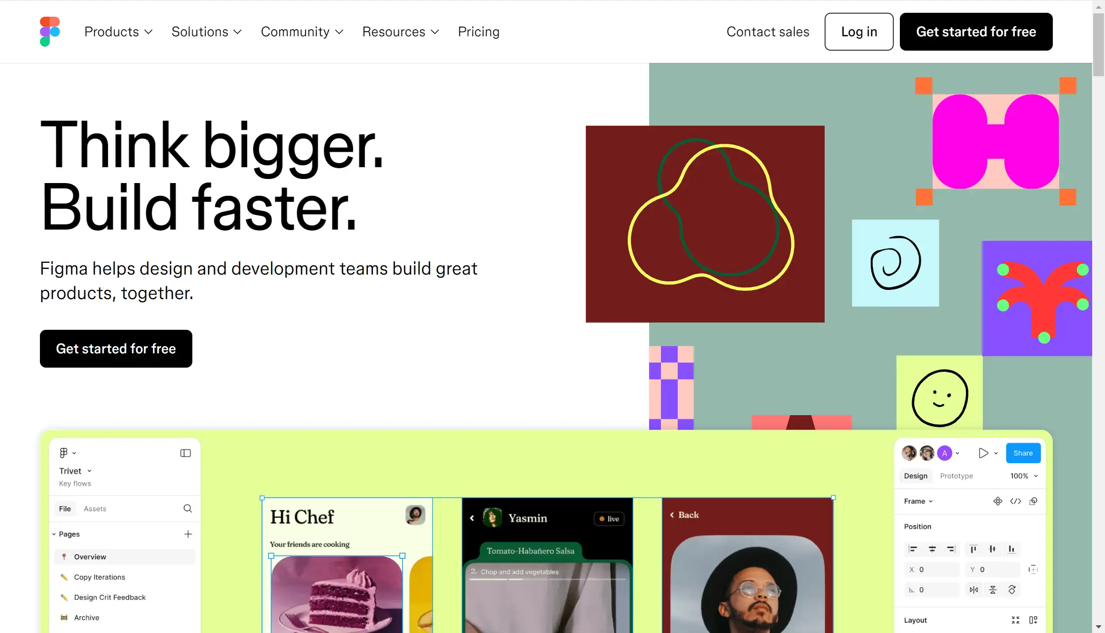
Now let us first introduce Figma. One of its biggest features is collaborative design capabilities. If you are a freelancer in a small team, Figma will be a good option because it allows your team to design and work together. Also, you can have real-time discussions on this website too. Its intuitive interface also makes it more friendly to many newcomers. You don't have to equip with any design experience and it would become exremely useful once you get the hang of it. However, its limitation is that it does not support offline.
Canva
- multiple templates
- user-friendly interface
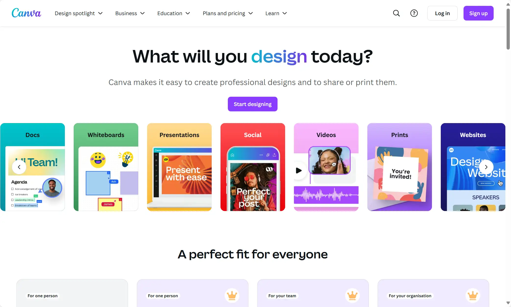
Canva is an easy-to-use graphic design tool for creating visual content. You can use it to further design your website's display interface, and utilize your creativity and whimsy. Canva has a huge library of templates for you to choose from, as well as a large number of filters, all kinds of distinctive design elements, and special effects that you can use. It will also provide you with working solutions, so if you are a beginner or need some quick and easy design solutions, then Canva is a very good choice.
Pexels
- rich images and videos of high-quality
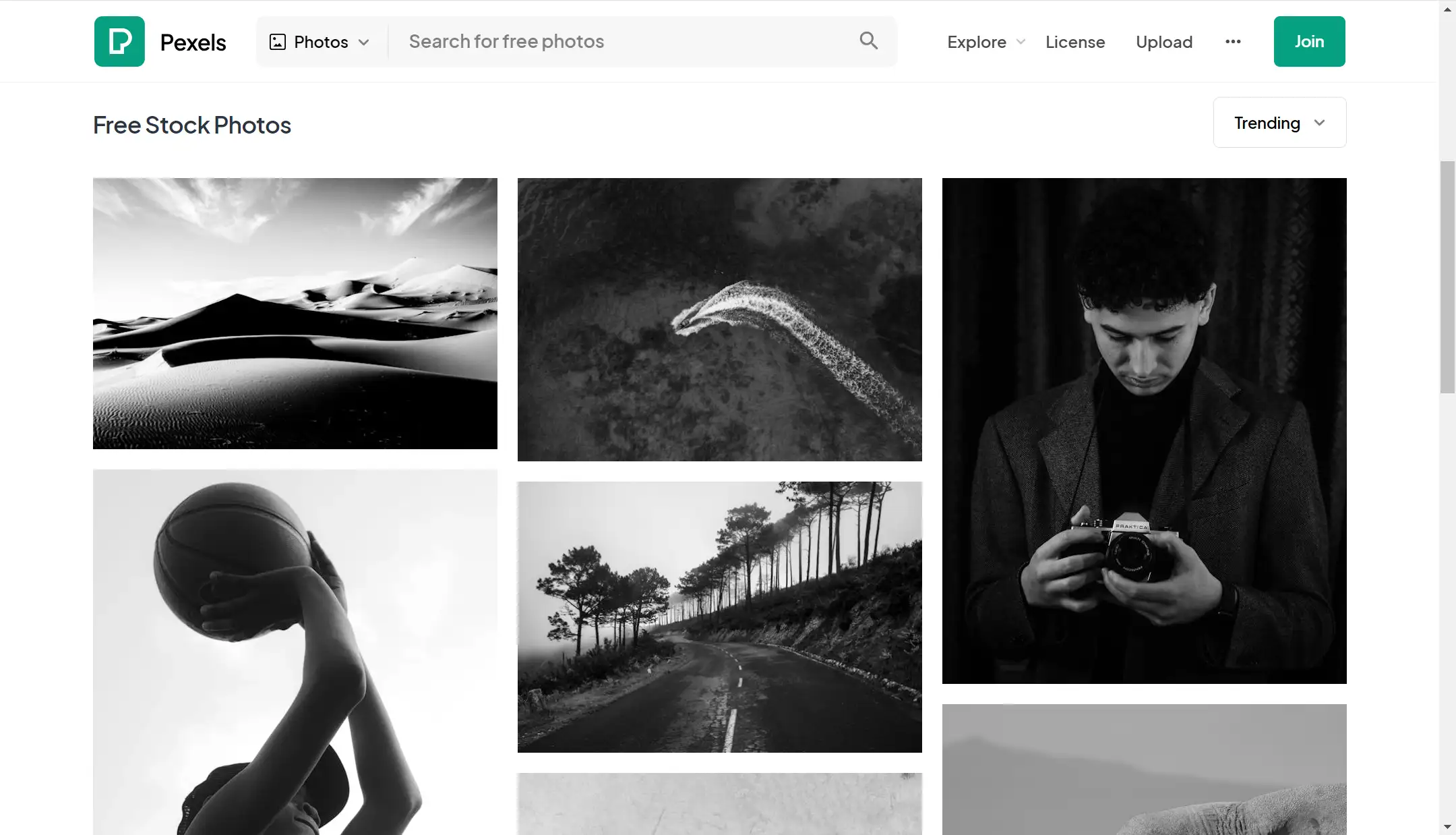
When you have added many fascinating and creative design elements to your website, now you can use Pexels to get more high-quality pictures and videos you need. These good image resources can beautify and improve your website's visual appearance further more. The pictures involve hundreds of thousands of themes and subjects. As you can see below, the search functionality is quite easy and simple so you can directly find what you need in a short time even if you have no experience with professional software. Choose some good pictures that match your style and demonstrate your brand and taste. A visually attractive and fascinating website will retain more users.
A1.art
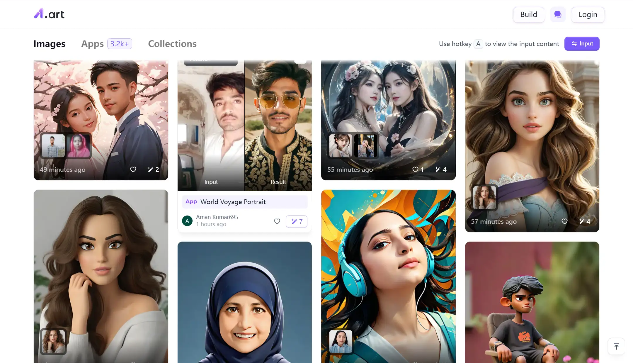
Unlike Pexels with so many beautiful pictures and videos, the image resources on the A1.art look more fantastic and funny. You can input your selfie and that it will generate another more interesting picture for you. You can choose a different scenery (such as an ID card, or make it more artistic) or various animation effects. If you are a new user and sign up, you will get 5 free credits. Each time you generate a photo, you will spend 1 credit. If you log in every day, the platform will also send you 5 credits per day. You can choose your favorite scenery as you like. When you put these cute and fantastic pictures on your website, you can quickly close the distance between you and your audience and make them curious about you.
Of course, it still depends on your personal needs and likes, and professional characteristics and other factors. People engaged in certain industries may favor some serious and rigorous style.
Third Step: 2 Tools Centering On Website Data
When everything is done, you have already built your website and made it go live, and now you might be wondering how well the website works. Does it attract more clients? Are there more people who get to know me? What is the audience most concerned about? How can you optimize your content? Here are 2 tools able to answer your questions: Google Analytics and Yoast SEO, centering on website data.
Google Analytics
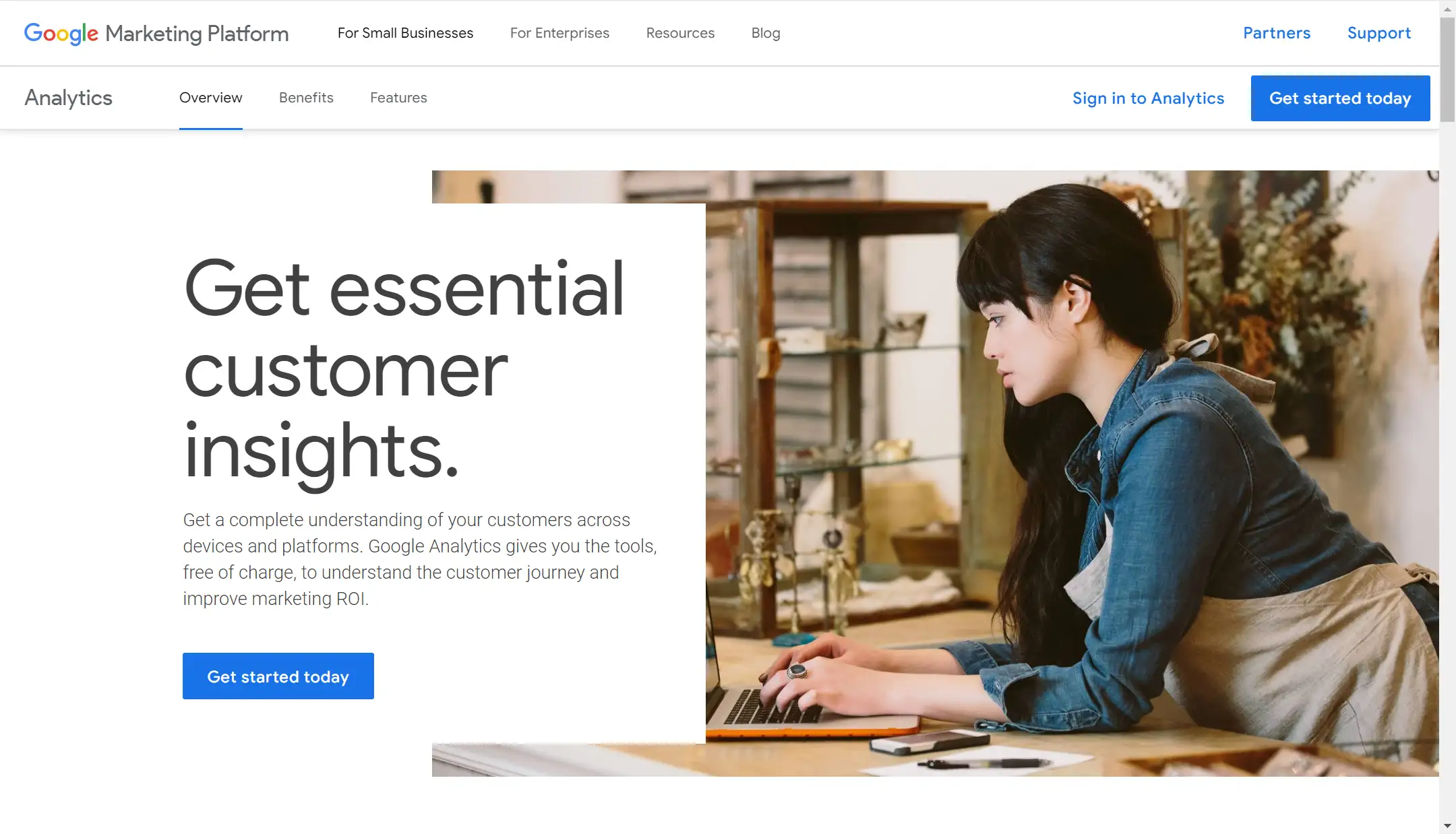
Google Analytics is a tool by which you can learn some basic information and adjust your business strategy. It can help you track website traffic and user behavior. The data it provides can help you get to know the user's profiles, user behavior, what they are interested in, what are their most important concerns, and so on. Knowing this data can help you optimize the content of your website, adjust your marketing strategy, and attract more customers leading to transactions.
Yoast SEO
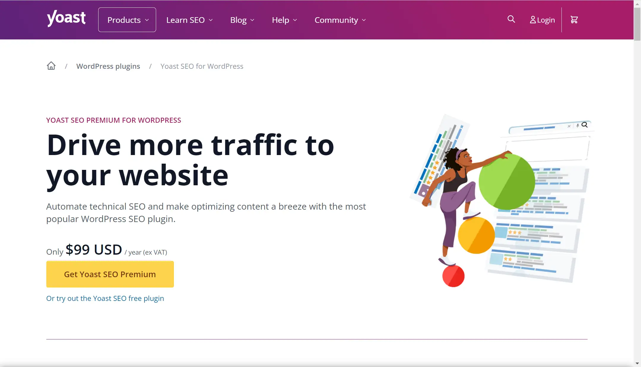
Yoast SEO is a bit same with Google Analytics, and it is an analytical tool that provides an overall SEO score for your site and highlights areas for improvement. It also offers an overview of readability scores across all your content. Based on this data, you will clearly know which part you should make improvements. Yoast SEO helps to increase the traffic on your website and boost your website's ranking in the search engine results pages. Only by increasing visibility will you be able to tap into more potential clients and get more jobs and resources.
Examples of Good Freelance Website
Here I am going to show you some examples of freelance websites for your reference.
Robby Leonardi
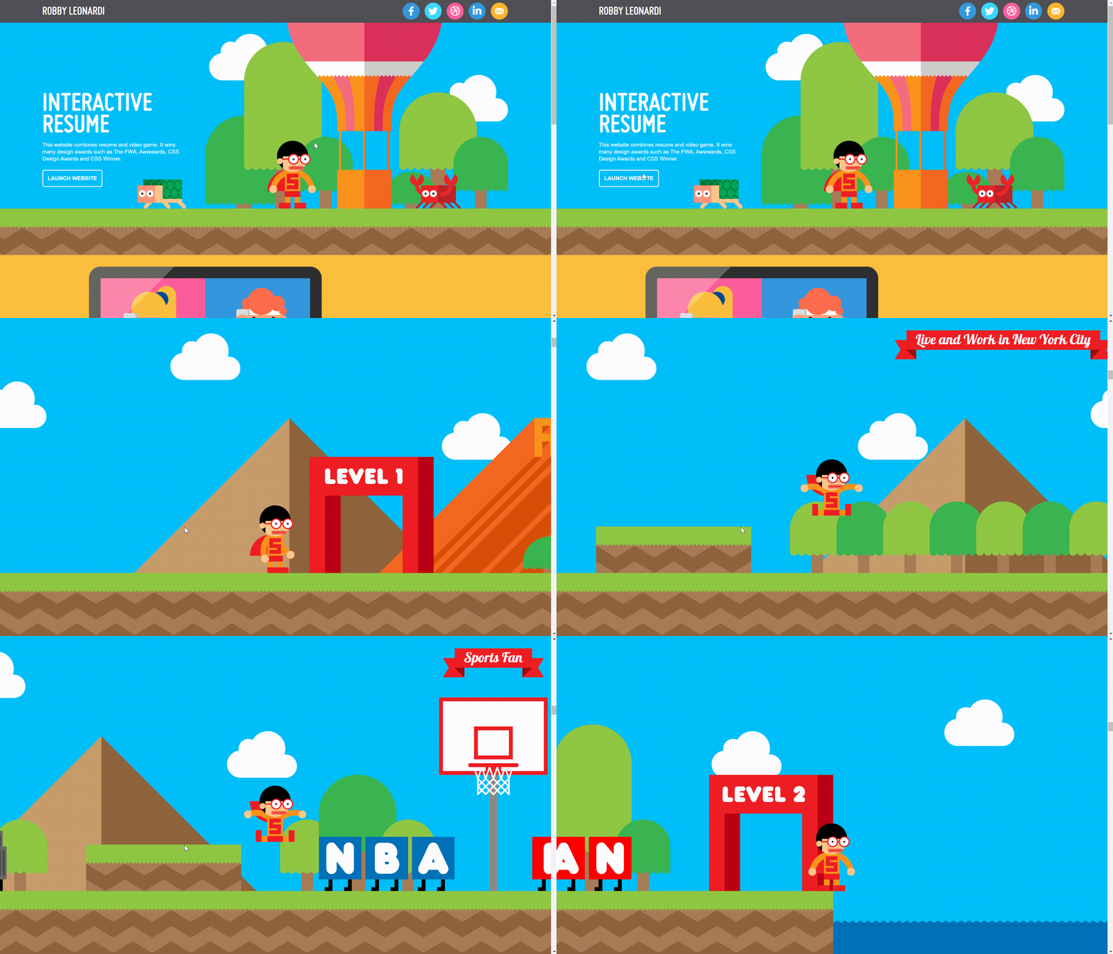
Robby Leonardi is a freelancer who lives in New York City. He does illustration, design and animation. His specialty is illustrative design, a combination between illustration and design. His website looks quite fascinating. Robby has applied some animation effects on his website. The interactive and game-like design showcased Robby's creativity and professionalism. On this website, you can also easily get to know his portfolio presentation, resume, and contact information.
Paul Jarvis
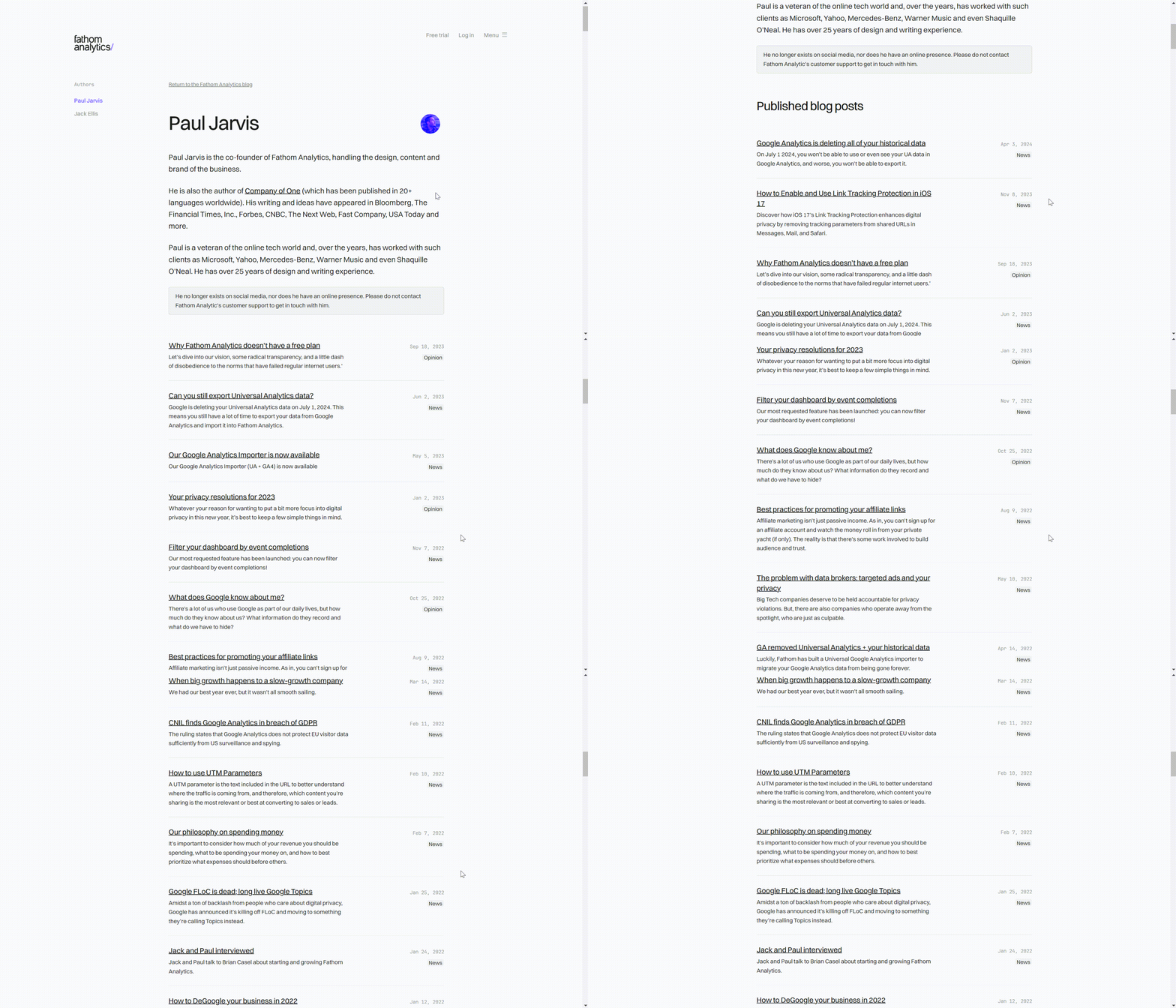
Paul Jarvis is the co-founder of Fathom Analytics, handling the design, content and brand of the business. He is also a veteran of the online tech world and, over the years, has worked with such clients as Microsoft, Yahoo, Mercedes-Benz, Warner Music and even Shaquille O'Neal. He has over 25 years of design and writing experience. Below is his website. The whole page looks clean and straightforward, and professional. You can easily find that his website focuses on the content, centering on his ideas and experience sharing. So the website style and content determines your personal needs and interests.
Matt Farley
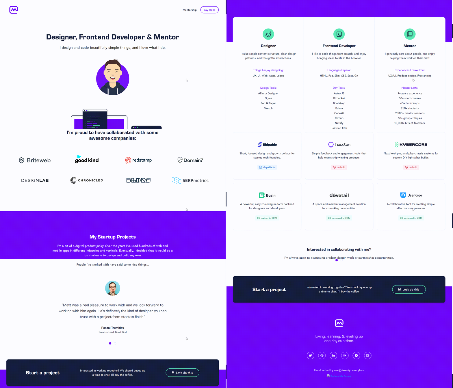
Another freelance website I would like to recommend is Matt Farley. He is a designer, front-end developer and mentor. He has used many modern design elements on his website. The general website style is clean and modern with intuitive navigation. You can clearly know him from the content he has demonstrated, including his portfolio, achievements, work experience, what he is good at, and his contact information.
Conclusion
The above are some useful tools for freelancers to design a website and some good examples. They are very friendly to newcomers, including Wegic, which can help your creative idea come to the ground with its simple operation, and 120 credits can be used for free per day. If you're a new beginner, you can have a try. Combine these tools when designing your website, you would find that it would not be as challenging as you have imagined, especially with the help of AI assistance. Try to seek feedback after using these tools and you can further optimize your website.
Written by
Kimmy
Published on
Aug 8, 2024
Share article
Read more
Our latest blog
Webpages in a minute, powered by Wegic!
With Wegic, transform your needs into stunning, functional websites with advanced AI
Free trial with Wegic, build your site in a click!