Log in
Build Your Site
16 Florist Website Design Examples to Fuel Your Inspiration
Explore 16 stunning florist website design examples that inspire creativity and elevate your floral business online. Discover trends, tips, and best practices!
Stepping into a sun-drenched flower shop, where the air is fragrant with the sweet scent of blooming roses and the vibrant colors of tulips, daisies, and peonies dance playfully before your eyes--each arrangement tells a story, whispering tales of love, celebration, and comfort, evoking emotions that linger long after you've left.
Now, consider this: just as those carefully curated blooms create a visual feast for the senses, a beautifully designed website has the power to captivate visitors, drawing them in with its elegance and charm, while also serving as a virtual testimonial that reflects the essence of your floral artistry.
So, what makes a florist's website unforgettable? Is it the breathtaking imagery that transports visitors into a garden of dreams, or perhaps the seamless navigation that allows them to explore with ease?
In this age where first impressions can make all the difference, the right combination of aesthetic allure and functional design can transform a simple click into an enchanting experience, leaving an indelible mark on anyone fortunate enough to stumble upon it.
Buckle up and embark on a journey through the realm of floral website design, where inspiration awaits at every turn!
The Art of Floral Website Design
Artistry Meets Functionality
-
Each bouquet crafted represents a unique visual narrative, reflecting the florist's artistry.
-
A well-designed website blends creativity and user experience, transforming visitors into active participants in the story being told.
Importance of First Impressions
-
Research shows that 75% of consumers judge a company's credibility based on its website design.
-
A captivating online presence is essential for florists to establish trust and attract customers.
Conveying Brand Identity
-
High-quality images of meticulously arranged flowers showcase a florist’s signature style—whether whimsical, romantic, or modern.
-
Thoughtful descriptions enhance emotional connections, conveying the florist's passion and expertise.
Seamless User Experience
-
Intuitive navigation ensures that beautiful artistry does not overwhelm visitors.
-
A guided journey highlights offerings while fostering a sense of trust and reliability.
Harmonizing Form and Function
-
The website’s design elements—colors, fonts, layout—must work together to create a cohesive digital experience.
-
Capturing the essence of the florist's brand encourages exploration and engagement, ultimately leading to conversions.
Invitation to Connect
-
A well-designed site invites customers to partake in the florist’s story, creating a memorable experience that lingers long after their visit.
Must-Have Features for Florist Website Design
Petal Perfect Imagery

At the heart of any florist website lies petal perfect imagery—stunning, high-resolution photos that showcase your floral creations in their best light. Just as a beautifully arranged bouquet captures attention in a shop, compelling images draw visitors into your online space, inviting them to explore further.
Each photograph should tell a story, whether it's the vibrant colors of a seasonal arrangement or the delicate details of a wedding bouquet.
Bouquet of User Experience
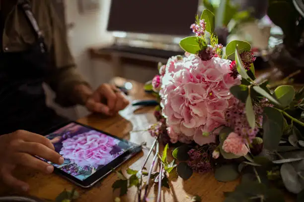
Next comes the bouquet of user experience, which includes intuitive navigation, clear calls to action, and a layout that feels effortless to navigate. It's just like walking through a well-organized flower shop where each section is clearly labeled, and easy to find.
A florist website design template website should replicate that ease, guiding visitors smoothly from one section to another. A smooth user experience ensures that customers don’t feel frustrated or lost; instead, they can enjoy the journey of discovering your floral offerings, increasing the likelihood of making a purchase.
Blooming Testimonials
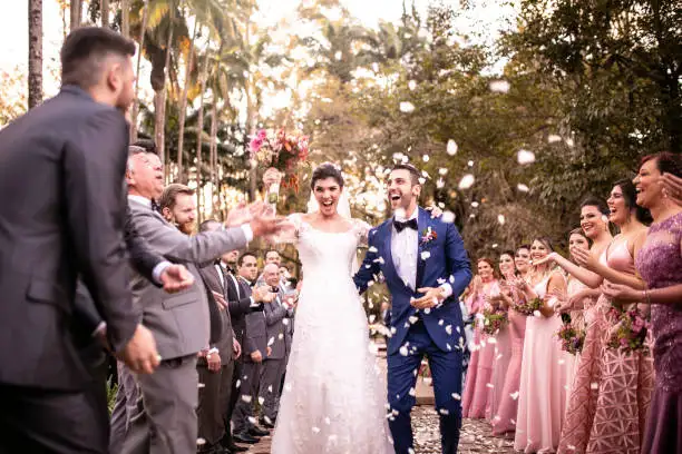
Another essential feature is the inclusion of blooming testimonials from satisfied customers. Just as word-of-mouth referrals are vital in the floral business, showcasing reviews and experiences on your website builds trust and credibility, which serve as a powerful reminder that your work has made a difference in someone’s life—be it through a thoughtful gift or a fabulous centerpiece for a special occasion.
Incorporating these personal stories humanizes your brand and encourages new customers to envision their own experiences with your flowers.
Seasonal Arrangements Section

To keep your offerings fresh and relevant, a dedicated seasonal arrangements section is crucial. Highlighting special bouquets or arrangements that celebrate the current season—like bright sunflowers in summer or cozy, warm-toned blooms in fall—helps to capture the essence of what your shop represents at any given time.
The seasonal arrangements section not only keeps your website dynamic and engaging but also encourages customers to return regularly to see what’s new. Plus, it can inspire them to purchase flowers that reflect the season's beauty or upcoming holidays.
Contact and Location Information

Finally, don’t overlook the importance of contact and location information. Just as customers appreciate knowing where to find their favorite florist, they need to easily locate your contact details and shop hours on your website.
Consider including an interactive map to guide them to your physical location or a simple contact form that allows inquiries to flow in. Being accessible fosters trust and reassures potential clients that you’re ready to assist them with their floral needs.
Spotlight: 16 Inspiring Florist Website Designs
1. Rosebud
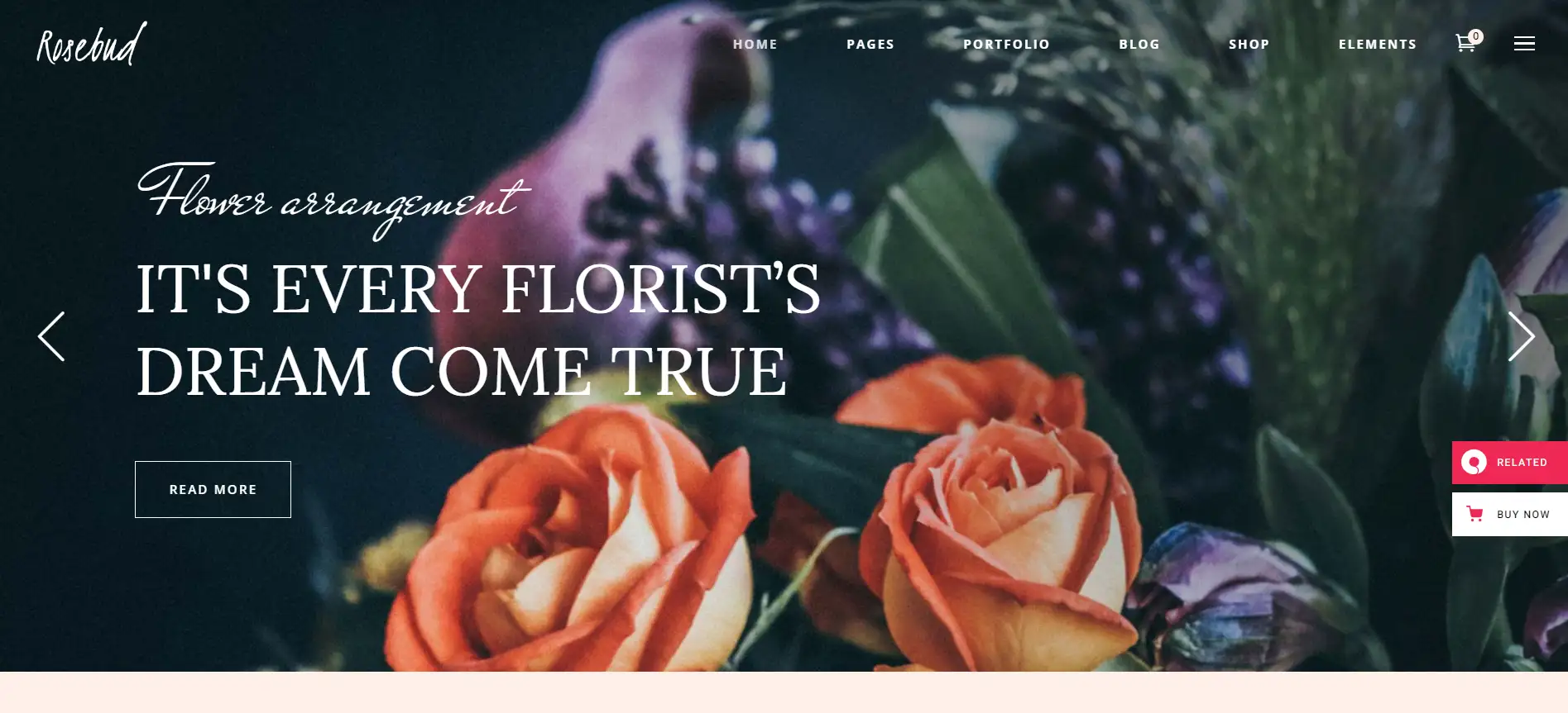
The high-resolution image in the hero section undoubtedly encourages users to engage with the inviting CTAs. At the same time, the detailed drop-down menu offers comprehensive insights into flower arrangement services while granting access to the portfolio. Ultimately, the homepage is expertly designed to impress potential clients, featuring a well-organized layout that showcases every element of the business in a visually appealing manner.
With its intuitive structure, the homepage ensures visitors can easily navigate and explore all floral offerings.
-
Takeaway: A compelling homepage with stunning visuals and clear navigation is essential for winning over clients.
2. Nectar Boutique
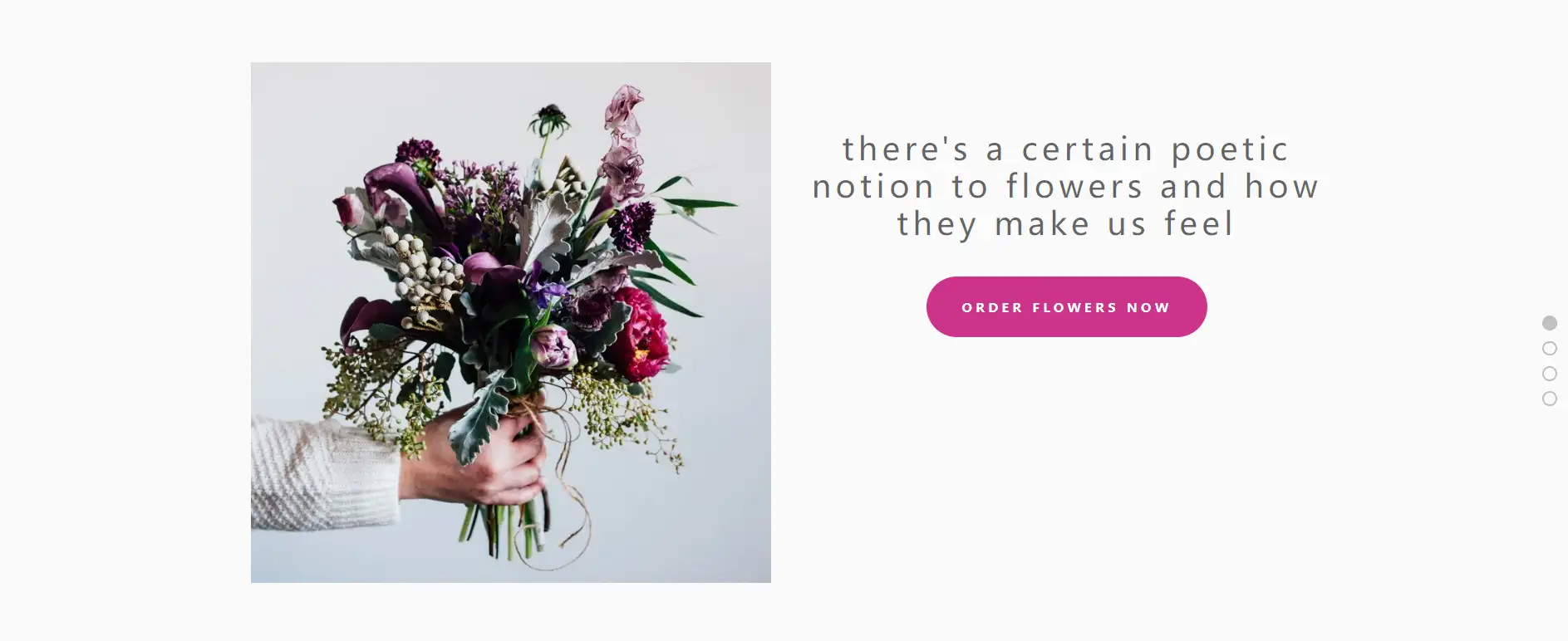
Radiating tranquility and elegance, the homepage of Nectar Boutique greets visitors with a stunning background image. Featuring organized navigation, an intuitive layout, and prominent CTAs, the site effectively captures user interest and fosters trust, prioritizing a smooth, enjoyable, and efficient experience while retaining a refined aesthetic, solidifying its status among the top florist websites.
Users definitely feel welcomed and engaged throughout their visit, while visuals appealing with functionality on Nectar Boutique can transform casual visitors into loyal customers.
-
Takeaway: A harmonious blend of aesthetics and usability is crucial for captivating users and building trust.
3. Zinnia Floral Designs
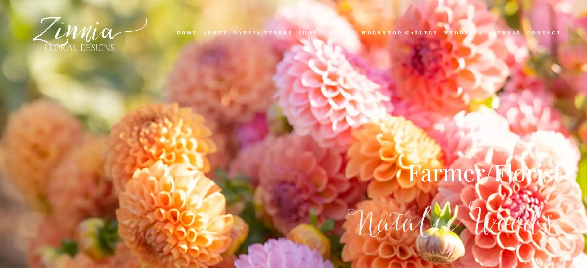
Zinnia Floral Designs presents a sleek and contemporary website that exudes sophistication, with its homepage featuring an organized layout that effectively showcases essential information about the florist’s offerings through well-arranged sections. With a focus on clear design and elegant navigation, users are drawn to the captivating visuals that effortlessly establish trust and encourage engagement.
-
Takeaway: A stylish and well-structured website enhances user experience by highlighting beautiful imagery and ensuring easy navigation
4. Isadia
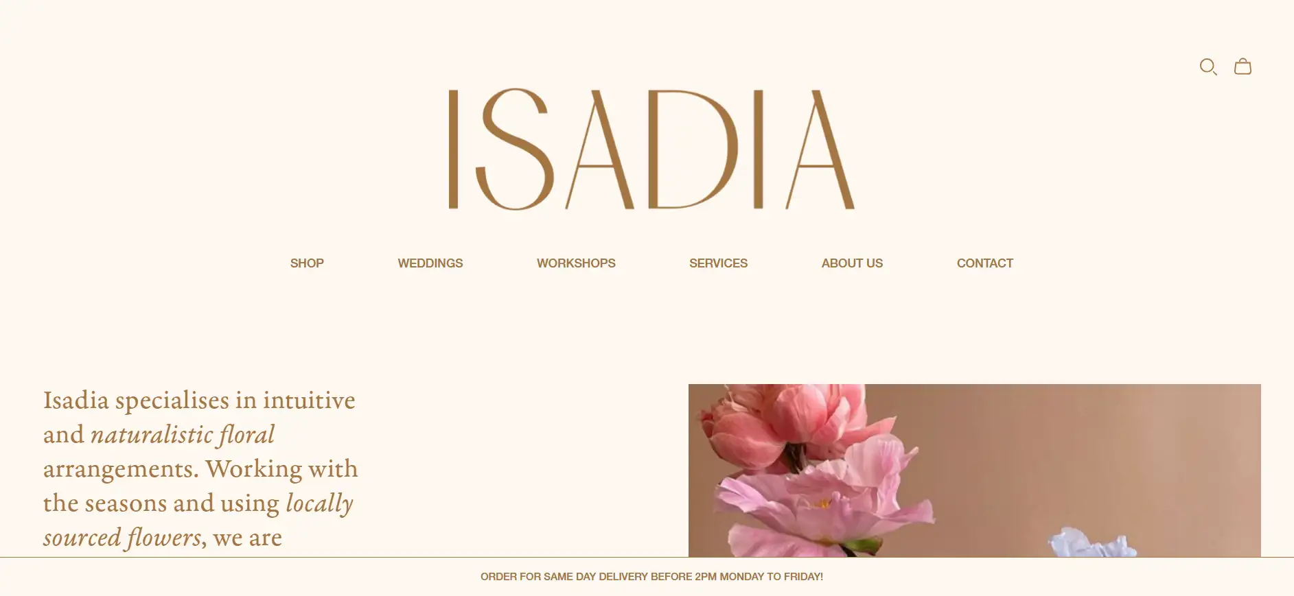
This website perfectly speaks for the florist’s philosophy of crafting romantic and natural arrangements, with its understated and minimalistic design effectively showcasing ample visuals and information about the various services offered. With straightforward navigation and consistent aesthetics across all pages, this florist website stands for a charming illustration of how to cultivate a trustworthy and appealing brand image.
-
Takeaway: A simple yet effective design can significantly enhance brand credibility while showcasing products and services.
5. Twig & Twine Floral Design Studio

Twig & Twine Floral Design Studio features an eye-catching homepage characterized by its sleek and minimalist design, which is further amplified by the effective use of a four-column grid in the portfolio section enhances usability and makes navigation a breeze. This site relies heavily on striking, high-quality visuals to convey her artistry and attract clients, and it certainly captivates—leaving us eager to learn more!
-
Takeaway: A clean, minimalist design combined with stunning imagery can effectively engage visitors and promote services.
6. Gosha Flowers

The homepage of Gosha Flowers showcases a contemporary design that integrates all elements in a smooth yet revoking way. With thoughtfully arranged photos, clear navigation tabs, and engaging interactive elements, the site exudes a welcoming and modern vibe, creating an excellent model for bridging the gap with potential customers while delivering a visually refreshing and user-friendly experience for a florist website.
-
Takeaway: A cohesive modern design enhances user engagement and fosters connections with potential clients.
7. Designs By Ahn
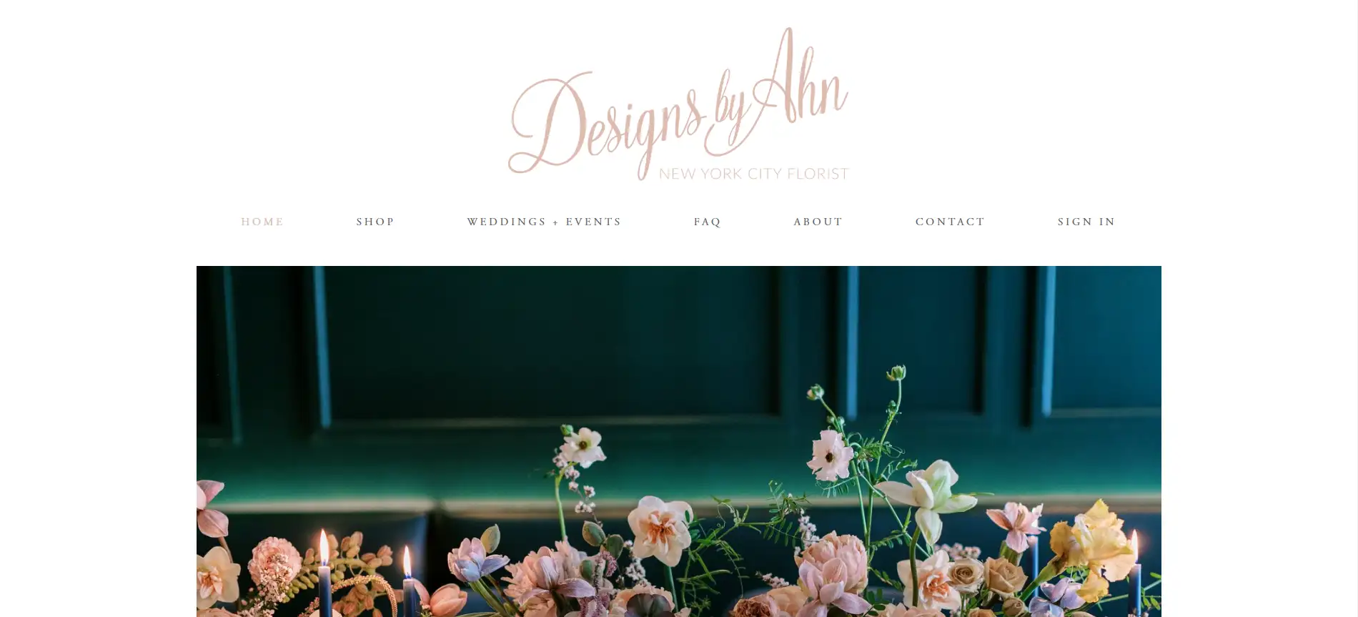
Designs By Ahn embraces a minimalist approach to its website, allowing the crisp white background to highlight images, press features, and customer testimonials. The site benefits from straightforward static navigation and comprehensive content that enhances user experience; however, increasing the font size would significantly boost readability and overall effectiveness.
-
Takeaway: A minimalist design can effectively showcase visuals, but readability is key to ensuring a positive user experience.
8. Alison Samantha Flowers
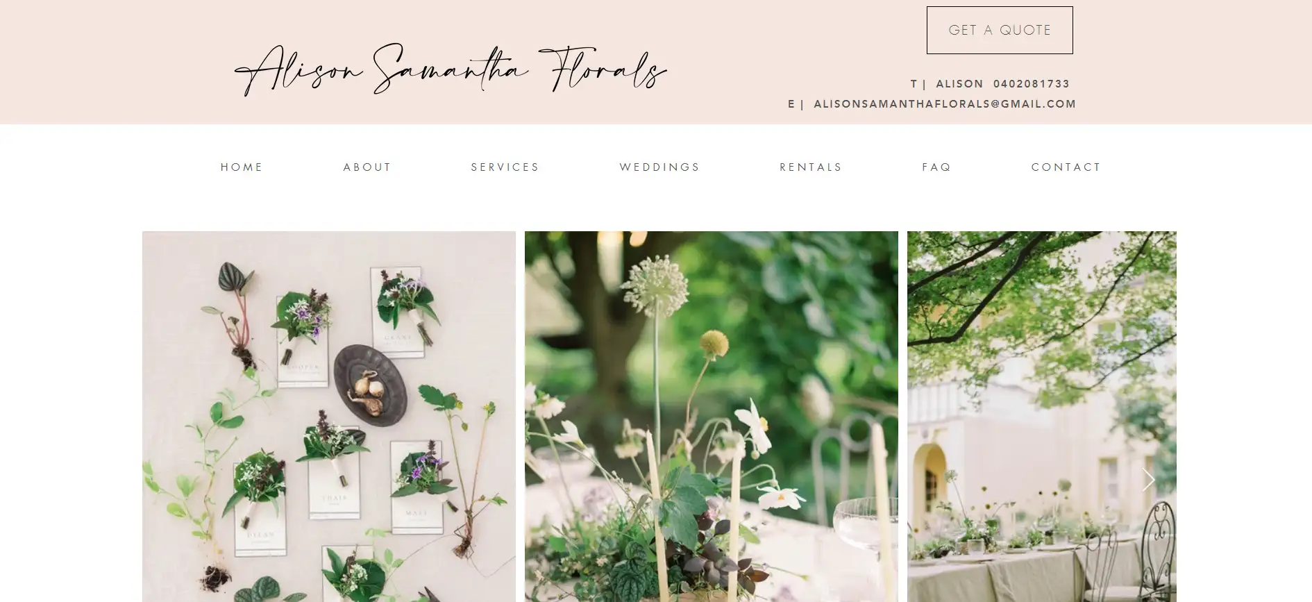
Alison Samantha Flowers greets visitors with a green-themed image carousel and a soft pastel header, making a strong first impression. The homepage includes testimonials, a concise bio, and highlights of past events, all contributing to building user trust, proof that it is designed with convenience in mind. The website also offers well-rounded information across its pages, an inspiring gallery, and accessible contact options through forms and details.
-
Takeaway: A visually appealing design combined with trust-building elements enhances user engagement and facilitates communication.
9. The Flower Hat

The Flower Hat showcases a straightforward design that emphasizes vibrant floral photography, beautifully reflecting the owner's passion for flowers. With organized and concise scrolling mechanisms, the website clearly delivers comprehensive information about the floral studio and its offerings, ensuring a pleasant user experience while mirroring the florist's unique style and arrangements, making it a model worth emulating.
-
Takeaway: A simple yet striking design, paired with clear information, can effectively convey a florist's passion and enhance user engagement.
10. Bramble & Wild
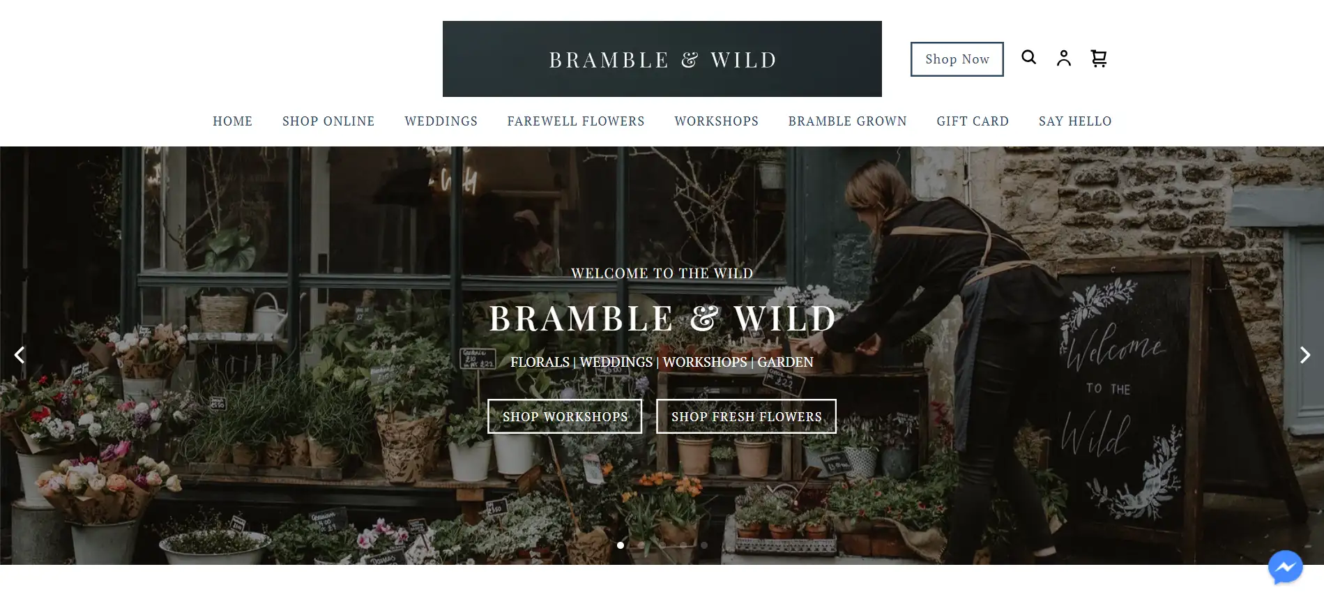
The website of Bramble & Wild impresses visitors with its understated design and sophisticated layout, earning trust and admiration--as it features effective calls-to-action, a showcase of highlighted products, a concise bio, and essential business information.
Additionally, an extensive menu offers a wealth of options to engage users and potential clients.
-
Takeaway: An elegant design paired with clear navigation and engaging content can significantly enhance user trust and interest.
11. Twig & Arrow Botanical Styling
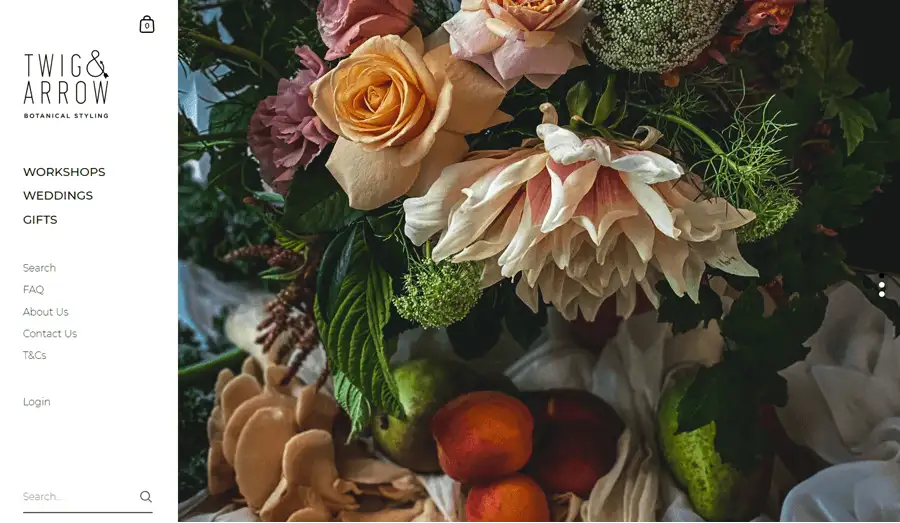
Twig & Arrow Botanical Styling features a left sidebar menu that simplifies navigation, offering comprehensive insights into the business. Throughout the site, stunning high-quality images captivate users, while the layout of the wedding gallery enhances the browsing experience, which fosters a seamless and enjoyable user journey, easy for visitors to explore.
-
Takeaway: Effective navigation combined with captivating visuals contributes to a smooth and engaging user experience.
12. FLWR Shop
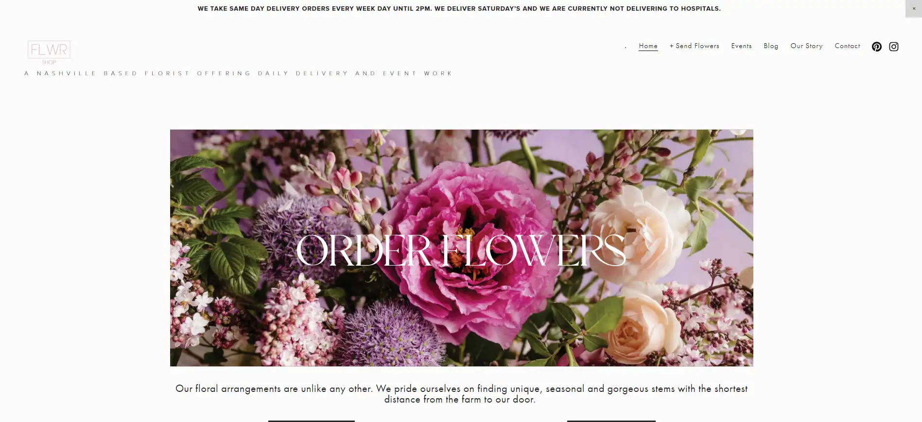
The FLWR Shop website showcases a clean and simple design that highlights striking visuals effectively, with its well-defined and user-friendly CTAs making it easy for customers to decide on purchases. Moreover, the site features clear and succinct copy that captures the essence and narrative of the business, encouraging visitors to engage with its services.
-
Takeaway: A straightforward layout and compelling content can significantly enhance user engagement and drive sales.
13. Bloom Flowers
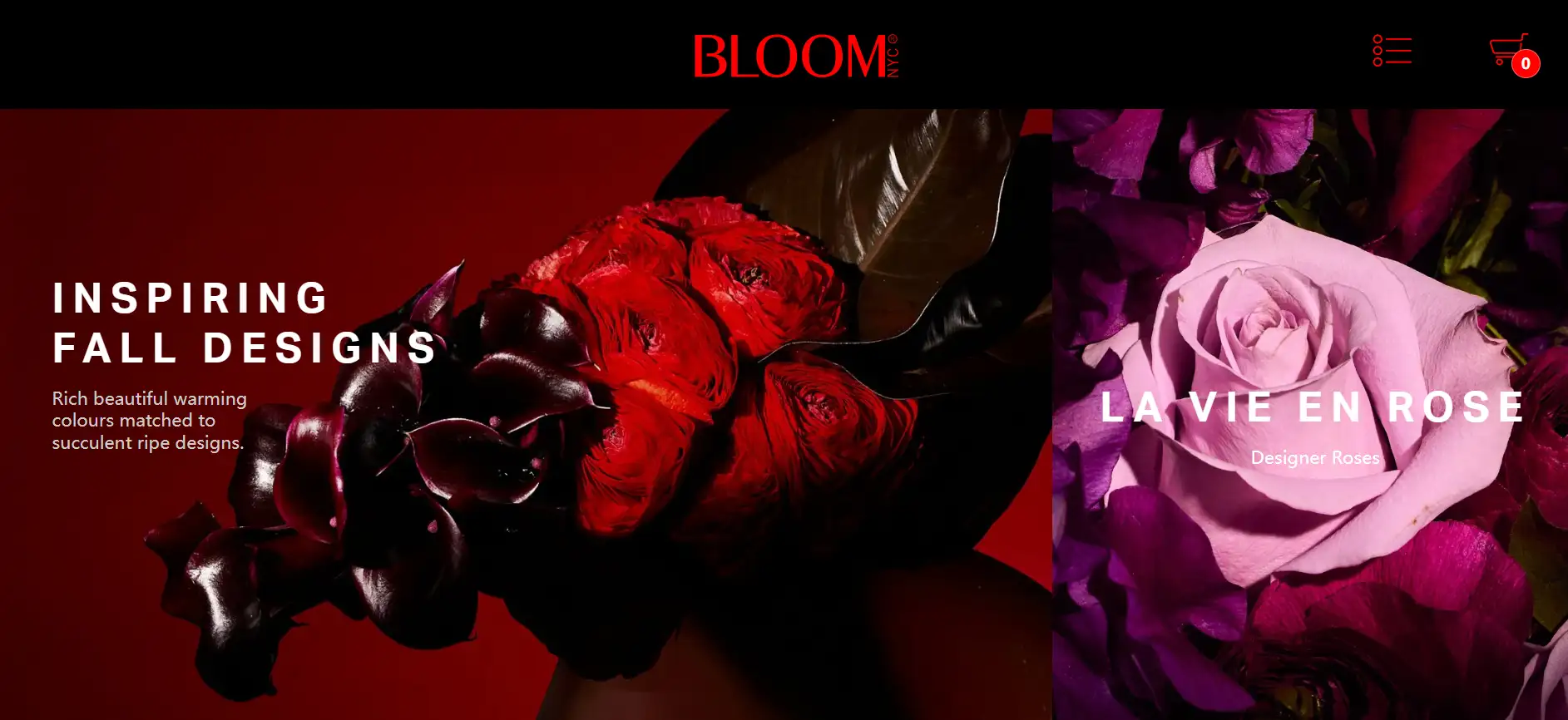
Bloom Flowers employs a bold contrast of black and vibrant red to manifest the exclusivity and luxury of its offerings. Its dark aesthetic makes convenience for the richly colored images to pop, leaving a memorable impression on visitors. Additionally, the site effectively utilizes internal linking, ensuring that each image directs users to shopping options or further exploration of its services.
-
Takeaway: A striking color scheme combined with strategic linking can create a powerful user experience and highlight premium offerings.
14. Jean-Pascal
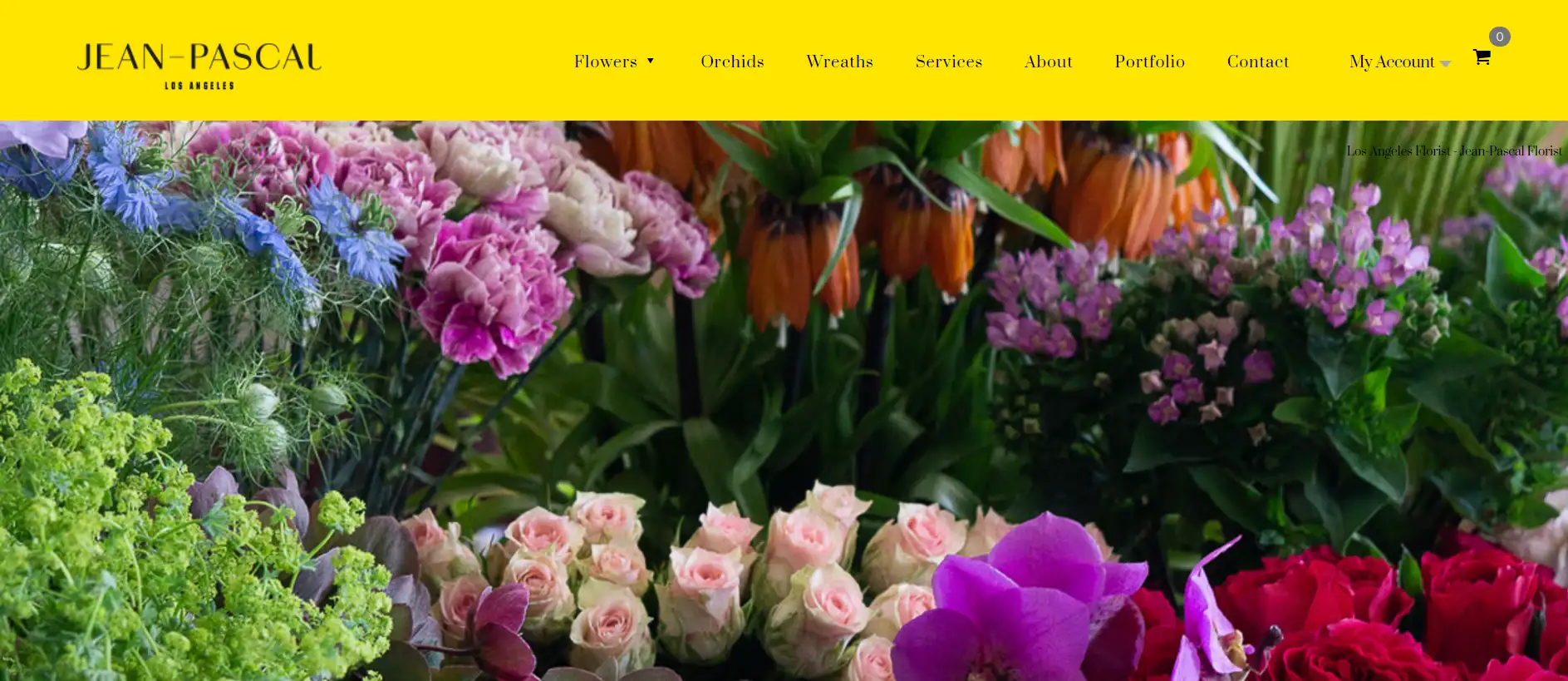
Jean-Pascal showcases a stunning array of custom flower bouquets and arrangements on his website by featuring an elegant and minimalist design and utilizing a grid layout that highlights high-quality images against a consistent backdrop.
To enhance credibility, it includes prominent reviews, reassuring potential customers of its quality. A noteworthy aspect is the expansive footer, detailing the neighborhoods, hospitals, and cemeteries served by Jean-Pascal’s delivery service.
-
Takeaway: A well-designed website that emphasizes quality and trust can significantly enhance customer engagement and sales.
15. The Flowers Box
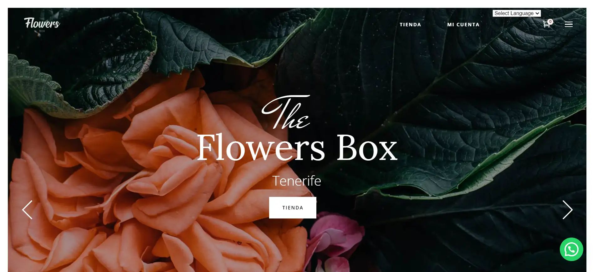
The Flowers Box welcomes visitors with a festive flair, reminiscent of a Christmas card showcasing seasonal floral arrangements, a thoughtful presentation that captures the spirit of the holidays.
A standout feature of the site is the WhatsApp chat button, making it easy for customers to connect instantly with the florist for quick orders and personalized support.
-
Takeaway: Incorporating seasonal elements and convenient communication tools can enhance user experience and foster customer relationships.
16. Acurela Events
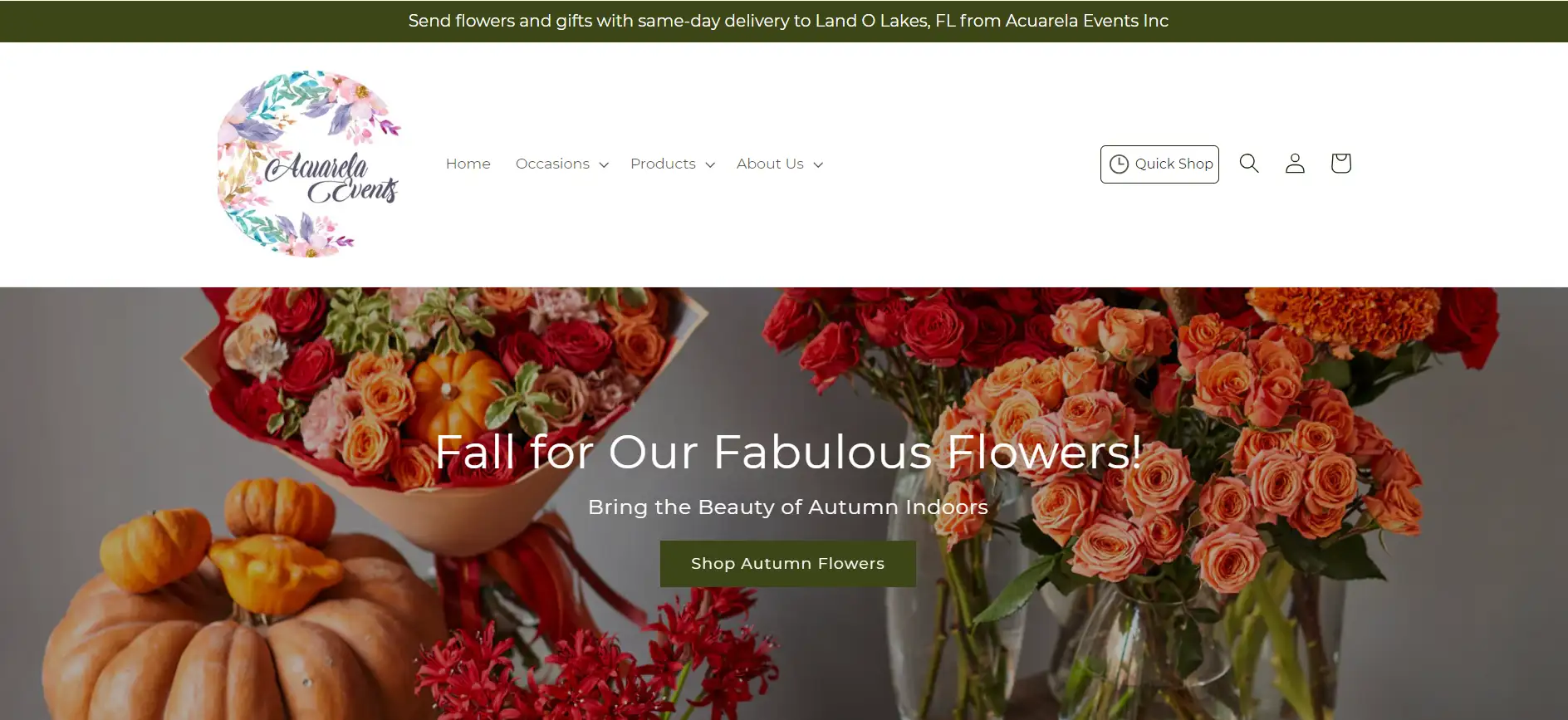
Acurela Events specializes in floral arrangements for events and also provides event planning services. The website captivates with its appealing design, incorporating an elegant handwriting font, a thoughtfully curated color palette, and stunning photography, which highlights the range of services offered by Acurela, complemented by a beautiful gallery showcasing previous projects and clear information on how visitors can access their desired services.
-
Takeaway: A visually appealing website that clearly communicates offerings can significantly enhance customer engagement and interest.
Conclusion
Floral websites hold the remarkable potential to flourish in the digital landscape, transforming the way florists connect with customers and showcase their aesthetics.
With the right design and features, these online spaces can blossom into vibrant platforms that highlight beautiful arrangements and engage and inspire visitors.
Now is the time to take that next step in creating your dream florist website—embrace your vision and let it thrive online!
Written by
Kimmy
Published on
Mar 12, 2026
Share article
Read more
Our latest blog
Webpages in a minute, powered by Wegic!
With Wegic, transform your needs into stunning, functional websites with advanced AI
Free trial with Wegic, build your site in a click!