Log in
Build Your Site
Website Imagery Guide: Choose the Right One for Your Site
Hard to choose the right imagery? Check this guide to find out more about website imagery and choose the right one.
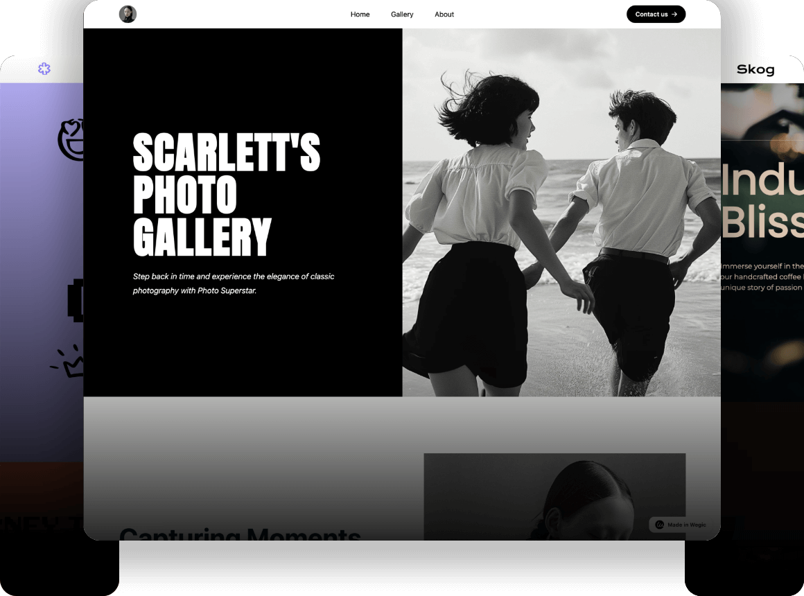
Can you imagine a website without any images? Let’s be honest: a site packed with text can be pretty boring! “A picture is worth a thousand words”, and this couldn’t be more true!
Whether you’re struggling to find images that showcase your website’s creativity or trying to select the right visuals to keep your content relevant and consistent, the right images can significantly impact your website’s success. This is because imagery can be used not only to create a unique impression of your brand but also to convince potential customers to buy your product. Don't worry, this website imagery guide is here to help.
In this article, I'll delve into why choosing the right images is crucial to your website, As well as following the steps to ensure that you are always selecting the perfect image for your website, the website imagery guide will tell you the pros and cons of each imagery type, as well as the size, format, sharpness, and consistency to focus on when selecting images.
So, let's check out this website imagery guide!
Why is it important to choose the right imagery for your website?
In today's world, people can visit more than 1 billion websites and view countless ads in a single day. They come in different forms. Some imagery appeals to the audience's eye, while others are full of interactive designs that can deepen the interaction with the audience. Pay attention to this website image guide to find more!
Some imagery highlights the unique features of their products, etc. Thus, in this digital age, how to make your product stand out through website imagery is crucial!
For instance, having good images and good interactive tools can make your website different. Web design like Wegic is full of interactivity.
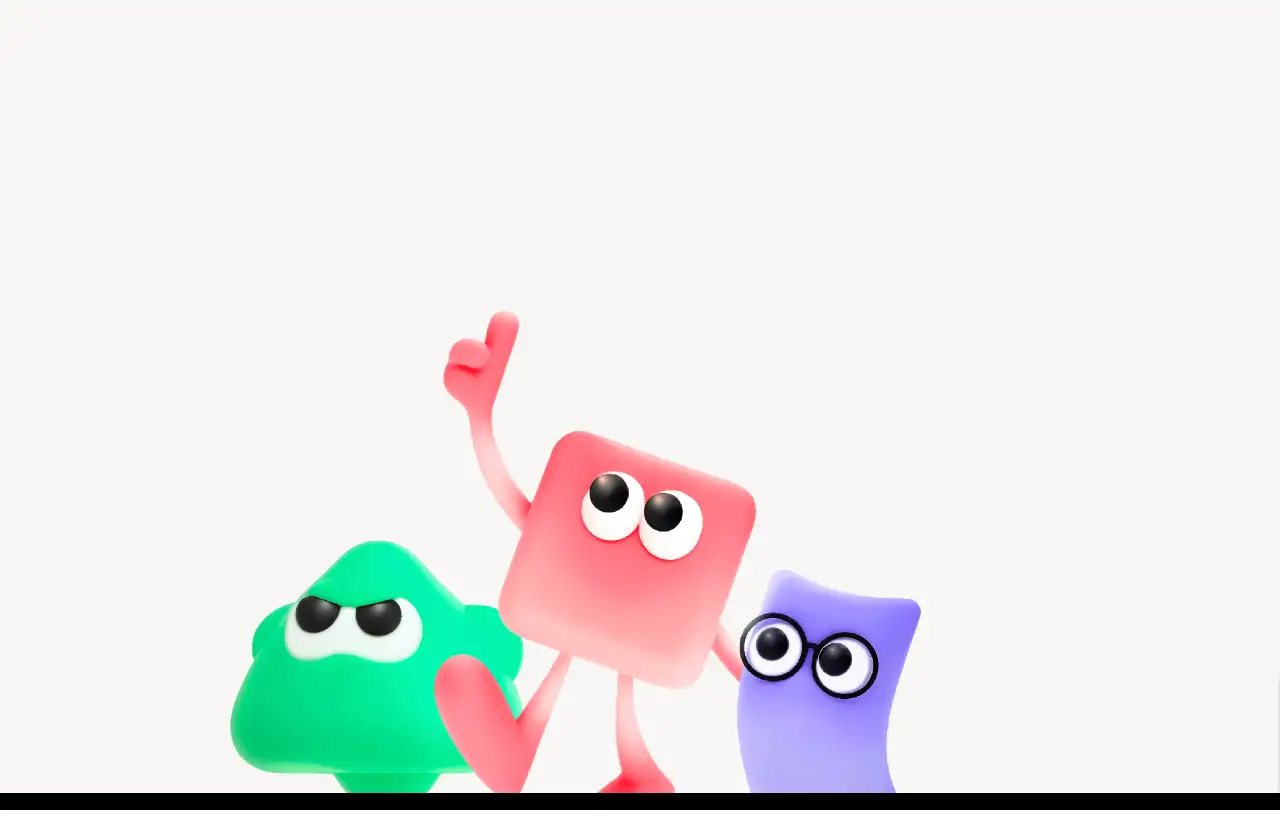
This kind of interaction design can make the website and your users or potential customers enhance the interaction, which could become a greater tool for attracting users to use your product.
Or you can make websites hold good visual performance by choosing images that match the tone of your brand. The users can always find out whether you have given your heart out to manage your own products and web pages.
Imagine this, if we open a website that is not well designed, has no depth of context, and does not have a good explanation of how the product is used and what the benefits are. We usually think that the company's products are not good enough.
A glossy Website Imagery is an excellent guide to effective customer retention, and this website imagery guide can help you!
In addition, excellent visual effects can reflect the style and culture of your company. Website Imagery is all about the company. Your company's overall image, product attributes, and even the company's approach can be revealed using Website Imagery. Don't overlook this seemingly insignificant thing.
The devil is in the details, and even a single image can highlight what differentiates a company's product from other similar products and get customers and potential customers to purchase. That's why this Website Imagery Guide is so important.
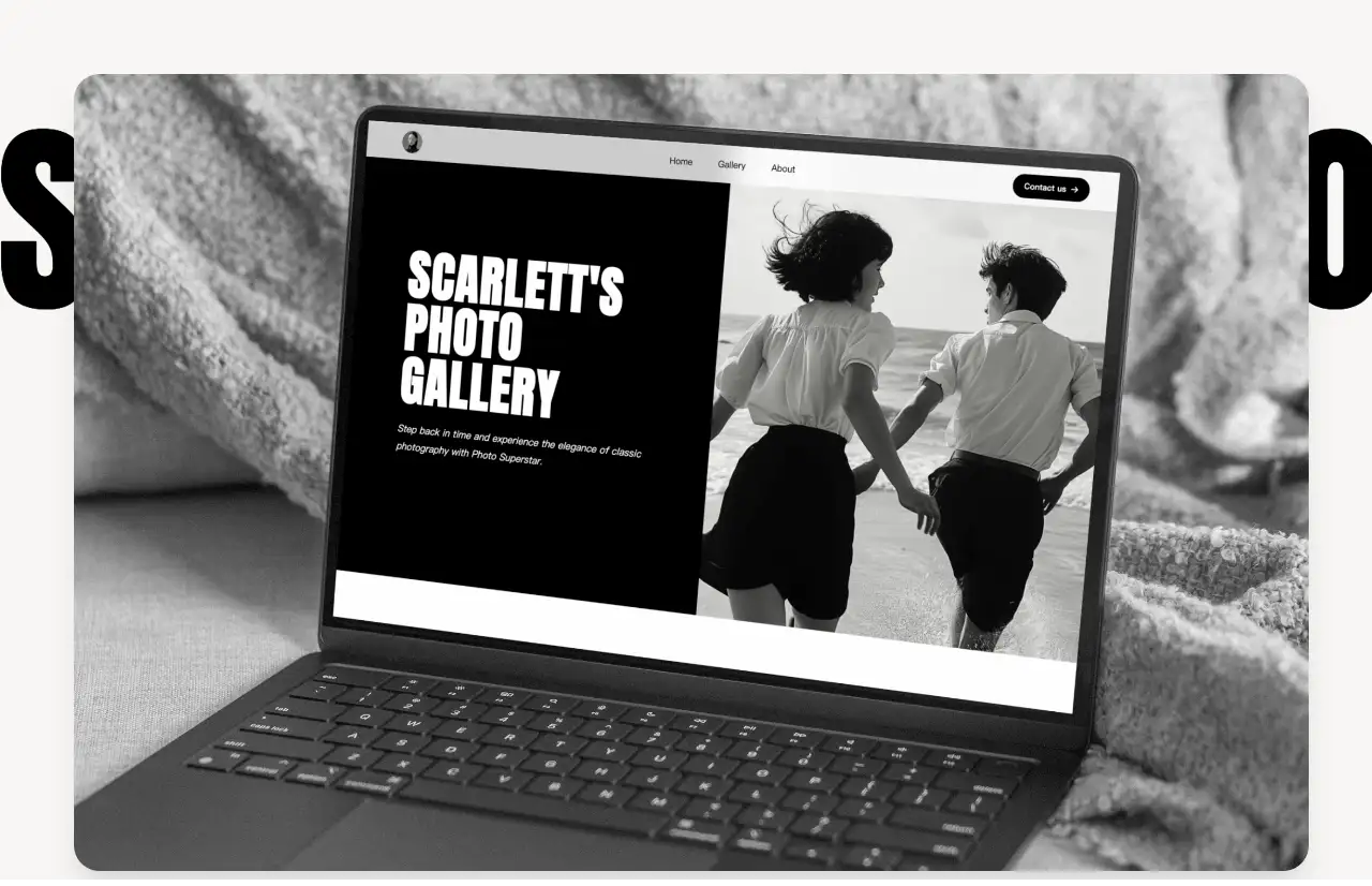
Furthermore, images can have a huge impact on a website's SEO performance. Many users like to search for images to view products, which is why images are crucial. (Small tips from this Website Imagery Guide).
According to Jumpshot's 2018 Big Data, one-third of all U.S. web searches are Google image searches.
In addition, other market analyses found that 62% of users prefer to find and learn about products through visual search.
What users like, then Google will improve. This is very easy to understand. Google itself is also a product, and it must follow the user's preferences to determine the development of the product in order to improve the user experience.
Similarly, as early as 2018, one of Google's four major perspectives for its 20th anniversary was to move from text to visual information. Because fast-loading content is almost entirely visual, it can be very immersive.
Therefore, focusing on how Website Imagery is designed can help you effectively open the market, improve the user experience, and achieve more revenue.
That's why it's vital to read and study this Website Imagery Guide!
How do you choose the right one?
The First step of website imagery guide: Ask yourself what the goal of your website is.
Your website is designed around your products, goals, or other purposes. There is no doubt that the content should be carefully crafted to drive the website’s structure and design, including imagery. The images you choose should align with your objectives.
One of major thing of this website imagery guide is tell you: the choice of images and the design of the website should complement each other, helping you achieve your goals more effectively.
For example: every website you know likely has an ‘about us’ page, or some image or video to introduce your company. The purpose of this page is to let potential visitors understand what you do and why you do it. In other words, it’s your chance to communicate your mission. Thus, for this page, consider including team photos or images that showcase what you’re doing. This helps people discover the potential benefits of using your products.
Take wegic as an example. On the homepage, the website clearly introduces what wegic does and what it can help users through interactive design with words, pictures, and videos.
If you're interested in how Wegic made Website Imagery, click on the picture to see it !
So that's the first step of the Website Imagery Guide, so let's move to the second step.
The Second step of website imagery guide : what kind of story do you want your image to tell?
Imagine you own a travel company. Your website might contain scenic spots. Naturally, you’d think to include a few images of those locations. However, just showing pictures of spots isn’t enough to attract visitors. Travelers might also want to know the history of these places and why they should go. Thus, it could be a good idea to pair a brief historical context with an image that captures the essence of the location. This way, you tell potential visitors why they should choose your offering.
For example, if I just showed you the text or images of the Forbidden City, you might not be interested and have no intention of traveling. But what if I use images and text or interactive technology to attract you? You might want to take a look at this historic spot.
It is the same for brands. A brand's products not only need to be good quality but also need to have a story.(Small tips from Website Imagery Guide).
Pictures and words can complement each other to tell a brand's story well. Let customers feel that you are operating the company with your heart, and the quality of the products must be good.
This is the power of 'slowing down' in 'fast' times.
The first two steps in this website imagery guide are the key to success.
The third step of the website imagery guide is: Know your target audience.
This could be the most important step in the website imagery Guide! Before choosing your images, ensure you have a deep understanding of your target audience. What do they like? What are their values? Answering these questions will guide you in selecting images that resonate with your audience.
What kind of message do you want to send to your users?
There are a lot of products in the world, but each user has own preference. Because of this, your website should choose the right image when understanding the preferences of your product audience.
For example, if your target audience is young women who are huge fans of technology, you can make the site imagery more technical and interactive. But if your audience portrait is middle-aged men and women who love online shopping but don’t know much about technology, then your product illustration should be more concise and clearer, so that they can find products suitable for their own. Hope this website imagery guide helps you solve the issues.
The fourth step of the website imagery guide is to make sure to choose images that match your brand
What is your brand all about? Consider your mission, values, and personality. These elements will guide your image selection. Make sure the images you choose are consistent with your website’s style, align with your audience’s interests, and remain loyal to your brand values.
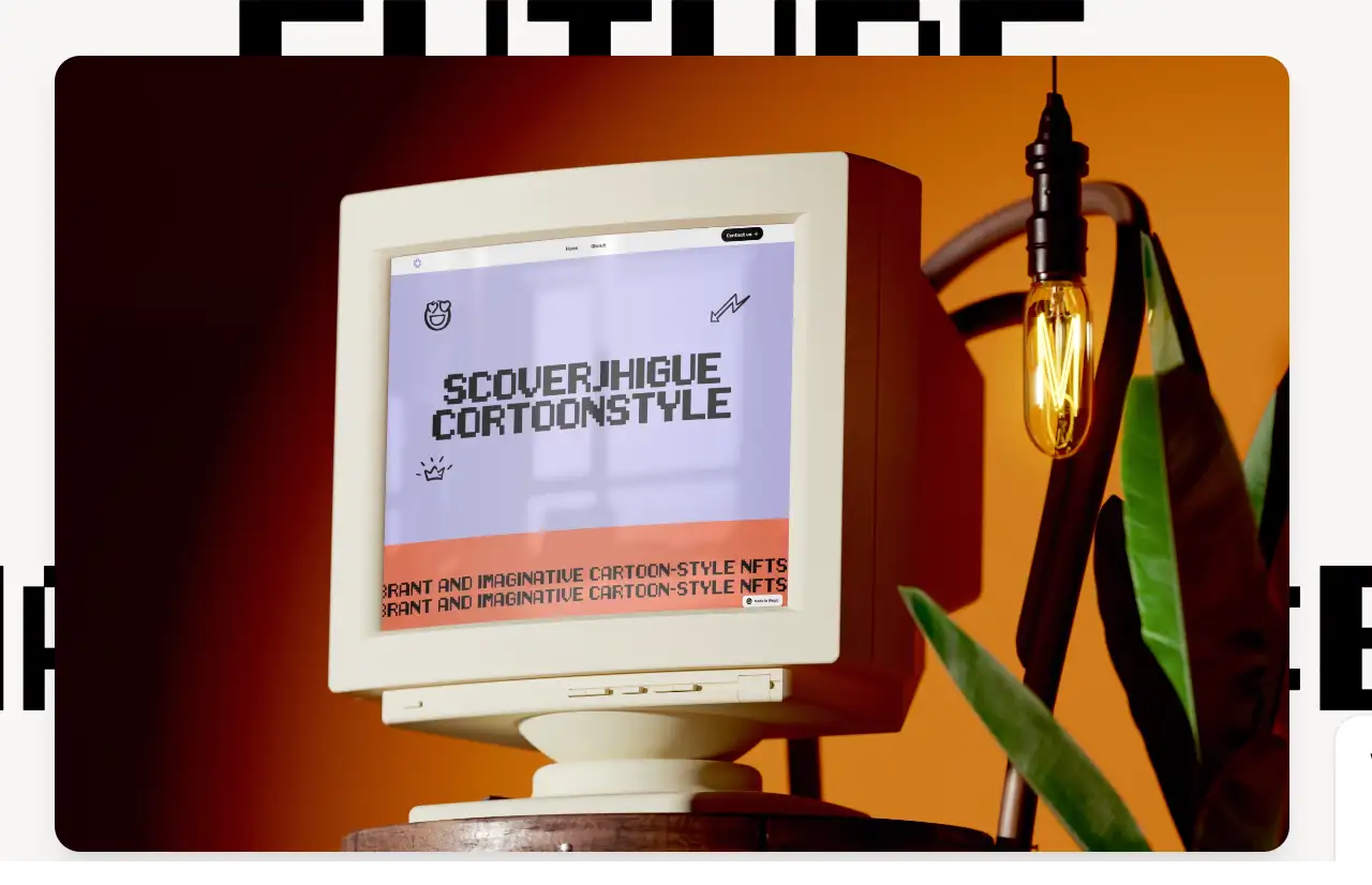
The fifth step of the of the website imagery guide is to choose the type of imagery.
Imagery comes in various forms, each with its unique advantages and disadvantages. Next, I will introduce you to the various types of imagery so that you can better choose what is suitable for your website in this website imagery guide.
Here are types of guided imagery!
Stock photographs:
PROS: Plenty of websites offer tons of pictures that capture universal visual ideas. You can easily access these websites to find the photos you need. For example, home, beach, dog, breakfast, etc.
CONS: Stock images may be copyright-protected and lack a brand identity. When selecting images, ensure they can be commercialized and reflect your brand’s identity. As this Website Imagery Guide discussed before, the consistency of pictures can make your brand successful.
Custom photographs:
PROS: Custom photography can cater specifically to your brand’s needs, making it unique. It will not only look professional but also contain high-resolution files. As this Website Imagery Guide talked about before, the uniqueness will make your brand different from others.
CONS: Custom photographs can be expensive. Custom photographs unlike others, it is designed for your brand and suit your company's needs. Thus, it could be quite expensive.
Traditional video player:
PROS: Video can be much more engaging than just pictures. It can bring more brand information to the audience and can successfully attract users who come to the page for the first time.
CONS: Although the video catches people's attention, with the development of science and technology, the traditional video form is not only long but also may make the audience feel bored. Therefore, how to make the video interesting is a key to success.
Transparent video:
PROS: Transparent video is a type of video in which the background is not visible, allowing the video to be layered on top of other videos and blend into the overall environment. This is a fun and fashionable model that can give users a novel experience when browsing the web.
CONS: Although this mode of video will bring more novel experiences to users and other website imagery guide may told you transparent video is good, but it may distract users from the product and content.
Video Box:
PROS: A video box is a tool that allows users to add videos to a website from a variety of sources. Video frames can be used to enhance the overall look of a website and make it more attractive to visitors.
CONS: Same with transparent video the Website Imagery Guide discuss before, the video box could distract the user’s attention.
Video Mask:
PROS: Video mask allows your video to take on the shape you think of, creating an impressive visual effect.
CONS: If the effect is presented too much, it may make users feel that the web content is complicated.
Vector art:
PROS: Vector images can be scaled up or down without loss of quality. It is also compatible across multiple browsers and devices.
CONS: Vector graphics cannot handle complex images such as photos, which require multiple colors, fading, contrast, etc.
By following this website imagery guide, you’ll find the right type of imagery that suits your brand’s style and aligns with your target audience's values.
The sixth step of the website imagery guide: Final tips on website imagery.
Next, let’s fucus on four essential elements when choosing images. Understanding this website imagery guide will make your site more appealing to your target audience:
High resolution:
One of the fundamental details of this Website Imagery Guide is high resolution. It is becuase low resolution will make your website look unprofessional and unattractive at the same time.
Picture consistency:
Maintain a consistent visual style across your website, which consist of image size, filters, and editing. The consistency picture has mentaion many times in this Website Imagery Guide becuase its importance. It can make your website look more professional.
Optimize picture:
Optimize your site's images so they load quickly while reducing file size and ensuring image quality is also a key detail of this Website Imagery Guide.
Picture Format:
The most common forms on the web are JPEG, PNG, and GIF.
Conclusion
Imagery is an integral part of website design. Websites that lack visuals can cause visual fatigue for your customers.
Paying attention to imagery design will not only help you tell your brand story but also attract more customers. Follow this Website Imagery Guide and Choose the Right visuals for Your Site. keep in mind “A picture is worth a thousand words”. We hope this website imagery guide assists you in your website design journey.
Written by
Kimmy
Published on
Mar 17, 2026
Share article
Read more
Our latest blog
Webpages in a minute, powered by Wegic!
With Wegic, transform your needs into stunning, functional websites with advanced AI
Free trial with Wegic, build your site in a click!
What kind of website do you want to build?
