Log in
Build Your Site
16 Amazing Storybrand Website Examples for 2025
Check out the 16 examples we picked for you in 2025 and then build your storybrand websites to deepen the connections between your brand and customers.
In today's world of numerous brands, how can you make your voice stand out? The answer lies in telling a unique brand story, that is to say, a storybrand website. However, how to design such a website that can both highlight the brand personality and efficiently convey information may be overwhelming.
No need to worry, in this article, we will introduce you to the storybrand website and provide you with a list of 16 amazing handpicked storybrand website examples to inspire you. In addition, at the end of the article, you will know how to build your storybrand website with Wegic effortlessly. Let's dive into it!
Storybrand Websites: Something You Need To Know
Definition of the Storybrand Website
Imagine that your website is your digital storefront. It’s probably the first date that a potential customer has with your brand. In this case, a storybrand website is designed to clarify a brand's value, market the service, connect with your audience, and eventually show your audience why they need it to encourage conversions.
Storybrand Framework: A Formula for Storytelling
The Storybrand Framework is a marketing strategy usually applied in building a storybrand website. The framework helps brands clarify their messaging so that they can effectively communicate with their potential clients and promote conversions.
The Storybrand Framework is based on the idea that every brand should tell a story where the customer, instead of the brand, is the hero. It imagines prospective customers as heroes in a story, guiding them from a problem to its solution in a step-by-step manner. The goal is to guide the customer through the process of purchasing a product or service to solve their problem.
It uses a storytelling formula that can be divided into seven parts:
1.Characters: Customers are the protagonists of the story, and they have specific needs and desires. Clarify who your target customers are, gain a deep understanding of their needs and desires, and make the brand closely related to their lives and problems. Your website should have a compelling website hero message, that is a website hero focusing on customers.
2.Problems and pain points: The problems (pain points) faced by customers are the core conflicts of the story. These problems include external practical challenges, internal emotional concerns, and philosophical value conflicts.
3.Solutions: As a guide, the brand uses expertise and capabilities to provide solutions to customers. By demonstrating the brand's strength and empathy, trust is established, and customers believe that your business is the solution to their problem.
4.Action guides: Provide clear step-by-step guides or plans to show how customers can work with your brand to solve problems. Make sure customers understand the feasibility of the solution, eliminate their concerns, and guide them to take action.
5.Calls to action (CTA): Design a clear CTA to encourage customers to take specific actions, such as purchases and registrations. A strong CTA can guide customers to take the first step, promote conversions, and achieve brand goals.
6.Warnings of not taking action: Remind customers of the consequences of not taking action. By emphasizing potential risks or consequences, it increases customers' sense of urgency and motivates them to seek solutions more actively, thereby choosing your brand.
7.Success vision and inspiration: Describe the success scenarios after customers use your products or services, and show positive results and changes. Therefore, customers are encouraged to believe in the value and necessity of taking action, which enhances the appeal of the brand.
16 Amazing Storybrand Website Examples for 2025
We will feature 16 amazing storybrand website examples that meet the requirements of the Storybrand Framework. Unlike the common trend of focusing too much on web copy and overlooking website layout and creativity, we will combine visual storytelling with clear written messaging.
Overview
1.Reverent Wedding Films
2.Moellering
3.Waterloo Schools
4.East Bank on Mill Creek
5.Parkland Direct
6.The Friday Habit
7.Foncannon
8.Steele Financial Partners
9.Zen Founder Business Coaching Website
10.Shirk Brothers Roofing
11.Fusion Designed
12.The Happy Sleeper
13.Axe and the Oak Distillery
14.Amory Realty
15.The Crossing at Grasslands
16.Moo Creamery
1.Reverent Wedding Films
Service: Wedding videography
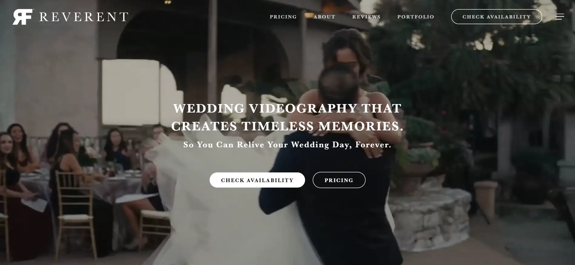
Reverent Wedding Films offers wedding videography services. Reverent is passionate about creating timeless and unique memories, ensuring every film is a personal reflection of their special day, which they can cherish for a lifetime.
“Wedding videography that creates timeless memories. So You Can Relive Your Wedding Day, Forever.” This hero message conveys that the service permanently captures your wedding day. It emphasizes that the videos produced are not just recordings, but rather cherished memories that you can revisit and enjoy repeatedly, allowing you to experience the emotions and joy of your wedding day whenever you wish. And this is exactly what newlyweds want from their big day.
The layout of the Reverent Wedding Films website is elegant and user-friendly, reflecting the beauty of their work. A stunning hero image or video on the homepage immediately draws visitors in, showcasing the cinematic quality of their films. An organized gallery displaying various wedding films, categorized by style or theme, to inspire potential clients. Prominent buttons inviting visitors to book consultations or view pricing, encouraging engagement.
2. Moellering
Service: Hiring process and team development transformation
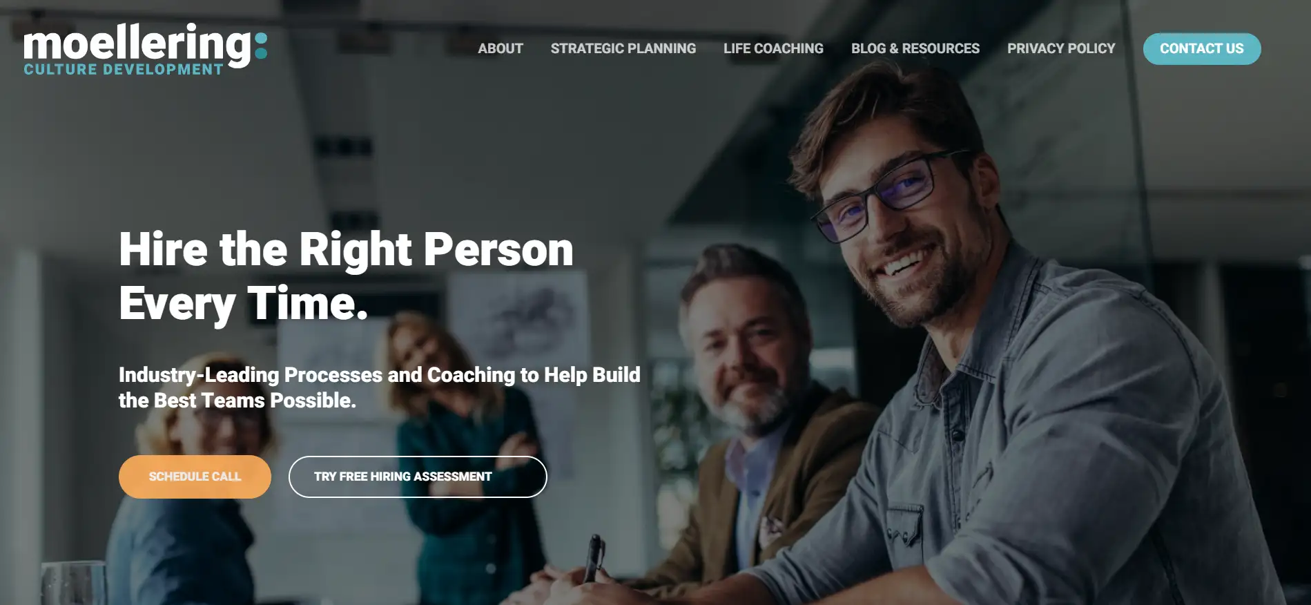
Moellering is a website or service agency focused on the recruitment process and team development. They ensure the perfect fit between positions and candidates through industry-leading assessments and coaching and provide data analysis and expert guidance to help organizations build stronger, more effective teams.
“Hire the Right People Every Time.” This hero message speaks directly to customer needs. It expresses a commitment to consistently selecting candidates who not only match the job requirements but also fit the company culture and values. Additionally, Moellering demonstrates an understanding of the audience’s goals and pain points with the copy “The True Cost of a Bad Hire”
The Moellering website features a modern and professional design that reflects its focus on innovation and effectiveness. It uses imagery that resonates with the themes of hiring and team collaboration. The streamlined layout allows users to easily access information about services and resources.
3.Waterloo Schools
Service: Academic programs and community engagement
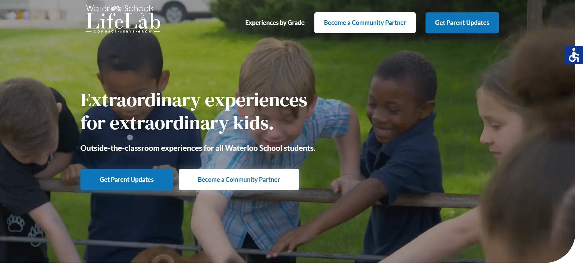
Waterloo Schools is an educational center aiming to explore and enhance every child's academic potential through experiential learning opportunities. It is a comprehensive resource for students, parents, and community members. It provides coordinated events to supplement classroom learning, which are free for every student to attend.
"Extraordinary experiences for extraordinary kids." indicates that the academic programs offered are designed to provide special and unique opportunities tailored for gifted students. This copy targets the service of gifted children, in line with the principle of making the customer the hero in the story. Every parent wants their child to excel, so this copy focuses on the needs of the customer. And it shows the brand's commitment to providing enriching opportunities that help every student shine.
The layout design of the Waterloo Schools website is user-friendly and visually appealing. There is a straightforward menu that allows users to easily find information about schools, programs, and resources. It presents high-quality images of students, parents, and school activities that convey a sense of community and engagement.
4.East Bank on Mill Creek
Service: Residence and space rental
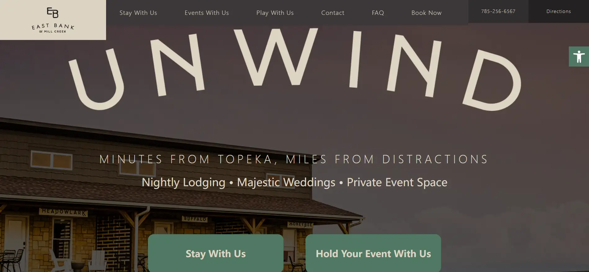
East Bank on Mill Creek is a comfortable community that perfectly connects modern living with natural beauty. Located along the banks of Mill Creek, this community offers a tranquil environment perfect for families and professionals.
The hero message “Minutes from Topeka, yet away from the hustle and bustle,” presents that the accessible community is near the city of Topeka and emphasizes that it is away from the hustle of city life. This will attract the customers who are looking for a tranquil environment but also close to cities. In addition, the word “unwind” shows the essence of the Eastbank lifestyle.
The website features a clean and intuitive layout. It includes a lead image that showcases beautiful scenery, with easy navigation to key sections such as available homes, amenities, community events, and resident resources. The use of warm colors and inviting imagery creates a welcoming atmosphere, while clear calls to action guide users to explore further or contact the management team. Overall, the design reflects the community’s commitment to providing quality living in a picturesque setting.
5.Parkland Direct
Service: Direct mail marketing services
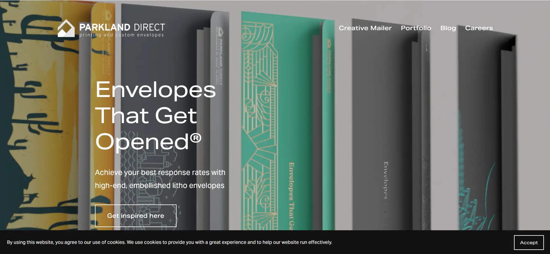
Parkland Direct, based in Virginia, provides printing and custom envelopes to the direct mail industry. It helps its clients increase envelope response and opening rates.
The hero message "Envelopes That Get Opened" conveys the idea that the direct mail marketing services provided will create eye-catching and engaging envelopes that capture recipients' attention, increasing the likelihood that they'll open and read the contents. It's a promise of effectiveness in standing out in a crowded mailbox.
The website showcases the design of their envelopes. It lists the problems its potential clients may encounter and provides solutions. What's more, this website has clear sections such portfolio and blog. On the main page, there is the CTA to improve conversions.
6.The Friday Habit
Service: Business productivity improvement podcast

The Friday Habit is a podcast run by Benjamin Manley and Mark Labriola II, who are entrepreneurs. It aims to improve business effectiveness and productivity through actionable advice.
The hero message "Boost Your Business Weekly" suggests that the podcast provides regular content to help listeners enhance their business performance. It conveys a commitment to delivering valuable content every week that can lead to tangible improvements in various aspects of their business operations. Essentially, it's an invitation for listeners to engage with the podcast every week.
The homepage has an obvious CTA that leads visitors to click to listen to the blog, thereby increasing the conversion rate. There is also an upward arrow on the homepage, suggesting the progress of the business. In addition, this website also points out the problems that entrepreneurs may encounter and the successful outcomes that can be obtained by listening to the blog.
7.Foncannon
Service: Tax and financial services.
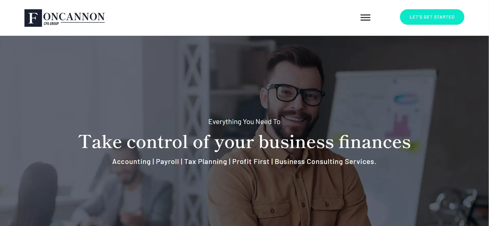
Foncannon is a dynamic brand that focuses on delivering a series of financial management services so that its clients can say goodbye to financial stress.
The hero message "Everything You Need To Take Control of Your Business Finances" conveys a clear and empowering promise to potential clients. It suggests that the services offered will provide comprehensive support and resources for managing their business finances effectively. Using different font sizes, this copy emphasizes the result, indicating that clients will gain the tools and knowledge necessary to make informed financial decisions, streamline their processes, and ultimately improve their financial health.
The simple business design style is in line with the characteristics of the services provided by the website. The website points out the adverse consequences that may occur if a business is not well-planned, and warns potential customers. At the same time, it clearly explains the benefits of good financial planning, prompting customers to realize that they need financial services.
8.Steele Financial Partners
Service: Financial advice
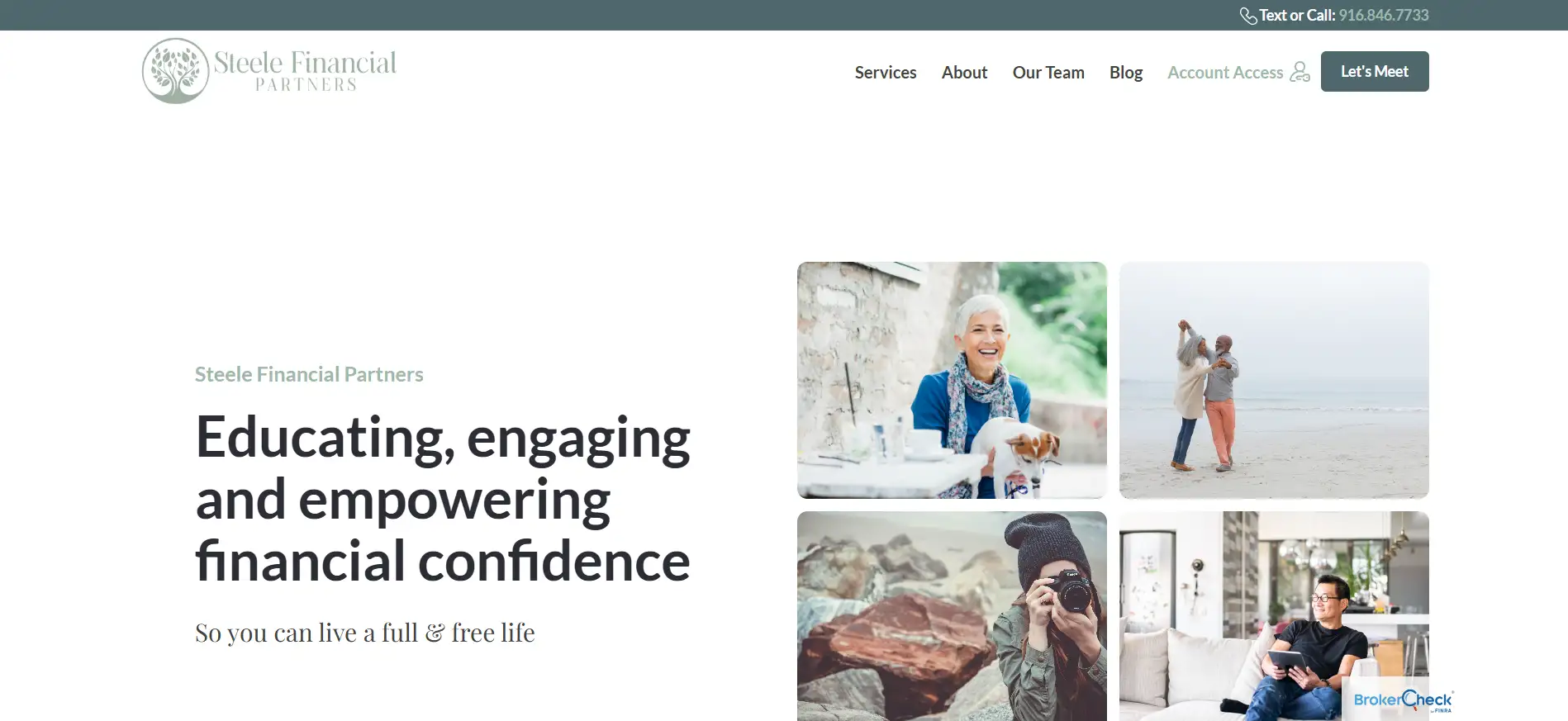
Steele Financial Partners is a dedicated financial advisory firm focusing on empowering individuals, especially women, with financial confidence. It offers personalized financial advice and planning.
The hero message "Educating, engaging, and empowering financial confidence. So you can live a full & free life" suggests that the financial services offered will not only provide knowledge and resources (education) but also actively involve clients in the process (engaging). By building financial confidence, the services aim to equip clients with the skills and understanding they need to make informed decisions. This message emphasizes personal growth and empowerment.
From the three photos on the homepage, we can see that the target customers of this website are mainly individuals, regardless of gender and age. The other text information on the website reflects the website's empathy for customers, thereby gaining their trust.
9.Zen Founder Business Coaching Website
Service: Burnout and isolation therapy
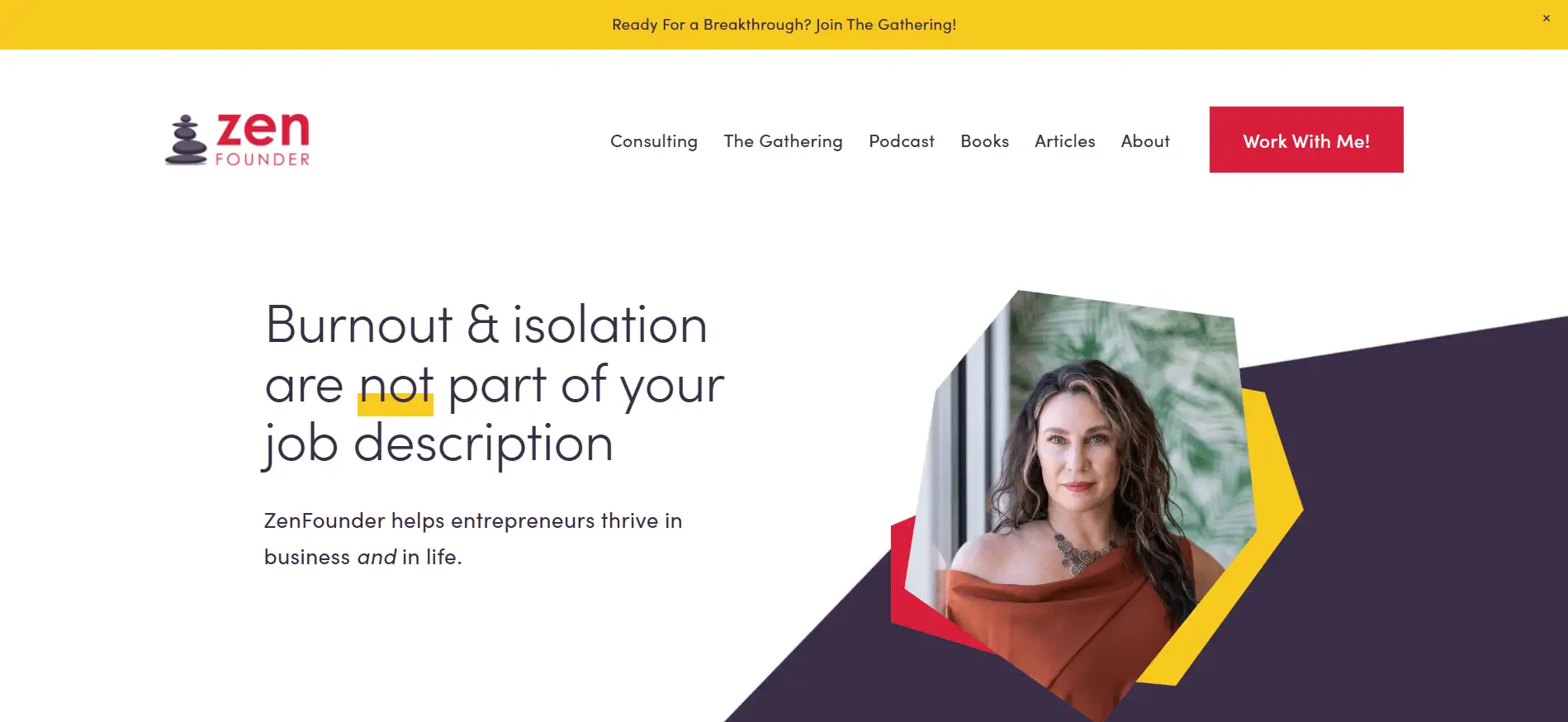
ZenFounder, founded by Dr. Sherry, aims to help entrepreneurs who have mental health problems get out of trouble.
The hero message "Burnout & isolation are not part of your job description" implies that experiencing burnout and feelings of isolation are not inherent or acceptable aspects of being an entrepreneur. It suggests that these challenges can be overcome and entrepreneurs should pay attention to mental health and well-being. The message gets the trust of entrepreneurs by acknowledging their struggles while encouraging them to seek support and resources for a healthier, more balanced work life.
The webpage points out the problems that potential customers are currently experiencing and the adverse consequences caused. CTAs are set in each section to guide customers to click. In addition, there is a customer feedback section. The examples of entrepreneurs who have experienced the same experiences as potential customers are more convincing.
10.Shirk Brothers Roofing
Service: Roofing services
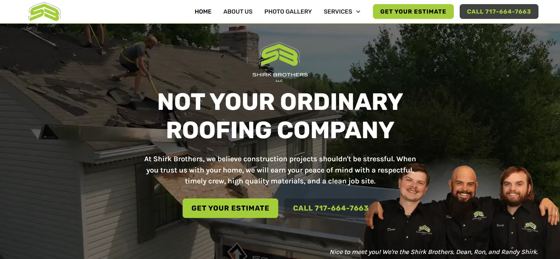
Shirk Brothers Roofing is co-founded by three brothers and recruited other family members. They aim to build and repair homes without mistakes.
The hero message "Not Your Ordinary Roofing Company" implies that the company offers unique, exceptional services that set it apart from typical competitors. It suggests a commitment to quality, innovation, and customer satisfaction, indicating that clients can expect a distinctive experience and superior craftsmanship.
A dynamic and high-quality image of roofing immediately captures customers' attention. Through combinations of pictures and texts, the website showcases the services and solutions it can offer. There is a section for customers' feedback to gain trust from potential customers.
11.Fusion Designed
Service: Interior design and feng shui
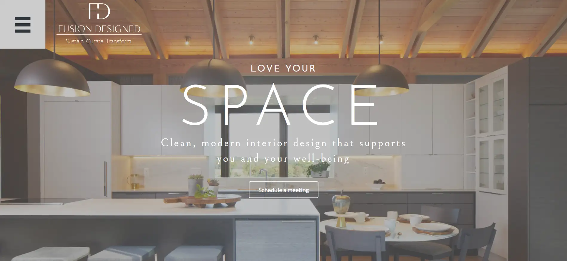
Fusion Designed offers modern interior design. It thinks that people's well-being is highly impacted by surroundings, and aims to design in a holistic approach.
The hero message "LOVE YOUR SPACE — a clean, modern interior design that supports you and your well-being" suggests a focus on creating environments that not only look good but also enhance the user's overall quality of life. The use of "clean" and "modern" conveys a minimalist approach, emphasizing simplicity and clarity in design. Overall, it invites visitors to appreciate their surroundings and suggests that the design services offered will help them cultivate a space that fosters positivity and personal growth.
The full-width hero image is consistent with the design style advocated in the hero message. The homepage has a lot of white space, which is also in line with the minimalist style. The website provides past award-winning architectural design cases to convince potential customers. In addition, it provides customers with a clear three-step solution and emphasizes respect for the customer's personality, which is in line with the principle of treating customers as heroes.
12.The Happy Sleeper
Service: Sleep consultation and resources

The Happy Sleeper is a dedicated online platform that focuses on helping parents achieve better sleep for their children. Through expert guidance and practical solutions, the website aims to create a positive sleep experience for families (actually people of all ages), assuring they can enjoy restful nights.
The hero's message "Ready to sleep through the night?" conveys a sense of reassurance and encouragement. It suggests that the service offers solutions to help individuals achieve restful, uninterrupted sleep. The copy invites potential clients to consider their readiness to improve their sleep quality, positioning the consultation as a supportive step toward better sleep and overall well-being.
The Happy Sleeper effectively combines expert knowledge with a supportive community. The main color of the homepage is pink, which is in line with the characteristics of the website's target users. The hero image is two quiet children under the quilt, which can attract the attention of parents and guardians and a CTA is set next to the image. The website points out the pain points that parents may have and proposes corresponding solutions.
13.Axe and the Oak Distillery
Service: Whiskey shop and community

Axe and the Oak Distillery is dedicated to creating high-quality spirits. Located in Colorado, they focus on small-batch production, ensuring that every bottle reflects craftsmanship and flavor.
The copy "Whiskey worth sharing" suggests that the distillery produces high-quality whiskey that is special enough to be shared with others. It implies the scene where friends often gather around good drinks and good times and presents a sense of community, celebration, and the idea that this whiskey enhances social experiences. It positions its product as a choice for gatherings with friends and family.
The layout of the Axe and the Oak website is designed to be visually appealing and user-friendly. A striking, full-width hero image with whiskey showcases their products. Engaging visuals and storytelling sections highlight the distillation process, the ingredients used, and the passion behind their craft.
14.Amory Realty
Service: Real estate agency
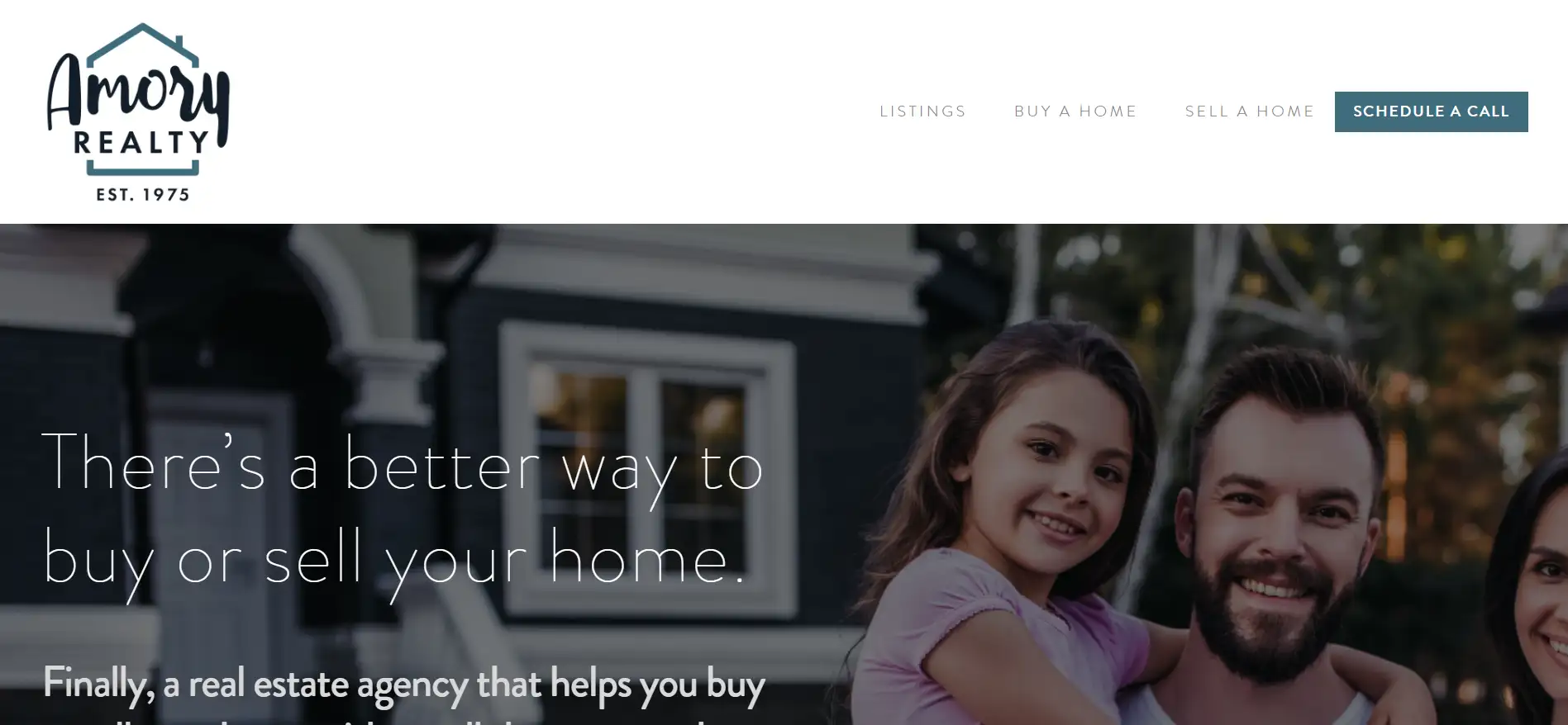
Amory Realty is a real estate agency that helps clients sell or buy a house with ease. With careful service and deep market knowledge, Amory Realty provides a seamless experience for buyers and sellers.
"There’s a better way to buy or sell your home." This fantastic hero message highlights Amory Realty's mission to redefine the real estate experience, positioning the agency as a trusted partner in the journey to find or sell a home. At the same time, this message addresses a customer's pain point. Buying or selling a house isn't easy, and we always want to find a better way. This message perfectly answers the customer's needs and attracts the customer to use the service.
The layout design of the Amory Realty website is sleek and user-friendly, emphasizing a modern aesthetic. The homepage features an eye-catching hero image of a beautiful house and a family, paired with the impactful hero message. Clear navigation allows visitors to easily explore property listings, service offerings, and client testimonials. The strategic whitespace enhances readability.
15.The Crossing at Grasslands
Service: Vacation community in grassland
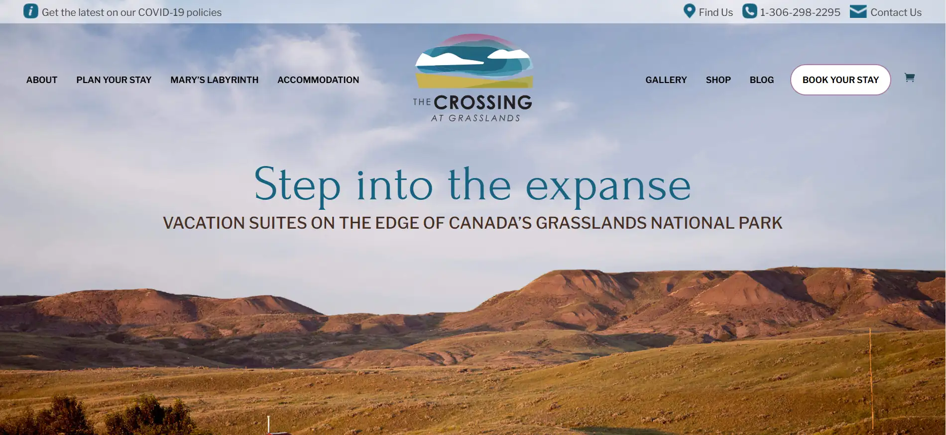
The Crossing at Grasslands is a classical residential community that blends modern living with natural beauty in Canada’s Grasslands National Park. Located in a scenic location, the brand focuses on creating a vibrant and welcoming environment for residents, offering a lifestyle that promotes comfort and connectivity.
"Step into the expanse." This message invites visitors to explore the vast opportunities and serene environment that The Crossing at Grasslands offers. It makes customers feel they are the heroes in the story. What's more, this copy emphasizes a lifestyle of freedom and connection with nature.
The website features a clean and modern layout, emphasizing user-friendly navigation. A striking full-width natural image showcases its scenic beauty and inviting atmosphere. Prominent buttons encourage visitors to schedule tours or learn more about available homes.
16.Moo Creamery
Service: Online food ordering
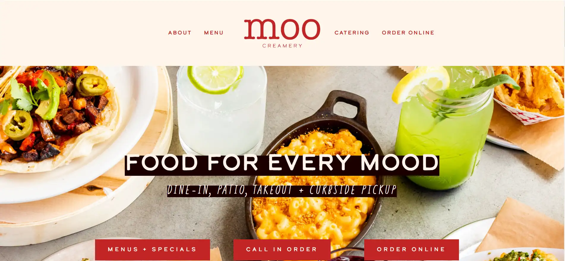
Moo Creamery is a popular website for foodies, especially ice cream lovers. The website offers yummy handcrafted ice creams made from local ingredients. The website reflects the brand's commitment to quality and creativity.
"Food For Every Mood" perfectly presents Moo Creamery's mission, showing the brand's diverse offerings that meet every need and occasion. The word "mood" can mean emotion or appetite.
The website features a clean, modern layout with vibrant visuals of dishes and a user-friendly interface. The homepage showcases compelling food images suitable for the site's theme and clear CTAs that guide customers to explore its services. The navigation is intuitive, allowing for easy access to the menu, and creating a seamless user experience.
How Can You Build Your Storybrand Website
1.Understand the StoryBrand Framework: Be familiar with the seven elements of StoryBrand and remember to integrate them into your design process.
2.Offer a clear brand message: Determine your brand mission, vision, and core values. Clearly define your target audience and their needs. And blend them into the hero message of your website.
3.Develop a content strategy: Find out what content your web pages need to contain. Here are the common sections:
-
Homepage: Usually you need to introduce the brand concisely and clearly on the homepage, highlighting the customer's pain points and solutions.
-
About Us: You can tell the brand story in the About Us section to establish an emotional connection.
-
Product page: It describes the product features and the benefits they bring in detail.
-
User cases: Success stories and customer feedback are shown here.
-
Blogs and resources: You can provide valuable content here to attract potential customers.
4.Design a user-friendly layout: Use a simple design to ensure that the information is clear and easy to navigate so that users can easily find what they need.
5.Use visual elements: Choose relevant text, images, and videos to enhance the message. Make sure the visual style is consistent with the brand image.
6.Optimize the CTA: You need to place clear and obvious CTA icons in a prominent position on each page to encourage users to take the next step.
7.Build and publish: You need to choose a website builder to set up pages, add content, and customize the design. With the help of Wegic, you can build a website in minutes and publish it with one click.
8.Promote and maintain: After launching the website, you can use social media, EDM, and SEO to drive traffic.
Wegic — The AI-powered Storybrand Website Builder by Your Side
Click the image below to try Wegic out now!
Wegic is your AI-powered web design and development companion! It is best for beginners or designers who want to create and modify various kinds of websites in minutes through simple conversations with AI assistants throughout the whole process. Wegic has the following AI features:
-
AI Website Generation
-
AI Image Recommendation
-
AI Text Writing
-
AI Adjustment and Promotion
In addition, Wegic offers great customization to meet the unique needs and aesthetic preferences of each user. It supports custom domain names in the paid version. However, you can still publish your website with One-click online in the free plan. Social media embedments are also provided. You can learn more about Wegic from our help center.
Start Your Adventure with Wegic Now
In essence, a brand and a StoryBrand website are like a compass and a map. The brand provides direction through its values, while the StoryBrand website depicts the journey, guiding customers to their desired destination through a clear narrative.
We hope you have gained valuable insights into storybrand websites and picked the storybrand website examples that fit your brand! So what are you waiting for? Dive in — click on Wegic and start your website-building adventure today. Wegic is always at your side to help!
Written by
Kimmy
Published on
Mar 17, 2026
Share article
Read more
Our latest blog
Webpages in a minute, powered by Wegic!
With Wegic, transform your needs into stunning, functional websites with advanced AI
Free trial with Wegic, build your site in a click!
