Log in
Build Your Site
10 Inspiring Startup Websites Examples for Beginners
We organized the top 16 stunning startup websites for inspiration. Learn how they are designed to promote UI/UX and online presence.

Startups need a strong website. A well-designed site highlights your professionalism, and customer focus, and strengthens your brand’s online presence. It’s often the first place people go to learn about your business, making it crucial for a great first impression. Not sure what makes a good startup website? You’re in the right place. Read this passage in under 5 minutes to get inspired on how to build a startup website that turns visitors into loyal customers.
Why Does a Startup Need a Website?
A startup is a young company in its early development stages, often facing high uncertainty and a significant risk of failure. Every startup needs a website to establish credibility, showcase products or services, and reach a broader audience. As a digital storefront, it offers 24/7 access and enhances visibility. A website also serves as a platform for marketing, lead generation, and customer support. In today’s digital-first world, having a professional site is essential for startups to compete, build trust, and foster growth.
Now, let’s explore some of the best startup website examples I’ve curated for you.
10 Inspiring Startup Websites Examples for Beginners
1.Apothékary
-
User-friendly Navigation
-
Informative Content & Copy
-
High-quality Visuals
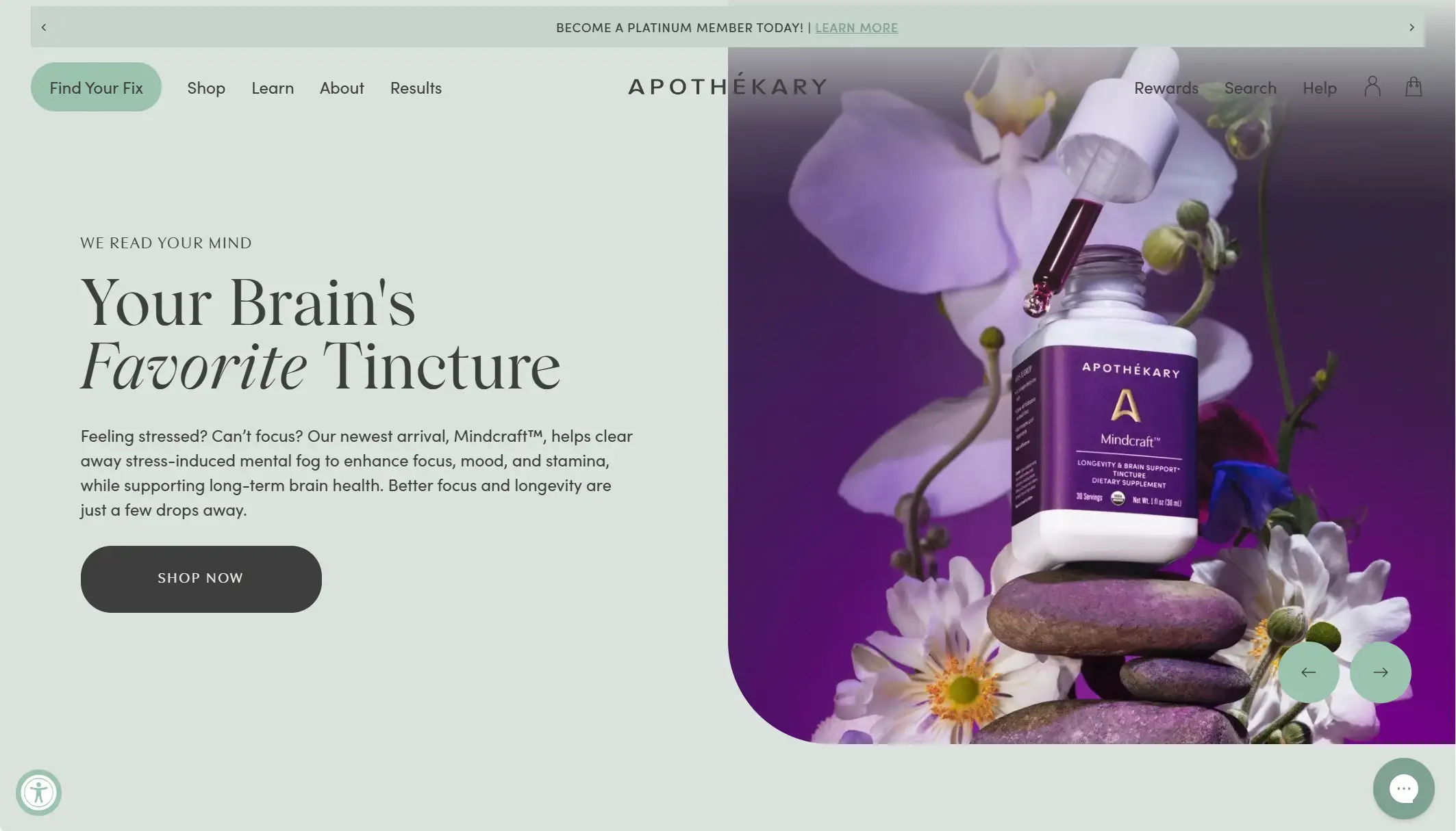
Founded in 2018 by former Wall Street financial analyst Shizu Okusa, Apothékary is an online retailer specializing in botanical wellness products.
Its startup website is user-friendly, allowing users to shop by benefit, category, or product. New visitors can use the “Find Your Fix” button on the homepage to take a quiz that recommends suitable products based on their needs. The site also features product comparisons by ingredients, taste, and usage details.
The layout is clean, with products and prices displayed on the homepage. High-quality CTAs, pastel-muted colors, subtle animations, and cohesive typography enhance the browsing experience. The company offers a free 15-minute consultation with an expert to help customers understand the products and dosage guidelines before purchase.
The content is informative and includes case studies linked to authoritative sources, making it easy for customers to research and learn more about the products.
2.Bundle x Joy
-
Colorful Interface
-
Clear Layout
-
Great Photography
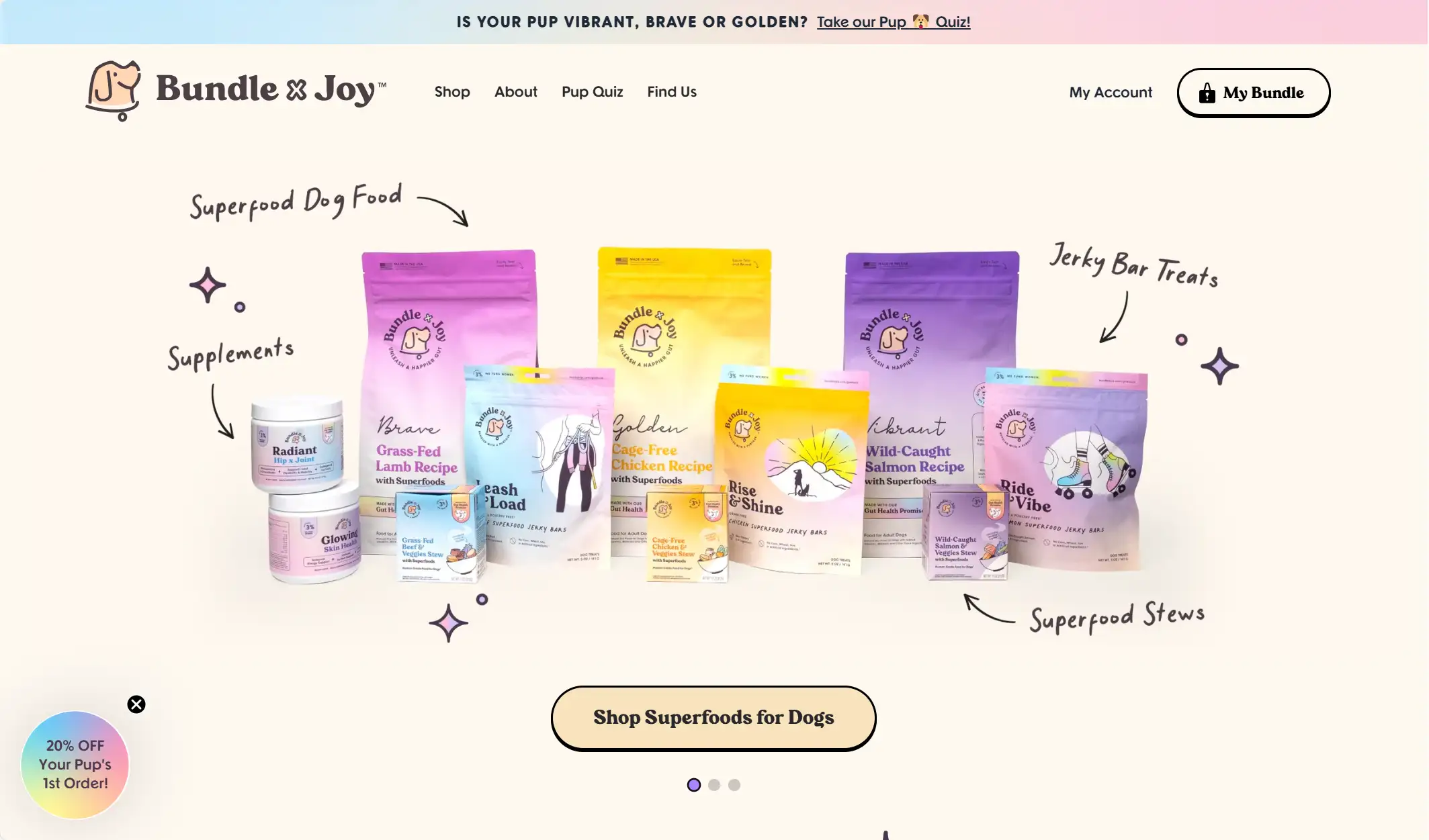
Bundle x Joy is a female-founded pet brand offering curated, high-quality products such as superfood jerky for dogs. The brand name is endearing, inspired by the phrase "bundle of joy," which often refers to a beloved child—just like our cherished pets.
The startup website is colorful yet maintains clear visibility of information and buttons. The user-friendly navigation allows visitors to shop by categories such as stews, dry food, treats, and toys. The interface is highly accessible due to the floating navigation bar, which remains visible even when scrolling to the bottom of the page.
Additionally, the high-quality photography aligns with the brand’s mission to revolutionize pet nutrition and community engagement. Product reviews are also displayed on product pages or below product descriptions, providing customers with valuable feedback and insights.
3.Due
-
Engaging Animated Elements
-
Smooth Page Transitions
-
Minimal Navigation
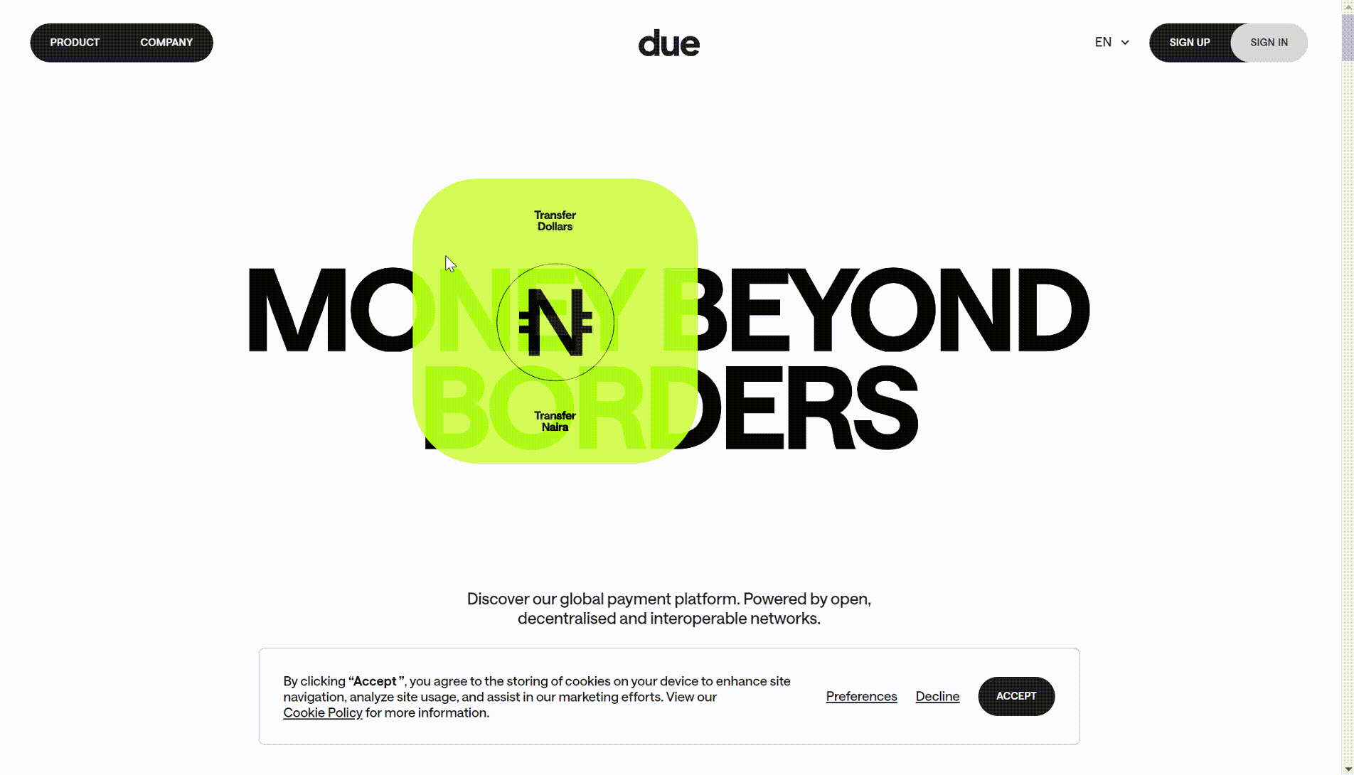
Since 2022, the company has been working to enable fast, accessible, and low-cost international money transfers for businesses and individuals worldwide. Built on decentralized networks leveraging stablecoins, its platform offers multi-currency accounts, global transfers, and merchant-acquiring services for everyone, everywhere. The company aims to give customers full control of their assets without the need for intermediaries.
The startup website features engaging animated elements and smooth page transitions that captivate visitors. Potential users are more inclined to sign up after learning about the brand’s services and understanding its professionalism. The homepage showcases moving images and texts over a bold tagline—“Money Beyond Borders”—emphasizing its support for both global corporations and local businesses.
As you scroll down, it becomes clear that the platform offers a new way to pay, send, receive, exchange, and get paid. Users can access digital US Dollars and Euros from anywhere, add funds using local payment methods, exchange seamlessly at real rates, and even earn interest on their capital.
The site’s minimal navigation allows users to explore and understand the brand simply by scrolling down. Due prioritizes accessibility and reliability, providing an effortless, user-friendly experience. The website also highlights membership features, offering personalized interactions for its users.
4.Electra
-
Demo Video
-
Interactive Map
-
Multilingual Selection
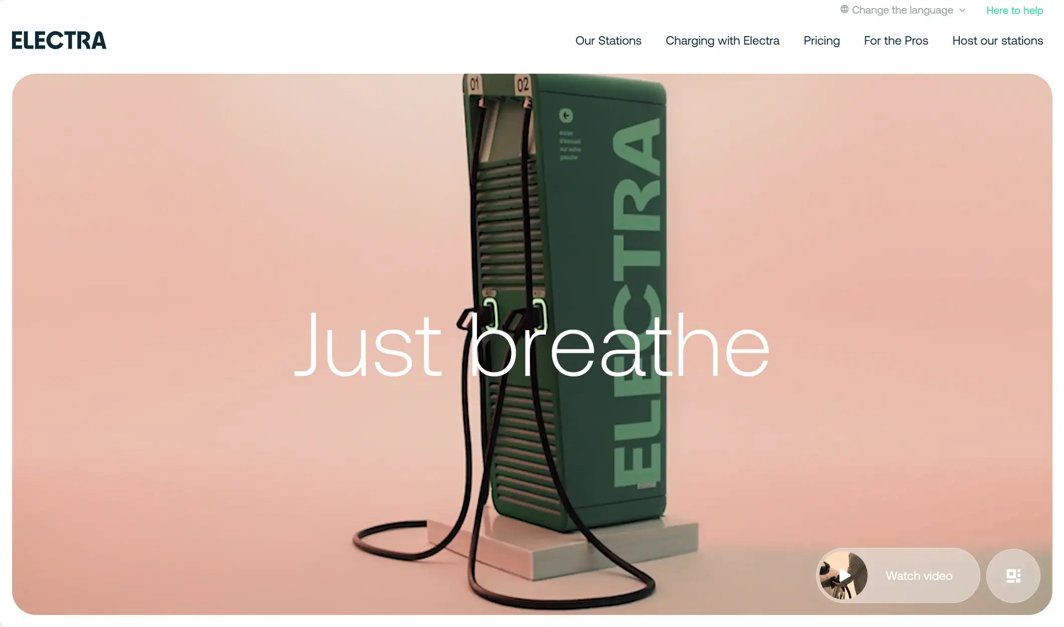
Electra is a startup developing an app that makes EV charging as simple as filling up a petrol tank, while helping motorists save time and enjoy greater convenience. Their vision is to eliminate barriers to electric car adoption by building the most efficient network of fast-charging stations in Europe. Users can find and reserve charging spots through the app.
The startup website starts with a demo video showcasing the effortless, rapid charging process. With Electra, you can drive 400 km on just a 20-minute charge, offering the fastest charging speed in the market at up to 400 kW.
Additionally, an interactive map displays the distribution of charging stations worldwide, allowing users to easily book an available spot. The site also supports real-time availability updates, enhancing user experience.
The website is available in six languages—German, English, Spanish, French, Italian, and Dutch—making it easier for global visitors to navigate and boosting the brand’s online visibility and credibility. Multilingual support encourages users to engage more comfortably with the site and its services in their native language, ultimately building trust and facilitating purchases.
5.Feastables
-
Easy Navigation
-
Attractive CTAs
-
Gamified Layout

Feastables is a chocolate and snack brand created by American YouTuber Jimmy Donaldson, better known as MrBeast. In January 2022, Donaldson launched the company with its signature product, the "MrBeast Bar."
The creative website design features a semi-flat layout with vibrant colors like blue, pink, red, and light green. The brand’s chocolates are prominently displayed across the site, and the easy navigation helps users quickly find where to buy the bars and explore new flavors on the homepage. Social media buttons are also easily accessible.
The engaging CTAs are strategically placed, drawing attention to ongoing promotions. Currently, the homepage features a special interactive promotion running from October 1st to October 30th, where a lucky winner will receive $10K each day. This campaign extends beyond the site, capturing the interest of loyal customers and new visitors.
The startup website also showcases playful visual elements, such as quirky models holding chocolates, which add a fun and inviting atmosphere to the brand’s image. MrBeast himself, often smiling with his signature eight-teeth grin, frequently appears throughout the site alongside the products, reinforcing the brand’s identity.
Feastables pays attention to localization as well. A globe icon in the top right corner allows users to switch between multiple currencies, enhancing accessibility and providing a more tailored experience for international customers.
6.FlyCode
-
Visual Benefits
-
Clean Design
-
Trusted Reviews
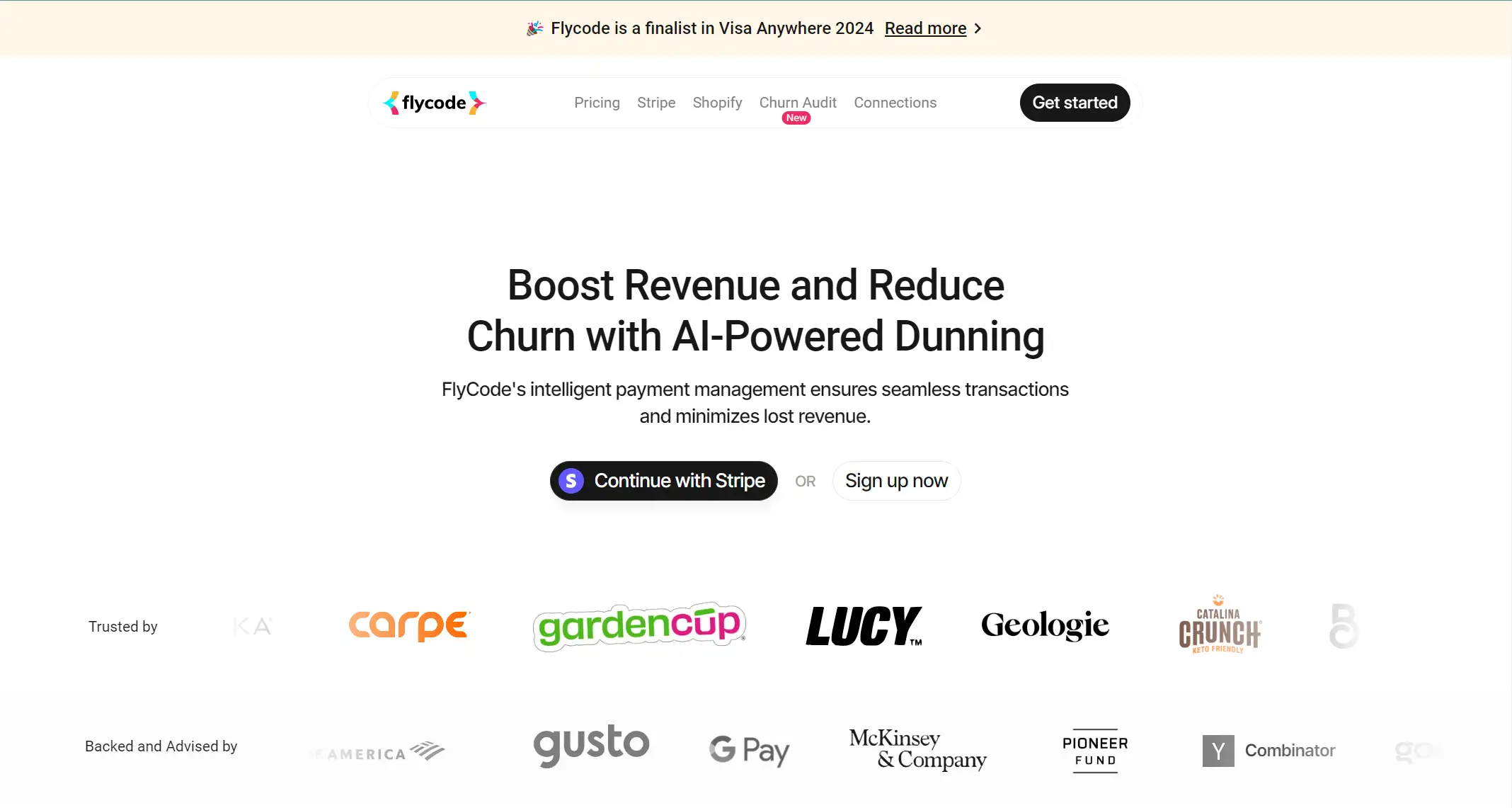
FlyCode is a product analytics tracking tool that utilizes AI and machine learning to prevent payment failures, recover lost revenue, and reduce churn—ultimately optimizing payments and increasing ARR.
The startup website has a clean design that effectively uses natural whitespace to highlight the software’s features and benefits. The site reduces information density to emphasize the brand’s key strengths and avoid overwhelming visitors with too much text or imagery. The homepage uses a comparison table to clearly showcase FlyCode’s advantages, along with bar charts and mind maps to visually explain how the platform functions.
Customer testimonials from well-known users add credibility and engagement to the brand. For instance, TJ Ferrara, Co-Founder of BUBS Naturals, shared, "We took our failed payment recovery rate from 51% to a staggering 66% in just a month! Our most notable victory? A phenomenal 71% recovery rate peak in January!" Such figures are convincing and highlight FlyCode’s impact.
In the "Pricing" section, the site provides an estimated revenue growth based on the user's annual revenue, aligning with the brand’s goal to recover more failed payments with ROI-based pricing.
7.Little Clay Land
-
Real Cases
-
Accessible Navigation
-
Personalized UI
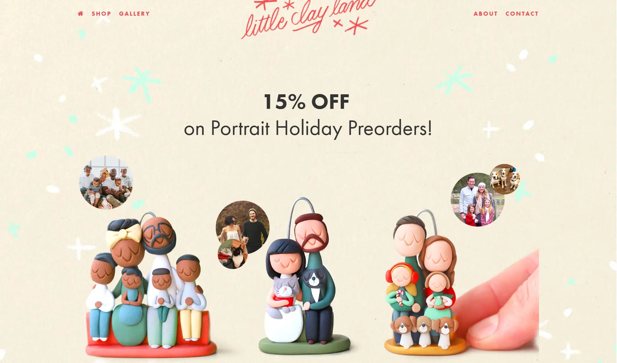
Little Clay Land is a unique online store specializing in custom, hand-sculpted clay portraits of family, friends, and pets.
The startup website showcases numerous real cases through images and videos, allowing visitors to see a variety of completed works. This display demonstrates that anyone can commission a custom clay portrait, removing the concern of needing artistic skills.
More examples can be found in the "Gallery" section, making it easy for users to explore different styles and options. The site’s accessible navigation bar guides users seamlessly to various sections, including the "Shop", where customers can purchase clay portraits, wedding cake toppers, and gift cards.
For instance, if you want a custom portrait for your wedding, you can choose a personalized clay portrait topper, select the size and number of people or pets, and then provide specific details via email after completing the purchase—offering a highly personalized and user-friendly experience.
8.MikMak
-
Informative Menu
-
Massive Demos
-
Seamless Interface
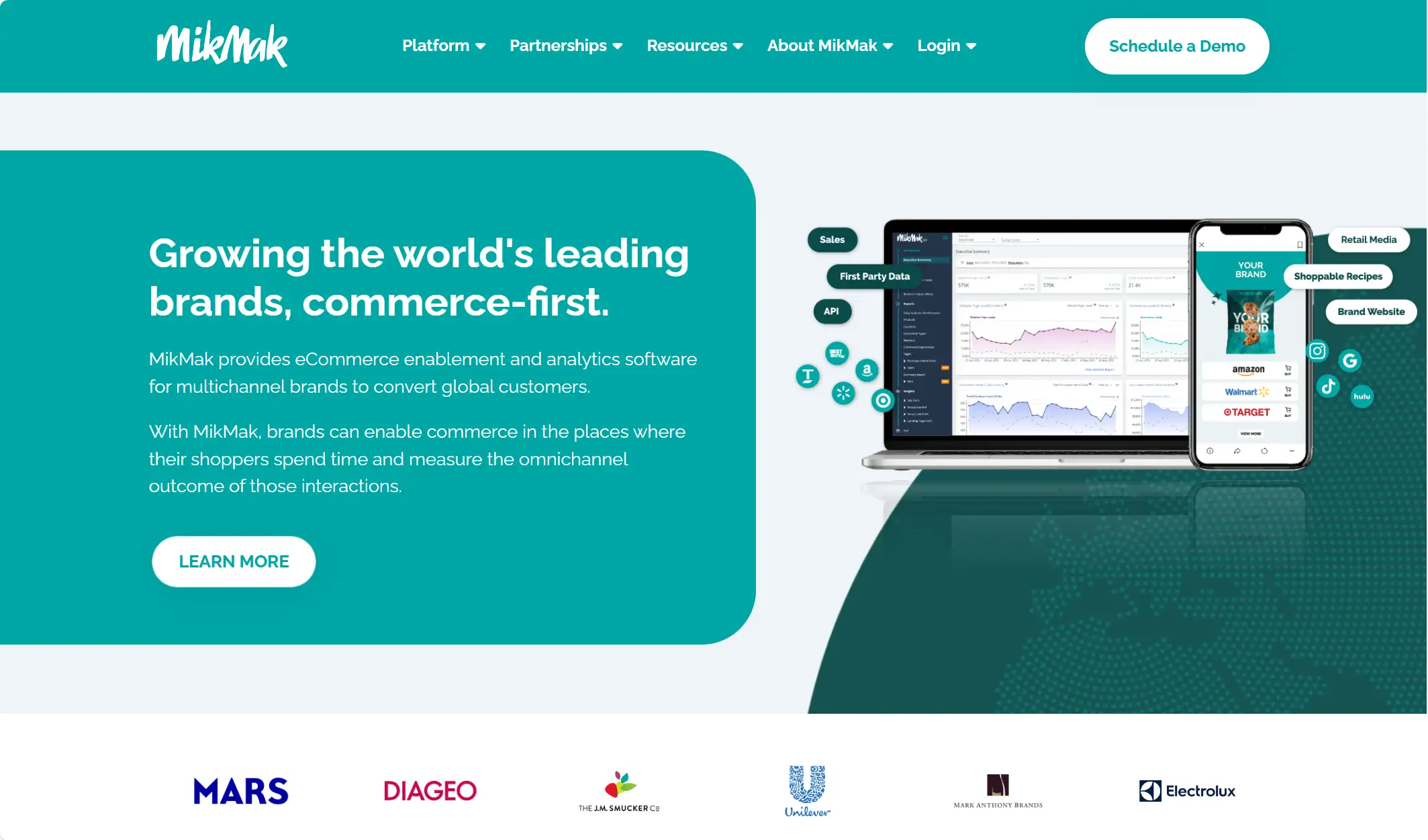
MikMak is a global software company that offers an eCommerce enablement and analytics platform for multichannel brands. Focused on growing brands by enabling commerce where shoppers spend time, MikMak measures the omnichannel impact of those interactions to provide valuable insights.
The startup's multi-page website is designed to cater to this need, providing a wealth of informative resources. Visitors can explore the platform’s overview, learn about the latest applications, and view various case studies—all presented in a way that prevents information overload. The content is well-organized, allowing users to easily understand the tool’s value by simply scrolling through the site.
The website’s massive demos demonstrate the platform’s capabilities and reflect the brand’s professionalism and customer-centric approach. The seamless interface—featuring cohesive images, compelling copy, and actionable insights—creates an engaging and informative experience for potential customers.
9.Saie
-
Engaging Hero Photo
-
Stunning UI/UX
-
High-Resolution Images
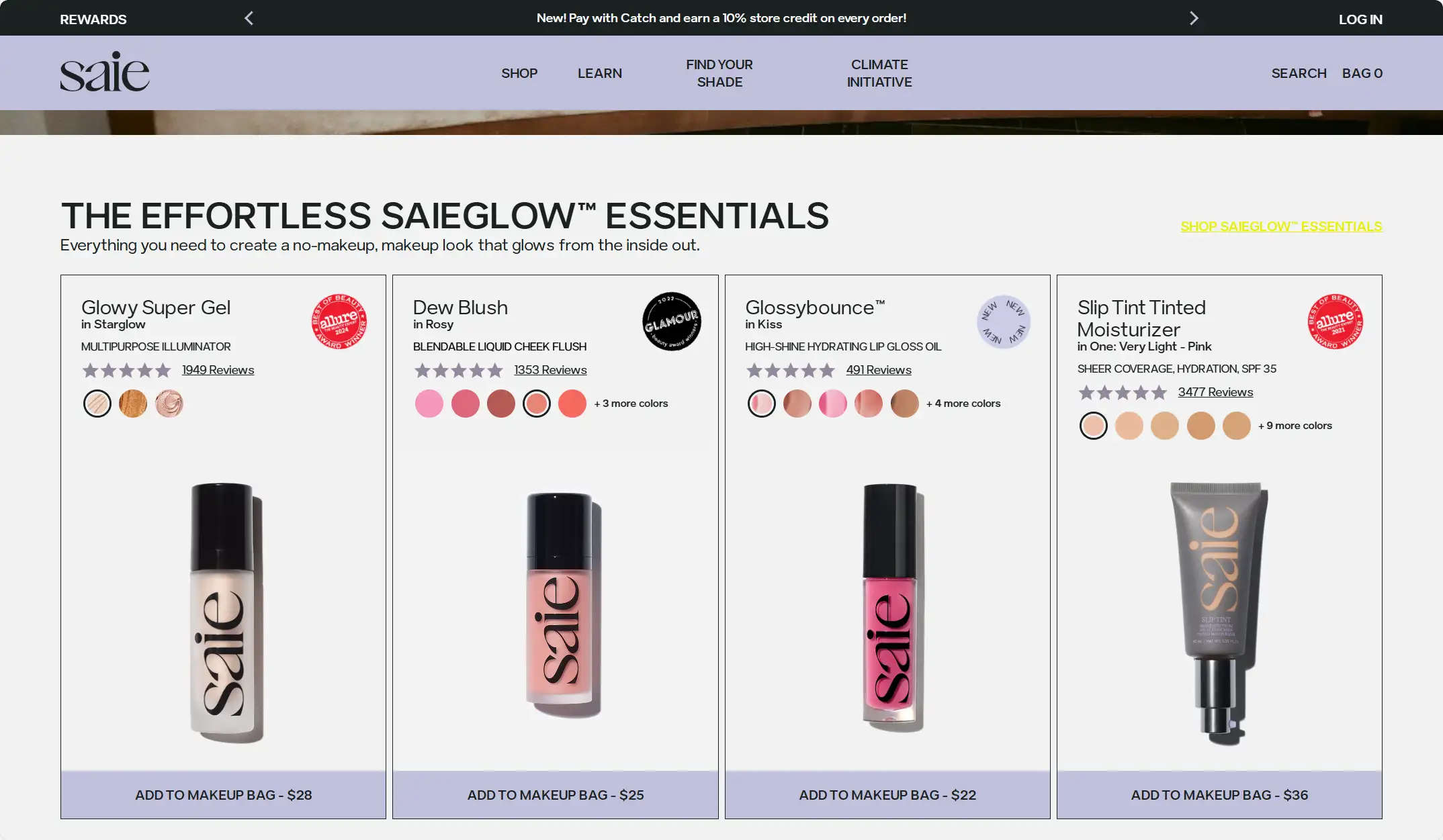
Saie creates high-quality, clean makeup products crafted with top-tier ingredients and inspired by customer feedback.
The startup website is an excellent example of a user-friendly cosmetic e-commerce platform. Upon entering the site, an engaging hero photo of a gorgeous woman reclining on a sofa immediately captures attention. Her striking eyes and glistening lips create a compelling visual experience for the target audience, effectively showcasing the brand’s promise of enhancing beauty through its makeup products.
As you scroll down, the site features various products with detailed information, such as reviews, colors, and prices. Each product’s color options are clearly labeled and creatively named, adding personality to the offerings. For instance, the Dew Blush comes in shades like Baby (pink), Sweetie (dark pink), and Cutie (brown). While defining each product isn't new, the website of the startup prominently highlights featured products on the homepage, making it easy for users to explore.
This startup website also helps customers identify their skintone with a category that ranges from very light to rich, using high-resolution images to demonstrate different shades. Users can then select their undertone and coverage preferences, which aids in personalized buying decisions.
Alongside its personalized design, the website stands out with its high-resolution images, well-crafted product descriptions, and convincing user videos showcasing the products' effectiveness and quality, providing a comprehensive and visually appealing shopping experience.
10.Supernatural
-
Visual Pleasure
-
Consistent Branding
-
Detailed Product Description
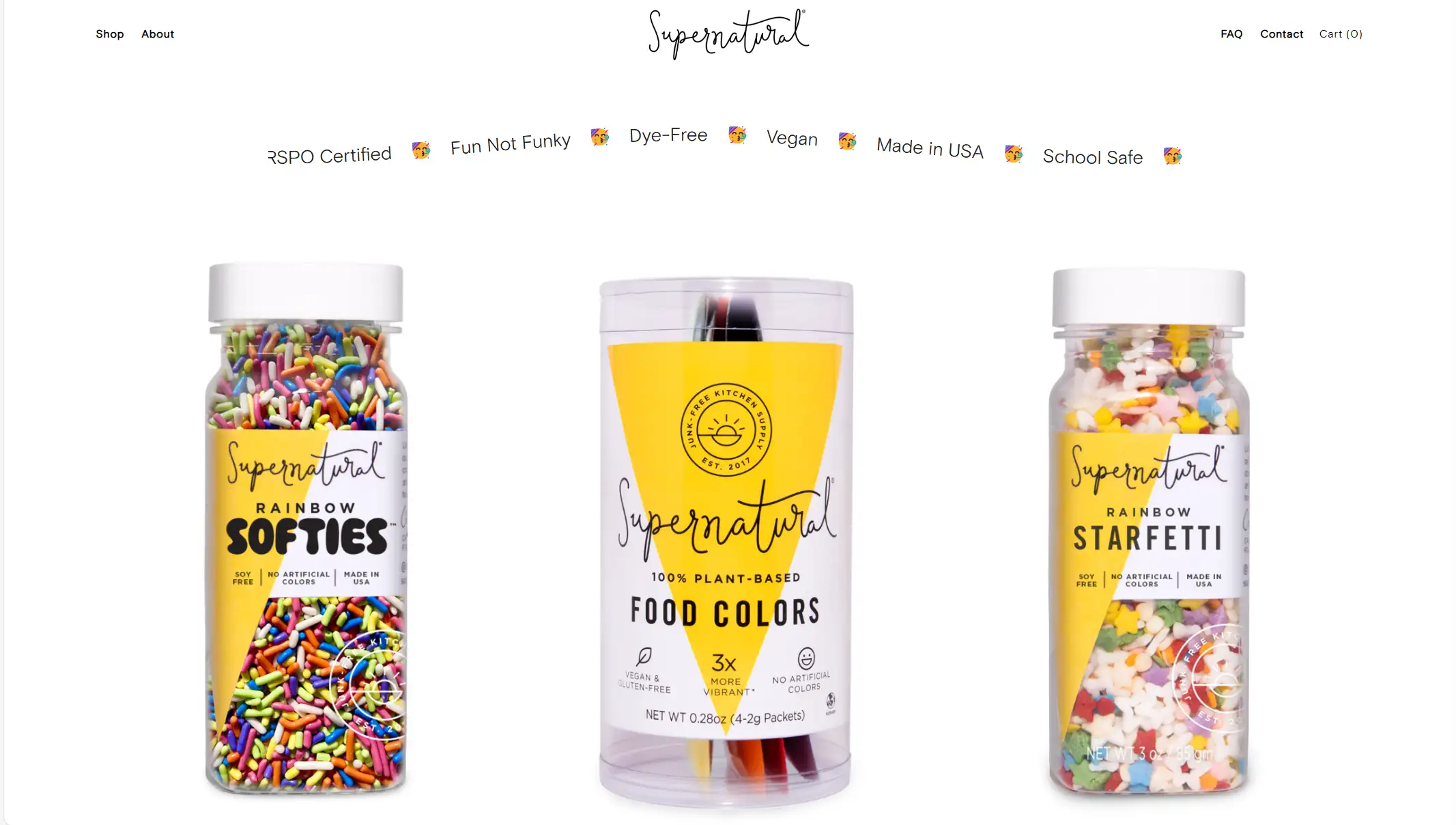
Supernatural brings more creativity to the kitchen with plant-based colors, free from controversial ingredients and confectioner’s glaze, making them allergy and animal-friendly.
The startup website offers an amazing visual experience with its bold and beautiful colors. The various shapes of sprinkles are adorable, adding a playful element to the site. Before visiting, many might not realize that baking ingredients could be so vibrant and visually engaging.
The website’s design is clean and simple, without an overload of text or CTA heroes. Instead, it emphasizes the display of each product, allowing the high contrast of the color scheme to highlight the brand’s unique features. The color scheme of the packaging and advertisements is carefully aligned to maintain consistent branding, while the use of warm colors evokes a sense of joy, enhancing the overall user experience as shoppers browse.
Product descriptions are tailored to each item, aiming to show not just what the ingredients look like, but also why and how they were created. This personalized approach makes customers feel valued by the brand. Furthermore, real reviews offer insights into customer satisfaction. For instance, reviews of Dinomite Sprinkles reveal that the dinosaur-shaped sprinkles are cute and highly appreciated by customers.
Overall, the high-resolution images, vibrant colors, and careful attention to detail create a captivating and enjoyable shopping experience.
Submit these inspirations to Wegic.ai to generate a high-quality startup website in 3 simple steps.
Feeling inspired by the stunning examples above? Act now and create a high-quality website for your startup in minutes—no tech expertise is needed! I highly recommend Wegic, the world’s first AI-powered web designer and developer. This free website builder is here to bring your vision to life effortlessly.
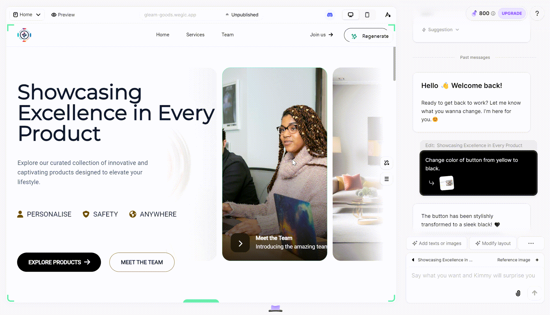
Step 1:
Start a conversation with Wegic by sharing your website preferences and design requirements. Wegic will guide you through the design process, offering recommendations and adjustments based on your feedback.
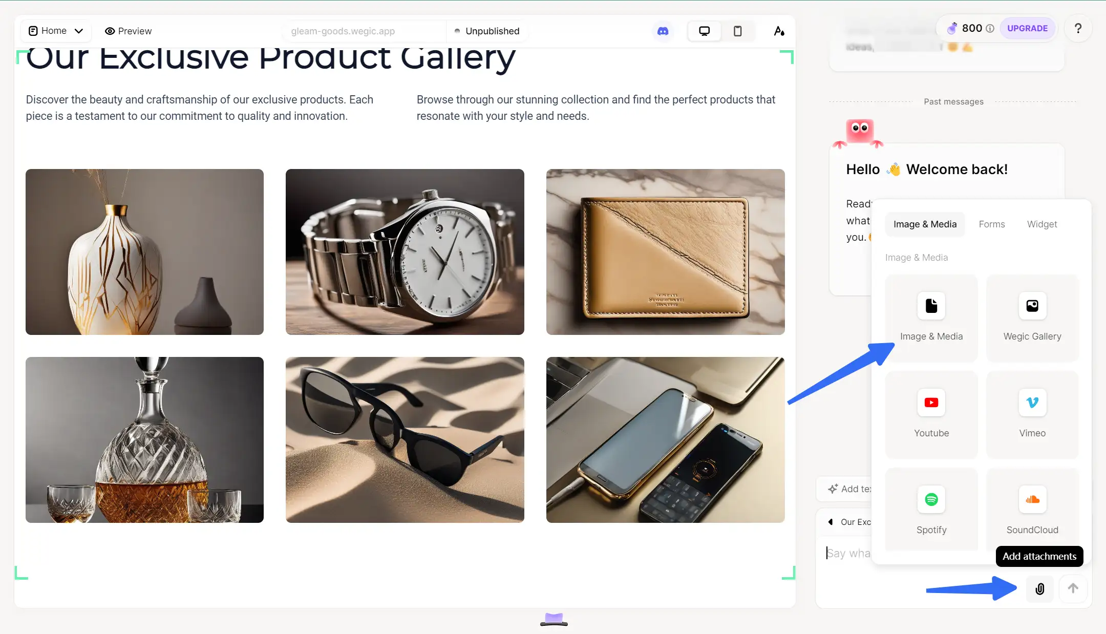
Step 2:
Click the "Add Attachment" icon and submit an image that visually represents your desired modifications. Wegic will then help you create a startup website that aligns with the reference style.
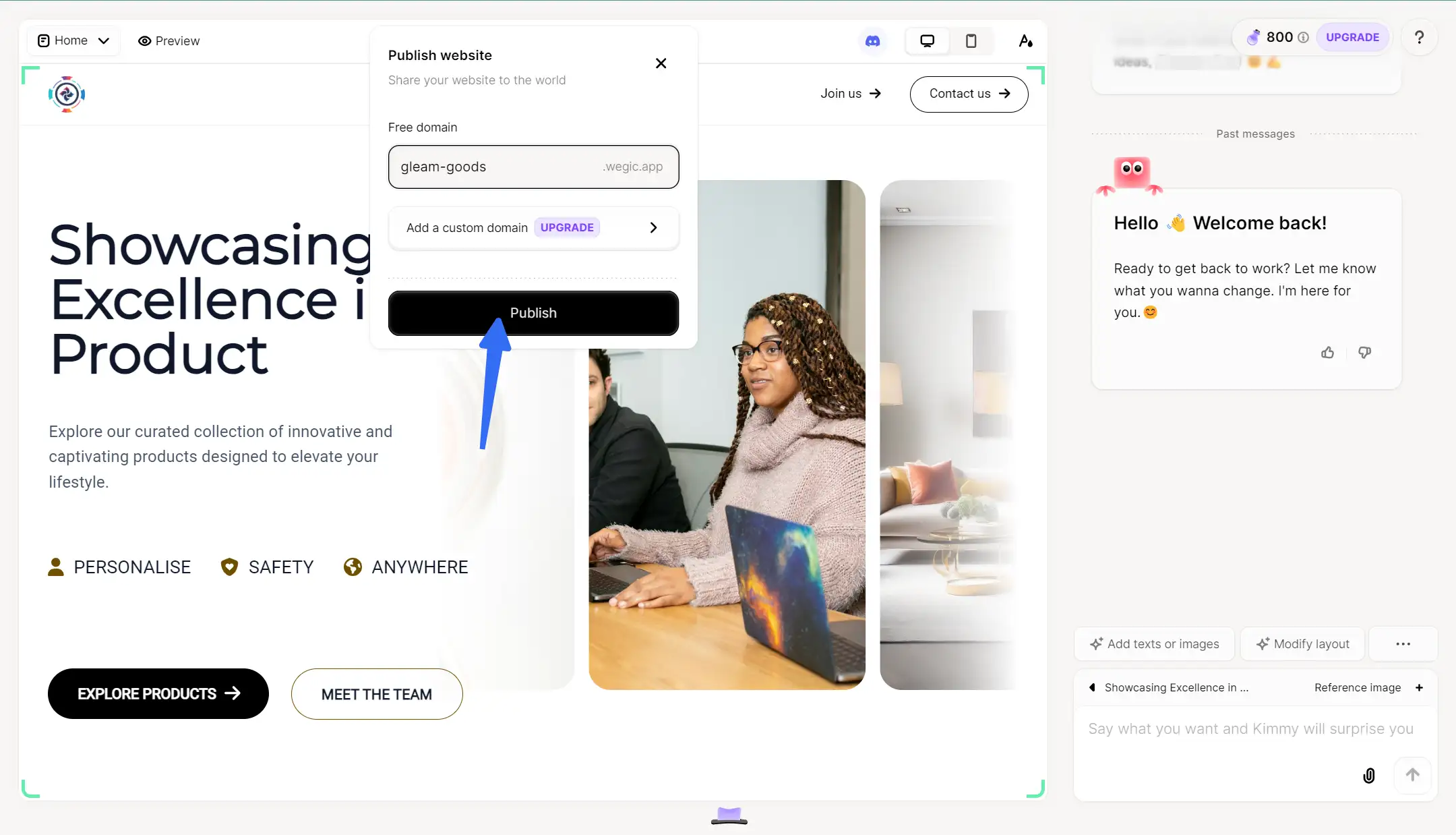
Step 3:
Once you're satisfied with the website design, Wegic makes it easy to publish your site, ensuring it’s readily accessible to your audience!
Conclusion
Learn from startup websites that you find interesting or inspirational—analyze and replicate what you like. Running a startup isn’t easy, but building an attractive website for your business doesn’t have to be hard. The best startup websites share a common formula: user-friendly navigation, eye-catching visuals, and strong branding. A solid website layout should prioritize user interface (UI) and user experience (UX) to create a seamless browsing experience for visitors.
If you want more information on how to build a website, the following links may help you well.
Written by
Kimmy
Published on
Mar 17, 2026
Share article
Read more
Our latest blog
Webpages in a minute, powered by Wegic!
With Wegic, transform your needs into stunning, functional websites with advanced AI
Free trial with Wegic, build your site in a click!
What kind of website do you want to build?