Log in
Build Your Site
HTML Header Tags: Key Concepts Explained
Learn the essentials of html header tags and how to structure your content for SEO and readability. Master html header usage with clear examples and tips.

I've spent a lot of time debugging websites and can tell you that figuring out the ins and outs of the header HTML will save you a lot of headaches later. Whether you're building your first website or trying to improve your SEO rankings, mastering these concepts will make your web development journey much smoother. The HTML heading tag is the foundation of every web page. It contains the basic information that browsers and search engines need to correctly demonstrate and understand the content.
Today, let’s take a closer look at the HTML header element and sort out everything you should know, from the most basic structure to cutting-edge managing techniques.
What is an HTML Header
The header HTML represents the introductory section of your webpage that contains metadata, navigation elements, and other essential information. Contrary to what many beginners think, the header HTML is not just the visible area at the top of the web page. It includes the top area of the document and the semantic header that everyone can see. When we talk about the HTML heading tag in the web creation process, it refers to two different but related concepts. The first is the
<head> section that contains metadata invisible to users but critical for browsers and search engines. The second one is that <header> tags are usually at the top of a web page, and involve things that can be seen directly, like logos, navigation menus, and introductory text. The HTML header element plays a vital role in website structure and user experience. Search engines rely heavily on information within the header HTML to understand your page content and determine how to rank it in search results. Users appreciate clearly structured HTML heading tags, which make it easier for them to navigate the site and find what they want faster. Understanding the differences between these HTML header concepts can help you build superior websites. They will rank higher in search engines and be more user-friendly. The header HTML sets the tone for your entire website. From the first second, a visitor enters the page. It impacts how they interact with the content.Key Elements of the Header HTML
The header HTML contains some critical parts that work together to create a functioning and search engine-friendly web page. Each HTML heading tag has its role and can help increase the total efficiency of your website.
-
Title Tag in HTML: This is one of the most key parts of your HTML head. The title tag appears in browser tabs and serves as the clickable headline in search engine results. A well-written title tag in HTML can significantly impact your click-through rates and search engine rankings. In HTML, the title tag in HTML of each page should be different. This tag should accurately describe the page's content using relevant keywords.
-
HTML Meta Keywords: This is another critical class that represents the HTML head component. The HTML meta keywords tag is not as essential as it used to be, but it still helps search engines better understand what your page is about. Today’s SEO techniques mainly underscore integrating keywords naturally into articles, rather than simply stuffing keywords into HTML meta tags.
-
Meta Description Tag: In the search results, the description meta tag in the HTML heading tags creates the snippet below the title. To put it simply, this header HTML component allows you to control how your web page is displayed in other people's search results. An eye-catching meta description can significantly enhance its click-through rates, even if the ranking position does not change.
-
Viewport Meta Tags: These codes are placed in the HTML head tag to make the website look superior on mobile phones and tablets. Mobile traffic now accounts for more than half of all web page views, so adding the appropriate viewport setting in the header HTML is particularly critical for user experience and SEO.
-
Link Tags: The header HTML also has link tags, which are used to add external resources like style sheets, fonts, and website icons to your web page. These HTML header elements are responsible for loading visual styling and branding elements, making your site look particular and professional.
What are the Header Tags in HTML
The HTML heading tag system provides a hierarchical structure for organising content on your webpage. There are six tags from H1 to H6. H1 is the most beneficial for SEO optimisation and visual effects, though H6 is the least critical among them.
-
H1 HTML Heading Tag: It should only appear once on each web page, usually with the homepage title or main keywords. The H1 HTML heading tag is used by search engines to identify the core topic of a web page, which is very critical for SEO success. The H1 HTML heading tag must be well written. It should immediately imply what the page is about and should contain relevant keywords.
-
H2-H6 HTML Heading Tag Elements: Turn these contents into subheadings, so that your article can be more easily digested and absorbed by everyone. Proper use of the HTML heading tag hierarchy will allow them to better understand how the content is organised, both for ordinary users and search engines. Each HTML heading tag level should be followed in order so that the outline of the page's topic is clear.
-
Accessibility Benefits: The HTML heading tag framework further improves accessibility for users of screen readers and other assistive technologies. These tools rely on the HTML heading tag component to allow for faster browsing of content on a page. When you follow the best practices for HTML heading labels, you can deliver a great experience to all your users, no matter how they browse the web.
-
SEO Impact: It carefully studies the arrangement of HTML heading tags to determine how relevant the content is to the search and what its quality is. Pages with a well-structured HTML heading tag hierarchy generally perform better in query results because they display clear organization and user-centered design principles.
How to Separate Header from Body in HTML

To make a clear separation between the header and body parts in an HTML document, you need to understand the semantic framework of the HTML document. Follow this step-by-step tutorial to put together the skeleton of your HTML document.
-
Step 1: Understand the Basic Structure
The header HTML component mainly contains introductory information, although the body tag in HTML contains the main page content. The body tag in HTML is such as an enormous box, which contains everything visible on the web page, except the content of the head part. Everything that users see and interact with on your web page is contained within the HTML body tag.
-
Step 2: Position Your HTML Header Element
Place the HTML head component directly after the beginning of the HTML body tag. This placement ensures that the header HTML stays firmly at the top of the page and is loaded before other content components are loaded. Your HTML document structure should look like this:
<body>
    <header>
        <!-- Your HTML header content goes here -->
    </header>
    <!-- Main content follows -->
</body>-
Step 3: Organise Content Within the Body Tag
The HTML body tag should involve the main content, navigation area, and finally conclude with footer information. This means that your header HTML, the main content area, the sidebar on the side, and the footer at the bottom should be arranged in a reliable order.
-
Step 4: Apply Visual Separation with CSS
To put it simply, CSS styling helps reinforce the visual separation between your header and the body tag in HTML content. You can make the header HTML and main content area look more distinct by adjusting the background colour, border, or spacing. This visual division makes the user experience superior and makes the website easier to navigate.
-
Step 5: Add the HTML Footer
The HTML footer is usually placed at the bottom of the body tag in the HTML content, and together with the HTML h1 at the top, it forms a balanced page layout. This configuration is similar to the regulation web page design that users usually see on the Internet and meets their expectations. HTML footer usually contains copyright information, how to contact the webmaster, and several less critical navigation links.
How to Centre a Header in HTML
To centre the header HTML area, you need to use a combination of HTML layout and CSS style approach. The most effective way to accurately align HTML heading content is to use the CSS flexbox or grid features.
Method 1: CSS Flexbox Approach
The flexbox technique used to centre the HTML header element is to set the display property to flex and then use the justify-content and align-items properties to achieve it. This approach works well for basic header element HTML, where you want to centre text, a logo, or a navigation bar within a header container.
<header style="display: flex; justify-content: center; align-items: center; height: 100px;">
    <h1>Your Website Title</h1>
</header>
Benefits of Flexbox for HTML Header Centring:
-
Perfect for single-line content centring.
-
It is suitable for displaying a line of text in the middle.
-
It can function as both text and block components.
-
It can automatically help adjust the alignment position up, down, left, and right.
-
The syntax should be straightforward enough so that people can understand it at a glance and use it right away.
Method 2: CSS Grid Approach
CSS Grid is also great for centring HTML heading tag content, especially when you have complex typography with lots of small blocks. The grid layout is a great trick. It allows the HTML header elements to be placed precisely in the desired position, and it can run steadily no matter what the screen size becomes.
header {
    display: grid;
    place-items: center;
    height: 100px;
}
Benefits of CSS Grid for Header HTML Centring:
-
It can effectively solve various complex layouts and layout problems of multiple modules.
-
It is capable of providing precise positioning control.
-
It automates responsive design.
-
It is especially useful for making complex HTML heading designs.
Method 3: Text-Align Centre
Text-align centre can align the text content of the HTML title to the centre, but it cannot adjust the position of block-level elements like divs or images. To centre all HTML headings, regardless of component type, it would be more reliable to use flexbox or grid techniques.
header {
    text-align: center;
    padding: 20px 0;
}
When to Use Text-Align for Header HTML:
-
Simple text title.
-
Basic layout solution.
-
In the HTML head, shift the inline components to the centre.
Responsive Design Considerations
Responsive design considerations become important when centring HTML header elements across different device sizes. The centring strategy should apply to devices like desktop computers, tablets, and smartphones. They should work properly on various platforms to offer users a unified user experience.
Key Responsive Tips for Header HTML Centring:
-
You can try the HTML title on various screen sizes to see how it works.
-
It is best to use relative units instead of fixed pixels.
-
You should make sure your header HTML works properly on mobile devices like mobile phones.
-
Use media queries to adjust the display effects for different devices when necessary.
How to Centre a Header Image in HTML in WordPress
WordPress provides some ways to centre the header HTML image. It can be adjusted using the custom settings in the theme or directly using CSS code. Which strategy you choose will depend on the capabilities of your WordPress theme and your familiarity with the technology.
Method 1: Using WordPress Theme Customizer
Most modern WordPress themes now have built-in options in the customizer interface to align the header image. This trick is pretty easy for most people to use.
Steps to Centre Your Header HTML Image:
-
Go to your WordPress dashboard
-
Navigate to Appearance > Customise > Header
-
Look for alignment or positioning options
-
Select "Centre" for your header HTML image alignment
-
Click "Publish" to save your changes
Benefits: It does not require writing code, can highlight the theme more accurately, and provides an immediate preview of changes.
Method 2: Custom CSS Implementation
In templates that don't have built-in centring functionality, custom CSS provides a reliable solution for HTML heading image positioning. You can insert CSS scripts by using Appearance > Customise > Additional CSS, or use a child theme stylesheet to ensure that your changes persist through theme updates.
.site-header img {
    display: block;
    margin: 0 auto;
    max-width: 100%;
    height: auto;
}
Steps to Add Custom CSS:
-
Go to Appearance > Customise > Additional CSS.
-
Paste the CSS code above.
-
Adjust the selector (.site-header img) to match your theme's HTML structure.
-
Preview your changes before publishing.
-
Click "Publish" to make changes live.
Benefits: Functions allow you to add a variety of templates, giving you full control over the page layout, and as long as they are added in the right place, they will not be overwritten when the theme is updated.
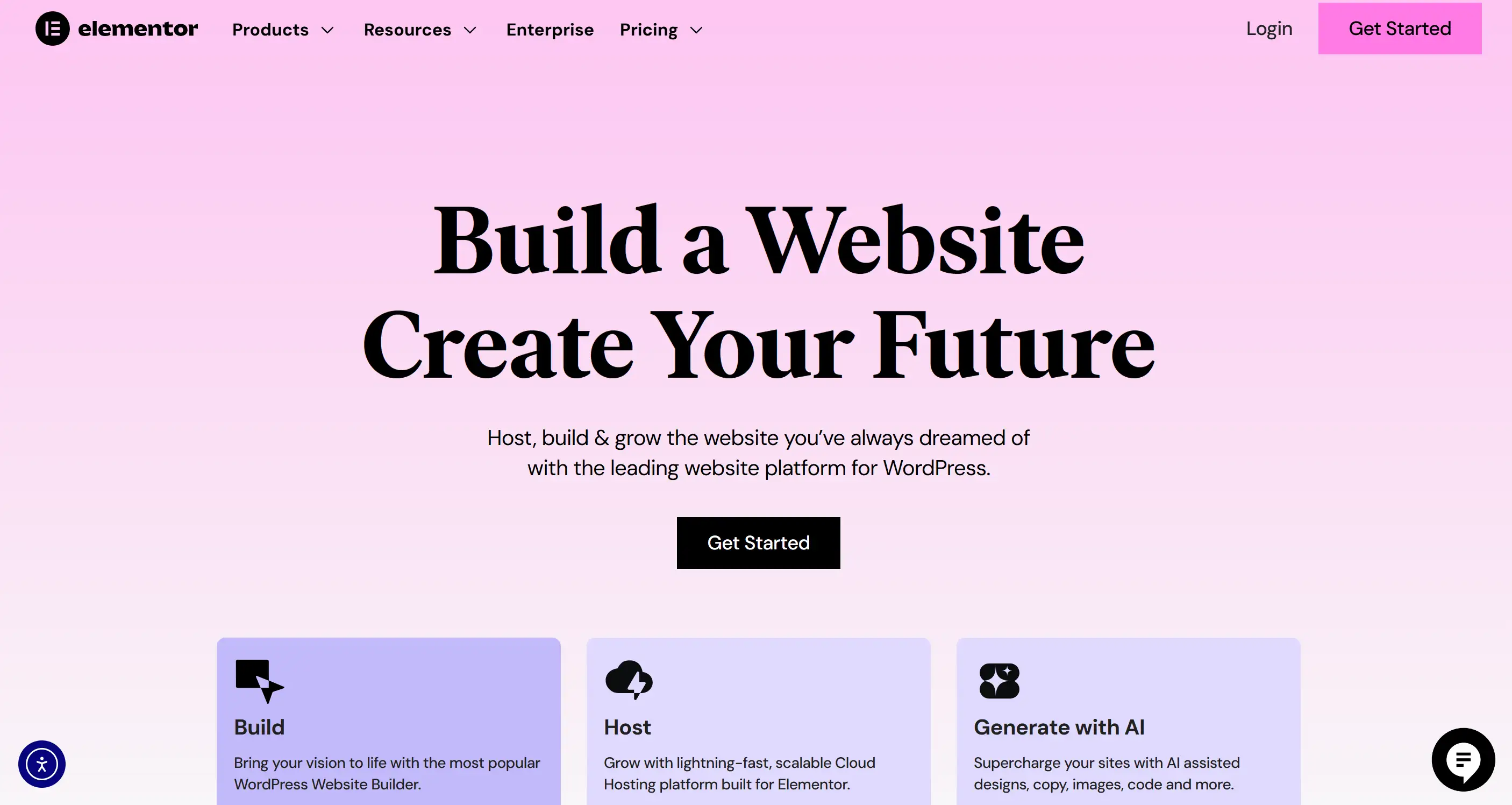
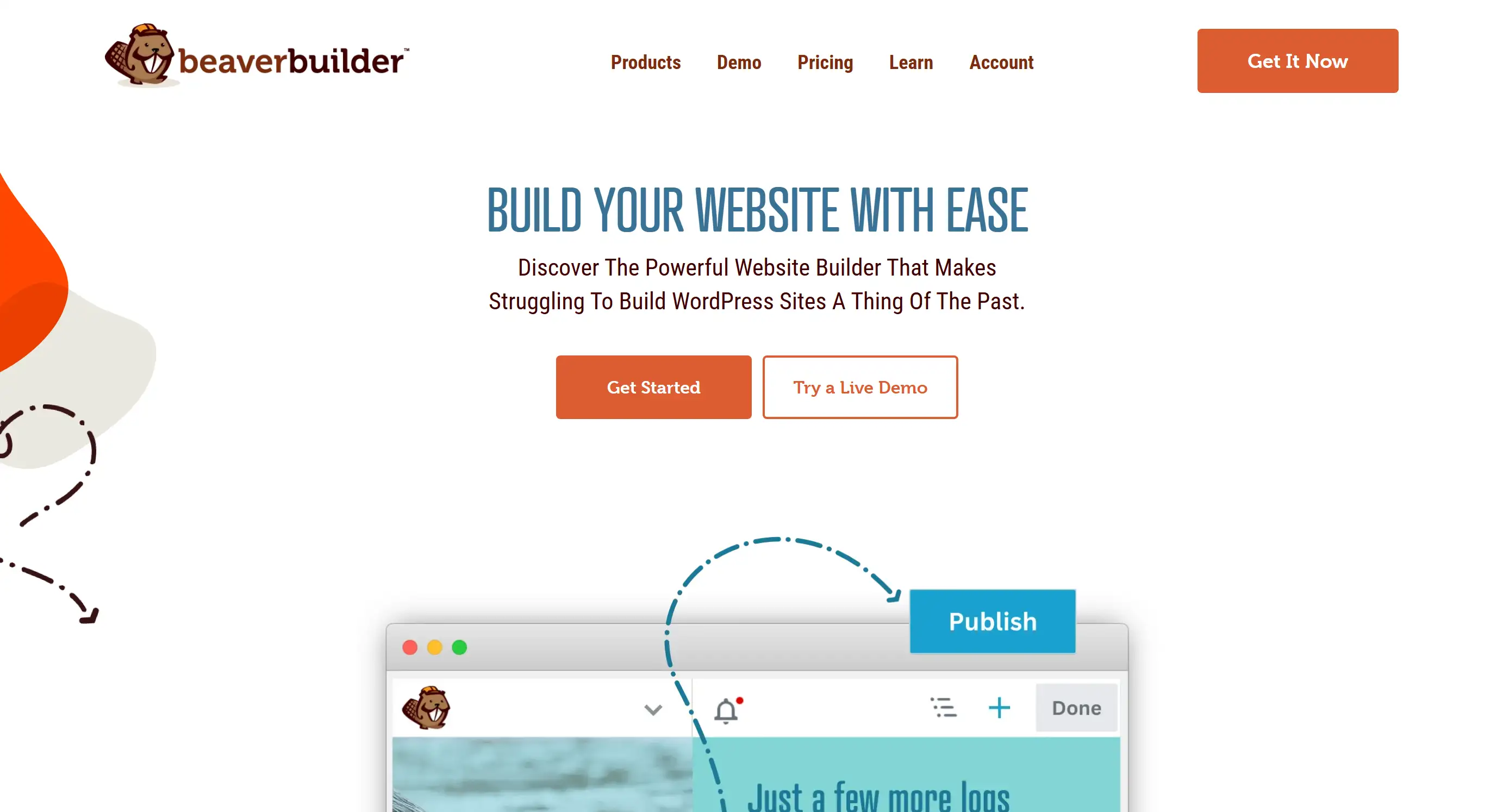
Method 3: Page Builder Solutions
Elementor, Divi, and Beaver Builder, page building tools specifically for WordPress, allow users to drag and drop images in the centre of the HTML page header. These tools offer drag-and-drop functionality, making it easy for users without programming expertise to customise the header HTML.
Popular Page Builders for Header HTML Design:
-
Elementor: It has free and pro versions available, and an intuitive interface.
-
Divi: It is part of Elegant Themes, with comprehensive design options.

-
Beaver Builder: It is user-friendly with excellent responsive controls.
Benefits: Graphic editing does not require writing code, providing a variety of personalisation options and automatic adjustment of design management.
WordPress-Specific Considerations
WordPress’ media library automatically generates multiple image sizes, which can help increase your HTML header image for different devices. Choose an appropriate image size so that it is easy to align and does not load too slowly or use too much data.
Recommended Header HTML Image Sizes:
-
Desktop: 1920px × 400-600px
-
Tablet: 1024px × 300-400px
-
Mobile: 768px × 200-300px
Pro Tips for WordPress Header HTML Images:
-
Always use high-quality images that compress very well.
-
Before publishing, remember to check the header HTML on various devices.
-
Consider how page loading speed affects the performance of your website.
-
Use WebP format whenever possible, as it provides the best compression results.
How to Make a Header Follow Scroll HTML
Creating sticky or fixed HTML tags that follow the user's scroll requires the use of CSS positioning properties and careful consideration of page layout and user experience components. It keeps critical navigation bars and brand logos in sight as users scroll up and down on long pages.
Method 1: CSS Fixed Position
The CSS position fixed property can turn the header HTML into a floating component, which will always be fixed in the same position on the screen and will not shift, no matter how the page is scrolled. This strategy works well in HTML heading tags, especially when they include critical navigation or contact information that users may need to find quickly.
CSS Code for Fixed Header in HTML:
header {
    position: fixed;
    top: 0;
    left: 0;
    width: 100%;
    z-index: 1000;
    background-color: white;
    border-bottom: 1px solid #ccc;
}
How This CSS Works:
-
position: fixed- It makes the HTML h1 stick to the viewport -
top: 0- It positions the HTML heading tag at the very top -
width: 100%- It ensures the header in HTML spans the full width -
z-index: 1000- It places the HTML header above other content
Method 2: JavaScript Solutions
The JavaScript solution provides a more complex sticky HTML header functionality where the header appears and disappears based on the scroll direction or position. These dynamic HTML head actions can make the interface look cleaner and allow people to find navigation easily, which can greatly enhance the user experience.
Benefits of JavaScript HTML Headings Control:
-
When you scroll down, the title hides; when you scroll up, the title pops up again.
-
Adjust the style of the HTML heading tags according to the scroll position.
-
It uses smooth animations and transitions that look natural.
-
Come up with more powerful ways to interact with users.
Important Implementation Considerations
Z-Index Management
The z-index property allows your fixed HTML title to always appear above other page content components. Set a greater z-index value for the header HTML so that when the user scrolls the page, other components will not appear on top of the header.
Recommended Z-Index Values:
-
Basic header: z-index: 100
-
Header with dropdowns: z-index: 1000
-
Complex layouts: z-index: 9999
Content Spacing Adjustment
Remember to add a top margin, either padding or margin, to the main content area that is as high as the HTML h1. This way, users won’t be annoyed by the sticky HTML heading tag blocking the beginning of the page content, nor will it affect the usability of the website.
body {
    padding-top: 80px; /* Adjust based on your HTML header height */
}
Mobile Optimisation for Sticky Headers
When implementing the sticky HTML heading tag feature, it is especially critical to think flexibly. Mobile screens don’t have much vertical space, so it’s best to think of ways to make the HTML heading tag smaller or use a collapsible navigation menu so that more content can be displayed on a small screen.
Mobile-Friendly HTML Header Strategies:
-
Reduce Height: Use smaller HTML heading tag dimensions to save more space on mobile phones.
-
Collapsible Menus: Save space with a hamburger menu so the menu collapses.
-
Auto-Hide: Let the header HTML disappear automatically when scrolling down the page to achieve a hidden effect.
-
Simplified Design: To make the design simpler, remove the less critical things on the small screen.
Example Mobile CSS:
@media (max-width: 768px) {
    header {
        height: 60px; /* Smaller height for mobile */
    }

    body {
        padding-top: 60px; /* Adjust body padding accordingly */
    }
}
Ready to Put Your HTML Header Knowledge to Work?
Now that you have figured out the HTML heading tags, you might want to try out the entire website yourself, but when you think about writing so much code, do you feel overwhelmed? Wouldn’t it be great if there were a way to create professional-looking websites without having to spend hours messing around with header code in HTML?
Meet Wegic, a powerful AI-powered website builder that is completely changing the way we build websites. Just talk to Wegic about the website concept, no need to spend days memorising HTML codes and debugging CSS. Think of it as having a conversation with a web developer who happens to be brilliant at web design.

What makes you happiest? Wegic is not only a master at writing code, but also will not leave you with any questions. It creates an amazing website experience that takes care of everything, large and small, from HTML header optimisation to perfect display on various devices, all driven by excellent AI and a natural conversational method. Whether you want to create a personal portfolio, an e-commerce website, or produce a unique wedding website, Wegic makes the whole process simple and easy, just like chatting with a good friend who knows a lot about website development.
Written by
Kimmy
Published on
Mar 17, 2026
Share article
Read more
Our latest blog
Webpages in a minute, powered by Wegic!
With Wegic, transform your needs into stunning, functional websites with advanced AI
Free trial with Wegic, build your site in a click!
What kind of website do you want to build?