Log in
Build Your Site
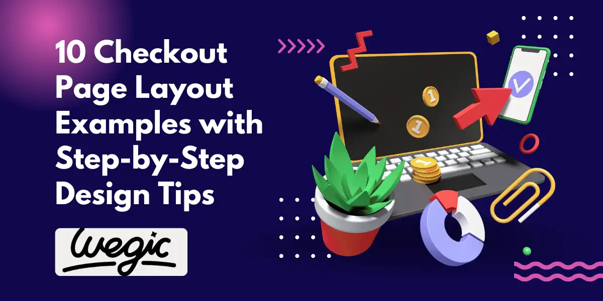
10 Checkout Page Layout Examples with Step-by-Step Design Tips
Discover 10 powerful checkout page layout examples with design tips to reduce cart abandonment and boost conversions. Learn how to create a secure checkout experience.

The checkout page stands as the ultimate gatekeeper in the e-commerce realm. It's the critical juncture where browsing transitions into tangible sales, and where potential revenue either materializes or vanishes into the abyss of cart abandonment. Startling statistics consistently highlight the significant percentage of online shoppers who abandon their carts before completing a purchase. This often isn't due to a lack of interest in the products themselves, but rather friction and frustration encountered during the final checkout process. A poorly designed checkout page can erode all the hard work invested in attracting customers and curating their shopping experience.
This comprehensive article delves into ten distinct checkout page layout sample designs, offering step-by-step design tips for each. Our goal is to equip e-commerce business owners, website developers, and UX/UI designers with the knowledge and inspiration needed to optimize this crucial stage of the customer journey. By understanding the nuances of different layouts and implementing checkout page best practices, businesses can significantly improve their conversion rates, enhance user experience, and ultimately reduce the costly issue of cart abandonment. Let's explore how the strategic implementation of various e-commerce checkout design principles can transform your checkout from a point of friction to a seamless and conversion-driving experience.
The Critical Role of Your Checkout Page
The checkout page is more than just a form asking for payment details; it's the culmination of the entire online shopping experience. It's where trust is either solidified or broken, and where the final decision to purchase is made. A well-optimized checkout flow ensures that this final step is intuitive, secure, and hassle-free for the user. Understanding the key elements and fundamental principles of effective checkout design is paramount to achieving this.
A typical checkout page comprises several essential components, including:
-
Shipping Information: Where customers provide their delivery address.
-
Billing Details: The address associated with their payment method.
-
Payment Options: The various ways customers can pay for their order.
-
Order Summary: A clear overview of the items selected, quantities, and total cost.
-
Contact Information: Typically an email address for order confirmation and updates.
-
Optional Account Creation: An opportunity for customers to create an account for future purchases.
-
Promotional Code/Gift Card Input: Fields for applying discounts.
-
Call to Action: The final button to submit the order (e.g., "Place Order," "Complete Purchase").
Effective checkout usability hinges on several core principles:
-
Clarity: All information should be presented in a clear and easy-to-understand manner. Labels should be concise, and instructions should be minimal.
-
Simplicity: Minimize the number of form fields and steps required to complete the purchase. Only ask for essential information.
-
Trust: Build confidence by displaying security badges, clear return policies, and transparent pricing.
-
Efficiency: The process should be quick and seamless, allowing users to complete their purchase without unnecessary delays or distractions.
-
Mobile-Friendliness: With a significant portion of online shopping occurring on mobile devices, ensuring smooth and responsive mobile checkout optimization is crucial.
By prioritizing these principles and strategically choosing the right checkout page layout sample, businesses can create a checkout experience that encourages completion and fosters customer satisfaction.
10 Checkout Page Layout Examples with Step-by-Step Design Tips
Let's delve into ten distinct checkout page layout sample designs, each with its own set of characteristics, advantages, and design considerations.
Single-Page Checkout Layout
The single-page checkout layout presents all the necessary checkout steps on one continuous page. Users can scroll through the different sections to enter their information and complete their purchase.
Design Tips:
-
Clear Visual Hierarchy: Utilize headings, subheadings, and visual cues to clearly delineate different sections (shipping, billing, payment, order summary). This improves scannability.
-
Progress Indicator: Even though it's a single page, a subtle progress bar at the top can provide a sense of how far along the user is.
-
Collapsible Sections: For users with smaller screens, consider making sections collapsible to reduce the initial visual clutter.
-
Inline Validation: Provide immediate feedback as users fill out form fields to prevent errors and frustration.
-
Prominent Order Summary: Keep the order summary visible throughout the process, ideally in a fixed sidebar on desktop or at the bottom on mobile.
Advantages: Can feel faster for users as all steps are immediately accessible. Reduces the number of page loads.
Disadvantages: Can appear overwhelming if there are many form fields. May lead to longer initial load times.
Best For: Businesses with relatively straightforward checkout processes and fewer required fields.
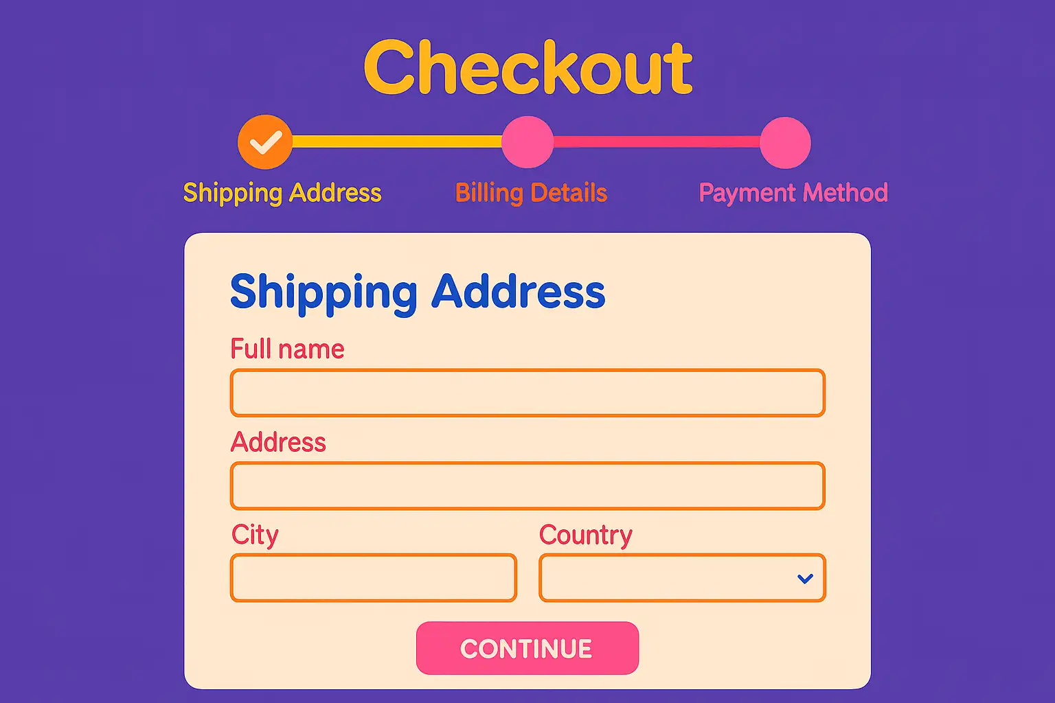
Multi-Step Checkout Layout
The multi-step checkout layout breaks down the process into a series of distinct pages. Users navigate through these steps sequentially to complete their purchase.
Design Tips:
-
Clear Progress Indicator: A prominent progress bar with clear labels for each step (e.g., "Shipping," "Billing," "Payment," "Review") is essential.
-
Logical Flow: Organize the steps in a logical and intuitive order. Typically, shipping information precedes billing and payment.
-
Back Button: Allow users to easily navigate back to previous steps to review or edit their information.
-
Step-by-Step Guidance: Provide clear instructions or hints on each page to guide users through the required fields.
-
Reinforce Security: Display trust badges on each step to reassure users about the security of their information.
Advantages: Can feel less overwhelmed as users focus on one set of information at a time. Allows for more complex checkout flows.
Disadvantages: Multiple page loads can sometimes feel slower. Users might abandon the process if they perceive too many steps.
Best For: Businesses with more complex checkout processes, such as those involving multiple shipping options or detailed customization.
Sidebar Summary Layout
The sidebar summary layout features the checkout form on the main part of the page and a persistent sidebar displaying the order summary, including items, subtotal, shipping costs, and taxes.
Design Tips:
-
Fixed Sidebar: Ensure the sidebar remains visible as the user scrolls through the checkout form, especially on desktop.
-
Dynamic Updates: Update the order summary in real-time as the user makes changes (e.g., selecting a different shipping method).
-
Clear Breakdown: Present a clear and itemized breakdown of the order costs.
-
Prominent Call to Action: The "Place Order" button should be clearly visible below the order summary.
-
Mobile Optimization: On mobile, the sidebar typically collapses or appears at the bottom to maintain screen real estate.
Advantages: Provides constant visibility of the order details, reducing surprises and increasing transparency.
Disadvantages: Can take up valuable screen space on smaller devices if not implemented carefully.
Best For: E-commerce stores where customers often want to review their order details frequently during checkout.
Minimalist Layout
The minimalist checkout page layout sample focuses on reducing visual clutter and distractions, presenting only the essential form fields and information needed to complete the purchase.
Design Tips:
-
Ample White Space: Utilize plenty of negative space to create a clean and uncluttered feel.
-
Simplified Navigation: Remove unnecessary navigation elements that might distract the user.
-
Clear Typography: Use legible fonts and a consistent visual style.
-
Focused Call to Action: Make the "Place Order" button the most prominent element on the page.
-
Streamlined Forms: Only include essential form fields. Consider using autofill options where appropriate.
Advantages: Can improve focus and reduce cognitive load, leading to a faster and smoother checkout experience.
Disadvantages: Might not be suitable for very complex checkout processes that require more information.
Best For: Brands with a clean and modern aesthetic, and products with straightforward purchasing processes.
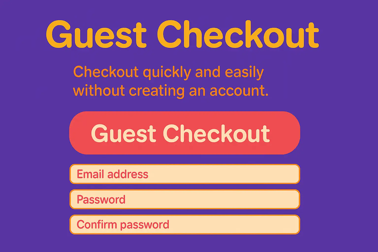
Guest Checkout Focused Layout
This layout prioritizes the guest checkout option, making it the most prominent choice for users who don't want to create an account.
Design Tips:
-
Prominent Guest Checkout Button: Position the guest checkout button above or alongside the login/registration options and make it visually distinct.
-
Delayed Account Creation: Offer account creation as an option after the purchase is complete, highlighting its benefits (e.g., order tracking, faster future checkouts).
-
Minimal Information Request: For guest checkout, only ask for the absolutely necessary information to complete the order.
-
Clear Benefits of Account Creation: If offering post-purchase account creation, clearly articulate the advantages to the user.
-
Streamlined Guest Forms: Ensure the guest checkout forms are short and easy to complete.
Advantages: Reduces friction for first-time buyers who may be hesitant to create an account. Can lead to higher conversion rates.
Disadvantages: Might result in fewer registered users, potentially impacting long-term customer engagement.
Best For: E-commerce stores targeting a large number of first-time buyers or those selling products where repeat purchases are less frequent.
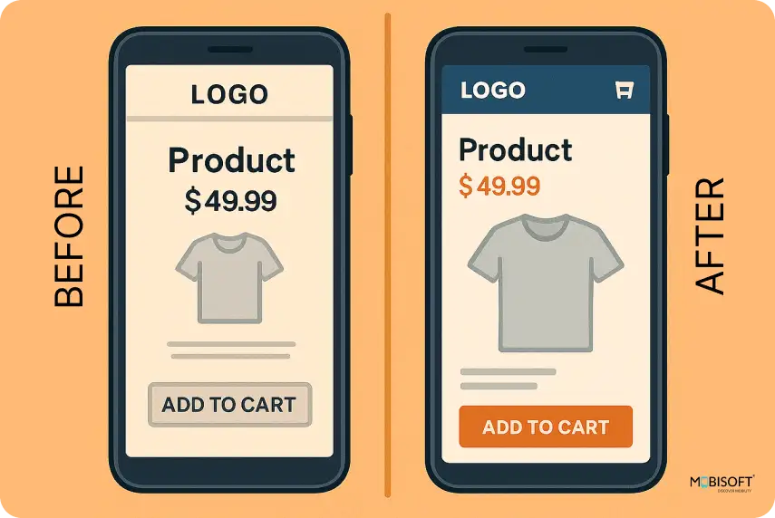
Mobile-Optimized Layout
With the increasing prevalence of mobile shopping, a dedicated mobile checkout optimization is crucial. This layout is specifically designed for smaller screens and touch interactions.
Design Tips:
-
Vertical Layout: Utilize a single-column layout for easy scrolling on mobile devices.
-
Large Touch Targets: Ensure buttons and form fields are large enough to be easily tapped on touchscreens.
-
Minimized Data Entry: Use features like address autocomplete and saved payment information to reduce typing.
-
Clear and Concise Labels: Keep form field labels short and easy to understand. Consider using placeholder text as hints.
-
Progressive Disclosure: Break down long forms into smaller, manageable sections.
Advantages: Provides a seamless and user-friendly experience for mobile shoppers, reducing mobile checkout optimisation-related cart abandonment.
Disadvantages: Requires careful planning to present all necessary information effectively within limited screen space.
Best For: All e-commerce businesses, as a significant portion of traffic and sales likely originates from mobile devices.
Trust-Building Layout
This layout strategically incorporates trust signals checkout throughout the process to reassure users about the security and legitimacy of the transaction.
Design Tips:
-
Prominent Security Badges: Display recognized security badges (e.g., SSL certificates, payment gateway logos) near the payment information section.
-
Secure Connection Indicators: Visually indicate a secure connection (e.g., a padlock icon in the browser address bar).
-
Clear Return and Privacy Policies: Provide easy access to your return and privacy policies.
-
Customer Testimonials or Reviews: Consider including brief positive testimonials or reviews related to the checkout experience.
-
Contact Information: Make it easy for users to find your contact information if they have questions or concerns.
Advantages: Increases customer confidence and reduces anxiety about submitting sensitive information, leading to higher conversion rates.
Disadvantages: Overuse of trust signals can sometimes appear cluttered if not implemented tastefully.
Best For: All e-commerce businesses, especially those dealing with sensitive customer data or higher-value transactions.

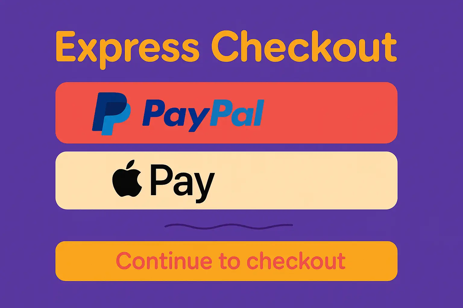
Express Checkout Layout
The express checkout page layout sample offers a streamlined way for returning customers or those using specific payment platforms (e.g., PayPal, Apple Pay) to complete their purchase quickly.
Design Tips:
-
Prominent Express Checkout Buttons: Display express checkout options clearly on the cart page and the checkout page.
-
Seamless Integration: Ensure a smooth and efficient integration with the chosen express checkout platforms.
-
Pre-filled Information: Leverage stored information from the express checkout platform to minimize the need for manual data entry.
-
Clear Communication: Inform users about the information being shared with the express checkout provider.
-
Fallback Options: Always provide standard checkout options for users who don't want to use express checkout.
Advantages: Significantly speeds up the checkout process for eligible users, improving convenience and conversion rates.
Disadvantages: Requires integration with specific payment platforms. Might not be suitable for all customers.
Best For: E-commerce stores with a significant number of repeat customers or those targeting users who commonly use express payment methods.
Coupon Code Integration Layout
This layout focuses on the strategic placement and integration of the coupon code field to encourage usage without distracting users who don't have a code.
Design Tips:
-
Discreet Placement: Position the coupon code field in a less prominent location, such as below the order summary or as a collapsible section.
-
Clear Labeling: Use clear and concise labeling for the coupon code field (e.g., "Enter Promo Code").
-
Easy Application: Ensure the coupon code can be easily applied with a clear "Apply" button.
-
Success/Error Messaging: Provide clear feedback to the user when a coupon code is successfully applied or is invalid.
-
Avoid Auto-Application: Generally, avoid automatically applying coupon codes as it can confuse users.
Advantages: Allows users with coupons to easily apply them without cluttering the checkout process for others.
Disadvantages: If the field is too hidden, some users might miss the opportunity to use a coupon.
Best For: E-commerce stores that frequently offer discounts and promotions through coupon codes.
Accessibility-Focused Layout
An accessibility-focused layout ensures that the checkout process is usable by individuals with disabilities, adhering to accessibility guidelines (e.g., WCAG).
Design Tips:
-
Semantic HTML: Use semantic HTML elements to structure the content logically for screen readers.
-
Keyboard Navigation: Ensure all interactive elements can be accessed and operated using a keyboard.
-
Sufficient Color Contrast: Maintain adequate color contrast between text and background for users with low vision.
-
Clear Form Labels: Associate form labels correctly with their input fields for screen reader users.
-
Alternative Text for Images: Provide descriptive alt text for all images.
-
Error Handling: Implement clear and accessible error messages for invalid form inputs.
Advantages: Improves usability for a wider audience, including individuals with disabilities, and can also benefit all users.
Disadvantages: Requires careful attention to detail during the design and development process.
Best For: All e-commerce businesses, as accessibility is a crucial aspect of user experience and inclusivity.
Common Mistakes to Avoid in Checkout Page Design
Even with many checkout page layout samples to get inspired, certain common mistakes can sabotage your conversion rates and lead to reduced cart abandonment. Avoiding these pitfalls is crucial for optimizing your checkout flow.
-
Cluttered and Overloaded Design: Presenting too much information or too many options can overwhelm users and distract them from completing their purchase. Keep the design clean and focused.
-
Lack of Clear Visual Hierarchy: Without a clear visual hierarchy, users can struggle to understand the flow of information and identify the next steps. Use size, color, and spacing to guide their eye.
-
Ignoring Mobile Optimization: A checkout page that isn't properly optimized for mobile devices will lead to frustration and abandonment among mobile shoppers.
-
Forcing Account Creation: Requiring users to create an account before they can make a purchase adds unnecessary friction, especially for first-time buyers. Offer a guest checkout option.
-
Hiding or Misplacing Coupon Code Fields: If the coupon code field is difficult to find, users with valid codes might miss it, leading to dissatisfaction. Place it logically and make it easily accessible.
-
Poor Trust and Security Signals: A lack of visible security badges or clear indications of a secure connection can make users hesitant to enter their payment information.
-
Using Low-Quality Images or Visuals: Poor quality images or a visually unappealing design can erode trust and professionalism.
-
Ignoring Accessibility: Failing to design an accessible checkout page excludes a significant portion of potential customers.
-
Not Providing Progress Indicators in Multi-Step Checkouts: Without a clear progress indicator, users in a multi-step checkout might feel lost or unsure how many steps remain.
-
Failing to Test and Customize Layouts: A one-size-fits-all approach rarely works. Regularly testing different layouts and customizing the checkout flow based on user behavior is essential.
Optimizing Your Checkout Flow: Key Takeaways
Optimizing your checkout page is an ongoing process that requires attention to detail and a deep understanding of your customers' needs and behaviors. By carefully considering different checkout page layout sample designs and implementing checkout page best practices, you can create a seamless and efficient experience that minimizes cart abandonment and maximizes conversions.
Remember the importance of clarity, simplicity, trust, and mobile checkout optimization. Avoid common pitfalls like cluttered design and forced account creation. Embrace user-friendly checkout principles and always prioritize the needs of your customers.
Struggling with cart abandonment? Learn how top-performing sites design frictionless, secure, and user-friendly checkout flows. Upgrade Your Checkout Flow with Wegic AI builder!
Written by
Kimmy
Published on
Mar 17, 2026
Share article
Read more
Our latest blog
Webpages in a minute, powered by Wegic!
With Wegic, transform your needs into stunning, functional websites with advanced AI
Free trial with Wegic, build your site in a click!
What kind of website do you want to build?