Log in
Build Your Site
Mobile Website Design Tips for Intuitive Navigation
Master mobile website design with expert tips for intuitive navigation. Explore best practices, templates, and tools like Figma to boost user engagement and conversions.

In this digital age, it is very important to create an intuitive and user-friendly navigation system. If your website menu is cluttered and the buttons are hard to find, users will usually stop clicking on your website within seconds. They will definitely choose to find a better and more trustworthy alternative website.
So, what is effective navigation? This must include a well-structured website navigation menu, which not only improves the user experience, but also plays a vital role in SEO optimization, thereby increasing your website's traffic and conversion rate. So, how should it be done specifically? This article can provide you with valuable navigation design guidelines and tips to meet your mobile website design needs. Let's get started together.

What is website navigation?
Mobile website design directly impacts user engagement and revenue. Website navigation refers to the system that allows users to easily navigate through the sections and pages of a website. It includes menus, hyperlinks, buttons, and other modules that facilitate users ' interaction with the website content. Effective website navigation can give users a good experience and allow them to quickly and intuitively access the content they want to see. Another benefit of a well-structured website navigation structure is that it helps users find information easily without much effort.
A typical website navigation system includes many additional features. The first-level navigation consists of the main menu, which is usually located at the top of the web page and provides direct links to the most critical parts of the website, such as the "Home", "About", "Services and Contact" pages. Secondary navigation consists of submenus, sidebar links, and footer links, which provide more links to more specific content for users to find.
6 Essential Mobile Design Strategies
1. Prioritize layouts that are thumb-friendly
Mobile website design places great emphasis on whether it conforms to ergonomics, which is also the key to improving user experience. When designing a website, you should align the touch targets (buttons, links) with the natural curvature of the human thumb. For example, Spotify significantly reduces the false click rate by placing the play/pause button in the center of the screen. This design not only enhances the user's operating experience, but also increases their favorability towards the application.
To achieve a thumb-friendly layout, designers must follow basic mobile website design guidelines:
Firstly, the size of touch targets (such as buttons and links) should be large enough for users to easily click. According to Google's Material Design guidelines, the minimum touch target size is 48 × 48 pixels. In addition, the distance between touch targets should be large enough to avoid misoperation.
Secondly, designers should also place important operation buttons and links in areas that are easily accessible to the user's thumb, typically at the bottom or middle of the screen.
2. Optimize Menu Structures for Clarity
Optimizing menu structure is also one of the key strategies to enhance user experience in mobile website design. This way, users won't be able to find what they need due to too many options. You can also use the burger menu to hide secondary links while ensuring that key operations (such as shopping cart and search) are visible to users. For example, Nike successfully reduced bounce rates by 18% by placing a sticky bottom bar at the bottom of its mobile website, which prominently displays shopping carts, menus, and search icons.
When designing menus, you should prioritize clarity and simplicity of the content. At the same time, it is important to ensure that the menu is consistent across different devices so that users can have a consistent and clear navigation experience regardless of whether they are using iOS, Android, or mobile browsers. In addition, it is best to refer to the mobile web design guidelines when designing, as they will provide you with richer design skills for easy modification and polishing.
3. Leverage AI-Powered Search Tools
Did you know that modern mobile website design relies heavily on AI-powered tools? These tools enhance user search efficiency, saving time and boosting engagement. For instance, intelligent features like “Did you mean?” prompts help users quickly find answers to similar queries directly on your site. This keeps visitors engaged, reduces bounce rates, and improves your website’s retention.
However, the placement of the search bar is crucial to ensuring the efficiency and usability of the search function. It's best to place the search bar at the top of the page and pair it with a magnifying glass icon so that users can easily find content there. This layout not only conforms to users' intuitive operation but also ensures easy access to search functions on various mobile devices.

In addition, if your website is rich in content, such as an e-commerce website, it is best to use some mega menus combined with visual prompts, such as Best Buy, which successfully increased user conversation time by 27% through image-driven categorization. This design not only enhances the user experience during the search process, but also helps users find the desired content faster through intuitive visual elements.
4. Design for Speed & Responsiveness
In mobile website design, speed and responsiveness are also important factors that cannot be ignored. This is the key to determining whether users can stay on your website. For example, you can compress website images into the Webp format, which is 70% smaller than JPEG and can reduce loading time. You can also use lazy loading techniques. What does this mean? It is set to load these resources only when the user scrolls to the content outside the screen, which can effectively accelerate the initial loading speed of the page. The New York Times has successfully reduced page loading time from 4.2 seconds to 1.8 seconds through these optimization measures, and its ranking on the browser has also increased by 15 places.
5. Implement Clear Visual Hierarchy
Another thing you need to consider is having a clear visual hierarchy in mobile web design. Because users will search on the navigation based on these contents, if you want to guide users, you can use contrast and spacing to increase this visual effect. At this point, you can also use the mobile website design guidelines as a reference to ensure that the website's font size is at least 18px to ensure readability. In addition, you can also use high contrast CTA (such as orange buttons on a white background). These are all good ways to try.
6. Test with Real Users
The last tip you should not forget is to conduct user and A/B testing regularly, an important means to optimize user experience and improve conversion rates. Through user testing, you can identify users' problems and challenges while using the website and make targeted improvements accordingly. For example, you use UserTesting to collect feedback from real users, helping them discover and solve problems in interface design. Meanwhile, A/B testing can also be used to compare the effectiveness of different design schemes, such as menu layout, CTA button position, and colour. See which one is more popular among users. AB testing aims to select better websites to attract more users.

4 Top-Rated Tools for Better Mobile Design
When you are designing a mobile website, in addition to the helpful tips mentioned above, using the right tools can significantly improve the efficiency and quality of the design. Here are some handy website design tools that you must bookmark!
1. Wegic: A super powerful website design tool
Wegic is perfect for those with creativity and ideas. Its powerful platform lets you craft websites in diverse styles and formats. Simply share your vision, and Wegic can generate a custom website in as little as one minute, delivering results that rival the work of skilled designers.
Check Wegic's tutorial if you'd like to create your website in seconds!
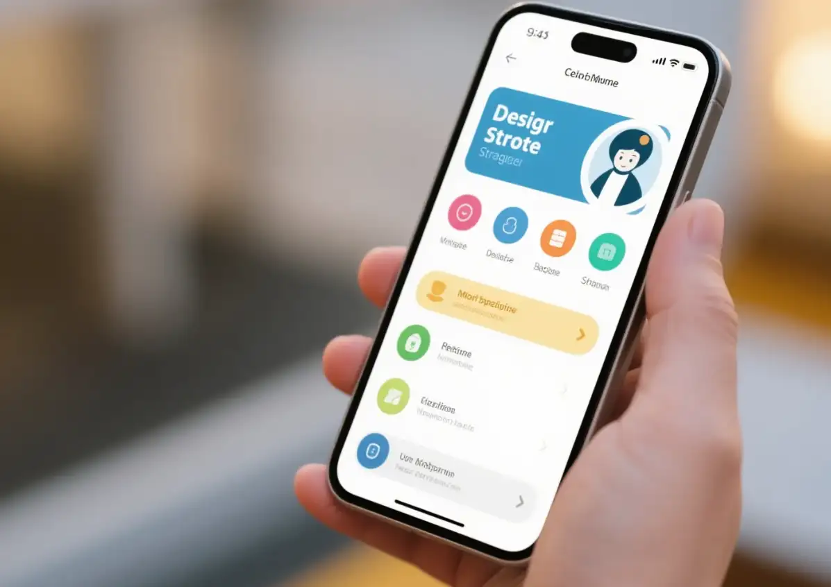
Click on the image to start creating your own mobile website👇
https://wegic.ai/

After your first website generation, the AI assistant Timmy inside will also help you polish and adjust the mobile web design, allowing you to create a website that best meets your needs. Moreover, after the website design is completed, you can directly use it, such as sharing it with your colleagues or friends, and anyone can become a designer. Most importantly, it also supports free trials. If you still don't know how to design a website, you must try it!
2. Figma: A powerful cloud design tool
Figma is a powerful cloud design tool, particularly suitable for team collaboration. Many rich mobile website design templates, such as the Material Design Mobile suite, are available here, which can help you quickly build website prototypes. In addition, Figma's real-time collaboration feature allows multiple team members to edit designs simultaneously, which can greatly improve your design efficiency.
3. Adobe XD: A tool designed specifically for design and prototyping
Adobe XD is a tool specifically designed for design and prototyping, particularly suitable for creating mobile websites. Its auto animation transitions feature lets your website easily have smooth transition effects. For example, button clicking, page switching, etc., are all easy to handle. Adobe XD also supports responsive design, which can automatically adjust the layout of website pages to fit different screen sizes so that you will see the same website on any device without deformation or other phenomena, and the experience will still be very good.
4 .Google Mobile-Friendly Test: A powerful tool for evaluating website responsiveness and speed
The best feature of Google is its mobile friendliness! Its testing tools can help designers evaluate the responsiveness and speed of a website. With this tool, you can quickly discover and solve compatibility issues of websites on mobile devices, ensuring that the website can provide users with a good experience on various devices. However, it should be noted that Google's mobile friendliness testing tool and its API will be discontinued in December 2023, so it may not be available now.
Common Mistakes to Avoid
When designing a mobile website, it is inevitable to encounter a series of problems. We have also listed some of the most common problems for everyone. Avoiding them is also very useful for improving user experience and website performance. Here are some common errors and their solutions:
Too many menu options
Excessive menu options can confuse users and hinder their ability to find the information they are looking for, thus increasing their bounce rate.
So you need to streamline the menu items and only keep the most critical parts. For example, the hamburger menu can hide secondary links while keeping important operations such as the shopping cart and search in a prominent position.
Ignore the size of the touch target
If the buttons or links on your website are too small (less than 48x48 pixels), it is highly likely to cause user errors and affect user experience.
So, to enable users to operate correctly, the size of buttons and links on the website should be at least 44x44 pixels to accommodate people's finger operations. At the same time, you also need to maintain the spacing between elements to avoid users accidentally touching them.
Neglecting accessible design
If the contrast between the text and background on your mobile website is not sufficient (less than 4.5:1), it will also greatly affect the reading experience of visually impaired users and reduce the accessibility of the website.
So, for this situation, you need to set sufficient contrast between the text and the background, which should be at least 4.5:1. In addition, you also need to use semantic HTML and ARIA attributes to provide a better access experience for people with disabilities.
No cross-device testing has been conducted
There are differences in the parsing and rendering of web pages between different devices and browsers, and failure to conduct cross-device testing may result in abnormal page display. So it's best to use real devices and online simulators (such as BrowserStack) for testing to ensure that the webpage can display properly on various devices and browsers.
Conclusion
If you are proficient in mobile web design, you can convert ordinary visitors into loyal customers. By adopting mobile website design best practices such as thumb-friendly layout, artificial intelligence search, and speed optimization, you can create intuitive experiences to drive more conversions. Whether it's using mobile web design templates to improve efficiency or optimizing mobile web design dimensions to enhance performance, every detail is important.
Do you know how to create a mobile website now? Follow this guide and take action immediately!
FAQs
What are the best practices for mobile website design?
The best practices include optimizing menu structure, ensuring that touch targets are large enough (at least 48x48 pixels), following accessibility design standards (such as ensuring text to background contrast exceeds 4.5:1), and using responsive design to accommodate different devices.
How to optimize the menu structure of mobile websites?
To prevent users from feeling overwhelmed, avoid having too many menu options. You can use the burger menu to hide secondary links while keeping key operations (such as shopping cart and search) prominently displayed.
Why should mobile web design avoid touching targets that are too small?
Touching targets that are too small (less than 48x48 pixels) can lead to user errors and affect the user experience. Ensure that the size of buttons and links is large enough to accommodate finger operation, which can effectively reduce erroneous clicks.
How to ensure the accessibility of mobile websites?
Ensure that the contrast ratio between text and background exceeds 4.5:1 to meet the needs of visually impaired users. In addition, using semantic HTML and ARIA attributes provides a better access experience for people with disabilities.
How to optimize image and resource loading in mobile website design?
Use modern image formats such as WebP and optimize image loading through lazy loading techniques. At the same time, add the secret and sizes attributes to the image to accommodate different screen sizes.
Written by
Kimmy
Published on
Mar 17, 2026
Share article
Read more
Our latest blog
Webpages in a minute, powered by Wegic!
With Wegic, transform your needs into stunning, functional websites with advanced AI
Free trial with Wegic, build your site in a click!
What kind of website do you want to build?