Log in
Build Your Site
Typography in Design: What is it & Why it Matters
Explore the essentials of typography in design. Learn what typography is, why it matters, and how to effectively use it to enhance your designs.
Ever wondered why some websites immediately grab your attention, while others feel dull or frustrating? The secret often lies in typography.
Typography for design isn’t just about choosing a nice font; it’s about using type to communicate a message, set the tone, and guide the reader's eye. Studies show that 75% of users judge a company’s credibility based on its website design, and typography plays a crucial role in that first impression.
Typography rules for web design are key to creating a positive user experience. A carefully chosen font can make text easier to read, more appealing, and memorable. Whether you’re designing a blog, e-commerce site, or portfolio, understanding typography tips for designers can help you create designs that resonate with visitors, inviting them to stay longer and return.
Let's dive into Wegic's insights into typography for design and use it as a way to connect with your audience on a deeper level!
What is Typography?
Typography is the art of arranging letters and symbols to make written text clear, readable, and visually appealing.
It’s about choosing the right fonts, adjusting sizes, spacing, and alignment to create a design that feels balanced and easy to follow. Think of typography as dressing your words—just like the right outfit can change someone's appearance, the right typography can change how a message is perceived. For typography for designers, mastering these elements is crucial, as they influence everything from branding to user experience.
A Quick Journey Through Typography’s History
Typography has been around for as long as writing itself. Thousands of years ago, people carved words into stone—talk about a slow process! But everything changed in the 15th century when Johannes Gutenberg invented the movable type printing press, a game-changer that made it possible to print books quickly and affordably. Before this, books had to be copied by hand, which was incredibly slow and expensive.
Fast forward to the 20th century, and the rise of computers brought another revolution. Designers could now create and tweak fonts using software, opening up endless possibilities for creativity. Today, typography for web design is more flexible than ever.
For typography tips for designers, understanding this history is key, as it shows how far we've come in using typography not just to make things look good, but to improve how people interact with content.
The Importance of Typography in Design: The Silent Communicator of Your Brand
As we talked about earlier, typography is more than just picking a font; it’s the silent way your design speaks to the world. It helps communicate messages clearly and visually, guiding the reader’s emotions and understanding.
When you look at a website, a brand, or even a poster, the typography used can instantly tell you something about the mood, the message, and the personality behind it.
Visual Communication
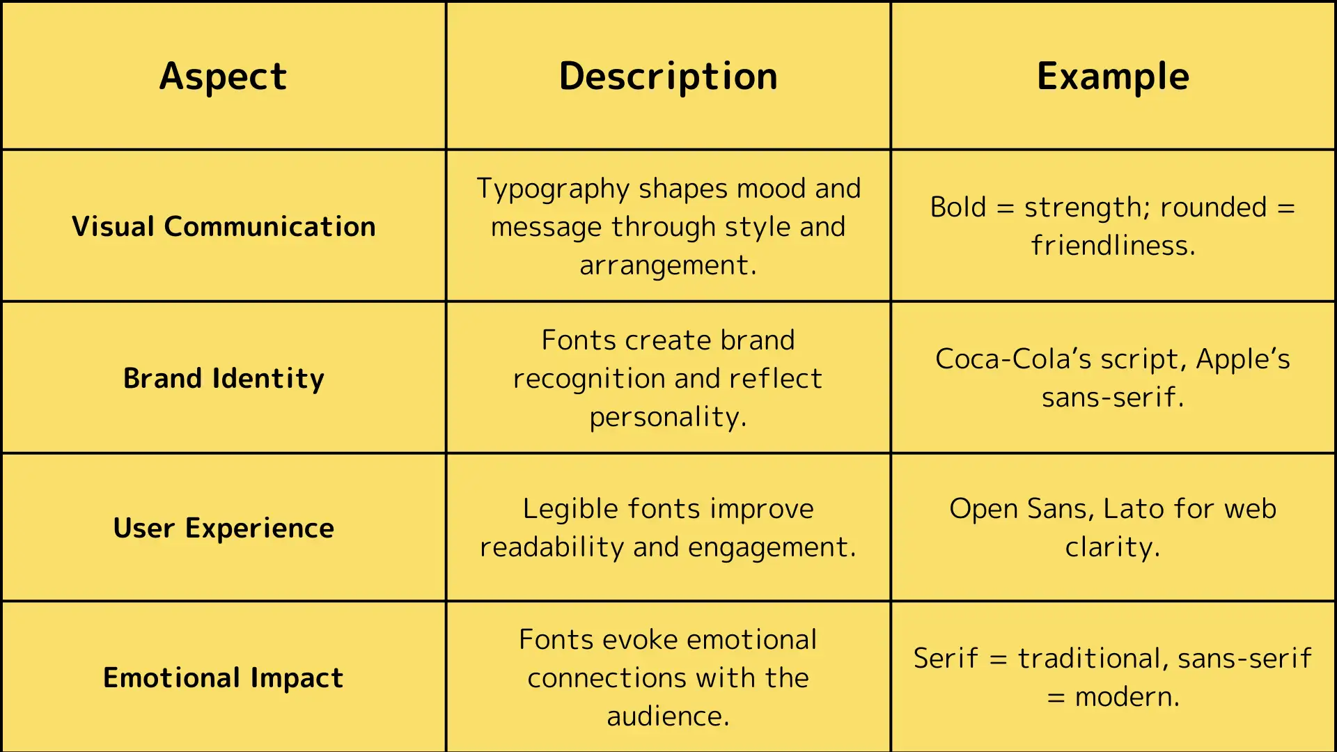
Typography is a powerful tool for visual communication. The way text is styled, sized, and arranged can influence how we feel about what we’re reading.
For example, a bold, all-caps font can give a feeling of strength or urgency, while a soft, rounded font may feel friendly and welcoming. For typography for design, using these elements effectively can ensure your message comes across exactly how you intend.
Brand Identity
Typography plays a huge role in creating and maintaining a brand’s identity. The fonts you choose become part of how people recognize and remember your brand. Think of Coca-Cola’s flowing script, or Apple’s sleek, modern sans-serif fonts.
These fonts are more than just text—they’re instantly recognizable symbols of the brands themselves. For typography for designers, understanding how to choose the right typography rules for web design is key to establishing a strong brand identity.
User Experience
Typography also affects how easily people read and interact with your content. If your text is hard to read or the font choices don’t match the tone, users might leave your site in frustration.
Good typography improves user experience, making content clearer and more engaging. Typography tips for designers often focus on keeping text legible and easy to navigate, which is crucial for keeping visitors on your website longer.
Emotional Impact of Fonts
Fonts aren’t just functional—they also carry emotion. Serif fonts (like Times New Roman) often feel traditional and professional, while sans-serif fonts (like Helvetica) are seen as modern and clean. The right font can help your brand connect with the audience emotionally.
For example, a high-end fashion brand might use elegant serif fonts to convey luxury, while a tech startup might choose a minimal sans-serif to feel fresh and innovative.
Key Elements of Typography
When you dive into typography, there are a few key elements you need to know. These parts help make sure your text is not only stylish but also easy to read and understand. Let’s break it down!
Fonts and Typefaces
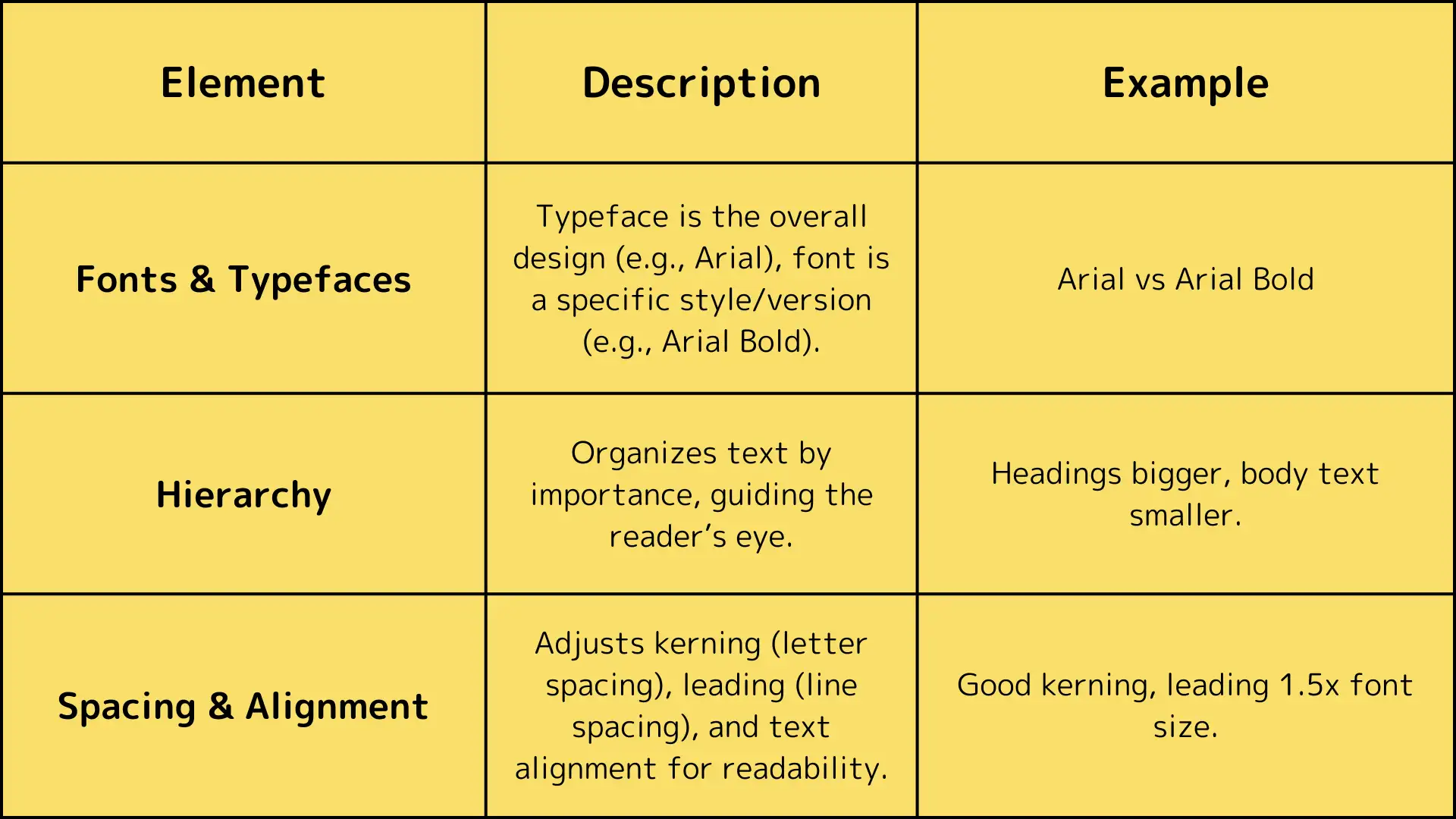
First, let’s clear up some confusion between fonts and typefaces. Many people use these words like they mean the same thing, but they don’t! A typeface is the overall design of a set of characters, like Arial or Times New Roman. It’s the look and feel of the letters as a whole.
A font, on the other hand, refers to a specific version of a typeface, like Arial Bold or Times New Roman Italic. So, when we talk about using a font, we’re referring to a specific style or size of the typeface. For typography for designers, understanding this difference is crucial for picking the right style that matches the vibe of your design.
Hierarchy
Next up is typographic hierarchy, which is about organizing text so it’s easy for readers to follow. Think of hierarchy as a guide for the eyes, helping readers know where to look first, second, and so on.
For example, headings are bigger and bolder than body text, so people know those are the most important. Using hierarchy well in typography for web design ensures that your site is easy to navigate. If all your text looked the same, it would be confusing! With the right hierarchy, designers can make sure the reader's experience is smooth and enjoyable.
Spacing and Alignment
Now, let’s talk about spacing and alignment, two small but powerful details that affect how text looks and feels.
Kerning is the space between individual letters. If the letters are too close together or too far apart, it can make the text hard to read. Good kerning ensures that every letter has just the right amount of space.
Leading is the space between lines of text. When lines are too close, it can feel cramped; too far apart, and it feels disconnected. Proper leading makes sure the text flows easily, helping the reader stay engaged.
Finally, there’s alignment—how text is arranged on the page. You can align text to the left, center, or right. Left-aligned text is often easiest to read, especially for longer paragraphs, because our eyes naturally move from left to right. Knowing these typography rules for web design helps ensure your text is pleasant to read and looks great!
For typography tips for designers, these elements are the building blocks of great design. They help create clear, readable, and visually appealing text that enhances the overall experience of your website or project.
Typography Trends to Watch in 2025
As we step into 2025, the world of typography is buzzing with exciting trends that can help designers create fresh, engaging, and memorable designs. Let’s take a look at some of the standout typography trends to watch:
Popular Trends
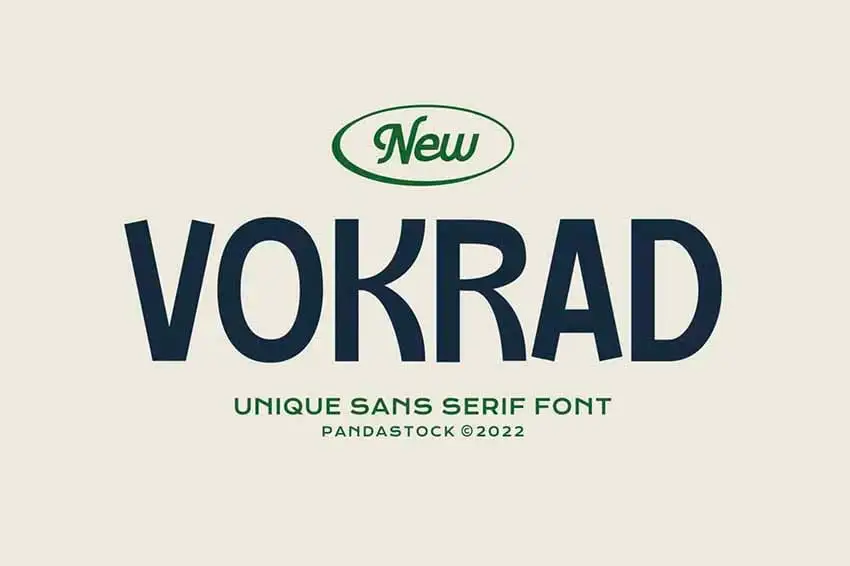
Quirky Sans Serifs
Source: Envato Tuts+
-
Gone are the days of plain, generic sans-serif fonts. Designers are now leaning toward quirky, geometric sans-serifs that come with unique features, like imperfect lines and playful shapes. Fonts like Del Ray have this charming, approachable feel that adds personality and helps designs stand out.
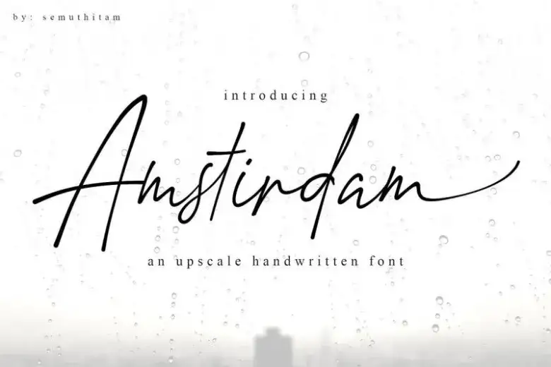
Handwritten Script
-
There’s a rising love for handwritten fonts, which bring a personal touch to digital designs. These fonts feel warm and authentic, creating a connection between brands and their audiences. Apothecary, for example, combines traditional calligraphy with modern elements for a unique, inviting vibe.
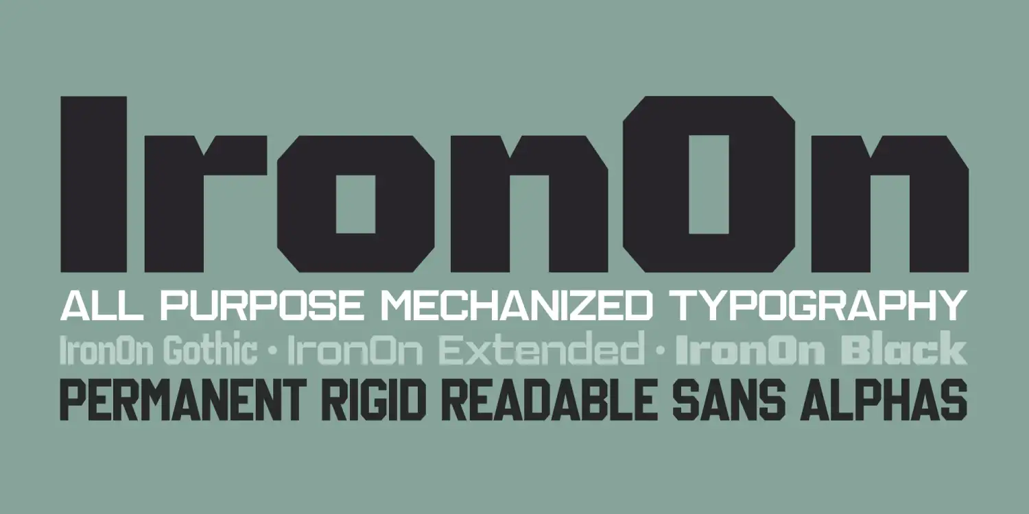
Display Fonts
Source: Font Bros
the lawless years fonts display-
Bold, attention-grabbing display fonts are making a comeback! Often used for logos and headlines, these fonts can be bold and playful or sleek and serious. The Lawless Years, for example, inspired by graffiti, captures raw energy and an urban feel, making it perfect also for brands with an edge.
Old-School Vintage Fonts

-
Nostalgia is a powerful design tool. Many designers are embracing vintage fonts that remind us of the past and tell stories of craftsmanship and quality.
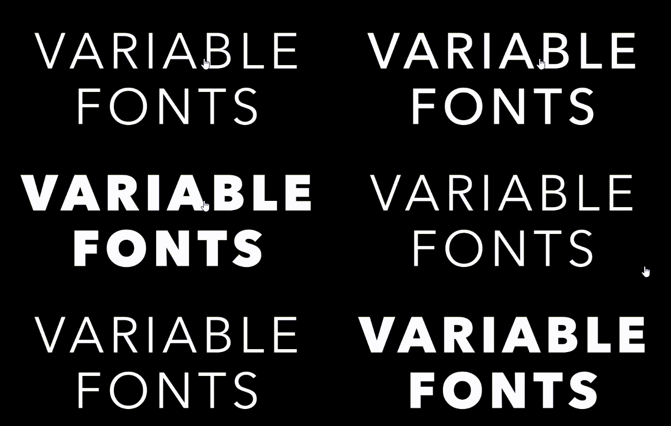
Variable Fonts
-
This exciting trend allows one font file to change its style dynamically. Designers can adjust weight, width, and slant within a single font family. It’s especially useful in web design, where responsiveness is key for delivering a consistent experience across all devices.
Want to know more about what's trending now in fonts? Read: [Choosing the 16 Best Fonts for Your Website]
Case Studies of Typography in Action
Many brands we are pretty familiar with have harnessed these trends to communicate their message effectively:
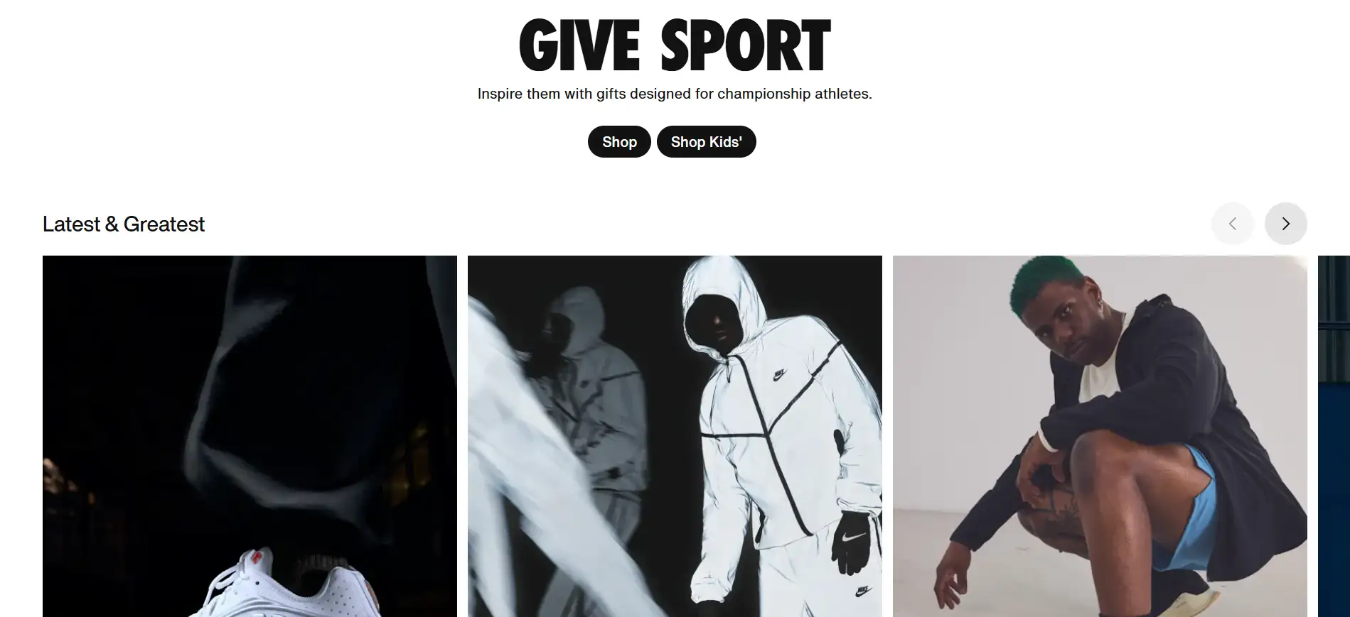
Nike
-
Known for its innovation, Nike uses a bold, condensed sans-serif font that reflects power and movement—perfect for an athletic brand. Their typography grabs attention and complements their dynamic marketing materials.
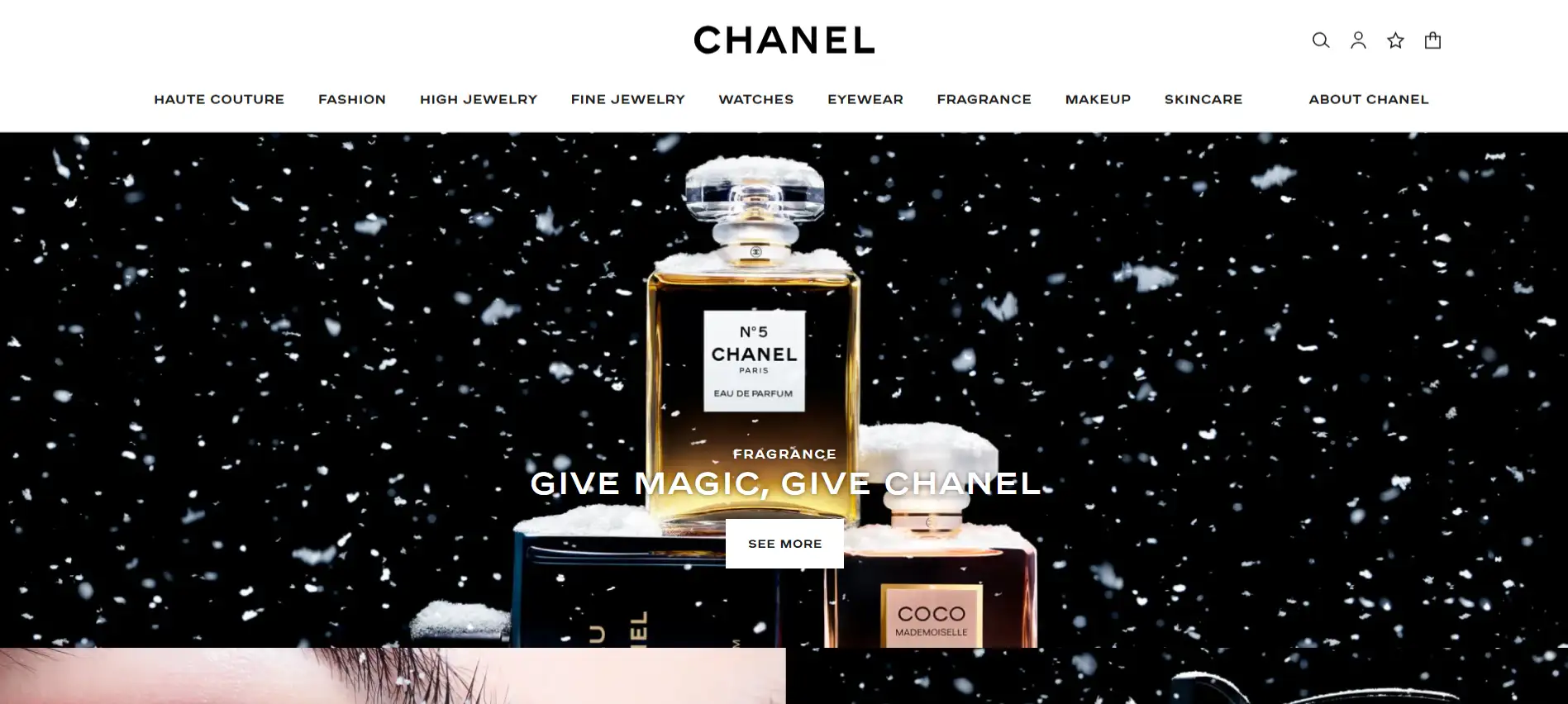
Chanel
-
Chanel’s logo features a custom serif typeface that exudes luxury and sophistication. Their use of typography communicates elegance and instantly connects with the high-end fashion market.
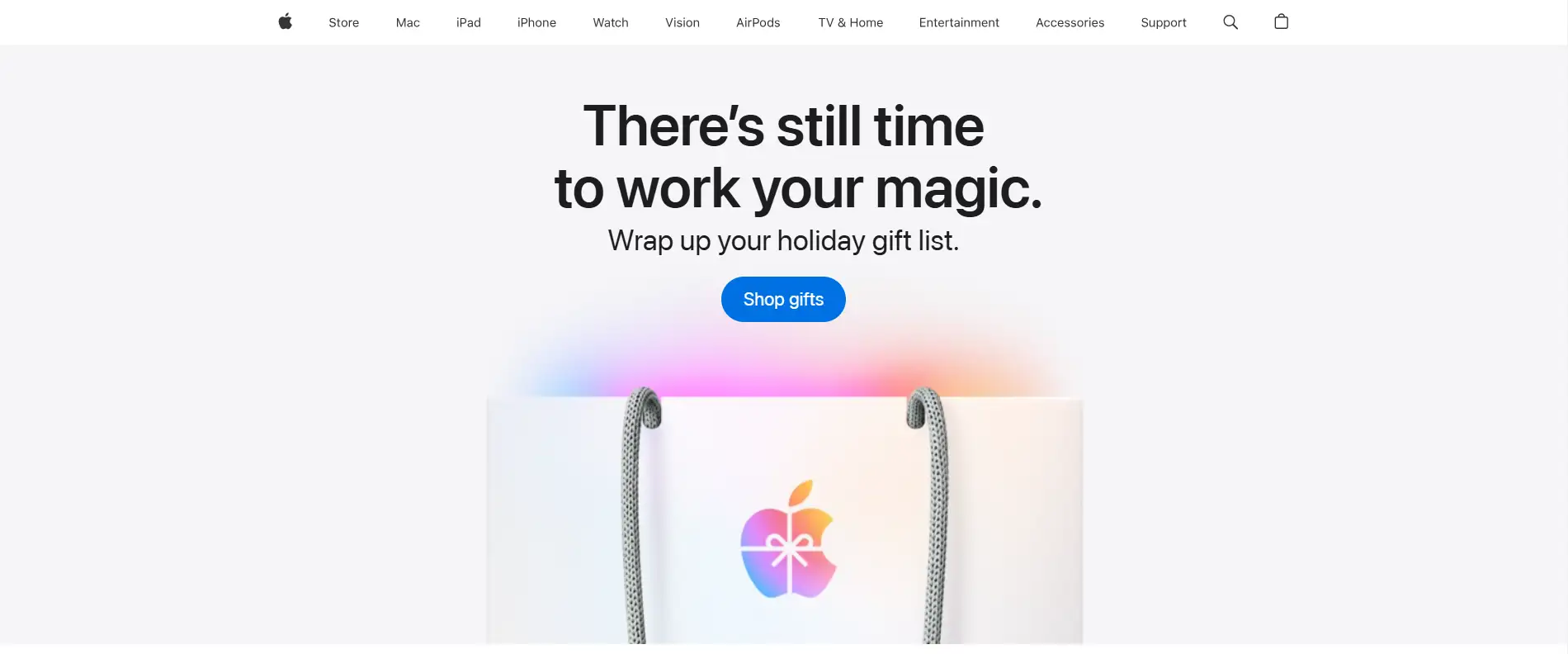
Apple
-
Apple uses the sleek San Francisco font across all of its products, reinforcing the brand’s commitment to simplicity, modernity, and user-friendliness.
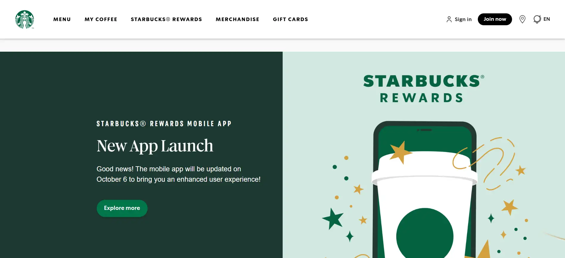
Starbucks
-
Starbucks uses the hand-drawn Freight Sans Black for its logo, which adds a personal, approachable touch. It aligns with their cozy coffee shop vibe, inviting customers to relax and unwind.
Essential Tools and Resources for Typography Design
Typography Tools
-
Google Fonts: A fantastic, free resource with thousands of fonts perfect for web design. You can browse, preview, and easily embed fonts into your website. Google Fonts is especially useful for designers who want to enhance their projects without any cost.
-
RightFont: This Mac app is a game-changer for managing fonts. It allows you to organize, preview, and sync fonts, saving time when you're juggling multiple design projects. RightFont is a must-have for designers with large font libraries.
-
Fonts Ninja: A handy Chrome extension that lets you identify fonts on any webpage. It gives you quick details like font size and color, and lets you test it with your own text before committing to it. Great for finding new fonts during your design process!
-
Archetype: This tool helps you maintain consistent typography across all your digital projects. With Archetype, you can set sizing, spacing, and style parameters directly from your browser, making it easier to create a design system that works well with web developers.
Learning Resources
-
Better Web Type: A free course designed for designers and web developers who want to improve their web typography skills. It covers everything from choosing typefaces to creating layouts that are both readable and visually appealing.
-
Butterick’s Practical Typography: This free online book is a fantastic resource for understanding typography rules for web design. It’s written in a straightforward, approachable way, covering key concepts like font recommendations and text formatting.
-
Typewolf: This website offers expert advice on typography, including font pairing and typeface suggestions. It’s a great place for designers to learn more about typography and get inspired by creative font combinations.
Pro Tip: How to Build an Effective Typography Strategy
An effective typography strategy can elevate your design and make your message clear and memorable. Whether you’re working on a website, brand identity, or print material, here are some essential tips for choosing the right font, pairing fonts effectively, and making your typography accessible.
1. Picking the Right Font
When selecting fonts, think about the context and what you want to express:
-
Know the Purpose: Choose a font that fits the tone of your project. A playful font like Comic Sans might work for a kids' book, while a professional font like Arial or Times New Roman is better for business documents.
-
Match the Brand’s Style: The font you choose should reflect the brand's personality. For a luxury brand, go for elegant serifs like Bodoni; for tech brands, clean sans-serifs like Roboto work well.
-
Focus on Readability: No matter how beautiful a font is, it’s useless if people can’t read it. For web design, choose fonts like Open Sans or Lato, which are easy to read on any screen.
2. Combining Fonts
Pairing fonts can be tricky, but when done right, it can make your design pop. Here’s how to do it:
-
Stick to Two or Three Fonts: Using too many fonts can make your design look messy. Pick one for headings and another for body text. This keeps your design clean and organized.
-
Create Contrast: Choose fonts that contrast with each other. For example, pair a bold serif font for headings with a simple sans-serif for the body text. This helps guide the reader’s eye and makes your content easier to digest.
-
Use Font Pairing Tools: Websites like Font Pair or Typewolf can help you discover font combinations that work well together. These resources show you successful pairings you can try in your own projects.
3. Making Typography Accessible
Good typography is also about being readable for everyone:
-
Choose Clear Fonts: Pick fonts that are easy to read, especially for smaller text. Avoid overly fancy fonts that might confuse readers.
-
Ensure Good Contrast: Text should stand out from the background. For example, black text on a white background is easy to read, but light gray text on white can be tough for many people.
-
Use Text Alternatives: If you include images with text, always provide alt text. This ensures users with screen readers can access your content.
-
Mind the Spacing: Proper line spacing (leading) and font size make a huge difference in readability. Aim for at least 1.5 times the font size for line spacing, especially in body text.
Conclusion
Typography is a vital element of design that shapes how we communicate and connect with our audience. By understanding the key aspects of typography—such as choosing the right fonts, creating effective combinations, and ensuring accessibility—designers can elevate their work and enhance user experience.
Try out new fonts, play with different pairings, and see how thoughtful typography can turn your designs into something truly impactful. Embrace the art of typography and let your creativity shine!
Written by
Kimmy
Published on
Mar 17, 2026
Share article
Read more
Our latest blog
Webpages in a minute, powered by Wegic!
With Wegic, transform your needs into stunning, functional websites with advanced AI
Free trial with Wegic, build your site in a click!
What kind of website do you want to build?