Log in
Build Your Site
Building Trust Through Design: Modern Website Design Essentials for Non-profit
Discover key design strategies to build trust on your non-profit’s website, from layout to storytelling—with tools like Wegic guiding every step.
Fornon-profits, trust is the engine driving action, not simply a value. Every interaction—whether you are asking for money, looking for volunteers, or expanding memberships—depends on one invisible asset: reputation. In the digital age, your website usually creates the first impression. Visitors depart if it doesn't seem reliable right away, and your opportunity to engage goes with them.
Nearly 75% of users base their evaluations of a company's trustworthiness mostly on its website design, says the Stanford Web Credibility Project. For non-profits, where money and support mostly depend on emotions and faith in your goal, this makes design decisions mission-critical. Modern website design trends like intuitive navigation, clean typography, and mobile responsiveness send signals of professionalism. Modern layouts, professional visuals, and current material indicate your company is responsible and legitimate. On the other hand, obsolete design, broken links, or messy pages can quickly undermine confidence.
Let’s look at real-world examples:
-
Red Cross uses a clear, action-forward homepage with emergency alerts, real-time donation CTAs, and transparent financial updates—all reinforcing reliability in critical moments.
-
Charity: water showcases stunning visuals, human-focused stories, and GPS-mapped well data, proving where donor money goes.
Following modern website design trends and drawing from modern design inspiration can help nonprofits turn passive visitors into passionate supporters. Let's take a look at the key elements of a non-profit website!
The Trust Triangle: Transparency, Usability, and Emotion
Creating a reliable website for your non-profit involves presenting authenticity, trustworthiness, and compassion in every click—not about flashy design or ingenious slogans. Three fundamental foundations of trust-driven user experience (UX) are at its core: Transparency, Usability, and Emotion. Taken together, these components change your website from a virtual brochure into one where supporters feel educated, at home, and motivated to act.
Transparency
Openness starts trust. For non-profits, transparency is clearly conveying how your organization runs, where money goes, and who drives the goal. Saying "we're trustworthy" is not sufficient; you must demonstrate it.
Transparency on your site can be shown in important ways as follows:
-
Leadership visibility: Share professional photographs and biographies of your executive team and board members. Like Doctors Without Borders does with their leadership page, this places actual names and faces behind the cause and offers a feeling of responsibility and expertise.
-
Upload your most recent IRS Form 990s, audit findings, and a downloadable PDF of impact reports, financial statements, and annual reports. Forty-one percent of donors in a Give.org survey from 2021 stated that having obvious financial data boosts their giving propensity.
-
Live or real-time impact metrics: Donors at charity: water can literally see their money at work since organizations use dynamic maps to follow the effects of every donation by project and region.
Being open and honest is a strong means of eliminating uncertainty and building trust before any money is given; it is not only a legal or moral benchmark. These practices align with modern website design trends focused on transparency and user-centered information architecture.
Usability
Visitors who believe in your goal must be able to interact with it readily. Usability enters here. A reliable website streamlines every contact; it doesn't let people struggle to locate information, give money, or get engaged.
The best rules of usability for non-profits include:
-
Mobile optimization: Your website has to fit phones and tablets, given that more than 60% of website traffic today comes mobile-first. Forms should be brief and simple to fill; buttons should be tappable; content should be legible.
-
Accessibility: Ensure screen reader support, strong color contrast, keyboard navigability, and alt text for every picture. An accessible website demonstrates that your company values everyone.
-
Site speed and performance: Google's conversion rate for a site loading in 1 second is three times that of a site loading in 5 seconds. To ensure quickness, utilize modern website design trends like modern frameworks, minimal scripts, and compressed pictures.
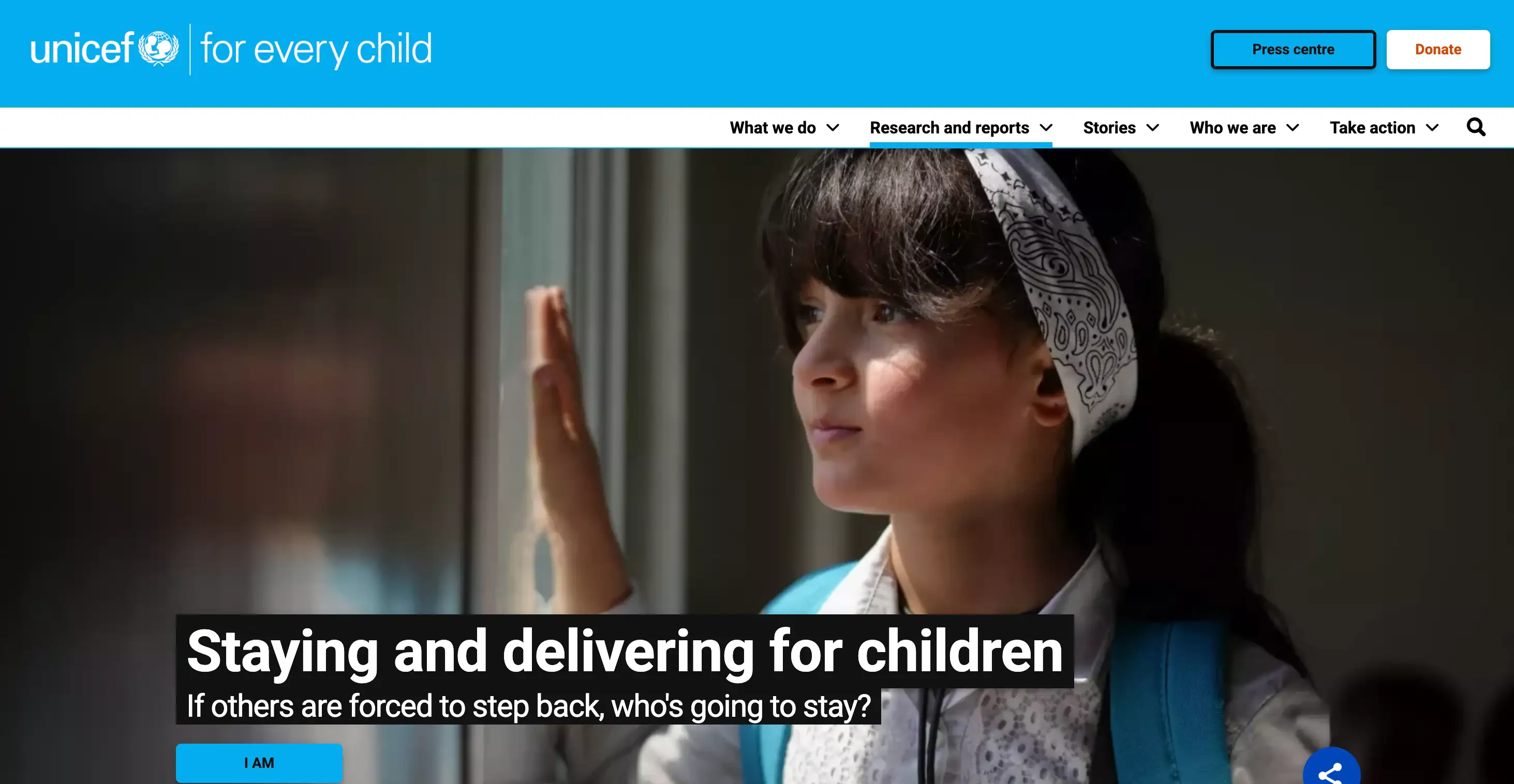
Example: UNICEF's worldwide website is a perfect example of modern web design inspiration, emphasizing simple navigation, local language choices, and quick-loading pages independent of user location. Users' interaction with your cause grows more confident the more seamless the experience is.
Emotion
Ultimately, passion is what turns passive site visitors into loyal supporters. While usability and openness offer reason and simplicity, emotion gives meaning—which is what inspires action.
Nonprofits should incorporate emotional design:
-
Real human imagery: Use high-quality photos of your beneficiaries, volunteers, or field workers (with permission). Avoid staged stock photos—they come off as generic and inauthentic.
-
Personal storytelling: Feature short, focused stories about one person helped by your cause. For example, World Vision uses child sponsorship stories that tug at the heart while showing measurable impact.
-
Purpose-driven communication: Center yourCTAs and headlines on why the goal is important, not just what it accomplishes. Try "Help Maria Get Clean Water Today," instead of "Donate Now."
Especially when combined with obvious action routes, emotionally engaging content enhances recall, motivation, and conversion. These emotional storytelling methods are part of modern website design inspiration that helps causes resonate more deeply with supporters.
Key Design Elements to Build Confidence

When someone lands on your non-profit website like a modern web design, you have less than 10 seconds to make an impression. In those crucial first moments, your design either builds trust—or loses it. That’s why the visual elements above the fold (everything seen without scrolling) carry so much weight. It’s your organization’s digital handshake—and it needs to be firm, clear, and warm.
Above-the-Fold Essentials
What people see first sets the tone of your modern website design. Your above-the-fold area should immediately answer three questions:
What is this organization about? Why should I care? What can I do right now?
To achieve this, include:
-
A clear, concise mission statement in a headline that resonates emotionally
-
A supporting sub-headline with one powerful sentence that expands on your mission
-
A strong, action-oriented CTA (Call to Action), like “Donate Now,” “Join the Movement,” or “See Our Work”
-
A relevant hero image or short background video showing your cause in action
Visual Hierarchy

A trustworthy design doesn’t overwhelm—it guides. Using visual hierarchy properly helps users know where to look, what matters most, and how to take the next step.
Key tactics:
-
Whitespace (negative space): Avoid clutter. Whitespace gives breathing room and signals sophistication and credibility.
-
Font clarity: Use easy-to-read typefaces, clear headings, and consistent sizing. Serif fonts often feel traditional and reliable; sans-serifs feel modern and clean—choose based on your tone.
-
Iconography: Support content with simple, intuitive icons. For example, a heart for “Donate” or a calendar for “Events.” Icons help scan-readers absorb information faster and create visual rhythm.
Modern website design trends show that clarity and visual priority win over excessive decoration.
Remember: clean doesn’t mean empty—it means intentional.
Color Psychology

Colors affect emotions and behavior, as the right palette can make your site feel safe, inspiring, and action-oriented. For non-profits, the focus should be on calm, trust-inducing colors balanced with accents that drive decision-making.
Some practical color tips:
-
Blues convey stability, honesty, and trust (commonly used by global health and development orgs)
-
Greens suggest growth, hope, and sustainability—great for environmental and community-based missions
-
Reds, while attention-grabbing, can signal urgency or aggression—use sparingly, perhaps in donate buttons or alerts
-
Soft neutrals (light greys, beige) provide calming backgrounds that help calls to action stand out
Social Proof
Nothing builds confidence like hearing it from someone else. Social proof validates your impact, showing that real people and real organizations believe in what you do.
Ways to display social proof effectively:
-
Donor or beneficiary testimonials with names and photos
-
Trust badges: e.g., GuideStar certification, BBB Accredited Charity seals
-
Partner logos: Display recognizable collaborators like UNICEF, local governments, or corporate sponsors
-
User-generated content: Repost photos or videos from your community (with permission) to demonstrate real-world engagement
Organizations like Feeding America or Habitat for Humanity leverage social proof effectively by weaving testimonials and partner credibility into the design—not as afterthoughts but as trust-building features front and center. These placements are great examples of modern website design inspiration that goes beyond aesthetics to build emotional and social connections.
In the end, your website’s first impression isn't about overwhelming with flash—it’s about establishing credibility through thoughtful clarity. Every design element, from font choice to button color, works together to say one thing to your visitor:
“You’re in the right place—and this mission is worth your trust!”
Branding for Non-profits
For non-profits, trust—not style—defines consistency. Visitors are confident your company is organized, purposeful, and mission-driven when it has a unified brand. Supporters feel sure they are interacting with the same reliable entity when your website, social media, emails, and brochures all sound consistent.
Prioritize visual consistency. Every outlet—your website, Instagram posts, donation sites, and newsletters—employs the same logo, color scheme, fonts, and design components. Even basic design repetition—such as consistent button designs or image framing—increases brand trust and identification. These practices are also essential in following modern website design trends that emphasize simplicity and recognizability.
Next, pay attention to essential identity factors:
-
Logo placement: always in the top-left corner for familiarity
-
Use consistently one to two easily legible fonts
-
Whether you're crafting a homepage introduction or a tweet, keep the same voice—be it optimistic, desperate, or quiet.
Consider groups like WWF: they present their goal and message clearly by always maintaining tone and appearance across channels. These are perfect examples of organizations applying modern website design inspiration to branding beyond just their homepage.
At the very least, develop a basic style guide if you are a team of one. Outline your logo use, color schemes, type preferences, and writing style. Notion or Canva help to accomplish this easily. It guarantees that upcoming campaigns, personnel, or partners remain in line.
Every click of a consistent brand builds familiarity, reliability, and trust in addition to visual appeal—this is at the core of modern web design trends that value cohesion as a sign of credibility.
Conversational Creation: How Wegic Empowers Non-profits to Build Trust-First Websites

For non-profits, time and resources are often stretched thin—but that shouldn’t stand in the way of a beautiful, trustworthy website. Wegic is a new kind of website builder—one that talks with you like a design-savvy teammate. Powered by conversational AI, Wegic helps you create and publish a professional website tailored to your mission, just by telling it what you need.
There are no templates to pick from, no complex tools to master. Instead, you simply describe your vision in natural language:
“Make this page focus on donations,” or “Add volunteer testimonials with warm visuals,” and Wegic generates or adjusts the site in seconds. Its AI understands your intent and transforms it into a visually polished layout—complete with design logic, hierarchy, and emotion-driven storytelling inspired by modern website design trends.
For non-profits, Wegic offers essential trust-building support aligned with modern website design inspiration:
-
Clean and mobile-responsive layouts by default
-
Accessibility-friendly elements (compliant with WCAG standards)
-
Easy embedding of tools like YouTube, Google Forms, and donation links
-
Support for multiple languages and cross-cultural storytelling
-
Intuitive modification tools, such as circling areas you want to change or uploading reference pictures
-
Free Plan: Ideal for beginners, includes 70 credits/month, 3-page websites, and 1,000 visitors/month.
-
Starter Plan ($39.90/month or $23.90/month annually): Offers 600 credits/month, 10-page websites, and 10,000 visitors/month.
-
Premium Plan ($69.90/month or $41.90/month annually): Provides 1,000 credits/month, unlimited pages, custom domain support, and unlimited visitors.
Launch your non-profit’s site with confidence, just by having a conversation. Try Wegic for free and let your mission speak through design that reflects today’s modern website design trends.
Concluding: Design Is About How It Connects
For nonprofits, trust is the link between action and awareness. Your site is sometimes the first place individuals choose whether your goal seems credible and worth supporting; it is not only a digital brochure. That choice comes quickly and is shaped by design: how obvious your message is, how intuitive the layout feels, and whether the encounter instils trust.
The greatest aspect? Building trust does not require an entire transformation. Little, deliberate adjustments—such as more obvious donate buttons, headlines, or real pictures—can have a major influence. Learn from the key elements of modern website design for nonprofits and build your sites that deserve to be believed in.
Written by
Kimmy
Published on
Mar 17, 2026
Share article
Read more
Our latest blog
Webpages in a minute, powered by Wegic!
With Wegic, transform your needs into stunning, functional websites with advanced AI
Free trial with Wegic, build your site in a click!