Log in
Build Your Site
Build a Memorable Brand with 2025’s Most Popular Color Palette
Discover 2025’s most popular colors and learn how to use them to craft a standout brand identity. Get data-driven insights, case studies, and actionable tips for lasting impact.

Nowadays, competition in various industries is very fierce. If you have your own brand, what would you do to leave a good impression on your fans? In addition to the marketing methods we know, color is also a key element of brand visual identity, and it is very important. A carefully selected color palette can instantly recognize and leave a lasting impression on a brand. However, with so many colors to choose from, finding the right combination that resonates with your target audience and reflects your brand value can be a challenge.
In this article, we will explore themost popular color in the world of 2025 and tell you how to use it to create your own exclusive brand. By understanding and learning how to use these color combinations, you can create a unique and attractive brand image. Let's keep looking!
The influence of color on brand
Have you never thought before that color doesn't have any special significance for a brand? This is the misconception of most people. However, color has a significant impact on how consumers perceive a brand. Research shows that people have their first impression of a product or brand within 90 seconds of seeing it, with color accounting for 62% -90% of this impression.
In 2025, the trend of "most popular colors" will integrate diverse and personalized elements of nature, culture, and technology. If you grasp this trend and can cleverly use these colors, you can enhance their attractiveness, increase awareness, and loyalty.
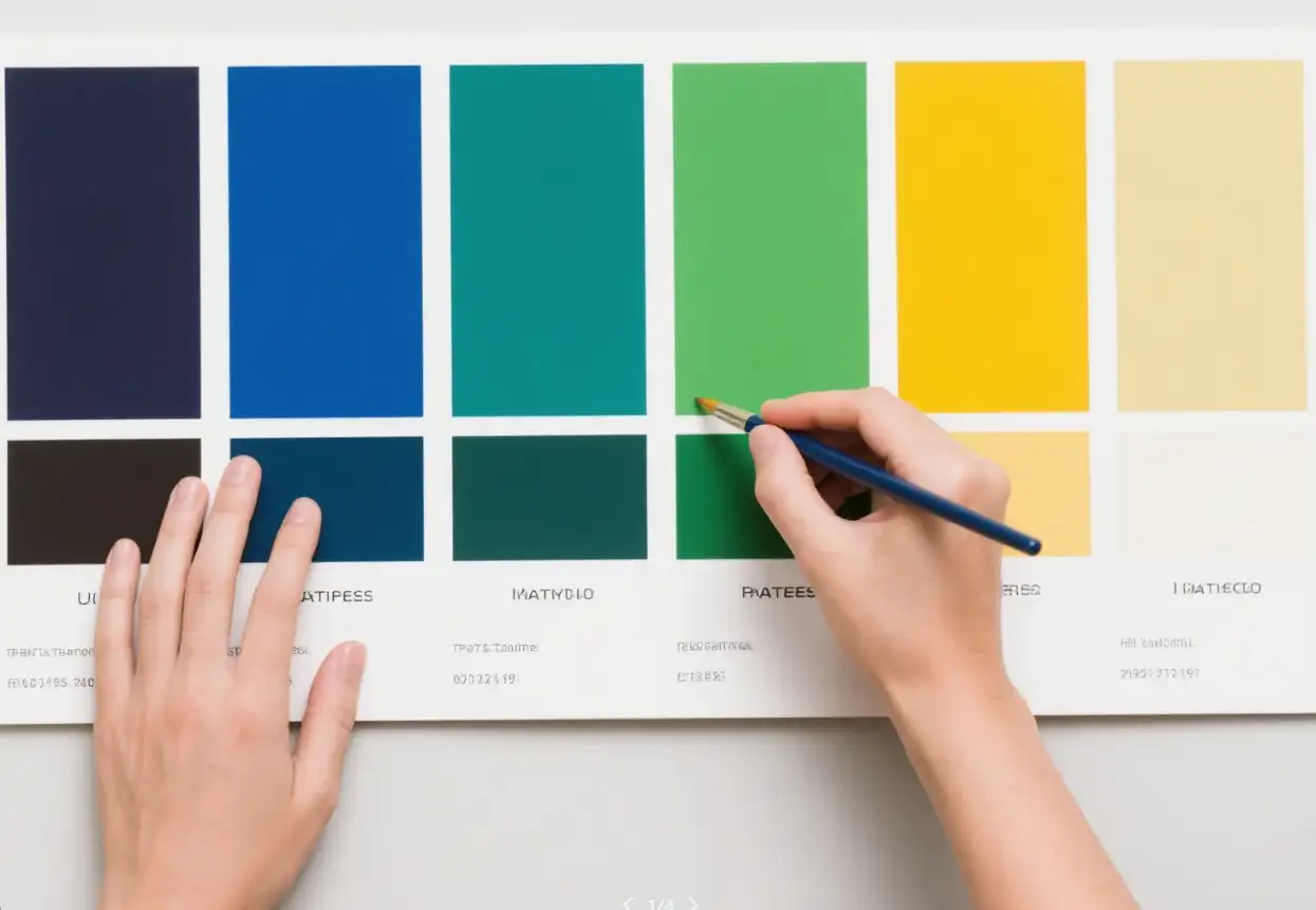
The most popular colors of 2025 cover various fields. From fashion to home design, from digital media to packaging, you can see this trend. For example, fashion brands have launched clothing collections using the 2025 color palette developed by Pantone, giving users a refreshed feeling and attracting many consumers. Moreover, just understanding is not enough. Understanding the symbolic meaning of colors is also important for brand building. Different colors can trigger different emotional reactions among users. Red represents passion, vitality, and courage, often used in the food and entertainment industry to stimulate purchasing desire. Blue symbolizes stability, trust, and professionalism, suitable for finance, technology, and healthcare. Green is related to nature, health, and environmental sustainability, and is commonly used for food and outdoor brands. But sometimes the division is not so clear. Nowadays, many brands choose a variety of colors, and gradient colors are being used more and more frequently.
Most popular colors for 2025 and the psychology behind them
Digital Lavender (# B4A7D6): This flowing purple gray blend dominates the technology and health industries. Apple's iPhone 16 series has made it the most popular color for iPhone 16, taking advantage of Generation Z's love for neutral and soothing tones.
Solar flare orange (# FF6F61): This color tone is full of vitality and boldness, appearing in fitness apps and food packaging. The use of the orange Dunkin' Donuts campaign increased engagement on social media by 19%. Recently, Xiaomi cars in China have also come in orange color, which looks full of vitality.
Deep Sea (# 005F73): Trustworthy and timeless, this blue is replacing the classic navy blue in corporate brands. IBM's 2025 rebranding uses it to demonstrate the stability of the era of artificial intelligence. And some wine brands also choose blue as the main color tone, representing classic and profound meanings.
Mushroom beige (# D3C1AB): This color is most commonly used in the home furnishing industry. It is a warm color, especially in minimalist design, so many people like to decorate their homes with it. This is also the most popular color for kitchen cabinets.
Neutral soil: Neutral soils such as red soil, olive green, and warm gray brown symbolize a commitment to sustainability and authenticity. These colors give a natural and down-to-earth feeling, which is very suitable for brands that value ecological awareness and transparency. For example, organic grocery stores, coffee shops, etc., can use neutral soil colors to emphasize their commitment to sustainable development and attract environmentally conscious consumers.
Sunset color scheme: As the name suggests, it refers to the colors of the sunset, such as pink, orange, and purple, which are generally warm and vibrant. They are perfect for brands that want to encourage exploration, wonder, and emotional connection. Local travel agencies can use sunset tones in their brands to stimulate travel desires, inspire customers to explore new destinations, and connect with their adventurous spirit.
Minimalist Black and White: Black and white is still a classic minimalist combination that exudes timeless elegance. This color palette is suitable for brands that value delicacy, simplicity, and versatility. Local boutique stores can use black and white as a brand to highlight the quality and delicacy of their products, attracting audiences with refined taste. Also, some black-and-white websites attract users by their clarity. Moreover, many young people are increasingly fond of decorating their homes in black and white tones, revealing a simple beauty.
Neon color tones: Neon colors such as electric blue, neon green, and bright pink have been around since 2025. These accents are bold and eye-catching, perfect for brands that want to stand out and create a strong visual identity. Local gyms can use neon lights to convey energy and motivation, attracting customers who are excited to stay active and engaged.
Rich gemstone tones: Gem tones, including emerald, ruby red, and sapphire blue, convey a sense of luxury, uniqueness, and quality. These colors are perfect for high-end brands that want to showcase their high standards. A local jewelry store can use jewelry color tones to reflect the quality and craftsmanship of its products, which can attract customers seeking unique, high-quality jewelry.
Soft, Silent Tone: Soft, silent tones such as gray rose, sage green, and light gray can produce a calming effect, making them perfect for brands that emphasize health, mindfulness, and relaxation. A local yoga studio may use soft, gentle tones in its brand to attract customers who want to relax, unwind, and practice mindfulness.
Retro Revival: Inspired by the 1970s and 1980s, retro colors such as mustard yellow, burnt orange, and blue-green have become a trend again. These color tones can evoke nostalgia in everyone. A local restaurant may use vintage colors to create a nostalgic dining experience and attract customers who appreciate the classic atmosphere.
Some practical techniques for implementing color trends
When designing the style of your brand, you need to consider your brand personality and your users. Different colors can evoke different emotions and associations in people. If your brand is primarily aimed at young and energetic consumers, then you can try choosing some bold and vibrant colors, such as neon or gemstone tones, which are more suitable.
If your brand values luxury and refinement, gemstone tones or minimalist black and white can better reflect its values. If your brand emphasizes sustainability and environmental friendliness, neutral soil would be a better choice.
Brand color is actually quite crucial, for example, once you have determined a certain color, the next step is to effectively apply it to various brand assets. This includes your website, social media, packaging, marketing materials, and in-store decorations. Consistency is the key to brand building. Using the same color palette on all platforms helps create a cohesive and recognizable brand image.
However, it is also important to adapt your color usage to different environments and platforms. For example, on your website, you can use bright and bold colors as CTA buttons or highlights to attract attention and encourage user engagement. For social media, you can incorporate these colors into visually striking images and videos to capture the audience's attention and evoke inspiration. On the packaging, you can use bold colors to make your product stand out on the shelf and attract potential customers. The interior decoration can use these colors to create a unique and unforgettable shopping experience, reflecting the personality and values of your brand.
Speaking of website design, I have to introduce you to a very practical website design tool. That's Wegic! It is a very practical online website design tool, and it is also an AI design tool. When you use Wegic, you can feel what's fast. The entire process of creating a website takes less than 60 seconds, and after creation, you can easily publish with just one click.

Most importantly, once you have designed the website, you can change the color scheme and adjust it according to the color scheme we provide. Additionally, Wegic offers free points, which many people can use for free. Interested? Click on the image below to try it out immediately!
Click on the image to start using Wegic immediately👇
https://wegic.ai/login

Some case studies using the most popular colors for your reference
Currently, many brands have successfully utilized color to enhance their brand image and market share. For example, Pantone's 2025 Color Mocha Mousse has been widely used in various industries. This warm brown color paired with a pink base blends modern elegance with classic aesthetics, making it an ideal choice for walls, furniture, fashion collections, and packaging.
Similarly, Benjamin Moore's cinnamon slate, mixed with variegated plums and velvet-like brown, has been widely used in interior design to create a comfortable and refined atmosphere. These examples demonstrate how brands can align with popular colors, resonate with consumers, and enhance their brand's visual appeal.
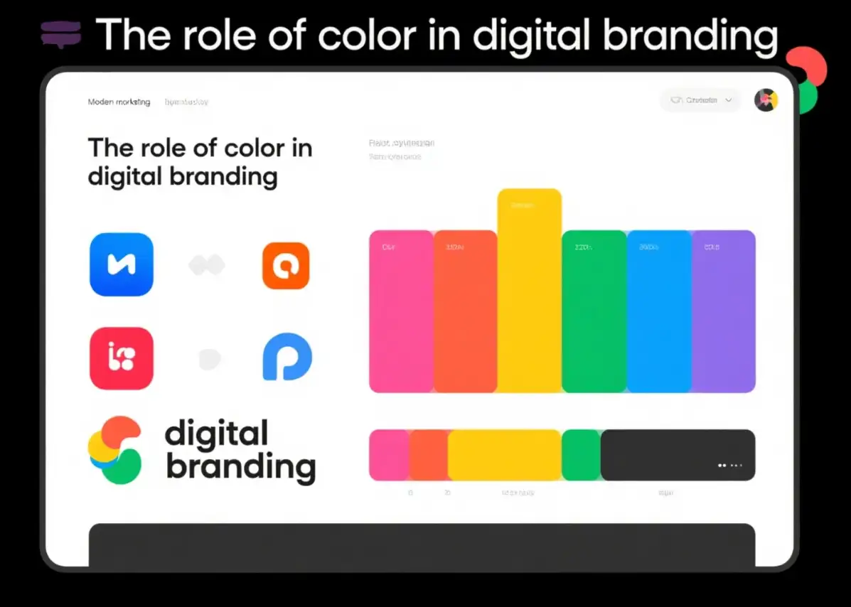
The role of color in digital branding
In the digital field, color plays a crucial role in shaping user experience and brand perception. Websites and applications that utilize popular colors can instantly catch people's attention. For example, using deep and melancholic blue as a navigation bar and call to action buttons can effectively guide users and convey trust and reliability.
Future validation of your brand's color strategy
Although keeping up with color trends is beneficial, ensuring that yourbrand's color palette remains consistent and recognizable over time is equally important. It's best to regularly update your brand's color palette when you have time to ensure it continues to resonate with your target users.
Conclusion
The most popular colors of 2025 provide a wide range of choices for branding. Choosing the right color is also not easy, as you need to fully understand the color characteristics, symbolic meanings, and combinations and coordinate them with your brand. In a fiercely competitive market, a carefully selected and effective color palette can help your brand stand out and leave a good impression on consumers.
Therefore, take some time to explore the color trends of 2025 and find the perfect color that resonates with your brand and audience. Don't you want users to remember your brand at a glance? If you're interested, give it a try now!
FAQs
What are the brand color trends for 2025?
In our Looka logo data of 2025, we found the colors with the most monochromatic pairings were brown, blue, and yellow. Folks toggled with pairing dark tones with light ones to create that unified monochromatic look. Check out Bose's Ads by Collins below, it's a masterful use of a monochromatic color palette.7
How can a brand ensure its color palette is memorable?
A cohesive color palette can reiterate specific brand attributes and personality. For instance, a brand that aims to be youthful and energetic might opt for bright and vibrant colors, while a luxury brand might choose muted, sophisticated tones.
What is the color of 2025?
The Pantone color of the year 2025 is mocha mousse. Pantone has named an “evocative soft brown” its color of the year for 2025, continuing a tradition that has now run for more than a quarter of a century.5 Dec 2024
What is the color prediction for 2025?
What is the colour prediction for 2025? In 2025, say goodbye to neutrals as you know them, and say hello to a rich array of trending colours — most notably, “mocha mousse” brown, butter yellow, paprika red, mint green, dusty pink, and cobalt blue.
What is the most trending color in 2025?
Cherry Red. We're going full cherry mode in 2025. Inspired by the Cherry Coded trend, this bold hue is here to make a statement. Nail it, wear it, or decorate your space with it.
Written by
Kimmy
Published on
Mar 17, 2026
Share article
Read more
Our latest blog
Webpages in a minute, powered by Wegic!
With Wegic, transform your needs into stunning, functional websites with advanced AI
Free trial with Wegic, build your site in a click!
What kind of website do you want to build?