Log in
Build Your Site
14 Interior Design Portfolio Websites We Love 2024
Explore 14 inspiring interior design portfolio websites. And discover how tools like Wegic make building a professional site easier.
Creating a stunning interior design portfolio website can seem daunting, but it's essential for showcasing your unique style and attracting clients.
This post highlights 14 interior design portfolio websites we love in 2024, from sleek, minimalist designs to bold, visual presentations. Then, we'll walk you through the key steps to build your portfolio site, whether you're looking to simply showcase your work or convert potential clients into leads. By the end, you'll see how tools like Wegic can make the process of building your dream site easier than ever.
14 Interior Design Portfolio Websites We Love 2024
In this part, we will delve into 14 interior design portfolio examples. I will explain some features we love in these cases and what we can learn from them.
01.Rior Interior
02.Abel Design Group
03.Melyssa Robert
04.Kelsey Heims
05.Mustafa Abid Paracha
06.Blackhaus
07.Grace Adams
08.Ensoul
09.Alexander Reid
10.Armitage Studio
11.Jacobs Interiors
12.Highlight Design
13.Debbie Dahl Interiors
14.Güliz Çetin Mbagaya
01.Rior Interior
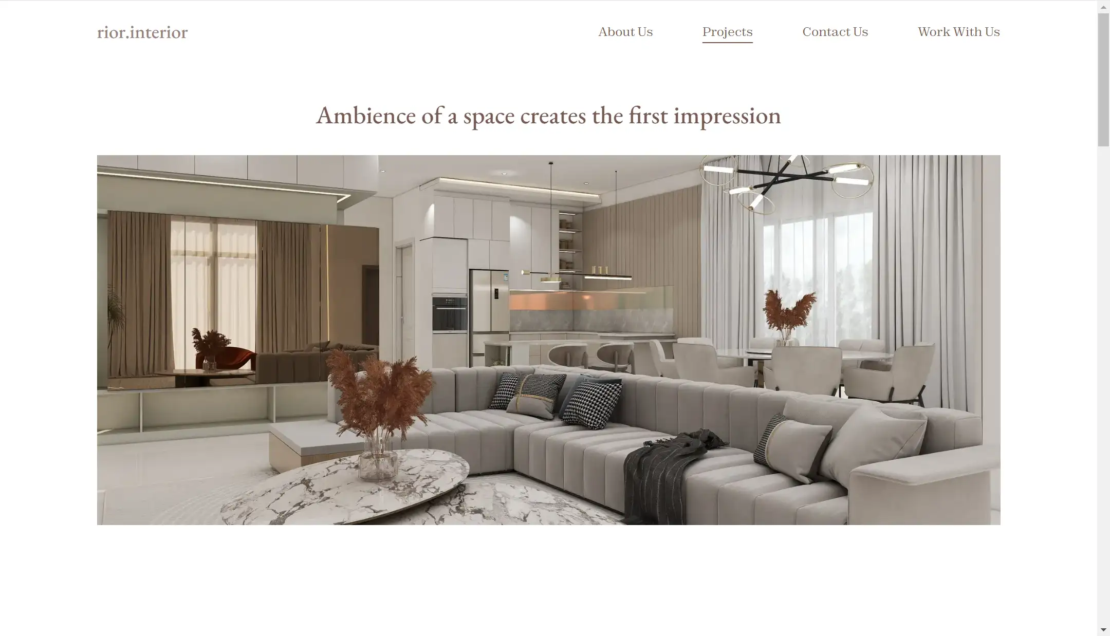
When you enter Rior Interior's website, the standout feature is its extensive interior design portfolio, which showcases a wide range of design projects. The portfolio is filled with numerous high-resolution, detailed images, including layouts, design plans, and 3D perspectives. These stunning visuals speak volumes, effectively demonstrating the design team's professionalism and unique style.
In addition to the project gallery, the website includes three other pages that provide relevant information about the design team and contact details. This streamlined setup makes it easy for potential clients or interested individuals to reach out.
02.Abel Design Group
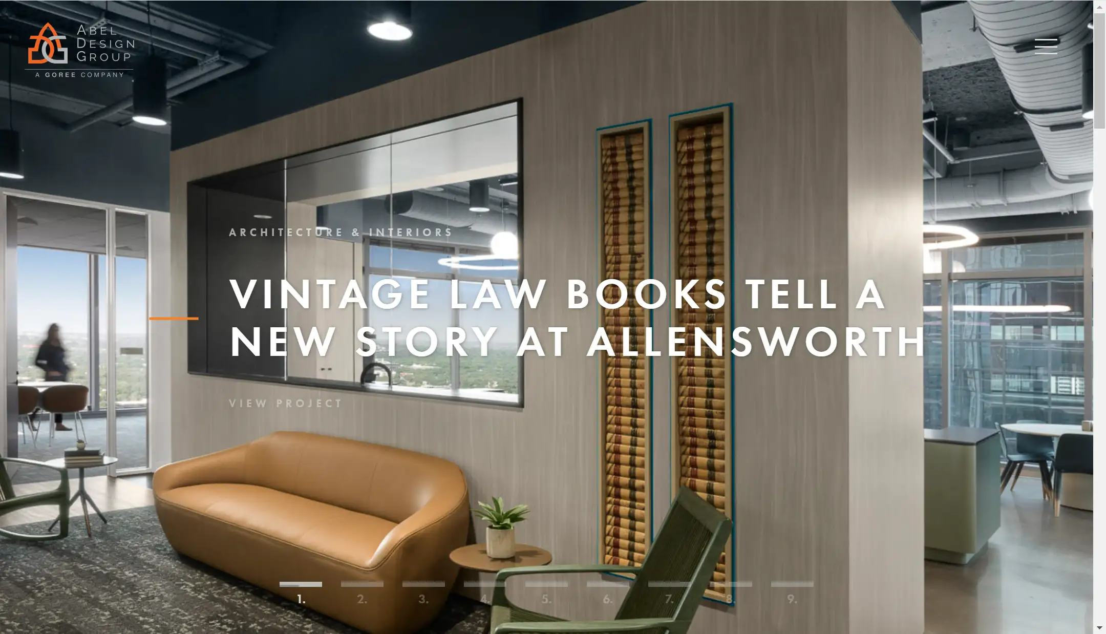
Abel Design Group’s website has many features I admire in an outstanding interior design portfolio. It showcases a variety of impressive projects with neat layouts and high-quality images that truly highlight their professional level, giving the audience an intuitive understanding of their work.
One detail that really stood out to me is the button design. The colors align perfectly with the brand’s signature orange, creating a cohesive look throughout. Almost every page and project features buttons and arrows placed strategically, making it easy to take the next step. As you explore a project’s design background, the eye-catching button naturally leads you to the final design. After finishing one project, another button guides you smoothly to the next.
Additionally, I appreciated how each project wraps up with customer testimonials, subtly enhancing the audience’s trust in the brand.
03.Melyssa Robert
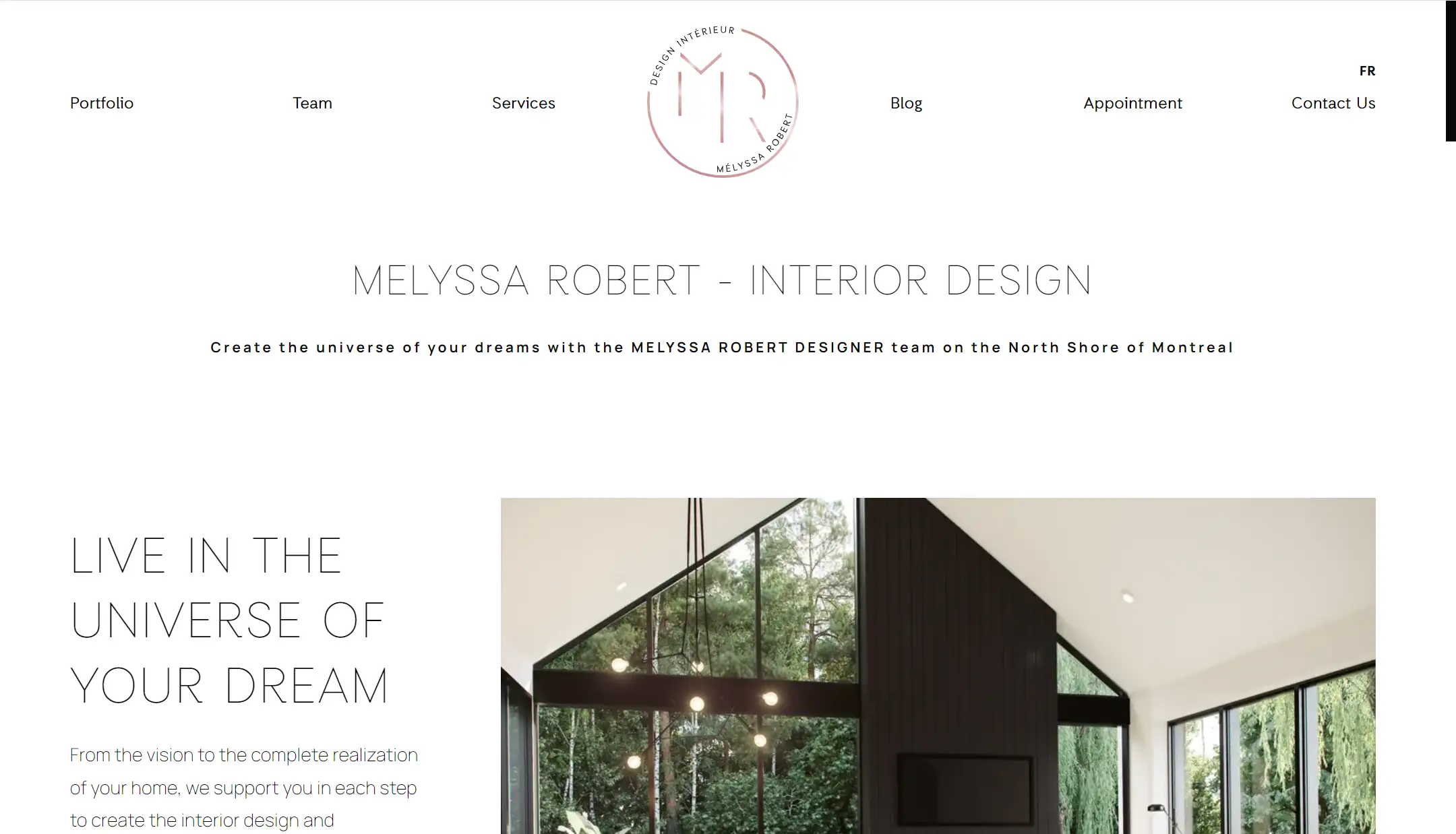
I also really love Mustafa Abid Paracha’s website. There are so many highlights, and I’ll break them down one by one.
The site is packed with content, including a well-organized interior design portfolio, team info, services, blogs, contact details, and even an appointment section. This well-rounded setup sends a clear message to visitors: this is a professional and trustworthy brand.
Many of the design elements are also highly engaging. The portfolio showcases a large number of images using a grid format, which effectively demonstrates their expertise. The team introduction adds a personal touch, bringing the audience closer to the people behind the projects. The blog, with its detailed articles, shares the design philosophy with readers.
The site also incorporates animations like lazy loading on the homepage and hover effects in the portfolio section, making it feel dynamic and enhancing the user experience while boosting site performance.
Furthermore, the navigation bar follows a logical hierarchy, with sections clearly divided to help users quickly find what they need. The language switch button is easy to spot, adding to the overall user-friendly design.
04.Kelsey Heims
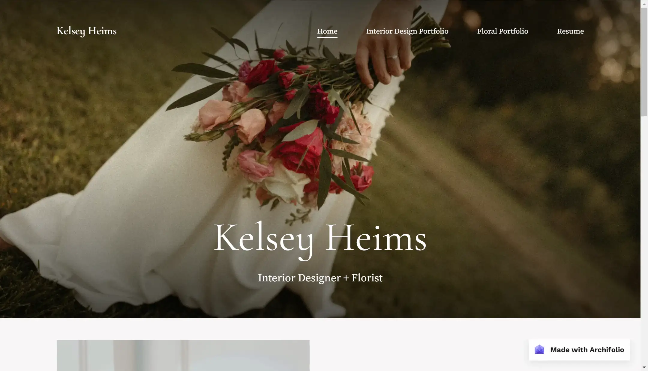
Kelsey’s website also strikes a great balance between aesthetics and professionalism. It's divided into two sections: one for interior design and another for floral design. In the interior design section, there are plenty of layout images accompanied by her detailed explanations on the right, which subtly highlight her expertise.
She shares her design process in a simple, relatable way, making her more approachable to readers. The use of soft colors like white, gray, and wood tones, combined with neat, uniform layouts, creates a very comfortable and pleasant browsing experience.
05.Mustafa Abid Paracha
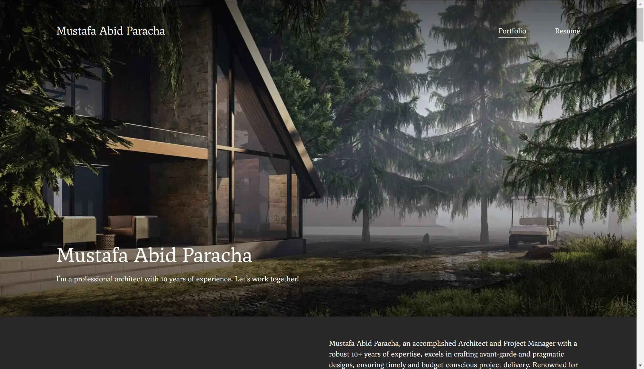
Among the interior design websites I’ve browsed, I must admit Mustafa Abid Paracha's interior design portfolio immediately caught my eye. His hero section features a full-screen image that is not only visually appealing but also effectively grabs the reader's attention.
The dark background contrasts sharply with the white text, improving readability and making the content pop. His portfolio layout is highly organized, using a parallel structure that enhances the user experience. This orderly design extends to his project showcases, reflecting the same principle of neatness and balance throughout the entire interior design portfolio.
The variety of projects he’s worked on, from malls and office buildings to schools and residential complexes, indirectly highlights his strong design capabilities. Each project is showcased systematically, with images progressing from the overall design to detailed close-ups. The high-quality visuals, combined with a distinct aesthetic and clear design style, make his portfolio a perfect example for any designer seeking inspiration.
06.Blackhaus
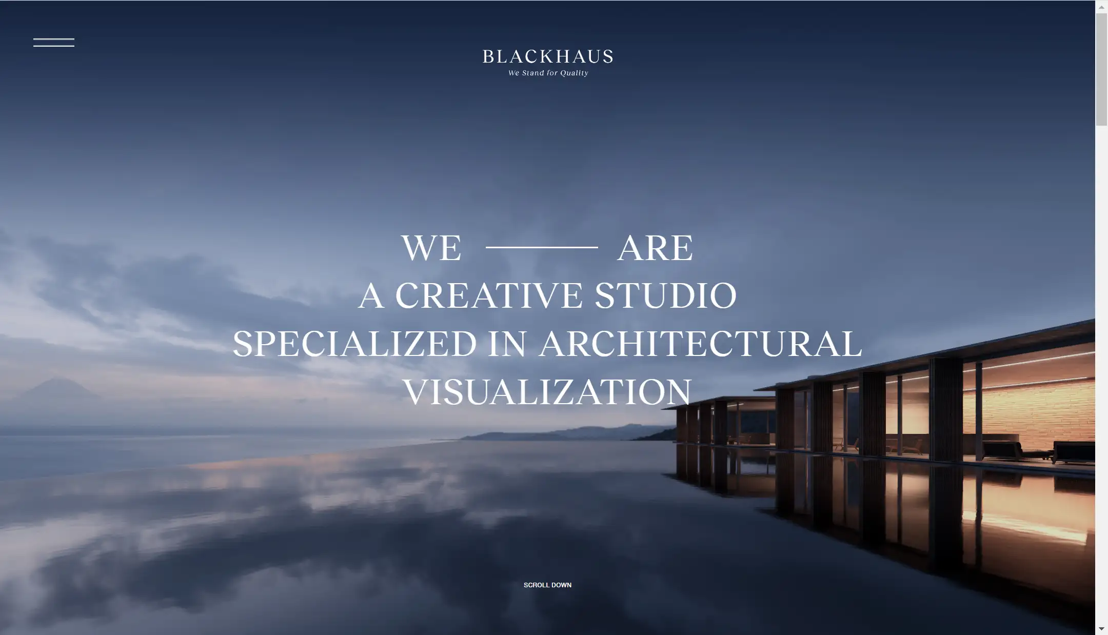
I think Blackhaus has taken minimalism to the extreme with its interior design portfolio. It features the least amount of text among the websites I’ve seen, relying heavily on a monochromatic color scheme—primarily black and white. This minimal approach creates a professional and sophisticated atmosphere.
In addition to image displays, Blackhaus excels at using video to showcase its work, offering a variety of visual formats that provide readers with a fresh and engaging experience. The video style aligns perfectly with the overall aesthetic of the website and the design of its projects, ensuring a cohesive visual narrative throughout the interior design portfolio.
07.Grace Adams
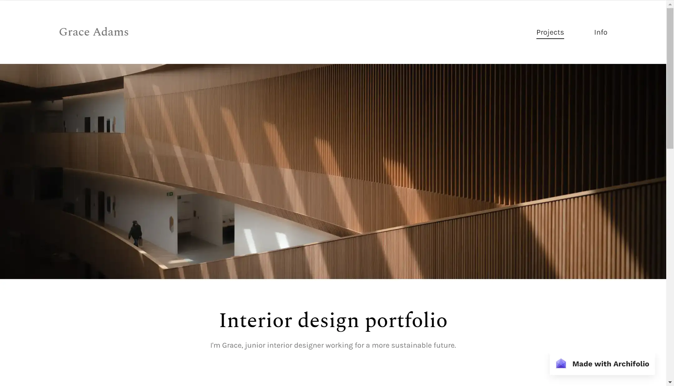
One of the main reasons I like Grace’s website is that it epitomizes minimalism. The color palette—mainly black, white, gray, and brown—creates a harmonious and inviting atmosphere. Although she doesn’t display many projects, the ones she does showcase are consistent, modern, minimalist, and innovative, making her interior design portfolio both memorable and reflective of her unique brand.
Additionally, website navigation is simple and intuitive. Each project card features a smooth hover effect, and these small design touches significantly enhance the overall user experience.
08.Ensoul
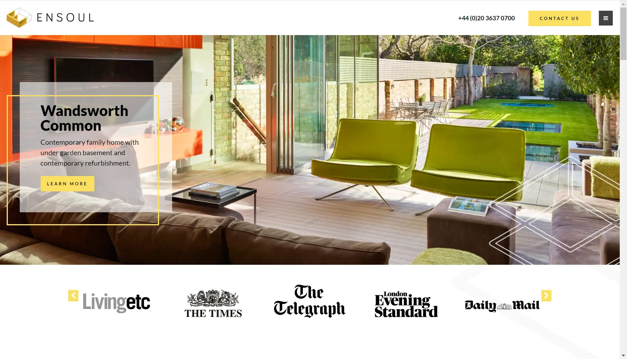
The website's layout is neat, with a hamburger menu for navigation, saving space while maintaining functionality. Ensoul’s interior design portfolio is also rich in content, featuring a portfolio, the latest news, blog posts, and detailed contact information. This variety of content helps build trust with the audience and makes the brand more approachable.
While some of the previously mentioned websites lean towards minimalism, this one stands out by offering more detailed content. The extensive text introduces the team and services, which is highly effective for boosting conversion rates and increasing the likelihood that potential clients will engage with their services. Text has the added advantage of providing in-depth information, allowing the interior design portfolio to present a more complete picture of the designer's offerings.
Additionally, the blog topics are closely tied to design, offering insights into specific projects and practical interior design tips. These valuable pieces of content help readers, especially those unfamiliar with design, gain a deeper understanding of the process, showcasing the designer's expertise and professionalism.
Another feature I love about this site is the bold use of yellow for all the CTA buttons and the footer section. Yellow is bright and eye-catching, and when used sparingly, it effectively draws attention without feeling overwhelming, guiding users to focus on key information or take specific actions.
09.Alexander Reid
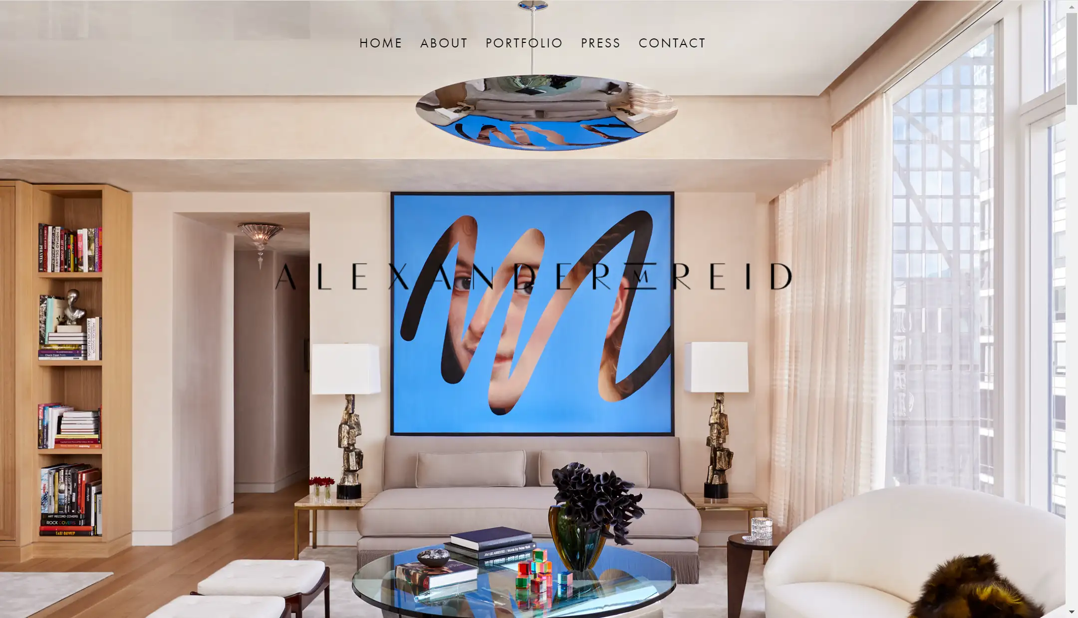
Neat layouts, smooth fonts, and beautiful design images perfectly embody a modern, minimalist style in this interior design portfolio. One standout feature is the use of an Image Carousel to showcase project images. This allows users to view different content without manually interacting, which may appeal to more passive readers. For those who prefer more control, there's an interactive button to manually switch images, providing flexibility in the browsing experience.
10.Armitage Studio
In my opinion, the portfolio website for Armitage Studio is an excellent model to follow. It achieves perfection in nearly every aspect of web design. If you’re looking to build a commercial site—not just showcasing your work but also converting your audience into clients—this interior design portfolio offers plenty of valuable lessons.
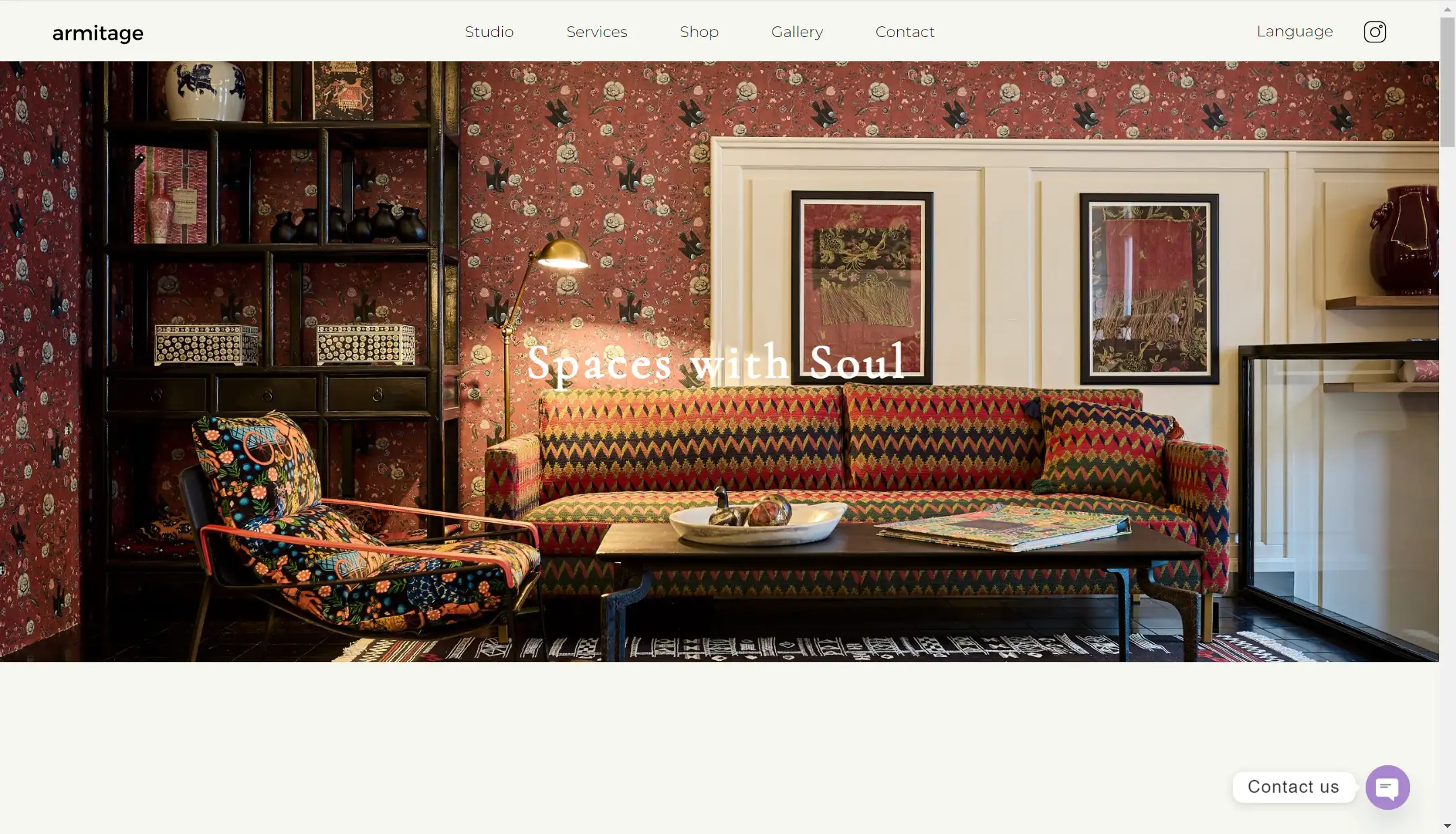
The intuitive navigation bar and multi-language options reflect a user-friendly design philosophy. The designer uses a grid format to display a wide array of images, perfectly showcasing her design style and expertise. The neat layout, coupled with smooth animations, adds to the overall professionalism of the interior design portfolio.
What stands out most is how the services are introduced using case studies, including before-and-after pictures. These examples provide a strong, visual contrast that convincingly demonstrates the impact of her designs. The service page also incorporates dynamic "Contact Us" CTA buttons, and these subtle yet effective design choices play a key role in increasing conversion rates.
11.Jacobs Interiors
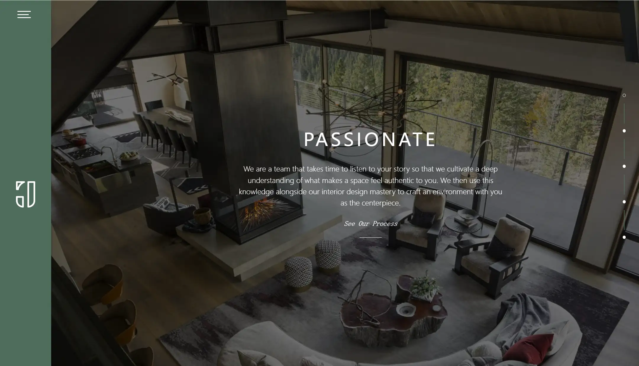
The widescreen layout of the website, featuring a full-screen background image and ample white space, creates a visually impactful experience. This large display not only highlights the brand's design style but also conveys a sense of high-end taste, making the interior design portfolio feel luxurious.
The vertical left-hand navigation bar, which combines icons with menus, along with the right-hand progress bar, strikes a balance between aesthetic appeal and practicality, further enhancing the user experience. The site's main color palette includes earthy tones like gray-green, paired with natural wood textures, creating a warm, cozy atmosphere that aligns perfectly with the interior design theme.
The dimmed background contrasts beautifully with the white text, improving readability while maintaining a luxurious and elegant feel throughout the website. This combination gives off a high-end, sophisticated vibe that aligns with the overall theme of the interior design portfolio.
12.Highlight Design
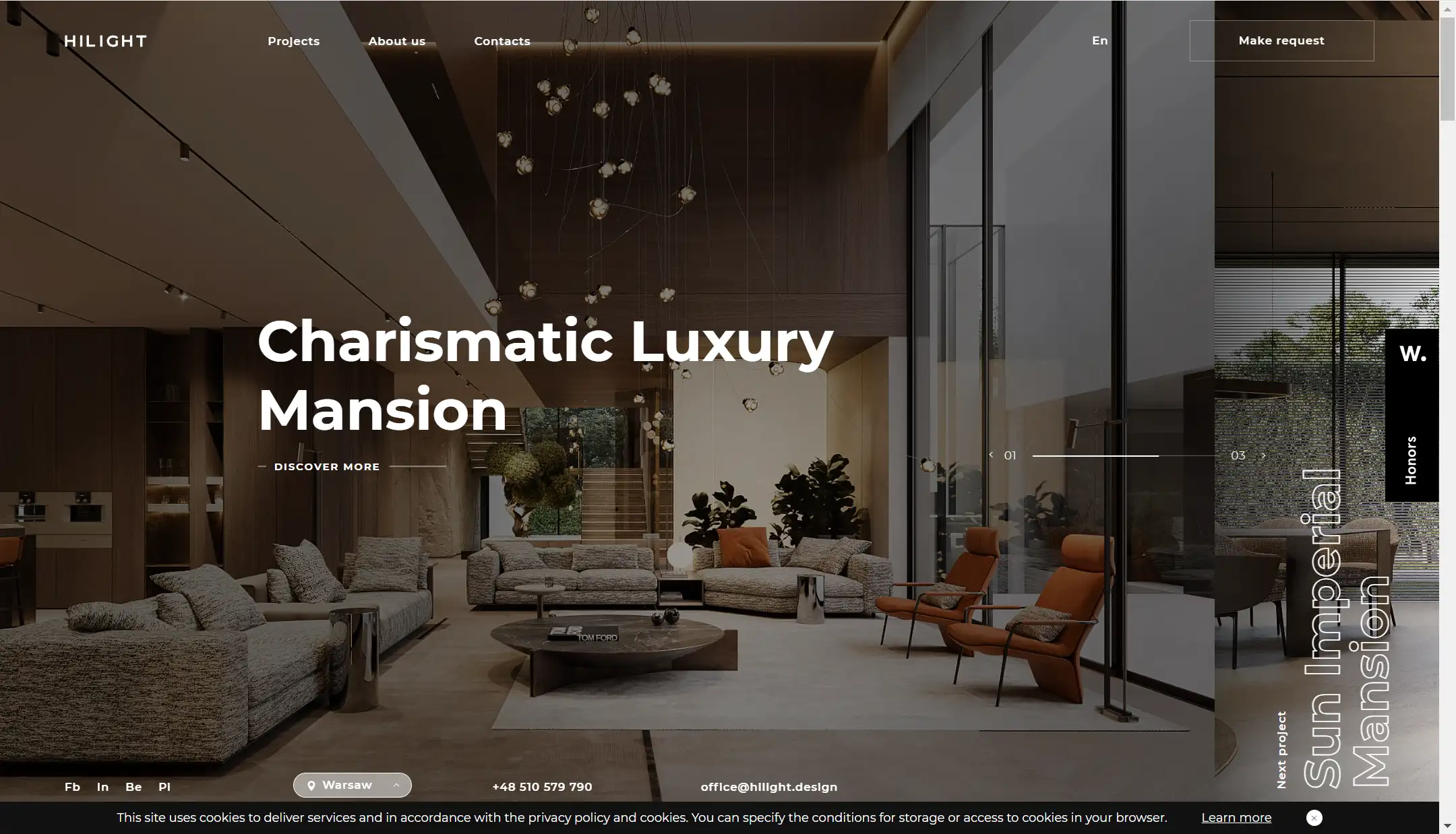
This website, much like Jacobs Interior's, employs a full-screen background image, creating a wide and immersive view that evokes a strong sense of atmosphere. The white text on a dark background provides a very comfortable reading experience, enhancing the overall usability of the interior design portfolio. This design team boasts extensive experience, with over 150 design cases spanning various sizes, types, and locations, showcasing their impressive expertise.
Their style is distinctly cohesive, perfectly exemplifying Modern Minimalism—characterized by simple designs, natural materials like wood, large open spaces, textured furniture, and the use of neutral tones. This clarity in design helps the audience form a lasting impression of the brand and its values within the interior design portfolio.
Each case features a wealth of high-quality images for readers to appreciate, reinforcing the team’s professionalism. What I particularly love about this website is the use of a Spotlight Effect on every page. This effect follows the mouse, dynamically changing brightness to guide the user’s focus, creating an engaging experience that makes browsing the interior design portfolio feel interactive and lively.
13.Debbie Dahl Interiors
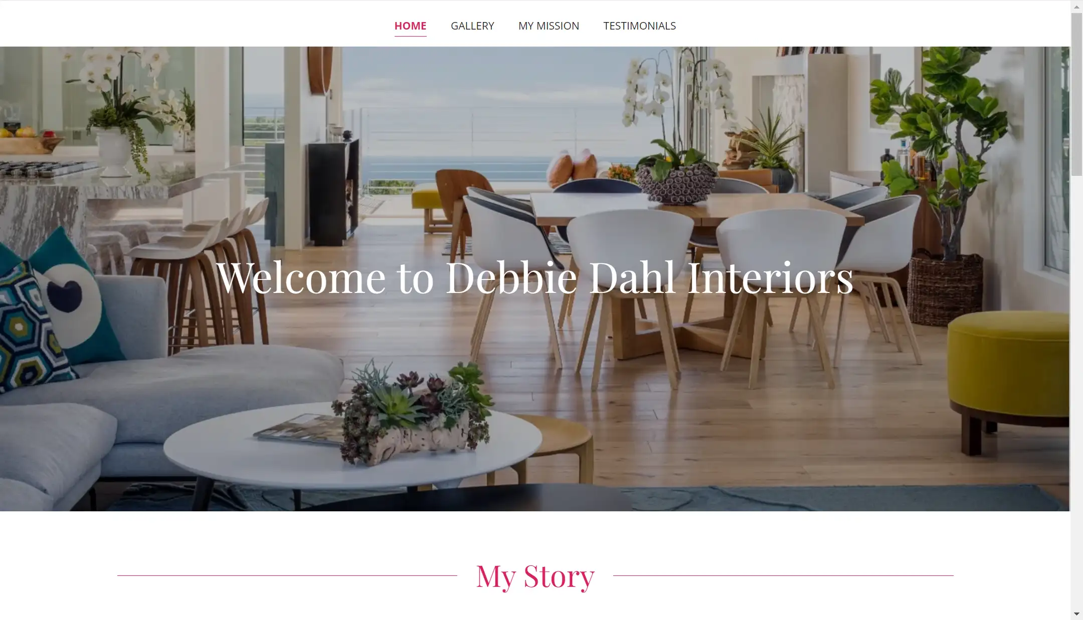
Debbie boasts over 30 years of experience in interior design, making her an authority in the field. Her website navigation is clear and intuitive, presenting an overall design that is both minimalist and comfortable, enhancing the user experience within her interior design portfolio.
In the photo gallery section, she employs slide cards where the images on either side are slightly faded, effectively directing the audience's focus to the center. Additionally, the incorporation of an image carousel feature allows users to view images either on autoplay or manually cycle through them, adding an interactive element to her interior design portfolio.
One of the most impressive aspects of her website is the significant emphasis on written content. This focus on communication is particularly appealing to potential clients, as the text effectively conveys the designer's value proposition. By using the first person—expressions like "My mission," "I," and "I can help"—it feels as though you’re having a direct conversation with Debbie. This personal touch creates an emotional connection with prospective clients.
Throughout the text, there’s a strong emphasis on the client's needs and experiences, with statements like "Good designers design for you, the client, and not for themselves." This approach ensures that clients feel their needs are a top priority, which builds trust and appeal. Debbie also encourages clients to be open and honest about their ideas and dreams, fostering a sense of goodwill and laying the foundation for a trusting, collaborative relationship within her interior design portfolio.
14.Güliz Çetin Mbagaya
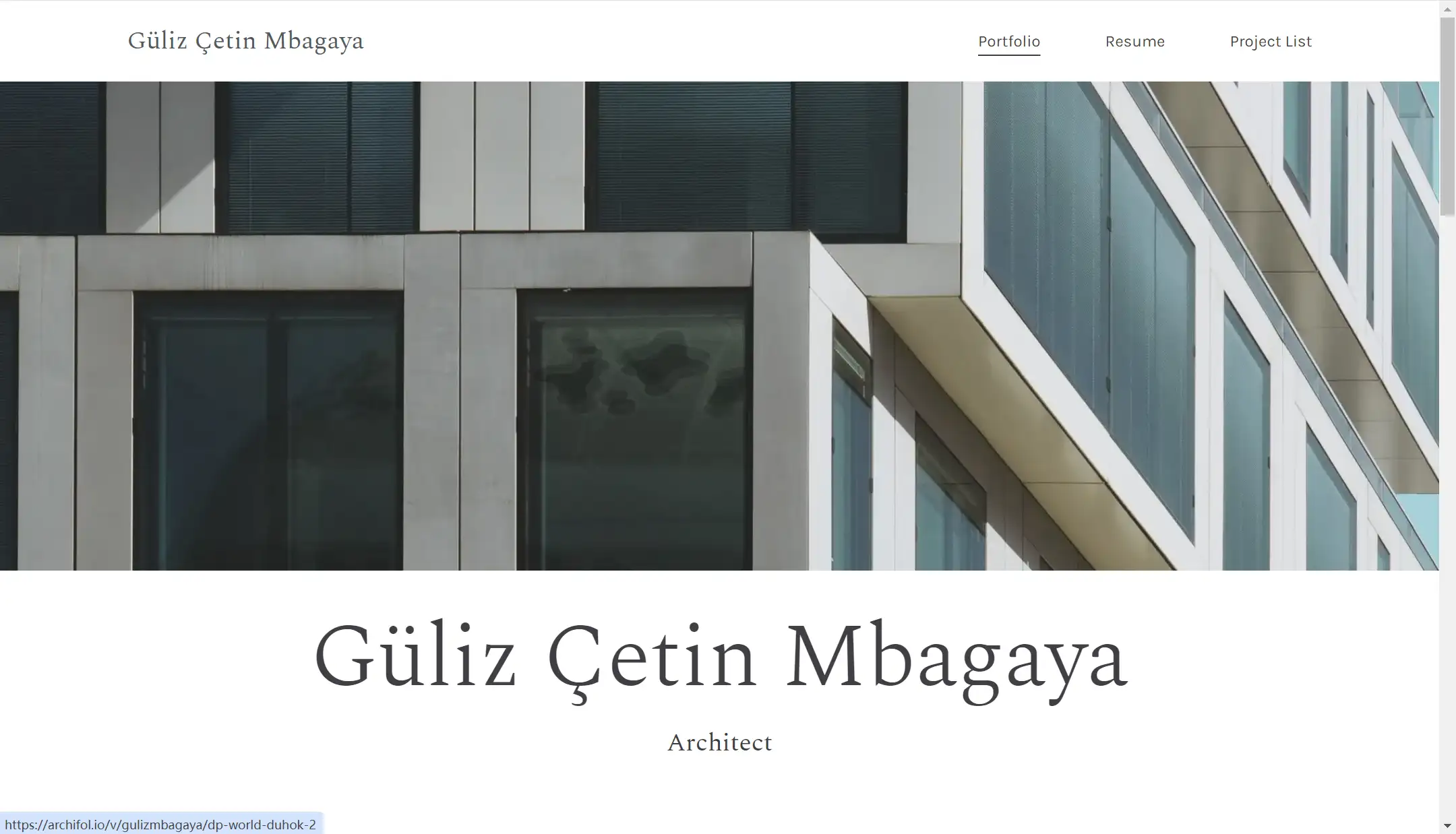
I love Güliz Çetin Mbagaya's website so much! It’s as sharp and professional as she appears in her photos. The combination of black, white, and gray tones, along with sleek, minimal fonts, enhances readability while creating a sophisticated atmosphere that perfectly reflects her style within her interior design portfolio.
The designer showcases several projects, each featuring high-quality professional sketches and final renderings. These visuals are precisely what the audience wants to see, as they highlight her talent and attention to detail. Güliz's extensive resume indicates that she has handled a variety of large-scale projects, demonstrating her high level of expertise. When creating your interior design portfolio website, showcasing your work is essential—it's a perfect way to introduce yourself without words!
How to Make a Stunning Interior Design Portfolio Website?
After viewing these professional and creative websites, do you want to build your own interior portfolio website? And now, let’s look at the 3 easy steps that will help you create a stunning interior design portfolio website:
Step 1: Identify Your Goals
Defining the goal of an interior design portfolio website is crucial, as it directly shapes the design and functionality. Each purpose influences key decisions like layout, content, and user interaction.
For example, if you just want to showcase only, you might focus on a sleek, image-heavy design with minimal text, similar to Blackhaus, allowing the work to speak for itself. But if you want client conversion, you need to emphasize CTA buttons. Or you would like to provide service, it would be better to add some e-commerce functionality. So, it is important to define your goals as it can help you make informed decisions during the design process.
Step 2: Choose a Website Builder: Wegic
If it is your first time to build an interior portfolio website, it is important to choose the right website builder. If used effectively, it can help you save a lot of time and effort. Wix and Webflow are matured platforms, offering diverse templates that fit many industries. But there are some limitations like high subscribe fee for its paid plan or technical knowledge required. So I want to share other tools ----Wegic
I want to recommend it for its free credits, user-friendly interface, and powerful AI feature. I know most small businesses or individuals have limited budgets in building a website. They also have no much website-building experience or coding foundation. That’s why I like to recommend Wegic. It is quite easy to use and offers powerful features for free.
Building a website in Wegic just takes three steps.
-
At first, tell Wegic what your website is about;
-
Then, enter the website Name, and choose the language;
-
Finally, click the OK button.
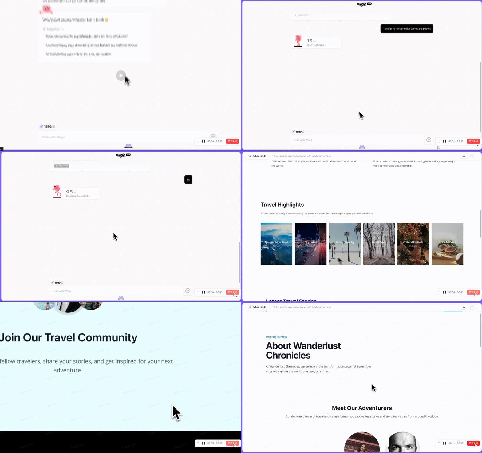
Congrats! Your website is generated. In this process, you just need to spend 40 credits only. If you are new to Wegic, you can get 70 credits for free at the beginning. Of course, you are just at the initial stage. If you want to make a stunning website, you need to make adjustments and polish it.
In the free version, Wegic can generate 3 pages for each website, That’s cost-effective compared to other tools. In a 3-page website, you can introduce your portfolio, your contact information, and your team or your service. A 3-page setting is enough to build a completed and professional website.
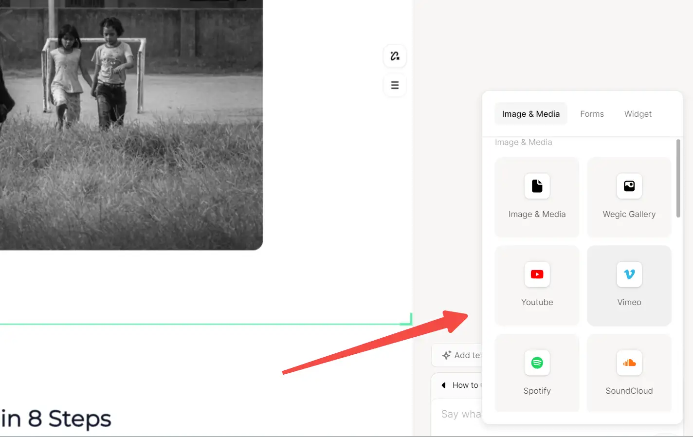
Due to its powerful AI, you can easily communicate your idea with the Wegic and it can understand what you need and bring your idea into reality effortlessly. It provides a lot of useful features like third-party embedding or circling and drawing faetures.
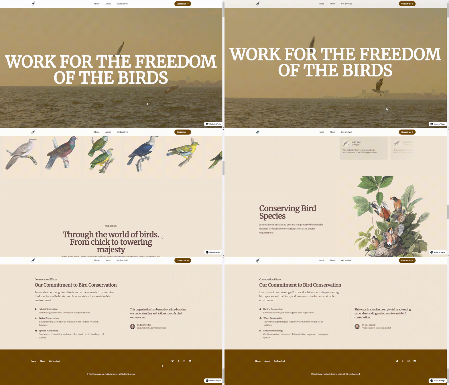
Here are some websites made by Wegic. Just give a try.
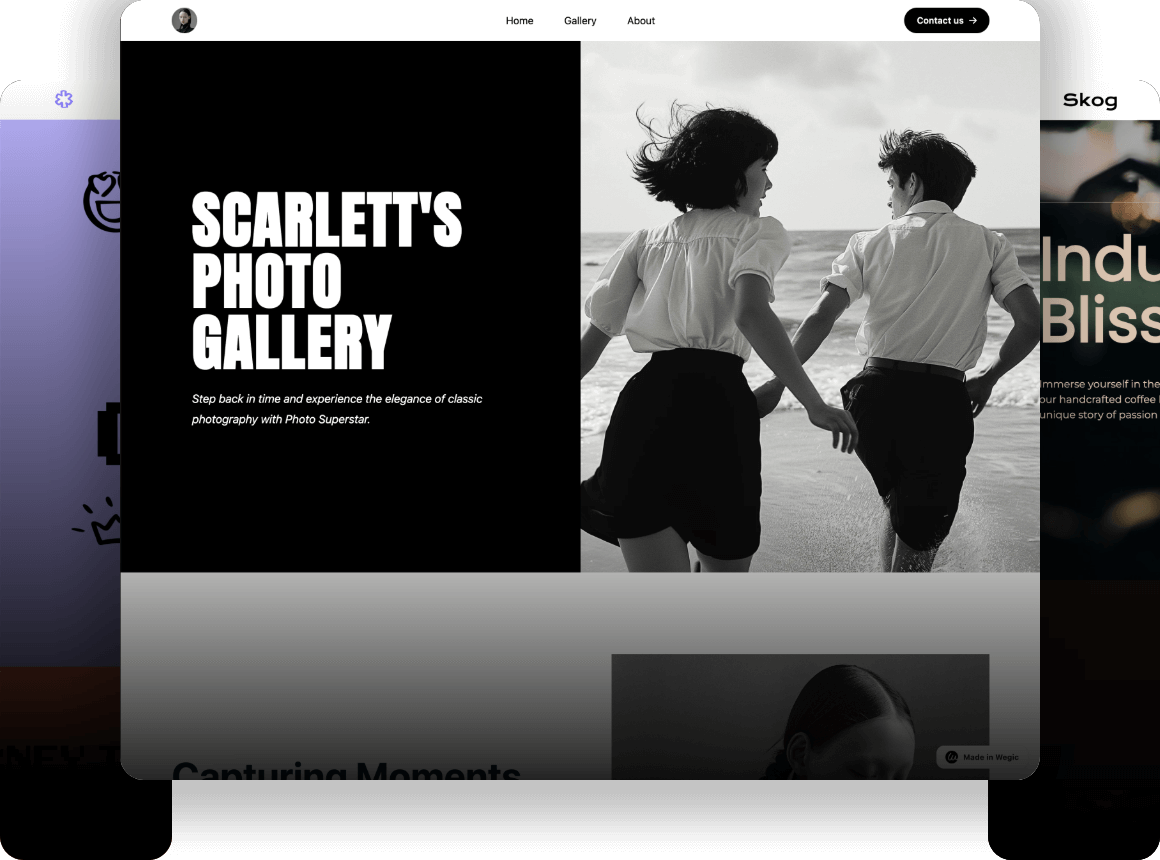
A photography portfolio website

A bird protection website
Step 3: Include 4 Must-Have Elements in Your Design
When you build your website, you need to further polish it and make it look appealing and professional. No matter what your goals are to build a website, showcasing or selling service, you need to make sure your interior portfolio website includes some key elements.
Intuitive and clear Navigation: You should ensure that the website structure is simple and clear, and visitors can easily find information such as design cases, services, contact information, etc.
High-Quality Visuals: We can very intuitively understand the importance of high-quality images or videos in the case analysis above. The website should allow for zooming in on details and feature a combination of static images and dynamic content like videos, similar to Blackhaus. This can not only show the design work and inspiration, but also attract the attention of visitors.
Compelling Portfolio Showcase: If possible, provide your audience with detailed design project cases, including before and after comparisons, design concepts, materials and colors used, etc. You can use image galleries, sliders, or carousels to display your best projects. This can well show your professionalism and design concepts.
Responsive and Fast Loading: Make sure your website is compatible with all devices, including mobile phones and tablets, and The fast loading speed can significantly improve user experience.
Conclusion
Building a strong interior design portfolio website is a crucial step for any interior designer. It allows you to present your work professionally, attract new clients, and express your personal style.
While it can feel overwhelming to get started, you can make good use of some website builder tools like Wegic. It makes building a site more manageable than you might think. So, whether you're a seasoned designer or just starting out, don’t hesitate to take that step and bring your portfolio to life.
FAQs
How can I organize my portfolio to impress potential clients?
Categorize your work based on project type or style to make it easier for visitors to browse. Use before-and-after shots, videos, or case studies to showcase the impact of your designs.
Can I update my portfolio easily with Wegic?
Yes! Wegic allows you to make quick updates and adjustments to your website as your portfolio grows. It's user-friendly and flexible, making it easy to keep your content fresh.
Is Wegic suitable for customizing interior design portfolios?
Absolutely! With its AI features, Wegic offers high customizations for designers, allowing you to adjust layouts, upload images, and create a website that perfectly reflects your brand and style, without needing coding skills.
Read More
Written by
Kimmy
Published on
Mar 17, 2026
Share article
Read more
Our latest blog
Webpages in a minute, powered by Wegic!
With Wegic, transform your needs into stunning, functional websites with advanced AI
Free trial with Wegic, build your site in a click!