Log in
Build Your Site
12 Best Art Portfolio Website Examples of 2024
We will show you the 12 most amazing art portfolio websites for your reference! The website owners include illustrators, font designers and many others!
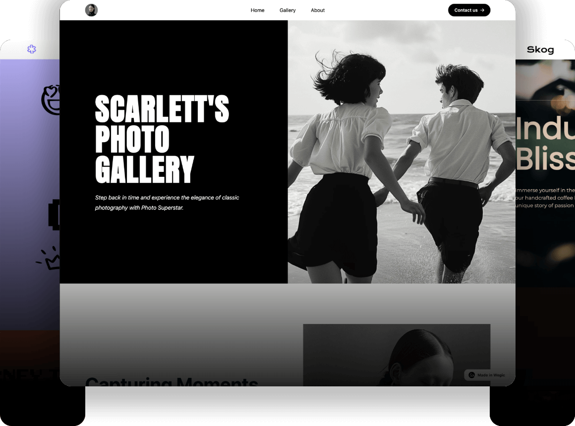
In today's digital age, creating your website has become one of the most effective marketing tools. It allows more people to see your products and services and increases your brand awareness. For artistic creators, including illustrators, 3D artists, photographers, designers, or sculptors, the importance of having a personal portfolio website is beyond doubt. Through your website, you can show your works to the audience, convey your style and aesthetics, and demonstrate your professionalism, thereby increasing your visibility and gaining more revenue.
In this article, we will show you the 12 best art portfolio websites for your reference. The website owners include illustrators, font designers, photographers, painters, etc. Each website has its unique characteristics. Whether you are just starting to create a personal portfolio website or are looking for inspiration to optimize an existing one, these examples will provide you with inspiration and help. Now please scroll down and start exploring.
12 Best Art Portfolio Website Examples of 2024
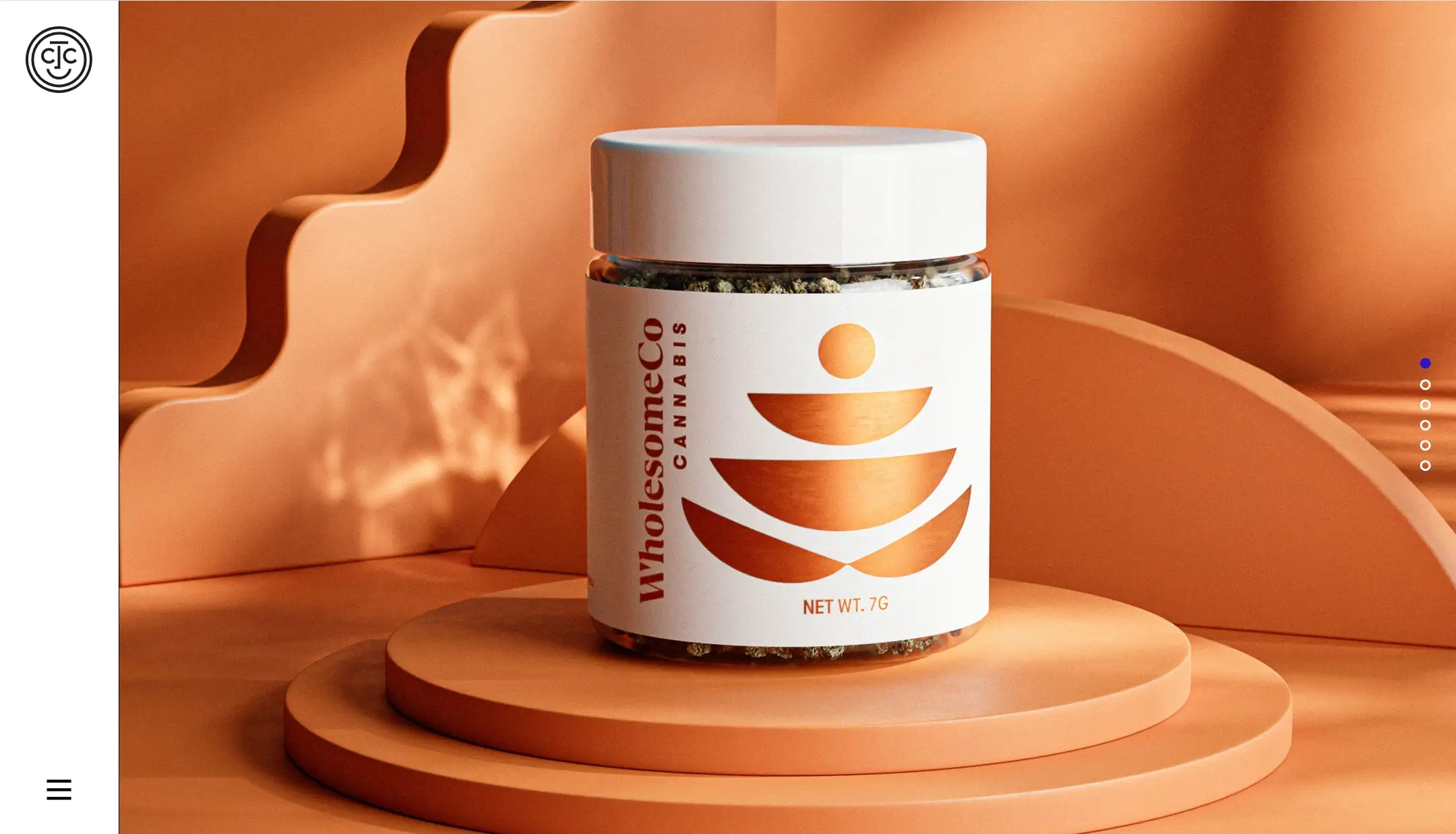
1.Tad Carpenter
Tad Carpenter is a designer and illustrator known for his vibrant, playful designs that blend typography with engaging visuals. How to make an art portfolio? Everyone should see his website.
A simple and intuitive hamburger menu on the homepage helps users find what they want quickly.
Smooth animations keep the audience engaged and improve the user experience.
His portfolio site contains a large number of case studies. Take Boulevard Brewing Co. as an example.
The website uses vibrant visuals and engaging typography to convey the artist's creative process. He narrates the entire design process from start to finish, including the problems the team encountered and the solutions. This allows the audience to understand more about his design philosophy and thinking, and how he sees problems and solves them. This has well demonstrated his professionalism as a designer. It can also inspire other audiences.
The large number of high-quality creative images highlights Tad's strengths and features. He is very good at design illustration, branding, and graphics. This section allows the audience to visualize Tad's skills.
2.Nakashima Photography
Nakashima Photography specializes in capturing the delicate beauty of nature through stunning landscape and wildlife photography. Each case study contains a large number of high-quality, beautiful images, showing expertise and skill in photography.
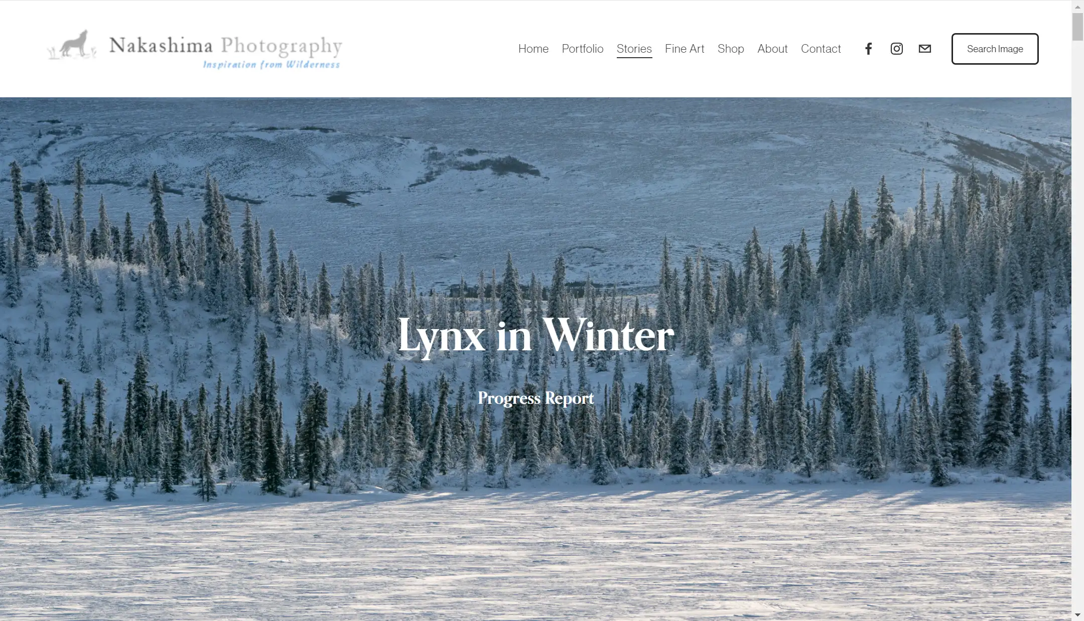
What inspiration can be drawn from this portfolio website:
-
We can see that the navigation is straightforward, containing several sections, including one's portfolio, the shop as well as contact information, social media, and more. With comprehensive content, there is a clear structure with further subdivided menus below each option.
-
You will see that the background of its website is a picture of a Tibetan antelope that occupies the whole screen, which can quickly catch the viewers' eyes and make them focus on the content.
-
The white text contrasts with the background color to increase readability. The text content is a synopsis of the entire website, which allows the viewer to quickly understand what the main content of this website is.
-
Exploring the site further, we notice a total of six collections distributed in a vertical structure that makes for a smooth reading experience for the viewer. Each case is introduced by a beautiful background image and white text. The color scheme has been chosen to maintain a consistent style throughout the site and increase the readability of the content.
-
In addition, it is worth mentioning that the shop page also displays the photographs for sale, including a brief description and price, which is conducive to a smooth transaction.
3.June Digan
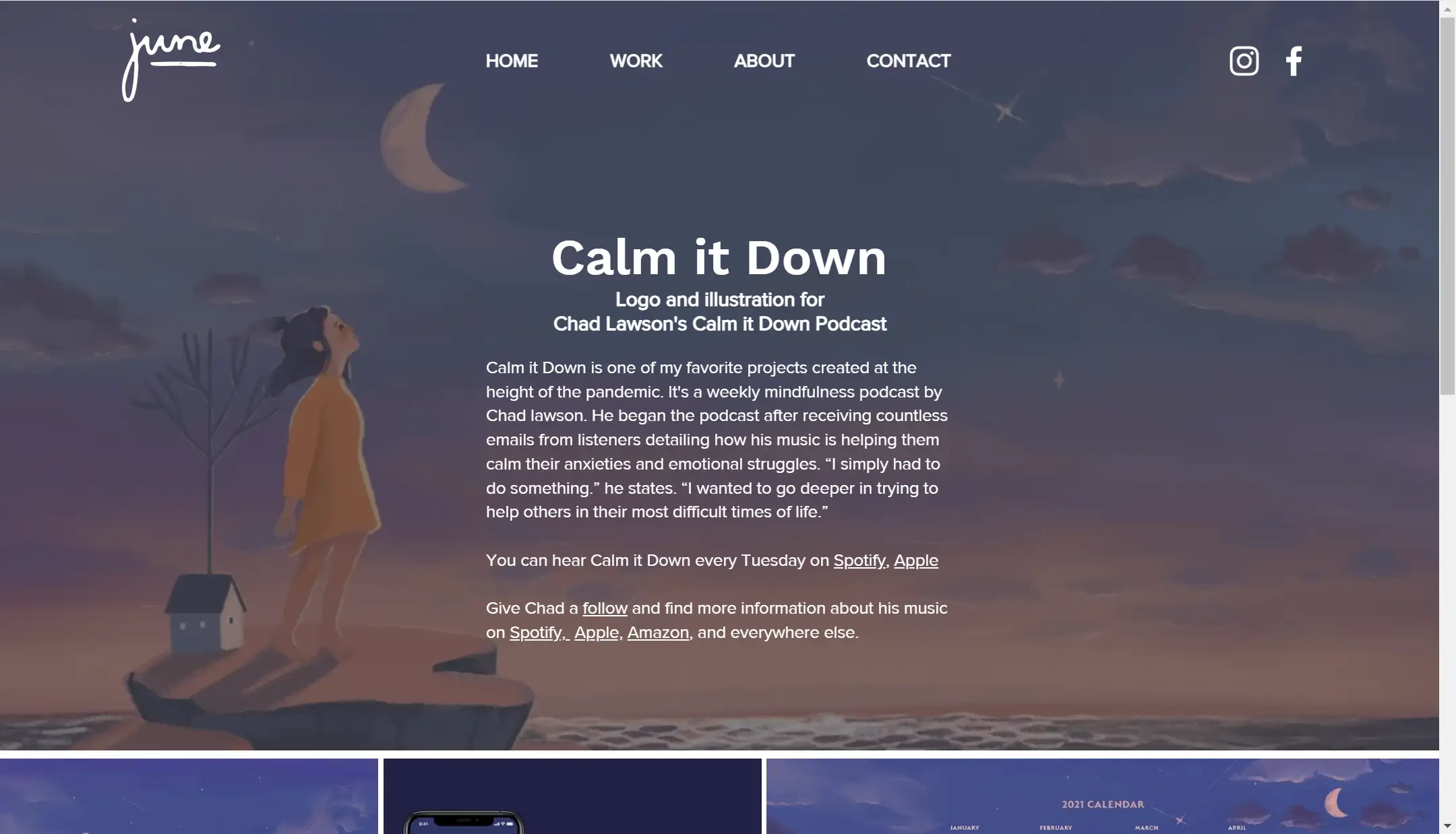
June is a designer and illustrator specializing in traditional and digital mediums. She loves to tell stories through delicate characters, whimsical landscapes, and lettering, aiming to reflect a vibrant, positive outlook on life.
When we browse June Digan's portfolio site, it can be noticed that the website has a very personal style. So, what inspiration can be drawn from this portfolio website:
-
Simple and clean navigation helps increase the user experience.
-
What's more, the overall style of the site makes the audience feel warm, friendly, and comfortable, with an illustration of a sunset orange color in the background. The white font of the self-introduction contrasts with the background, which can make the audience focus their attention.
-
Her portfolio covers several cases, all of which are presented to the audience in the form of a grid. June also utilizes a variety of animation effects such as hover effects to showcase her work in all aspects.
-
In her case studies, she starts with an introduction to the project, including background information, allowing the viewer to form an overall understanding.
-
The high-quality illustration images are arranged in a grid format with a warm and comfortable color scheme and white fonts to enhance the reading experience.
4.Art by Rhein
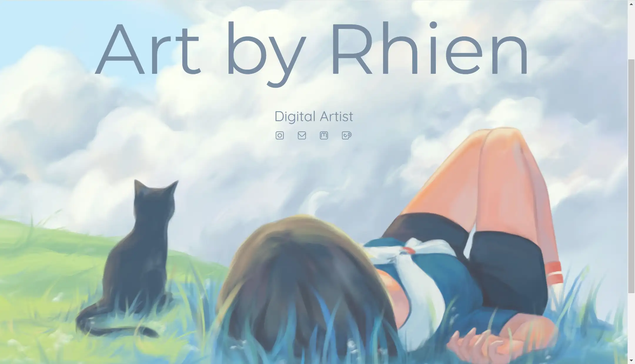
Rhien is a digital artist who merges fine art with graphic design, creating visually striking and thought-provoking pieces.
Her website also follows the principles of minimalism. The intuitive navigation is user-friendly, with rich content, including the portfolio, About page, and shops.
Its homepage features a full-width display of her artwork, with gentle blues creating a sense of tranquility. Then, what inspiration can be drawn from this portfolio website:
-
The portfolio shows users several beautiful illustrations, mainly character illustrations, which have a very strong personal style. These illustrations have a very strong personal style, bold colors, detailed drawings, very creative, and a variety of styles, leaving a deep impression on the viewer. There is no extra text description, but it is enough to let the viewers understand the designer's high level of drawing and unique aesthetics.
-
About page shows a cartoon self-portrait of the illustrator and her self-introduction, which tells the audience about her drawing experience from childhood to adulthood in a very calm and vivid language. A lot of emojis are used in the storytelling process, and these designs help her build a more intimate connection with the audience.
-
The Shop's page has a wide variety of categories, and the product information and price labels are visible.
-
In her portfolio site, interactive elements such as galley lightbox and hover effects are also worthwhile for many newcomers to learn from, the use of these animations can make your site more dynamic, and keep your audience engaged!
5.Manuel Lozano
Manuel Lozano is an accomplished photographer renowned for his compelling portraiture and documentary-style work that captures the essence of his subjects.
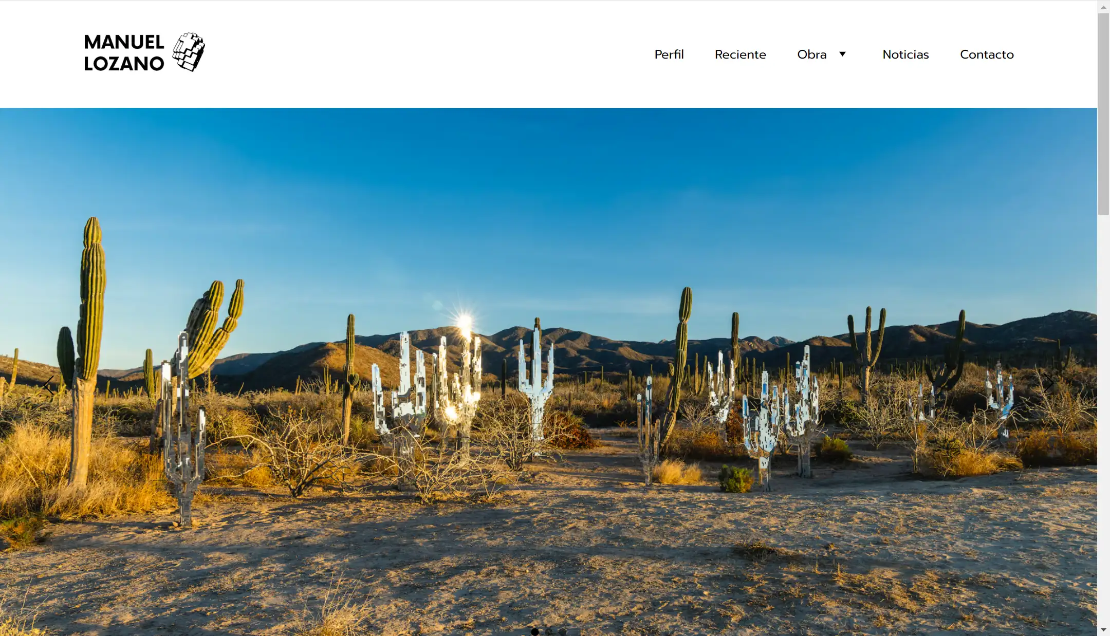
Manuel's website is clean and intuitive to navigate, with simple typography and a focus on image presentation.
His portfolios are sorted by year, one for every five years, and he presents a total of five portfolios to his audience. The audience can learn about his creative experience, changes in style, etc. through these collections. Each collection follows a minimalist design, which allows the audience to focus on his work.
It is worth mentioning that, in addition to the basics of biography, portfolio, and contact information, he also added a Recent page, which helps the audience to know the latest news and style characteristics of his work.
The recent page is about a project he has conducted recently named Anicá. It is an exhibition that highlights the voracious development of current technology while problematizing the notion of “the future”. It is an exhibition that highlights the voracious development of current technology while problematizing the notion of reality and fiction in interpersonal relationships.
In addition to highly creative images, this page has several textual descriptions that will help the audience understand more about the designer's ideas and design concepts.
6.Jennifer Cartright
Jennifer didn't start as a professional photographer until she was 56 years old, but she still has a lot of good photography to her credit.
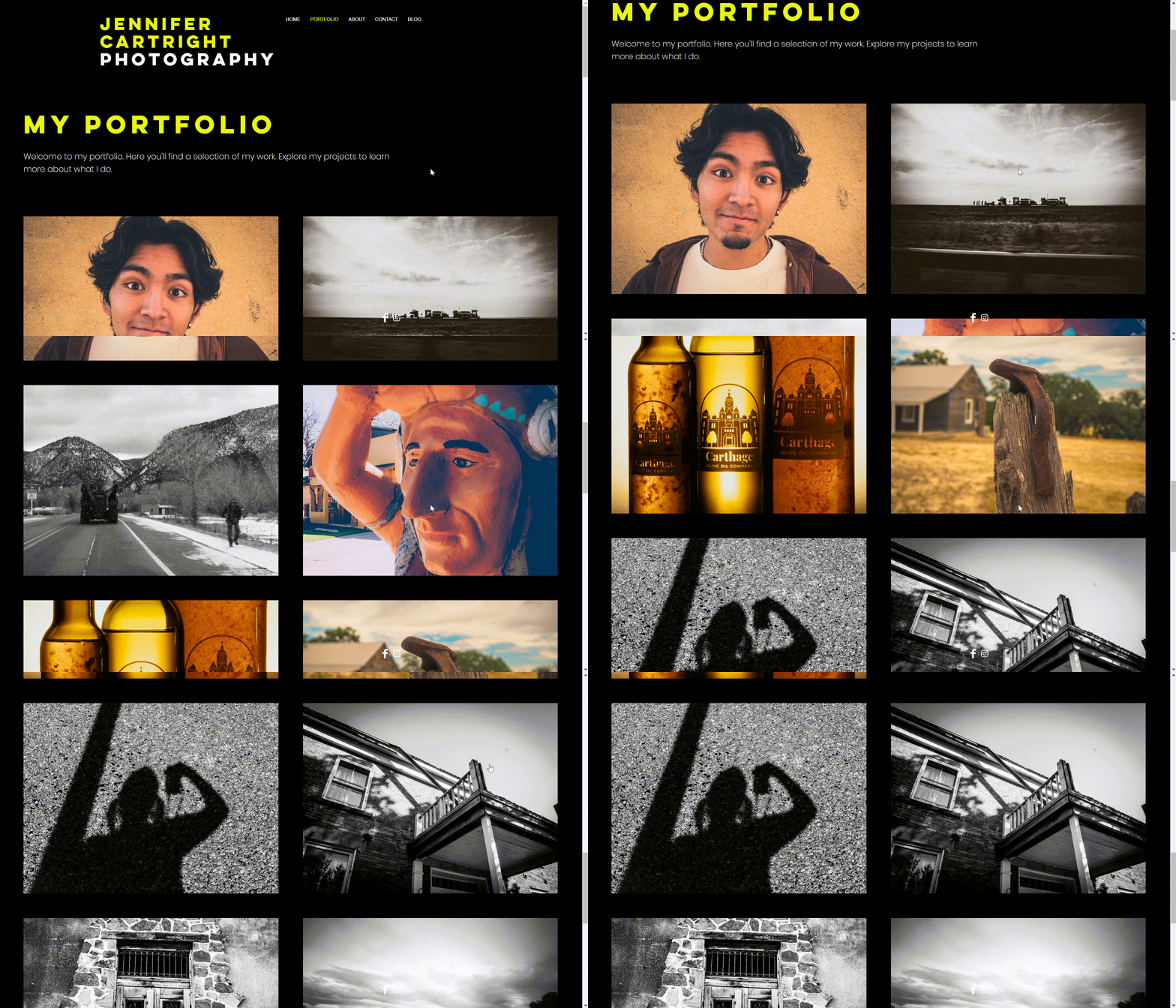
The navigation is clean and user-friendly. Next is her choice of color scheme. A black background with prominent yellow fonts creates a sharp contrast and greatly enhances the readability of the content.
As we look at her website, it is easy to see that her portfolio work can be divided into two categories: COLOR and BLACK & WHITE. She shows her viewers many collections with different themes. Most of the themes are related to daily life, such as working observation or self-portrait, and each collection contains a large number of high-quality image resources.
Her work is notable for its artistic depth and the personal stories it tells. The layout of the portfolio is vertically distributed in two columns, which is very simple and neat, with a sense of hierarchy, plus the use of animation effects, which helps to enhance the user experience.
Also worth mentioning is her blog page, which she frequently updates, mostly sharing her and her husband's travel diaries. She has made a name for herself within the niche of fine art and travel photography.
7.Loshi
Loshi is a digital artist known for creating surreal, dreamlike compositions that challenge the boundaries of reality.
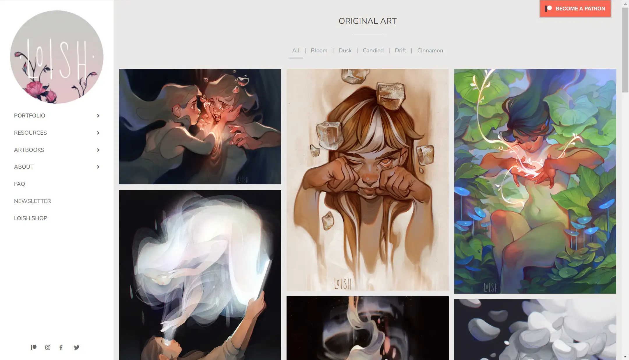
The Loshi portfolio website has intuitive and user-friendly navigation. Moreover, the portfolio pages are subdivided according to “Bloom,” “Dusk,” “Candied,” etc., which allows users to quickly find what they are looking for and enhances the quality of the artwork.
The portfolio features high-resolution images that showcase the detail and quality of the artwork. This helps the audience maximize their appreciation of the artwork.
Moreover, the layout of the images is very simple and there is no unnecessary text to interfere, which allows the audience to focus on the designer's work. The large number of high-quality image resources is enough to speak for designers.
Interactive elements like hover effects make the page more dynamic, enhancing the user experience and keeping the audience engaged.
Including links to newsletters, art books, and a shop provides multiple avenues for audience engagement and potential income streams. This can be one of the simpler and more consistent ways for designers to generate income. This can be one of the easier and more stable ways for designers to earn an income.
8.Ohdada
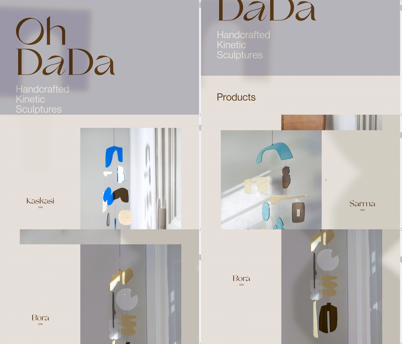
Ohdada is one of the best examples of minimalism I've shown, a collaborative brand created by graphic designers Nora Römer and Susi Chmela, who make handcrafted kinetic sculptures for a more calming and dream-like atmosphere. more calming and dream-like atmosphere - for your home and mind.
The art site is minimalist, with a brown font contrasting with a grayish-purple background, enhancing readability and deepening the viewer's impression of the brand. As you scroll down the page, you'll notice that the content consists of three basic parts: the name of the artwork, the price, and a picture of the artwork.
Tap into each image to get more detailed information about the piece, including more detailed pictures, materials used, dimensions, and a description of the production process. In addition to this, the call to action button such as buy or back has been placed in a prominent position, which encourages users to make purchases. In terms of commercialization, it is essential to be able to convert this into profit.
9.Zaria Forman
Zaria Forman is a fine artist celebrated for her large-scale pastel drawings that vividly depict the effects of climate change on polar ice landscapes.
Zaria's menu is simple, clear, and very user-friendly. Each section is well-organized, making it easy for users to find what they're looking for.
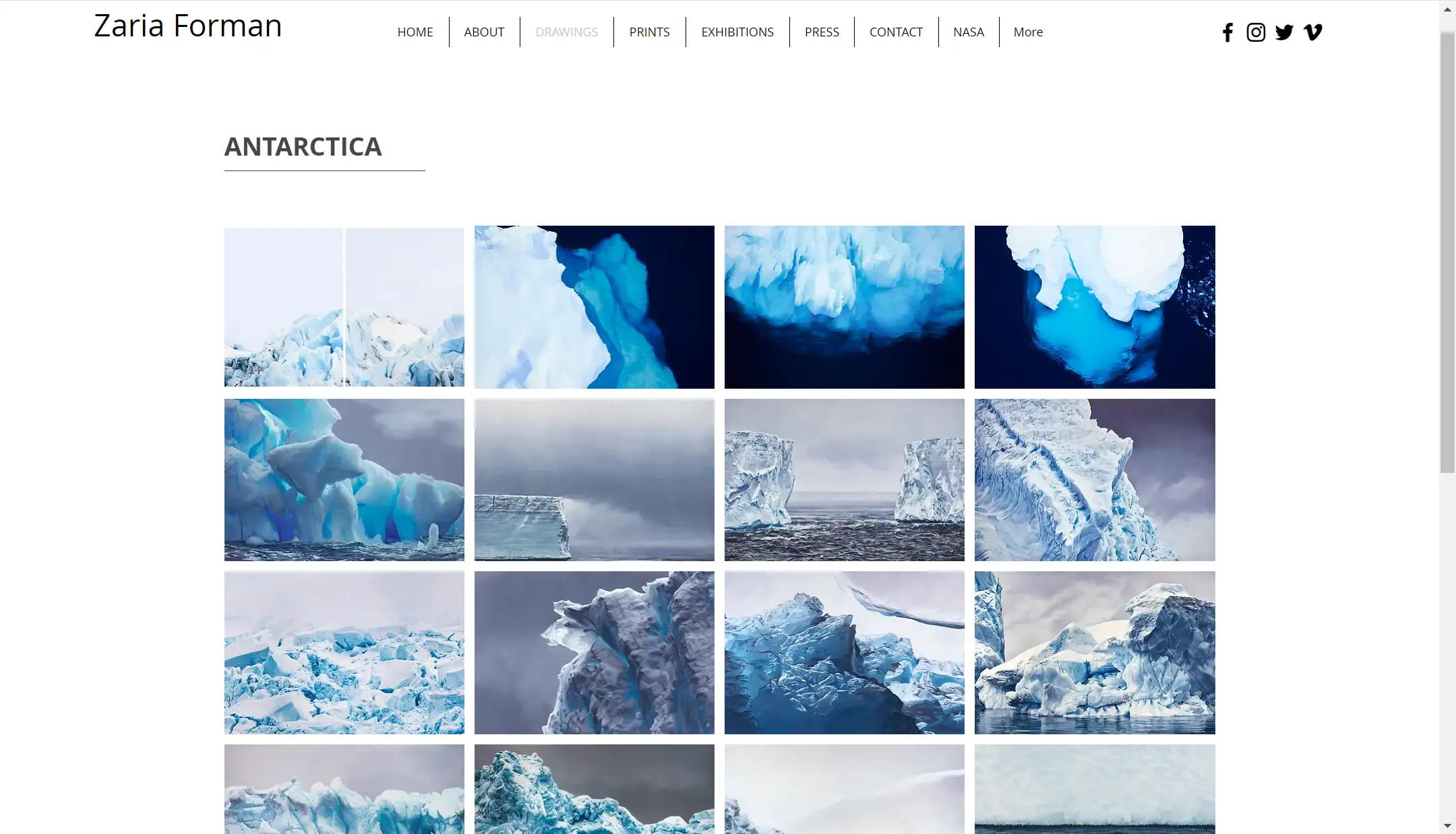
We can focus on the fact that her main business is a set of pictures that take up the whole screen and attract the viewer's attention. The website as a whole has soft blues and whites as its main colors, creating a feeling of serenity and peace.
We can focus on her main works. The drawing section contains many images and presents them to the viewers in the form of a lightbox gallery, which is very simple, intuitive, and clear. The color palette of the images is unified, deepening the viewer's brand awareness and giving them a deeper impression of the artist's personal style.
The paintings depict the sea in various parts of the world, and Zaria links her work with environmental issues, hoping that people will not only appreciate her paintings but also arouse public awareness of environmental protection and contribute to the cause of environmental protection through her paintings. On the menu of her personal website, it is worth mentioning her More page, which is an appeal to the public to reduce their carbon footprint.
This section helps the audience to know more about her and her work, as well as her philosophy.
10.Mike Winkelmann (Beeple)
Beeple is Mike Winkelmann, a graphic designer who does a variety of digital artwork including short films, Creative Commons VJ loops, and VR or AR work.
His website contains a cutting-edge portfolio that reflects Beeple’s influence in the digital art and NFT space. The design is futuristic, with a focus on innovation and digital culture.
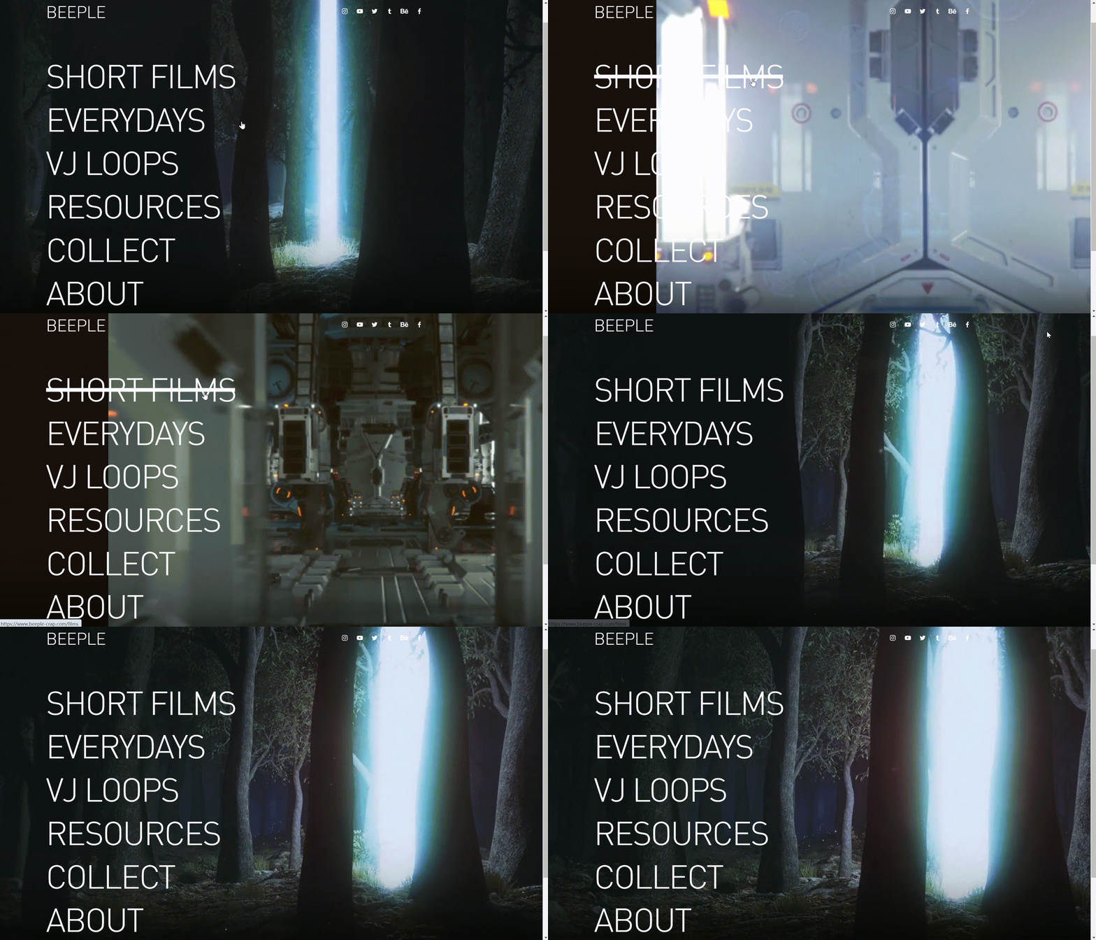
When entering his website, we can notice the black background and the large white font form a sharp contrast, providing a concise and clear navigation menu while being readable. When you move the mouse to any section, the background video animation changes while triggering the hover effect. These interactive elements greatly enhance user engagement and user experience.
His website covers a large number of high-quality and creative visual elements such as videos and pictures, exploring a range of themes, all of which show Mike’s super professional level in the field of digital art and bring extremely pleasant visual enjoyment to the audience.
His work is characterized by its bold, often surreal imagery that blends pop culture, social commentary, and futuristic elements. In particular, his daily artwork post fully showcases the artist’s prolific output and commitment to creativity.
11.Paolo Ventura
Paolo Ventura is a photographer and artist who crafts imaginative, narrative-driven scenes that blend reality with fantasy.
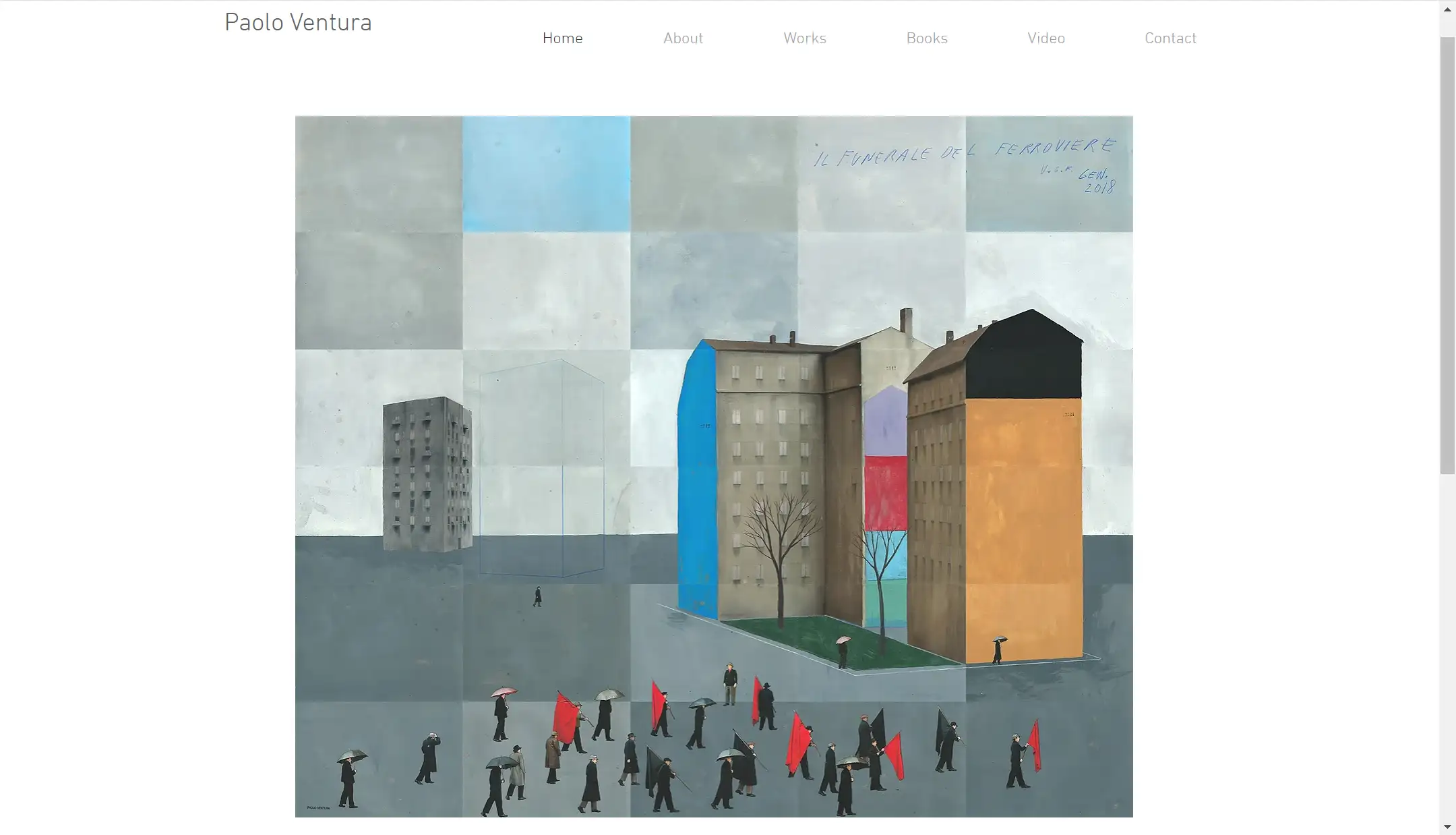
The general style of Paolo's website is very clean and minimalist allowing the viewer to focus themselves on his content. The navigation bar is very intuitive and simple, divided into several common sections. Each section breaks down the content in a well-organized way, which is very neat and intuitive and helps the viewer find the appropriate content quickly.
Tapping into the portfolio we can see that each collection is sorted chronologically from closest to furthest. Each collection also has its theme. We can see that all of his work has a consistent theme. Sticking to the vintage style, using muted colors, classic fonts, and aged textures that echo the nostalgic quality of his artwork, while being both creative.
Each theme has its separate page, with a tight structure and organized layout, all of which help to enhance the user's browsing experience and leave a lasting impression on the viewer.
12.Caroline Denervaud
Caroline Denervaud is a multidisciplinary artist whose work spans painting, performance, and video, exploring the movement and rhythm of the human body.
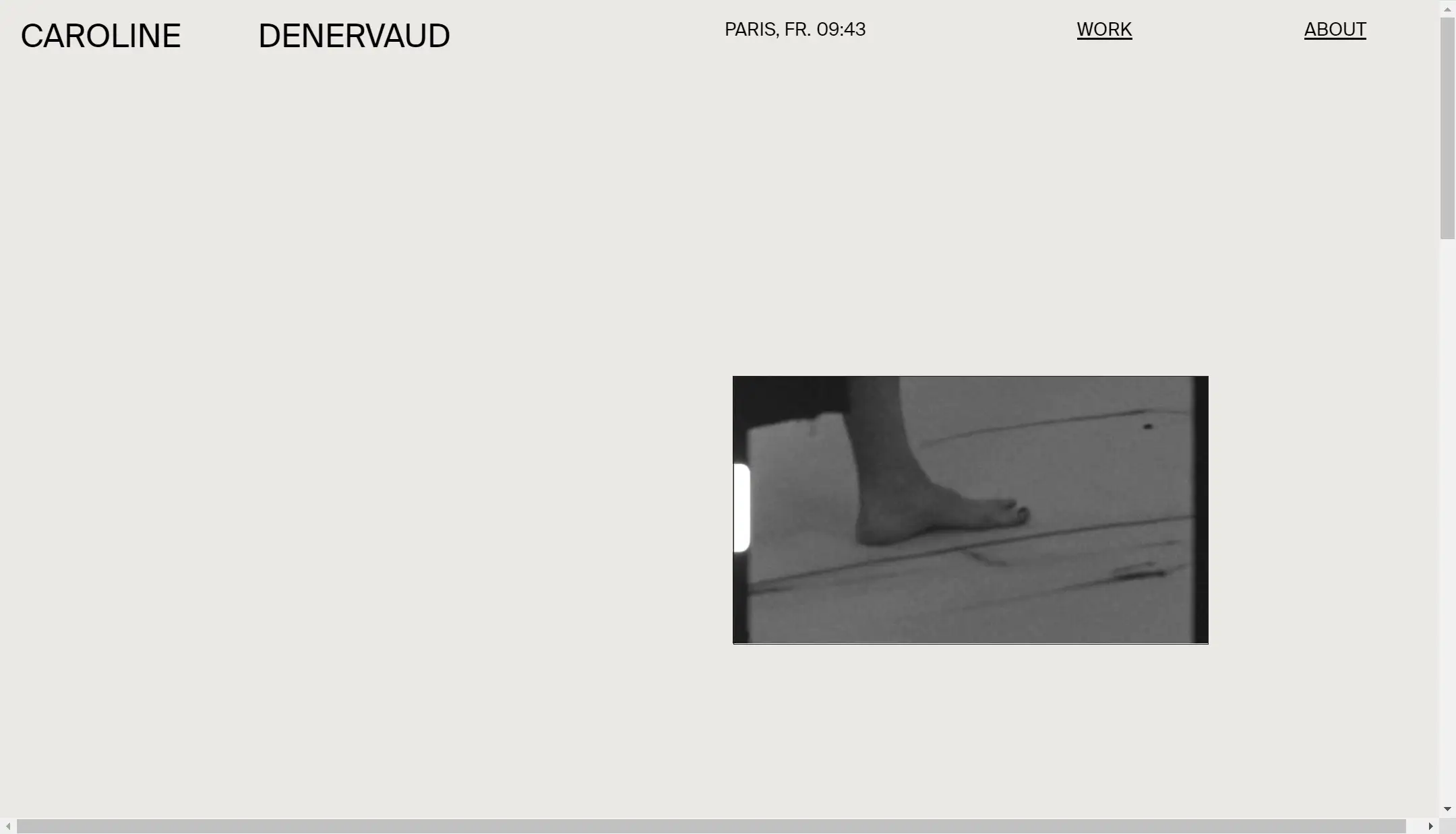
The navigation is minimalist, with only the portfolio and about page sections, simple and intuitive, directing the viewer's attention to the images and videos on the homepage.
The video on the homepage documents Caroline's process of painting with her own body, which is very exciting and creative. The video also features scroll-triggered effects, which adds a dynamic layer to the browsing experience.
Although the number of images is not very high, the images have a very strong personal touch, which creates a strong impression and strengthens brand awareness.
The About page is very informative, providing the viewer with a wealth of details, including her personal introduction and educational background. There is also a long list of art exhibitions that the designer has participated in. This helps the audience to know more about her.
What makes a stunning art portfolio website?
After browsing 12 good examples, you might have a general understanding of what a good portfolio should be like. An excellent personal portfolio website has several key elements.
First, intuitive and concise navigation and a clear structural layout are essential elements because they help visitors quickly find the information they are looking for.
Secondly, high-quality image and video resources are indispensable contributions to a good art portfolio website. These visual elements should not only be aesthetically appealing but also fully reflect your style and features.
Third, a good art portfolio should include case analysis and related descriptions. You can introduce the background of the project, and the meaning behind your works, or share your unique insights into art.
At the same time, an introduction to your career and the honors you have acquired can be included as well. All of the information can allow the audience to have a deeper understanding of your experience in the field of art, your style, philosophy, and your attitude toward design.
How to create an art portfolio website on Wegic
Now, are you already full of inspiration and can't wait to create your portfolio website? Building a portfolio website is not complicated. There are many AI website-building tools to choose from, and Wegic is one of them that is particularly friendly to newcomers.
It is easy to operate and does not require any website-building experience or code foundation. You can give full play to your creativity and turn all your ideas into reality by using Wegic. Simply put, you can create your art portfolio website in just 3 steps.
First, tell Wegic what kind of website you want to create, whether it is a personal photography collection or the official website of a travel agency.
Then enter basic information such as language and website name.
Finally, click Publish, and your website will be automatically generated in a few seconds.
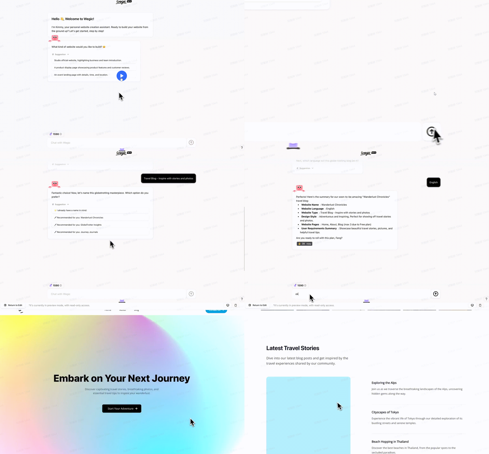
If you want to further optimize the website, you can talk to the IP character and describe your needs in detail, and it will help you realize all your ideas. Wegic also provides very beginner-friendly features, such as sketching and uploading reference pictures.
If you are not good at description, you can draw a simple sketch as a reference, and Wegic will immediately understand what you mean and make corresponding modifications.
You can also upload screenshots of other excellent websites, and Wegic can also optimize them according to the reference pictures.
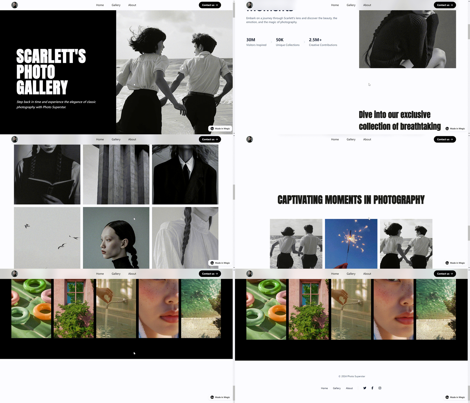
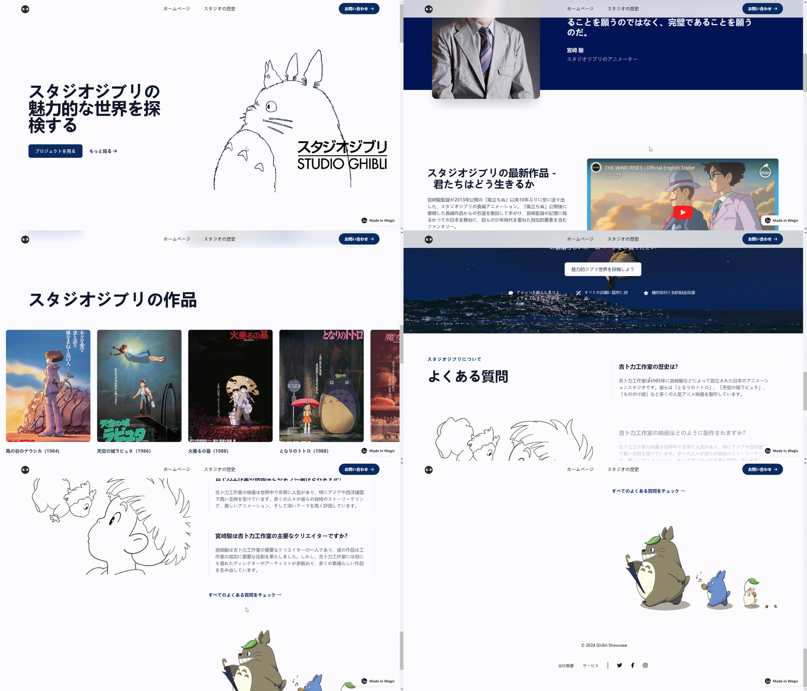
In general, Wegic is an AI website-building tool that is very suitable for beginners. As long as you have any creative ideas in design, it can help you realize these ideas perfectly. The following are website examples generated by Wegic. If you think it is good, you might as well try it yourself
Conclusion
This article shows 12 examples of art portfolio websites, each with unique highlights. By analyzing these examples, we also summarized the common features of excellent portfolio websites. If this content inspires you, you can try to use AI website builders such as Wegic to build your portfolio website in a fast and efficient way.
As I mentioned earlier, it is not difficult to build a portfolio website, but there are many factors you need to consider to create a beautiful, stunning portfolio website. You have to think about what kind of website you want to present, and what effect you want to achieve through this website. These questions will lead to more detailed thinking, such as what kind of layout can best show the effect, how to select the works to show your professionalism and uniqueness, and how to balance aesthetics and functionality to make the website both visually attractive and user-friendly. The answers to these questions mainly depend on your purpose and your audience. It requires you to keep exploring and trying. But don't worry, now you can try to create your portfolio website with these questions as the first step.
Written by
Kimmy
Published on
Mar 12, 2026
Share article
Read more
Our latest blog
Webpages in a minute, powered by Wegic!
With Wegic, transform your needs into stunning, functional websites with advanced AI
Free trial with Wegic, build your site in a click!