Log in
Build Your Site
Google Ads Landing Page Design: Best Practices & Tips
Want to maximize your Google Ads performance? Learn essential landing page design tips and best practices that can enhance user experience and drive conversions.
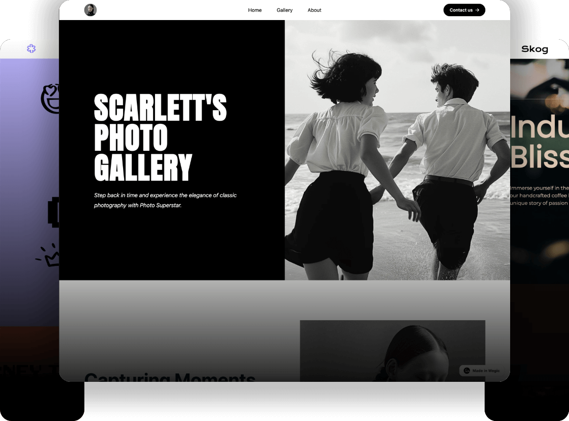
With an image of some athletic shoes, you click on a Google Ad for “best athletic shoes” and go to a generic sportswear homepage. Disappointed? So would most users. This is why Google Ads landing page design is important in maintaining a smooth and engaging user journey. Aesthetics aren’t just about how your audience feels about a space; aesthetics are about pulling your audience into action. In this guide, we’ll dive into everything you need to know about crafting effective, conversion-driven landing page designs for Google Ads.
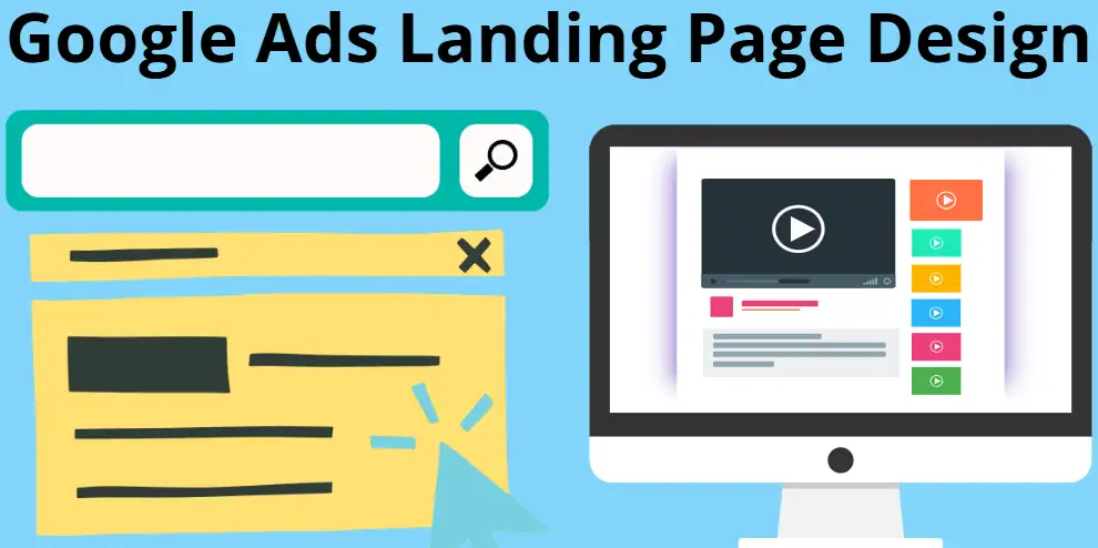
What Is a Landing Page in Google Ads?
A landing page is the specific webpage users land on after clicking your Google ad. Picture your online storefront — what users expect to see and what you promise to deliver based on your ad.
A landing page doesn’t have that same generic homepage setup as you have on normal sites. A landing page is specific to one thing – you have a goal that it wants to please, whether it entails getting leads, signing people up for something, or relaying sales. Your ad copy and the landing page message are aligned, meaning you’re more relevant, have a better user experience, and a better Google Ads Quality Score. A compelling Google Ads landing page design isn’t just helpful — it’s vital to succeed in the competitive online advertising space.
How to Create a Landing Page for Google Ads: 9 Steps
Building a landing page for a Google Ads campaign can seem like a juggling act. That’s because aesthetics, functionality, and strategic messaging must all be balanced with an awareness of your target audience. A well-crafted landing page design for Google Ads can significantly improve conversions, reduce bounce rates, and enhance your campaign’s overall performance. Here’s a step-by-step guide to help you nail it:
1.Start with a Single Goal
Any good landing page relies on clarity. Before you start designing, figure out what you want visitors to do. You should think about what are you asking them to do. Are you asking them to sign up for a newsletter, download an eBook, or check out a purchase? Keeping your messaging sharp with a focused goal means no distractions. Whereas a typical general webpage should have one clear call-to-action, your landing page should have just one.
2.Choose the Right Platform
A landing page from scratch can be daunting, but tools exist to simplify the building. Platforms like Unbounce, Instapage, and Leadpages offer templates optimized for Google Ads landing page design examples. These tools work for both newcomers and knowledgeable marketers, offering drag-and-drop features that enable you to build extraordinary pages without having to learn to code. And if, say, customizability is crucial, these platforms can integrate flawlessly with your current website infrastructure.
3.Plan Irresistible Headlines
The first thing users will see when they land on your page is your headline. Your ad needs to attract attention immediately and match up to your ad’s theme. Imagine you are using an ad that says “Affordable Web Hosting Solutions”; then your headline should read something like “Your Cheap Web Solutions Has Stood the Test of Time—From $5 a month!” This consistency builds confidence, making visitors spend more time at your site.
4.Write Persuasive and Relevant Copy
Your copy needs to do more than inform— it needs to persuade. Instead, you should be providing your audience with a conversation to address their needs, concerns, or desires. Instead of detailing the features of your offering, take your customers through the benefits of your offering instead. Instead of ‘Our software has automated reporting’ say ‘Save hours with our automated reports — focus on what matters’! Subheadings to divide paragraphs, and bullet points to make difficult concepts easier to understand will leave your audience with some silver linings.
5.Design for Visual Attractiveness and Functionality
A strong Google Ads landing page design is both eye-catching and practical. Instead, stay away from cluttered and busy layouts that will confuse your audience. Always use high-quality images and videos that are intelligent enough to help your message and not your image or video. If you’re selling physical products, upload nice, clear, well-lit pictures of your products from all angles.
6.Prioritize Mobile Optimization
You don’t realize that most of the ad clicks occur on mobile devices. For this reason, responsive design is a non-negotiable requirement. And if your mobile experience isn’t optimized well, you’ll lose users faster than you can say "bounce rate." Load your page fast across devices and screen sizes, scale it right and have a lot of fun with it.
7.Use Strong Calls-to-Action
Your landing page has the CTA as its linchpin. Be bold, directive and just not able to ignore. Instead of using words like "Download Your Free Guide Now", you can use phrases like "Start Your Trial Today". You can try to put your CTA above the fold and let it do its magic all over the page. Use play as an opportunity to experiment with button colours, shapes, and placement to find what works best with your audience.
8.Make Full Use of Social Proof
We already know what people trust: what other people have validated. Honest, real-life stories of how your product or service has helped others will persuade hesitant visitors to take the plunge.
9.Test and Refine Regularly
We all know that the best landing page design ideas require fine-tuning. Instead of just writing headlines, A/B testing them would help you compare different elements like headlines, images, and calls to action. Look at metrics like bounce rates, click-through rates and conversion rates to see areas of improvement. Finally, keep tweaking until you get the best results you can.
By following these steps, you’ll create a landing page that not only meets Google Ads landing page requirements but also resonates with your audience. A properly executed page acts as a stunning bridge from your ad to your audience, converting to meaningful interactions and clear outcomes.
Google Ads Landing Page Requirements
That’s only half the battle of making a Google Ads campaign! To truly succeed, your landing page must meet certain requirements set by Google and adhere to Google Ads landing page design best practices. These aren’t arbitrary guidelines for the sake of it — they have to do with user experience and ensuring your Ads work and work in the way they should. So let’s break down the most important factors to consider to build a high-performance landing page.
1.Relevance and Consistency
A success rule, of course, is that your landing page is in sync with the message of your ad. Your landing page should highlight and shout out the top of your web page that if your ad says "Free Shipping on All Orders," that's exactly what you're getting. Having ad and landing page content mismatch causes visitor frustration and higher bounce rates. It also reassures users that they’ve landed in the right place.
2.Clear and Actionable CTAs
Your landing page can be very effective when you have a clear purpose, like without signs for the road. Google gives direct and visible calls to action (CTA) priority. It’s compelling, easy to see, and it’s in sync with your campaign’s goal. Whatever you want visitors to do, that’s your ‘Call-to-Action’ needs to stand out and take the visitor down the path of what you want them to do.
3.Mobile-Friendly Design
Mobile devices capture a huge percentage of ad clicks so your landing page needs to be geared towards smaller screens. A mobile-friendly Google ads landing page design ensures that text is readable, images load quickly, and navigation is seamless across all devices. Slow-loading pages or pages that are difficult to use on tablets and mobile phones will turn off a significant chunk of your future customers.
4.Adherence to Content Policies
A landing page has to satisfy Google’s content policies strictly. Therefore, we prevent the delivery or display of prohibited content which includes misleading claims, malicious software, restricted products and more. To continue running your ads smoothly, make sure this page meets these standards.
Meeting these Google Ads landing page requirements ensures your campaigns not only reach the right audience but also provide a positive user experience. Your page will be more polished, relevant and efficient and it will lead to more conversion, lower costs, and consequently higher campaign success.
Best Google Ads Landing Page Design Examples
Safesforce's Google Ads Landing Page Design Examples
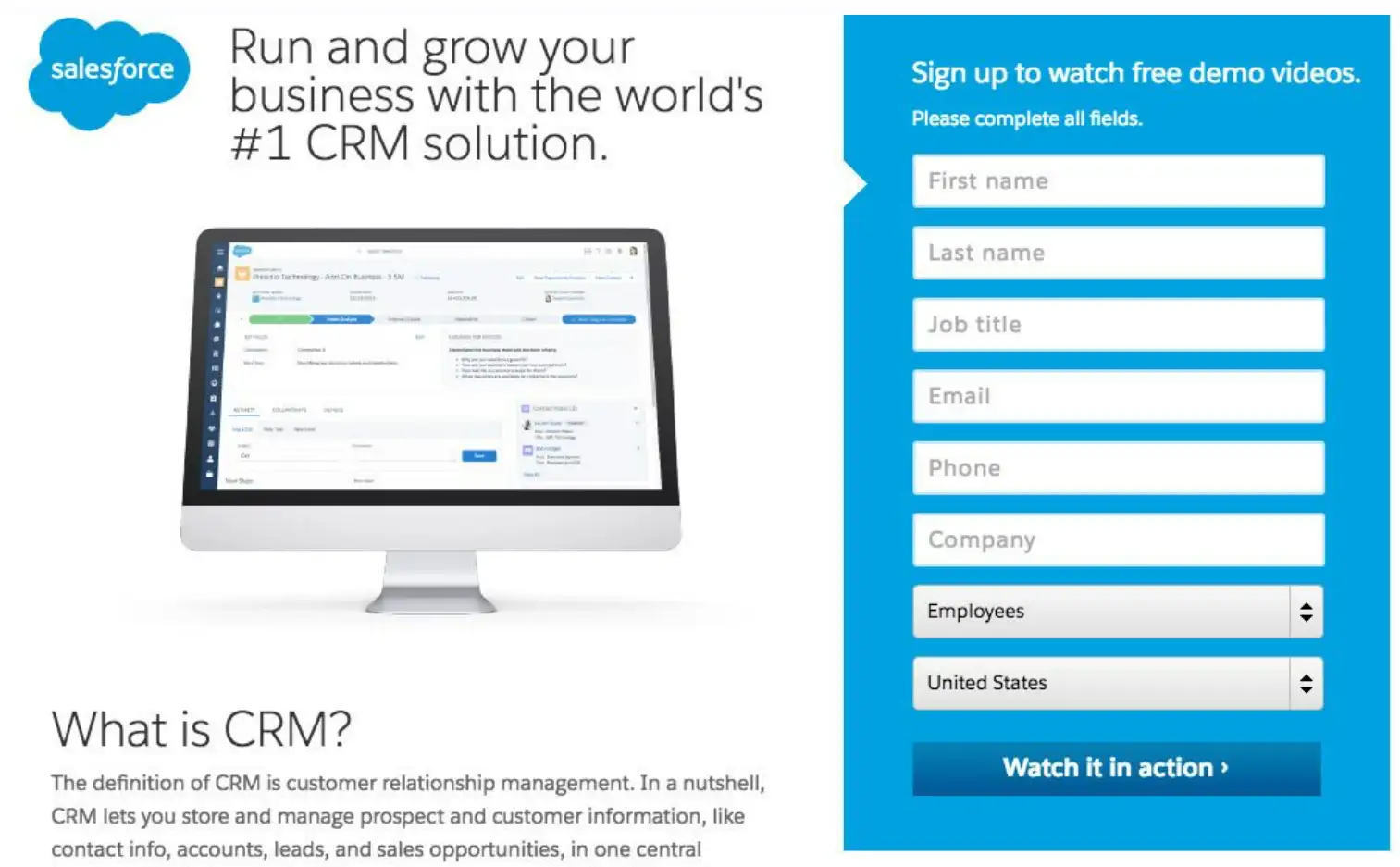
Here's a breakdown of the key elements of a typical Salesforce landing page:
-
Headline: Your benefit-oriented headline needs to be strong, and of course, it needs to attract the visitor's attention grabber together with the specific value proposition. For instance "More leads with Salesforce."
-
Body Copy: Deeply explain the benefit of the product or solution using persuasive language and solving the potential pain points.
-
Visuals: Images or videos of high quality, normally showing the product or solution in action.
-
Call-to-Action: A clean and clear call-to-action button that prompts your visitors to do what you want them to do. For example, sign up for a free trial or request a demo.
-
Form: Usually a pretty simple form to capture leads asking for basic contact information.
-
Social Proof: Customer logos or testimonials that help build some credibility. Salesforce’s customer success stories or case studies show the clientele whether or not Salesforce solutions are effective.
Slack's Google Ads Landing Page Design Examples
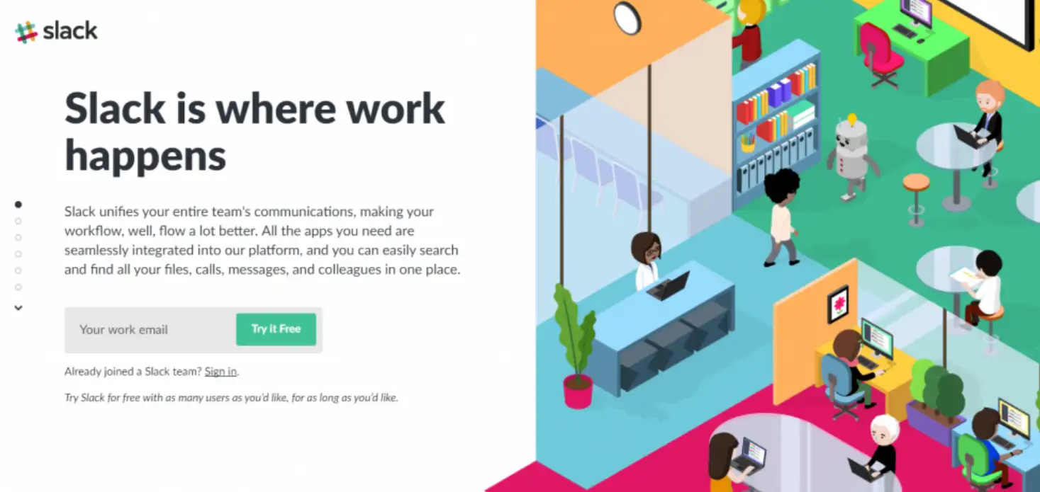
Here are some notable aspects of Slack's landing page designs:
-
Clear Value Proposition: The pages immediately show how Slack improves team communication and collaboration.
-
Visually Driven: The boldest use of colours and animations, all to create a memorable and positive brand experience—Slack.
-
Focus on Ease of Use: What is used is straightforward and explains just how easy it is to get up and running with Slack.
-
Prominent Call to Action: Usually the call to action buttons on these pages are to 'Try Slack for free.
-
Minimalist Forms: Signup forms are usually minimised in terms of friction by not requiring much, keeping only an email address as an input to signup.
Unbonce's Google Ads Landing Page Design Examples
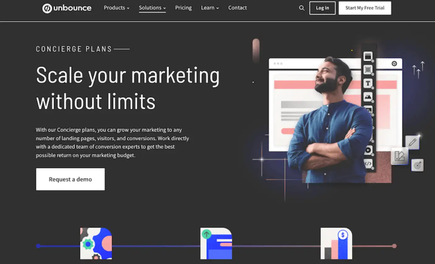
They use a few key strategies:
-
Bold and Engaging Visuals: They use bold colours and unusual graphics. Once seen, their pages are unique and catch your eye right away.
-
Clear and Concise Messaging: They’re straightforward and tell you what they do – what the benefits of their product are.
-
Strong Calls to Action: They will lure you with more relishing words and make buttons conspicuous to encourage you to take the next step, like, a free trial offer.
-
Social Proof: They usually have their lists of happy customers who give their testimonies. You can contribute to building that trust and credibility because you tell the audience that other people succeeded when using their product.
How to Make Your Google Ads Landing Page Design More Effective
An effective Google Ads landing page design is the bridge between grabbing attention with your ad and converting that interest into tangible action. To maximize its impact, you need to focus on a combination of strategy, creativity, and adherence to proven landing page design ideas. If this is what you want to design, here is a step-by-step guide to refining your design as well to make it better.
1.Keep It Simple, Yet Compelling
The first rule of good landing page design ideas is simplicity and that is a fact. However, if visitors find you have a clogged page chock full of distractions, they may confused. Leave the flashy aside, and focus on a clean design with clear sections that direct users to your call to action (CTA). Keep your headlines short and to the point, telling instantly what’s in it for readers. For instance, instead of a simple "Welcome to Our Site", try to use "SHOP NOW! Unlock 50% Savings Today!" It is a way that technically captures your ad’s attention, but in a way that remains relevant to it.
2.Focus on Visual Hierarchy
Visual hierarchy is the art of guiding the user's view to where it is most critical on your page. An exciting headline that grabs the reader’s attention by the scruff of the neck and supporting text to solidify your information. You can strategically use colours and fonts to highlight your CTA. For instance, a button like 'Sign Up Now on a neutral background is attractive. This tactic is often showcased in successful Google Ads landing page design examples.
3.Personalize the User Experience
Have your landing page adjusted according to the type of audience you are targeting via your Google Ads campaign. If your ad is trying to appeal to first-time buyers, then try this: offer a special offer or a first-time buyers intro. For returning customers, you can highlight and feature loyalty rewards.
4.Prioritize Speed and Responsiveness
If a page is slow to load, even the most beautiful and branded one will fail. Make the image and the page optimized, and the coding should be efficient. Always test the page’s performance regularly. Also, make sure that the design moves organically from device to device. A responsive layout isn’t just a bonus; it’s a must-have to meet Google Ads landing page requirements.
5.Test, Measure, and Improve
Finally, your landing page should be considered a work in progress. You can try out different layouts, headlines, and CTAs by using A/B testing. Bounce rate and conversion rate should be watched as monitor metrics to improve. The key is iteration when creating a really good page.
By combining creativity, analytics, and user-centric design, you can transform your Google Ads landing page design into a high-performing conversion machine. Whether drawing inspiration from landing page design examples or applying fresh ideas, these strategies ensure your page stands out in a competitive digital landscape.
Common Google Ads Landing Page Design Mistakes to Avoid
Even the most eye-catching landing page design of Google Ads can falter if certain pitfalls are overlooked. Unfortunately, these common mistakes can kill your conversion rates in a few drops, and you want to avoid them.
1.Lack of Message Match
One of the biggest mistakes is the landing page content not matching the ad copy. If your ad says it is ‘Free Shipping on All Orders’, then your landing page needs to reflect this prominently. If you don’t pay attention to how your offer messages compare to the experience your site delivers, it will send mixed signals to visitors, who will probably be less trusting of your offer. This way, if readers don't find value in the ad’s promise, they won’t bother to further scan the headline and visuals.
2.Overloading with Information
Whilst you need to include details of your product or service, scrolling through way too much text on a page can be overwhelming for visitors. A good Google Ads landing page design emphasizes clarity, using bullet points, concise paragraphs, and engaging visuals to convey key information.
3.Weak Call-to-Action (CTA)
A surefire way to lose potential leads is to have a vague or poorly placed CTA button.
Do not use generic phrases like ‘Click Here’ and use action-oriented text like ‘Get Your Free Quote Now!’ Also, the CTA should contain strong differences in colour and so good spacing around it.
4.Overlooking Trust-Building Elements
If you’re leaving out trust signals like customer reviews or secure payment badges you’ll be robbing your credibility. However using social proof, testimonials and trust badges ensures users feel more comfortable moving on.
Avoiding these pitfalls will significantly enhance your landing page design for Google Ads and improve the overall user experience. A thoughtful design doesn’t only attract clicks, it converts.
Why Stop at Ads?
You've mastered the art of creating a stellar Google Ads landing page design, but what if your digital ambitions stretch beyond a single page? And after all, your landing page is merely the curtain call of your very own online presence. Imagine building a fully fleshed-out website based on your vision when it’s time, and why not make it as seamless as your Ads process?
Wegic is the ultimate sidekick to create your website. Imagine getting a multi-page professional site while chatting! No headaches, No missed coffee breaks, no coding needed. Wegic's AI-powered website builder fused with easy design will see your ad campaigns mirroring your ideas into an aesthetic website that is equally stunning to the look of your ads. Wegic enables you to run others' fingers and eyes over your passion for making things without giving them a glimpse of what every byte has been through.
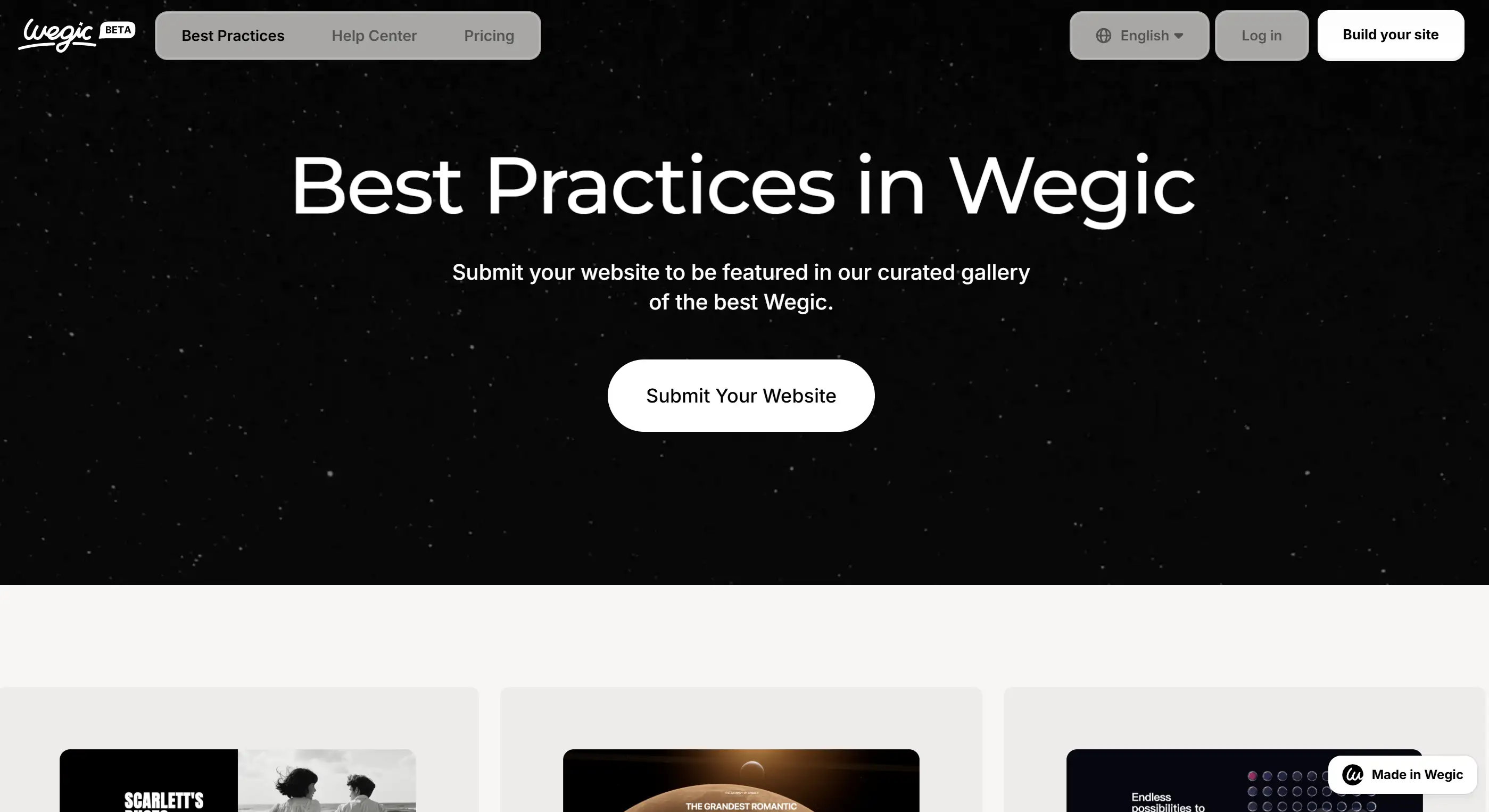
That’s why you should give up on the cool landing page and start growing your digital empire. Taking the next step is as easy as a conversation through Wegic. Now, just start building your dream website because your brand deserves a stage, not just a spotlight.
Written by
Kimmy
Published on
Mar 17, 2026
Share article
Read more
Our latest blog
Webpages in a minute, powered by Wegic!
With Wegic, transform your needs into stunning, functional websites with advanced AI
Free trial with Wegic, build your site in a click!