Log in
Build Your Site
10 Stunning Footer Examples to Inspire Your Website Design in 2025
Discover 10 stunning footer examples and learn pro tips to design stylish, high-converting website footers with ease—no code needed using Wegic.

We’ve all seen those generic templates that are bland, have messy formatting, or are missing basic details such as a map in website footers, a clear call to action, or even a reasonable email footer. If I scrolled to the bottom of a page and saw a footer like that, I'd leave without hesitation.
Ignoring this area means giving up a major opportunity to make your website look comprehensive and professional. But here's the thing: How can you avoid the common mistakes and build a footer that looks clean and works hard for you?
This post will analyze ten carefully selected footer examples from real websites in 2025. These are more than just pretty layouts. They are smart, know how to formulate strategies, and have a lot of experience worth learning from and drawing lessons from. Whether you’re looking for simple website footer inspiration, modern footer design in HTML, or want to know what the best website footers have in common, you’ve come to the right place.
What Is a Website Footer?
Let’s start with the basics. Your website footer is the last section people see on a page, but it’s not the least critical. A well-designed website footer often works like a second navigation bar, helping users get what they need without scrolling all the way back up. Done right, it can guide visitors, boost your brand credibility, improve SEO, and even drive conversions.
Critical Elements of a Great Website Footer:
-
Navigation Links
Every clean and simple website footer should come with useful navigation. Think about it: you could have an About Us page, contact information, FAQs, and maybe even a small site map. The more intuitive, the better. This is especially true for mobile users who rely on footer navigation to move around.
-
Contact Info + Social Icons
Of all those little icons on the footer, the one that’s most easily overlooked is the one that lets people find the right place to contact you. Include your phone number, email address, and social media profile information. It builds trust. Bonus points if you include email footer examples like a direct newsletter signup.
-
Legal + Privacy Links
The best website footers will generally have links to terms of service, privacy policy, cookie preferences, and disclaimers. This is not only about following the rules, but more importantly, it reflects professionalism.
Whether it’s "Subscribe to our newsletter" or "Book a demo," an appealing CTA really matters. Many of the best footer designs, which we will look at in detail later, all use this trick, which is particularly clever in changing readers who are not very active in reading the page.
Your web footer is a great place to reinforce your branding. A clean logo, brand colors, or typography adds polish and cohesion.
-
Language & Location Selectors
If you run a global website, this is something you cannot ignore. It’s a small feature, but some of the top footer examples make switching between sections feel really smooth.
-
Map or Store Locator
For regional businesses, it is especially useful to have a map in website footers. This thing is quite practical, and it shows that it cares about whether people can easily access the real world.
-
HTML Customization Flexibility
If you’re creating a CMS template from scratch or modifying one, look for a flexible footer design in HTML that gives you more control over spacing, padding, responsiveness, and interactivity.
By the way, if you need inspiration, studying the footer illustrations is one of the quickest ways to enhance your own web page designs. Seriously, I'm going to come up with a whole list next.
10 Stunning Footer Designs That Still Inspire in 2025
#01 Cartier – Elegant Minimalism
Type: Narrow + CTA
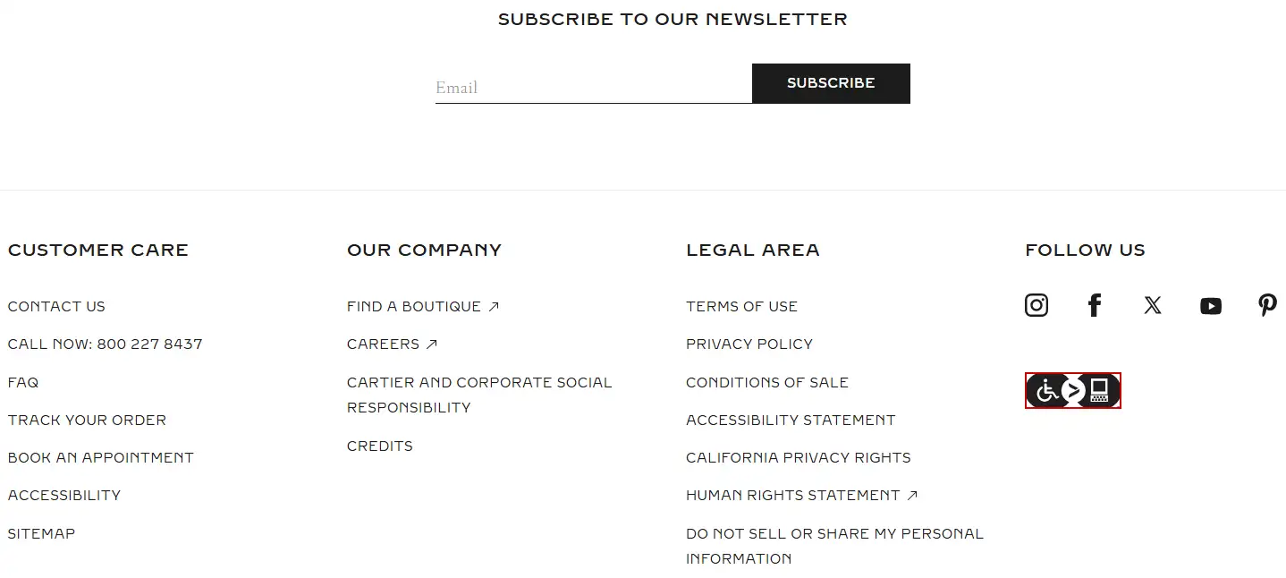
What makes it particular: This web footer is a masterclass in luxury branding. It looks minimal and elegant, with sharp edges and a subtle font style. What makes it one of the best footer examples is the strategically placed newsletter signup, acting as a great email footer example, and seamless accessibility links. Additionally, Cartier ensures that the digital world is accessible and functional for people with physical disabilities. It doesn’t try to say a lot, but it says it clearly and beautifully.
#02 Target – Functional at Scale
Type: Wide, multi-column
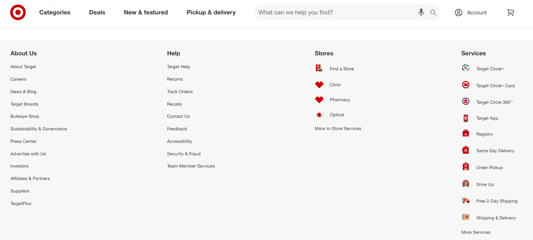
What makes it unique: Because Target has so many different product departments and customer segments, its web footer needs to work hard. And it does. It is organized in columns, and there is a lot of empty space, which makes it smooth to use. It is definitely one of the top web footer examples, especially suitable for large-scale online shopping websites that need to arrange their content neatly.
#03 Patagonia – Purpose-Driven and Accessible
Type: Narrow + Actionable CTA
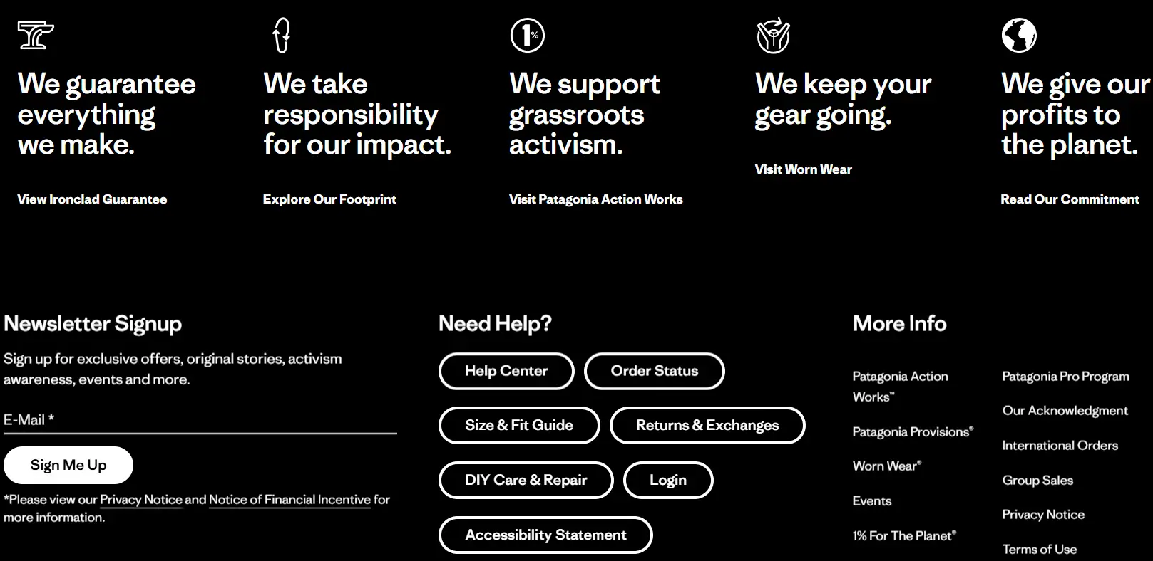
What’s particular about this is that Patagonia puts action first in their footer. Its brand-value CTAs, like "View Ironclad Guarantee", and service call-to-action buttons such as "Order Status" are prominently designed and quite useful. This HTML footer layout is really well done. The code is neat and tidy, the structure is well organized, and particular attention is paid to the accessibility of the web page. This is a great example of a footer design in HTML that accomplishes a few goals.
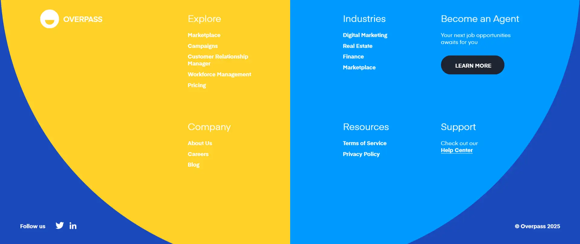
#04 Overpass – Colorful and On-Brand
Type: CTA, multi-column
What makes it particular: This company uses eye-catching colors and brand-related visual design directly at the bottom of its website. This webpage masterfully uses color to make its CTA buttons pop, offering a great lesson on balancing comprehensive footer elements with creativity and aesthetics. Its symmetrical background design and contrasting color scheme truly make it one of the best footer designs.
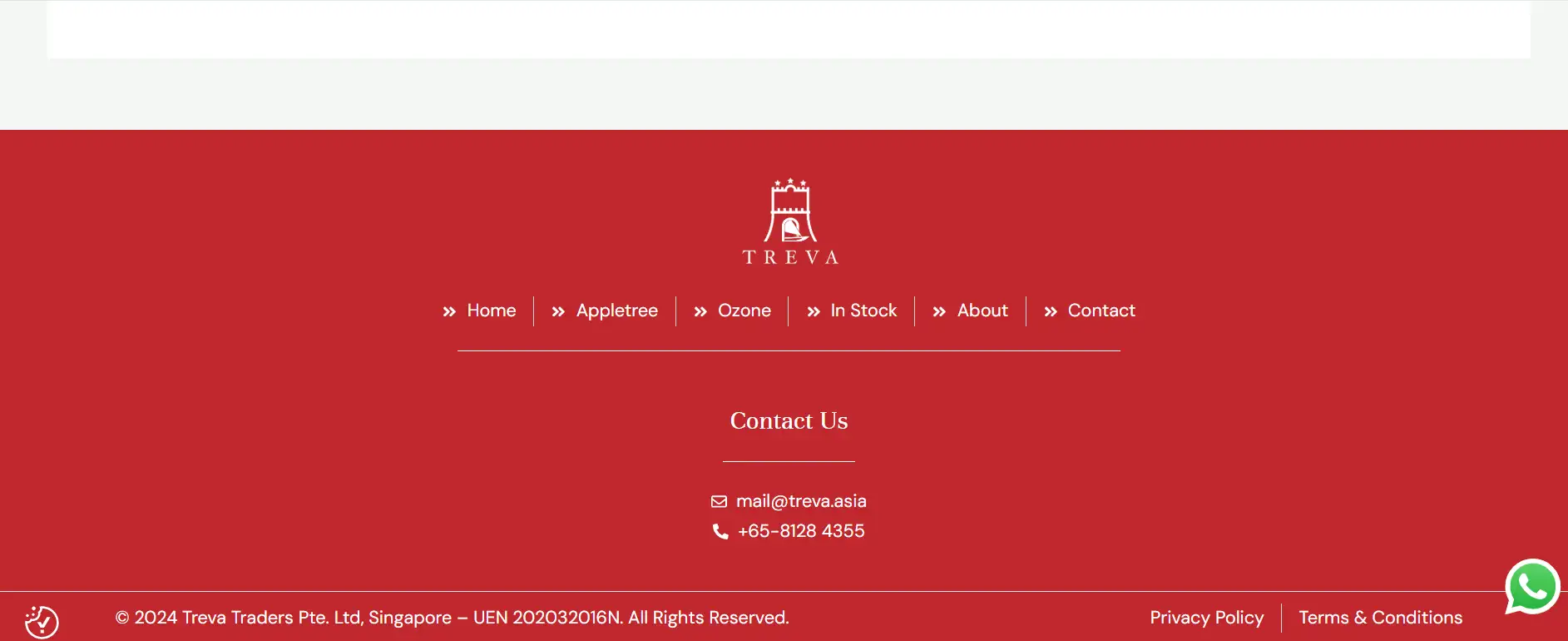
#05 Treva – Simple yet Professional
Type: Information, single-column
What makes it particular: This company uses a red background and white text for a clean footer design. It provides essential navigation and contact details clearly. With copyright info and policy links, plus a WhatsApp icon, its simplicity in presenting key info makes it a professional footer design.
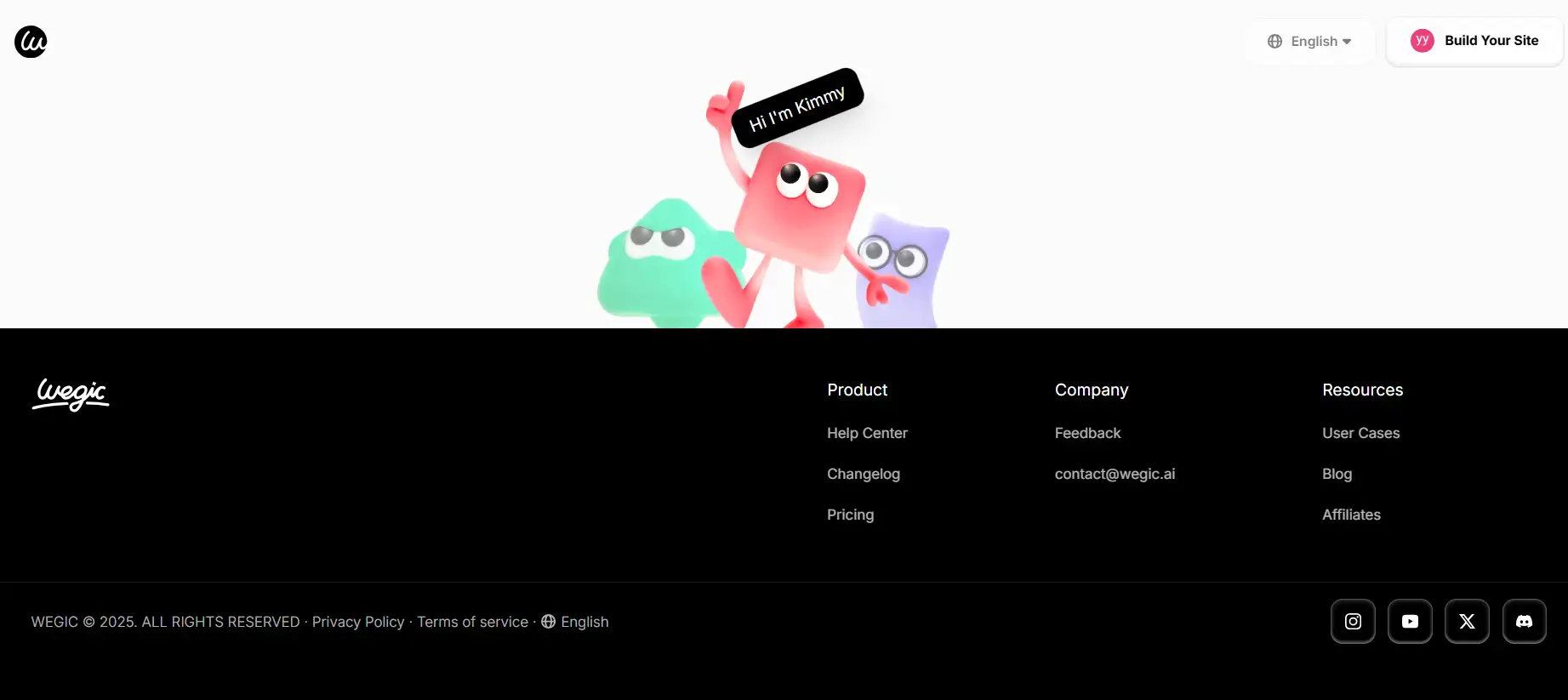
#06 Wegic – Playful and Interactive
Type: Interactive, multi-column
What makes it particular: The footer of this website stands out among loads of footer examples due to the lively cartoon characters. They have hover interactions, and their names will be displayed when you put the mouse over them. This creative touch adds an element of fun and engagement. Coupled with the clean layout and clear categorization of links, it creates a bottom layout that is both attractive and user-friendly.
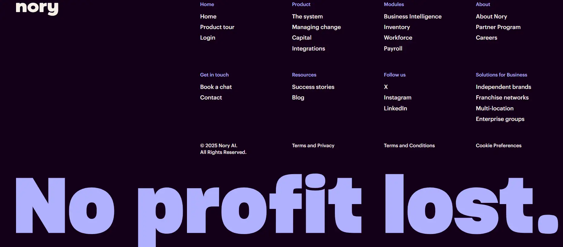
#07 Nory – Minimalist and Functional
Type: Information-rich, multi-column
What makes it stand out: The Nory website's footer stands out with its clean design and functional layout. It uses a dark background with bright fonts, which makes it look particularly clear and comfortable to read. The bottom section is well organized and detailed, covering multiple categories like Product, Solutions for Business, and Follow Us. The bold statement "No profit lost" at the bottom adds a touch of brand personality, making the whole look both informative and attractive.
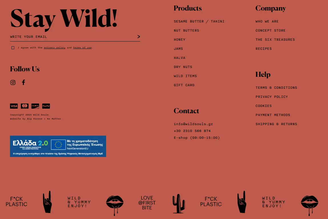
#08 Wild Souls – Bold and Eco-conscious
Type: Informational, multi-column
What makes it stand out: The bold monochrome design at the bottom of the Wild Souls page and the environmental message really stand out even within the 10 stunning footer examples. By using a unified color palette and eye-catching visual elements such as the anti-plastic logo, the cohesive and impactful look is particularly harmonious. It integrates various information and contact information together effectively, making navigation easy while maintaining a strong brand identity.
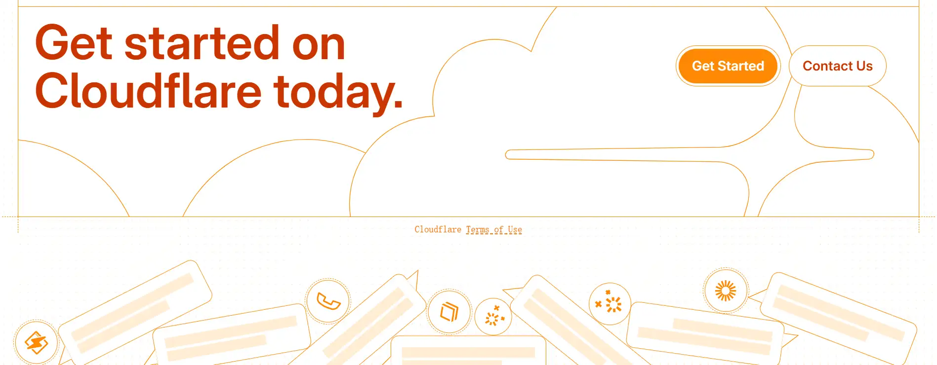
#09 Cloudflare – Minimalist and Inviting
Type: Narrow, CTA
What makes it particular: The Cloudflare footer stands out among the best footer designs due to its minimalist design and warm color palette. It uses symbols that are easy to understand at a glance, coupled with very clear text, to guide users. The eye-catching "Get Started" and "Contact Us" buttons make people feel very friendly and invited. The dotted line and light orange design add a lot of creativity, making it comfortable to look at despite being a simple website footer.
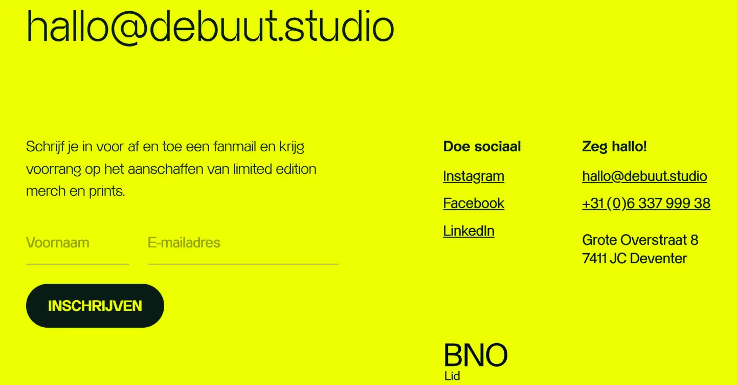
#10 Debuut - Vibrant and Functional
Type: Narrow
What makes it unique: This web footer uses a vibrant yellow color and a clean layout to make it feel particular and unique. There are crucial elements here, such as email and social network links, which make for great footer and email footer examples. The contrasting black elements add visual appeal, and the call-to-action button is prominent, making it both functional and aesthetically pleasing.
Pro Tips for Designing a Functional & Stylish Footer
You’ve seen a lot of footer examples — several simple and minimal, several content-rich and interactive. But how can you make a website footer practical? Here are several tips for designing a footer that not only looks good but actually helps achieve your brand goals.
Define the Primary Goal of Your Footer
Is it to collect emails? Drive traffic to support? Or highlight your brand mission? Don’t try to do it all. The best footer designs clearly set a goal and then intentionally guide users to that goal. For example, if growing your email list is a top priority, design your layout around a powerful email footer example.
Prioritize Navigation Without Clutter
Footers are often used to store all sorts of clutter. Don’t fall into this trap. Use a clean layout (columns or grids work great), and organize your links into categories — assist, legal, social, etc. You can learn from structured website footers such as Target and Nory, which organize a lot of information in an orderly manner, making it easy for visitors to read without feeling too cluttered.
Keep the Design Simple, Not Lazy
A simple website footer doesn’t mean it has to be boring. They can make links more prominent and eye-catching by adjusting contrast, setting hierarchy, and appropriate white space. You can even play with fonts or icons to add personality while staying consistent with your overall site design. Several best website footers may seem insignificant, but they are actually very effective.
Add a Map or Location for Physical Presence
If your business operates in a specific area, include a map in website footers. It can make people more convincing and help users find you faster. This is especially critical to note for shops, agencies, and businesses that deal with events.
Make the Email Signup Worth It
Don't just say "Join our newsletter." You should mainly emphasize the three benefits of it: exclusive content, promos, and sneak peeks. Also, remember to include a privacy disclaimer and several incentives in your email footer examples. Let’s see how Patagonia uses a more down-to-earth way of speaking and simpler expressions to make the registration process smoother.
Test CTA Buttons and Interactions
Want an engaging website design with interactive elements just like Wegic? Click the link below to start creating on Wegic!
https://help.wegic.ai/
A footer design in HTML should be adaptable, like hover effects, smooth transitions, or fixed footers, which can optimize the user experience. Try A/B testing different call-to-action labels, like "Get in touch" and "Contact us," to see which performs best.
Don’t Forget Mobile Experience
On mobile devices, your web footer should collapse smoothly. Check whether the click spacing and font size of the test subjects make people feel comfortable, and make sure that the call to action can make people understand what it means, even if it is arranged vertically. Many of the most popular footer examples put mobile first, and this has indeed shown good results. Wegic has done a really good job in this regard.
Build a Stunning Footer Effortlessly with Wegic
After taking a closer look at these footer examples, it’s clear that you can’t treat website footers as an afterthought anymore. Here’s the good news: it doesn’t require someone to write it pixel by pixel.
With Wegic, creating the best footer designs becomes a breeze. You simply describe the style or layout you want, like "minimalistic footer with newsletter signup, social icons, and graphics" or "sticky email footer showcases with high-contrast CTAs," and Wegic will customize a section for your site in no time. Want to add several graphics and a map to website footers? How about adding lively and interesting animation effects directly to your videos? Customize hover effects? Wegic makes website design so simple that you can get your footer right away.
Written by
Kimmy
Published on
Mar 17, 2026
Share article
Read more
Our latest blog
Webpages in a minute, powered by Wegic!
With Wegic, transform your needs into stunning, functional websites with advanced AI
Free trial with Wegic, build your site in a click!
What kind of website do you want to build?