Log in
Build Your Site
Stunning Website Designs: Top Picks for 2025
Discover the top 20 best website designs of 2025, from business to portfolios. Learn why good design matters and how it impacts user experience and branding.

With the growth and improvement of technology, user interaction experiences, websites no longer carry just a brand image as a crucial aspect of user experience. The web design for the year 2025 aims towards enhancing visuals and storytelling, along with focusing on responsive layouts and interactive features.
To aid designers, developers, and brand proprietors, this article illustrates 20 different styled best website designs. The listed examples include corporate websites, online stores, and personal portfolio pages. Regardless of whether you are creating a new website or enhancing an already existing one, this article will provide you with beneficial insights.
Why Best Website Designs Matter in 2025?
How good a website looks isn’t the only important thing. You can tell what the company stands for, what their users go through and what their business wants to achieve. When web design is good, visitors quickly know how to find what matters to them. It establishes confidence and encourages people to perform steps like buying, filling out forms, or registering for benefits. Clear design, simple navigation and noticeable highlights reduce the chance of bouncing back. They make users stay engaged with the company and its products.
A well-designed site works smoothly and is user-friendly. Websites today should be usable on every device, display rapidly, and gain high rankings in online searches. Being unique and friendly to use is what makes a site visible in a busy market. Google often advises people to use it.
Good website design is not just art—it’s part of business strategy. Firms that pay special attention to users when designing their websites are more likely to succeed in the future. Having content improves their presence online, increases their following, and enhances sales.
20 Best Website Designs Across Different Website Types
Below are examples of business, corporate, and personal website designs. These templates include business, personal, school, charity, SaaS, and event sites. All designs show a unique style and approach to user guidance.
Click on the image to design the best website designs without code! ⬇️
https://wegic.ai/

Image by Istock
Business Websites
You can see a brand’s image, its products, and its way of working through its business website. The goal is to make a good and reliable first impression. They must be designed well and be easy for visitors to use. Often, their pages have straightforward colors and uncomplicated arrangements. Having good pictures, real-life stories, and easy navigation keeps the brand fresh in readers’ minds and motivates them to stay on the best-designed website.
1. Haus
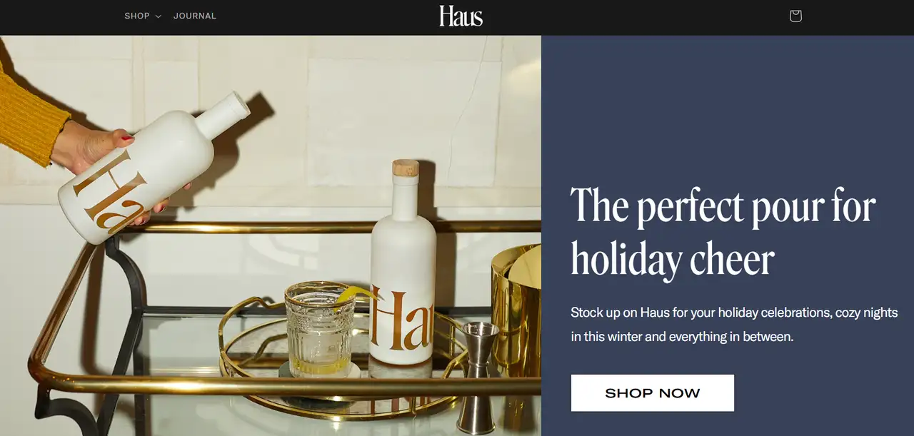
Haus, among the best website designs, shows an adventurous and contemporary design. It features great photos and a plain style to reflect the brand’s style. A light color palette and clear, uncluttered space attract attention to the products. They emphasize that their drinks are made from natural ingredients. The smooth scrolling and easy way to shop make the good website design seem big-brand, yet it remains easy to use. This is in line with their goal to be a social brand for people now.
2. Ugmonk
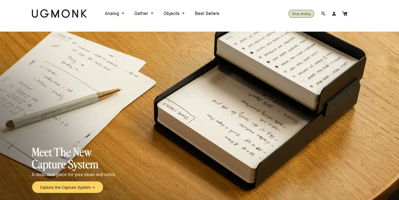
There is nothing complicated about the best designed website Ugmonk—everything is well organized and clean. Graphic designers use black and white, along with clear fonts, to achieve a polished, business-like appearance. Empty space highlights each product. Reading this is easy, and people can find any detail they may need. Being able to see the products and other details lets you understand how the brand represents the founder’s motto: "design is life." Because of this, the brand comes across as personal and trustworthy.
3. Beardbrand
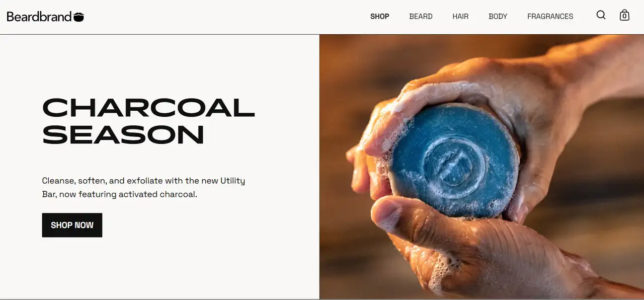
Beardbrand’s best-designed website makes it obvious they serve as a brand in men’s grooming, using classic and rugged imagery. A good website design features the company’s traditions and helps visitors understand its products using images that reflect stability. You get both the appeal of a story and the sale of products without any bother. By including a fresh look and the best modern website designs, the site is more like a lifestyle brand than just an online shop.
To build an online store for free, click the article: ⬇️
4. Blue Bottle Coffee
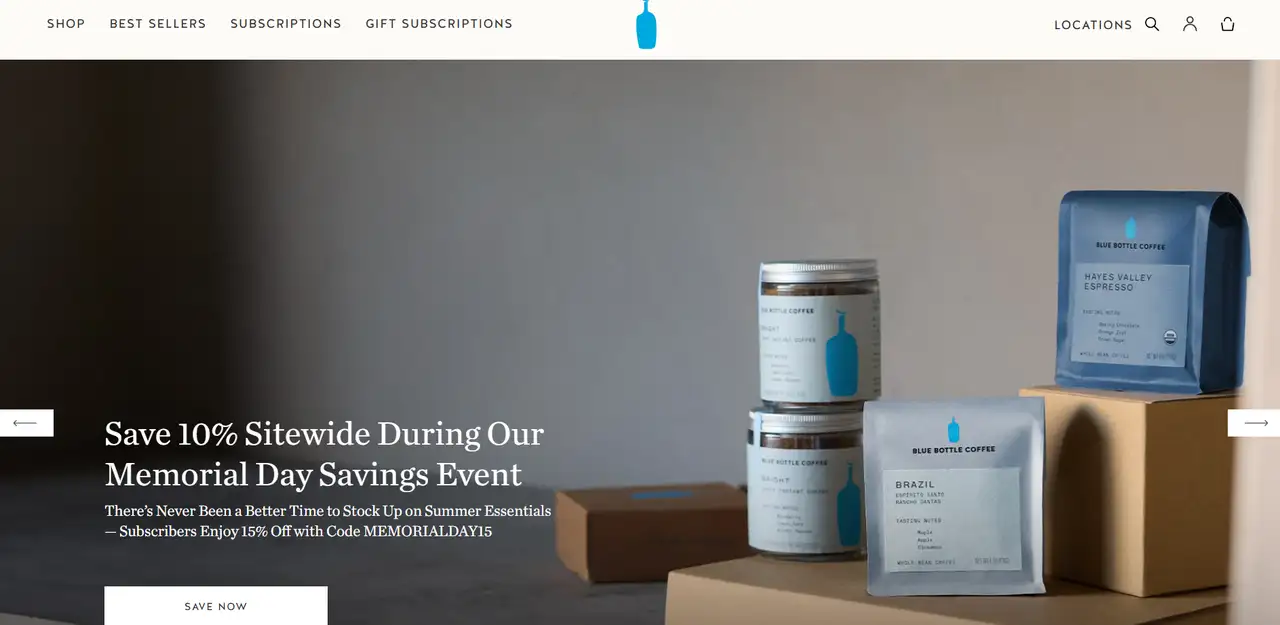
Blue Bottle Coffee shows off its streamlined style through its official website. With pure backdrops, detailed images of products and surroundings, calm tones, and stylish fonts, the brand ensures its customers have a comfortable experience. The design focuses on user guidance, from the subscription process to store navigation, reflecting the brand's ultimate pursuit of a quality life and detailed experience.
Personal Websites
The main goal of a personal website is to highlight the individual’s personal style and professional look. Often, a good website design is full of creativity and art. Most people use these websites to show their latest work, resumes, or unique thoughts. There are many combinations of layout and color styles. A lot of sites add moving images, custom symbols, and native fonts to leave an impression. The best website designs have to be attractive and unique. The information on the site needs to be orderly so people can discover what the owner does and why within seconds.
1. Mack & Pouya Photo
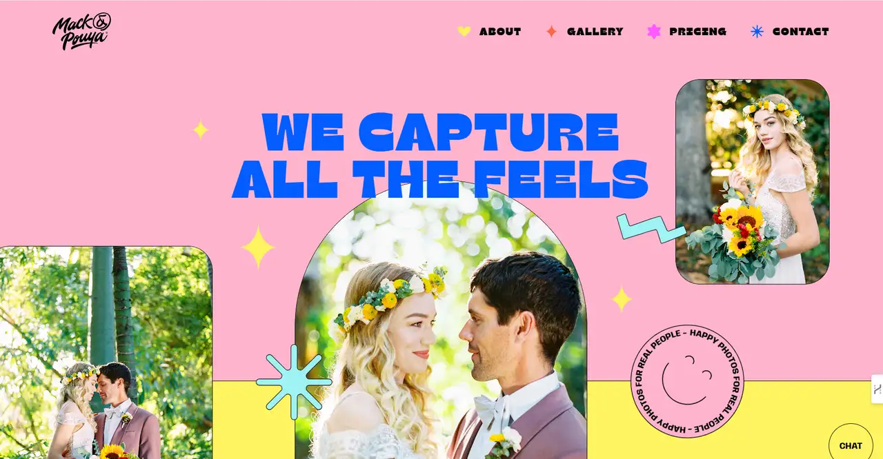
Visitors to this photography website see images filling the screen as they browse. Scrolling is easy and the changes in the app are gentle, allowing the visuals to explain the story. You will find their best photographs on the homepage to draw your interest. The website design is good, simple, and chic. You can see the photographers’ unique style and talent in wedding and portrait photography throughout the site.
2. Ali Abdaal
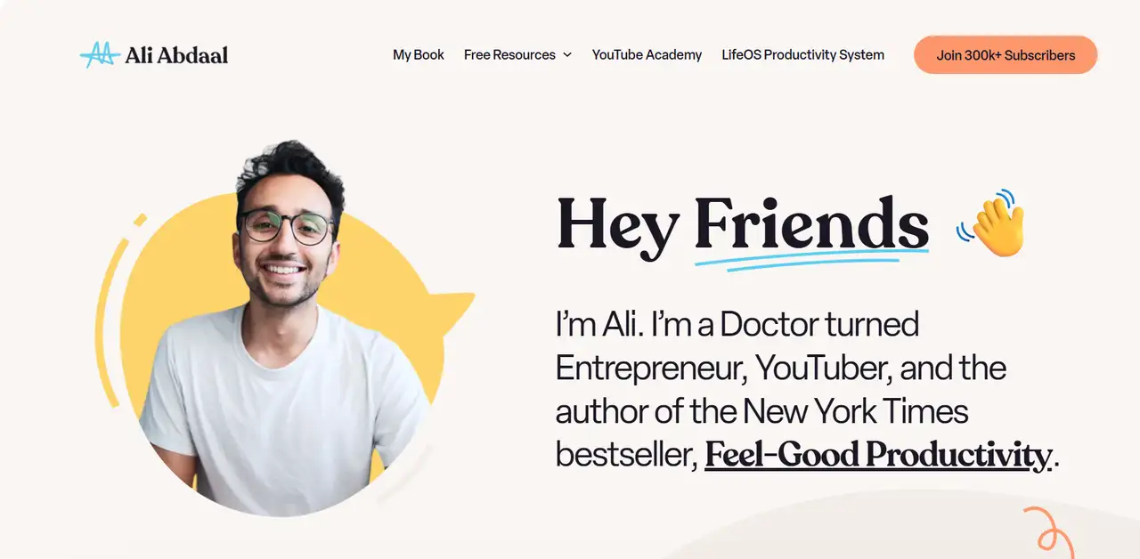
Ali Abdaal’s best designed website is both colorful and easy to read. His pictures are easy on the eyes, reflecting his helpful guidance in how to be productive. Most of the page is focused on his blog and courses. It has a neat organization that is simple to follow and user interaction is emphasized. Cenk shows himself as a scholar and educator, yet keeps the best modern website designs understandable and friendly.
3. Jack Cheng
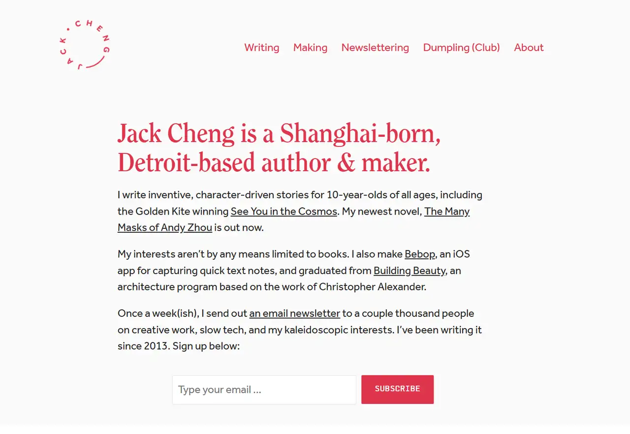
This best-designed website by Jack Cheng is very literarily inspired. The site uses simple colors and familiar fonts to give a tranquil and peaceful sense. You’ll mainly find text on these news sites, along with stories designed to be simple and straightforward. Literature identifies with who he is as a writer. Everyone’s focus on Keynes is on his words and thoughts because the well-designed website is simple. His best modern website designs help to deliver a calm and deep impression of his brand.
4. Chris Coyier
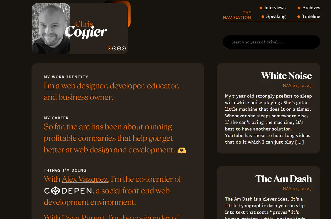
Chris Coyier’s well-designed website was made for developers. Everything on the site is organized logically, offers lots of useful details, and uses bold and relaxing colors. His website features many technical posts, useful links, and his personal projects are highlighted on the front page. The look and feel are fun and comfortable, similar to seasoned programmers' easygoing approach and skill.
5. Val Head
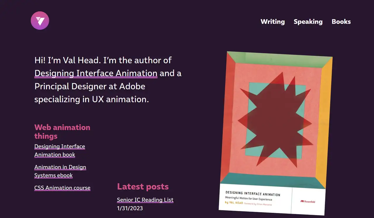
His well-designed website is clean and uses bright contrast and motion to present himself as a specialist in Web motion design. The site is easy to get around, speeches, teaching and writing are covered and it maintains a basic structure. The use of animation throughout the site matches the best modern website designs idea of bringing together creativity and technology which expresses professionalism and style recognition.
6. Tim Tadder
The site uses a big carousel of pictures to capture Tadder’s art’s suspense. The entire screen is devoted to the lens language, and the design expresses what is needed through its work. The arrangement on the web page is uncomplicated, and interaction with the website is easy. All the photographs on the site show Safdie’s groundbreaking style and ability to tell exciting stories.
Educational Websites
Educational websites are designed to provide information and allow users to learn interactively. The structure of information learners receive and how they interact should guide the best modern website design process. Clear navigation, readable text, and responsive web design are the main features of the site’s interface to suit all users. Most systems have both text and images, predefined lesson modules, and reward students by tracking their progress. A simple and gentle way to present things makes people feel safe and comfortable while learning and using rewards encourages users to return more often.
1. BrainPOP
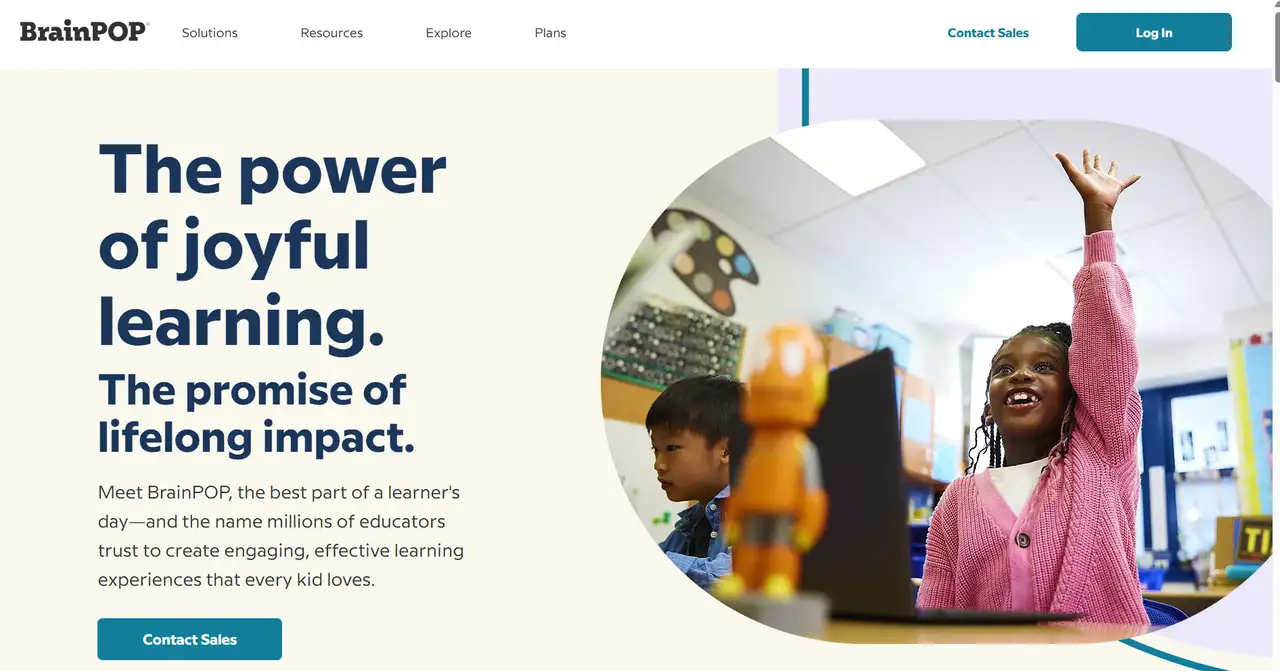
Bright colors and fun cartoons are part of how BrainPOP presents its website. As a result, it looks attractive and fun for kids and teenagers. This site features pictures and words, plus animated characters guiding visitors. It helps make learning simpler. Sections are neatly arranged, and the colourful style holds the learner’s attention. It allows students to engage in the lessons more easily because they focus better.
2. FutureLearn
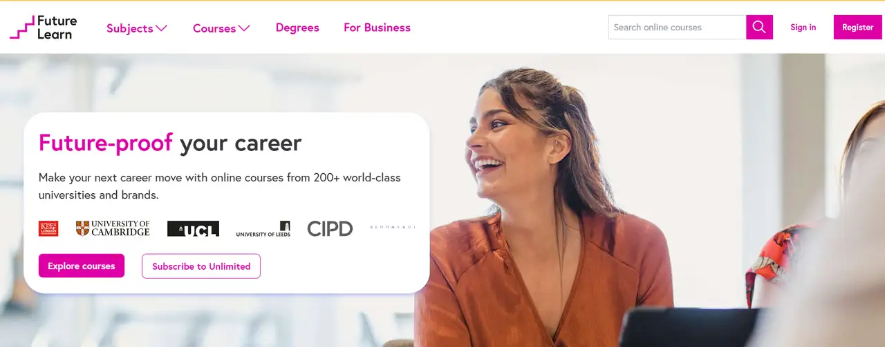
The website is modern and straightforward in appearance. It has plenty of white background and soft colours to give it a relaxed and professional look. The homepage lists courses by the topics they cover so people can learn what interests them. It is easy to use, even when you’re on a phone. It agrees with its main interest in "social learning" and role as an international education provider.
3. Coursera for Business
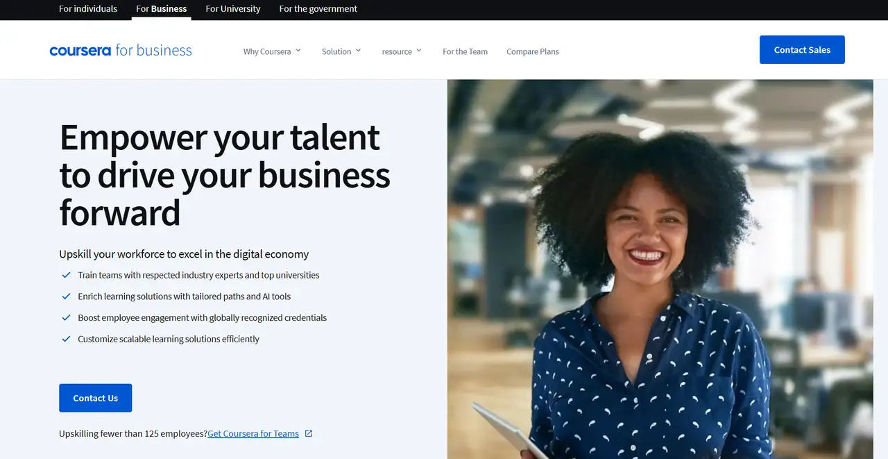
Coursera for Business is designed simply and professionally. Clear partnerships with leading schools and companies can be seen on the platform’s main page, which shows it is a reliable place to use for assessments. Almost everything here is in light colors and rows, making cleaning easy. Menus are set according to corporate needs, such as teaching new employees and providing workers with new abilities. It’s clear how to find information and join is step-by-step. It’s clear that the B2B style puts focus on practical results and staff improvement through learning.
Non-Profit Websites
Non-profit websites ought to focus on both connecting with viewers and delivering useful information, meaning their users are more likely to trust them and take action. Most of the colors used are gentle or represent meaning, such as green and blue, or warm tones. Entrance areas such as "donate" and "participate" ought to be the first items visitors see. Using stories, real image,s and results displays is useful for getting across your ideas to people. understanding.
1. Amnesty International
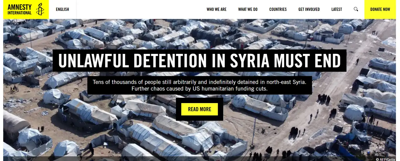
Amnesty International has a serious and tidy website design. The brand colors yellow, white and black are used by Amnesty to signify rights, vigilance and action. It’s very simple to understand the menu. Sections that matter, including urgent actions, reports and topics across the world, use both photos and text to actively engage users. The website gives ample information and also invites visitors to take next steps. The organization acts in line with its professional and worldwide responsibilities as a human rights group.
2. Oxfam
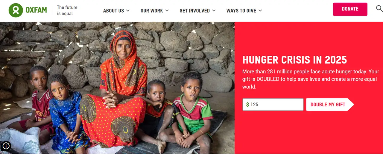
To underline its tasks for those lacking access to resources, Oxfam’s homepage uses friendly colors along with actual images of real people. The site is organized to keep the sections for donations, campaigns and reports separate. It highlights stories and genuine changes as they occur. The site helps people discover problems and respond accordingly. The organization seems motivational and dedicated to tackling poverty and unfairness.
3. Habitat for Humanity
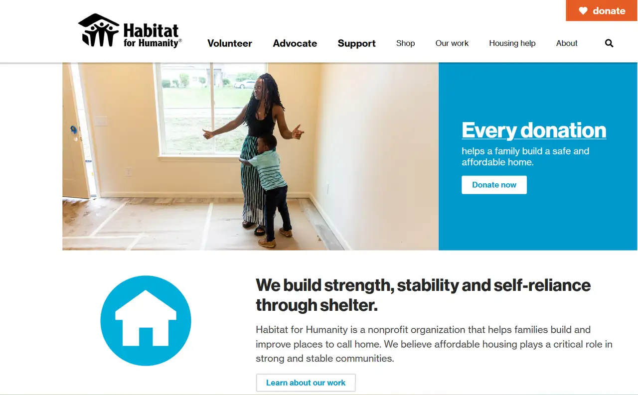
On its site, Habitat for Humanity uses soft blue colors and home images to match what it does. The hospital’s design makes people feel at ease. It features information about volunteering, building houses, and methods of helping out. Visitors can experience how the stories are told and see the care they take by looking at their menu images. The site makes it easy for users by limiting the menu and making calls to action obvious. It’s a wonderful case of a nonprofit site combining emotion with usefulness.
SaaS Websites
A SaaS website should make it easy for users to understand what their product does and how to work with it. The design should ensure that all information is easy for anyone to grasp. Graphics that move, easy-to-use scrolling, and true user examples are frequently part of it. Choose a fresh design that is tech-savvy, with lots of colors to emphasize the main areas of the app. Enabling visitors to move forward by signing up or running through a free trial.
1. Zendesk
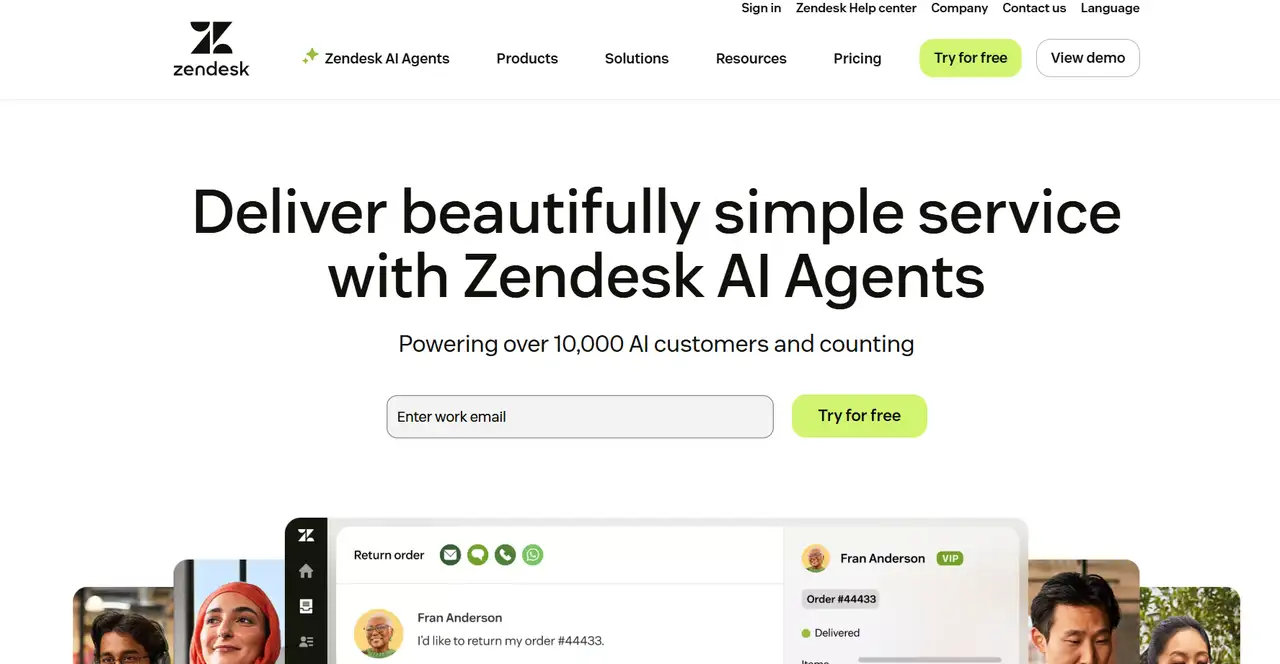
Zendesk is modern and tidy, and is definitely one of the best website designs. Crimson and Neutral use soft hues and lots of white areas to appear trustworthy. Product solutions and triumphs can be found on the homepage. Its purpose is to help users easily discover features that address their own needs. Since the animations are smooth, the site appears both advanced and friendly. It proves that Zendesk is good at offering customer service tools.
2. HubSpot
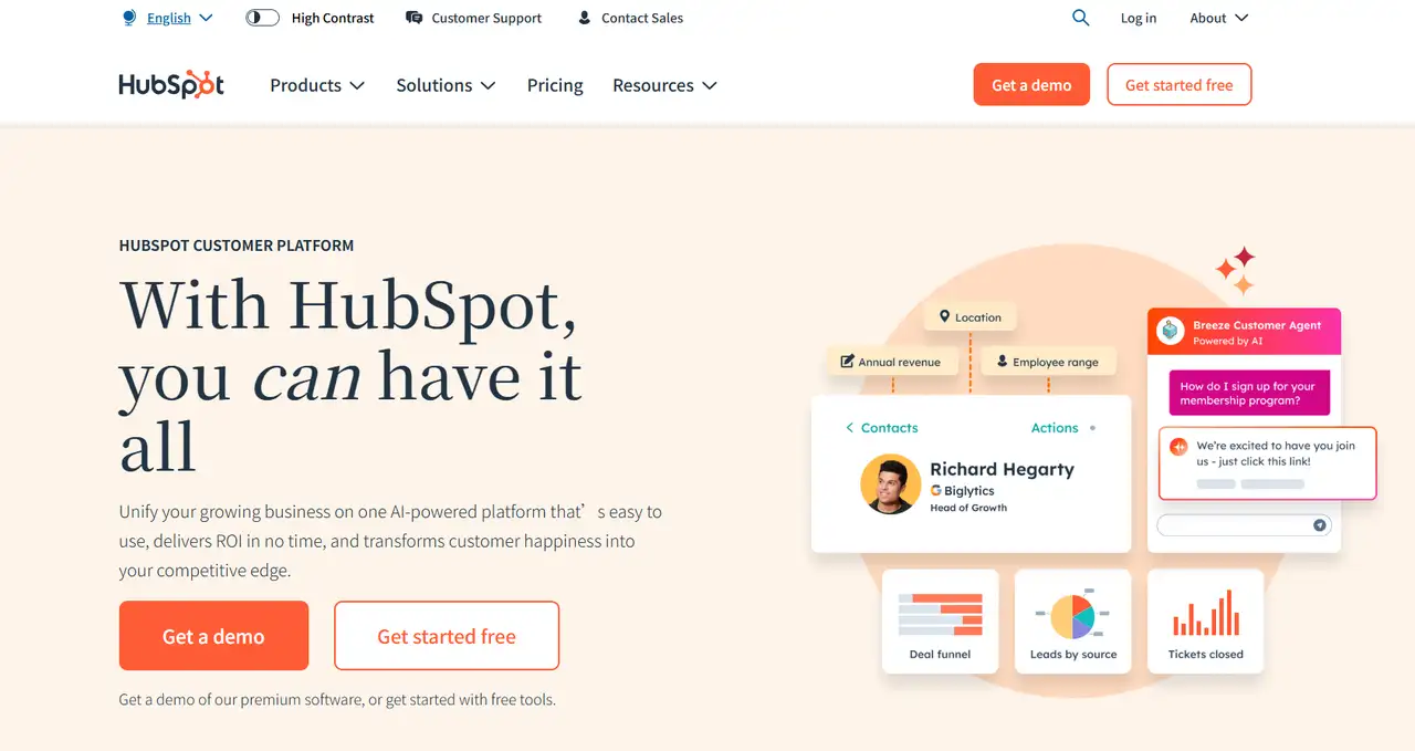
The HubSpot site is full of movement, and information is easy to find. Because of its bright orange and blue, the brand looks both energetic and reliable. The information can be read fast, starting with free resources and going to complete products. The drawings make the site pleasant to look at, and the sections are clearly arranged for easy use. It demonstrates that HubSpot is designed to support marketing teams as a single, helpful platform.
Event Websites
Time, place, what’s happening and what is attractive to the audience are emphasized on event websites. Important information and the feeling of the event should be clear through the design itself. You can usually find background images, special videos and timers on pages about a release. The CTA buttons should be easily visible. Butons that say "Buy Tickets Now" or "View Agenda" shouldn't be hard to find. It needs to be accessible even through a mobile app. The decor should reflect the type of event. If it’s an entertainment event, the design needs to be lively and creative. If the event is major, it should look and feel professional and honest. Users will feel more encouraged to be part of your community.
1. SXSW (South by Southwest)
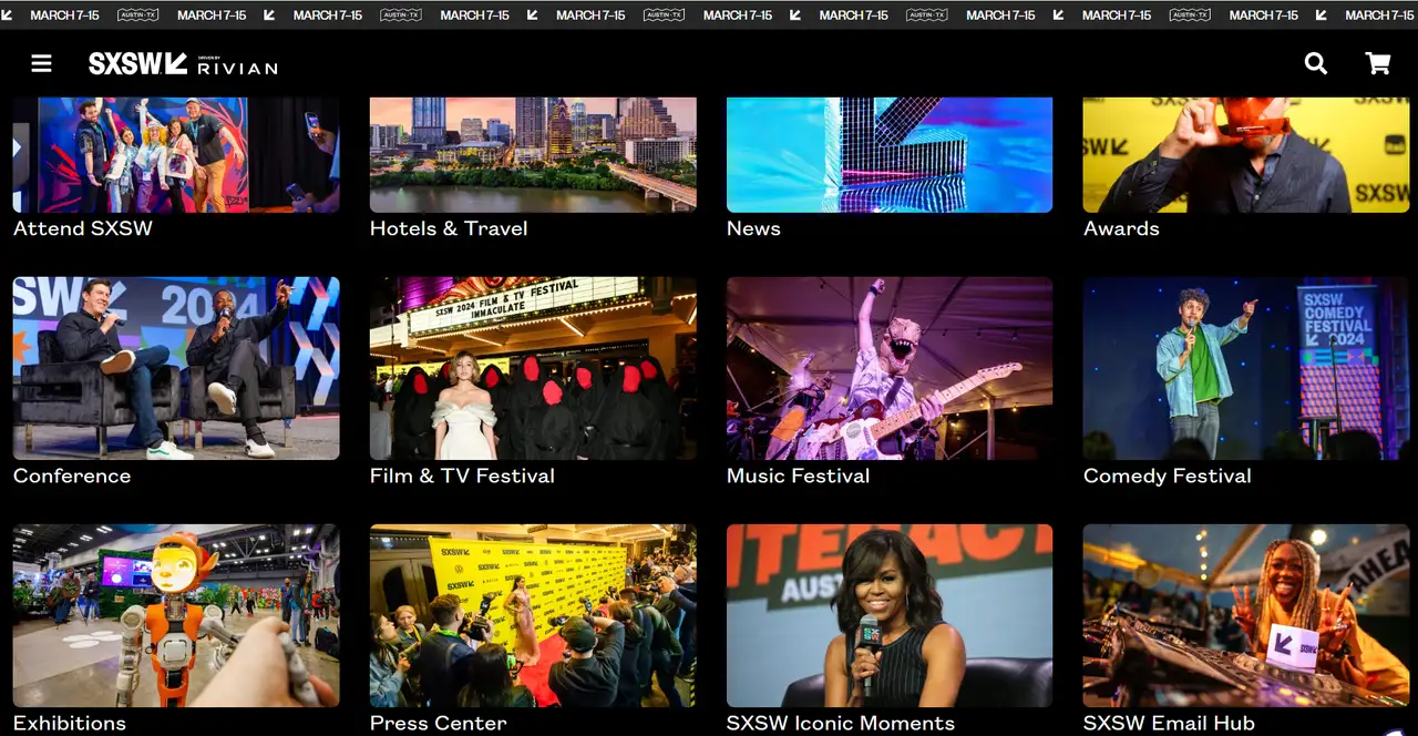
The design on the SXSW website is up-to-date. It includes lots of white space together with vibrant designs to demonstrate how technology, music, and creativity mix. Important information on the homepage discusses the event date, getting tickets, and what the event is about. It is simple to get around the site, which has a wealth of information. Images and videos look good with the website’s theme. This process doesn’t take much time. Both the color and the style reflect a professional tone while remaining connected to SXSW’s lively global atmosphere for artistic folks.
2. Comic-Con International
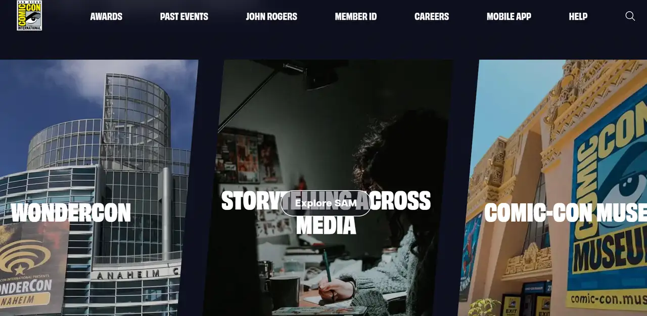
The well-designed website continues to use the playful approach popular with Comic-Con fans. It has lots of bright colors and plenty of information. Quick access to ticket, guest, and performance schedule information is provided for all fans. The page has comic-style icons and badges, which keep with the brand’s lively feel. It’s an easy design that suits the needs of its audience.
Wegic: Best Well-designed Website Builder
You don’t need to write code because Wegic allows you to build professional websites instantly. Because it combines the roles of designers, developers, and content managers, it greatly saves time and money during website creation. With just a few clicks and plenty of options, anyone can design and publish a great website without much delay. Platform users can enjoy various design tools to personalize the website to their needs and improve its uniqueness and professional touch. Launching their own professional websites is made easy for small and medium companies, freelancers, and personal brands using this solution.

Wegic offers the following main benefits in its design:
-
Anyone using Wegic can build their own web pages by simply talking to the program.
-
People can modify page layout, fonts, colors, and images as needed to align the best website designs with their brand image and improve their appearance.
-
After getting user input, the system comes up with three alternative designs. Users can compare solutions and select the best one to boost both the results and the speed of the design.
-
When Wegic makes a website, it automatically adjusts the design so that all visitors, on any device, have a better experience.
-
Google Analytics can be set up behind the scenes, so users can keep a close eye on their site statistics and user actions.
-
Enable users to add popular social platforms with simple clicks, show new content right away, and promote better interactions and messages for the brand.
Check how to use wegic, click the article: ⬇️
Conclusion
The best website designs allow your brand to inform visitors about itself and fare better against competitors. Excellent design is key to success, whether you are making a website for your company or yourself. You can make a website with Wegic by just chatting and receiving helpful design advice from AI. It makes your website look better and attracts more interest.
Written by
Kimmy
Published on
Mar 17, 2026
Share article
Read more
Our latest blog
Webpages in a minute, powered by Wegic!
With Wegic, transform your needs into stunning, functional websites with advanced AI
Free trial with Wegic, build your site in a click!
What kind of website do you want to build?