登入
打造你的網站
Inside United Natural Foods: Website UX & Brand Analysis
Inside the United Natural Foods brand website: discover how UNFI combines storytelling, UX Analysis, and design to craft a seamless digital experience.
In today's business landscape, where digital transformation has become the norm, a brand's website is no longer just a simple online presence—it serves as a central hub that integrates corporate identity, business capabilities, and brand culture. For major food distributors like United Natural Foods (UNFI), a company with a vast footprint across North America, the United Natural Foods brand website plays a critical role in building trust with potential customers, partners, and investors through cohesive design and functionality.
Recognized as one of the largest distribution platforms for natural and organic foods in the United States, UNFI operates an extensive logistics network, a wide-ranging brand portfolio, and deep connections with retailers throughout the region. But does its website effectively reflect this brand strength? This article explores the official United Natural Foods (UNFI) website in detail, examining its design structure, interactivity, content organization, site performance, and brand voice. We'll also share actionable recommendations based on industry best practices and show howAI tools like Wegic, an AI-powered website builder, can help businesses quickly create enterprise-level websites with similar capabilities.
Click here to try Wegic👇
What is UNFI, and Its Website Value?
United Natural Foods, Inc. (UNFI), founded in 1976, is a leading force in the U.S. food supply chain, specializing in natural, organic, and specialty health products. As part of this review, our UX Analysis evaluates how the United Natural Foods brand website reflects UNFI's values and applies branding in UX design principles to communicate trust and scale. Its customers range from household names like Whole Foods and Kroger to independent retailers and thousands of emerging food brands. Beyond its core distribution services, UNFI has been expanding into digital solutions, data analytics, and B2B commerce platforms, further strengthening its role in the industry.
The official UNFI website serves several vital purposes:
- Communicating the brand – highlighting its commitments to sustainability, social responsibility, and health-focused values
- Showcasing its services – illustrating its distribution network, capabilities, and tailored solutions
- Connecting with stakeholders – providing a gateway for partners, retailers, and investors
- Managing and sharing content – hosting annual reports, ESG disclosures, and industry insights
To achieve these objectives, the site must deliver more than just information. It needs a user experience that feels seamless and intuitive, with a clear structure, credible and accessible content, and a cohesive visual identity that reflects UNFI's leadership and values.
Website Structure and Visual Presentation Analysis
We begin by understanding how the United Natural Foods brand website uses its homepage and navigation to express identity, while our UX Analysis examines its ability to balance clarity with brand storytelling.
1.Top Navigation and Information Architecture
The UNFI website features a fixed, easy-to-navigate top bar divided into clear sections:
- Primary Navigation: About Us, Solutions, Suppliers, Retailers, Sustainability, Careers, Investors
- Secondary Links: Customer Login, Search, and Contact
This organized three-tier navigation allows users, whether partners, retailers, or investors, to quickly locate the information they need while providing flexibility for future expansion. The logo, with its green leaf-inspired design, anchors the header on the left, while the navigation uses dark text with a blue-gray hover effect on a white background for clarity across all devices. On mobile, the menu transforms into a clean hamburger icon with a bottom drawer, preserving a seamless experience.
2.Hero Banner and Brand Positioning
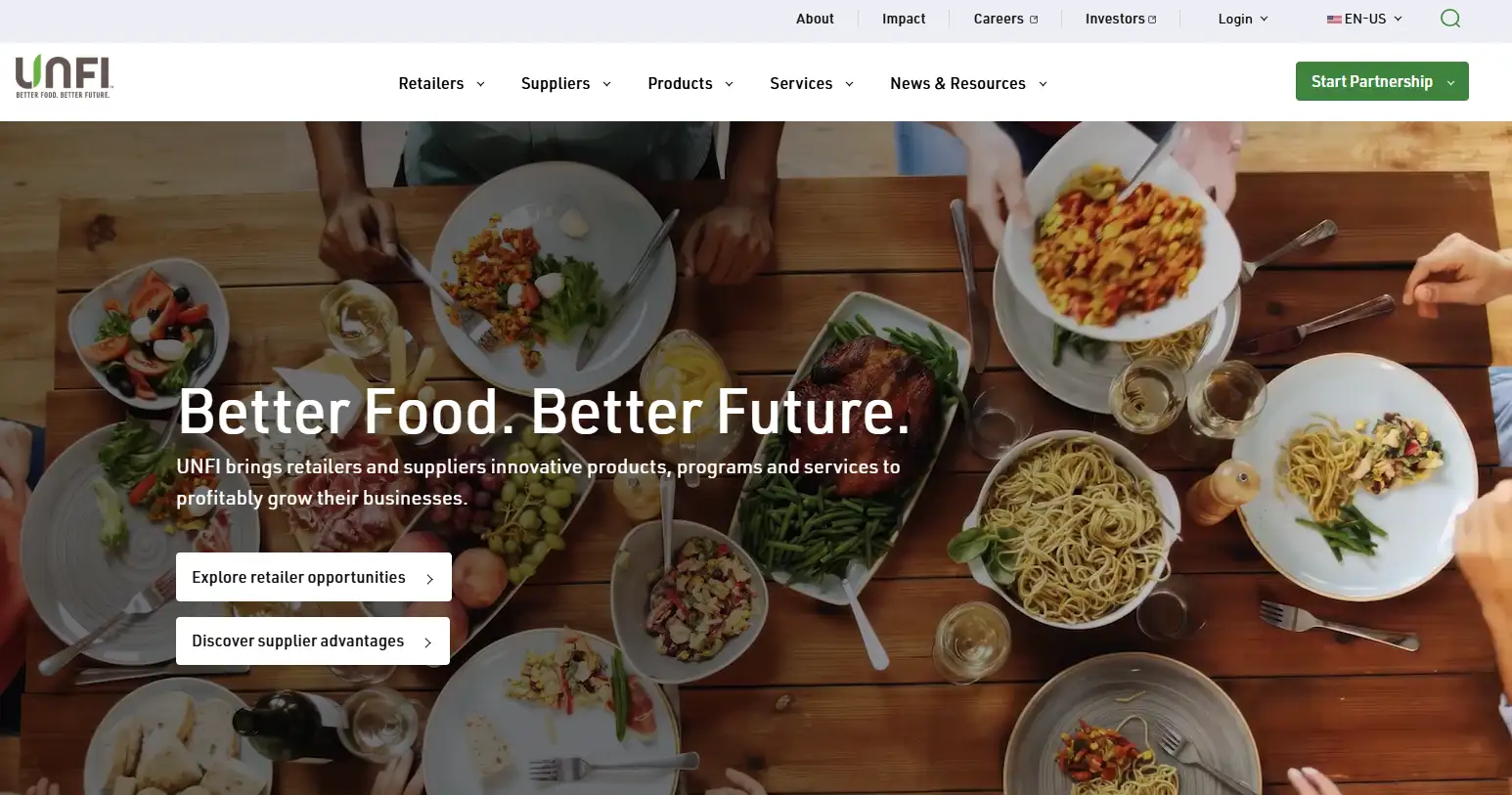
The homepage opens with a full-screen, high-resolution hero image paired with a bold tagline:
- Main Headline: "Better Food. Better Future."
- Subtitle: Emphasizing health, natural living, and sustainability
- CTA Buttons: Prominent calls-to-action like "Explore Solutions" and "View Sustainability Report"
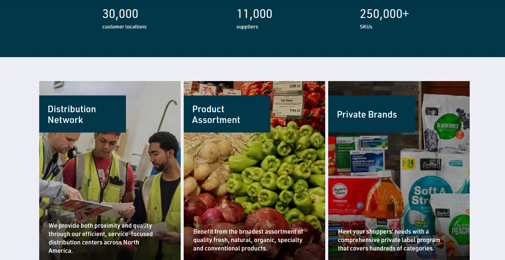
White text with a subtle dark overlay ensures legibility, while vibrant green buttons stand out to encourage engagement. Directly below, a three-column grid highlights UNFI's strengths—its logistics network, broad service coverage, and partner ecosystem—through striking visuals, concise text, and clickable CTAs, creating a clean visual rhythm.
3.Content Organization with Visual Balance
Beyond the hero section, the site transitions into a data-driven showcase, using icons, numbers, and text to underline UNFI's scale and expertise:
- Over 10,000 SKUs, 7,000+ retail partners, and 58 distribution centers
- A short brand vision video to create immersion
- A visual ESG summary spotlighting efforts in climate action, food waste reduction, and community initiatives
These modules adopt card-based layouts, making them easy to scan while reinforcing brand recall. By balancing concise text with compelling visuals, the site avoids the static, uninspired feel of many corporate websites, keeping visitors engaged.
4.Media Integration for Engagement
The website incorporates dynamic video content showcasing UNFI's sustainable facilities, logistics operations, and dedicated teams. Videos are embedded with hover-to-play functionality for ease of use. To preserve fast performance, lazy-load technology ensures videos only load as users scroll, optimizing the initial page load.
5.Dedicated Sustainability Section
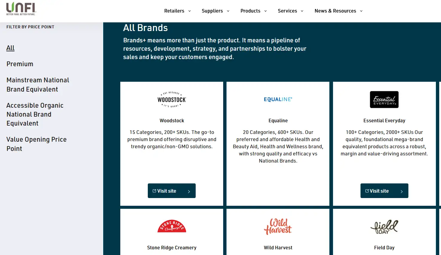
Sustainability is given a prominent place in the site's structure, with a dedicated navigation tab and thoughtfully designed content blocks. Sections like "Climate Action," "Food Waste Reduction," and "Community Support" use green, blue-gray, and white backgrounds for clear segmentation. Each includes visual icons, key statistics, and concise descriptions, along with a convenient "Read Report" button linking to downloadable PDFs. Complementary charts, infographics, and real quotes from employees and partners enhance both credibility and emotional connection.
6.Showcasing Partnerships and Clients
A sleek carousel displays partner logos—including Whole Foods, Sprouts, and Vital Choice—within a subtle gray-white gradient background. Each logo links to related business pages, reinforcing UNFI's extensive industry relationships while maintaining a polished, professional aesthetic.
User Interaction and Usability Analysis
The UNFI website takes a straightforward, user-first approach to its interaction design. While it avoids unnecessary flashiness, it places strong emphasis on intuitive navigation and fast, effective access to information. This level of clarity shows how branding in UX design can drive engagement, helping the United Natural Foods brand website deliver intuitive pathways for diverse audiences, from retailers to investors.
1.Clear and Logical Navigation
The site employs a well-structured, standardized information architecture:
- A top navigation bar links directly to key business areas
- Secondary dropdown menus break down sections like "Solutions" into categories such as B2B Tools, E-commerce, and Analytics
- An integrated search tool lets users quickly find product categories, reports, or news
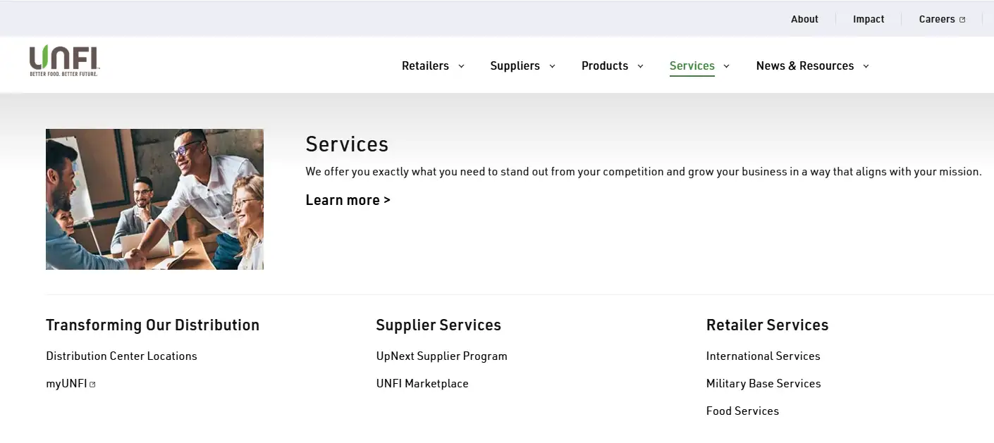
This tiered structure is ideal for a content-rich, complex B2B platform. The navigation is built for speed, with a hover-triggered menu that displays subpages instantly—no extra clicks needed. Each submenu item includes an icon, a short description, and a direct link, helping users recognize and reach their target page quickly. On mobile, these menus transform into a smooth slide-out panel, offering the same functionality in a touch-friendly format.
2.Action-Oriented CTA Buttons
A search icon in the top right corner activates a full-site search overlay. Users can type keywords to see live suggestions, trending results, and filters for products, reports, or job listings. Many results include a small thumbnail and summary in the dropdown, letting users preview content before clicking.
Call-to-action buttons stand out with a bold green background and white text, shifting to a darker shade with a subtle shadow on hover for instant visual feedback. Each button uses an action verb ("Explore," "Talk," "Download") to encourage immediate engagement.
3.Optimized Responsive Design
The site is fully optimized for mobile users. Text, images, and buttons resize dynamically to fit different screens, while the navigation condenses into a hamburger menu with large, finger-friendly touch targets (over 40px). Hover effects are replaced by clear tap highlights, reducing accidental taps.
Images are delivered in the most efficient format for each device, automatically selecting the right resolution to conserve bandwidth and ensure fast load times.
Brand Language and Content Delivery
Across sections like sustainability and investor relations, the United Natural Foods brand websitedemonstrates a consistent tone, integrating UNFI's identity with principles of branding in UX design for a polished corporate image.
1.Brand Messaging Strategy
UNFI's brand voice centers on the concise promise: "Better Food. Better Future." This tagline captures its commitment to health, sustainability, and shared growth. It appears prominently across H1 and H2 headings and throughout page copy, reinforcing a positive and forward-looking brand image.
Across its site, UNFI frequently uses inclusive language like "We," "Our mission," and "Our commitment," inviting audiences to feel part of its vision for a healthier, more sustainable future. This collaborative tone helps create a sense of shared purpose between the brand and its stakeholders.
2.Crafting Language for Sustainability Topics
The "Sustainability" section uses a structured, reader-friendly format, organized into six key focus areas—such as Climate Action, Community Health, and Resource Protection. Each area follows a three-part layout:
- A concise overview
- Data-backed highlights
- A clear action plan
For instance, the "Climate Action" module quantifies progress with metrics like "1 million tons of carbon emissions reduced," displayed alongside progress indicators. This mix of data and visual cues lends credibility while encouraging audience engagement.
The copy strikes a balance between factual reporting and human storytelling. Alongside metrics and summaries, it features narratives about supplier partnerships and community initiatives, blending corporate authority with emotional connection.
3.A Timeline-Driven "About Us" Experience
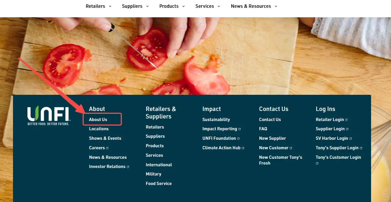
UNFI's "About Us" page tells the company's story through a clean, interactive timeline. Key milestones include:
- 1976: Company founded
- 1990: Entered the health food distribution market
- 2007: Acquired a leading logistics company
- 2023: Launched a digital analytics platform
Interactive cards, icons, and date markers create a visually engaging flow, making the brand's evolution easy to follow while reinforcing its credibility and legacy.
4.Dynamic Content and Resource Access
UNFI keeps its content fresh with regular press releases, investor reports, industry insights, and ESG updates. All materials are housed in the "Insights" hub, where each item is presented as a clickable card featuring a thumbnail, title, date, and category label (e.g., "News," "ESG," or "Reports"). This clear, organized layout helps visitors quickly browse, filter, and download the information they need.
5.Tone, Style, and Consistency
The site's content is written in professional American English, with a neutral tone that avoids slang or overblown marketing language. When speaking about its mission and community efforts, however, UNFI incorporates uplifting words like "inspiring," "leading," and "empowering" to align with its role as a forward-thinking B2B leader.
All clickable labels and headings follow consistent Pascal-style capitalization, such as "Explore Solutions" and "View Partner Programs," ensuring both readability and a polished, uniform presentation.
Technical Architecture and Performance Insights
While UNFI's backend infrastructure isn't publicly detailed, its front-end performance and behavior reveal a well-optimized, enterprise-grade technical strategy. From fast load speeds to SEO-friendly architecture, the United Natural Foods brand website uses its technical framework to reinforce user trust while enabling deeper engagement with UNFI's digital ecosystem.
1.Speed and Performance Optimization
Lighthouse audits of UNFI's core pages show a First Contentful Paint (FCP) of roughly 1.2 seconds and an overall performance score exceeding 85. This is achieved through:
- Lazy-loading images and delivering them via multiple resolutions (
srcset) to fit various screen sizes - Minified, combined CSS and JavaScript for lighter requests
- Modern protocols like HTTP/2 and HTTP/3 to accelerate delivery
- Global CDN distribution and server-side caching for fast, consistent load times
These techniques not only create a smoother browsing experience but also strengthen SEO performance by meeting Google's Core Web Vitals standards.
2.SEO Metadata and Structured Data
Every page is structured with proper
<title>, <meta description>, and <h1> tags, alongside Open Graph metadata for social sharing. Structured data schemas—covering Organization, BreadcrumbList, and FAQPage (on select subpages)—help Google generate rich snippets, improving both visibility and click-through rates in search results.3.Mobile-First, Responsive Design
UNFI's layout adapts seamlessly to all devices using fluid grids and media queries:
- Desktop views use wide, horizontal layouts
- Tablet screens reflow to two columns, while phones collapse to a single column
- Buttons and interactive elements meet touch-friendly guidelines, with targets exceeding 48px for easy tapping
Scripts are selectively loaded to minimize overhead, delivering a leaner, faster experience for mobile visitors.
3.Security and Data Protection
UNFI's website enforces HTTPS with HSTS and validates third-party resources using Subresource Integrity (SRI). It complies with GDPR and CCPA regulations, offering users transparent cookie consent controls.
To further safeguard operations, the site uses a robust Content Security Policy (CSP) to block unauthorized scripts and leverages enterprise-grade WAF protection for its API endpoints. Paired with regular database backups and CDN synchronization, these measures ensure both resilience and uptime continuity.
4.Accessibility by Design
With Lighthouse accessibility scores exceeding 90, UNFI's site demonstrates a clear commitment to inclusivity:
- All interactive elements are keyboard-friendly, ensuring full tab navigation support
- Descriptive
alttext andaria-labelattributes make images and videos accessible to assistive technologies - Text contrast adheres to WCAG 2.1 AA standards for optimal readability
- Forms use properly associated labels for clarity
- "Skip to content" links provide quick navigation for screen reader users
A dedicated "Accessibility Statement" page details these practices and offers channels for feedback or concerns, reinforcing both user trust and regulatory compliance.
How to Build a UNFI-Level Brand Website in Days with Wegic
For any food brand aiming to achieve the polish of the United Natural Foods brand website, Wegic offers AI-driven tools to replicate its structure and UX quality without heavy coding or long timelines. For food companies, distribution networks, and retail tech providers, creating a corporate website on par with UNFI's can be a daunting project, often taking months and significant developer resources. Wegic changes that.
With Wegic's AI-powered platform, you can launch a professional, enterprise-grade site in a fraction of the time, complete with:
- A fully structured brand framework, including Homepage, ESG hub, Services pages, and Partner showcases
- Responsive UX templates that seamlessly adapt to desktop and mobile devices
- Automatically generated SEO metadata and Schema for maximum search visibility
- Flexible visual modules—buttons, image-text blocks, and CTA sections—that you can customize anytime
- One-click deployment to secure servers, with CDN acceleration and HTTPS enabled by default
More than just a website builder, Wegic is an intelligent platform built to deliver an exceptional user experience, consistent branding, and SEO-ready architecture. For enterprises aiming for UNFI-level polish and functionality, Wegic is your fastest path from concept to launch.
Click here to build your site👇
Conclusion
The United Natural Foods brand website stands as a benchmark for how UX Analysis and branding in UX design can converge, creating a platform that strengthens UNFI's brand reputation and connects with all its stakeholders. As a leader in the North American food supply chain, UNFI shows how a corporate website can unify brand vision, customer engagement, and social responsibility into one powerful digital experience.
A successful brand website isn't about stacking "flashy" templates. It's about delivering a clear structure, effective communication, data-driven insights, and a sustainable design approach. If you're ready to build a professional, conversion-focused website that earns industry trust, Wegic can help bring your brand vision to life, taking you from concept to launch in record time.
撰寫者
Kimmy
發布於
Aug 6, 2025
分享文章
閱讀更多
我們的最新博客
Wegic 助你瞬間打造網頁!
透過 Wegic,利用先進的 AI 將你的需求轉化為驚艷且實用的網站
使用Wegic免費試用,一鍵建立你的網站!
