登入
打造你的網站
10 Easy Responsive Web Design Techniques for Beginners in 2025
Master responsive web design techniques with practical tips, layout grids, and tools like Wegic to build flexible, high-converting websites on any device.
When I built my first website, I had no idea what responsive web design techniques meant. I just wanted this webpage to look nice, but when I looked at it on my phone, it was all messed up. That's when I learned that no matter how beautiful a website is, if it doesn't work on all screen sizes, it's useless.
Now, for beginners, understanding the basic points of responsive website design can be said to be the most critical skill. The best part? You don't have tobe a programming expert. With simple steps and the right platform, you can easily master responsive web design techniques and have fun doing it.
This blog will introduce ten simple and easy-to-use responsive techniques to help solve problems encountered when creating website layouts. Whether you are designing a new responsive web page or planning toupdate an old website, you'll find this guide refreshingly doable, especially when you have Wegic on your side.
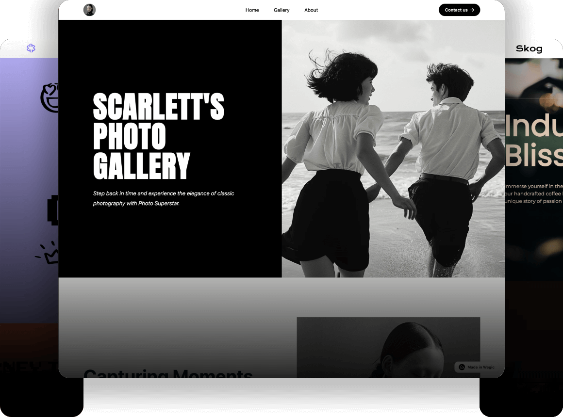
Curious about AI-generated responsive web design? Click the link below to start your exploration with Wegic!👇

Understanding the Core Principles of Responsive Design
Fluid Grids are the foundation of most responsive web design techniques. Designers now use proportional layouts instead of rigid pixel values. This layout is particularly good and can adjust to the size of the user's monitor. This makes responsive web pages look more pleasing and natural on various devices.
Flexible Images & Media come next. Set the max width of the images & media to 100% so the material can enlarge without breaking the frame. This is one of the simplest and most direct responsive CSS approaches, but it has a notable influence on the user experience.
Media Queries are the core of responsive web design. It is a CSS feature that allows you to adjust the style of the web page according to the width of the screen. Whether you want to resize text on a mobile phone or reformat the layout on a tablet, media queries can do it all. These are integral to every modern responsive web page structure.
Why Responsive Design Still Matters
Mobile Traffic Dominates: Why Every Responsive Website Design Counts
According to AQ Marketing, over 50% of global web traffic now comes from mobile devices, so it is necessary to ensure that web pages display correctly and run smoothly on various devices.
Google Prioritizes Mobile: Responsive Web Design Techniques Boost SEO
Search engines prefer websites that can be displayed properly on mobile phones. Responsive web design techniques can directly increase your search ranking.
If you're learning SEO, consider reading the articles below:
Consistent Experience Across Devices: Build One Responsive Web Page for All
Whether users are using a mobile phone, tablet, or laptop, they all want a seamless online experience. A single well-designed responsive web page delivers just that.
10 Easy Responsive Web Design Techniques for Beginners in 2025
When researching responsive web design techniques, it helps to start with the basics that you can put to use right away. Each of the following ten techniques is beginner-friendly but powerful enough to apply to real-world projects. These aren't just trendy things. They're core methods used in every modern responsive website design.
Technique 1: Add the Viewport Meta Tag
To create a web page that can automatically adapt to various screens, the most crucial step is to set the viewport. Without it, the layout will not be able to automatically adjust its position on small screens like mobile phones and tablets.
Add this tag inside your
<head> element:
It enables the browser to automatically adjust the page layout according to the width of the mobile phone or computer screen instead of defaulting to a shrunken version of the desktop site. Every programmer should include these basic elements when using responsive web design techniques. Without it, even the best responsive CSS won't behave as expected.
This small tag is the gateway to true responsive website design, especially on devices such as mobile phones that require frequent zooming.
Technique 2: Mobile-First Design
Responsive web design basics start with designing for the smallest screen first, then expanding upward—a strategy called mobile-first design.
Here's a simplified example using responsive CSS:

This method allows responsive web pages to load quickly on small devices. The pages will already look great before adding the complexity of larger devices. It also makes scripts leaner and more efficient. Both of which are critical factors in today's responsive website design techniques.
When evolving responsive web pages nowadays, people generally think that it is best to develop the mobile version first.
Technique 3: Fluid Layouts & Relative Units
In responsive web design techniques, the critical method is to embrace a fluid layout instead of a fixed width. Static pixel values (px) don't work very well across devices. It's recommended to use percentages and relative units such as "em" or "rem" for layout. Because they can automatically adapt to resizing.
Here's a basic fluid grid example:

This ensures that responsive web pages can be displayed properly on various screens, and the layout will not be messy.
You should also use "em" or "rem" for font sizes and spacing:

These measurements are adjusted based on each person's device and configuration. They allow for larger accessibility and adaptability.
Fluid layout is a crucial element of any robust responsive website design and a core part of responsive CSS strategies.
Technique 4: The Magic of Media Queries — Set Breakpoints Strategically
Breakpoints are the core mechanism that makes responsive design adaptive. These are the screen width thresholds where your layout should shift to provide the best viewing experience. Setting breakpoints is not only about choosing the right pixel value. It also includes understanding how the content will be displayed on different devices.
Identify "breakpoints": Don't set a fixed width for your device from the beginning. You should expand your browser window checking, or use a responsive design tool. Observe where your design starts to look awkward, crowded, or unreadable. This could be where:
- Text lines become too long for comfortable reading.
- The images are either too small or too gigantic, and they distort the layout.
- The navigation component may be stuck or unusable.
- The columns are now misaligned, which looks weird.
Set breakpoints at these natural "break points." This allows designs to look good and function well on a variety of devices.
Although content is king, it's helpful to be aware of general device categories for initial planning:
- Extra Small Mobile: Up to ~480px (for older/smaller smartphones)
- Mobile: ~320px - 576px
- Tablet (Portrait): ~600px - 768px
- Tablet (Landscape) / Small Laptop: ~769px - 1024px
- Desktop: ~1025px - 1440px
- Big Desktop: 1441px+
Technique 5: Embrace Modern Layouts with Flexbox & CSS
In responsive web design, the layout you choose will not only affect development efficiency but also the adaptability of the website on various devices. Compared to traditional layout techniques like
float or position, Flexbox and CSS Grid are now more popular, and superior. All major browsers support them.Flexbox is particularly suitable for unidirectional arrangement. Whether it is arranged in a row horizontally or in a column vertically, it works well. It is particularly useful for making common UI components like navigation menus, card collections, or button groups. Flexbox makes the tasks of centering elements, distributing space, and wrapping content much easier using simple features such as
justify-content and align-items.Use Case: A horizontal row of links or social icons.
HTML Example:

CSS Example:

Result Preview (Mobile-friendly):
📱 [About] [Contact] [Privacy]
CSS Grid is great at handling complex two-dimensional layouts. It's really easy to use, and can create responsive grids, masonry-style content areas, and clearly structured layouts without having to use too many layers. It can accurately and flexibly set row height, column width, and spacing.
Use Case: Complex layout with multiple columns like:
| Company | Resources | Social |
HTML Example:

CSS Example:

Result Preview (Desktop & Mobile Responsive):
🖥️

📱

Technique 6: Responsive Media (Images & Typography)
Modern websites must adapt seamlessly across a range of screen sizes. Responsive media ensures your visuals and text scale naturally. That helps improve both aesthetics and accessibility.
- Responsive Images with
max-widthandsrcset
To prevent image overflow or distortion on smaller screens, always use this rule:

This ensures images shrink to fit their containers without breaking layout.
For performance and clarity on different devices, use the
srcset attribute:
This tells the browser to load the right image based on screen width, improving speed and visual quality.
- Fluid Typography: Text That Scales
Instead of fixed
px values, use relative units such as em, rem, or modern fluid scaling:
The
clamp() approach creates an elastic font size that adjusts itself between the minimum, most comfortable, and maximum sizes. It is perfect for ensuring that text is clear and easy to read on all screens.Technique 7: Progressive Enhancement with Unobtrusive JS
JavaScript is a programming language that runs on browsers and is used to add interactivity and dynamic behavior to web pages. Nowadays, many interactive things on the website, like click events, animations, and self-adjusting tables, are done with JavaScript.
Good responsive web design starts with a simple, working foundation, then adds extra features on top. This method is generally called progressive enhancement. The site should function properly even if JavaScript is turned off.
When evolving responsive web pages, non-intrusive JavaScript is a particular way of writing code that can add new JavaScript features while maintaining the original HTML structure and basic functions of the web page unchanged. This method improves usability and accessibility by strictly separating structure (HTML), presentation (CSS), and behavior (JavaScript).
Technique 8: Performance Optimization & Lazy Loading
A beautifully built responsive website means little if it loads slowly. That's where performance optimization comes into play. It is considered an essential part of mastering responsive web design techniques. Whether you're working on a personal portfolio or a large-scale web application, speed matters just as much as visual adaptability.
One key technique is lazy loading. It means delaying loading non-critical resources (like images, videos, or iframes) until they're actually needed. This dramatically reduces initial page load time and bandwidth consumption. Those things are critical in mobile-first environments where responsive website design is valuable.
To implement lazy loading in a responsive web page, make sure your HTML uses the loading="lazy" attribute on images and embeds. Combine that with responsive CSS practices, such as media queries and flexible grid layouts, to ensure content not only loads efficiently but also adapts seamlessly across devices.
Technique 9: Testing & Debugging Responsiveness
After using responsive web design techniques, the next step is to test and debug the problem. No matter how well a responsive website is designed, it can only be truly effective if it works well on a variety of devices, browsers, and screen sizes.
Chrome DevTools (Responsive Mode)

This integrated tool in Google Chrome is very popular among programmers. Its responsive web design basics interface allows you to simulate devices like iPhones, iPads, and Android phones. You can adjust and modify the responsive CSS directly so you can see the effects of the transition points immediately. It is helpful to figure out how to make web responsive and user-ready.

BrowserStack
BrowserStack helps enable more than 50,000 organizations to test web pages and mobile apps directly on real devices and browsers. That covers more than 20,000 real Apple and Android devices and more than 3,000 computer browsers. This broad coverage helps the responsive web design techniques to be applied more smoothly. This also makes sure that your website runs stably on a variety of platforms.

Critical Highlights:
- Real Device Cloud: Connect to thousands of real devices to help teams test. Testing is conducted in an environment that is exactly the same as what end users will actually encounter.
- Scalability and Reliability: Users have run over 1 billion evaluations on the platform. Additionally, 6 million programmers in 123 countries use the platform.
- Fast Evaluation Cycle: Brands such as Deckers and UNiDAYS say that this tool can assess web pages faster than traditional in-house labs. So it can save a lot of time and money.
- Easy Integration: It works seamlessly with Selenium, Appium, CI/CD pipelines, and programmers' commonly used tools. Therefore, it plays a critical role in the entire process of responsive site layout.
LambdaTest
Another cloud-focused cross-browser evaluation platform is LambdaTest. It ensures that responsive web page layouts perform well on a variety of modern and classic browsers. LambdaTest is a popular cloud testing platform driven by artificial intelligence.

Crucial Highlights & Metrics:
- It detects and evaluates over 3,000 desktop and mobile browser and managing system combinations. Simultaneously, simulators, emulators, and physical devices are all supported.
- Assist automation frameworks such as Selenium, Playwright, Appium, Cypress, and TestCafe, integrated seamlessly with CI/CD pipelines.
- Includes excellent advanced features:
- LT Browser for previewing site responsiveness
- Visual regression testing
- AI-native analytics and observability
- Accessibility testing
- Evaluations can be done at the same time, with more than 100 sessions running simultaneously.
- It is popular among corporate customers and small and medium-sized enterprises around the world. It also has compliance certifications like SOC 2 and GDPR, which makes it feel reliable.
Technique 10: AI and Personalization in Responsive Design
How AI Enhances Responsiveness
Today's AI tools can quickly analyze user information to predict what content users may be interested in and interact with. For example, ane-commerce site might rearrange product listings based on the visitor's previous actions or location. At the same time, AI-powered chatbotscan offer custom greetings and smarter navigation suggestions depending on user intent.
Personalization Meets Device Context
Responsive design plus several customizations mean that your website not only looks good on any device, but it also feels personal. Users on mobile devices will see a simple and intuitive interface, and quick operation is critical. When they log in from a desktop device, they can browse for more detailed content and see reminders of previous operation records.
Tools That Help
- Wegic: A natural language interface is a great choice. Wegic lets you speak your mind, such as "add a particular greeting to returning customers." Then it will turn those words into elements that can be adjusted in real time. It can customize and adjust page layouts according to different devices, user groups, and content purposes. This is especially helpful for creators or marketers who want to quickly customize a page without having to touch code.
Want to auto-adapt your design to every user without extra coding? Try Wegic for free and build smarter pages with responsive web design techniques.👇

- Adobe Sensei: Adobe's AI engine, which is used in tools such as Adobe XD and Experience Manager, can automatically make layout suggestions, categorize content, and adapt to different operations.

- Builder.io: This visual editor provides custom rules combined with AI-enhanced content targeting. You can take a look at the responsive adjustment and then come up with various versions of A/B testing very easily.

- Segment + Webflow: If you use them together, Segment can handle real-time customer information. The power of Webflow is that it can make responsive layouts that switch content based on data flow. Both platforms are ideal for conducting responsive web design techniques.


Related blog for you:
-10 Best AI Tools for Developers: Comprehensive Reviews
Conclusion: Master These 10 Tips to Stay Ahead in 2025's Content Game
Whether you're a beginner launching your first project or a seasoned content team managing multiple campaigns, the ten tips above will help you accelerate time-to-market and increase conversion efficiency in 2025. In this era of information explosion, if you want to make a name for yourself, you can't just rely on manual repetition. You have to use tools and platforms well, and understand how to do responsive web design techniques. The future of content production will not only be fast and robotic, but also mobile, more adaptive, and more user-centric.
Signing up for Wegic is super easy. Try it and you'll have an automatically adaptable, high-converting Instagram hub built right away!👇

Mastered responsive web design techniques but still struggling with web design? Read the articles below to spark your creativity!
Frequently Asked Questions
What is the difference between adaptive and responsive web design?
Adaptive web design uses multiple fixed layout sizes, and the site selects the best one based on the user's device. In contrast, responsive web design uses flexible grids and media queries to fluidly adapt to any screen size. It allows users to have a smooth user experience on devices of different sizes and also reduces subsequent maintenance work.
What is the best grid system for responsive design?
The best grid framework actually depends on the specific requirements of the project. But CSS Grid and Flexbox have become the mainstream elements in the industry. They offer more flexibility than older systems like Bootstrap's 12-column grid.
Is CSS Grid better than Bootstrap?
CSS Grid allows for more precise layout configuration, and all modern browsers already support it natively. For particularly complex responsive web designs, it is really useful. Bootstrap is actually a framework with ready-made components and a consistent grid system. It is particularly suitable for rapid project development and can save a lot of custom code. For responsive layouts, CSS Grid is often favored. Because it's so adaptable on its own, especially when combined with Wegic, which provides CSS Grid-compatible templates.
What are the best responsive web design examples?
Several great responsive web design examples are the websites of Airbnb, Stripe, and Dropbox. To give another particularly good example, Wegic, a website-building tool, can help you build a website in a very intuitive way. The web pages it creates by default can be displayed perfectly on various devices. Its templates are carefully adjusted for all screen sizes. Wegic makes the content display perfectly on computers, tablets, and mobile phones without having to write breakpoints or modify code yourself.
撰寫者
Kimmy
發布於
Aug 4, 2025
分享文章
閱讀更多
我們的最新博客
Wegic 助你瞬間打造網頁!
透過 Wegic,利用先進的 AI 將你的需求轉化為驚艷且實用的網站
使用Wegic免費試用,一鍵建立你的網站!