登入
打造你的網站
8 Best UI Kits Designers Love in 2025 (Free & Premium)
Discover the 8 best UI kits for designers in 2025. Explore free and paid options to boost your workflow with modern, high-quality design assets.

Why are 90% of the first drafts of designs rejected during the development phase? UI Kits may be the key bottleneck that is being overlooked. The ideal workflow would be that designers and developers can interact without complication. Nevertheless, in real projects, even senior designers may not correctly reproduce the interface because of the absence of unified parts, or no directions of interaction, or a variety of design styles, which means rework and poor working performance.
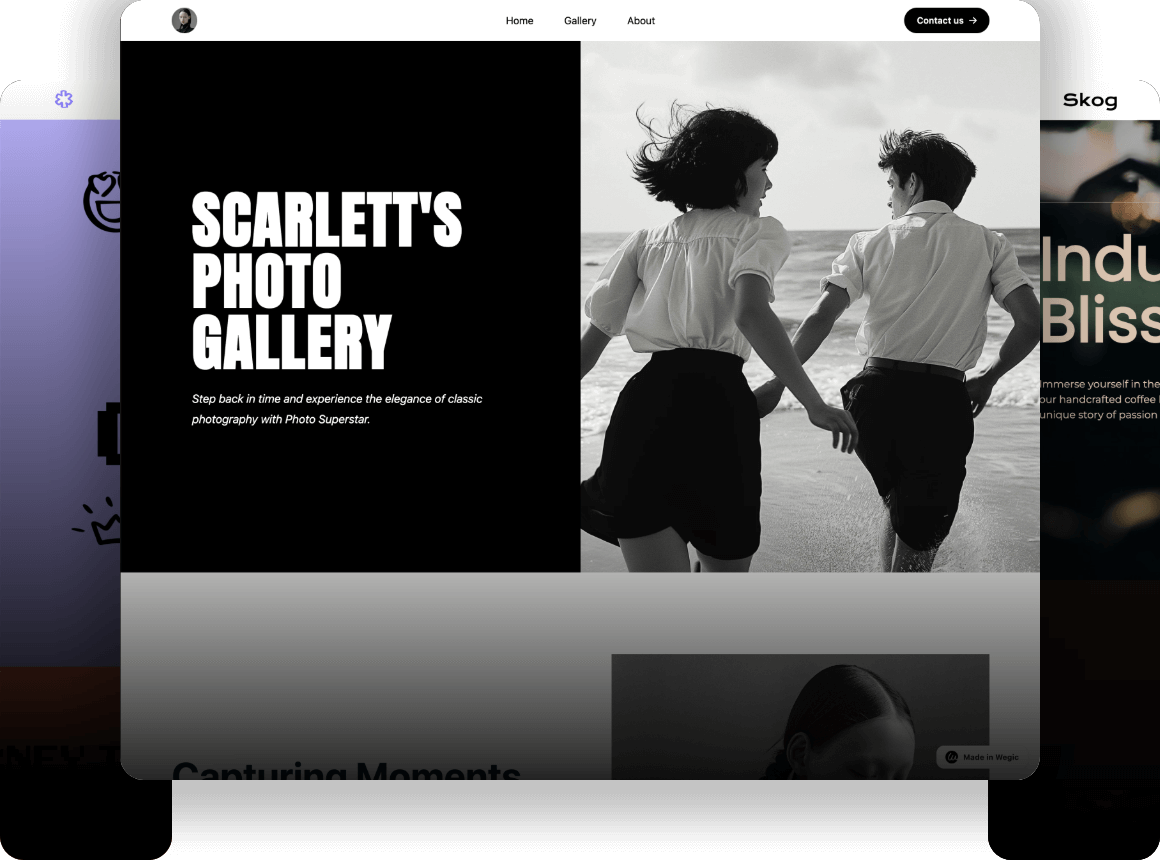
Click on the image to build a website without code! ⬇️

The best UI kits for designers are intended to address these issues. It does not only enhances the efficiency of design, but also acts as a bridge to simplify the design and easier to apply. But, in front of the infinite amount of UI Kits on the market, the designers also find themselves in a state of dilemma: are the free tools professional enough? Do paid products get the money worth it? What are the UI Kits that actually address the project at various levels and every scenario?
This article will support the designer in systematically thinking about the importance of UI Kits, profoundly examining the pros and cons of free and paid tools, and referring to the best UI kits for designers of 2025 to ensure that every creation is made quickly and with the desired high levels of professionalism by the designer.
Why Does UI Matter?
The role of user interface (UI) design of digital products cannot be overlooked. The newest statistics of Adobe research indicate that approximately 73 percent of users abandon a web page or uninstall applications because of a rough or user-unfriendly interface design. Such data is the direct manifestation of the direct influence of good UI design on the rate of user retention.
Using the example of large e-commerce websites, Amazon and Target showed rather considerable changes in the conversion rate before and after the revision of the interface. Amazon simplified the process of procuring goods and made it more convenient to search and purchase, thus generating a 15 percent rise in sales. Target enhanced the design of the websites, and hence users spent 20 percent more time there. Such figures are convincing that creating a good UI design is not only a matter of appearance, but it also makes the users behave in a different way and helps businesses earn more money.
To designers, the user interface is what the user perceives first upon relating to a brand. It influences the attitude that customers develop towards the brand and their total experiences. A good UI design may boost user confidence and the competitiveness of the product. Thus, learning about the importance of UI design and learning to appreciate this value will be one of the connecting points that each designer should consider in the project.
What are the UI kits?
User Interface Kit, or UI Kit, is a set of simple elements utilized by designers in creating interfaces of digital products. It mostly consists of diverse design elements:
Click on the image to design a website with AI! ⬇️

Image by Istock
- Buttons: buttons in common states and forms to satisfy various operational needs.
- Forms: standard format of different forms like input boxes, selectors, check boxes, etc, to make it easy to collect data.
- Navigation bar: There are multi-level menus and tab bars to enable patients to navigate through the structures of content using techniques to move through these structures fast.
- Animation templates: the frequently occurring transition and feedback animation to enhance the dynamic expression of the interface.
- Design Guidelines: specifications and interaction guidelines that would make the design consistent and user-friendly.
The best UI kits for designers have the advantage of saving time and ensuring that everything that is involved is well aligned, both in terms of appearance and functionality. It also assists designers and developers to collaborate well.
However, there are dangers associated with the excessive use of UI Kits by designers. Using them too much can render alternative products too similar. This removes the edge of uniqueness and new ideas, and the user experience is not so cool. When using UI Kits, the designer must consider the needs of the project and brand style. It would help them to change and modify the designs so that they are not imitations.
Free Best UI Kits for Designers
Free ui kits are an excellent initial option when a designer needs to initiate the work fast and to test some new ideas. They are free of cost and readily available. These toolkits have simple and standard components, and this enables the designers to design prototypes and interfaces within a very short time. Free toolkits usually incur fewer parts, less detailed designs, and minor support. They may not be suitable for big or complex projects. Designers are requested to consider how convenient the toolkit is in use and whether it offers all the features that they require.
Flowbite
Features: Extensive library of Tailwind CSS components; responsive buttons, modals, dropdowns, and forms; easy to accomplish, given the usage of Tailwind utility classes.
Notes: It is a component especially suited to the use of Tailwind CSS; it is well suited to front-end development and rapid prototyping; an active community with constant development.

How to Use Free UI kits:
- Add components in Tailwind CSS projects through importing modules.
- Customize styles by adjusting Tailwind utility classes to fit your design needs.
- Use official documentation for setup guidance and example usage.
- Combine components to build an interactive, responsive UI rapidly.
Flowbite is built for Tailwind CSS. It offers a large collection of ready-to-use parts for websites. This helps designers and developers who know Tailwind CSS work faster. It makes creating websites that work on all devices easy. You can change styles freely and build pages quickly. The toolkit has an active community and timely updates, ensuring its continued vitality. However, the learning threshold for non-Tailwind users is high, and its application in other technology stacks is limited.
Eva Design System
Features: Cross-platform UI components for Web and React Native; supports light and dark themes; includes typography, icons, and UI elements.
Notes: Emphasizes consistent design across platforms; ideal for mobile-first projects; provides detailed documentation for developers and designers.

How to Use:
- Import React components for web or mobile development.
- Download design assets for UI reference and prototyping.
- Follow the theming and customization guides to adapt components.
- Utilize light/dark mode toggles to maintain UI consistency across devices.
The Eva Design System helps keep the look of apps and websites the same across different devices. It works for both web and React Native. It offers many ready-to-use parts like buttons and menus. It also lets you change colors and styles easily. This makes the user experience similar on all platforms. The free tools are very good and work well for skilled teams. But the system is not simple. Beginners or designers who don’t know React may find it hard to learn. They will need more time to understand it. Eva is suitable for projects that require cross-platform synchronous design and long-term maintenance.
UIdeck Free UI Kit
Features: Over 100 Bootstrap-based UI elements; templates for dashboards, landing pages, and e-commerce sites; responsive and cross-browser compatible.
Notes: Strong Bootstrap ecosystem support; suitable for various website types; free version covers essential components and templates.

How to Use:
- Download the full UI kit package.
- Customize HTML and CSS files according to your project needs.
- Use templates to accelerate dashboard, landing page, and e-commerce site creation.
- Ensure responsiveness and browser compatibility via Bootstrap standards.
UIdeck uses Bootstrap and offers many ready-made parts and layouts for different websites. It works well for teams and fast building. The free version has all the basic features you need. The designs are more classic and simple. It doesn’t have the newest or fancier parts. It may not fit projects that want creative styles or more complex features.
Ant Design UI Kit
Features: Extensive React component library designed for enterprise applications; supports accessibility and internationalization; polished and consistent UI elements.
Notes: Open-source with detailed documentation; backed by a large active community; focuses on complex backend and enterprise systems.

How to Use:
- Install the library via nm and integrate it into React projects.
- Follow Ant Design guidelines and best practices for component usage.
- Customize themes and styles to align with project branding.
- Leverage built-in accessibility and localization features.
Ant Design is an enterprise-level React UI library launched by Alibaba. It has many good parts to use. It works well for all users and supports different languages. It is great for big business systems. It is free to use and has clear instructions. Many people help with it, so it's good for big projects. But it only works with React. The look is more serious and business-like. It may not fit if you want something unique or creative.
Check AI tools for UI, click the article: ⬇️
Paid Best UI Kits for Designers
Paid UI toolkits have more benefits. They offer better design depth, more ready-to-use parts, and good support. These toolkits come with many professional parts and ready-made designs. The makers update them often. They work well for big business projects and large teams. You need to pay for them, but they save time and make designs better. They also cut down on repeat work and make team communication easier. Designers should reasonably choose paid resources based on the budget and project complexity.
Untitled UI
Features: Massive Figma library; modular components; dark mode support; design tokens.
Costs: Starts at $129 per license.

How to Use Modern UI kits:
- Purchase and download the license from the official website.
- Open Figma and import the Untitled UI library file.
- Browse modular components and design tokens within the library.
- Drag and drop desired components into your project file.
- Customize styles, colors, and layout according to your project needs.
- Use dark mode and design tokens to maintain design consistency across screens.
Untitled UI offers a big and advanced Figma design library. Its best UI kits for designers work well for designers and teams who want modern and flexible designs. Its parts are easy to change for different projects. It has dark mode and design tokens. This helps keep designs looking the same and well-organized. It is reasonably priced and suitable for small and medium-sized professional teams. However, beginners may need some time to adapt to its complex structure and usage.
Frames X UI Kit
Features: Pre-built layouts and templates; responsive design; Sketch and Figma compatible.
Costs: Starting around $99 per user.

How to Use Modern UI kits:
- Purchase and download the UI kit compatible with Sketch or Figma.
- Open your design tool (Sketch or Figma) and import the Frames X file.
- Explore pre-built layouts and templates included in the kit.
- Copy templates or layout blocks into your project file.
- Adjust text, colors, and images to match your branding.
- Utilize responsive design components to ensure adaptability across devices.
Frames X UI Kit is based on a large number of preset layouts and templates. This tool works with Sketch and Figma, two popular design programs. It helps designers create flexible designs quickly. It offers many ready-made templates for different types of projects. These templates fit various business needs. The tool is appropriate for small groups and single designers. It is not very expensive, although there are certain special features to require additional payment. The style of design is not very modern and may be used in stable and practical projects.
UI Prep
Features: Customizable components; supports Sketch and Figma; focused on interaction design.
Costs: Annual subscription from $99.

How to Use Modern UI kits:
- Sign up and take UI Prep files in either Sketch or Figma format.
- Download the files in the design system and import them into your preferred design tool.
- Read through the interaction-oriented elements and rules given.
- Fit any components according to the interaction and visual requirements of your project.
- Apply the given pieces of documentation design system in a consistent manner.
- Enforce design standards by collaborating with your team on a project-by-project basis.
UI Prep directs itself to the integration of interactive design and design specifications. This tool is compatible with Sketch and Figma. It is suitable for large company projects. It has numerous sections that you can modify to suit you. These components assist teams in maintaining designs identical and cooperating. It follows a subscription type, and there are always updates and decent support. Nonetheless, the level of complexity is too high, thus making the barrier to entry a high one.
Check the best UX designer portfolio website builder, click the article: ⬇️
Atomize UI Kit
Features: Extensive design elements and icons; supports Sketch, Figma, Adobe XD; includes animation templates.
Costs: One-time purchase from $149.

How to Use Modern UI kits:
- Purchase the one-time license and download the appropriate version (Sketch, Figma, or Adobe XD).
- Start your design program and load the Atomize UI Kit.
- Surf among numerous amounts of design elements, icons, and animation templates.
- Drag and drop the components in your project artboards.
Animate and work with some visual details to improve the user experience by customizing them.
- Preserve and characterize your resources for upcoming undertakings and gang sharing.
Atomize UI Kit is compatible with numerous design systems. It possesses numerous design components and symbols. It also has readymade animations, which make the design appear better. You only pay to purchase it, which is good when you have a lot of money and wish to use it over a long period of time. Its design materials are contemporary, and they suit people who are conversant with design. Specifically, certain animations or difficult segments require good abilities. On the whole, though, Atomize UI Kit would be most appropriate for designers who are concerned with minor graphic details, and movement. It is particularly desirable when there are projects that require fancy animations.
Free vs Paid UI Kits: How to Choose for Designers?
In selecting a UI kit, designers have a hard time. There are fewer features in the free options. Paid utilities are more expensive with more to offer. The difference between free and paid UI kits is as illustrated in the table below. This will help you choose the best UI kits for designers.
| Aspect | Free UI Kits | Paid UI Kits |
| Cost | $0 | Usually $99 - $150+ per license |
| Component Quality | Basic to moderate | High-quality, detailed |
| Customizability | Limited customization options | Extensive customization and flexibility |
| Support & Updates | Community-driven, less frequent | Professional support, regular updates |
| Learning Curve | Generally easier, quick start | May require time to master |
| Suitable Projects | Small-scale, prototypes, simple sites | Complex, enterprise-level projects |
In sum, free UI kits can be used in the start-up segment of projects or low-budget projects. The paid UI kits are more effective when one wants to have designs that require heavy details and a professional appearance. When you are fed up with having to decide between the alternative of being free and limited or paid and high cost, take a third choice, and that is the free and easy design tool provided by Wegic. Wegic lets you use pro-level UI libraries. It also turns your designs into clickable web pages. This saves time and helps teams work together better.
Wegic: No-code Web Design Tool
Wegic introduces huge improvements in efficiency and freedom of design to designers. Not only, is it a code-free web design tool, but it also integrates design and development to make the whole project process simple. Its core functions and advantages are the following:

- Wegic enables the designers to create the page layouts fast through drag and editing. It also lowers the technical barrier since designers do not require writing a single line of code.
- Designers have an opportunity to align client responses with the development team to work in real time, and avoid losing information during its conveying from one point to another, and work effectively.
- The designers have the flexibility of making customized web pages using the provision of flexible components and style settings to fit the needs of various customers.
- The effect of the web page can be observed in real time during the design process, which affects the elimination of repetitive changes and makes work faster.
- Add an ability to simultaneously edit by multiple people, allow improving the efficiency of communication between the design team and the customers.
- Additionally, the web page produced automatically conforms to different screen resolutions, hence ensuring that the design will be of high quality to be displayed on mobile phones, tablets, and desktops.
Conclsuion
Best UI kits for designers are the most important element in the process of effective creation among designers, and Wegic can help us to accomplish a symbiotic bond between design and development. It saves a lot of precious time as well as increases the flexibility and accuracy of design. By selecting Wegic, designers will find it easy to design personalized web pages, transform their creativity into reality, and encourage effective project development. Make your design more professional, efficient, and competitive, and use Wegic now!
撰寫者
Kimmy
發布於
Aug 4, 2025
分享文章
閱讀更多
我們的最新博客
Wegic 助你瞬間打造網頁!
透過 Wegic,利用先進的 AI 將你的需求轉化為驚艷且實用的網站
使用Wegic免費試用,一鍵建立你的網站!