O Que Faz um Ótimo Site de Salão
Ele Torna o Agendamento o Próximo Passo Óbvio
Um visitante que gosta do que vê nunca deve precisar procurar como agendar. Os melhores sites de salão colocam um botão de agendamento no cabeçalho, que permanece visível ao rolar a página. Um link de agendamento que permite aos clientes escolher um horário na hora supera uma linha "ligue para nós" sempre. Se alguém precisa enviar uma mensagem para perguntar quando você está disponível, você já perdeu parte deles.
Ele Mostra o Trabalho, Não Apenas o Espaço
Uma foto bonita do interior é agradável. Ela não diz ao visitante se você realmente pode fazer o corte ou a cor que ele quer. Os melhores sites destacam fotos reais de antes e depois, resultados reais de clientes, não apenas uma foto ampla das cadeiras e espelhos. Essa é a única coisa que um cliente potencial realmente tenta avaliar.
Ele Faz Você Sentir a Vibe Antes de Entrar
Salões vendem uma experiência, não apenas um serviço. Escolhas de cores, fontes e fotografia criam uma expectativa antes de qualquer pessoa sentar na cadeira. Um site com clima editorial e sóbrio promete algo diferente de um site claro e divertido. Nenhum dos dois está errado. O que importa é que o site realmente combine com a sensação de entrar pela porta.
Ele Responde Perguntas Práticas Rapidamente
Horário de funcionamento, faixa de preço, se aceita clientes sem agendamento. Coisas pequenas, mas que impedem alguém de agendar se não encontrar rápido. Esconder isso em um menu PDF ou página separada faz você perder clientes que simplesmente desistem e tentam outro lugar.
9 Exemplos de Sites de Salão Que Amamos
Fotografia de Produto Que Vende a Marca, Não Apenas o Corte
Site: https://yello.salon/
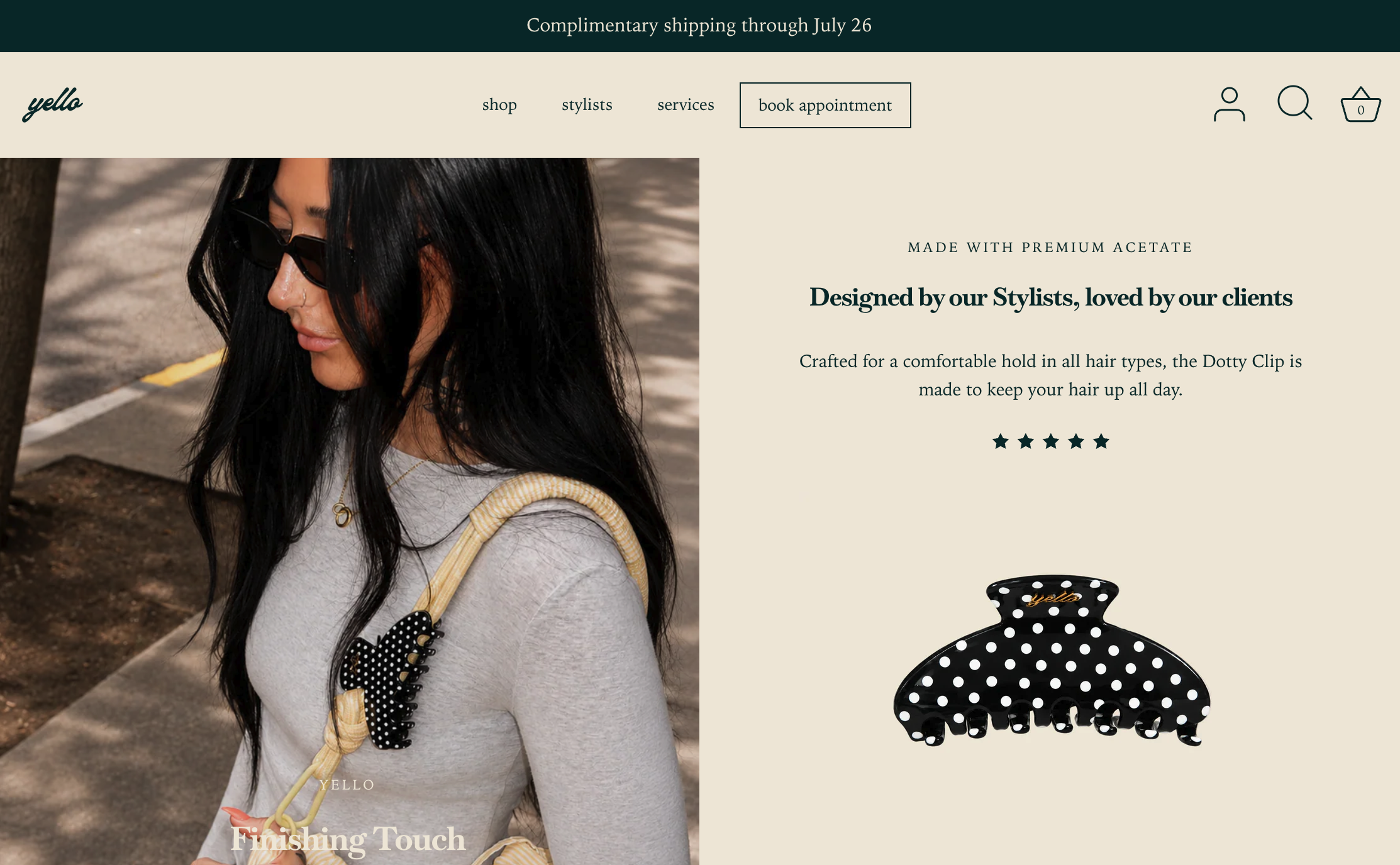
Yello é um salão de cabelo em Portland conhecido por balayage e loiramento. A página inicial destaca fotografia de produto estilizada, não uma foto simples do interior. Um link "Agendar Consulta" fica logo na navegação. Seis cabeleireiros têm sua própria foto e link do Instagram. Há até uma opção "Agendamento Fora do Horário", com preço mais alto, para pessoas que não podem ir durante o dia.
O que funciona: A fotografia de produto tem dupla função. Vende o nível de gosto da marca e sugere uma linha de varejo sem uma página de loja separada. A opção fora do horário é um movimento pequeno e inteligente também. Em vez de perder um cliente que não pode agendar no horário normal, Yello transforma isso em um horário premium. Se sua agenda tiver alguma flexibilidade, cobre por isso em vez de simplesmente dizer não.
Agendamento Que Nunca Para
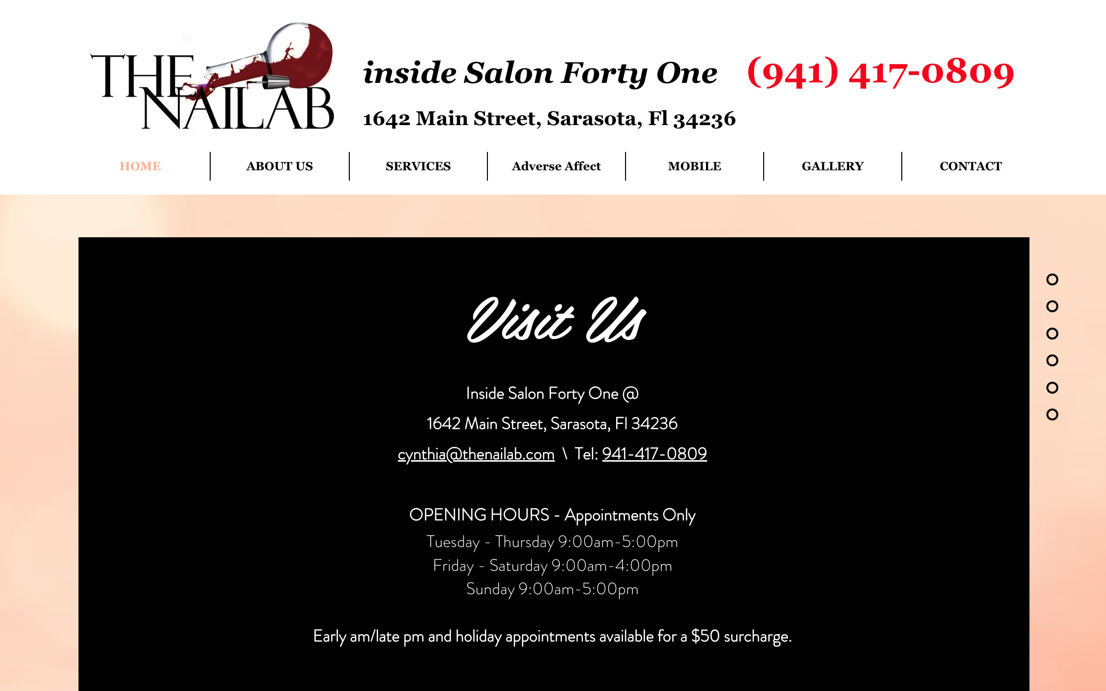
The Nail Lab é um salão de unhas em suíte privativa em Sarasota. A página inicial começa com "dentro do Salon Forty One", criando um tom boutique e só por agendamento desde o início. O agendamento é feito pelo Acuity, disponível online a qualquer hora do dia. A galeria separa os trabalhos por categoria: manicures, pedicures, depilação, até uma opção de serviço móvel.
O que funciona: "Disponível 24/7" importa mais para um serviço como este do que as pessoas imaginam. Alguém decidindo se presentear com uma manicure geralmente está navegando às 22h, não durante o horário comercial. Um sistema de agendamento que não exige uma ligação no dia seguinte captura esse impulso antes que ele desapareça. Se sua opção de agendamento funciona apenas das 9h às 17h, você está perdendo o momento exato em que alguém estava pronto para dizer sim.
Um Botão de Agendamento em Dois Lugares, Não Apenas Um
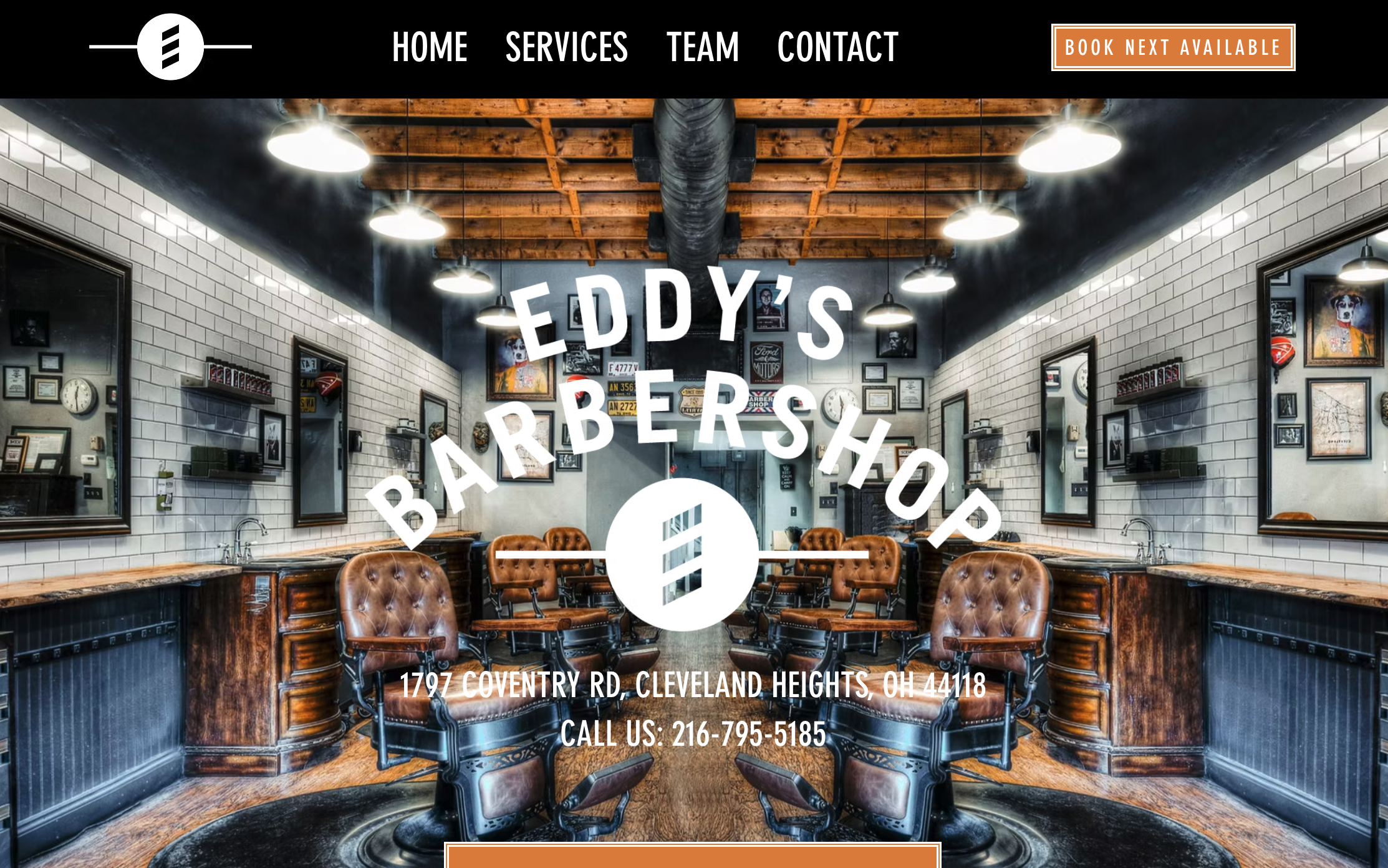
Eddy's é uma barbearia com um botão "Agendar Próximo Disponível" colocado tanto no topo quanto no rodapé da página inicial. Uma seção "Conheça Nossa Equipe" apresenta os seis barbeiros pelo nome e foto, cada um com 10 a 20 anos de experiência listados. O tom é simples: "Versátil. Expertise. Apaixonado."
O que funciona: Colocar o botão de agendamento em dois lugares, não apenas no cabeçalho, significa que o visitante nunca precisa rolar a página para cima depois de decidir. A seção da equipe também resolve um problema real de barbearia: os clientes habituais se importam com qual barbeiro específico corta seu cabelo. Nomear todos logo de cara, em vez de esconder atrás de uma linha genérica "nossa equipe", ajuda um novo cliente a escolher alguém com confiança em vez de adivinhar.
Pegando Emprestado o Sistema de Agendamento de Outra Pessoa de Propósito
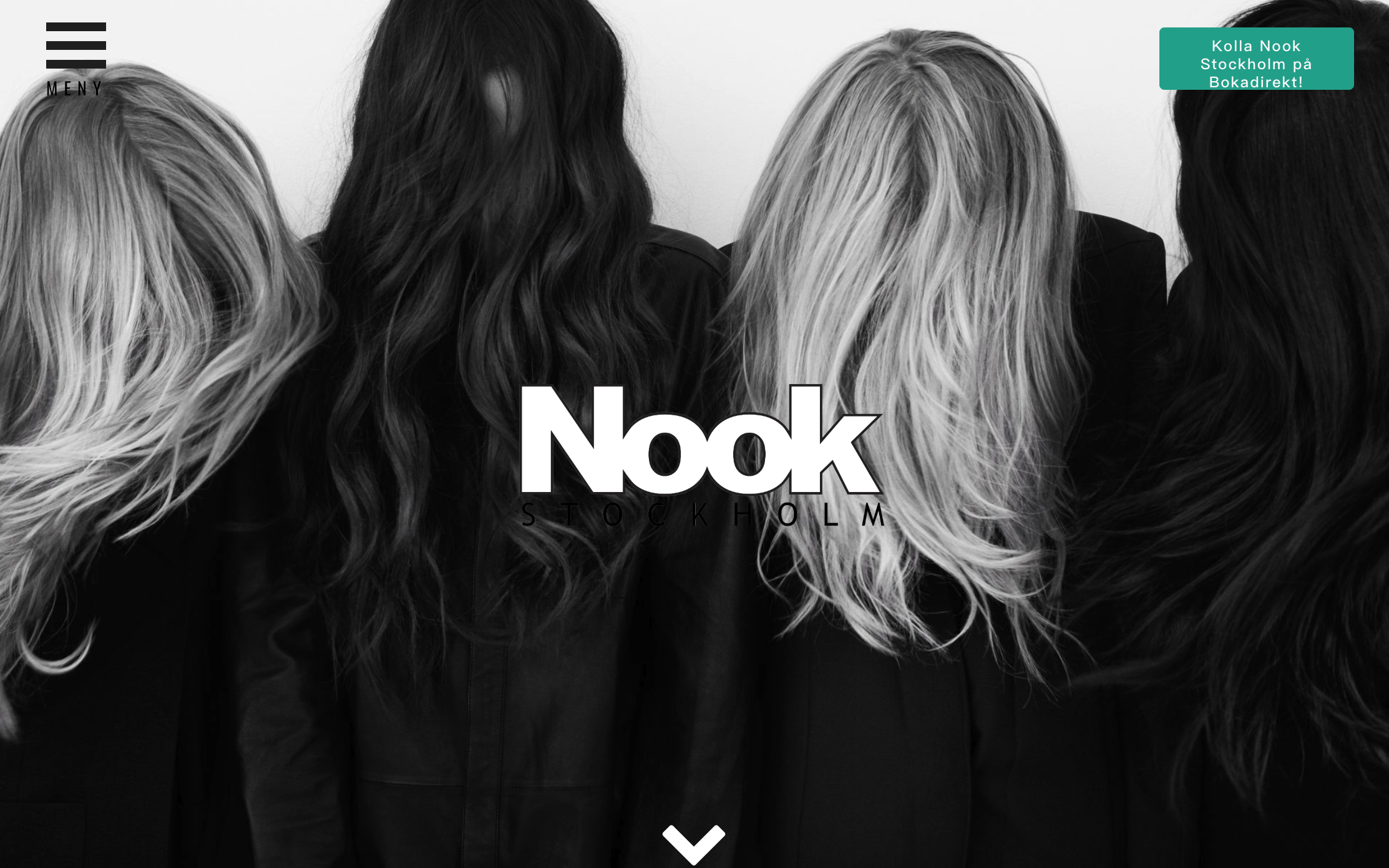
Nook é um estúdio de cabelo e beleza em Estocolmo que cobre cortes, coloração e tratamentos corporais. A página inicial é construída quase inteiramente em torno da fotografia: cabelo molhado, tranças, coques, ondas, fotografados em um estilo limpo e neutro. O agendamento é feito por meio de uma plataforma externa, Bokadirekt, vinculada de forma destacada perto do topo.
O que funciona: Confiar em uma plataforma de agendamento externa em vez de construir uma não é uma fraqueza aqui, é um atalho. Nook não precisava resolver o agendamento. Eles precisavam parecer tão bons assim, e investiram seu esforço nisso. Se já existe uma ferramenta sólida de agendamento terceirizada para sua categoria, use-a e coloque sua energia nas partes que só você pode fazer, como a fotografia.
Uma Página Inicial Construída em um Ponto de Vista, Não Apenas em uma Lista de Serviços
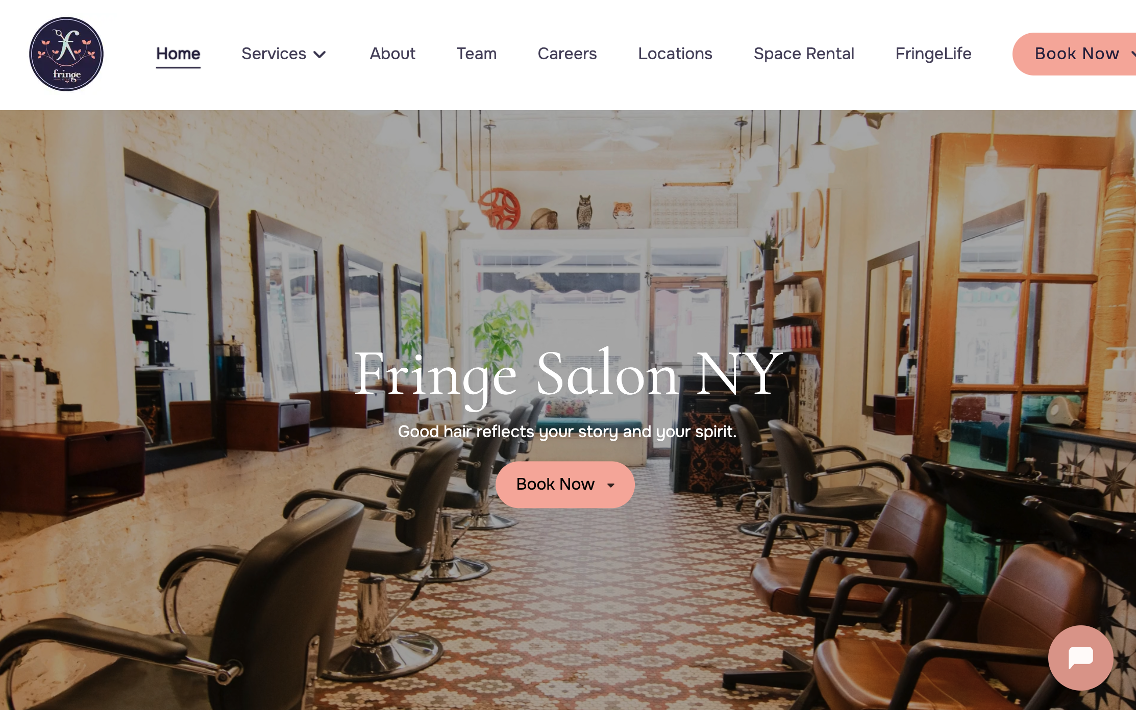
Fringe tem duas unidades em Nova York e uma página inicial construída em torno de uma frase: "Um bom cabelo reflete sua história e seu espírito." O design é preto e branco, minimalista, quase editorial. O site fala sobre estar "profundamente conectado à nossa comunidade local, engajado nas artes e no ativismo", não apenas cortes de cabelo.
O que funciona: A maioria dos sites de salão fala sobre técnica. Fringe fala sobre identidade e comunidade, e é memorável por causa dessa escolha. Um visitante comparando dez salões parecidos lembra daquele que parecia algo, não apenas outra lista de serviços. Se você tem um ponto de vista real sobre por que faz esse trabalho, diga isso na página inicial em vez de guardar para uma página sobre que ninguém lê.
Um Link para Galeria Direto na Navegação Principal
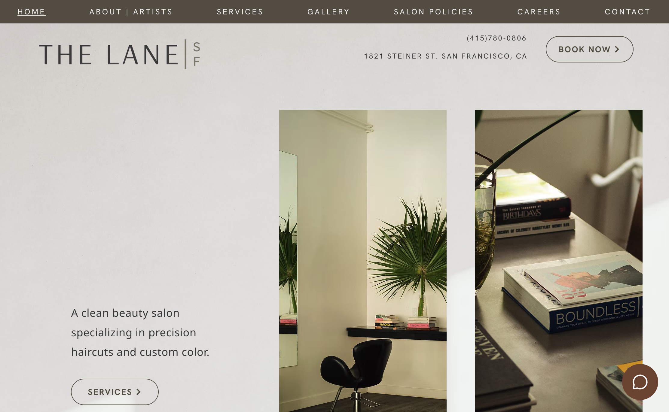
The Lane é um salão de "clean beauty" em San Francisco fundado por Frank e Stevie Lane. A navegação da página inicial inclui uma seção dedicada à Galeria com fotos reais de antes e depois de coloração e corte, não apenas uma foto de estilo de vida. O agendamento é feito pelo Mangomint, com um botão "Book Now" em destaque. Uma avaliação do Google é citada diretamente na página inicial.
O que funciona: Um link dedicado à galeria na navegação principal, não enterrado a três cliques de distância, diz aos visitantes logo de cara que este salão tem confiança suficiente para mostrar seu trabalho real. Combinado com o posicionamento nomeado de "clean beauty", é uma resposta clara para duas perguntas diferentes ao mesmo tempo: eles podem fazer o que eu quero, e compartilham meus valores. Ambos importam, e este site não faz você procurar por nenhum dos dois.
Avaliações Ligadas a uma Pessoa, Mas Sem Fotos para Comprová-las
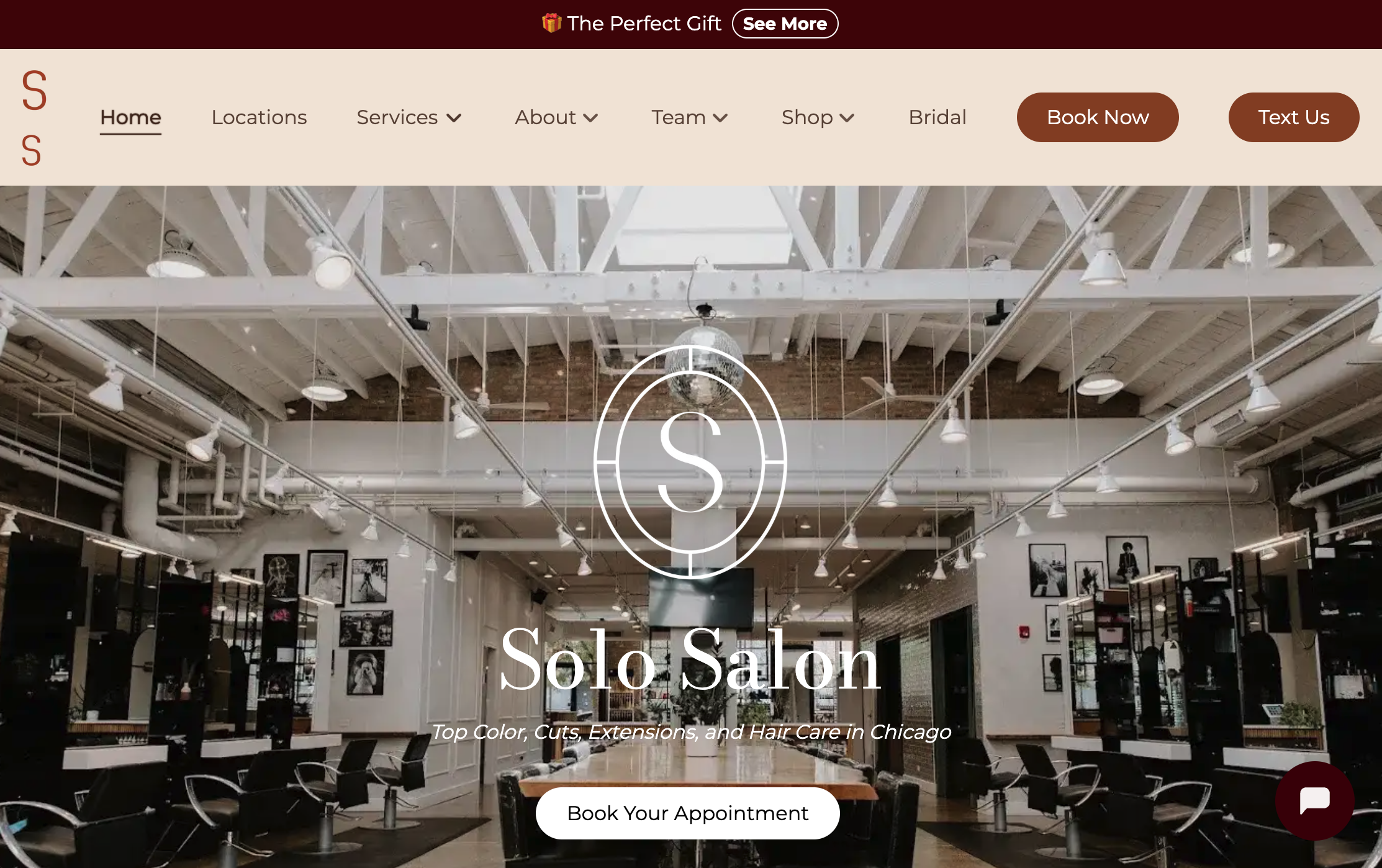
Website: https://www.solo-salon.com/
Solo é um salão no West Loop de Chicago construído em torno da "educação ao lado da cadeira" e uma parceria de sustentabilidade com a Green Circle. A página inicial nomeia cabeleireiros individuais como Alexis e Julia, com avaliações cinco estrelas ligadas especificamente ao trabalho deles, não apenas ao salão como um todo. O que falta: não há galeria de antes e depois em nenhum lugar da página inicial.
O que funciona e o que falta: Ligar avaliações a um cabeleireiro específico, em vez de uma avaliação genérica do salão, ajuda o visitante a escolher uma pessoa, não apenas um lugar. Isso é uma jogada inteligente para um salão com vários cabeleireiros. Mas para uma categoria tão visual, pular a galeria é uma lacuna real. O visitante ainda precisa confiar nas avaliações em vez de ver o trabalho real. Se você fizer uma coisa na página inicial de um salão, mostre os resultados, não apenas os elogios.
Um Gancho Sazonal em vez de uma Saudação Genérica
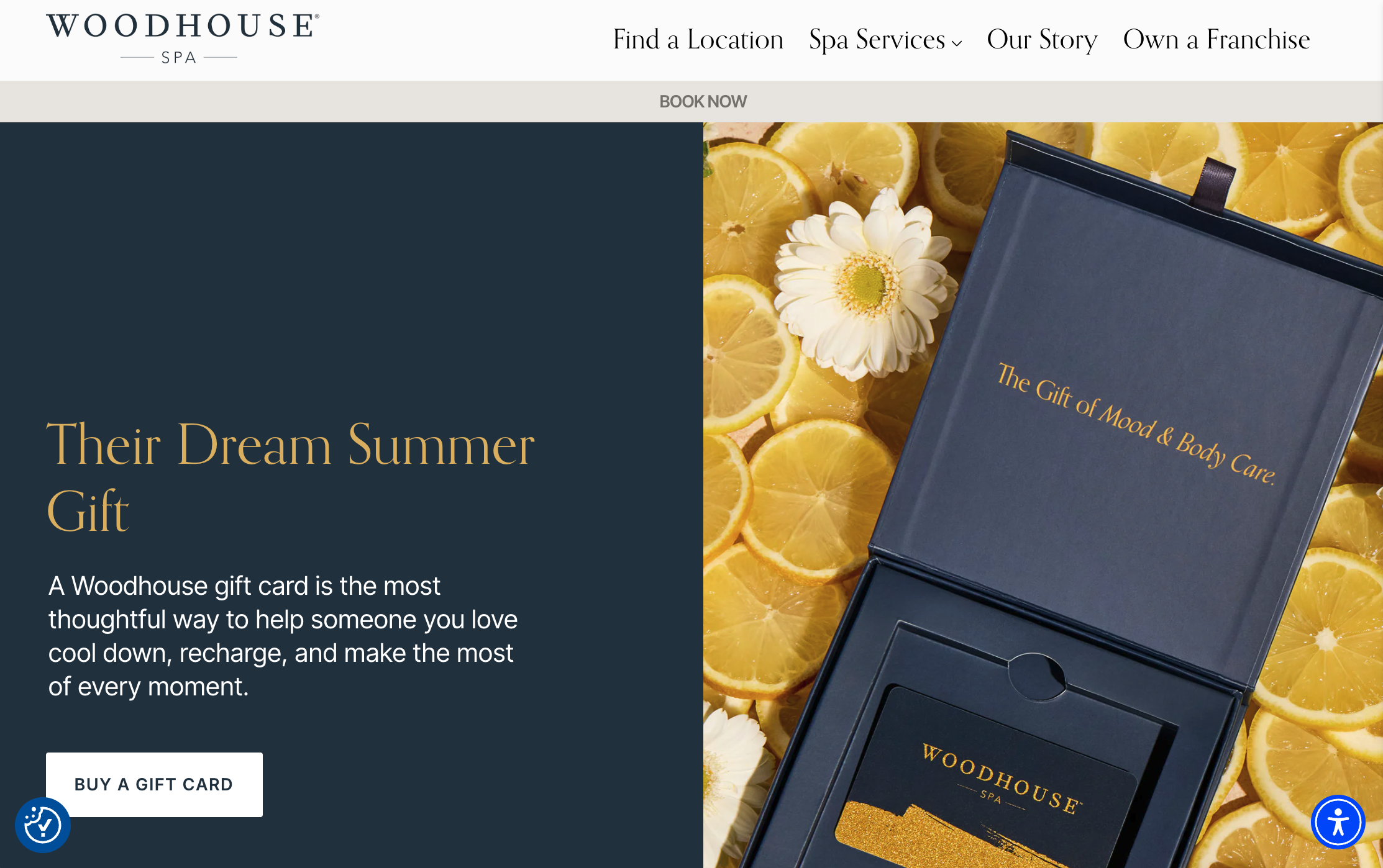
Website: https://www.woodhousespas.com/
Woodhouse é uma franquia de day spa com locais por todo o país. A página inicial exibe uma promoção sazonal rotativa, "Seu Refresco de Meio de Verão", em vez de um banner genérico estático. Mais de quinze avaliações cinco estrelas aparecem em destaque na página, junto com um botão "Book Now" que aparece em toda parte.
O que funciona: Um gancho sazonal faz algo que um título simples de "bem-vindo ao nosso spa" não faz. Dá ao visitante que retorna um motivo para agendar novamente agora, em vez de "algum dia". Combinado com o grande volume de avaliações exibidas, a página responde às duas perguntas que um visitante de primeira viagem tem ao mesmo tempo: agora é um bom momento, e posso confiar neste lugar. Você não precisa de 20 locais para aproveitar a ideia da oferta sazonal, apenas um motivo real ligado ao calendário.
Construído com Wegic: Um Site Demo de Salão
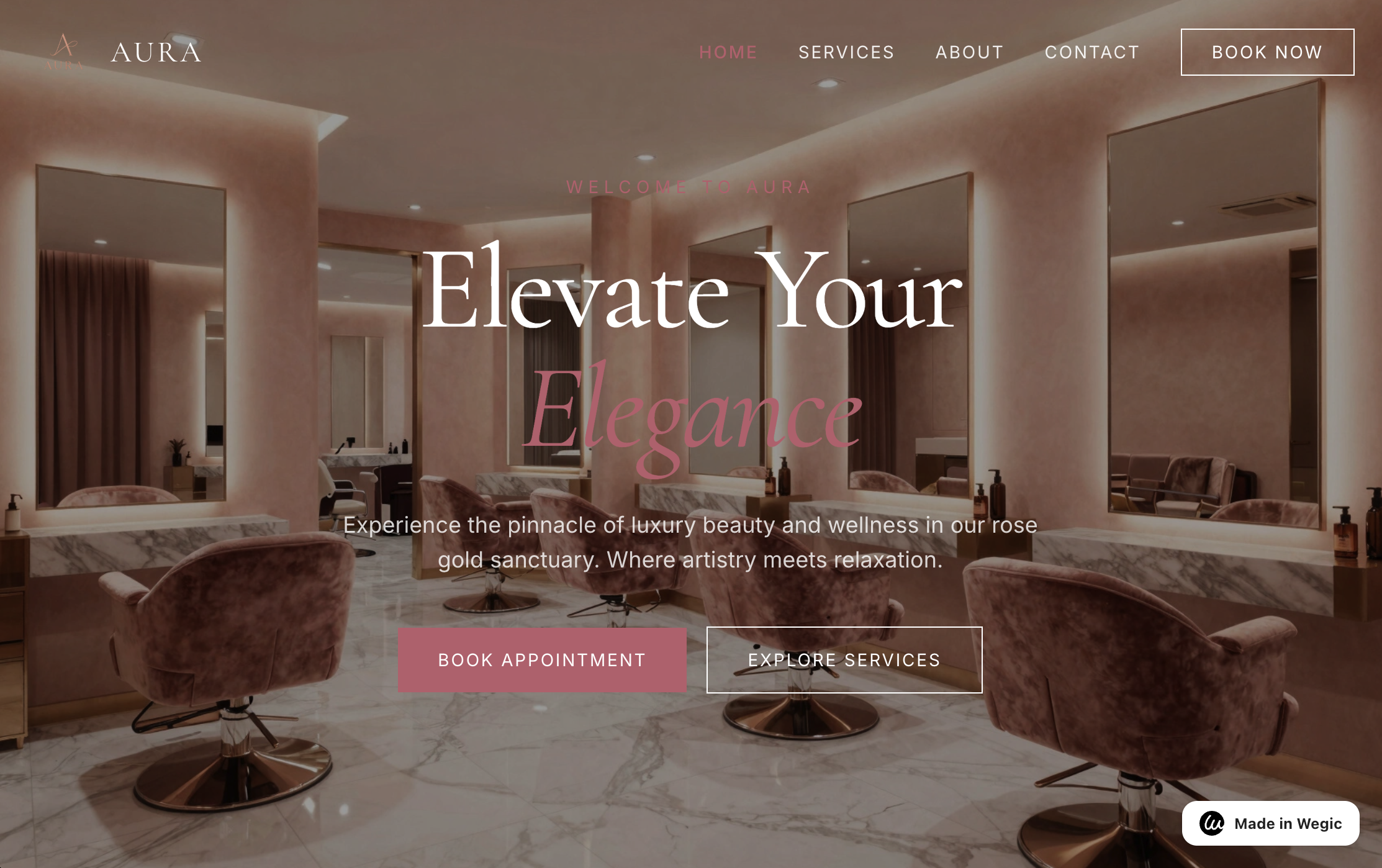
Este é um demo que construímos diretamente no Wegic, sem trabalho manual de design envolvido. A página inicial começa com uma foto do interior do salão em rose gold, combinada com uma manchete serifada: "Eleve Sua Elegância." O subtítulo define o clima em uma linha: "beleza e bem-estar de luxo em nosso santuário rose gold." Dois CTAs ficam lado a lado, "Book Appointment" em rosa sólido, "Explore Services" contornado ao lado. Um botão "Book Now" se repete na navegação.
O que funciona: Tudo o que foi abordado neste artigo aparece aqui, e ninguém precisou contratar um designer. Fotografia de interiores com aparência real em vez de uma imagem de banco de imagens. Um título e subtítulo que criam um clima antes de você rolar a página. Um botão de agendamento em dois lugares, assim como no Eddy's. Descreva seu salão para o Wegic e você terá um site com esses fundamentos já configurados. Então você gasta seu tempo personalizando, em vez de começar do zero.
Como Construir Seu Próprio Site de Salão (Sem Precisar de Desenvolvedor)
Olhando para esses exemplos, o padrão é simples. Não se trata de um orçamento enorme ou código personalizado. São fotos reais, uma forma fácil de agendar e um site que realmente parece o seu salão.
É exatamente para isso que o Wegic foi criado. Descreva seu salão: seus serviços, seu estilo, sua vibe. A IA do Wegic cria um site com menu de serviços, galeria e link para agendamento já configurados. Substitua pelas suas próprias fotos. Ajuste o texto. Conecte seu próprio domínio. Sem necessidade de código.
Os planos começam em $2,99. Você não precisa de preços de agência para ter um site como os exemplos acima.
Perguntas Frequentes
P: O que todo site de salão deve incluir?
No mínimo: uma forma clara de agendar, um menu de serviços com preços aproximados, fotos reais do seu trabalho e seu horário e localização. Todo o resto é um bônus depois que esses básicos estiverem no lugar.
P: Preciso de um sistema de agendamento integrado ao meu site?
Ajuda, mas não é a única opção. Um link visível para agendamento ou até um número de telefone claro funciona se for fácil de encontrar. O que importa é que o agendamento não esteja enterrado a três cliques de distância.
P: Como o site de um estilista solo é diferente do de um salão com equipe completa?
Um site de equipe precisa representar todos de forma justa. Um site solo pode ser inteiramente sobre você: sua especialidade, seu portfólio, sua personalidade. Isso é uma vantagem. Os clientes conhecem exatamente quem vai cuidar do cabelo deles antes de agendar.
P: Que tipo de fotos devo usar no site do meu salão?
Trabalho real em vez de fotos de banco, sempre. Antes e depois, estilos finalizados, clientes reais se estiverem confortáveis com isso. Uma foto polida de banco de imagens de um modelo aleatório não diz nada a um visitante sobre o que você realmente pode fazer.
P: Quanto custa construir um site para salão?
Um site personalizado feito por uma agência pode custar milhares. Construtores de sites custam muito menos. O Wegic começa em $2,99 e usa IA para acelerar a configuração. Isso ajuda se você for um estilista solo sem orçamento de marketing.
Olhando para todos esses sites, o padrão se mantém. Os que conseguem agendar clientes não são os mais chamativos. São os que facilitam o agendamento e mostram trabalho real. Uma foto clara do seu melhor corte e uma forma óbvia de agendar vão superar uma página inicial bonita sem CTA toda vez. Se você já entendeu isso, está na maior parte do caminho para ter um site que realmente enche sua cadeira.