What Makes a Great Bakery Website
Photos That Make People Hungry
A bakery website lives or dies on its photos. Nobody orders a cake from a blurry phone snapshot taken under bad kitchen lighting. The sites that convert well use close-up shots that show texture - the crackle on a sourdough crust, the layers in a slice of cake, the shine on a glazed donut. You don't need a professional photographer for this, but you do need natural light and a steady hand.
Bakeries sell a lot of similar-looking things, which makes menus easy to mess up. The good ones group items into clear categories (breads, cakes, pastries, seasonal specials) with prices right next to each item, so people aren't messaging you to ask "how much for a dozen cookies?" If people have to ask, your menu isn't doing its job.
Room for Custom Orders, Not Just "Buy Now"
Most bakery website advice defaults to standard e-commerce: browse, add to cart, check out. But if custom cakes are a big part of your business, a single "buy now" button doesn't fit how people actually order from you. They need somewhere to describe what they want, see examples of past work, and get a rough sense of pricing before they commit. A booking link for a tasting or consultation call works better here than a contact form that goes quiet for two days. Treat custom orders as their own path, not an afterthought bolted onto a product page.
Ordering and Pickup Info That Actually Works on a Phone
Most people looking up a bakery are doing it on their phone — standing in line somewhere else, scrolling while they decide what to order for the weekend, or searching "bakery near me" on the walk over. If your pickup times, delivery zones, and "how much notice do you need for a cake" answers are buried in tiny text or a menu that doesn't fit the screen, you lose the order before anyone's frustrated enough to call you instead. Everything above has to actually work with one thumb on a small screen, not just look good on a laptop.
This is one of those things that's much easier to get right if the site is mobile-friendly from the first draft, which is exactly what an AI builder like Wegic does automatically, instead of you testing everything on your phone after the fact. 10 Bakery Websites We Love
Ginger & White - The Café-Bakery Hybrid
Ginger & White is a British café and bakery that sells everything from dippy eggs and toasties to artisan coffee and their "cult favourite" cakes, which need 48 hours' notice. Their navigation splits cleanly into About, Click & Collect, Pre-Order Cakes, Merchandise, and Gift Vouchers, so nothing gets lost in one crowded menu.
What works: The Shop Now / Click & Collect button is impossible to miss, and the navigation splits into clear buckets so people looking to grab a coffee, pre-order a cake, or browse merch never wonder which button to click. That matters more than it sounds - most bakery purchases are impulse decisions, and every extra click is a chance to lose someone.
Happy Chicks Bakery - Built Around Custom Cakes
Happy Chicks is a vegan pastry shop known for custom wedding and celebration cakes, alongside a café menu of sandwiches and pastries made on their own croissants and biscuits. The homepage uses a playful, cartoon-style illustration that matches the bakery's name, with a scrolling display of baked goods right up top.
What works: The illustrated style makes the site instantly memorable and matches the name in a way a straight product photo never could - you know exactly what kind of bakery this is before you've read a word. It's also proof that "custom wedding cakes" and "playful branding" aren't opposites; a couple planning a wedding can still enjoy a bit of personality. Custom orders get their own path too, with a downloadable contract and pricing sheet instead of being crammed into a generic contact form.
TOAD Bakery - Minimalist and Direct
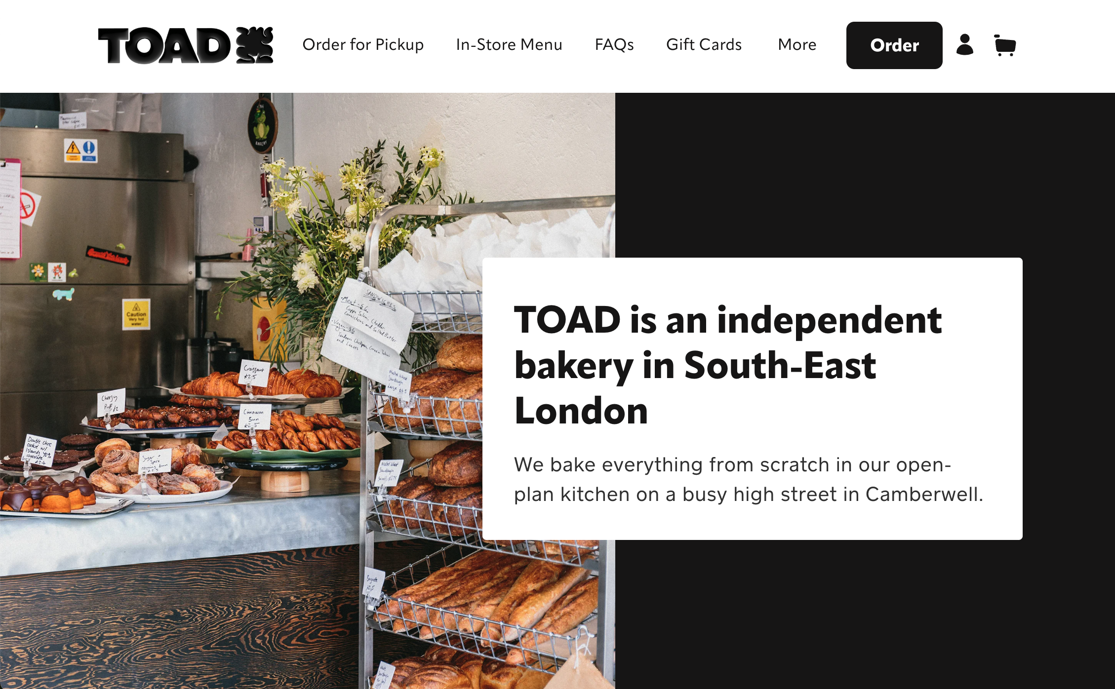
TOAD Bakery's site leans hard into whitespace. There's a clear one-line tagline up top and not much else competing for attention.
What works: With this much empty space, the product photography and the one tagline do all the talking, without banners or pop-ups getting in the way. When the information is this direct, people spend less time hunting around the site and more time actually deciding what to order.
Little Tart Bakeshop - Warm and Multi-Location
Little Tart runs three locations across Atlanta and works with local farmers and producers for its pastries and coffee. The homepage uses a soft, warm green background and highlights all three neighborhoods by name.
What works: Since each location has different pickup rules, they solved it by giving each one its own ordering link right on the homepage, instead of forcing everyone through a single generic "Order Now" button. A map for each location would make it even easier for someone to figure out which one's actually closest before they order. The soft green hero and warm palette do a lot of the "this place feels cozy" work before you've read a single word.
Janjou Patisserie - Elegant and Understated
Janjou is a neighborhood patisserie in Boise, Idaho, with a short, simple navigation - Pre-Orders, E-Gift Card, Careers - and a large hero photo of their pastries front and center.
What works: Keeping the navigation short means nothing distracts from the hero photo doing the selling. The almost-monochrome palette makes the pastries the only real spot of color on the page, a cheap trick that makes food photography look more expensive than it is.
Pompadour Beverly Hills - Luxury French Patisserie
Pompadour sells French-trained-chef pastries, custom celebration cakes, and bespoke event catering, and everything about the site - dark backgrounds, close-up photography, words like "bespoke" and "edible art" - signals a high price point before you've even reached the menu.
What works: The tone of the copy and the tone of the design are telling the same story: this isn't a $3 muffin. If your bakery sits at the high end, your website has to sound and look like it before people even see a price, or the price won't feel believable.
The Rustic Sourdough - One Baker's Story
This is a one-person sourdough operation built around organic, stone-ground flour and a philosophy the founder calls "Bread Therapy." The homepage opens with their personal journey before it gets to any product.
What works: The whole page is basically a story before it's a shop. For a one-person operation, that's smarter than pretending to be a big brand - people are buying the baker as much as the bread, and the site is built to sell exactly that.
Sweet Diplomacy - Allergen-Friendly, Nationwide
Sweet Diplomacy bakes gluten-free, dairy-free, and vegan treats, and ships nationwide, including a subscription box option.
What works: Leading with "gluten-free, dairy-free, vegan" answers the one question allergy-conscious customers ask before anything else - can I actually eat this - so they don't have to dig through a menu hoping. Nationwide shipping and a subscription option also mean the business isn't capped by how many people can walk through one door. Pairing that subscription option with email marketing is how you keep those out-of-town customers ordering again next month instead of forgetting you exist.
Crumbl Cookies - Bold, Playful, and Always Rotating
Crumbl is a national chain, but it earns its spot here for a different reason: a weekly rotating menu, bright high-contrast photography, and a card-grid layout built entirely around "come back next week for something new."
What works: The rotating menu gives people an actual reason to check the site again instead of ordering once and forgetting it exists. A push notification the moment a new flavor drops would save people from having to remember to check back at all. It's a good reminder that a bakery site doesn't have to be quiet and elegant to work — loud and playful is just as valid, as long as it matches your real brand.
Wegic Demo - DreamCake
DreamCake's hero isn't a static photo - it's a looping animation of a cake actually being decorated, running right in the background the moment the page loads. Menu and Shop both sit in the main navigation, so there's no guessing where to go to actually order something.
What works: The moving hero grabs attention in a way a still photo can't, and it tells you what this bakery does before you've read a single word. It's also mobile-friendly by default, the layout, the menu, the ordering flow all work on a phone without anyone having to think about it separately.
How to Build Your Own Bakery Website (No Design Skills Needed)
Looking at ten different bakery websites is fun, but at some point you have to actually build one. If you don't have a developer on speed dial - and most independent bakers don't - an AI website builder like Wegic can get you from nothing to a real site with your own photos, menu, and ordering info in one sitting.
You start by describing your bakery in plain language: what you bake, who it's for, what makes you different from the bakery three blocks over. Wegic builds a draft site around that description. You can even point it toward a look you liked above - "something warm like Little Tart" or "minimal like TOAD" - and it adjusts the design instead of leaving you to fight with a blank template. From there, you fill in the parts that actually run your business: your real menu with prices, a way for people to describe a custom cake instead of just an "Add to Cart" button, and your pickup or delivery details, so people stop DMing you to ask if you're open Saturdays. You can also accept payment online for deposits on custom orders, so a cake booking is confirmed the moment someone pays, not after a few back-and-forth messages.
Since most people will be looking you up on their phone, not a laptop, Wegic builds the site mobile-friendly by default. You don't need to build a desktop version and then separately worry about how it looks on a phone. Plans start at $2.99, so you're not committing to a big budget before you know whether the site is bringing in orders. FAQs
Q: Do I need a website if I already take orders through Instagram?
You can run a small bakery on Instagram alone for a while, but a website gives you things DMs can't: a real menu with prices, a place for people to submit custom cake requests, and a link you can put on packaging, business cards, or Google. It also makes you look like an established business instead of a side project, which matters when someone's deciding whether to trust you with their wedding cake. If you still want the convenience of chatting directly, adding WhatsApp chat to your site gets you that without forcing every order through your personal DMs.
Q: What should be on a bakery website's homepage?
At minimum: photos of your actual food, a clear menu or list of specialties with prices, how to order (online, DM, phone, in person), and your pickup or delivery details. If custom cakes are a big part of your business, add a way for people to describe what they want instead of forcing them through a generic order button.
Q: How much does it cost to build a bakery website?
A custom site from an agency or freelance developer can run anywhere from a few hundred to several thousand dollars. Website builders are much cheaper - most charge somewhere between $20 and $50 a month. Wegic starts at $2.99 and uses AI to speed up the setup, which helps if you're building this yourself without a big budget or a lot of spare time. Q: Can I sell online and also take custom cake orders on the same site?
Yes. The trick is not treating them the same way. Standard items (cookies, pastries, loaves) work fine with a normal add-to-cart flow. Custom cakes work better with an inquiry form or a short questionnaire, so you can get details like flavor, size, and event date before you quote a price.
Q: Does my bakery website need to work well on phones?
Yes, more than almost any other type of business site. People look up bakeries while they're out and about - in the school pickup line, on a break at work, deciding what to order for tomorrow - not sitting at a desktop. If your menu is hard to read, your pickup hours are buried in tiny footer text, or the order button is too small to tap, you lose the sale before anyone's frustrated enough to just call you instead. Wegic builds mobile-friendly by default, but it's worth double-checking your own site on your own phone before you launch.
Ready to stop taking orders through DMs? Build your bakery website with Wegic , describe what you bake, and get a full site back in minutes - no coding, no blank page.