What Makes a Great Nonprofit Website?
A clear mission statement above the fold
Before anyone scrolls, they should know what you do. Sounds simple. But a lot of nonprofit homepages open with something like "Empowering communities for a better tomorrow" - which could mean almost anything.
The good ones answer one question right away: what does this organization actually do? One sentence. Plain language. charity: water nails it in several words: "Bring clean and safe water to every person on the planet." Room to Read does it in seven: "World change starts with educated children."
Concrete beats inspirational, every time.
Storytelling that builds emotional connection
Numbers tell donors how many people you've helped. Stories tell them why it matters. The best nonprofit sites use both.
You don't need a full video production for this. One photo, a real name, and two sentences about what changed can say more than a whole page of program descriptions. Give donors someone specific to root for - not just a problem to care about.
One strong call to action
A lot of nonprofit websites either hide their donation button or put five options on the same screen. Pick one main action - usually Donate or Give - and make it easy to find. Everything else (volunteer, newsletter, learn more) plays a supporting role.
- Quick test: show your homepage to someone who's never heard of you. Ask what the site wants them to do. If they pause, your CTA needs work.
Trust signals: impact numbers, testimonials, transparency
First-time donors are taking a leap of faith. Help them feel okay about it. Share real numbers, not vague claims. Add a Charity Navigator or Candid badge if you have one. Show your team. Make your financials easy to find.
One study found that 60% of donors check a nonprofit's website before giving. That visit is part of their decision. Make sure your site is ready for it.
9 Nonprofit Organization Website Examples to Inspire You
1. Womankind Worldwide - Women's Rights Advocacy
Website: womankind.org.uk
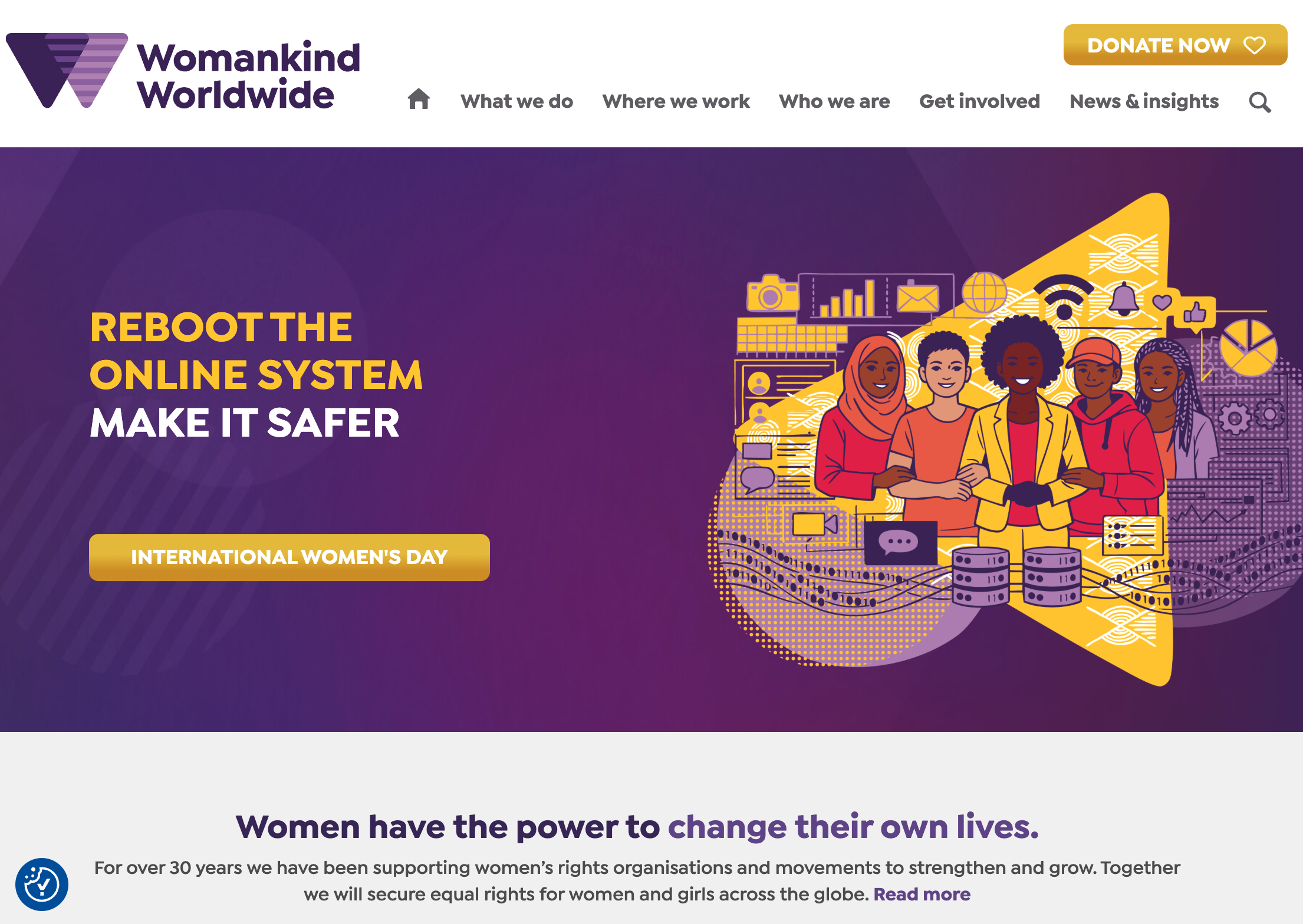
Womankind has been fighting for women's rights internationally for 30 years. Their homepage is purple throughout, illustration-heavy, and not very text-heavy. One yellow button sits in the top right - the only donation CTA on the page. Their headline says "Women have the power to change their own lives." Each donation tier (£23, £55, £100) comes with a line about what it actually does. Their mission pillars include phrases like "Resource the revolution" and "Decolonise our practice" - no softening.
What works: Most charities say "your donation makes a difference." Womankind tells you what it does, specifically, before you've committed. That one change removes a lot of hesitation.
2. All We Can Save - Climate Community Project
Website: allwecansave.earth
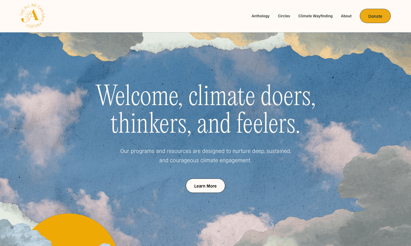
All We Can Save started as a book and grew into a community for women working on climate. Their opening line: "Welcome, climate doers, thinkers, and feelers." The whole site feels like a garden - botanical illustrations, earthy greens, nothing urgent or alarming anywhere. They lead with member stories, not org stats.
What works: "Feelers" in the headline and a soft botanical design aren't two separate decisions - they're saying the same thing: this is a safe, hopeful space. When your words and your visuals line up, people trust both.
3. The Trevor Project - LGBTQ+ Youth Crisis Services
Website: thetrevorproject.org
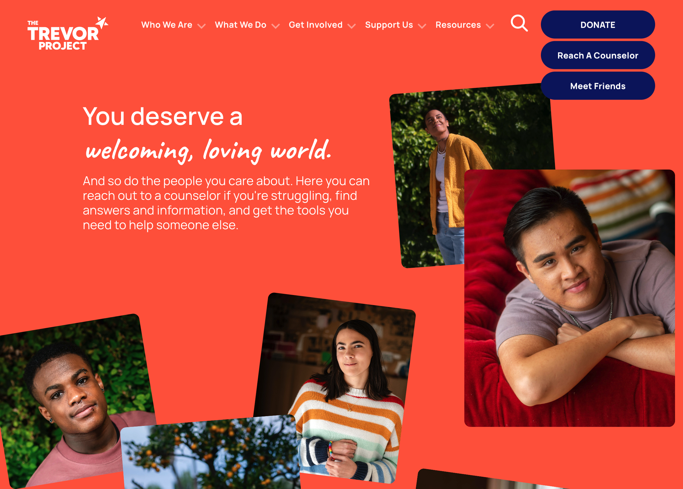
The Trevor Project runs a 24/7 crisis line for LGBTQ+ youth - call, text, or chat. Their homepage opens with: "You deserve a welcoming, loving world." That's not a line for donors. It's for someone who might be struggling right now. And their crisis number is right there in the nav - same size, same spot as the Donate button.
What works: Where you put things in the nav says what you actually care about. Putting the crisis line next to Donate says: we built this for the people we serve, not the people who fund us. Donors notice that, and it means something to them.
4. Women's Aid - Domestic Violence Charity
Website: womensaid.org.uk
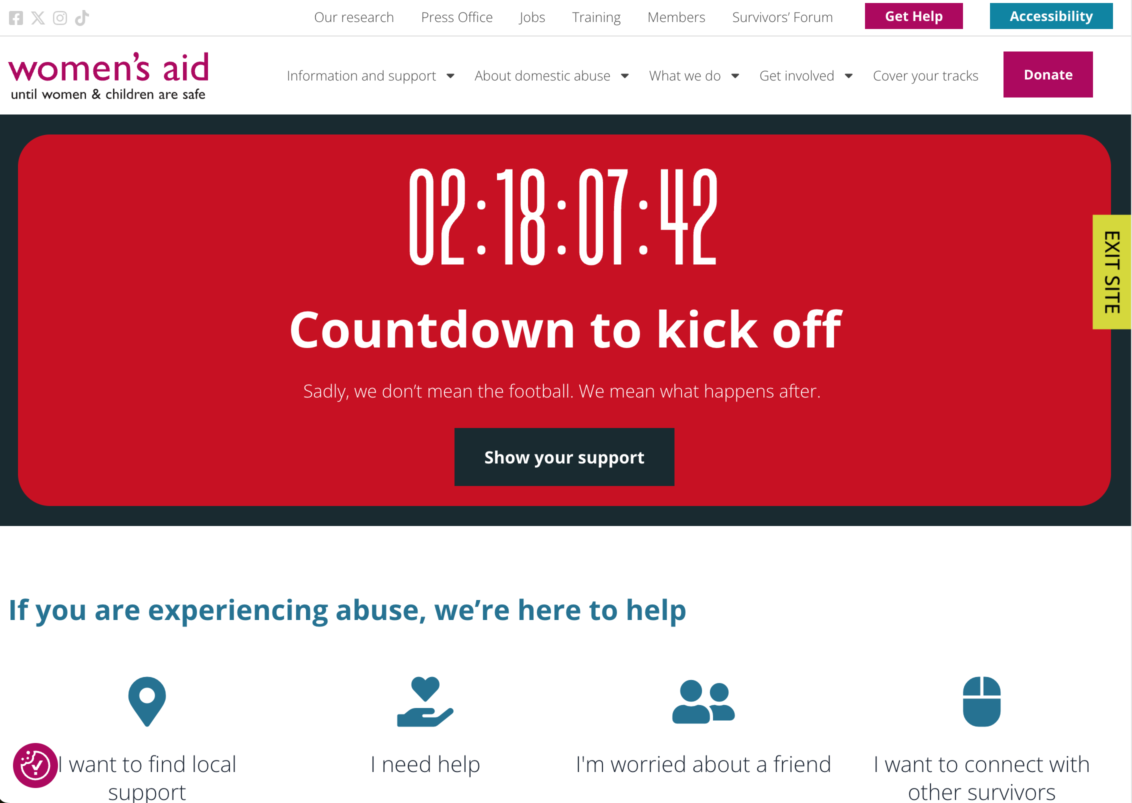
Women's Aid supports domestic abuse survivors in the UK. Their homepage opens with a countdown timer. No explanation - just seconds ticking down. Then the reveal: this is the time until a football match ends. Because domestic violence calls go up sharply right after big games.
What works: There's a real difference between reading "domestic violence spikes after football matches" and watching a clock count down to it. By the time the explanation arrives, you've already felt it. The stat hits differently.
5. Obama Foundation - Webby Award–Winning Design
Website: obama.org
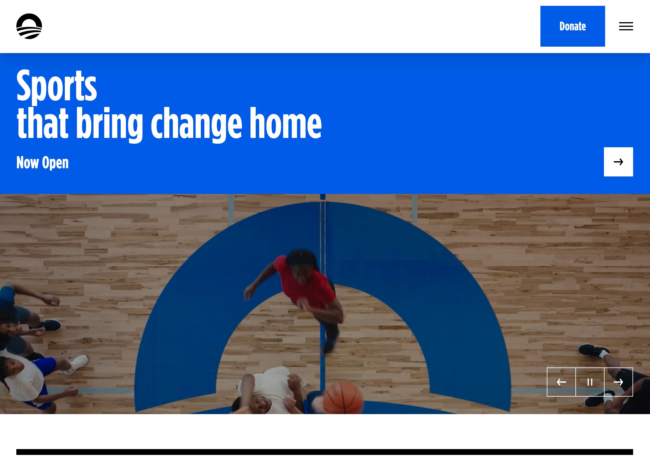
The Obama Foundation works on civic leadership and community programs, including the Presidential Center in Chicago. Their homepage is mostly big photos. The headline rotates through what's on offer - museum, art, sports, events. Each section as you scroll says one thing and links to one place. That's it.
What works: Most nonprofits over-explain because they're worried visitors won't get it. Using fewer words actually takes more confidence - and more editing time. This site trusts the photography to carry people through. That restraint won them a Webby.
6. Eden Projects - Nature-Based Climate Restoration
Website: eden-plus.org
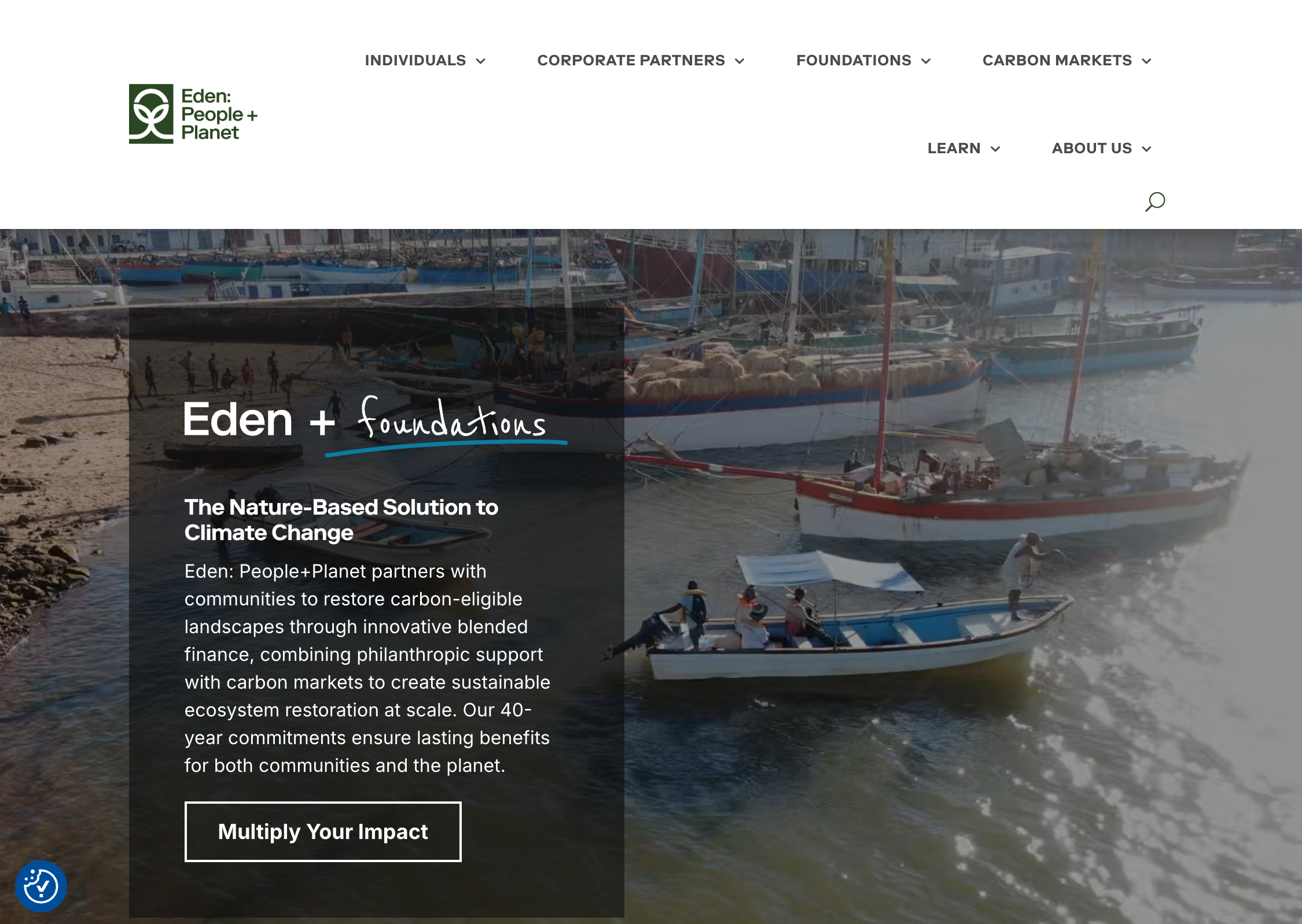
Eden Projects restores ecosystems at scale, funded by a mix of donors, foundations, and carbon credit buyers. The moment you land, the nav splits into four: Individuals, Corporate Partners, Foundations, Carbon Buyers. Their impact stats - things like "125x multiplication through carbon credit generation" - are written for business partners. The site makes no attempt to simplify them for anyone else.
What works: Most sites try to speak to everyone at once. Eden's nav says: we know who comes here, and we built separate paths for each of them. Nobody has to dig for content that's meant for them.
7. Sunrise Movement - Youth Climate Activism
Website: sunrisemovement.org
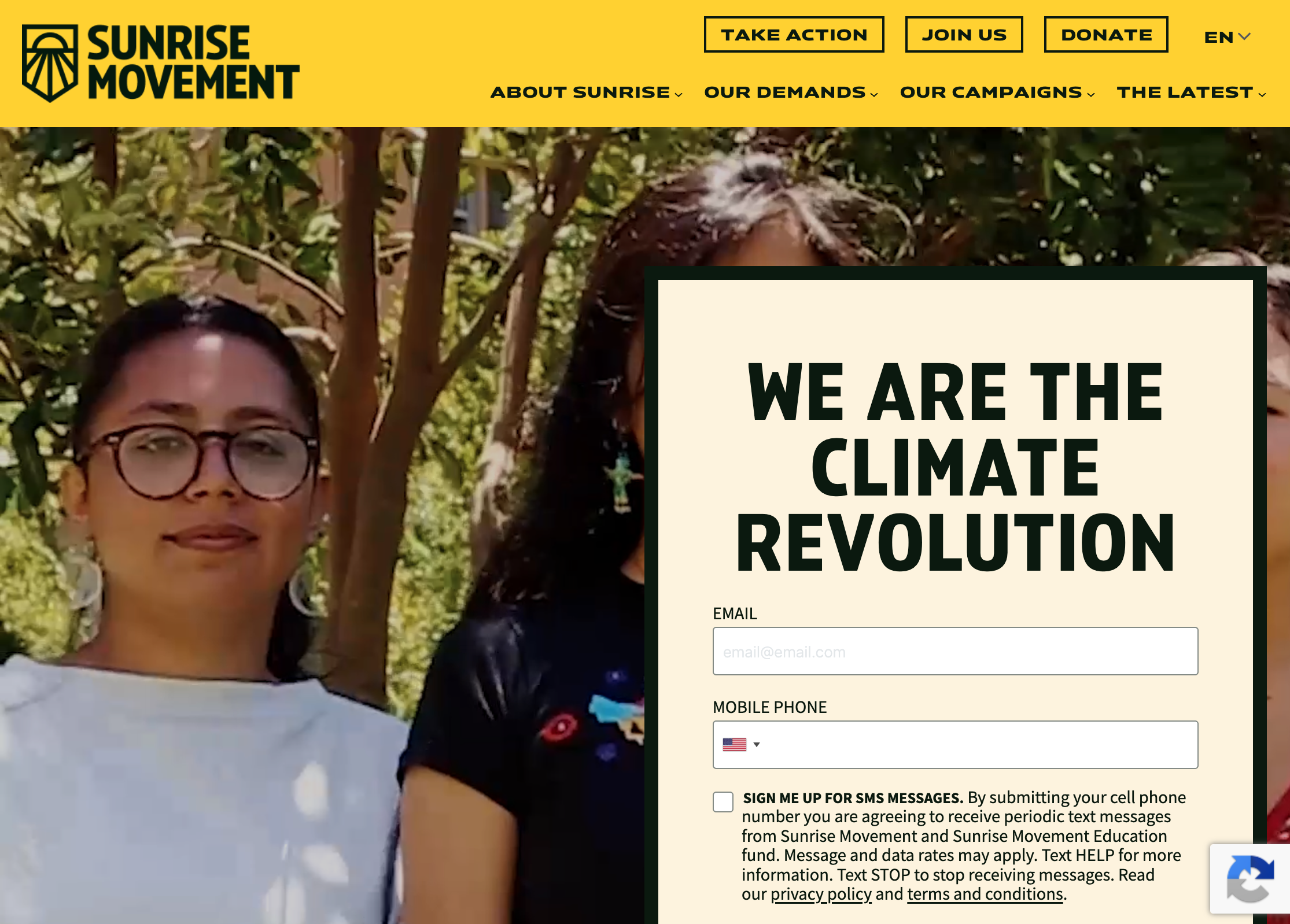
Sunrise is a youth-led climate movement in the US - more protest energy than charity vibes. Yellow and black, all caps, real protest photos. The main CTA isn't a button - it's a full screen asking you to join a specific campaign, like calling voters or showing up to a phonebank. In the nav, "Take Action" comes before "Donate."
What works: Your nav order tells people what you actually want from them. Sunrise needs participants, not just donors - and the nav says so. It's worth asking: does yours say the same thing your mission does?
8. Homeward Trails - Small Animal Rescue
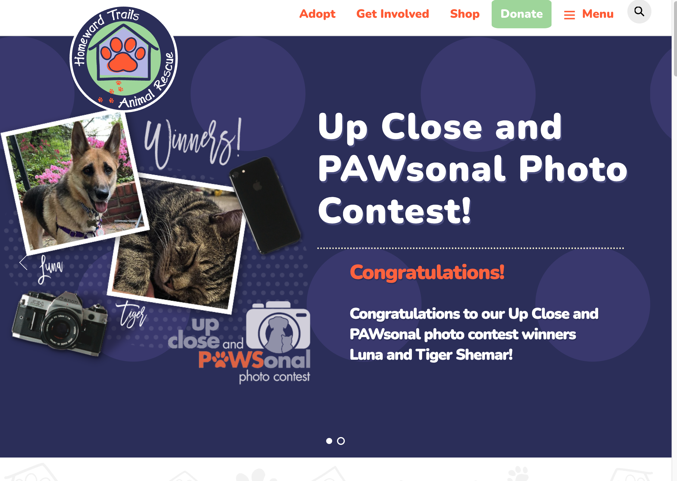
Website: homewardtrails.org
Homeward Trails is a small animal rescue in Virginia. No national profile, no big budget. Their homepage shows specific animals by name - Leela, Splotch - with photos and individual Instagram handles. "Statistics and Financials" is right there in the nav. No badge, no fanfare.
What works: Instagram handles are free. But they let you check that Leela is real, has followers, is being cared for - before you give. For a small org without formal trust badges, that kind of proof costs nothing and actually works.
9. Fresh Green - Built with Wegic AI
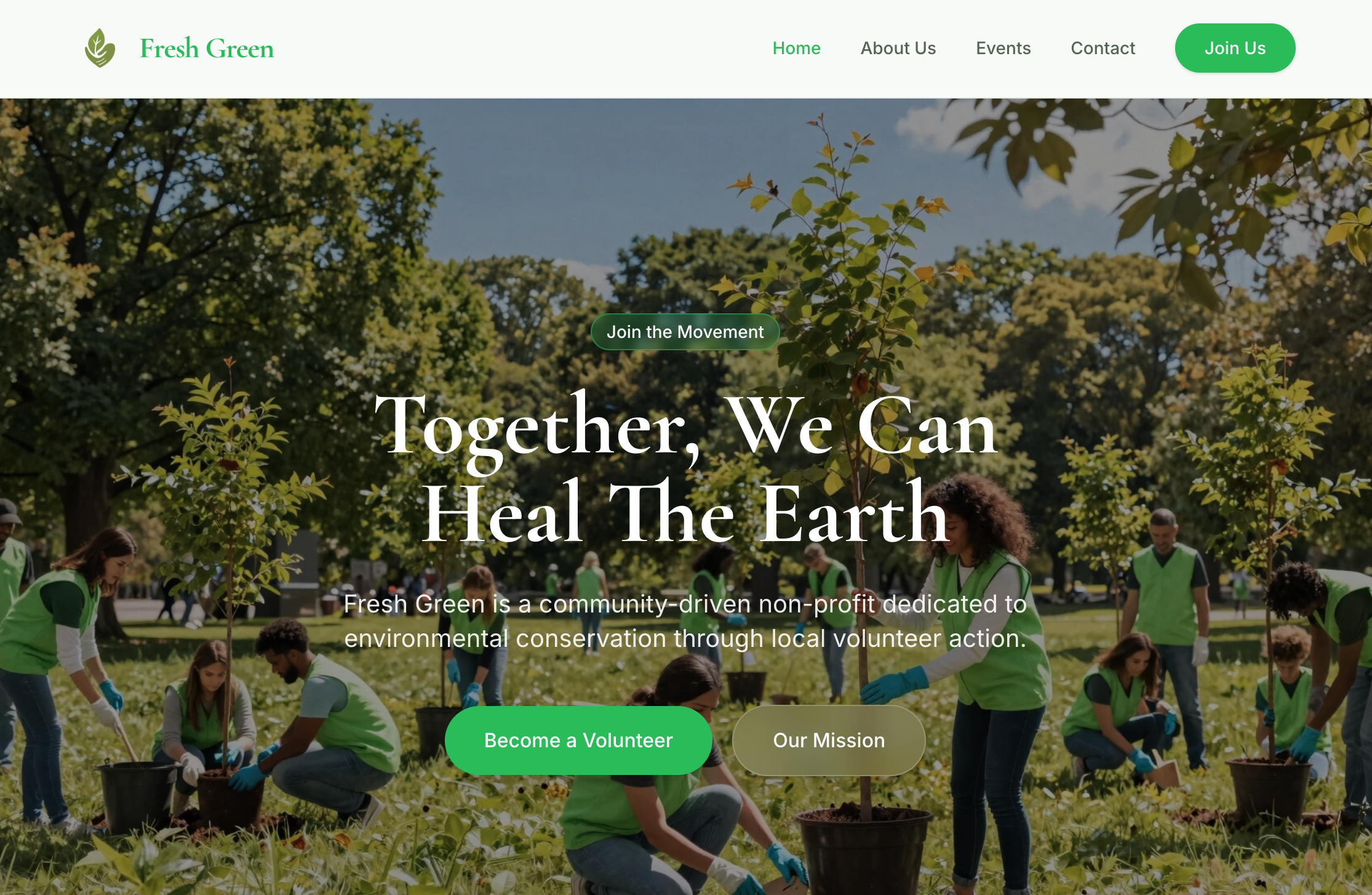
Website: my-website-4wdms7ei.wegic.net
Fresh Green was built entirely with Wegic AI. No developer, no agency. The homepage has a mission statement you can read in five seconds, four nav items, and an impact section that's easy to scan. The layout decisions - what goes where, what gets emphasized - were handled by the AI from the start.
What works: The hardest part of building a nonprofit website usually isn't the tech. It's staring at a blank page without knowing where to start. Wegic solves that first. You describe your org, it builds out the structure. You edit something real instead of making it up as you go.
How to Build Your Own Nonprofit Website (Without a Developer)
Start with your mission, not your design
Before you open any website builder, write two things down. Your mission in one sentence. And the one thing you most want visitors to do. Those two answers will shape everything else - your headline, your nav, your homepage layout.
A lot of nonprofits spend hours picking a template before they know what they want to say. No template can fix a muddy message. Start with the words.
Choose a platform built for non-technical teams
Most website builders assume you know what you're doing. Or that you can afford to hire someone who does. For most nonprofits, neither is true.
Wegic works differently. Describe your organization in plain language - what you do, who you help, what you want people to do on your site. It builds the layout and starting copy for you. Then you edit from there. No code. No design skills needed.
Must-have pages for every nonprofit website
You don't need a big site to look credible. These five pages cover the basics:
- Homepage: Mission, impact, primary CTA
- About: Your story, your team, how you got started
- Programs / Work: What you do, who you serve, measurable outcomes
- Ways to Give: Donation options, volunteer info, other ways to get involved
- Contact: Email, location if relevant, social links
Launch fast, improve over time
A working website launched this month is worth more than a perfect one launched next year. You can always add better photos, a deeper impact report, or a full donation campaign later. You can't build trust if you don't have a site at all.
Start with four or five pages. Get them live. Then update things a little every quarter - a new story here, a fresh start there. That does more good than one big redesign every few years.
FAQs
Q: What should a nonprofit website include?
Start with the basics: a homepage, an About page, a page for your programs, and a Contact page. Add a Ways to Give page when you're ready. Keep your nav to five items or fewer - more than that and people stop reading it.
Q: How much does it cost to build a nonprofit website?
A custom site from an agency can run $5,000 to $50,000+. Website builders are much more affordable - most charge $20–$50/month. Wegic starts at $2.99 and uses AI to speed up the setup, which helps when you don't have a big team or a long runway. Some platforms offer nonprofit discounts if you have 501(c)(3) status.
Q: Can I build a nonprofit website without coding?
Yes. You don't need to know how to code to build a modern website. With Wegic, you describe your org in plain language and the AI builds out a site structure to start from. You edit in a visual interface from there. No technical background needed.
Q: What's the best website builder for nonprofits?
It depends on what you need. If you want something fast with minimal setup, Wegic is a good place to start - it skips the blank page problem entirely. The most important thing is picking something your team can actually update without calling in outside help.
Q: How do I make my nonprofit website stand out?
Three things separate good nonprofit sites from forgettable ones: real stories instead of stock photos, specific numbers instead of vague claims, and a CTA that's easy to find. Most sites look the same because they use the same template language. Make yours specific - to your org, your community, your actual results.
None of the sites above needed a big budget or a dev team. From a small animal rescue in Virginia to a Webby Award winner - what they shared was knowing what they wanted to say. The design followed from that. You can always find more inspiration in Wegic's template library.
Ready to build yours? Try Wegic. Describe your organization, get a full site structure back in minutes, and go from there. Plans start at $2.99 - no developer needed.