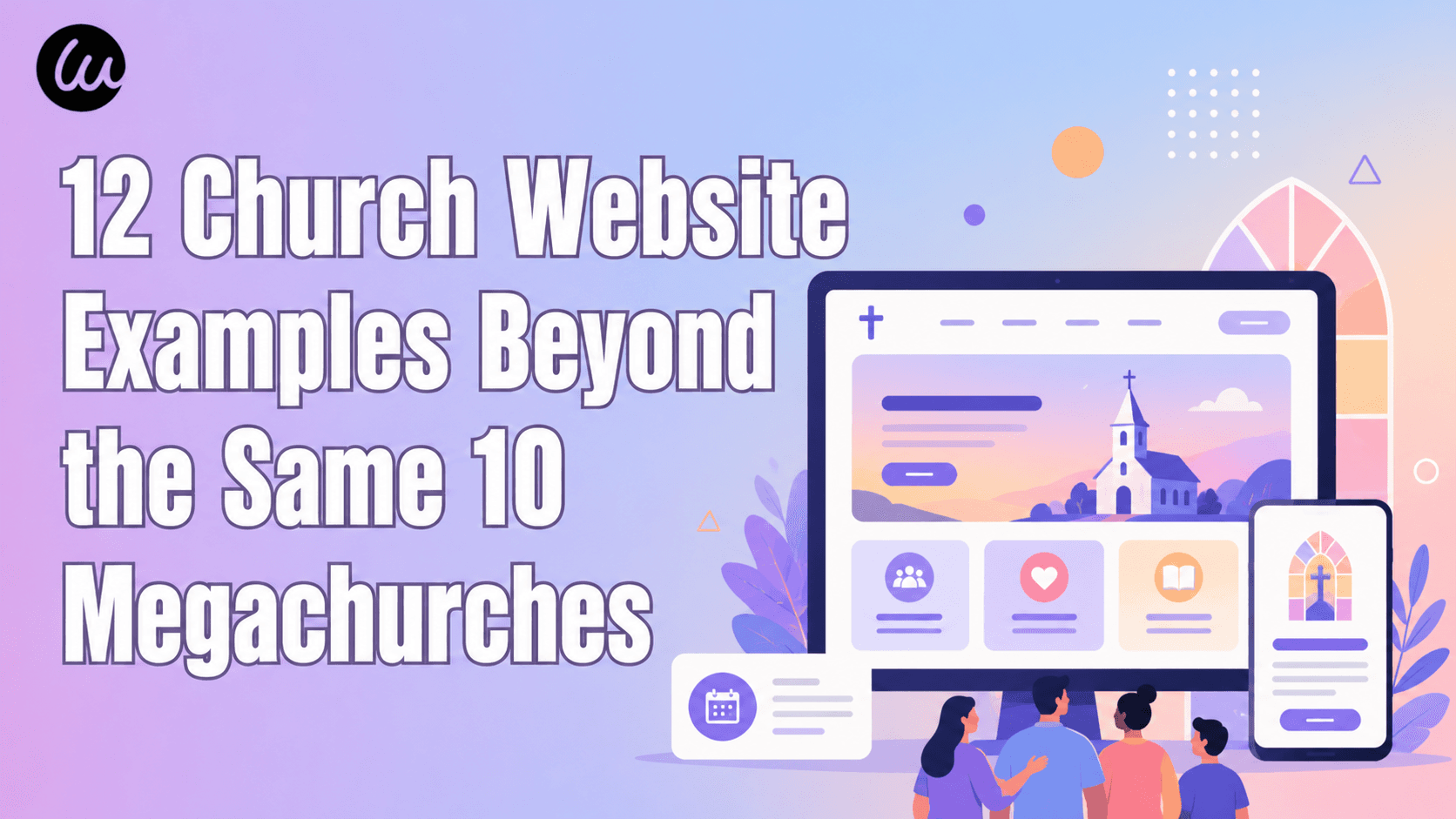
Uma redefinição rápida: por que seu cabeçalho tem mais peso do que quase qualquer outro elemento
Três fatos em linguagem simples antes dos exemplos:
- Seu cabeçalho é a primeira coisa que quase todo visitante vê. Estudos de rastreamento ocular mostram consistentemente que as pessoas escaneiam a faixa superior de uma página antes de ler qualquer coisa abaixo dela. Se o seu cabeçalho for confuso nesses primeiros segundos, o resto da sua página nunca será lido.
- É a única peça de design que aparece em todas as páginas. Uma imagem hero vive em uma página. Um cabeçalho segue o visitante para todos os lugares. Isso o torna a decisão de design de maior alavancagem em todo o site — acerte uma vez e ela compensará em todas as telas.
- As pessoas decidem se ficam em segundos, e seu cabeçalho está fazendo a maior parte desse trabalho. Um cabeçalho claro e confiante sinaliza uma empresa clara e confiante. Um cabeçalho desordenado ou quebrado faz com que os visitantes presumam silenciosamente que o produto por trás dele também é desordenado e quebrado — justa ou injustamente.
Cada exemplo abaixo foi selecionado porque resolve pelo menos uma dessas três tarefas de uma forma que vale a pena estudar — e porque você quase certamente não o viu nas outras dez listas.
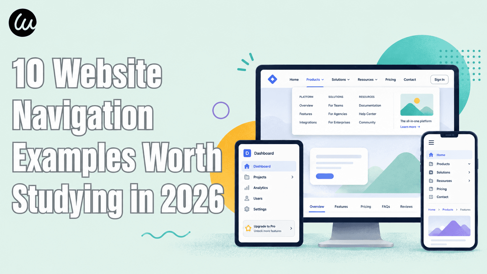
4 Categorias de Padrões — Escolha a Que Melhor Se Adapta ao Seu Site
Padrão | Melhor para | Exemplos de sites | |
1 | Mínimo / desaparecendo | Publicações, aplicativos de leitura, produtos com foco principal | Medium, Substack, Ghost |
2 | Barra de comando / teclado primeiro | Ferramentas de desenvolvimento, SaaS para usuários avançados, aplicativos de produtividade | Raycast, Vercel, Superhuman |
3 | Multicamadas / utilitário (duas audiências) | Fintech, marketplaces, B2B com ofertas complexas | Wise, Booking.com, Figma |
4 | Editorial / marca transparente | Marcas de varejo, museus, estúdios, formato longo | Aesop, Tate, A24 |
Os 12 exemplos de cabeçalhos de sites abaixo estão organizados nestes quatro grupos. Encontre a linha mais próxima do seu site e, em seguida, use os movimentos que se encaixam.
Padrão 1: Cabeçalhos Mínimos / Desaparecendo — Quando o Conteúdo Precisa da Tela Inteira
O primeiro grupo de exemplos de cabeçalhos de sites vem de produtos focados em leitura, que convergiram silenciosamente para um cabeçalho que quase não aparece. A lógica é simples: quando seu produto são as palavras na página, um cabeçalho fixo e grande é apenas uma distração competindo com o que as pessoas vieram buscar. Esses três sites mostram diferentes nuances da mesma contenção — e provam que um cabeçalho minimalista não é falta de design, é um design deliberado. Se você quer ideias de cabeçalhos de sites para um site com muito conteúdo, comece por aqui.
1. Medium — O Cabeçalho Que Se Esconde Enquanto Você Lê
Padrão: Cabeçalho com ocultação automática que desaparece ao rolar para baixo e reaparece ao rolar para cima
A experiência de leitura do Medium usa um dos comportamentos de cabeçalho mais limpos da web. Enquanto você rola para baixo em um artigo, a barra superior desliza para fora, dando a tela inteira ao texto.
Três coisas para roubar:
- Oculte o cabeçalho ao rolar para baixo, revele-o ao rolar para cima. Este único comportamento dá ao conteúdo a tela inteira, mantendo a navegação a um gesto de distância. Para qualquer site com muito conteúdo de leitura, é a atualização de cabeçalho de maior impacto que você pode implementar.
- Reduza o cabeçalho de leitura a três coisas. O cabeçalho dentro do artigo do Medium é essencialmente logotipo, pesquisa e conta. Todo o resto (palmas, compartilhar, salvar) fica perto do conteúdo, onde é contextualmente relevante — não amontoado na barra superior.
- Não faça com que "minimalista" signifique "vazio". O cabeçalho do Medium ainda funciona de verdade — pesquisa e conta estão sempre a um rolagem para cima. O design minimalista do cabeçalho remove a desordem, não a função.
Entre os exemplos de cabeçalhos fixos, o do Medium é o que mais vale a pena estudar, precisamente porque ele sabe quando não deve ficar fixo.

2. Substack — O Escritor É a Marca, Não a Plataforma
Padrão: Cabeçalho minimalista que coloca a identidade da publicação individual acima da plataforma
Em um Substack individual, o cabeçalho destaca o nome e o logotipo do escritor, não do Substack. É um dos exemplos de cabeçalhos de sites mais instrutivos para quem está construindo um produto multi-inquilino, porque a interface da plataforma é deliberadamente discreta — uma barra fina com assinar, fazer login e pesquisar — para que cada newsletter pareça sua própria publicação, em vez de um inquilino no prédio de outra pessoa. Esta é uma escolha deliberada de layout de cabeçalho: a plataforma recua para que o criador possa se destacar.
Três coisas para roubar:
- Deixe o cabeçalho carregar uma identidade, não duas. Se sua plataforma hospeda marcas de outras pessoas (um marketplace, uma ferramenta para criadores, um SaaS multi-inquilino), decida qual nome prevalece no cabeçalho. O Substack escolhe o criador todas as vezes — e é por isso que os escritores confiam nele.
- Coloque "Assinar" como a única ação principal. O cabeçalho do Substack tem exatamente um botão que importa, e ele é visualmente óbvio. Todo o resto é um link de texto discreto. Sua navegação de cabeçalho deve tornar a única ação que você realmente deseja inconfundível.
- Um campo de busca sinaliza profundidade. Mesmo um cabeçalho minimalista se beneficia da busca quando o arquivo cresce. O Substack o exibe sem torná-lo chamativo — um ícone que se expande, não uma barra de busca gorda e permanente ocupando espaço.

3. Ghost — Contenção de Código Aberto
Padrão: Cabeçalho ultra-minimalista com espaçamento generoso e um único CTA contrastante
Ghost, a plataforma de publicação de código aberto, executa um dos exemplos de cabeçalhos de sites mais esparsos que você encontrará: marca nominativa à esquerda, quatro ou cinco links de texto e um botão preenchido ("Começar"). Nenhum mega menu, nenhuma barra de utilitários, nenhuma barra de anúncios por padrão. A contenção é a declaração da marca — Ghost vende "publicação calma", e o cabeçalho prova isso antes mesmo de você ler uma palavra.
Três coisas para roubar:
- Espaço em branco é um recurso do cabeçalho, não espaço desperdiçado. O espaçamento generoso do Ghost entre os links faz com que cada um pareça deliberado e fácil de tocar. Amontoar dez links na mesma largura pareceria ansioso. Dê espaço para seus links respirarem.
- Um botão preenchido, o resto como texto. Um único CTA contrastante contra links de texto simples cria um ponto focal imperdível. No momento em que você adiciona um segundo botão preenchido, você dividiu a atenção do visitante e enfraqueceu ambos.
- Deixe o cabeçalho corresponder à promessa do produto. Uma empresa de "software calmo" não deve ter um cabeçalho frenético. Seja qual for a promessa principal do seu produto — velocidade, calma, poder, ludicidade — seu cabeçalho é o primeiro lugar para demonstrá-la.

Padrão 2: Cabeçalhos de Barra de Comando / Teclado Primeiro — Quando Usuários Avançados Vivem no Teclado
Um padrão mais recente, quase totalmente ausente dos resumos habituais: cabeçalhos construídos em torno de uma paleta de comandos ou interação de busca primeiro, onde digitar
Cmd+K é mais rápido do que clicar em qualquer coisa. Ferramentas de desenvolvimento e produtos para usuários avançados lideram aqui porque seu público realmente prefere o teclado. Estes são os exemplos de cabeçalho de site mais distintamente de 2026 neste guia.4. Raycast — Quando a Filosofia do Produto É o Cabeçalho
Padrão: Cabeçalho de marketing com foco no teclado que espelha o próprio produto launcher
Raycast cria um launcher de teclado, e o cabeçalho de seu site de marketing reflete essa visão de mundo. É um dos exemplos de cabeçalho de site mais limpos de um site de marketing que se parece com o produto que vende: a navegação é concisa e tipograficamente precisa, e todo o site o direciona para o teclado — a linguagem de design do cabeçalho ecoa a barra de comando estilo holofote que é o produto.
Três coisas para copiar:
- Faça com que seu cabeçalho de marketing pareça seu produto. Um visitante que se move da sua página inicial para o aplicativo não deve sentir que mudou de empresa. A tipografia, o espaçamento e as dicas de interação do Raycast são consistentes do cabeçalho ao produto. Essa continuidade constrói confiança discretamente.
- Espaçamento conciso e preciso transmite a ideia de “engenharia”. Para produtos técnicos, um cabeçalho com alinhamento exato e tipo de letra contido sinaliza artesanato. Espaçamento desleixado no cabeçalho faz com que os desenvolvedores presumam um código desleixado por baixo.
- Mostre o atalho de teclado em algum lugar visível. Produtos com foco no teclado que exibem uma dica
⌘Kno ou perto do cabeçalho ensinam a interação a novatos que nunca leriam a documentação sobre isso. Descoberta através do próprio cabeçalho.

5. Vercel — A Barra de Comando Vive no Cabeçalho
Padrão: Cabeçalho fixo minimalista com um menu de comando/busca
⌘K integradoO cabeçalho da Vercel parece minimalista — um punhado de links e um botão de inscrição — mas é um dos exemplos de cabeçalho de site mais inteligentes para um produto complexo, porque a verdadeira história é o menu de comando integrado a ele. Pressione
⌘K de quase qualquer lugar e uma paleta de busca e salto aparece, permitindo que usuários avançados naveguem por documentos, painel e configurações sem tocar no menu. O cabeçalho visível permanece limpo precisamente porque a barra de comando absorve a complexidade.Três coisas para copiar:
- Uma paleta de comandos permite que seu cabeçalho visível permaneça minimalista. Em vez de expor 30 destinos em um cabeçalho de mega menu, empurre a profundidade para uma busca
⌘K. O cabeçalho parece calmo; usuários avançados ainda chegam a todos os lugares rapidamente. (Para o lado da navegação dessa troca, veja nosso guia de exemplos de navegação de site.) - Um botão de inscrição, visualmente distinto. A Vercel torna o CTA principal um botão preenchido que é instantaneamente localizável em relação aos links de texto. O olho pousa nele sem precisar procurar.
- Comportamento fixo discreto supera o teatral. O cabeçalho da Vercel se compacta sutilmente ao rolar — ele não salta, expande ou anima dramaticamente. Um cabeçalho fixo que simplesmente permanece calmamente no lugar transmite profissionalismo; um que se exibe parece barato.

6. Superhuman — Um Cabeçalho Tão Rápido Quanto o Produto
Padrão: Cabeçalho obcecado por velocidade para um cliente de e-mail controlado por teclado
Superhuman construiu sua reputação em velocidade bruta e atalhos de teclado, e seu cabeçalho de marketing carrega esse DNA. A barra é enxuta, o tipo é confiante, e toda a apresentação transmite "este produto respeita seu tempo". O cabeçalho não desperdiça um pixel — apropriado para um produto cuja proposta inteira é fazer você passar pelo e-mail duas vezes mais rápido.
Três coisas para copiar:
- Deixe o cabeçalho definir a expectativa de velocidade. Se a promessa do seu produto é velocidade, um cabeçalho pesado e de carregamento lento a contradiz instantaneamente. O cabeçalho minimalista do Superhuman parece rápido antes mesmo de a página terminar de carregar.
- O tipo de letra confiante carrega um produto premium. Superhuman cobra um preço premium, e a tipografia do cabeçalho reflete isso — generosa, decisiva, sem pressa. Um tipo de letra com aparência barata no cabeçalho compromete um preço premium.
- Resista à tentação de explicar tudo no cabeçalho. Superhuman não lista todos os recursos no topo. Ele escolhe as poucas coisas que importam e confia no resto da página para fazer a explicação. Um cabeçalho de site moderno que diz menos geralmente converte mais.

Padrão 3: Cabeçalhos de Múltiplas Camadas / Utilitários — Quando Você Atende Duas Audiências ao Mesmo Tempo
Isso é o oposto do Padrão 1. Marketplaces, fintechs e produtos B2B complexos muitas vezes não podem ser minimalistas — eles precisam expor um seletor de moeda, um seletor de idioma, um menu de conta, um botão "para empresas" e um CTA primário, tudo ao mesmo tempo. Os exemplos de cabeçalhos de sites neste grupo mostram a arte de fazer isso em duas camadas limpas em vez de uma faixa caótica. Um layout de cabeçalho bem construído nesta categoria usa uma barra de utilitários fina acima de uma linha de navegação primária mais alta.
7. Wise — Utilidade Fintech Sem Bagunça
Padrão: Cabeçalho multicamadas com utilitário de região/moeda acima da navegação principal e uma divisão pessoal/empresarial
Wise (a empresa de transferência internacional de dinheiro) tem que lidar com um problema de cabeçalho difícil, e produz um dos exemplos de cabeçalho de site mais úteis para qualquer produto global: visitantes em dezenas de países, pagando em dezenas de moedas, divididos entre uso pessoal e empresarial — todos precisando encontrar preços e fazer login rapidamente. O cabeçalho resolve isso com uma estrutura em camadas: uma linha superior fina para utilitários de região e conta, uma linha de navegação primária abaixo para produtos e um único e claro CTA "Registrar". Nada disputa atenção.
Três coisas para copiar:
- Separe utilitários da navegação com duas camadas. Região, idioma, moeda e conta pertencem a uma faixa superior fina. Seus produtos reais e o CTA principal pertencem à linha principal abaixo. Misturá-los em uma única linha é como os cabeçalhos se transformam em ruído.
- Um botão de alternância pessoal x empresarial pertence ao cabeçalho, não escondido. Se você atende a dois tipos distintos de clientes, deixe-os se identificar imediatamente. Wise exibe a divisão bem no alto para que cada visitante veja um caminho relevante no primeiro segundo.
- Um CTA, mesmo com um cabeçalho ocupado. Apesar de toda a utilidade, Wise ainda tem exatamente um botão primário. A complexidade na barra de utilitários é aceitável; a complexidade na chamada para ação é fatal.

8. Booking.com — Um Marketplace de Dois Lados em Um Cabeçalho
Padrão: Cabeçalho de marketplace de viagens atendendo tanto viajantes quanto parceiros de propriedade
O cabeçalho do Booking.com é um dos exemplos de cabeçalho de site mais trabalhados em viagens: ele precisa funcionar para duas pessoas completamente diferentes — um viajante reservando um quarto e um proprietário listando um. A solução é uma faixa de utilitários que contém moeda, idioma, conta e um link proeminente "Anuncie sua propriedade" para o lado da oferta, situado acima da pesquisa e navegação focadas no viajante. Ambas as audiências encontram seu caminho em um segundo após o acesso.
Três coisas para copiar:
- Dê à audiência menor uma única porta clara, não uma pista inteira. A maioria dos visitantes são viajantes, então o caminho do viajante domina. Os proprietários recebem um link óbvio "Anuncie sua propriedade" na barra de utilitários — o suficiente para encontrar o caminho, mas não o suficiente para poluir a experiência principal.
- Seletores de moeda e idioma sinalizam "somos para você". Para qualquer site com visitantes internacionais, um controle visível de moeda/idioma no cabeçalho é um sinal de confiança. Ele diz a um visitante de outro país que o site foi construído pensando nele.
- Pesquisa persistente no cabeçalho para sites com muito inventário. Quando seu produto são milhares de listagens, a pesquisa não é um recurso — é a navegação. O Booking.com trata a funcionalidade de pesquisa como um elemento permanente do cabeçalho, não um ícone escondido.

9. Figma — O Cabeçalho B2B Feito com Disciplina
Padrão: Cabeçalho SaaS multicamadas com navegação de produto suspensa, links de utilitários e um CTA ousado
O cabeçalho de marketing do Figma lida com uma linha de produtos extensa (design, modo de desenvolvimento, quadro branco, slides) sem parecer extensa. As categorias de produtos ficam em menus suspensos organizados, um "Fale com vendas" e o login aparecem como links de utilitários discretos, e um único botão "Começar" ousado ancora o lado direito. É um design de cabeçalho responsivo exemplar que se recolhe de forma limpa em uma gaveta no celular.
Três coisas para copiar:
- Agrupe uma ampla linha de produtos em alguns menus suspensos, não em uma lista plana. O Figma tem muitos produtos, mas apenas alguns itens de cabeçalho de nível superior. A profundidade vive dentro dos menus suspensos. Um cabeçalho plano listando cada produto parece esmagador; categorias agrupadas parecem organizadas.
- "Fale com vendas" e "Login" são utilitários, não primários. O Figma os estiliza como links de texto discretos para que não compitam com o CTA principal "Começar". Saiba quais itens do cabeçalho são portas para usuários existentes e quais são portas para novos, e dê pesos diferentes a eles.
- Projete o recolhimento móvel deliberadamente. O cabeçalho do Figma se dobra em uma gaveta limpa em tela cheia nos telefones — não em um menu suspenso apertado. Trate o design do cabeçalho móvel como seu próprio layout, não como uma reflexão tardia espremida da versão para desktop.

Padrão 4: Cabeçalhos Editoriais / de Marca Transparente — Quando o Cabeçalho Faz Parte da História
O último padrão é para sites onde o cabeçalho não é apenas uma utilidade — é uma parte da identidade visual da marca. Marcas de varejo, museus e estúdios usam cabeçalhos transparentes que ficam sobre imagens de sangria total, tipografia editorial contida e links focados no conteúdo. Bem feito, o cabeçalho parece menos um menu e mais a primeira linha de uma história. Estes são os exemplos de cabeçalhos de sites esteticamente mais distintos do conjunto, e os mais difíceis de copiar sem entender a marca por trás deles.
10. Aesop — Transparente para Sólido, Silenciosamente
Padrão: Cabeçalho transparente sobre imagem que desvanece para um fundo sólido ao rolar
A marca de cuidados com a pele Aesop apresenta um dos mais elegantes exemplos de cabeçalhos de sites no varejo: um cabeçalho que começa transparente — flutuando sobre uma imagem de herói de sangria total com uma tipografia serifada fina — e depois transita para um fundo sólido e legível à medida que você rola para o conteúdo. A contenção reflete a estética de boticário da marca. Um cabeçalho transparente como este é bonito, mas a Aesop acerta na parte que a maioria dos sites erra: ele permanece legível durante todo o percurso.
Três coisas para copiar:
- Um cabeçalho transparente deve ter um estado de rolagem. A falha mais comum de cabeçalhos transparentes é o texto que se torna invisível sobre uma seção clara. A Aesop resolve isso desvanecendo para um fundo sólido assim que você rola além do herói. Nunca lance um cabeçalho transparente sem isso.
- Combine a tipografia do cabeçalho com a personalidade da marca. A tipografia discreta e editorial da Aesop faz mais pelo trabalho da marca do que qualquer animação de logotipo poderia. Para um site de marca, a fonte do cabeçalho é uma decisão de marca — escolha-a com tanto cuidado quanto sua embalagem.
- Deixe a imagem respirar sob uma barra transparente. Quando o cabeçalho flutua sobre uma foto de herói, mantenha-o esparso para que a imagem não fique sobrecarregada. Um cabeçalho transparente abarrotado com dez links anula todo o efeito elegante.

11. Tate — Quando "O que está em cartaz" é o ponto principal
Padrão: Cabeçalho de museu editorial ousado destacando exposições e informações de visitação
A Tate, a rede de museus de arte moderna e histórica do Reino Unido, apresenta um dos exemplos de cabeçalhos de sites mais instrutivos para qualquer organização orientada a eventos — um cabeçalho construído em torno das duas coisas que todo visitante deseja: o que está em cartaz e como visitar. A navegação é editorial e confiante — tipografia grande, entradas claras de "O que está em cartaz" e "Visitar", e uma ênfase em "Planeje sua visita" — com a identidade do museu transmitida por cores e tipografia ousadas, em vez de um tratamento de logotipo complicado. É um ótimo modelo para qualquer organização onde eventos e visitas são as tarefas principais.
Três coisas para copiar:
- Comece o cabeçalho com a pergunta real do visitante. Para um museu, isso é "o que está em cartaz" e "como faço para visitar". A Tate torna ambos imperdíveis. Seja qual for o motivo mais comum pelo qual as pessoas vêm ao seu site, esse link deve ser o primeiro no cabeçalho.
- A tipografia editorial pode substituir um logotipo chamativo. A marca Tate se manifesta em sua tipografia e cores confiantes, não em um logotipo animado e exagerado. Para marcas culturais e editoriais, um cabeçalho tipográfico forte supera os teatros de logotipo.
- Um CTA "Planeje sua visita" para qualquer destino físico. Museus, locais de eventos, restaurantes e lojas se beneficiam de um CTA no cabeçalho voltado para a visita presencial. A Tate dá a ele grande destaque — um padrão que vale a pena copiar para qualquer marca física. (Veja-o aplicado à gastronomia em nosso guia de exemplos de sites de restaurantes.)

12. A24 — O Cabeçalho do Estúdio como um Clima
Padrão: Cabeçalho editorial ousado e focado no conteúdo que estabelece um tom cinematográfico
O estúdio de cinema A24 apresenta um cabeçalho que é puro clima de marca — confiante, discreto e focado no conteúdo, impulsionando filmes, loja e conteúdo editorial em vez de links corporativos. O cabeçalho trata o estúdio como uma publicação e uma marca ao mesmo tempo, que é exatamente como o público da A24 pensa nele. Isso prova que um cabeçalho pode ter uma *personalidade*, não apenas uma função.
Três coisas para copiar:
- Um cabeçalho pode transmitir um clima, não apenas links. O cabeçalho da A24 parece cinematográfico e distinto no instante em que carrega. Se sua marca tem uma personalidade forte, deixe o cabeçalho expressá-la — tipografia contida, espaçamento deliberado e um logotipo confiante fazem mais do que uma navegação genérica jamais fará.
- Dê prioridade ao conteúdo, não às páginas corporativas. A A24 coloca filmes e editoriais em primeiro plano; os links "Sobre" e corporativos recuam. Lidere seu cabeçalho com o que seu público realmente veio procurar e deixe as páginas obrigatórias em segundo plano.
- A distinção supera a convenção para sites de marca. O cabeçalho da A24 não se parece com um modelo SaaS, e esse é o objetivo. Se o seu negócio vive ou morre pela marca, um cabeçalho ligeiramente não convencional que é inconfundivelmente você supera um seguro e esquecível.

Os 5 Erros Que Silenciosamente Custam Suas Conversões
Os melhores exemplos de cabeçalho de site acima compartilham uma disciplina que falta aos sites que falham. Em inúmeras auditorias de design de cabeçalho de site, esses cinco erros são responsáveis pela maioria dos cabeçalhos que falham:
- Um cabeçalho que ocupa a parte visível da tela — especialmente no celular. Um cabeçalho alto mais uma barra de anúncio pode engolir um terço da tela do telefone antes que qualquer conteúdo apareça. Mantenha o cabeçalho compacto e faça-o encolher ao rolar. O espaço da tela na parte superior é o mais caro do seu site.
- Um cabeçalho transparente sem estado de rolagem. Cabeçalhos transparentes ficam deslumbrantes sobre um herói escuro — e se tornam invisíveis no momento em que o visitante rola para uma seção clara. Se você usa um cabeçalho transparente, ele deve desaparecer para um fundo sólido e legível à medida que o usuário rola. Sem exceções.
- Um cabeçalho fixo que nunca encolhe. Um cabeçalho fixo é útil em páginas longas, mas um que permanece em altura total enquanto fixo rouba espaço de conteúdo a cada rolagem — brutal no celular. Cabeçalhos fixos devem se compactar para uma barra fina assim que o usuário rolar além do topo.
- Um logotipo que não leva para a página inicial. Parece trivial, mas um número surpreendente de sites esquece isso. O logotipo é o controle universal de "me leve de volta ao início". Se não for um link para a página inicial, você está quebrando uma convenção na qual todo visitante confia.
- Muitos botões concorrentes, sem um primário claro. Quando o cabeçalho tem "Inscrever-se", "Entrar", "Agendar uma demonstração", "Contato" e "Baixar" todos estilizados como botões, nenhum deles se destaca. Escolha uma ação primária, faça dela um botão preenchido e rebaixe todo o resto para links de texto discretos.
Melhores Práticas de Cabeçalho de Site Moderno em 2026
Além de evitar esses erros, seis coisas separam os melhores exemplos de cabeçalho de site 2026 do resto. O que quer que você tire desses exemplos de cabeçalho de site, estas são as melhores práticas de cabeçalho de site que valem a pena manter em uma lista de verificação:
- Uma CTA primária inconfundível. Um único botão preenchido que o olho encontra instantaneamente. Cada botão adicional estilizado da mesma forma o enfraquece.
- Encolher ao rolar, discretamente. Um cabeçalho que se compacta para uma barra fina ao rolar mantém a navegação disponível enquanto devolve espaço ao conteúdo. Mantenha o movimento sutil — sem saltos ou redimensionamentos dramáticos.
- Um estado de rolagem real para cabeçalhos transparentes. Transparente sobre o herói, sólido e legível em todos os outros lugares. Teste-o sobre sua seção mais clara, não apenas a mais escura.
- Mobile como seu próprio layout. Mais da metade de todo o tráfego é móvel. Projete o design do cabeçalho móvel deliberadamente — uma gaveta limpa, grandes alvos de toque, pesquisa no topo — em vez de espremer o cabeçalho da área de trabalho em um telefone.
- Consistência em todas as páginas. O cabeçalho deve ser efetivamente idêntico em todo o site. Um cabeçalho de página inicial com seis itens e um cabeçalho de página interna com quatro diferentes faz com que os visitantes se sintam perdidos.
- Disciplina da barra de anúncios. Uma barra de promoção por vez, dispensável e nunca empilhada em duas camadas. Uma barra de anúncios é um espaço emprestado do seu conteúdo — devolva-o graciosamente.
Como a Wegic Gera Cabeçalhos Que Realmente Funcionam
A maioria dos construtores de sites oferece um cabeçalho de modelo e permite que você troque o logotipo. A Wegic trata o cabeçalho como algo que a IA infere do seu negócio — mais próximo dos exemplos de cabeçalho de site acima do que de um modelo genérico. Diga à Wegic que tipo de site você está construindo e ela escolhe o padrão certo — minimalista e desaparecendo para uma publicação, barra de comando minimalista para uma ferramenta de desenvolvedor, multicamadas para um marketplace, editorial transparente para uma marca.
Wegic é um sistema de crescimento de sites com IA conversacional. Em vez de herdar um cabeçalho pré-definido de um modelo, você descreve seu site e a Wegic escreve o design do cabeçalho para o site do zero — estado de rolagem, gaveta móvel, comportamento fixo e tudo mais.
Fase 1: Informe sua IA
Abra a Wegic e converse com Kimmy, sua gerente de projeto de IA:
"Crie um cabeçalho para uma publicação focada em leitura como o Medium. Barra fixa minimalista com logotipo, pesquisa e conta. Oculte-o ao rolar para baixo, traga-o de volta ao rolar para cima. Um botão de assinatura à direita. Mesmo cabeçalho em todos os artigos."

Fase 2: Montagem da IA em Menos de Um Minuto
O motor da Wegic escreve o código do zero — incluindo o cabeçalho. Em menos de 60 segundos, você obtém um design de cabeçalho responsivo com o comportamento de rolagem correto, uma gaveta móvel que se recolhe de forma limpa em telefones (e apenas em telefones), contraste legível em todos os estados de rolagem, estilos de foco do teclado e rótulos de acessibilidade tratados automaticamente.
👇 Clique abaixo para começar com Wegic

Fase 3: Edite por Conversa
"Deixe o cabeçalho transparente sobre a imagem principal, depois desvaneça para branco sólido ao rolar. Mova a pesquisa para um ícone que se expande. Adicione um seletor de região fino em uma barra de utilitários superior acima da navegação principal."
Wegic propõe duas ou três opções de design com justificativa antes de aplicar, e mantém as versões mobile e desktop sincronizadas.

Fase 4: Publique com Hospedagem Incluída
Clique em Publicar. Hospedagem, domínio personalizado,
sitemap.xml gerado automaticamente e metadados de SEO estão todos incluídos. Para uma comparação de como Wegic lida com cabeçalhos e layouts versus outros construtores de IA, veja nossa análise aprofundada de 5 ferramentas de IA para web design.
Conclusão: Combine o Cabeçalho com o Trabalho
Os 12 exemplos de cabeçalhos de sites neste guia funcionam porque cada um foi combinado com um problema específico. O cabeçalho que desaparece do Medium funciona porque o Medium é para leitura. O cabeçalho de várias camadas do Wise funciona porque o Wise atende dezenas de países e dois tipos de clientes ao mesmo tempo. O cabeçalho transparente da Aesop funciona porque a Aesop vende uma estética. Nenhum deles funcionaria se você os trocasse — que é a verdadeira lição por trás de cada um desses exemplos de cabeçalhos de sites.
Se você copiar um cabeçalho que não corresponde à função real do seu site, o resultado é decoração. Combine o padrão com o que seu visitante veio fazer, e o cabeçalho sai do caminho — que é exatamente o que um bom design de cabeçalho de site faz.
Para mais inspiração de design em outras categorias, veja nosso guia mais amplo de exemplos de páginas iniciais de sites, e para uma galeria mais aprofundada focada puramente na estética do cabeçalho, nossa coleção de 16 melhores exemplos de design de cabeçalho de site. Para implementação, o fluxo do construtor de sites responsivos gera padrões de cabeçalho que se encaixam na sua categoria por padrão, e a galeria de sites estéticos mostra como os cabeçalhos se conectam ao design completo do site.
Perguntas Frequentes
O que todo cabeçalho de site deve incluir?
Cinco elementos essenciais, em ordem de prioridade — e eles se aplicam a quase todos os exemplos de cabeçalhos de sites acima: (1) um logotipo que linka de volta para a página inicial; (2) uma navegação primária de cinco a sete itens, nunca mais; (3) uma única CTA primária distinguível (Cadastre-se / Começar / Assinar / Agendar); (4) uma funcionalidade de busca se o seu site tiver profundidade real; (5) uma versão mobile limpa que se recolhe para uma gaveta. Opcional, dependendo do tipo: uma barra de utilitários para região/idioma/conta, e uma única barra de anúncio dispensável. A maioria das auditorias de cabeçalho falhas remonta à violação de uma dessas regras.
Qual a diferença entre um cabeçalho sticky e um cabeçalho fixo?
Os termos são frequentemente usados de forma intercambiável, mas os profissionais geralmente querem dizer o seguinte: um cabeçalho fixo permanece fixado no topo da viewport o tempo todo enquanto você rola. Um cabeçalho sticky se comporta da mesma forma uma vez que você o alcança, mas pode começar no fluxo do documento ou ocultar e revelar com base na direção da rolagem (como o do Medium). Na prática, "sticky" tornou-se o termo guarda-chuva para qualquer cabeçalho que segue a rolagem. A regra chave de UX para ambos: encolher para uma barra fina assim que o usuário rola para além do topo, para que você não esteja ocupando espaço de conteúdo em todas as telas — especialmente no celular.
Meu cabeçalho de site deve ser transparente?
Um cabeçalho transparente funciona lindamente quando está sobre uma imagem ou vídeo de herói de largura total e sua marca tem um apelo editorial (pense em Aesop, marcas de moda, museus). A regra inegociável: ele deve fazer a transição para um fundo sólido e legível à medida que o usuário rola para seções mais claras. A falha mais comum de cabeçalho transparente é o texto de navegação que desaparece sobre um bloco branco mais abaixo na página. Se você não conseguir implementar um estado de rolagem confiável, use um cabeçalho sólido.
Qual deve ser a altura de um cabeçalho de site?
Não há um número de pixels universal, mas o princípio é: o mais compacto possível, mantendo-se clicável. No desktop, um cabeçalho de aproximadamente 60–80px de altura é comum; no celular, mantenha-o fino e garanta que os alvos de toque sejam grandes o suficiente para serem clicados confortavelmente. A regra maior é o que acontece na rolagem — um bom cabeçalho de site moderno encolhe assim que o usuário rola para baixo, devolvendo esse espaço ao conteúdo. Nunca deixe o cabeçalho mais uma barra de anúncio engolir um terço da tela de um telefone.
O que é um cabeçalho com mega menu e eu preciso de um?
Um cabeçalho de mega menu é um cabeçalho cujos menus suspensos se expandem em painéis grandes e de várias colunas — usado por varejistas e grandes catálogos para expor dezenas de categorias de uma só vez. Você só precisa de um se seu conteúdo for genuinamente abundante e bem organizado (muitos produtos, muitas categorias). Para a maioria dos SaaS, publicações e sites de marcas, um mega menu é um exagero e alguns menus suspensos organizados funcionam muito melhor, como a maioria dos exemplos de cabeçalho de site neste guia demonstra. Recorra a um mega menu para resolver a profundidade real do catálogo, não para parecer impressionante.
Como eu crio um cabeçalho para celular?
Trate o design do cabeçalho para celular como seu próprio layout, não como uma versão desktop espremida. O padrão dominante de 2026: uma barra fina com logotipo e um ícone de menu que abre uma gaveta em tela cheia. Dentro da gaveta: uma lista vertical de links com grandes áreas de toque, pesquisa perto do topo e a CTA principal como um botão de largura total. Evite menus suspensos apenas com hover (eles não existem em telas sensíveis ao toque) e certifique-se de que o cabeçalho encolha ao rolar para que o conteúdo tenha o máximo de espaço.
Quantos links devem estar na navegação do cabeçalho?
Cinco a sete itens primários é o ideal. Abaixo de cinco, você pode estar subexpondo destinos importantes; acima de sete, você força os visitantes a escanear mais do que o olho absorve confortavelmente em um relance, e geralmente você acaba com um vago "Mais" que abrange tudo. Se você tem mais de sete destinos que realmente merecem destaque de alto nível, isso é um sinal de que sua arquitetura de informação precisa de reestruturação — conserte a estrutura do site, não apenas a navegação do cabeçalho.
Onde deve ir a chamada para ação em um cabeçalho?
No canto superior direito é o posicionamento convencional e de alto desempenho em idiomas da esquerda para a direita — o olho termina de escanear a navegação ali. Estilize-o como um único botão preenchido que contraste com os links de texto simples, para que seja o ponto focal óbvio. A regra cardinal: uma CTA principal. Se você estilizar três botões de forma idêntica, nenhum deles ganha, e os visitantes hesitam em vez de clicar.
