Une réinitialisation rapide : pourquoi le site web de votre église est réellement important
Trois faits simples avant les exemples :
- Pour la plupart des nouveaux visiteurs, votre site web est leur première rencontre avec votre église — pas un dimanche matin, pas l'invitation d'un ami, mais une recherche la veille. Si cette page ne répond pas à « quelle heure, quoi porter, où me garer, où vont les enfants », ils choisissent souvent une autre église.
- Plus de 60 % du trafic des sites web d'églises provient d'un téléphone. Les gens consultent les horaires des services depuis leur cuisine un samedi soir. Un site difficile à lire sur mobile perd des visiteurs avant même que quelqu'un ne leur ait adressé la parole.
- Votre site web est la porte d'entrée de facto de votre église. Un visiteur potentiel se fera une idée de votre communauté avant de rencontrer qui que ce soit. Un site chaleureux et clair signale une communauté chaleureuse et claire ; un site encombré ou défectueux signale le contraire — à tort ou à raison.
Chaque exemple ci-dessous est sélectionné parce qu'il résout au moins l'une de ces trois tâches d'une manière qui mérite d'être étudiée — à travers des traditions très différentes.
4 catégories de modèles — Choisissez celle qui correspond à votre église
Modèle | Idéal pour | Exemples d'églises | |
1 | Cathédrale historique (visiteur + fidèle) | Monuments historiques, cathédrales, abbayes | Notre-Dame, Abbaye de Westminster, Trinity Wall Street |
2 | Catholique / liturgique (calendrier sacramentel) | Paroisses catholiques, églises anglicanes de haut rang | St. Patrick's NYC, Brompton Oratory, Cathédrale de Westminster |
3 | Urbaine + multigénérationnelle | Implantations d'églises, églises de quartier universitaire, congrégations urbaines classiques | HTB Brompton, All Souls Langham Place, Redeemer NYC |
4 | Congrégation mondiale / multilingue | Grandes églises internationales, congrégations d'immigrants, églises urbaines multiethniques | Yoido Full Gospel, Brooklyn Tabernacle, City Harvest |
Les 12 exemples de sites web d'églises ci-dessous sont organisés en quatre groupes. Choisissez la ligne qui correspond le mieux à votre église, puis inspirez-vous des éléments qui conviennent.
Modèle 1 : Cathédrales historiques — Quand votre site web doit servir les fidèles et les touristes à parts égales
Un site web de cathédrale a un problème que la plupart des sites paroissiaux n'ont pas : il doit servir deux publics complètement différents qui arrivent avec des intentions complètement différentes. Un pèlerin qui veut les horaires de messe a besoin d'une page différente d'un touriste qui veut une visite audio autoguidée, et les deux doivent trouver ce qu'ils cherchent en moins de 10 secondes. Les trois exemples de sites web de cathédrales ci-dessous résolvent particulièrement bien cette dualité.
1. Notre-Dame de Paris — Site reconstruit pour une cathédrale reconstruite
Modèle : Site patrimonial axé sur la réservation, équilibrant l'accès libre au culte et le flux de visiteurs chronométré
Le site officiel de Notre-Dame a été reconstruit pour la réouverture de la cathédrale en décembre 2024 après l'incendie de 2019. Le défi était unique : la cathédrale reçoit plus de 11 millions de visiteurs par an (plus que le Louvre), mais c'est aussi toujours une cathédrale catholique active avec des messes quotidiennes, des mariages et le siège de l'archevêque de Paris. Le nouveau site gère les deux. Un système de réservation en ligne gratuit permet aux visiteurs de réserver un créneau d'entrée de 30 minutes, mais les participants à la messe peuvent toujours entrer librement sans réservation. Les informations de visite et les horaires liturgiques sont côte à côte sur la page d'accueil, sans que l'un ne relègue l'autre à un rôle secondaire.
Trois choses à retenir :
- Un modèle de « réservation gratuite » est préférable à « acheter des billets » pour les sites spirituels. Notre-Dame ne facture rien pour l'entrée — mais la réservation chronométrée sert toujours l'église en gérant l'affluence. De nombreuses cathédrales et grandes paroisses peuvent emprunter ce modèle pour gérer la capacité lors des services de pointe sans monétiser l'entrée.
- Fidèles vs visiteurs comme deux CTA de poids égal. La page d'accueil accorde une importance à peu près égale à « Planifiez votre visite » et « Horaires des messes & offices ». De nombreux sites de cathédrales enfouissent le calendrier des offices sous « À propos » ou « Communauté ». Traitez l'horaire liturgique comme une destination de premier ordre.
- Une application mobile compagnon pour l'exploration autoguidée. L'application « Compagnon de Visite » de Notre-Dame fournit des informations historiques, des commentaires artistiques et de l'audio en plusieurs langues — remplaçant un guide papier qui aurait dû être repensé en 8 langues. Pour tout site patrimonial, une petite PWA (progressive web app) est désormais moins chère à produire que des guides imprimés.

2. Abbaye de Westminster — Cérémonies royales, Evensong quotidienne et carte touristique
Modèle : Site à trois publics (fidèles, touristes, universitaires) avec des voies visuelles claires
L'Abbaye de Westminster accueille des couronnements toutes les quelques décennies, des mariages royaux tous les quelques ans, l'Evensong quotidienne tous les après-midi, et 1,5 million de touristes chaque année. Le site web gère ces publics avec ce qui est effectivement une navigation supérieure à trois voies : Visiter (parcours touristique), Culte (parcours des services et du clergé) et Apprendre (histoire, archives, musique). La boutique en ligne et la billetterie de l'Abbaye se trouvent sous Visiter. Le bureau du chapitre et la chorale se trouvent sous Culte. La même page d'accueil fonctionne pour un touriste réservant une visite et un Londonien assistant à l'Evensong ce soir.
Trois choses à retenir :
- Trois voies claires pour le public sont plus performantes qu'un méga-menu « Ressources » encombré. Si votre église sert plusieurs publics (membres / visiteurs / ministères spécifiques), rendez les voies structurelles — et non enfouies dans un menu hamburger.
- Les services quotidiens en direct méritent leur propre page — et non une entrée de calendrier. L'Abbaye de Westminster a une page dédiée « Aujourd'hui à l'Abbaye » qui est mise à jour quotidiennement avec l'horaire des services du jour, le prédicateur et la chorale qui chante. Cela vaut la peine d'être copié pour toute église ayant des services en semaine.
- La boutique devrait ressembler à une extension de l'église, pas à Etsy. La boutique en ligne de l'Abbaye de Westminster utilise la même typographie et la même palette de couleurs que le reste du site. Une boutique ajoutée avec des photos de stock rompt la marque. Si vous vendez quoi que ce soit (livres, enregistrements, produits dérivés), concevez-le comme faisant partie de l'église.

3. Trinity Church Wall Street — Une église historique au cœur de la finance moderne
Modèle : Paroisse épiscopale urbaine active servant les fidèles, les voisins et 1,5 million de visiteurs annuels
Trinity Church est située au début de Wall Street, à deux pâtés de maisons du site du World Trade Center. C'est une paroisse épiscopale active depuis 1697, et son site web gère la tension entre être une église en activité, un site commémoratif du 11 septembre, un lieu de concert gratuit en semaine (Bach at One), et une importante fondation philanthropique. La page d'accueil utilise une mise en page éditoriale — carte de présentation, cartes secondaires, bande de calendrier — qui ressemble plus à un magazine qu'à un site d'église. Cela fonctionne parce que Trinity produit réellement du contenu (sermons, concerts, conférences théologiques, initiatives de justice raciale) au volume d'une organisation médiatique.
Trois choses à retenir :
- Si votre église produit du contenu, concevez-la comme un site média. La plupart des sites web d'églises sont des brochures avec une page « Sermons » ajoutée. Trinity traite les sermons, les concerts et les conférences comme un flux éditorial unique et les affiche sur la page d'accueil comme les articles principaux d'une publication.
- Aperçus du calendrier sur la page d'accueil, pas sur une page séparée. Trinity affiche les 3 à 4 prochains événements directement sur la page d'accueil avec la date, l'heure et une description d'une ligne. Les gens viennent pour « ce qui se passe cette semaine », et cela devrait être visible immédiatement.
- Les sites commémoratifs / lieux sacrés nécessitent une page calme et séparée. Le cimetière de Trinity (où est enterré Alexander Hamilton) a sa propre page avec un design digne et sobre — pas d'animations, pas de CTA. Les espaces sacrés ou commémoratifs doivent paraître sacrés. Ne mettez pas de formulaire d'inscription à côté d'une tombe.

Modèle 2 : Églises catholiques et liturgiques — Quand le calendrier sacramentel EST le site
Un site web d'église catholique a des besoins de conception qu'aucune liste de méga-églises évangéliques n'aborde. Horaires des messes en plusieurs langues et rites. Horaires des confessions. Parcours de préparation au baptême. RCIA (Rite d'Initiation Chrétienne pour Adultes). Politiques de mariage. Arrangements funéraires. Rotations des jours saints. Le travail du site est moins de « convertir les visiteurs en participants » et plus de « servir une communauté sacramentelle qui existe déjà » — tout en accueillant respectueusement les personnes intéressées. Les trois églises ci-dessous le font avec un savoir-faire remarquable.
4. Cathédrale Saint-Patrick, New York — L'horaire des messes comme élément principal de la page d'accueil
Modèle : Page d'accueil de cathédrale catholique avec les horaires des messes comme contenu principal, non enfouis sous la section À propos
La cathédrale Saint-Patrick sur la Cinquième Avenue est le siège de l'archevêque de New York et l'un des monuments catholiques les plus reconnus des États-Unis. Son site web fait la chose la plus simple et la plus importante : l'horaire des messes est la première chose que vous voyez sous le héros. Horaires des messes quotidiennes, horaires des messes du dimanche, messe espagnole, heures de confession — tout est clairement présenté sans forcer l'utilisateur à naviguer. La page d'accueil n'essaie pas de « convertir » le visiteur avec un CTA « Planifiez votre visite ». Elle le sert.
Trois choses à retenir :
- Horaires des services visibles sans défilement, sans exception. Quoi qu'il y ait d'autre sur votre page d'accueil, l'horaire des cultes doit être visible sans avoir à faire défiler. Pour les églises catholiques et liturgiques, cela signifie les horaires des messes / Liturgie Divine / Vêpres / Confession regroupés en un seul bloc, et non dispersés.
- Indiquez clairement les langues à côté des horaires des services. St. Patrick's marque les messes en espagnol en ligne (messe espagnole de 17h, etc.) plutôt que de les enfouir sur une page séparée « Ministère hispanique ». Si vous proposez des services en plusieurs langues, traitez-les comme des éléments de premier ordre dans l'horaire.
- Les informations sacramentelles nécessitent un centre clair et dédié. Baptême, Mariage, Funérailles, Confirmation, Ordres sacrés — chacun est un événement majeur dans la vie du visiteur. St. Patrick's consacre à chaque sacrement une page dédiée avec les exigences, la planification et les coordonnées. C'est l'équivalent catholique du parcours « Je suis nouveau » d'un évangélique.

5. Brompton Oratory — Quand la beauté est le mot d'ordre
Modèle : Paroisse catholique traditionnelle connue pour sa musique liturgique et sa messe latine, avec un site web qui correspond à son esthétique
L'Oratoire de Brompton est l'une des églises catholiques les plus importantes architecturalement de Londres et l'une des rares en Angleterre à célébrer régulièrement la messe latine traditionnelle. Son site web est inhabituel parmi les sites paroissiaux par la clarté avec laquelle il adopte une *esthétique spécifique* : typographie à empattements, photographies sobres en noir et blanc, enregistrements de musique classique mis en avant, et un horaire des messes qui distingue entre la forme ordinaire, la forme extraordinaire (latin) et les liturgies des jours de fête. Le site ressemble à une extension de l'intérieur baroque du XIXe siècle du bâtiment — et cette cohérence est tout l'intérêt.
Trois choses à retenir :
- Adaptez votre langage de conception à votre tradition liturgique. Une église qui célèbre le culte en latin ne devrait pas avoir un site web qui ressemble à une page de destination SaaS. La typographie géométrique sans empattements évoque une « startup moderne » ; les empattements et les mises en page éditoriales évoquent la « tradition ». Choisissez délibérément.
- Mettez en avant votre ministère musical s'il est central à votre culte. Le chœur de l'Oratoire de Brompton est de renommée internationale, et la page d'accueil renvoie directement aux enregistrements, aux horaires de diffusion et aux détails des concerts. Pour toute église où la musique fait partie de l'identité, traitez-la comme un élément de navigation de premier ordre.
- Distinguez les rites et les formes sur votre horaire de messe. Un fidèle qui souhaite une messe latine n'est pas servi par une liste générique « Messe du dimanche 10h ». L'Oratoire de Brompton indique pour chaque service sa forme, sa langue et son chœur. Si vous offrez de la variété, mettez-la en avant.

6. Cathédrale de Westminster — L'Église Mère faite avec retenue
Modèle : Église mère catholique romaine d'Angleterre et du Pays de Galles, équilibrant les visites touristiques et la vie liturgique quotidienne
La Cathédrale de Westminster (à ne pas confondre avec l'Abbaye de Westminster, qui est anglicane) est la principale église catholique d'Angleterre. Son site web gère une dualité similaire de visiteurs/fidèles à celle de Notre-Dame, mais à plus petite échelle. Le design est délibérément sobre : un en-tête épuré avec les destinations principales (Services, Musique, Visite, Histoire, Salle de la Cathédrale), un calendrier des messes à venir sur la page d'accueil, et une section séparée et magnifique pour le Chœur de la Cathédrale (l'un des chœurs catholiques les plus célèbres au monde).
Trois choses à voler :
- La retenue est perçue comme une autorité pour les institutions établies. Une cathédrale centenaire n'a pas besoin de convaincre de sa crédibilité avec une typographie audacieuse. Un design épuré et sobre signale la confiance. Gardez le design audacieux pour l'église en création qui essaie de se faire remarquer.
- Une page « Salle de la Cathédrale » ou « Location d'Espaces » pour les bâtiments qui servent également d'espaces événementiels. De nombreuses églises historiques subventionnent leur entretien par des concerts, des mariages et des événements d'entreprise. La Cathédrale de Westminster dispose d'une page claire et professionnelle à cet effet. Ne cachez pas votre activité événementielle — de nombreuses personnes la recherchent spécifiquement.
- La messe en direct devrait être une fonctionnalité permanente, pas une relique de la pandémie. La Cathédrale de Westminster diffuse en direct la messe quotidienne et les liturgies des grandes fêtes. Les liens se trouvent dans une bande d'en-tête permanente. Pour les églises catholiques et liturgiques, c'est non négociable en 2026.

Modèle 3 : Églises urbaines en création et congrégations multigénérationnelles
Ce sont les églises où le parcours « Je suis nouveau » est le plus important — et où les modèles de sites web d'églises modernes des méga-églises s'appliquent en partie mais nécessitent une adaptation. Les trois églises ci-dessous sont influentes dans les cercles évangéliques du monde entier, mais chacune adopte une approche sensiblement différente de l'esthétique standard du modèle Hillsong.
7. Holy Trinity Brompton (HTB) — Lieu de naissance du parcours Alpha
Modèle : Église charismatique anglicane à Londres avec une influence mondiale du parcours Alpha et une forte démographie de jeunes professionnels
HTB est l'église anglicane la plus influente dans le monde anglophone pour ce qu'elle a produit : le parcours Alpha, le programme mondial d'introduction au christianisme. Son site web gère bien la double identité — un accent clair sur « Ce dimanche » pour la paroisse de Londres, et une porte d'entrée séparée pour Alpha (qui est sa propre marque sur alpha.org). La page d'accueil de HTB est exceptionnellement conversationnelle : de grandes photographies de personnes réelles de la congrégation, un texte écrit à la deuxième personne, une expérience « Planifiez votre visite » qui vous guide pas à pas sur ce à quoi vous attendre le dimanche matin.
Trois choses à voler :
- Un guide en plusieurs étapes « À quoi s'attendre le dimanche » réduit l'anxiété de la première visite plus que toute autre page. La version de HTB guide les visiteurs à travers l'arrivée, le service, l'enregistrement des enfants et le café après l'église. Pour les nouveaux venus à l'église, cette page unique est l'actif à plus forte conversion sur le site.
- Les photos de la congrégation réelle surpassent la photographie de stock par des ordres de grandeur. Chaque photo sur HTB est de HTB. Le résultat est un site qui ressemble à une communauté, pas à une brochure. Engagez un photographe pour un dimanche matin si vous n'avez pas de budget pour une photographie continue.
- Si vous dirigez un programme phare, donnez-lui sa propre marque. Alpha est plus grand que HTB à ce stade. Plutôt que d'essayer d'intégrer Alpha dans le site de HTB, HTB laisse Alpha être sa propre entité — et y renvoie depuis une section dédiée. Si votre église gère un programme de rétablissement, une école ou un ministère de conseil, demandez-vous s'il mérite sa propre marque.
")
8. All Souls Langham Place — Quand la congrégation s'étend sur cinq générations
Modèle : Église évangélique anglicane historique au centre de Londres avec une démographie exceptionnellement large (des étudiants aux retraités)
All Souls est situé en face de la Broadcasting House de la BBC, dans le centre de Londres. Ce fut l'église de John Stott pendant 50 ans et c'est l'une des congrégations anglicanes évangéliques les plus influentes au monde. Le défi : le service dominical d'All Souls réunit dans la même salle des étudiants universitaires de 21 ans, des professionnels en milieu de carrière, des diplomates expatriés et des membres âgés de longue date. Le site web en témoigne en étant délibérément sobre et riche en informations – n'essayant pas d'être cool pour les étudiants ou rigide pour les retraités. Les heures de service, les archives de sermons, les ministères par étape de vie (étudiants, 20-30 ans, internationaux, familles, seniors) et les ressources théologiques ont tous le même poids.
Trois choses à retenir :
- Organisez les ministères par étape de vie, et non par nom d'activité. « Étudiants », « 20-30 ans », « Familles » et « Seniors » fonctionne mieux que « Études bibliques », « Petits groupes » et « Fraternité ». Les gens trouvent plus rapidement ce qui les concerne.
- Une archive de sermons robuste avec du texte et de l'audio vaut plus qu'un livestream. La bibliothèque de sermons d'All Souls comprend de l'audio, des transcriptions, des références scripturaires et une organisation par série. Les sermons sont trouvés via la recherche Google, ce qui est impossible si vous n'avez que de la vidéo.
- Traduisez le vocabulaire théologique pour les non-initiés, mais ne le simplifiez pas à l'excès. All Souls utilise des mots comme « évangélique » et « prédication expositoire » sur son site – parce que leur public sait ce que cela signifie ou veut activement l'apprendre. Ne supprimez pas le jargon qui a un sens réel ; définissez-le simplement une fois.

9. Redeemer Churches & Ministries — Le réseau d'implantations de Tim Keller à New York
Modèle : Réseau presbytérien multi-paroissial à New York, mettant l'accent sur un ministère urbain réfléchi
Redeemer Presbyterian était l'église de Tim Keller à Manhattan et est devenue un petit réseau de congrégations apparentées à travers New York après sa retraite. Le site web gère bien cette complexité : un seul hub Redeemer.com présente la philosophie du réseau et renvoie aux congrégations individuelles (Redeemer East Side, West Side, Downtown, Lincoln Square), chacune avec son propre site et pasteur mais une identité théologique partagée. La page d'accueil privilégie un contenu long et réfléchi (essais, podcasts, ressources pour les chrétiens urbains) plutôt que la promotion d'événements – ce qui correspond à l'héritage intellectuel de Keller.
Trois choses à retenir :
- Les sites de réseau ont besoin d'une architecture claire en étoile. Si votre église a plusieurs congrégations ou implantations, décidez quelles informations se trouvent sur le hub et lesquelles se trouvent sur les branches. Redeemer place la théologie et la philosophie sur le hub ; les heures de service et les ministères locaux sur les branches. C'est la bonne répartition pour les réseaux de sites web d'églises multi-sites.
- Les ressources de longue durée renforcent l'autorité au fil du temps. Redeemer publie des essais, des podcasts et des articles qui touchent des personnes qui n'assisteraient jamais au culte du dimanche – et beaucoup d'entre elles finissent par le faire. Un site web d'église avec un matériel de lecture substantiel surpasse les sites uniquement événementiels dans les recherches au fil des ans.
- Une page « Ville pour la Ville » ou mission locale renforce la confiance avec les voisins non-participants. Redeemer a une page explicite sur ses engagements envers la ville de New York – partenariats, travail de justice, ministères de quartier. Cela communique aux visiteurs potentiels que l'église est pour la ville, pas seulement dans celle-ci.

Modèle 4 : Congrégations mondiales et multilingues — Lorsque vos visiteurs ne parlent pas tous anglais
Certaines églises desservent une ville dans de nombreuses langues, d'autres desservent une communauté immigrée dont la langue maternelle n'est pas l'anglais, et quelques-unes – comme la plus grande église du monde – desservent plus d'un demi-million de personnes à travers les continents et doivent le faire dans plusieurs langues et fuseaux horaires. Ces exemples de sites web d'églises sont très différents des modèles de méga-églises américaines.
10. Yoido Full Gospel Church — La plus grande congrégation sur Terre
Modèle : Église pentecôtiste coréenne avec plus de 480 000 membres, site web multilingue et plusieurs services hebdomadaires
L'église Yoido Full Gospel à Séoul est la plus grande congrégation unique au monde. Le site web est nécessairement multilingue – coréen, anglais, japonais, chinois, espagnol et autres – chaque version linguistique conservant ses propres actualités, archives de sermons et horaires de service plutôt que d'être une simple traduction du site coréen. Plusieurs services ont lieu chaque dimanche (5h, 7h, 9h, 11h30, 13h30, 16h, 19h) pour gérer le volume. Le site traite chaque langue comme une expérience de première classe, et non comme un widget Google Translate.
Trois choses à retenir :
- Un véritable site multilingue n'est pas un widget de traduction. Chaque version linguistique devrait avoir sa propre structure d'URL (
/en/,/es/,/ko/), ses propres balises méta SEO, et idéalement son propre contenu — pas seulement une traduction automatique. Google classe les pages spécifiques à une langue séparément, et un site correctement internationalisé génère du trafic de recherche dans chaque langue. - Plusieurs horaires de service méritent une mise en page en grille dédiée. Lorsque vous avez 7 services un dimanche, une liste semble accablante. Yoido utilise une grille qui associe chaque heure de service au style de culte, à la langue et à l'emplacement (le sanctuaire principal peut accueillir environ 12 000 personnes ; les chapelles annexes accueillent les services supplémentaires). Pour toute église multiservice, traitez l'horaire comme une véritable pièce de conception d'interface.
- Les fuseaux horaires sont importants pour les congrégations mondiales. Le site anglais de Yoido affiche les heures de service en heure normale de Corée (avec décalage UTC) — nécessaire pour la diaspora internationale qui rejoint les diffusions en direct depuis d'autres endroits. Si votre église diffuse à l'échelle mondiale, affichez les heures dans le fuseau horaire de l'utilisateur qui regarde la diffusion ou explicitez l'UTC.

11. Brooklyn Tabernacle — Une église multi-ethnique qui a l'air multi-ethnique
Modèle : Église indépendante du centre-ville de Brooklyn, connue pour son chœur primé aux Grammy et une démographie qui reflète celle de NYC elle-même.
La congrégation du Brooklyn Tabernacle est réputée pour sa diversité — à peu près également répartie entre Noirs, Hispaniques, Asiatiques et Blancs, avec des services en anglais et en espagnol. Le site web ressemble à cette congrégation. Les photographies de la page d'accueil montrent la congrégation réelle, et non des images de stock d'un groupe homogène. Le contenu en espagnol coexiste en parallèle avec l'anglais, et non comme une version réduite. Le chœur de l'église, six fois primé aux Grammy, bénéficie d'une place de choix car il fait partie intégrante de l'identité de l'église, et non seulement un atout marketing.
Trois choses à voler :
- Si votre congrégation est diverse, vos photos doivent le montrer. Des photos de stock de familles blanches souriantes sur un site web d'église sont un signe que l'église n'est pas ce qu'elle prétend être. Montrez vos vraies personnes. Cela s'applique encore plus fortement aux congrégations d'immigrants et multi-ethniques.
- Le contenu espagnol (ou quelle que soit votre deuxième langue) devrait être un frère de l'anglais, pas un enfant. Ne reléguez pas l'espagnol à une sous-page « Ministerio Hispano ». Brooklyn Tabernacle donne au contenu espagnol une importance égale dans la navigation.
- Un ministère phare (chorale, école, programme de réinsertion) mérite sa propre place sur le site. La chorale du Brooklyn Tabernacle a sa propre section avec des enregistrements, des informations sur l'adhésion à la chorale et les horaires des concerts. Si vous avez quelque chose pour lequel la communauté au sens large vous connaît, traitez-le comme une destination, pas comme une note de bas de page.

12. City Harvest Church — La mégachurch pentecôtiste mondiale de Singapour
Modèle : Église pentecôtiste asiatique multisite avec un important ministère de la jeunesse et une présence médiatique mondiale.
City Harvest à Singapour est l'une des plus grandes églises d'Asie, avec environ 18 000 membres répartis sur plusieurs horaires et lieux de service. Le site web gère un défi de conception distinctif des mégachurches asiatiques — une densité d'informations élevée sans paraître encombrée, de multiples ministères (jeunesse, enfants, jeunes adultes, familles) chacun avec des programmes actifs, et une forte branche de production médiatique. La page d'accueil utilise une grille basée sur des cartes qui permet aux visiteurs de parcourir visuellement les ministères, les événements et les flux de contenu en un seul passage. Les horaires des services en anglais et en mandarin sont clairement affichés.
Trois choses à voler :
- Les grilles basées sur des cartes sont plus efficaces que les longues pages à défilement pour les églises à grand volume. Lorsque vous avez 8 ministères actifs, 3 horaires de service, un sermon chaque semaine et 5 événements à venir, un défilement vertical en enterre la moitié. Une grille de cartes permet aux visiteurs de tout scanner en une seule vue.
- Affichez en évidence le contenu du ministère de la jeunesse et des jeunes adultes pour toute église ayant cette orientation démographique. Le ministère de la jeunesse de City Harvest a un poids visuel égal à celui des services pour adultes sur la page d'accueil — ce qui est approprié pour une église ayant cette priorité stratégique.
- Les services en mandarin / cantonais / langue maternelle méritent des mentions claires sur l'horaire. Les congrégations asiatiques desservent souvent plusieurs communautés linguistiques sous un même toit. Rendez la langue de chaque service évidente ; ne forcez pas les participants mandarins à chercher.

Les 5 erreurs qui coûtent discrètement des visites dominicales à votre église
Parmi des centaines d'audits de conception de sites web d'églises, ces cinq erreurs représentent la majorité des sites d'églises défaillants :
- Horaires des services enfouis sous « À propos » ou « Contact ». La première chose qu'un visiteur souhaite savoir est quand et où vous vous réunissez. S'il faut plus d'un clic pour trouver cette information, vous perdez des visiteurs. Les horaires des services doivent figurer sur la page d'accueil, au-dessus de la ligne de flottaison, sur tous les appareils.
- « Je suis nouveau » ou « Planifiez votre visite » manquant entièrement. Un visiteur novice a besoin d'un chemin clair : où se garer, quoi porter, où vont les enfants, à quoi ressemble le service. De nombreux propriétaires de sites web de petites églises supposent que « tout le monde en ville nous connaît » — mais le visiteur sur votre page d'accueil ne vous connaît probablement pas.
- Le site mobile est la moitié du site de bureau. Plus de 60 % du trafic des sites web d'églises est mobile, mais de nombreuses églises conçoivent pour l'ordinateur portable où elles consultent le site. Testez sur un téléphone, pas seulement avec DevTools. Un site web d'église mobile doit être la version principale, et non une adaptation réactive secondaire.
- Des photos qui ne sont pas de votre véritable église. Les photos de stock de services de culte génériques, de familles souriantes ou de croix au coucher du soleil signalent que l'église n'a pas d'histoire à raconter. Un dimanche matin avec un vrai photographe vaut mieux que dix photos de stock.
- Aucun moyen de donner en ligne (ou une page de don qui ressemble à une transaction). Le don en ligne n'est pas facultatif en 2026 — mais il ne devrait pas non plus être le premier ou le plus visible des appels à l'action. Rendez-le facile à trouver mais discret. Ne placez pas un bouton « FAIRE UN DON MAINTENANT » à côté de l'image principale de votre page d'accueil.
Meilleures pratiques pour les sites web d'églises modernes en 2026
Au-delà des erreurs ci-dessus, six éléments distinguent les meilleurs exemples de sites web d'églises 2026 des autres :
- Horaires des services dans l'en-tête, toujours visibles. Non pas enfouis dans une page « Visiter » — mais affichés partout sur le site.
- Planifiez votre visite comme une page dédiée en plusieurs étapes. Parking, code vestimentaire, à quoi s'attendre, où vont les enfants, qui trouver à votre arrivée. Guidez les visiteurs à travers cela.
- Bibliothèque de sermons avec audio, vidéo et texte. Les sermons doivent être trouvables sur Google. Les transcriptions textuelles rendent cela possible.
- Don en ligne fluide mais discret. Don en un clic via Apple Pay ou Google Pay ; options de dons récurrents présentées en douceur ; pas d'urgence manipulatrice.
- Diffusion en direct comme fonctionnalité permanente, pas un vestige de la pandémie. Même les petites églises peuvent diffuser sur Facebook ou YouTube. Pour les membres confinés à domicile, c'est un véritable ministère.
- Une page « Ce que nous croyons » honnête et claire. Un texte vague comme « Nous sommes une communauté de chercheurs » semble évasif. Indiquez ce que votre église enseigne — les visiteurs à la recherche d'un foyer doctrinal apprécient la clarté.
Comment Wegic génère des sites web d'églises par défaut
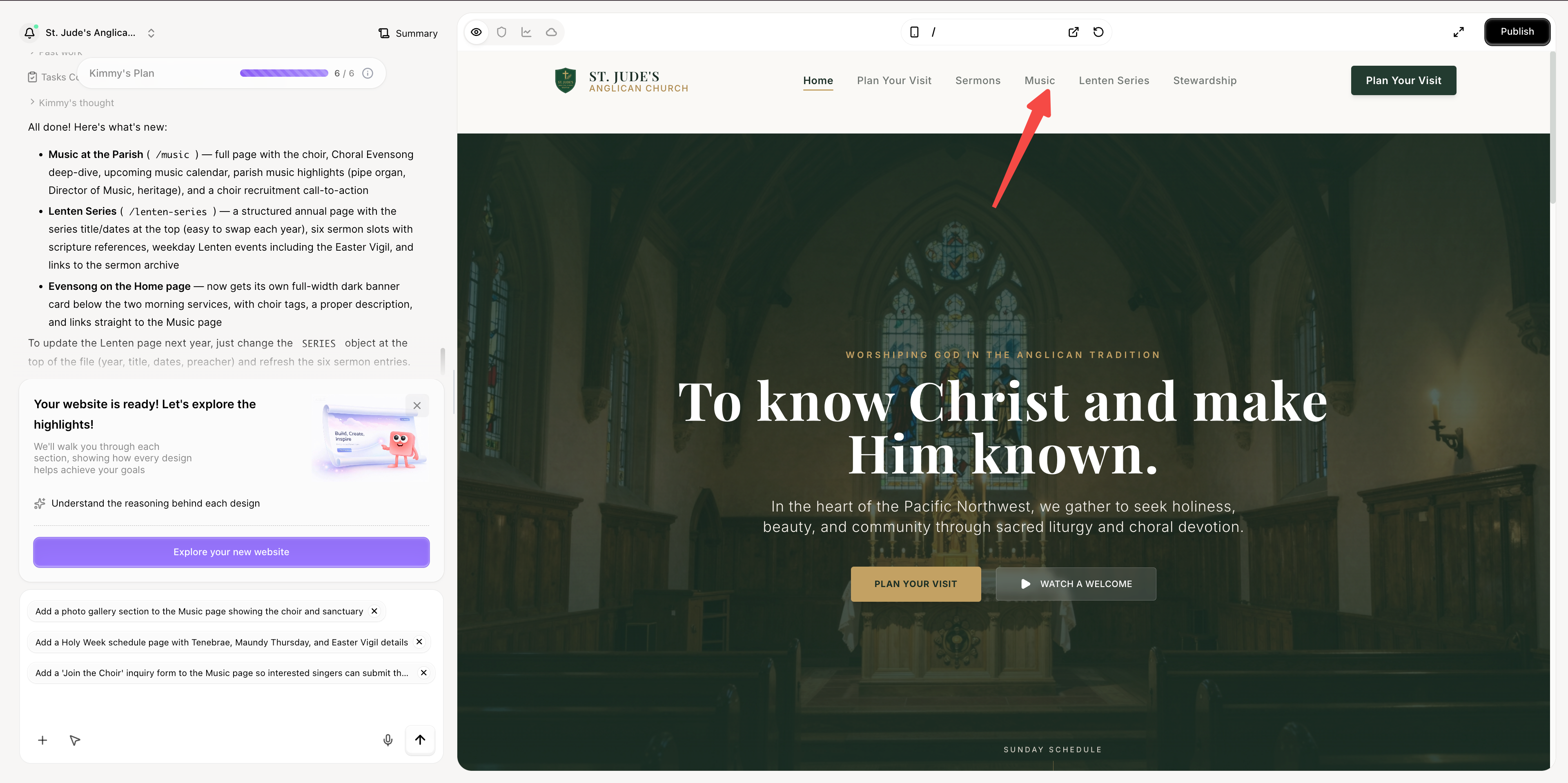
La plupart des plateformes de création de sites web d'églises vous obligent à commencer par un modèle qui ressemble à toutes les autres églises. Wegic n'utilise pas de modèles — il génère le site à partir d'une conversation sur votre église spécifique. Parlez à Wegic de votre tradition, de vos horaires de service, de vos ministères et de votre communauté, et l'IA génère un site adapté à votre congrégation réelle, et non à une mise en page standard.
Wegic est un système de croissance de sites web basé sur l'IA conversationnelle. Au lieu de choisir la mise en page pré-établie d'un modèle, vous décrivez votre église et Wegic écrit le code du site à partir de zéro — y compris l'archive des sermons, la page de dons, le flux « Planifiez votre visite » et la mise en page réactive.
Phase 1 : Briefez votre IA
Ouvrez Wegic et discutez avec Kimmy, votre chef de projet IA :
« Créez-moi un site web d'église pour une paroisse anglicane traditionnelle de 200 membres dans le Nord-Ouest Pacifique. Horaires des services : Eucharistie dite à 8h, Eucharistie chantée à 10h, Vêpres à 17h. Sermons en audio et texte. Une page claire « Planifiez votre visite » pour les nouveaux venus. Photos que je téléchargerai. Palette de couleurs discrète. Dons en ligne via Stripe, sans insistance. »

Phase 2 : Assemblage par l'IA en moins d'une minute
Le moteur alimenté par GPT de Wegic écrit le code à partir de zéro. En moins de 60 secondes, vous obtenez un site d'église multipage entièrement réactif avec les horaires des services dans l'en-tête, un parcours « Planifiez votre visite », une structure de bibliothèque de sermons prête à être remplie, des dons en ligne connectés à Stripe ou Tithe.ly, un design mobile-first qui fonctionne d'abord sur les téléphones, et les bases du référencement gérées dès le départ.

👇 Cliquez ci-dessous pour commencer avec Wegic

Phase 3 : Modifier par conversation
« Ajoutez une section « Musique à la paroisse » à la navigation — nous avons une chorale et voulons la mettre en valeur. Donnez aux Vêpres la même importance qu'aux services du matin. Ajoutez une page pour la série du Carême que je pourrai mettre à jour chaque année. »
Wegic propose 2 à 3 options de conception avec justification avant d'appliquer. Les variantes mobiles et de bureau restent synchronisées. Pour une couverture plus approfondie du flux de travail d'édition conversationnelle, consultez le tutoriel Wegic.
Phase 4 : Publier avec l'hébergement inclus
Publier. L'hébergement, le nom de domaine personnalisé, le
sitemap.xml auto-généré et les métadonnées SEO sont tous inclus. Pour une comparaison côte à côte de la façon dont Wegic se positionne par rapport aux constructeurs de sites web d'églises basés sur des modèles en termes de flexibilité et de qualité de conception, consultez notre examen approfondi de 5 outils d'IA de conception web.Conclusion : Adaptez le modèle à votre église, pas le modèle à votre bâtiment
Les 12 exemples de sites web d'églises dans ce guide fonctionnent parce que chacun a été adapté à une congrégation et une tradition spécifiques — et non tiré d'un modèle générique de méga-église. La conception de Notre-Dame axée sur la réservation fonctionne pour Notre-Dame parce que Notre-Dame a 11 millions de visiteurs annuels. La conception de St. Patrick axée sur les horaires de messe fonctionne parce que la congrégation de St. Patrick vient pour la messe. La photographie diversifiée du Brooklyn Tabernacle fonctionne parce que la congrégation du Brooklyn Tabernacle est diverse.
Si vous copiez un modèle qui ne correspond pas à votre église, le résultat est un site web qui ressemble à l'église de quelqu'un d'autre. Adaptez le modèle à votre communauté réelle, et le site web devient une invitation claire et honnête — ce à quoi sert une bonne conception de page d'accueil d'église.
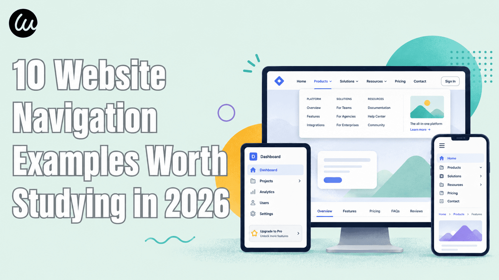
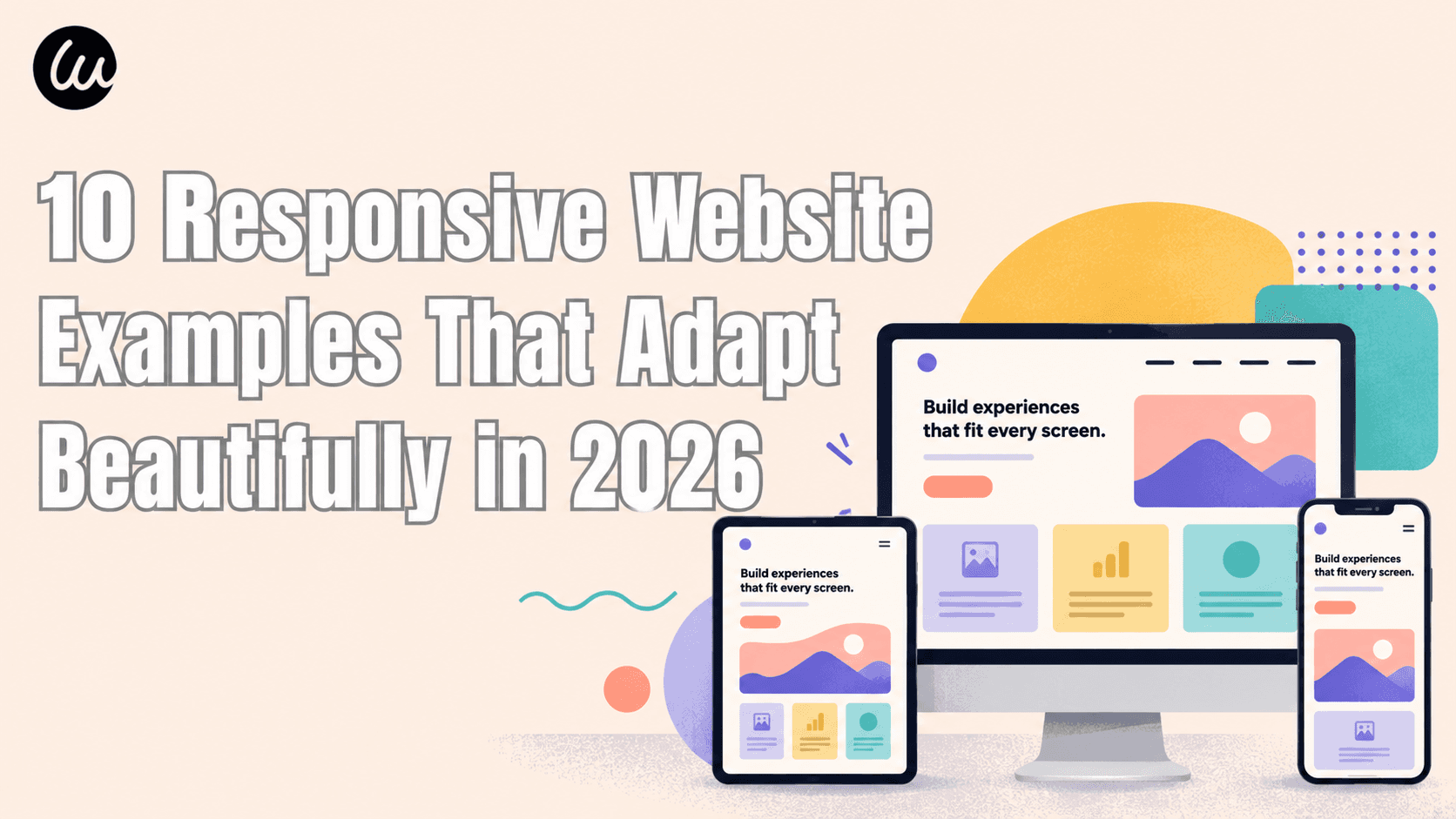
Pour plus d'inspiration de design dans d'autres catégories, consultez nos guides plus larges sur les exemples de pages d'accueil de sites web et les exemples de sites web de restaurants. Pour les fondations techniques, le guide des exemples de sites web responsives couvre les modèles "mobile-first" que la plupart des sites d'églises ne maîtrisent pas, et la collection d'exemples de navigation de sites web couvre les modèles de navigation qui se traduisent directement sur les sites d'églises.
FAQ
Quelles informations chaque site web d'église devrait-il inclure ?
Huit éléments essentiels, par ordre de priorité : (1) les horaires de service et l'adresse visibles sans défilement ; (2) une page claire "Planifiez votre visite" couvrant le stationnement, la tenue vestimentaire, les programmes pour enfants et ce à quoi s'attendre ; (3) une archive de sermons avec audio et idéalement du texte ; (4) le personnel et la direction avec photos et courtes biographies ; (5) les ministères organisés par étape de vie ou intérêt ; (6) les dons en ligne faciles à trouver mais pas insistants ; (7) un formulaire de contact et un numéro de téléphone clair ; (8) une page "Ce que nous croyons" ou une déclaration de foi. Facultatif mais de plus en plus attendu : la diffusion en direct, un calendrier des événements et un petit blog ou une newsletter d'église.
Quelle est la différence entre un site web d'église catholique et un site web évangélique ?
Un site web d'église catholique est centré sur le calendrier sacramentel (horaires de messe, confession, préparation au baptême, RCIA) et sert une communauté existante plus qu'il ne courtise les visiteurs. Un site web d'église évangélique a tendance à se concentrer sur le premier dimanche du visiteur — "Planifiez votre visite", ce à quoi s'attendre, l'introduction du pasteur principal. La page d'accueil du site catholique devrait rendre les horaires de messe et les informations de contact sacramentelles évidentes ; la page d'accueil du site évangélique devrait rendre le parcours du visiteur évident. Les deux philosophies de conception sont différentes et ne devraient pas être confondues.
Combien devrait coûter un site web d'église ?
Cela dépend de la taille et de la complexité. Une petite église peut lancer un site fonctionnel avec un constructeur alimenté par l'IA pour moins de 300 $/an, hébergement compris. Une église de taille moyenne avec plusieurs ministères, une archive de sermons et des dons en ligne dépense généralement entre 1 500 et 5 000 $/an pour une solution gérée. Une méga-église avec une production multimédia complète, une intégration d'applications et un design personnalisé dépense généralement entre 20 000 et 100 000 $ et plus pour la conception initiale, puis des coûts de développement continus. La plus grande variable est de savoir si l'église a besoin d'un design personnalisé ou peut utiliser un modèle bien pensé.
Quel est le meilleur constructeur de site web pour une petite église ?
Pour les projets de site web de petite église, trois options dominent en 2026 : les constructeurs basés sur l'IA comme Wegic génèrent un site personnalisé à partir d'une description en moins d'une minute ; Squarespace et Wix ont des modèles d'église soignés mais nécessitent un travail de mise en page manuel ; et les constructeurs spécifiques aux églises (Tithe.ly Sites, The Church Co, Subsplash) regroupent les dons, la diffusion en direct et la gestion de l'église. Le meilleur choix dépend si vous voulez de la flexibilité de conception (Wegic, Squarespace), des outils ministériels groupés (Subsplash, Tithe.ly), ou un coût très bas (le niveau gratuit de Wegic).
Comment ajouter des dons en ligne à mon site web d'église ?
Trois voies principales : (1) Intégration directe Stripe ou PayPal — la plus flexible, mais vous êtes responsable de la conception de la page de don ; (2) plateformes de don spécifiques aux églises comme Tithe.ly, Pushpay ou Subsplash Giving — conçues pour les églises, gèrent les dons récurrents, la gestion des donateurs et les reçus fiscaux ; (3) widgets intégrés de votre logiciel de gestion d'église (Planning Center, Breeze) si vous en utilisez déjà un. Pour la plupart des églises, une solution basée sur Tithe.ly ou Stripe offre le meilleur équilibre entre facilité et professionnalisme.
Les petites églises devraient-elles même se soucier d'avoir un site web ?
Oui — plus que jamais. Plus votre église est petite et peu connue, plus le site web devient important, car c'est ainsi que les visiteurs potentiels vous trouvent en premier lieu. Une église de 50 membres sans site web est invisible pour quiconque emménage dans le quartier. Une église de 50 membres avec un site web propre et honnête qui affiche les horaires de culte et un numéro de téléphone est trouvable. Le site web n'a pas besoin d'être élaboré. Il doit exister et répondre aux bases.
Quelle est une bonne mise en page de page d'accueil d'église ?
Une structure simple et reproductible pour la conception de la page d'accueil d'une église : (1) en-tête avec logo, navigation principale et horaires de culte persistants ; (2) héros avec un seul CTA clair (généralement « Planifiez votre visite ») ; (3) bande horaire des services sous le héros ; (4) aperçu du dernier sermon ; (5) 3 à 4 cartes de ministère (Enfants, Étudiants, Adultes, Sensibilisation ou similaire) ; (6) bande des événements à venir ; (7) déclaration de foi ou bloc « à propos de l'église » ; (8) pied de page avec adresse, contact et liens sociaux. Cette structure fonctionne pour les églises évangéliques, catholiques et historiques avec un léger réaménagement des priorités.
Les modèles de sites web d'églises valent-ils la peine d'être utilisés ?
Cela dépend. Les modèles de sites web d'églises de Tithe.ly, Subsplash ou Squarespace sont un point de départ rapide et abordable — mais ils ont tendance à faire en sorte que chaque église ressemble à toutes les autres églises utilisant le même modèle. Si votre église a une identité distinctive (une paroisse catholique avec messe latine, une congrégation pentecôtiste multiethnique, une implantation contemporaine), un modèle peut aplatir cette identité. Les sites générés par l'IA à partir d'outils comme Wegic évitent l'uniformité des modèles car chaque site est généré à partir de votre description spécifique, et non sélectionné dans une bibliothèque préexistante.