Are you trying to redesign your website homepage and keep getting stuck staring at generic "inspiration galleries" that all blur together? You're not alone. Having audited over 200 small-business and SaaS homepages in the last two years, I can tell you the single biggest reason a homepage underperforms isn't bad taste — it's that the owner couldn't point to a specific playbook they were trying to execute.
A good homepage does one job extremely well: it convinces a stranger, in under five seconds, that they're in the right place and that the next click is worth making. Everything else is decoration.
In this guide, we'll walk through 9 of the best website homepage examples on the internet right now — across SaaS, DTC, and service categories. For each one, you'll get:
- Who it's for (so you know when to copy it)
- What it does right (the specific mechanic, not vague "clean design")
- What to steal (the exact pattern you can apply this week)
At the end, I'll show you how Wegic's conversational AI lets you build a homepage using these same patterns in under a minute — no templates, no grid-wrestling.
Why Your Homepage Is Still Your #1 Conversion Asset in 2026
Before the examples, a quick primer on the numbers that should inform every homepage decision:
- 50 milliseconds. That's how long it takes a visitor to form an aesthetic first impression, according to a peer-reviewed study by Lindgaard et al. in Behaviour & Information Technology — the most-cited evidence in modern UX research.
- 75% of users judge a company's credibility based on its website design, per the Stanford Web Credibility Project.
- 53% of mobile visitors abandon a page that takes longer than 3 seconds to load, according to Google's mobile page-speed benchmarks.
- Google's current Core Web Vitals thresholds for a "good" page experience: Largest Contentful Paint under 2.5s, Interaction to Next Paint under 200ms, Cumulative Layout Shift under 0.1.
The takeaway isn't "make your site pretty." It's that speed, clarity, and immediate value communication are measurable — and every example below optimizes for those three levers.
Quick Note: Homepage vs. Landing Page
These two terms get confused constantly, and the distinction matters. A homepage is your front door: it serves multiple audiences, introduces your brand, and routes people to the right next step. A landing page is built for a single campaign or ad, usually strips out navigation, and exists to convert one specific audience on one specific action. The examples below are homepages, not landing pages. Don't copy a landing-page pattern onto your homepage — you'll confuse returning customers, press, and partners.
The 7-Layer Anatomy of a High-Converting Homepage
Every great homepage on the web has a recognizable skeleton. Here's the 7-layer anatomy I use when auditing homepages — you'll see each of these layers called out in the examples below:
- Hero — Logo, primary navigation, headline, sub-headline, primary CTA, hero visual or video. Your "elevator pitch in the doorway."
- Value Proposition Band — A short row (3–4 items, icons or stats) that answers *why you, not them*.
- Social Proof Strip — Customer logos, press mentions, review stars, or user counts. Placed just below the hero or after the first scroll.
- Product / Service Grid — What you actually do, broken into 3–6 modular blocks. Each block links to a deeper page.
- Narrative Section — The emotional story: case study, founder message, mission statement, or demo video.
- Trust & Proof — Testimonials with faces, named case studies, certifications, security badges.
- Footer CTA — The final "if you didn't click anything yet, click this" block.
If any layer is missing or weak on your homepage, you have a conversion leak. Use the examples below to see how the best brands fill each one.

3 SaaS & Tech Homepage Examples (Clarity Wins)
1. Linear — The Masterclass in 7-Word Clarity
Who it's for: B2B SaaS, developer tools, any product with a sharp ICP.
Linear sells project management software to engineers, and its homepage is a template every SaaS founder should study. The hero headline — "Linear is a purpose-built tool for planning and building products" — does the entire job of the fold in a single, un-hedged sentence.
What works: Zero jargon. Zero "empowering" or "unlock." The sub-headline adds one concrete benefit, and there's a single CTA: "Get started." No floating chat widget, no carousel, no dual CTAs competing for attention.
What to steal: Run your current hero headline through a simple test — could a first-time visitor, in 5 seconds, accurately describe what your product does to a friend? If not, rewrite it until they could. Linear spends its clarity budget on being understood, not on being clever.

Image by Linear
2. Stripe — A Developer-First Hero, a Marketer-Ready Body
Who it's for: Products serving two distinct buyers (a technical user and an economic buyer).
Stripe's homepage has been a reference point for a decade because of how it serves two audiences in one scroll: the technical buyer (who wants API evidence) and the business buyer (who wants case studies and logos).
What works: The hero headline is legible to a CEO (*"Financial infrastructure for the internet"*), but the very next band shows a live code snippet with animated gradient borders. This dual-signal hero says "we're serious about both sides of your org." Below it, massive customer logos (Amazon, Google, Shopify) close the trust gap in a single line.
What to steal: If you sell to more than one buyer persona, don't water down your hero to please both — layer them. Headline for the economic buyer, visual for the practitioner, logos to close the trust gap.

Image by Stripe
3. Notion — The Audience-Switching Homepage
Who it's for: Products with 2+ legitimately distinct ICPs (ideal customer profiles).
Notion's homepage uses explicit audience tabs ("For teams," "For enterprises," "For students") that swap the visual and value proposition without a full page reload.
What works: Instead of writing one vague headline for everyone, Notion writes one sharp headline per audience and lets visitors self-select. This is a conversion unlock for multi-audience products.
What to steal: If your product truly serves multiple distinct audiences, build an interactive audience switcher into your hero or just below it. If it only kind of serves multiple audiences, pick your strongest ICP and speak only to them. A split homepage trying to please everyone is the #1 mistake I see in B2B redesigns.

Image by Notion
3 E-commerce & DTC Homepage Examples (Personality Wins)
4. Oatly — When Brand Voice Is the Design
Who it's for: Commodity-category brands competing on personality (coffee, socks, skincare, snacks).
Oatly's homepage reads like a zine wrote a business. Handwritten-style copy, deliberately offbeat layouts, and taglines like "It's like milk, but made for humans" turn the homepage into a character, not a catalog.
What works: Oatly isn't competing on price or product specs — they're competing on *being the oat-milk brand you'd invite to a dinner party*. The homepage compounds that personality with every line of copy.
What to steal: If you're in a commodity category, your fastest moat is voice. Audit every sentence on your homepage: would anyone read it aloud and know it's *you*? If not, inject personality. Even a 20% voice injection separates you from 95% of your category. (See more creative website design examples for how brands do this.)

Image by Oatly
5. Allbirds — Mission-Driven Hero Without the Preachiness
Who it's for: DTC brands with a real values story — sustainability, ethics, provenance.
Allbirds leads with the product shot and a quiet line about carbon footprint rather than a giant "SUSTAINABILITY" banner. The carbon-footprint badge on every product card does the ethical work without beating visitors over the head.
What works: The homepage trusts the visitor to care. It shows the values rather than announcing them, which is the harder — and more credible — path.
What to steal: If your brand has a values story, embed it in product cards, icons, or footer callouts rather than a page-dominating banner. Brands that show their values convert; brands that shout them get ignored.

Image by Allbirds
6. Glossier — Community as Social Proof
Who it's for: DTC brands with engaged customers; beauty, fashion, fitness, lifestyle.
Glossier's homepage doesn't say "trusted by millions." It shows user-generated content — real customer photos tagged in a rotating grid just below the hero. Each photo links to the product the person is wearing.
What works: The UGC grid is social proof and product discovery in one unit. It also does what most testimonial strips miss — it shows real people who look like the target customer, not stock photos.
What to steal: Replace one testimonial block on your homepage with a UGC or customer-photo grid. If you don't have UGC yet, even a row of real customer-provided photos (with permission) outperforms a row of stock smiles. For more context, see our guide to call-to-action examples in writing.

Image by Glossier
3 Service & Marketplace Homepage Examples (Trust Wins)
7. Airbnb — The Search Bar Is the Hero
Who it's for: Marketplaces, booking platforms, configurators — any site with a single high-intent action.
Airbnb's homepage is famously minimal: a massive hero image, a headline, and a search bar that takes up most of the fold. There's no "Learn more." There's no feature tour. The core action is the homepage.
What works: Airbnb knows exactly what its visitors want to do. Instead of teaching them, it *hands them the tool*. This is a "primary-action-as-hero" pattern that works whenever your visitors already know what they want.
What to steal: If your site has a single high-intent action (search, book, configure, get a quote), promote that interactive element to hero position. Don't bury it under a carousel.

Image by Airbnb
8. Patagonia — Mission Statement as Value Prop
Who it's for: Retail and content-driven brands with genuine editorial expertise or point of view.
Patagonia's homepage opens with editorial journalism, product education, and environmental activism — actual content, not a hero image. Counter-intuitive for a retail brand, but the data says it works: Patagonia has some of the highest repeat-purchase rates in outdoor apparel.
What works: The homepage treats shoppers as readers and members, not as wallets. That earns a trust dividend no CTA button can buy.
What to steal: If your brand has genuine expertise or a point of view, commit a portion of your homepage to content, not sales. A featured essay, field report, or customer story in the hero position signals confidence and builds long-term credibility.

Image by Patagonia
9. Basecamp — The Long-Form, Opinionated Homepage
Who it's for: Products with a philosophy, a strong worldview, or a narrow-but-loyal ICP.
Basecamp (by 37signals) throws the "short homepage" rulebook out the window. The page is long, heavily typographic, and opinionated — with entire paragraphs arguing why their product is built the way it is.
What works: The long-form homepage is a filter. People who read it and agree become lifetime customers; people who don't bounce early. Basecamp is happy to lose the bad-fit visitor upfront.
What to steal: Don't assume short = good. If your product is a worldview, not a feature set — a way of working, a philosophy — let the homepage breathe long enough to explain it. Often the best conversion filter is a longer homepage, not a shorter one.
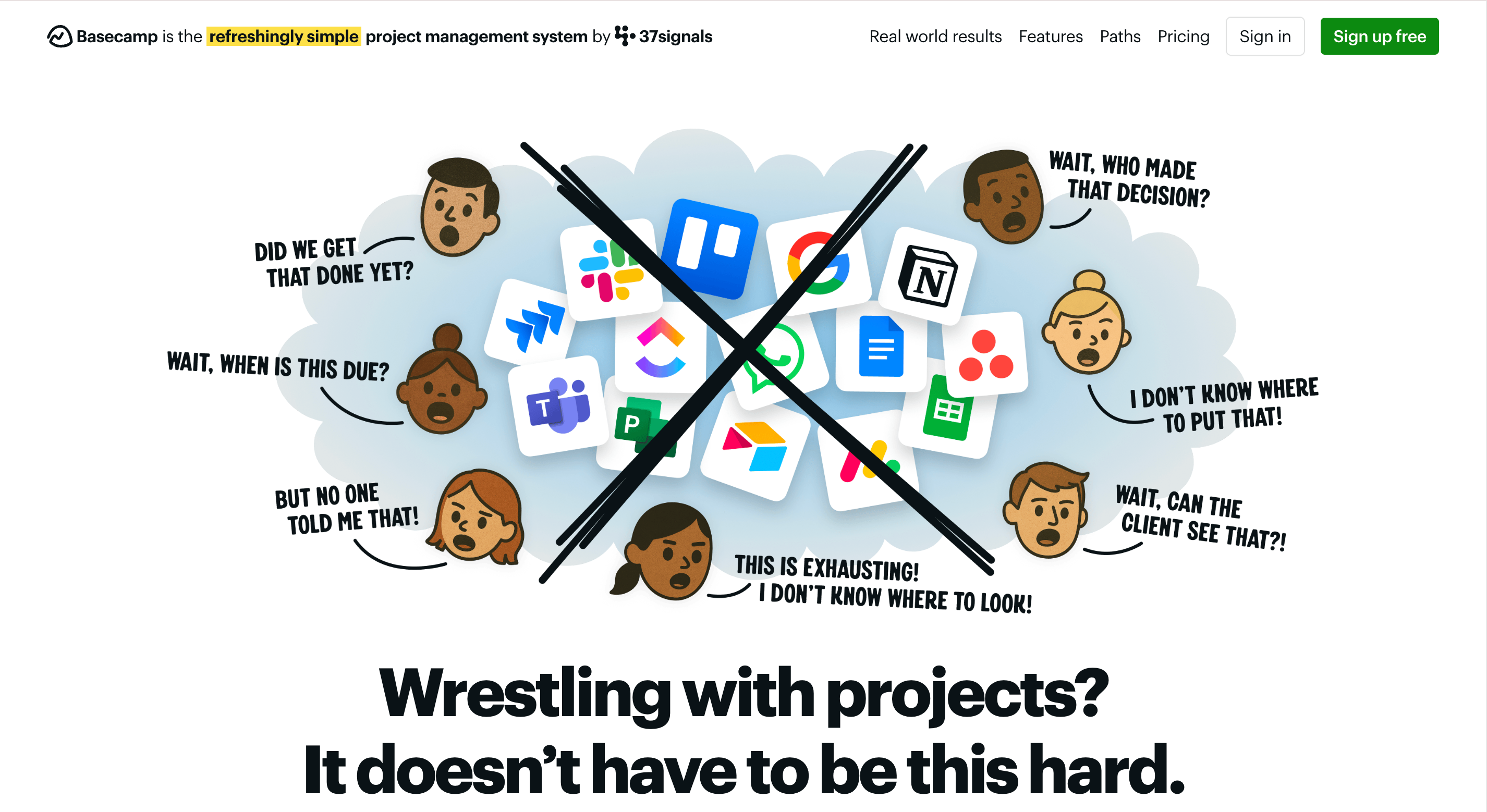
Basecamp homepage long-form opinionated designImage by Basecamp
5 Homepage Mistakes That Are Killing Your Conversions in 2026
Studying great homepages is only half the exercise. Here are the five patterns I see kill conversions on almost every audit I run:
- Hero carousels. Despite appearing on 43% of sites, Nielsen Norman Group testing shows auto-forwarding sliders hurt usability and conversion. Pick one hero message and commit.
- Vague headlines. "Empowering your journey to success." Nobody knows what you do. Be concrete.
- Auto-playing video with sound. The fastest way to get someone to close the tab.
- Three equally-weighted CTAs above the fold. If everything is a primary CTA, nothing is. Pick one.
- Cookie banner + chatbot + popup within five seconds. Each of these alone is tolerable. Together, they're a wall.
How to Build a Homepage Like These in Minutes with Wegic
You've seen the patterns. Now the hard part — implementing them without a designer, a developer, or three weeks of theme-fighting. This is exactly what Wegic was built for.
Wegic isn't a template builder. It's a conversational AI website growth system that generates a bespoke, fully-coded homepage from a description of your business. You describe; it builds.
Phase 1: Brief Your AI
Open Wegic and chat with Kimmy, your AI project manager. Instead of choosing a template, describe what you want using the patterns from this article:
"I need a homepage for a B2B analytics SaaS. Hero like Linear — one-sentence value prop, single CTA, no carousel. Add a Stripe-style logo strip below the hero, then a three-column feature grid. End with a long-form mission section like Basecamp."

Phase 2: AI Assembly
Wegic's GPT-powered engine reads your brief and writes the code from scratch. In under 60 seconds, you get a fully responsive multi-section homepage — not a pre-made template with your text dropped in. The AI handles visual hierarchy, mobile breakpoints, Core Web Vitals optimization, and on-page SEO defaults.

👇 Click the image below to start with Wegic!

Phase 3: Smart Tweaks — Just Talk to It
Traditional builders force you into CSS panels. Wegic lets you edit by chat:
"Make the hero headline shorter and punchier — under 10 words. Replace the third feature block with a testimonial carousel. Change the primary CTA from 'Start Free Trial' to 'See a 2-Minute Demo'."
Wegic proposes 2–3 design options with design reasoning before applying changes, so you never break your own mobile view — a known risk with traditional builders. Learn more about responsive website design.

Phase 4: One-Click Launch — Hosting Included
Hit "Publish." Wegic provides hosting, a custom domain option, an auto-generated
sitemap.xml, and SEO metadata out of the box. Your homepage is live and indexable within minutes.
Conclusion: Your Homepage Is a Decision, Not a Document
The nine website homepage examples above aren't "best" because they're pretty. They're best because each one commits to a single, legible job and executes that job with specificity — one audience, one action, one voice, one promise.
Most homepages underperform because they try to do everything. The fix isn't more design work. It's more *decision-making*: who is this for, what do we want them to do, and what's the single most credible way to ask?
Once you've made those decisions, the rest is execution — and with Wegic, execution is a five-minute conversation, not a five-week sprint.
FAQs
What's the difference between a website homepage and a landing page?
A homepage is your brand's front door — it serves multiple audiences, introduces your brand, and routes visitors to the right section of your site (products, pricing, about, blog). A landing page is built for a single campaign or ad, typically strips out navigation, and exists to convert one specific audience on one specific action. A homepage optimizes for *discovery*; a landing page optimizes for *conversion*.
How many CTAs should a homepage have?
Exactly one primary CTA (repeated 2–4 times down the page) and up to two secondary CTAs for lower-intent visitors. Above the fold, never show more than one visually dominant button. When you show three equal-weight CTAs, click-through typically drops because visitors freeze on the choice.
What's the ideal length for a website homepage in 2026?
There's no universal answer. Short homepages (Airbnb, Linear) work when visitors already know what they want. Long, opinionated homepages (Basecamp, Patagonia) work when your product is a philosophy that needs explaining. The rule: make the homepage as long as it takes to answer every objection a warm lead would raise, and not a pixel longer.
How fast should my homepage load?
Aim for Google's Core Web Vitals "good" thresholds: Largest Contentful Paint under 2.5 seconds, Interaction to Next Paint under 200ms, and Cumulative Layout Shift under 0.1. Above 3 seconds of load time, you lose roughly half your mobile traffic before they see your headline.
Do I need a hero video on my homepage?
No — and most small businesses shouldn't use one. Hero videos are expensive to produce well, add load time, and can push key content below the fold. A single high-quality image with a strong headline outperforms a mediocre video every time. Use video only if (a) your product is best demonstrated in motion and (b) you can produce it at professional quality.
Can AI actually build a homepage as good as these examples?
In 2026, yes — for most use cases. Tools like Wegic generate bespoke code (not templates) from a conversational brief and automatically apply layout, typography, and mobile-responsive best practices. For a homepage where your brand positioning is already clear, AI gets you to roughly 90% of the quality of a custom build in 1% of the time. You still need a human to make the positioning decisions that the AI then executes.