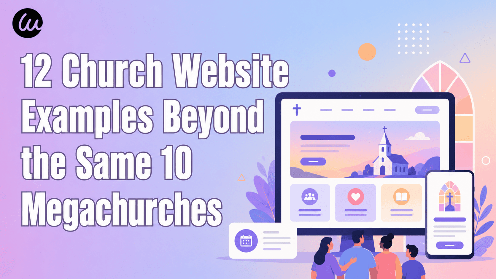
Uma Reinicialização Rápida: Por Que o Site da Sua Organização Sem Fins Lucrativos Importa Mais do Que a Maioria dos Conselhos Percebe
Três fatos em linguagem simples antes dos exemplos:
- Para a maioria dos doadores de primeira viagem, seu site é o primeiro contato com sua organização — não um evento de gala, não uma mensagem de texto de um amigo, mas uma busca depois de ler uma notícia. Se essa página não responder "quem são vocês, o que fazem, para onde meu dinheiro realmente vai", muitos fecham a aba.
- Mais da metade do tráfego de sites de organizações sem fins lucrativos agora vem de celulares. Doadores pesquisam causas enquanto esperam na fila do café ou na cama à noite. Um site difícil de ler no celular perde doações antes mesmo de alguém clicar em "Doar".
- Seu site é o sinal de confiança de fato para sua organização. Um doador em potencial formará uma impressão do seu profissionalismo, sua transparência e sua competência antes de conhecer qualquer pessoa. Um site claro e honesto sinaliza uma organização clara e honesta; um site desorganizado ou vago sinaliza o oposto — justa ou injustamente.
Cada exemplo abaixo é selecionado porque resolve pelo menos uma dessas três tarefas de uma forma que vale a pena estudar — em modelos organizacionais muito diferentes.
4 Categorias de Padrões — Escolha o Que Combina com Sua Organização Sem Fins Lucrativos
Os 12 exemplos de sites de organizações sem fins lucrativos neste guia se agrupam claramente em quatro padrões de design. Cada padrão resolve um problema fundamental diferente — acesso ao conhecimento, conteúdo investigativo, resposta a crises ou defesa de população específica — e sua escolha deve ser impulsionada pelo que sua organização realmente faz, e não pelo padrão que parece mais moderno.
Padrão | Melhor para | Exemplos de organizações | |
1 | Bens comuns de conhecimento (o site É o presente) | Conhecimento aberto, educação, arquivos sem fins lucrativos | Wikipedia, Internet Archive, Khan Academy |
2 | Redação sem fins lucrativos (investigação é a missão) | Jornalismo de interesse público, organizações de prestação de contas | ProPublica, The Marshall Project, Bellingcat |
3 | Resposta a crises humanitárias | Ajuda humanitária, assistência médica, advocacia urgente | MSF, British Red Cross, Crisis |
4 | Advocacia por causas específicas & populações vulneráveis | LGBTQ, saúde mental, financiamento da educação, segurança alimentar | The Trevor Project, DonorsChoose, Trussell Trust |
Os 12 exemplos de sites de organizações sem fins lucrativos abaixo estão organizados nestes quatro grupos. Escolha a linha que mais se aproxima do seu trabalho e, em seguida, use as estratégias que se encaixam.
Padrão 1: Conhecimento Comum — Quando o Site É Aquilo Para o Qual Você Está Doando
Esta categoria recebe quase zero atenção nas listas padrão dos melhores sites de organizações sem fins lucrativos e é um dos conjuntos mais negligenciados de exemplos de sites de organizações sem fins lucrativos no setor. Quando o produto é o site — quando os doadores não estão financiando um programa separado, mas a própria infraestrutura digital que estão usando — a página inicial tem um trabalho diferente de uma instituição de caridade típica. Ela precisa defender a coisa que o visitante já está recebendo de graça.
1. Wikipedia / Wikimedia Foundation — O Pedido de Banner Mais Bem-Sucedido do Mundo
Padrão: Front-end de enciclopédia + banners de doação periódicos no contexto + um site de fundação separado para transparência
A Wikipedia é o quinto site mais visitado do mundo e um dos mais bem-sucedidos exemplos de sites de organizações sem fins lucrativos de todos os tempos — mas a maioria dos visitantes nunca vê o site da Wikimedia Foundation. Eles veem a Wikipedia, a enciclopédia. O modelo de arrecadação de fundos é construído em um banner que aparece no topo dos artigos durante campanhas sazonais, pedindo pequenas doações de leitores regulares. O texto do banner parece uma carta do fundador, não um discurso de marketing. O próprio site da Wikimedia Foundation, separadamente, é onde doadores institucionais, jornalistas e visitantes curiosos sobre governança encontram relatórios financeiros, posições políticas e a entidade legal por trás da enciclopédia.
Três coisas para copiar:
- Separe o site do seu produto do site de arrecadação de fundos/governança se eles atenderem a públicos diferentes. A maioria das organizações sem fins lucrativos agrupa "Doar", "Sobre", "Relatório Anual" e "Programa" em uma única página. A Wikipedia mantém o produto em destaque e direciona doadores sérios/jornalistas/reguladores para um segundo site. Para organizações sem fins lucrativos onde o programa é o produto digital, essa divisão em dois sites esclarece ambos os públicos.
- Banners de doação no contexto superam páginas de doação separadas. O banner da Wikipedia aparece onde o leitor já está usando o produto. A relevância é a conversão. Para organizações sem fins lucrativos com alto tráfego para conteúdo específico (um blog, um banco de dados, uma ferramenta), pedidos incorporados superam o direcionamento de pessoas para uma página
/doarseparada. - Escreva seu pedido de doação como uma carta, não como uma campanha de marketing. O banner da Wikipedia é assinado (muitas vezes por Jimmy Wales ou outro líder da fundação), escrito em primeira pessoa simples e reconhece que a maioria dos leitores não doará. Essa honestidade converte melhor do que urgência ou culpa.

2. Internet Archive — Biblioteca, Missão, Página de Doação em Um Só Lugar
Padrão: Página inicial de biblioteca digital pública que funciona como um argumento de venda para a organização sem fins lucrativos
O Internet Archive abriga a Wayback Machine, milhões de livros digitalizados, software vintage, áudio e vídeo — tudo acessível gratuitamente. Entre os exemplos de sites de ONGs em larga escala, é um dos mais incomuns: a página inicial é essencialmente um catálogo de biblioteca, mas a navegação persistente inclui um link "Doar" que tem o mesmo peso visual que "Pesquisar" e "Sobre". Isso é incomum: a maioria das organizações sem fins lucrativos coloca a doação atrás de uma página separada ou de um CTA de destaque. O Archive trata a doação como um item de navegação permanente, da mesma forma que uma biblioteca pública trataria a associação. O resultado é que um visitante pesquisando um jornal de 1972 pode doar cinco dólares ao sair sem sentir que está sendo alvo de marketing.
Três coisas para copiar:
- Um link "Doar" na navegação principal, em todas as páginas, em todos os dispositivos. Muitos sites de organizações sem fins lucrativos escondem a doação em "Participe" ou "Apoie-nos". O Internet Archive a torna tão fácil de descobrir quanto a Pesquisa. Doadores doam quando estão com a mentalidade certa — sempre mostre o caminho.
- Para organizações com um arquivo ou biblioteca digital, exponha o catálogo na página inicial. Não faça os doadores adivinharem o que seu dinheiro preserva. A página inicial do Internet Archive mostra livros, softwares e arquivos reais sendo preservados. O produto é o argumento para o apoio.
- O posicionamento de bem público supera o posicionamento de caridade para doadores instruídos. O texto do Internet Archive enquadra a organização como "o equivalente digital de uma biblioteca pública", não como um caso de caridade. Para organizações sem fins lucrativos cujos doadores são profissionais, bem informados ou institucionais, apostar em um enquadramento de bem público supera apelos baseados em dificuldades.

3. Khan Academy — Quando Seu Produto Atinge 150 Milhões de Alunos
Padrão: Plataforma de aprendizado gratuita com um fluxo de doação separado e claramente marcado que financia a própria plataforma
A Khan Academy atinge cerca de 150 milhões de alunos em todo o mundo e opera como uma organização sem fins lucrativos 501(c)(3) financiada principalmente por doações filantrópicas. Entre os exemplos de sites de organizações sem fins lucrativos de plataformas educacionais, é o caso mais estudado: o trabalho principal do site é fornecer aulas de matemática, vídeos de ciências e preparação para o SAT para os alunos — não converter visitantes em doadores. Mas o caminho de "Doação" é honesto e bem projetado: uma página dedicada que explica a economia de custo por aluno, uma opção para doar mensalmente e níveis de doação nomeados que refletem a estrutura orçamentária real da organização. É importante ressaltar que a experiência de aprendizado nunca é bloqueada por paywall ou restrita por um pedido de doação — o que é, por si só, uma declaração de arrecadação de fundos.
Três coisas para copiar:
- Nunca restrinja seu serviço para forçar doações. A Khan Academy poderia colocar pop-ups de "apoie-nos" em cada vídeo. Eles não o fazem. A confiança que se constrói com os alunos e seus pais — muitos dos quais se tornam doadores anos depois — é mais valiosa do que a conversão de curto prazo.
- Mostre a economia de custo por impacto em sua página de doação. A página de doação da Khan Academy explica aproximadamente o que cada nível de doação financia em termos de alcance de alunos. Isso é mais credível do que argumentos aspiracionais e dá aos doadores um quadro para escolher um valor.
- A doação mensal merece seu próprio destaque visual. A Khan Academy destaca a doação mensal recorrente com peso visual igual ou maior do que as doações únicas. Doadores recorrentes são a aquisição mais valiosa para organizações sem fins lucrativos — o site deve refletir isso.

Padrão 2: Redações de Notícias Sem Fins Lucrativos — Quando a Investigação É o Programa
Esta é outra categoria que os resumos padrão de exemplos de sites de organizações sem fins lucrativos quase ignoram completamente: organizações sem fins lucrativos de jornalismo de interesse público cujo programa inteiro é a reportagem que produzem. Esses sites se parecem mais com redações do que com instituições de caridade, e as lições de design desses exemplos de sites de organizações sem fins lucrativos se aplicam a qualquer organização sem fins lucrativos cujo principal produto seja pesquisa, relatórios ou conteúdo.
4. ProPublica — Uma 501(c)(3) Que Parece Uma Redação Porque É Uma
Padrão: Página inicial de redação investigativa com enquadramento da missão no rodapé e doações como um CTA secundário permanente
A ProPublica é uma organização sem fins lucrativos de jornalismo investigativo vencedora do Pulitzer e um dos exemplos de sites de organizações sem fins lucrativos mais distintos na categoria de jornalismo de interesse público. A página inicial é estruturada como o The New York Times, não como uma instituição de caridade — matéria principal acima da dobra, matérias secundárias em cartões abaixo, seções organizadas por editoria (Saúde, Política, Justiça, Clima). O botão "Doar" fica no cabeçalho, mas não domina. O enquadramento de "Sobre" e da missão é deliberadamente discreto; o que defende o apoio é o próprio trabalho. Isso é o inverso da maioria das páginas iniciais de organizações sem fins lucrativos — que começam com sua declaração de missão e escondem o trabalho real.
Três coisas para copiar:
- Se o seu programa produz conteúdo, projete como uma publicação. A maioria dos sites de organizações sem fins lucrativos são brochuras com uma barra lateral de "Últimas Notícias". A ProPublica é uma publicação com um pedido discreto de doação. A conversão vem do leitor impressionado com o trabalho, não de ser solicitado.
- Experiência do leitor em primeiro lugar, pedido de doação em segundo. Os artigos mais lidos da ProPublica recebem tratamento de página inteira, tipografia generosa e visualizações de dados incorporadas. O pedido de doação aparece no final dos artigos, depois que o leitor experimentou o valor. Essa sequência supera dramaticamente os pedidos antecipados.
- Republicar e creditar é uma estratégia de distribuição. A ProPublica licencia explicitamente suas reportagens sob Creative Commons para qualquer redação republicar. Cada republicação carrega um rodapé "ProPublica é uma redação sem fins lucrativos...", que é a construção de conscientização mais eficaz que qualquer pequena organização sem fins lucrativos poderia pedir. Se o seu conteúdo é o seu programa, distribua-o com atribuição.

5. The Marshall Project — Foco em Uma Única Questão, Executado com Maestria
Padrão: Redação de notícias sobre justiça criminal com uma forte identidade editorial e enquadramento explícito de organização sem fins lucrativos
O Marshall Project cobre uma única editoria — o sistema de justiça criminal dos EUA — e o design reflete esse foco. Entre os exemplos de sites de organizações sem fins lucrativos de questão única, é uma aula de mestria em disciplina editorial: tipografia serifada forte, paleta de cores contida e um layout editorial que permite que investigações de formato longo respirem. O rodapé carrega o enquadramento da organização sem fins lucrativos: um claro "Somos uma organização de notícias sem fins lucrativos. Apoie nosso trabalho" com um CTA de doação. Sua newsletter "Closing Argument", que chega semanalmente com um único ensaio original, é essencialmente o motor de alcance da organização — e é exibida proeminentemente na página inicial.
Três coisas para copiar:
- Uma organização sem fins lucrativos com uma única causa pode construir uma identidade editorial mais forte do que uma generalista. O foco do Marshall Project na justiça criminal lhes confere uma consistência visual e tonal que organizações sem fins lucrativos mais amplas têm dificuldade em igualar. Se você tem um foco de causa restrito, invista nisso visualmente.
- Uma newsletter de destaque é o ativo mais subestimado de uma organização sem fins lucrativos. A "Closing Argument" do Marshall Project é o que faz os leitores voltarem semanalmente — e o que os converte em doadores ao longo do tempo. Para qualquer organização sem fins lucrativos que produz conteúdo, trate a newsletter como um produto principal, não como um item secundário.
- O jornalismo de membros supera o jornalismo de assinatura para organizações sem fins lucrativos. O Marshall Project pede aos leitores para "se tornarem membros" em vez de "assinarem". Essa abordagem posiciona a doação como participação em uma missão, não como pagamento por um serviço. A mesma lógica de conversão se aplica à maioria das organizações sem fins lucrativos — enquadre a doação como pertencimento.

6. Bellingcat — Investigação de Código Aberto como Modelo Sem Fins Lucrativos
Padrão: Coletivo de investigação com uma seção de metodologia "como fazemos" tão central quanto as próprias investigações
Bellingcat é uma organização de jornalismo investigativo sem fins lucrativos sediada na Holanda, especializada em inteligência de código aberto — verificando conflitos, crimes de guerra e desinformação usando dados publicamente disponíveis, imagens de satélite e mídias sociais. Entre os exemplos de sites de organizações sem fins lucrativos internacionais, ele possui uma adição única: uma seção dedicada a "Recursos" que ensina a metodologia da investigação de código aberto. As investigações em si são o programa, mas a seção de metodologia treina a próxima geração de pesquisadores. A página "Sobre" explica explicitamente a estrutura de financiamento da organização sem fins lucrativos e recusa certos financiamentos governamentais para proteger a independência editorial.
Três coisas para copiar:
- Mostre sua metodologia, não apenas seus resultados. O Bellingcat publica as técnicas que usa para verificar vídeos, geolocalizar imagens e analisar dados de voo. Para organizações sem fins lucrativos de pesquisa e investigação, a transparência da metodologia é a forma mais profunda de construção de credibilidade.
- Seja explícito sobre as fontes de financiamento e recusas. O Bellingcat publica uma lista de quem os financia e quais fontes eles recusam (por exemplo, eles não aceitam dinheiro de serviços de inteligência). Esse nível de transparência é mais poderoso do que qualquer texto de "Nossos Valores".
- Workshops, bolsas e programas de treinamento merecem destaque na página inicial. O Bellingcat treina jornalistas e pesquisadores em todo o mundo. O treinamento é tanto um programa (missão) quanto uma linha de receita (taxas). Para organizações sem fins lucrativos que fazem ambos, exponha a oferta de forma proeminente.

Padrão 3: Resposta Humanitária e a Crise — Quando a Página Inicial Pode Mudar Hoje à Noite
Os exemplos de sites de organizações sem fins lucrativos de resposta a crises enfrentam um problema de design que a maioria das instituições de caridade não tem: a página inicial pode precisar ser reescrita em 30 minutos quando um grande evento acontece. Um terremoto, um surto, uma escalada de conflito — o site precisa exibir mensagens de resposta a emergências, aceitar doações urgentes e fornecer links para informações de segurança, tudo enquanto o restante da organização ainda está operando seus programas normais.
7. Médicos Sem Fronteiras (Doctors Without Borders) — Flexibilidade Editorial Sob Pressão
Padrão: Organização médica humanitária multinacional com uma página inicial construída para atualizações editoriais rápidas à medida que as crises se desenrolam
MSF opera em mais de 70 países e é um dos exemplos de sites de organizações sem fins lucrativos mais amplamente referenciados para design editorial — lidando com um fluxo constante de notícias dessas operações. A página inicial é essencialmente um layout editorial — história principal, cartões secundários, filtros de país e tópico — que qualquer editor pode atualizar em minutos. Quando a situação em Gaza, Sudão ou Haiti muda, a página inicial reflete isso no mesmo dia. Os apelos à doação permanecem consistentemente visíveis, mas não competem com as notícias; o princípio é "conte a verdade, então deixe as pessoas decidirem se querem ajudar". Os sites separados da MSF específicos para cada país (msf.org para internacional, doctorswithoutborders.org para os EUA, doctorswithoutborders.ca para o Canadá, etc.) mantêm o controle editorial regional sem fragmentar a marca.
Três coisas para copiar:
- Construa um sistema editorial, não um site de marketing. Se sua organização sem fins lucrativos responde a situações de rápida mudança, seu CMS deve permitir que qualquer membro da equipe de comunicação publique uma atualização sem a ajuda da engenharia. Sites focados em marketing são muito frágeis para a resposta a crises.
- Subsites específicos por país com identidade compartilhada. A MSF mantém domínios separados para os principais países doadores, mantendo a consistência visual e editorial. Isso atende às regulamentações regionais de arrecadação de fundos e ao público em idiomas locais, sem forçar um único site a fazer tudo. Para exemplos de sites de ONGs de vários países, essa estrutura de hub-and-spoke é o padrão dominante em 2026.
- Testemunhe como uma categoria de conteúdo, não uma tática de marketing. O conteúdo "Voices from the Field" da MSF apresenta citações diretas e histórias de funcionários de campo e pacientes. Isso é o oposto de marketing polido — e converte doadores precisamente porque não parece fabricado.

8. Cruz Vermelha Britânica — Quando você executa programas de longo prazo e resposta a emergências
Padrão: Grande instituição de caridade humanitária estabelecida com uma página inicial de modo duplo — programas de estado estável em dias normais, banner de emergência em dias de crise
A Cruz Vermelha Britânica oferece suporte de ambulância, serviços para refugiados, treinamento de primeiros socorros e uma rede de lojas de caridade no Reino Unido, enquanto também responde a emergências internacionais através da rede global da Cruz Vermelha. Entre os exemplos de sites de organizações sem fins lucrativos grandes e estabelecidas, ela lida com estados de estabilidade e resposta a crises com notável elegância. Em um dia normal, a página inicial apresenta campanhas, voluntariado e recursos de primeiros socorros. Quando uma emergência ocorre, um banner assume o topo de cada página com um apelo de emergência dedicado e fluxo de doação. O conteúdo da loja e de primeiros socorros permanece acessível, mas recua. A alternância entre o estado estável e o modo de crise é estrutural, não improvisada.
Três coisas para roubar:
- Projete sua página inicial com dois modos desde o primeiro dia. Não espere uma crise para descobrir como apresentar um apelo de emergência. Crie um espaço em seu modelo que qualquer líder de comunicação possa preencher em minutos durante uma crise.
- Receita multicanal merece área de superfície multicanal. A Cruz Vermelha Britânica financia seu trabalho por meio de doações, lojas de caridade, taxas de cursos de primeiros socorros e contratos governamentais. O site expõe todos esses caminhos de receita — não apenas doações. Para organizações sem fins lucrativos com receita diversificada, o site deve corresponder.
- Recrutamento de voluntários como conteúdo de primeira classe. O cadastro de voluntários recebe navegação proeminente e uma clara explicação "o que está envolvido". Para a maioria das organizações sem fins lucrativos, os voluntários são tanto mão de obra quanto futuros doadores. Não trate o caminho do voluntário como uma reflexão tardia.

9. Crisis (Moradores de Rua no Reino Unido) — Uma Campanha Sazonal Que Dura o Ano Inteiro
Padrão: Instituição de caridade para moradores de rua no Reino Unido cuja campanha de Natal gera grande parte da receita anual, com um site que se adapta sazonalmente
A Crisis é a maior instituição de caridade para moradores de rua do Reino Unido, e a "Crisis at Christmas" é uma das campanhas de arrecadação de fundos mais conhecidas na vida pública britânica. Entre os exemplos de sites de organizações sem fins lucrativos com campanhas sazonais, o site muda em novembro-dezembro: a página inicial se torna um apelo de Natal dedicado, o mecanismo de doação "reserve um lugar" (X libras esterlinas reservam um lugar para alguém em situação de rua no Natal) se torna a CTA central, e o conteúdo de políticas públicas passa para posições secundárias. Após a campanha, a página inicial retorna à estrutura de programas e políticas públicas durante todo o ano. A mudança sazonal é mais disciplinada do que a maioria das organizações sem fins lucrativos tenta.
Três coisas para roubar:
- Um mecanismo sazonal exclusivo supera pedidos genéricos de fim de ano. "Reserve um lugar" funciona porque é concreto, específico e emocionalmente claro. Apelos genéricos como "Ajude-nos neste Natal" têm pior desempenho ano após ano. Invente um mecanismo específico e aproprie-se dele.
- Conteúdo de política pública durante todo o ano + campanha sazonal não é uma contradição. A Crisis é levada a sério pelos formuladores de políticas do Reino Unido por causa de seu trabalho de pesquisa e política, e arrecada enormes somas por meio de apelos emocionais de Natal. O mesmo site faz as duas coisas. Escolha uma divisão estrutural de trabalho entre as páginas de política e campanha.
- Uma página dedicada "para jornalistas" ou de mídia constrói credibilidade política. A Crisis mantém um centro de mídia com estatísticas citáveis, porta-vozes especializados e um contato de imprensa. Para organizações sem fins lucrativos que influenciam políticas, isso faz parte do programa — não uma reflexão tardia de marketing.

Padrão 4: Advocacia Específica por Causa & Populações Vulneráveis — Quando Seu Público Está em Crise
Algumas organizações sem fins lucrativos atendem pessoas em sofrimento imediato — jovens LGBTQ+ contemplando suicídio, famílias dependendo de bancos de alimentos, salas de aula sem suprimentos. O primeiro trabalho do site não é arrecadar fundos; é conectar com segurança a pessoa em risco com a ajuda de que precisa. Os três exemplos de sites de organizações sem fins lucrativos abaixo acertam essa ordem de prioridade e, em seguida, adicionam a arrecadação de fundos.
10. The Trevor Project — Segurança Primeiro, Doações Segundo
Padrão: Organização sem fins lucrativos de intervenção em crise para jovens LGBTQ+ com acesso à crise mais proeminente do que doações
O Trevor Project oferece serviços de crise para jovens LGBTQ nos EUA — aconselhamento por telefone, texto e chat 24 horas por dia, 7 dias por semana. Entre os exemplos de sites de organizações sem fins lucrativos focados em serviços, ele possui uma ordem de prioridade rigorosa que poucos outros igualam. O topo de cada página exibe uma barra persistente "Fale com um Conselheiro" com três métodos de contato (ligar, enviar mensagem, conversar) e um botão de saída rápida para usuários em ambientes inseguros. As doações ficam na navegação, mas nunca acima do acesso à segurança. O design visual é acolhedor e convidativo, não codificado para crise — a porta de entrada precisa parecer segura antes que a ajuda possa ser útil.
Três coisas para copiar:
- Para organizações sem fins lucrativos que atendem pessoas em risco, o acesso à segurança está acima do pedido de arrecadação de fundos. Sempre. Sem exceções. Se alguém visita o site do Trevor Project em crise, a doação deve ser o caminho menos proeminente. Essa ordem de prioridade é moral e prática.
- Um botão de "saída rápida" para conteúdo sensível. Organizações sem fins lucrativos que lidam com violência doméstica, LGBTQ, saúde mental e imigração frequentemente atendem usuários que não podem ser vistos no site. Um botão persistente que redireciona para uma página neutra (Google, previsão do tempo) protege os usuários. A vigilância de agressores, pais ou empregadores é uma ameaça real.
- Linguagem de navegação que prioriza o conselheiro. O Trevor Project usa "Fale com um Conselheiro", não "Obter Ajuda" ou "Recursos". A linguagem específica sinaliza o que realmente está do outro lado do clique. Para qualquer organização sem fins lucrativos de serviço direto, os rótulos de navegação devem descrever o serviço real, não uma categoria.

11. DonorsChoose — Uma Organização Sem Fins Lucrativos Que Opera Como Um Marketplace
Padrão: Marketplace de financiamento de salas de aula para professores onde doadores navegam e financiam projetos específicos, como uma versão do Etsy para doações
O DonorsChoose permite que professores de escolas públicas dos EUA publiquem pedidos específicos de financiamento para suas salas de aula ("16 conjuntos de lápis de cor para meus alunos do 3º ano", "um microscópio para nosso laboratório de ciências"), e os doadores os financiam diretamente. Entre os exemplos de sites de organizações sem fins lucrativos com modelo de marketplace, ele se destaca: o site é estruturado como um marketplace, não como uma página inicial de caridade — filtros de busca por assunto, nível de ensino, localização e valor em dólares; páginas de projeto com a foto do professor, pedido escrito e barra de progresso; checkout que lida com doações dedutíveis de impostos e correspondências em todo o projeto. Este modelo converte porque o doador não está doando para "educação" de forma abstrata; ele está financiando uma sala de aula específica do 3º ano em um CEP específico.
Três coisas para copiar:
- Se o seu impacto pode ser desmembrado em projetos específicos, exponha-o como um marketplace. DonorsChoose trata cada solicitação de sala de aula como uma página de produto. Organizações sem fins lucrativos de desenvolvimento internacional (GlobalGiving), resgates de animais, campanhas de material escolar e organizações sem fins lucrativos de recuperação de desastres podem usar este padrão. O específico supera o geral.
- Uma barra de progresso em uma página de doação supera um termômetro estático. Cada projeto DonorsChoose mostra exatamente quanto foi arrecadado e o que ainda é necessário. A matemática é concreta. A maioria dos "termômetros de arrecadação de fundos" nas páginas iniciais de organizações sem fins lucrativos são abstratos; as barras de progresso em nível de projeto são concretas.
- Fotos de beneficiários e pedidos escritos constroem confiança mais rapidamente do que textos institucionais. Quando um professor escreve seu próprio pedido ("Meus alunos no Bronx, NY precisam..."), a autenticidade é inegável. Para organizações sem fins lucrativos cujos beneficiários podem participar de seus próprios pedidos (com consentimento adequado e considerações de segurança), isso supera o texto institucional em terceira pessoa.

12. The Trussell Trust — Rede de Bancos de Alimentos do Reino Unido com Base Política
Padrão: Rede de bancos de alimentos do Reino Unido (mais de 1.400 centros) com uma ferramenta de busca de serviços e um sério braço de pesquisa de políticas
O Trussell Trust opera uma rede de bancos de alimentos no Reino Unido e é um dos exemplos de sites de organizações sem fins lucrativos mais instrutivos para design multi-público. O site precisa fazer duas coisas ao mesmo tempo: ajudar alguém que precisa de comida agora mesmo a encontrar o banco de alimentos mais próximo com horários de funcionamento atualizados, e informar formuladores de políticas, jornalistas e doadores sobre as causas estruturais da insegurança alimentar no Reino Unido. A ferramenta "Encontre um Banco de Alimentos" é uma busca por código postal que retorna locais próximos com horários, informações de contato e o que é necessário. Separadamente, a seção de políticas publica pesquisas originais sobre reforma do bem-estar social, pobreza infantil e estatísticas de insegurança alimentar — usadas regularmente pela mídia do Reino Unido. Os dois públicos (pessoas necessitadas / formuladores de políticas + doadores) recebem igual proeminência na navegação.
Três coisas para copiar:
- Um localizador de serviços por código postal / CEP é uma página de alto valor para qualquer organização sem fins lucrativos distribuída geograficamente. Bancos de alimentos, abrigos, clínicas gratuitas, grupos de apoio — se seus serviços são físicos e locais, construa um localizador real, não uma lista estática.
- Pesquisas originais são uma das ações mais fortes para a credibilidade que uma organização sem fins lucrativos pode fazer. Os relatórios da Trussell Trust sobre a insegurança alimentar no Reino Unido são citados pela BBC, The Guardian e pelo Parlamento. Isso posiciona a organização como autoritária — não apenas operacionalmente boa, mas intelectualmente séria sobre a causa.
- Usuários de serviços e públicos de políticas podem compartilhar um site sem conflito. A Trussell Trust não força alguém que busca comida a se aprofundar em conteúdo de políticas, e não força formuladores de políticas a se aprofundarem em conteúdo de busca de serviços. Duas vias claras a partir da página inicial. Para organizações sem fins lucrativos com múltiplas audiências, essa estrutura de via dupla supera uma expansão genérica de "Quem Somos".

Os 5 Erros Que Silenciosamente Matam o Desempenho de Sites de Organizações Sem Fins Lucrativos
Em centenas de auditorias de design de sites para organizações sem fins lucrativos, esses cinco erros são responsáveis pela maioria dos sites de organizações sem fins lucrativos que falham — e eles aparecem em aproximadamente nove de cada dez exemplos de sites de organizações sem fins lucrativos que eu reviso para clientes iniciantes:
- A declaração de missão é o destaque da página inicial. Um bloco de 50 palavras "Somos uma organização sem fins lucrativos comprometida em avançar..." acima da dobra é o erro mais comum na página inicial de organizações sem fins lucrativos. Os visitantes não o leem. Comece com o que você faz e o que está em jogo — mostre seu trabalho, depois explique-o.
- "Doar" é a única CTA, e é a coisa mais chamativa na página. A maioria dos visitantes de primeira viagem não está pronta para doar. Eles querem entender, ler, assistir, aprender — e possivelmente doar mais tarde. Um botão "Doe Agora" gritando para cada visitante exige demais da audiência fria e atende mal à audiência quente. Camade suas CTAs por prontidão.
- Fotos de banco de imagens de beneficiários genéricos. Fotos de crianças sorridentes não identificadas, mãos segurando comida ou cruzes ao pôr do sol sinalizam que a organização sem fins lucrativos não tem sua própria história para contar. Fotos reais de pessoas reais (com consentimento e dignidade) convertem melhor e constroem confiança.
- Nenhuma camada de transparência. Um doador sério procurará um relatório anual, 990 (EUA), contas auditadas (Reino Unido), lista do conselho e índices de despesas gerais. Esconder isso sinaliza algo a esconder. Torne a transparência financeira acessível em dois cliques a partir da página inicial.
- O site móvel é um site de desktop encolhido. Mais da metade do tráfego de sites de organizações sem fins lucrativos é móvel, e uma parcela não trivial disso são doadores mais velhos em telefones às 21h lendo um e-mail de agradecimento por uma doação recente. Um site móvel de organização sem fins lucrativos tem que ser a versão principal, não o resultado responsivo tardio.

Melhores Práticas Modernas para Sites de Organizações Sem Fins Lucrativos em 2026
Além de evitar esses erros, seis coisas consistentemente separam os melhores exemplos de sites de organizações sem fins lucrativos de 2026 do resto — e os mesmos padrões aparecem em todos os 12 exemplos de sites de organizações sem fins lucrativos neste guia:
- Um link persistente "Doar" na navegação principal, não apenas um botão de destaque. Doadores decidem doar em momentos imprevisíveis. Sempre torne o caminho óbvio.
- Uma página de doação dedicada com múltiplos valores, opção mensal e um claro custo por impacto. Formulários de doação genéricos têm desempenho inferior a formulários que explicam o que cada dólar financia.
- Relatório anual, finanças e 990 (ou equivalente) no rodapé. Não esconda sua camada de transparência atrás de "Sobre Nós" — mostre-a em todos os lugares.
- Fotografia real de pessoas reais, com consentimento e dignidade. Fotos de banco de imagens são um indicativo. Fotos reais constroem confiança.
- Um recurso de saída segura para organizações sem fins lucrativos com público sensível. Se seus visitantes podem estar em ambientes inseguros, construa para isso.
- Cadastro multicanal, não apenas e-mail. O e-mail ainda é central, mas públicos de SMS, WhatsApp e plataformas específicas (Facebook, Instagram) precisam de seus próprios caminhos para sua lista de apoiadores.
- Navegação clara e descritiva do site da organização sem fins lucrativos. Não use rótulos vagos como "Soluções" ou "Recursos". Use rótulos que descrevam o que realmente está do outro lado do clique — "Encontre um Banco de Alimentos", "Fale com um Conselheiro", "Relatórios Anuais", "Seja Voluntário Conosco".
- Pegue ideias de sites de organizações sem fins lucrativos de fora do setor quando elas se encaixarem. O padrão de marketplace do DonorsChoose vem do e-commerce; o padrão editorial do ProPublica vem do jornalismo; o banner contextual da Wikipedia vem da publicação. As melhores ideias de sites de organizações sem fins lucrativos geralmente surgem quando as equipes param de olhar apenas para outros sites de organizações sem fins lucrativos em busca de inspiração.
Como a Wegic Gera Sites de Organizações Sem Fins Lucrativos por Padrão
A maioria das plataformas de criação de sites para organizações sem fins lucrativos faz você começar com um modelo que se parece com todas as outras instituições de caridade — e o resultado raramente corresponde a qualquer um dos exemplos de sites de organizações sem fins lucrativos fortes acima. A Wegic não usa modelos — ela gera o site a partir de uma conversa sobre sua organização específica. Conte à Wegic sobre sua missão, seus programas, suas audiências e suas campanhas, e a IA gera um site moldado em torno de sua organização real, não um layout padrão.
Wegic é um sistema de crescimento de sites com IA conversacional. Em vez de escolher um layout pré-definido de um modelo, você descreve sua organização sem fins lucrativos e Wegic escreve o código do site do zero — incluindo o fluxo de doações, as páginas de programas, o caminho do voluntário, o download do relatório anual e o layout responsivo.
Fase 1: Dê um briefing à sua IA
Abra Wegic e converse com Kimmy, sua gerente de projeto de IA:
"Crie um site para uma organização sem fins lucrativos de 4 funcionários que administra uma clínica jurídica gratuita para refugiados em Toronto. Dois públicos: pessoas que buscam ajuda jurídica (precisam de um formulário de admissão e horários da clínica) e doadores e voluntários (precisam de um relatório anual, descrição do programa, página de doação mensal). Inclua francês junto com inglês. Botão de saída segura em todas as páginas. Design contido — doadores são profissionais. Doações via Stripe."

Fase 2: Montagem por IA em Menos de um Minuto
O motor alimentado por GPT de Wegic escreve o código do zero. Em menos de 60 segundos, você obtém um site multi-páginas totalmente responsivo para organizações sem fins lucrativos, com o caminho de doação em todas as páginas, um formulário de admissão claro para usuários de serviços, uma trilha separada para financiadores/voluntários, doações recorrentes mensais conectadas ao Stripe ou um processador comparável, design mobile-first que funciona primeiro em telefones, recursos de acessibilidade integrados e o básico de SEO tratado de forma nativa.
👇 Clique abaixo para começar com Wegic

Fase 3: Edite por Conversa
"Adicione um banner de apelo de fim de ano que eu possa ativar em novembro e dezembro. Faça o botão 'Solicitar Ajuda Jurídica' na página inicial ter o dobro do peso visual de 'Apoie Nosso Trabalho' — os usuários de serviços vêm em primeiro lugar. Adicione uma página 'Para jornalistas' com as biografias de nossa equipe e o download do relatório mais recente."
Wegic propõe 2 a 3 opções de design com justificativa antes de aplicar. As variantes para celular e desktop permanecem sincronizadas. Para uma cobertura mais aprofundada do fluxo de trabalho de edição conversacional, consulte o tutorial de Wegic.

Fase 4: Publique com Hospedagem Incluída
Clique em Publicar. Hospedagem, domínio personalizado,
sitemap.xml gerado automaticamente e metadados de SEO estão todos incluídos. Para uma comparação lado a lado de como Wegic se compara a construtores de sites para organizações sem fins lucrativos baseados em modelos em termos de flexibilidade e qualidade de design, consulte nossa análise aprofundada de 5 ferramentas de IA para web design.
Conclusão: Adapte o Padrão à Sua Organização Sem Fins Lucrativos, Não o Modelo à Sua Causa
Os 12 exemplos de sites de organizações sem fins lucrativos neste guia funcionam porque cada um foi adaptado a um modelo organizacional específico — não retirado de um modelo genérico de caridade. O modelo baseado em banners da Wikipedia funciona para a Wikipedia porque a Wikipedia tem um bilhão de usuários regulares. O design de segurança em primeiro lugar do The Trevor Project funciona porque os visitantes do The Trevor Project podem estar em crise imediata. O modelo de mercado do DonorsChoose funciona porque o impacto da organização pode realmente ser desmembrado em salas de aula individuais.
Se você copiar um padrão que não corresponde à sua organização sem fins lucrativos, o resultado é um site que se parece com a caridade de outra pessoa. Adapte o padrão à sua organização real, e o site se torna um convite claro e honesto para participar — que é para isso que serve um bom design de página inicial de organização sem fins lucrativos.
Para mais inspiração de design em outras categorias, consulte nosso guia mais amplo de exemplos de páginas iniciais de sites e exemplos de sites de restaurantes. Para fundamentos técnicos, o guia de exemplos de sites responsivos aborda os padrões mobile-first que a maioria dos sites de organizações sem fins lucrativos erra, a coleção de exemplos de navegação de sites aborda padrões de navegação diretamente aplicáveis a organizações sem fins lucrativos, e nosso guia de exemplos de sites de igrejas aborda outra categoria orientada por missão com desafios de design relacionados.
Perguntas Frequentes
Que informações todo site de organização sem fins lucrativos deve incluir?
Oito itens essenciais, em ordem de prioridade: (1) uma declaração clara e específica do que você faz e a quem você serve; (2) um caminho para doações com opções únicas e mensais e um quadro claro de custo por impacto; (3) páginas de programas descrevendo o que seu dinheiro financia; (4) equipe e conselho com fotos, nomes reais e breves biografias; (5) transparência financeira — relatório anual, contas auditadas e (nos EUA) o Formulário 990 mais recente do IRS; (6) um caminho para voluntariado ou envolvimento; (7) uma página de imprensa/mídia com contato atual e comunicados de imprensa; (8) informações de contato claras, incluindo um número de telefone real. Opcional, mas cada vez mais esperado em 2026: um botão de saída segura se seu público puder estar em ambientes inseguros, um localizador de serviços se você tiver locais físicos e um cadastro de newsletter com opções multicanal.
Qual a diferença entre um site de caridade e um site de organização sem fins lucrativos?
A terminologia varia de acordo com o país. Nos EUA, "nonprofit" (sem fins lucrativos) abrange entidades 501(c)(3) e relacionadas isentas de impostos; "charity" (caridade) é informal. No Reino Unido, "charity" é o termo legal usado pela Charity Commission para organizações registradas. As questões de design de sites são essencialmente as mesmas, independentemente do termo aplicável — exemplos de sites de caridade e exemplos de sites de organizações sem fins lucrativos são frases amplamente intercambiáveis na discussão de design. Os requisitos legais e de divulgação diferem, no entanto: as instituições de caridade do Reino Unido devem apresentar detalhes específicos de registro da Charity Commission; as 501(c)(3) dos EUA devem disponibilizar o 990; as instituições de caridade canadenses devem se registrar no CRA.
Quanto deve custar um site de organização sem fins lucrativos?
Depende do tamanho e da complexidade. Uma pequena instituição de caridade pode lançar um site funcional com um construtor alimentado por IA por menos de US$ 300/ano, incluindo hospedagem. Uma organização sem fins lucrativos de médio porte com vários programas, uma página de doação real e um equivalente a um arquivo de sermões geralmente gasta US$ 1.500 a US$ 8.000/ano em uma solução gerenciada. Uma grande organização sem fins lucrativos internacional com presença em vários países, conformidade de arrecadação de fundos em várias jurisdições e equipe editorial completa geralmente gasta US$ 50.000 a US$ 300.000+ em design e construção iniciais, e depois custos de desenvolvimento contínuos. A maior variável é se a organização sem fins lucrativos precisa de um design personalizado ou pode usar um modelo bem pensado.
Qual o melhor construtor de sites para uma pequena organização sem fins lucrativos?
Para projetos de sites de pequenas organizações sem fins lucrativos, três opções dominam em 2026: construtores baseados em IA como Wegic geram um site personalizado a partir de uma descrição em menos de um minuto; Squarespace e Wix têm modelos de organizações sem fins lucrativos polidos, mas exigem trabalho manual de layout; e plataformas específicas para organizações sem fins lucrativos (Wired Impact, Morweb, Soapbox Engage) agrupam processamento de doações, e-mail e integração de CRM. A melhor escolha depende se você deseja flexibilidade de design (Wegic, Squarespace), ferramentas de arrecadação de fundos agrupadas (Soapbox, Morweb) ou custo muito baixo (o nível gratuito do Wegic).
Como adiciono doações online ao meu site de organização sem fins lucrativos?
Três caminhos principais: (1) integração direta Stripe ou PayPal — mais flexível, mas você é responsável pelo design da página de doação, manuseio de recibos fiscais e gerenciamento de doadores; (2) plataformas dedicadas de doação para organizações sem fins lucrativos como Donorbox, Givebutter, GiveLively ou Classy — construídas para organizações sem fins lucrativos, lidam com doações recorrentes, recibos fiscais e registros de doadores; (3) widgets de doação incorporados do seu CRM para organizações sem fins lucrativos (Bloomerang, EveryAction, Salesforce NPSP) se você já usa um. Para a maioria das pequenas organizações sem fins lucrativos, uma integração Donorbox ou Givebutter oferece o melhor equilíbrio entre facilidade e profissionalismo com taxas baixas.
Vale a pena usar modelos de sites de organizações sem fins lucrativos?
Depende. Modelos de sites de organizações sem fins lucrativos do Wix, Squarespace ou plataformas como Wired Impact são um ponto de partida rápido e acessível — mas tendem a fazer com que todas as organizações sem fins lucrativos pareçam iguais, usando o mesmo modelo. Se sua organização tem uma identidade distinta (uma redação investigativa, um centro de conhecimento, um modelo de marketplace), um modelo pode achatar essa identidade. Sites gerados por IA de ferramentas como Wegic evitam a mesmice dos modelos porque cada site é gerado a partir de sua descrição específica, e não selecionado de uma biblioteca pré-existente.
Qual é um bom layout de página inicial para uma organização sem fins lucrativos?
Uma estrutura simples e repetível de design de página inicial de organização sem fins lucrativos: (1) cabeçalho com logotipo, navegação, link persistente "Doar" e (se relevante) link "Obter Ajuda" ou de acesso a serviços; (2) hero com uma CTA primária clara (varia de acordo com o tipo de organização — para organizações sem fins lucrativos de serviço, é "Encontrar Ajuda"; para advocacia, "Agir"; para jornalismo, a história mais recente); (3) o que fazemos, em linguagem simples com fotografia real; (4) conteúdo ou campanha mais recente; (5) números de impacto vinculados a resultados específicos (evite afirmações vagas como "milhares ajudados"); (6) formas de se envolver (doar / voluntariar / defender / fazer parceria); (7) imprensa, finanças e equipe no rodapé. Esta estrutura funciona para a maioria dos tipos de organizações sem fins lucrativos com uma pequena reorganização de prioridades.
Quais são os recursos mais importantes do site de uma organização sem fins lucrativos em 2026?
Os recursos que consistentemente separam projetos de sites modernos de organizações sem fins lucrativos fortes dos fracos: (1) acessibilidade — a conformidade com WCAG 2.2 AA é agora um requisito básico para organizações sérias e uma exigência legal em muitas jurisdições; (2) design responsivo mobile-first — mais da metade de todo o tráfego é móvel; (3) doações recorrentes sem atrito via Apple Pay, Google Pay e opções de um clique; (4) um CMS real que permite que a equipe não técnica publique atualizações sem ajuda de engenharia; (5) inscrição de e-mail integrada vinculada ao seu CRM; (6) transparência financeira a um clique da página inicial; (7) relatórios de impacto em nível de programa com resultados específicos; (8) prova social — menções na imprensa, classificações de caridade (Charity Navigator, GuideStar Platinum) e depoimentos reais de doadores.