What Makes a Great Event Website?
Before the examples, here's what separates a site that fills seats from one that gets scrolled past.
Clear dates, location, and event details above the fold
People don't scroll to find the basics. Date, time, and location should be visible the moment someone lands on your page. If a visitor has to hunt for when the event is, they'll assume you don't have your act together - and leave. For an in-person event, embedding a map right next to the address saves people from opening a new tab just to figure out where to park.
A registration or ticket CTA that's impossible to miss
Your call-to-action button needs to be big, obvious, and repeated as the page scrolls. "Register Now," "Get Tickets," "Save Your Spot" - whatever you call it, it should never be more than one scroll away. Most event websites make one mistake here: they put the CTA once, at the bottom. By the time readers reach it, half are already gone.
Visuals that make people feel the energy of the event
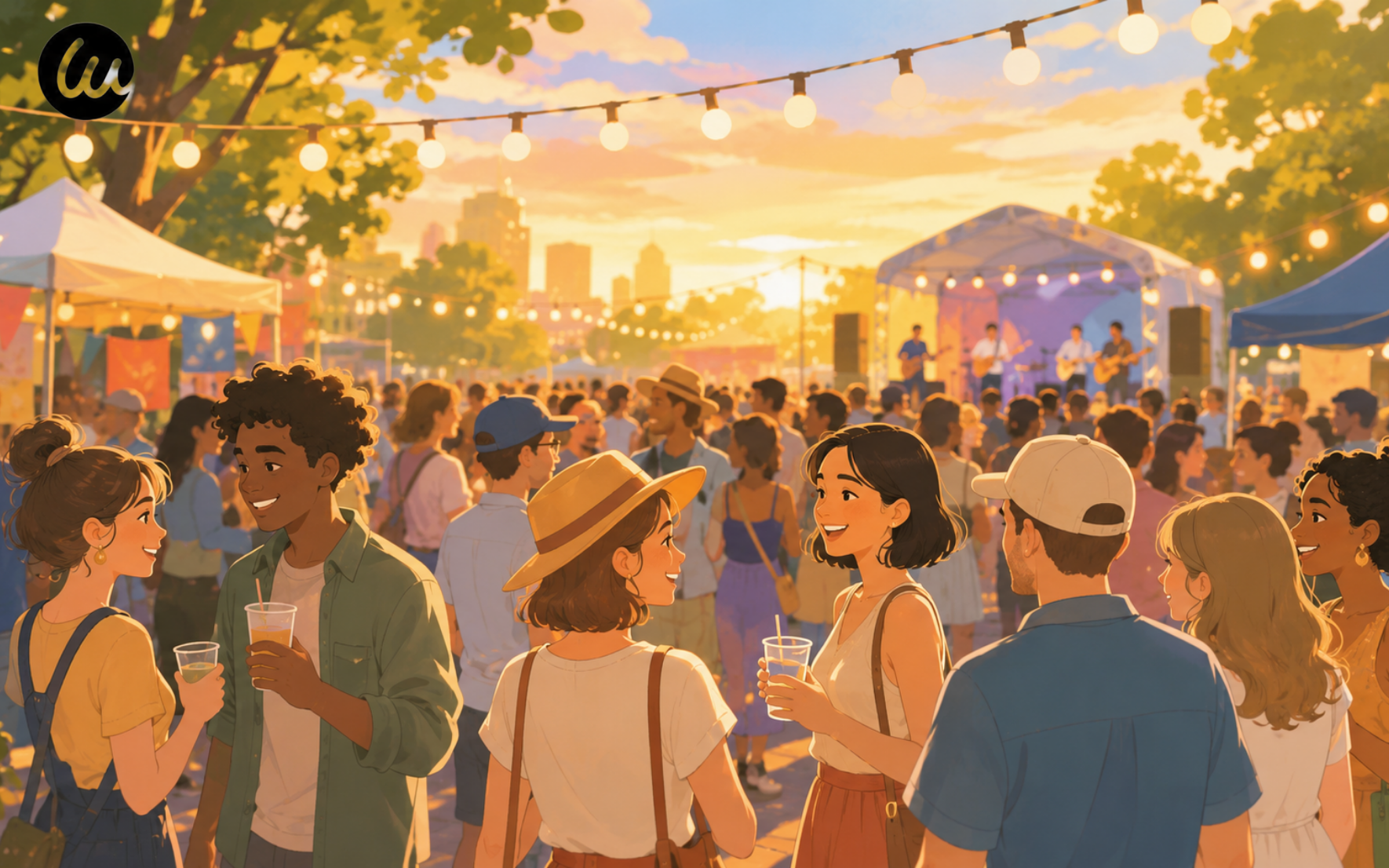
Photos and videos do more work than any headline. If it's a music festival, show the crowd. If it's a conference, show speakers on stage or candid moments from the hallway. Real images - even imperfect ones - make people feel like they're already there. Stiff stock photos kill the vibe every time.
Mobile-first design
Over 65% of event website traffic comes from phones. If your site isn't mobile-friendly, you're losing more than half your audience before they read a word. If you're building with Wegic, this is one less thing to worry about. Every site it generates is responsive by default, so it looks right on any screen without any extra setup. A schedule or lineup people can actually browse
Whether it's a speaker lineup, performance schedule, or session agenda, people want to know what they're signing up for. A scannable schedule is one of the fastest ways to turn a curious visitor into a confirmed attendee. For an event with dozens of sessions or acts, a search bar to filter by topic, track, or time slot beats making people scroll the whole thing. And if a room or set time changes on the day, a push notification reaches attendees a lot faster than an updated PDF nobody re-opens.
10 Event Website Examples to Inspire Your Next Build
These are real event websites, broken down by type. Each one does at least one thing really well - and we'll tell you exactly what that is.
ProductCon - Conference / B2B Event
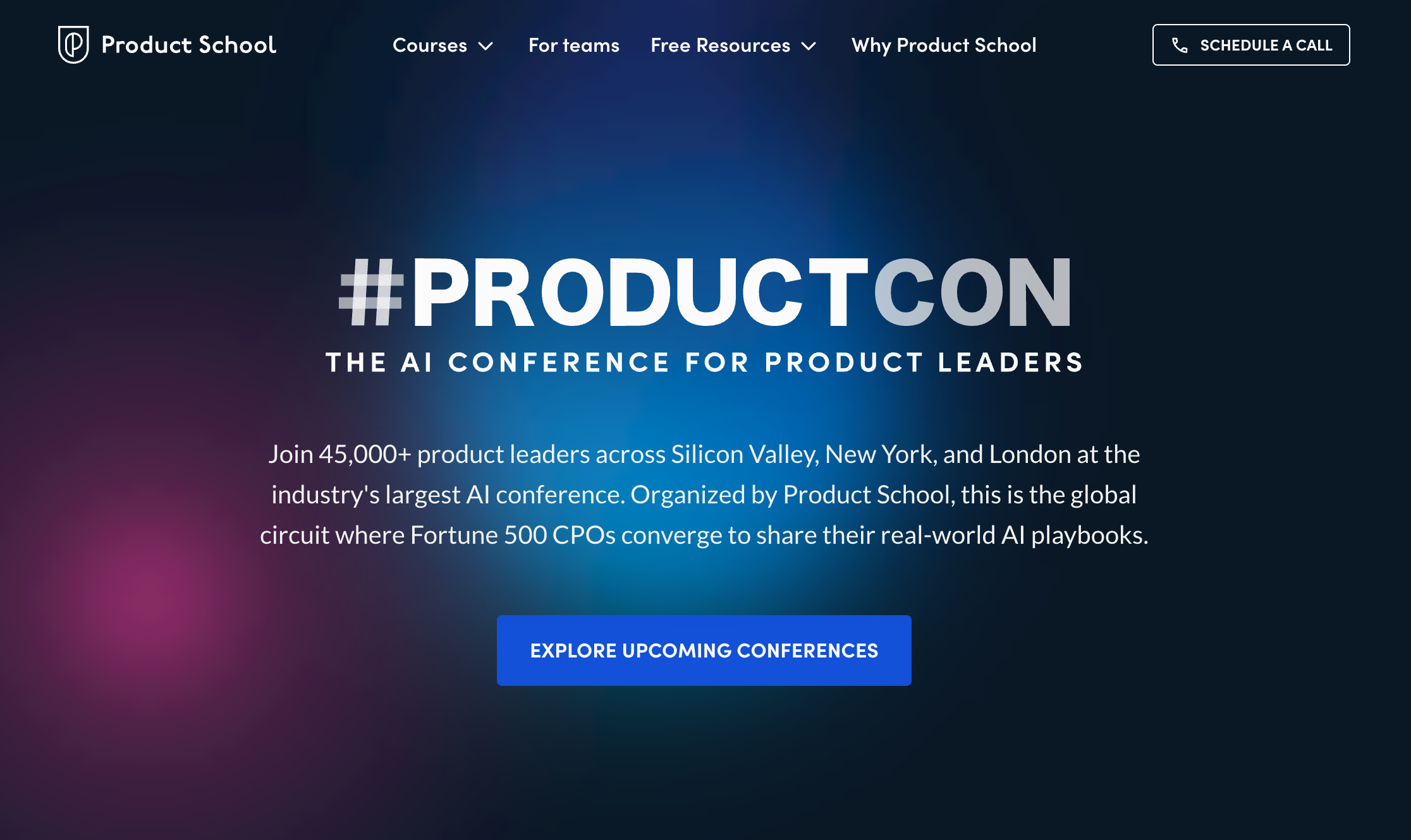
ProductCon is a conference for product managers and AI leaders. The homepage uses a dark background with a neon cursor effect - colored light follows your mouse as you move around the page. It's a small touch, but it signals right away that this is a tech-forward event. Below the hero, the layout stays clean. A short video shows what the conference looks like in person. Speaker names, dates, and sign-up options are all easy to find in one scroll.
What works: The "Get free ticket" button appears next to every conference date on the page - not just once at the top. Wherever you stop reading, the action is right there.For a conference that pulls in international product leaders, a multilingual version of the page means the agenda and registration flow aren't locked to English-only visitors.
Splore - Boutique Music Festival
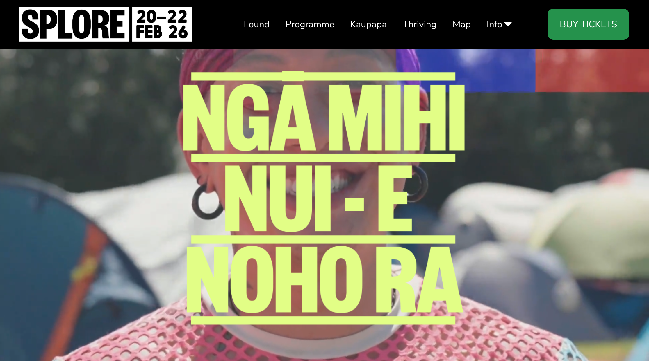
Splore is a boutique festival held on a beach in New Zealand. The hero headline uses a warm, bright color that stands out right away. More importantly, the "Buy Tickets" link sits in the top navigation bar - visible before you scroll at all. The page copy is short and specific: a few sentences about what you'll feel at this festival, not just what you'll see. Every photo is chosen to show the experience from the visitor's point of view.
What works: Putting the ticket link in the navigation bar removes a full step from the purchase path. A visitor who decides they want to go can act on it without scrolling at all.
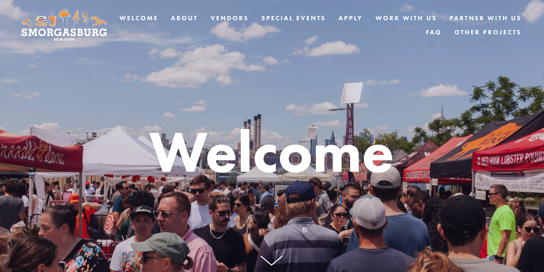
Smorgasburg is a weekly open-air food market across New York. One thing it does that most event sites don't: it serves two audiences at once - visitors looking for food, and vendors looking to apply. Both find what they need quickly. Navigation is sorted by audience, not by guesswork. Real market photos fill the page: food close-ups, full crowds, city views in the background.
What works: One website, two audiences, neither feels like an afterthought. Clear categories get each visitor where they need to go - no hunting. A WhatsApp chat button on the vendor side would give applicants a faster way to ask about stall availability than waiting on a contact form reply.
Romantic Lavender - Wedding Celebration (Built with Wegic)
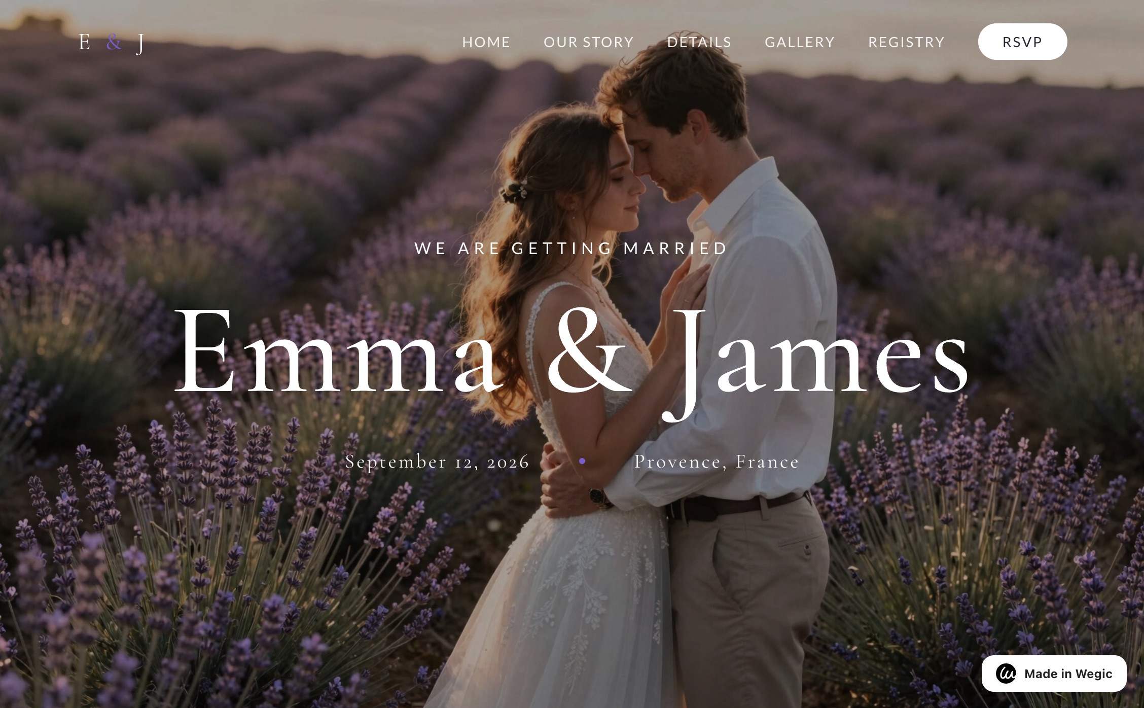
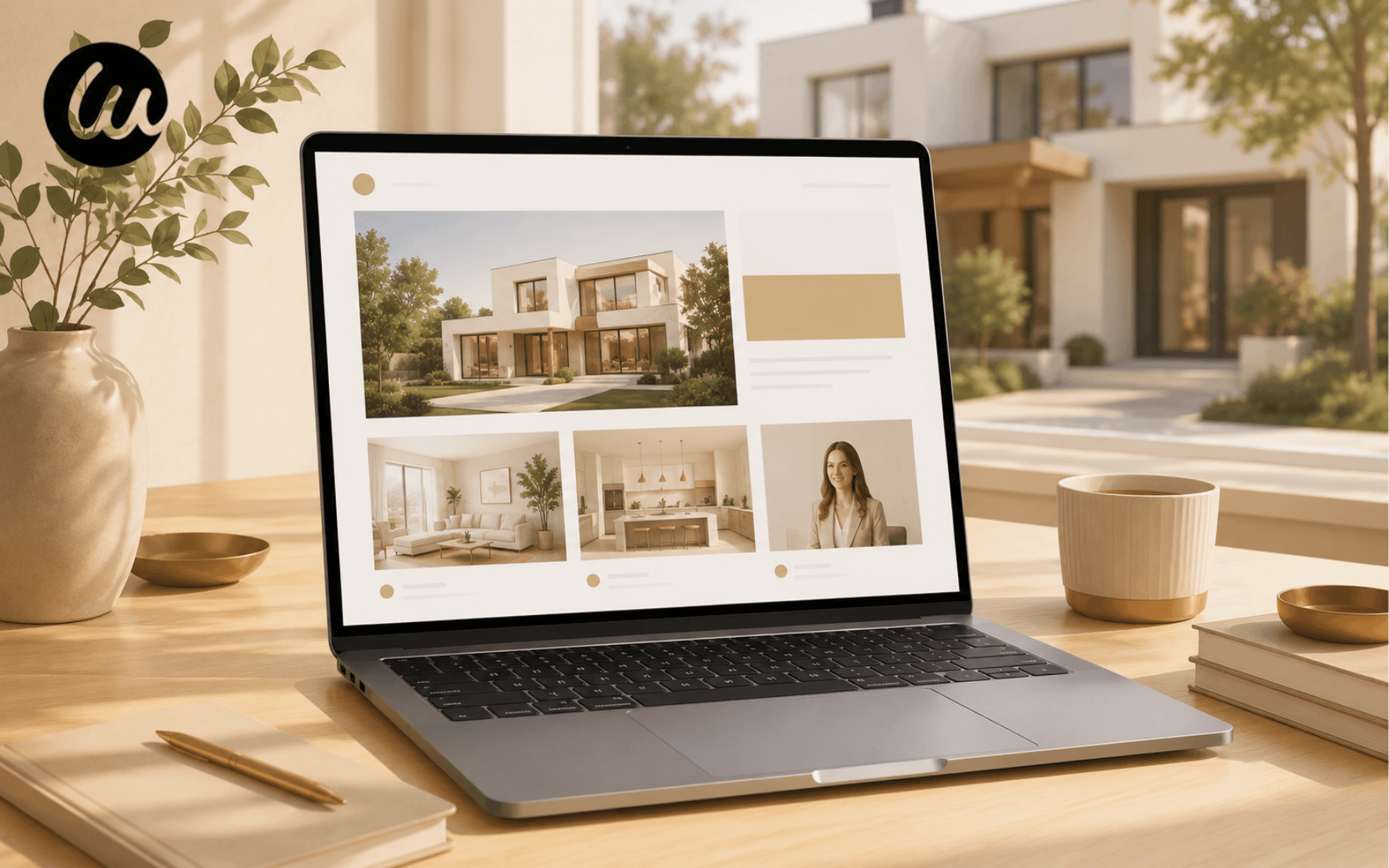
This wedding website was built using Wegic - no code, no designer. The hero shows the essential information right away: names, date, location. Below that, there's an RSVP form so guests can confirm on the spot. A Gallery page gives guests something to look at before the day. An About page adds the personal story behind the event. The whole site took less than an hour to build.
What works: The RSVP form on the homepage removes the back-and-forth of managing replies by email. For personal events - weddings, birthday parties, reunions - this one feature alone makes a standalone event website worth building.
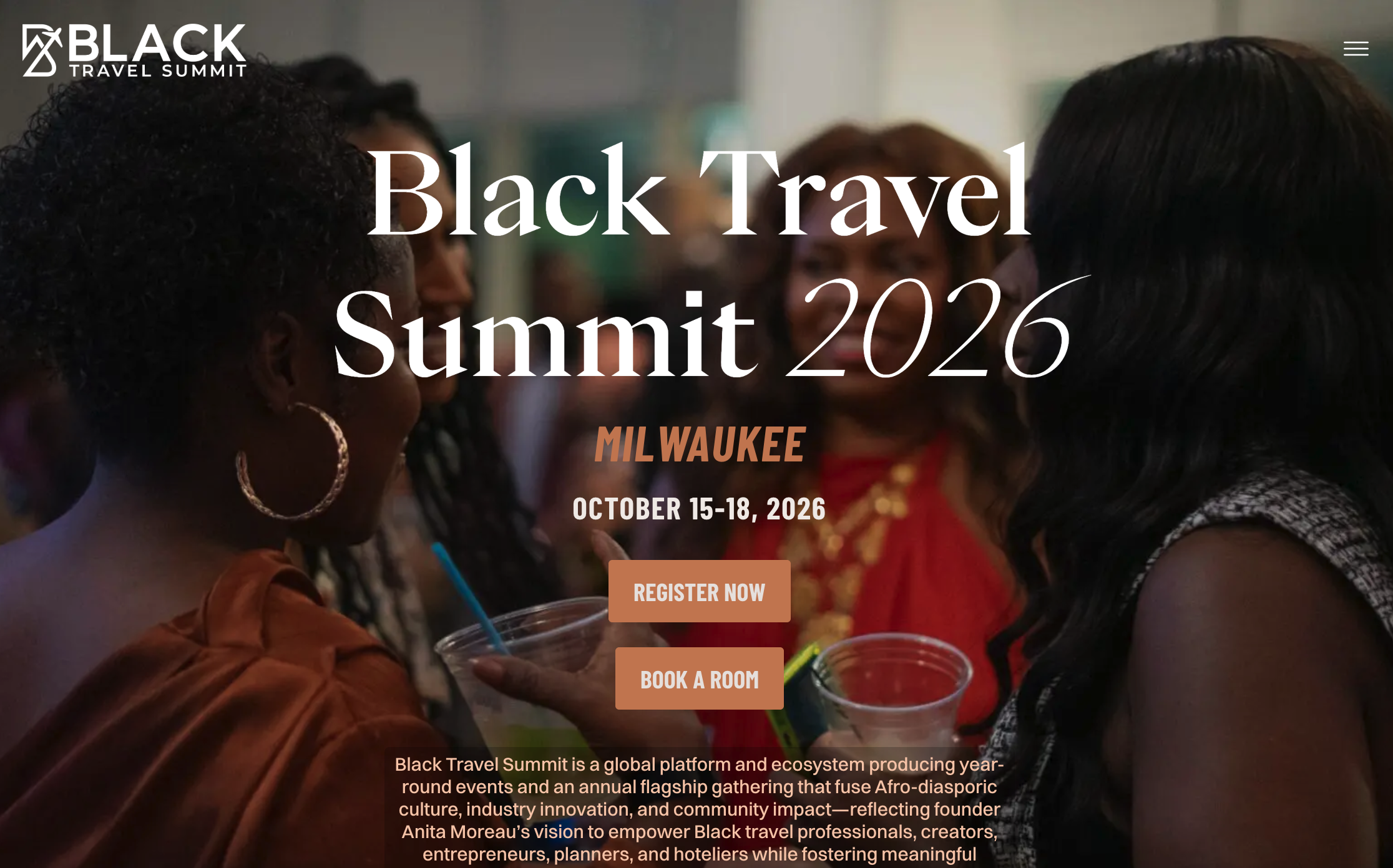
Black Travel Summit - Cultural Conference
Black Travel Summit is an annual conference for Black travel professionals, creators, and entrepreneurs. The hero leads with the event name, location, and dates - all visible before you scroll. Two CTA buttons sit side by side in the hero: one to register, one to book a hotel room. Past event photography fills the rest of the page. Candid shots of crowds, speakers, and moments from previous years tell visitors more than any description can.
What works: Two CTAs in the hero handle the two things a first-time attendee needs to do right away. Both are visible without scrolling. Nothing gets buried. A built-in scheduling tool for that hotel booking step keeps people from bouncing to a third-party site to sort out logistics.
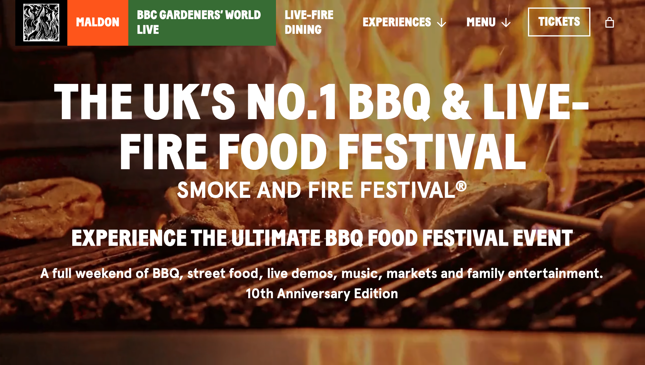
Smoke & Fire Festival - BBQ & Food Festival
Smoke & Fire is the UK's biggest BBQ food festival. The homepage opens with one bold line: "UK's No.1 BBQ & Live-Fire Food Festival." That claim does a lot of work before anything else loads. The rest of the page leans on past event photos to show what the experience is actually like. Upcoming event posters sit alongside them. An embedded YouTube video lets visitors see the festival in motion before they decide to buy a ticket.
What works: Opening with "UK's No.1" is a quick credibility shortcut. Visitors don't need to research whether this festival is worth attending. One headline makes that case for them.
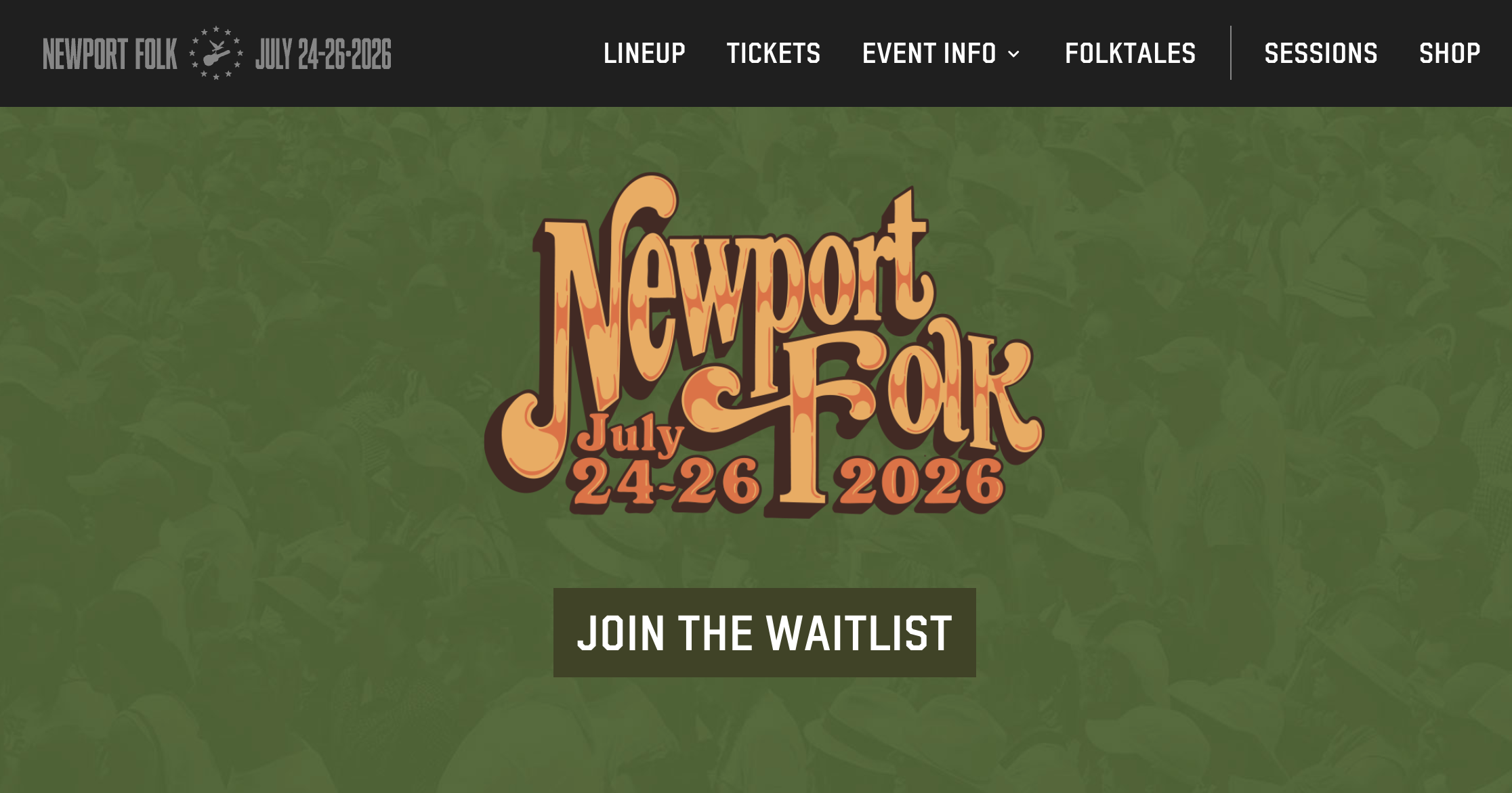
Newport Folk Festival - Iconic Outdoor Festival
Newport Folk has been running since 1959. The website is minimal on purpose. The only CTA on the homepage is "JOIN THE WAITLIST" - because the festival sells out every year. There are no tickets left to buy. But there is a line to join for next year.
What works: A sold-out event could just say "sold out" and stop there. Newport Folk turns that moment into a sign-up. Every disappointed visitor becomes a potential attendee for the next edition - and the email list grows every season. Feeding that waitlist into email marketing is what actually turns "join the waitlist" into next year's sold-out crowd, instead of a list that just sits there.
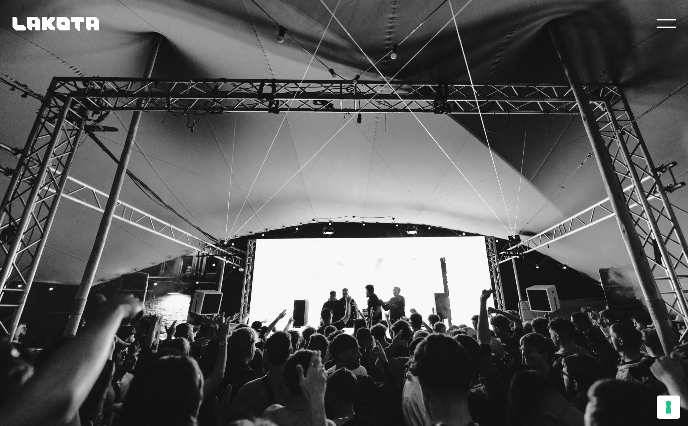
Lakota - Venue / Club Events
Lakota has been a club in Bristol for over 30 years. The homepage opens with six words: "the spirit of Bristol's underground." No event listings. No ticket prices. Just identity. From there, navigation splits into three spaces - Nightclub, Moon Club, and Gardens - so different visitors find their scene without digging through menus.
What works: Identity comes before the event calendar. People pick Lakota over other Bristol venues because of what it stands for. The lineup is secondary. The website gets that order right.
Cult Milk - Creative Workshops
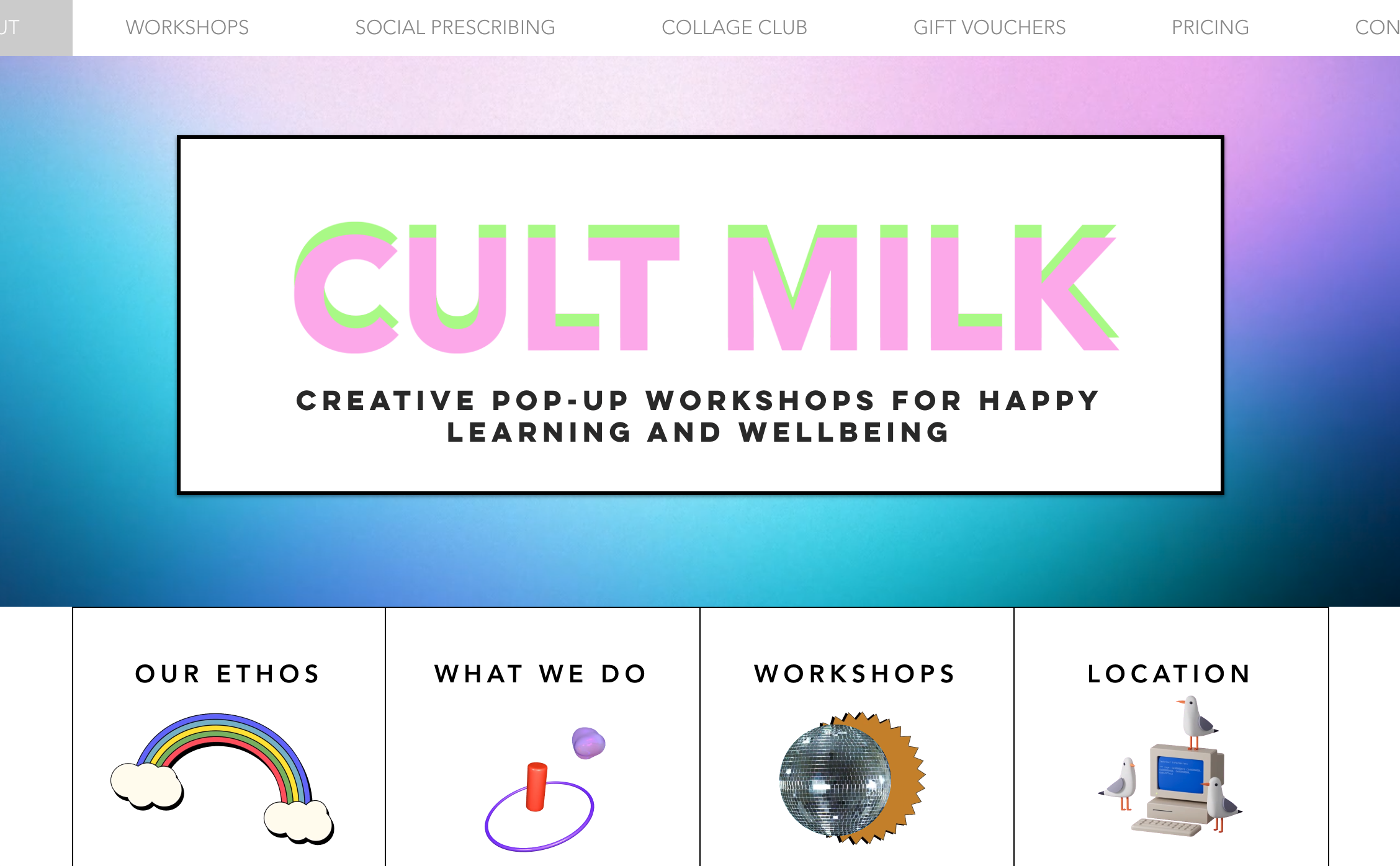
Cult Milk runs creative pop-up workshops in Brighton and London - collaging, lino printing, face painting, and more. The homepage opens with an animated GIF and one clear line: "creative pop-up workshops for happy learning and wellbeing." Seven words. You know exactly what this is. Tickets link out to Eventbrite, so visitors don't have to learn a new checkout process.
What works: Linking to Eventbrite instead of building a custom checkout is a smart call for a small business. People already know how to buy on Eventbrite. The site focuses on the experience; the platform handles the payment. If you'd rather keep people on your own site instead of sending them elsewhere, you can also just accept payment online directly, without losing that same one-click simplicity.
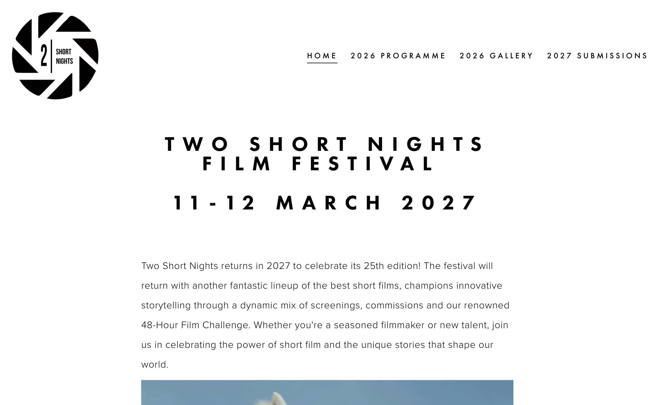
Two Short Nights is a short film festival in Exeter, running for 25 years. The website is as bare as it gets: black text, white background, festival logo, dates, and programme links. No animations. No hero video. Just clear information.
What works: Simple design signals confidence. When a small event's site is overdone, it can feel like it's compensating for something. When the information is easy to find and the dates are obvious, the event feels organized - which is all a first-time visitor needs to show up.
How to Build Your Own Event Website (Without the Headache)
You've seen what good looks like. Now, how do you actually build one?
The old way: hire a designer, wait two weeks, spend thousands, and still not get exactly what you pictured.
Start with your event's core info
Before you touch any tool, get five things ready: event name, date and time, location (or online link), a short description of what it is and who it's for, and a registration or ticketing link. That's your website's backbone. Everything else is decoration.
Choose visuals that match your vibe
Pull your best photos from past events. If this is your first one, find images that capture the feeling you want to create - warm and festive, clean and professional, artsy and underground. Your visuals should answer that question before anyone reads a word.
Add a clear registration flow
The path from "I'm interested" to "I'm registered" should be as short as possible. One button, one form, one confirmation. If you're selling tickets, link directly to your ticketing page. If registration is by request, make the contact form obvious and fast. Selling merch or a VIP upgrade alongside your tickets? A simple shopping cart keeps that add-on purchase in the same flow instead of routing people to a separate store.
Build it with Wegic - describe your event, get a website
With Wegic, you don't need to drag and drop anything or know any code. Just describe your event in a few sentences - the type, the vibe, what you need on the page - and Wegic's AI builds a fully designed website around it. You adjust the layout, swap colors, and add your photos. Most people have their event site live in under an hour.
Starting at $2.99, it's one of the most accessible options for anyone running an event without a big production budget. FAQs
Q: What should an event website include?
At minimum: event name, date, time, location, a short description, and a clear way to register or buy tickets. Beyond that, a speaker or performer lineup, schedule, and FAQ section all help. The most important thing is making sure the basics - when, where, what - are visible before anyone scrolls.
Q: How do I make my event website stand out?
Use real photos instead of stock images. Keep the design consistent with your event's brand - colors, fonts, and tone should all feel like they belong together. And write copy that speaks to a specific person. "For indie makers and creative freelancers" is more compelling than "for anyone interested in creativity."
Q: Can I build an event website without any design skills?
Yes. AI website builders like Wegic are built exactly for this. You describe your event, the AI generates the design, and you edit from there. No blank canvas, no learning curve. Starting at $2.99, it's a lot cheaper than hiring someone. If speed is the priority, an AI website builder is hard to beat. Describe what you need, and the site comes out designed - not blank. Traditional builders like Squarespace or Wix are solid too, but they take more hands-on setup time before they look like anything.
Q: Do I need a separate website for every event?
Not necessarily. If you run events regularly, a single site with an events page that updates over time is more practical. But for a one-off event, especially a bigger one like a festival, conference, or fundraiser - a dedicated site usually performs better. It's focused, easier to promote, and cleaner for first-time visitors.
Planning your first event website - or rebuilding an existing one? Describe it to Wegic and have a full, designed site ready before your next planning meeting.