What Makes a Great School Website
It Speaks to Parents and Students Differently
A prospective parent wants proof: academic results, safety, what a normal day looks like. A prospective student, especially in high school, wants to know if they'll fit in. A good school site doesn't try to say everything to everyone on one homepage. It splits the journey early, often right in the main navigation, so a parent researching curriculum and a 16-year-old checking out the sports teams both find what they came for.
It Makes the Admissions Path Obvious
However good your programs are, if a visitor can't figure out how to apply, book a tour, or ask a question, they'll leave and try the next school on their list. The strongest sites put one clear next step in front of every visitor, whether that's "Schedule a Visit," "Start Your Application," or a simple scheduling tool that lets a parent book a campus tour without a single back-and-forth email.
It Builds Trust With Real Proof, Not Just Claims
"Excellence in education" on a homepage banner means nothing on its own. What actually convinces a parent is specific: graduation rates, college placements, class sizes, accreditation logos, or a handful of real quotes from current families. The schools that do this well treat their proof points like headlines, not fine print buried on an "About Us" page.
It Works for Families Who Don't Speak the Same Language You Do
If your school serves an international community, or you're trying to reach one, a site that only works in one language quietly turns families away before they even reach out. A multilingual website means a family can browse admissions info, tuition, and campus life in the language they're actually comfortable reading, not a Google-translated afterthought.
8 School Website Examples We Love
Large International School Built Around Its Campuses
Website: https://www.jisedu.or.id/
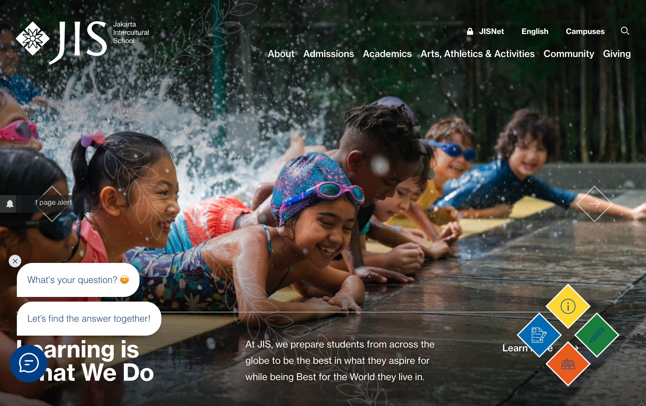
Jakarta Intercultural School (JIS) has been running since 1951, and its homepage carries that weight without feeling like a wall of history. The tagline, "Learning in Indonesia to be Best for the World," sits over a rotating slideshow, and a sticky bar with Inquire, Apply, and Visit buttons stays put no matter how far you scroll. A "Fast Facts" strip does a lot of the persuading on its own: three campuses, 2,000+ students from 70+ nationalities, 150+ clubs, all before you hit a single paragraph of copy.
What works: The fast-facts strip is doing the job a whole "Why Choose Us" page usually tries to do, in about five seconds of reading. If your school spans multiple campuses like JIS does, an embedded map makes it obvious at a glance which campus a family should actually be looking at, instead of making them dig through an About page to figure it out.
Public School District Built for Busy Parents
Website: https://www.npsk12.com/
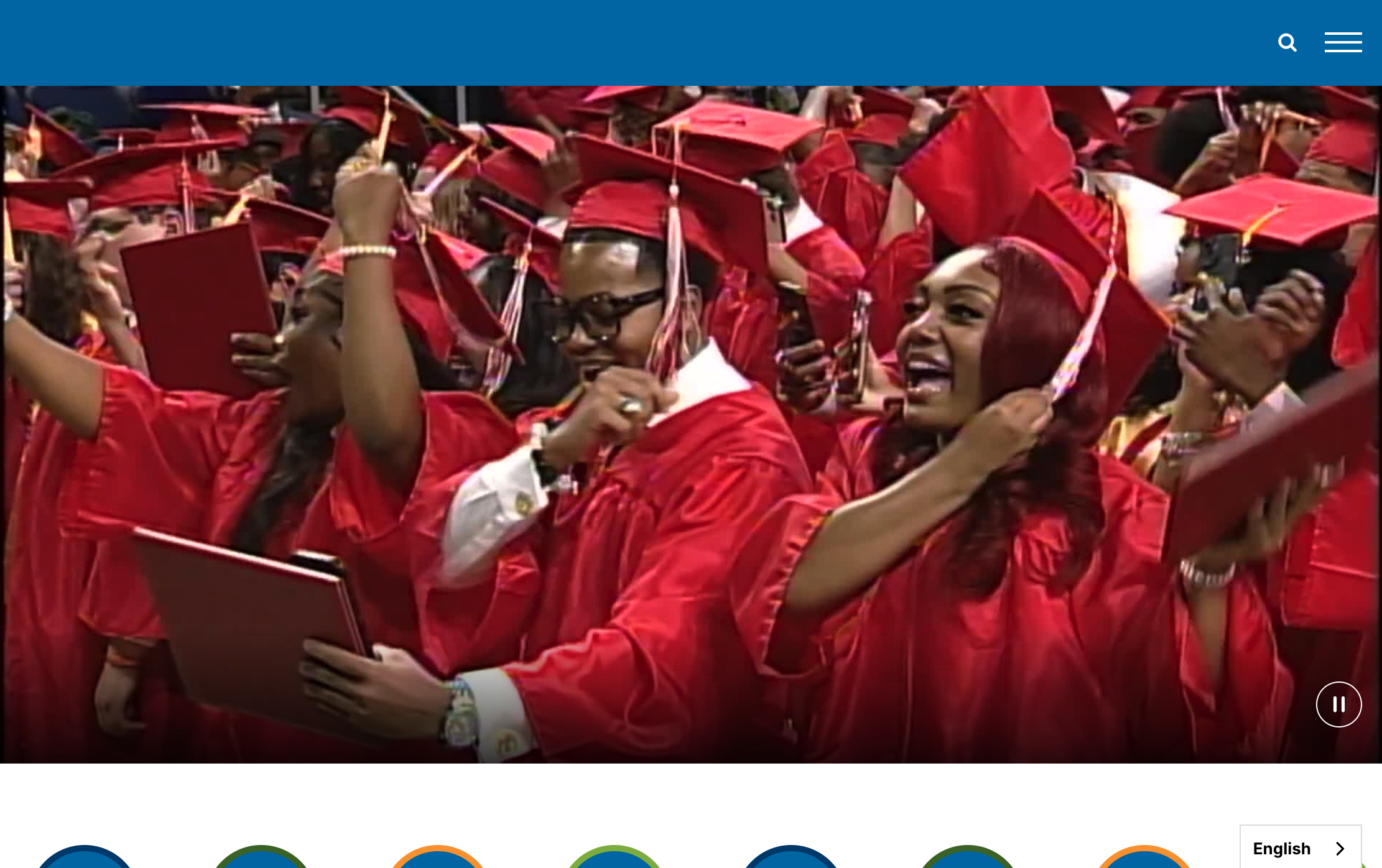
Norfolk Public Schools serves 27,000+ students across dozens of school sites, and the homepage is built around that scale. Quick-access buttons for Athletics, Meals & Nutrition, Safety & Security, and Transportation sit right up top, next to a stats grid ($63M in scholarships, 1.6M miles driven, 42.7% honor graduates) that doubles as a district report card. News and events get their own section further down, next to a "Skip to Main Content" link for accessibility.
What works: When a website serves thousands of families instead of dozens, generic navigation stops working; parents need to find their specific need (bus route, lunch menu, board meeting) in one or two clicks. Push notifications for closures or urgent announcements would save a district like this from parents missing time-sensitive news buried in a feed they don't check daily.
Small Independent Preschool Selling Trust, Not Scale
Website: https://www.reachearlylearning.com/
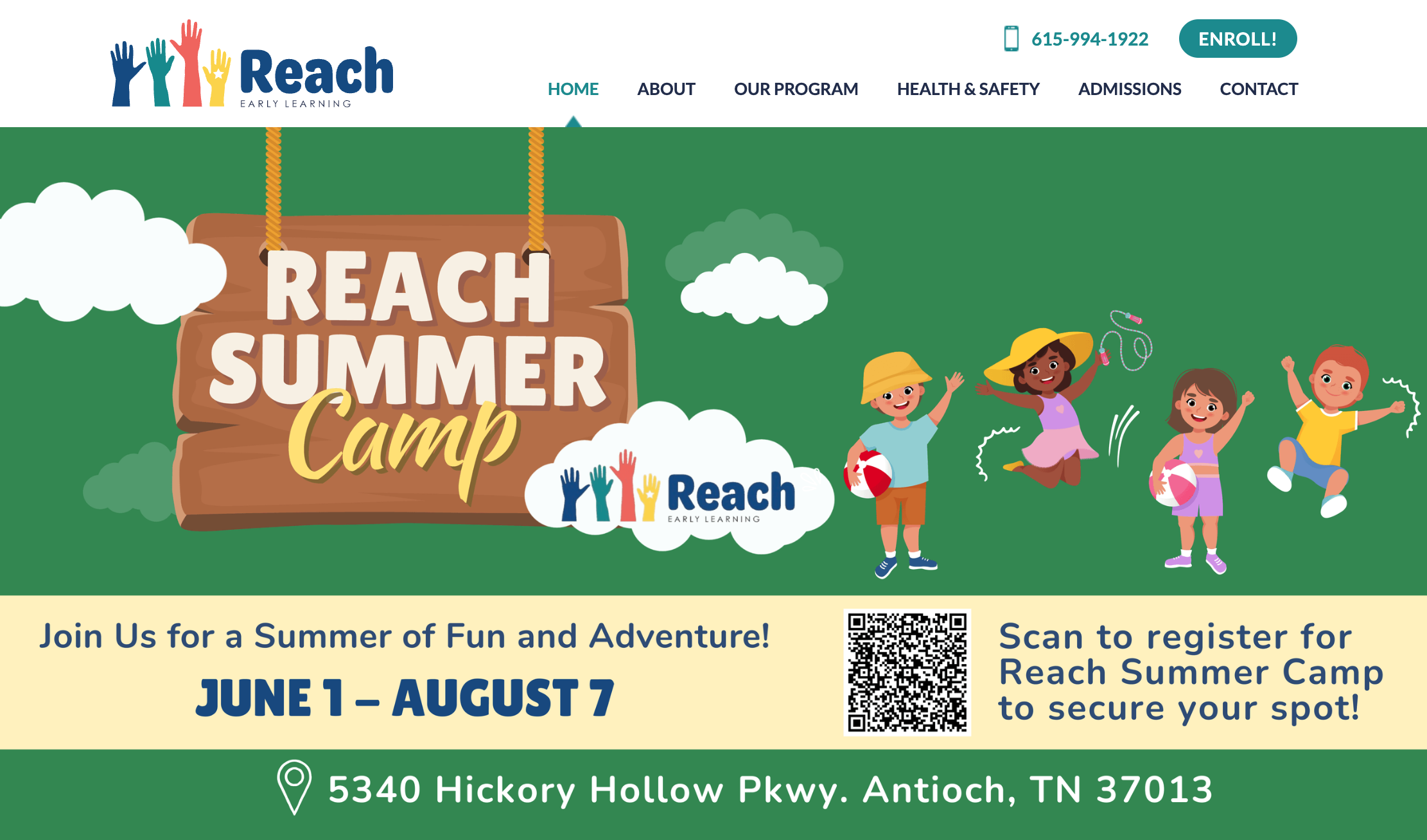
REACH Early Learning Center is a single-location preschool, not a franchise, and the homepage doesn't pretend otherwise. The hero line, "Embark on a Lifetime of Achievement," sits next to a bright "Enroll!" button that's visible from the moment the page loads. Further down, a "Why REACH?" section explains year-round hours and individualized instruction in plain language, plus a note that the center accepts childcare payment assistance, which matters a lot to the parents actually looking for this kind of program.
What works: A single, prominent "Enroll!" button beats a menu buried three clicks deep, especially for parents comparing five daycare tabs at once. This is exactly the kind of site a small school with no dev team can realistically build and maintain on their own.
Small Language School Winning on Community, Not Size
Website: https://freedaspace.com/
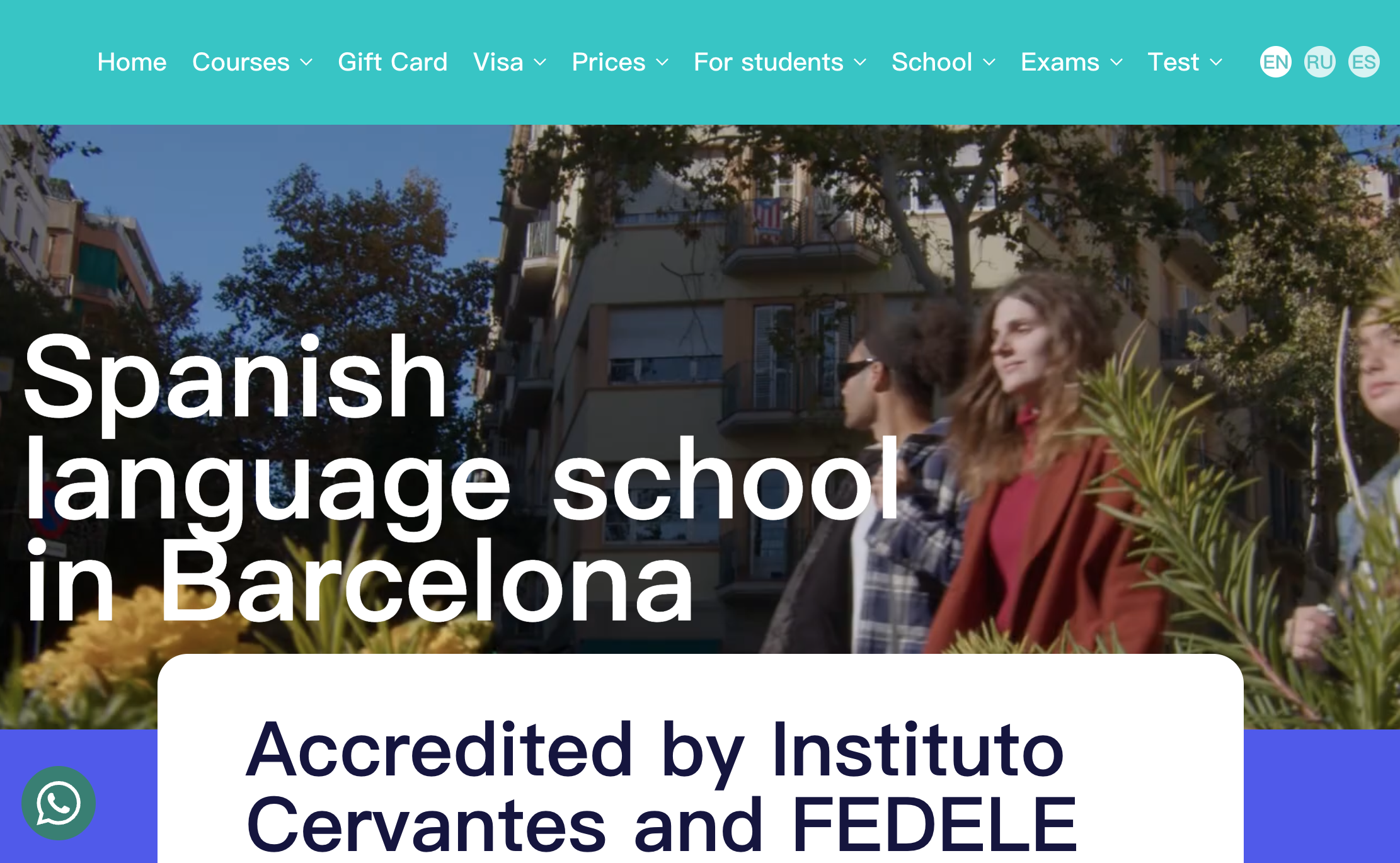
Freeda Language Space teaches Spanish, English, and Catalan out of two small locations in Barcelona, and it leans hard into that scale instead of hiding it. The homepage promises small groups and consistent teachers, offers a free trial class right on the hero section, and backs it up with 30+ testimonials that include real names and dates, not just star ratings. A visa and accommodation section acknowledges that a lot of visitors aren't locals, they're planning a move.
What works: A free trial offer removes almost all the risk of signing up, which matters a lot for a purchase most people have never made before. For a school fielding constant questions about visas and start dates, WhatsApp chat next to that trial offer would catch the students who have one quick question before they're ready to commit to a form.
High School Homepage Doing Triple Duty
Website: https://hhs.hudson.k12.ma.us/
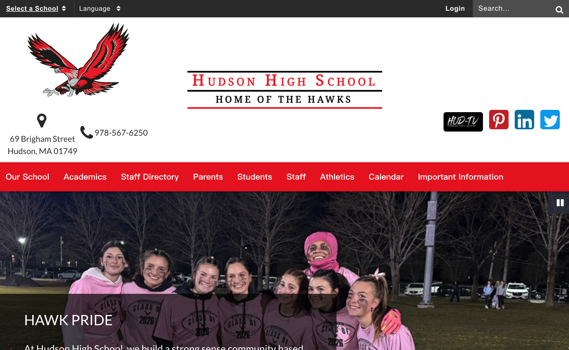
Hudson High School's homepage has to serve students, parents, and staff at once, and it handles that with a quick-links row (Staff Directory, Calendar, Food Services, Counseling) that sits above the fold, right under a "Hawk Pride" hero banner. Announcements about summer reading and AP coursework get their own section, and work-permit information is offered in English, Portuguese, and Spanish, which says something about who actually reads this site.
What works: Splitting the homepage into audience-specific quick links, instead of one long list of departments, means a parent looking for the lunch menu and a student looking for exam dates both get there in one click. Offering key forms in multiple languages is a small touch that goes a long way if your school community isn't monolingual, even if you're not ready to translate the whole site yet.
International School Built for a Multilingual Community
Website: https://www.unishanoi.org/
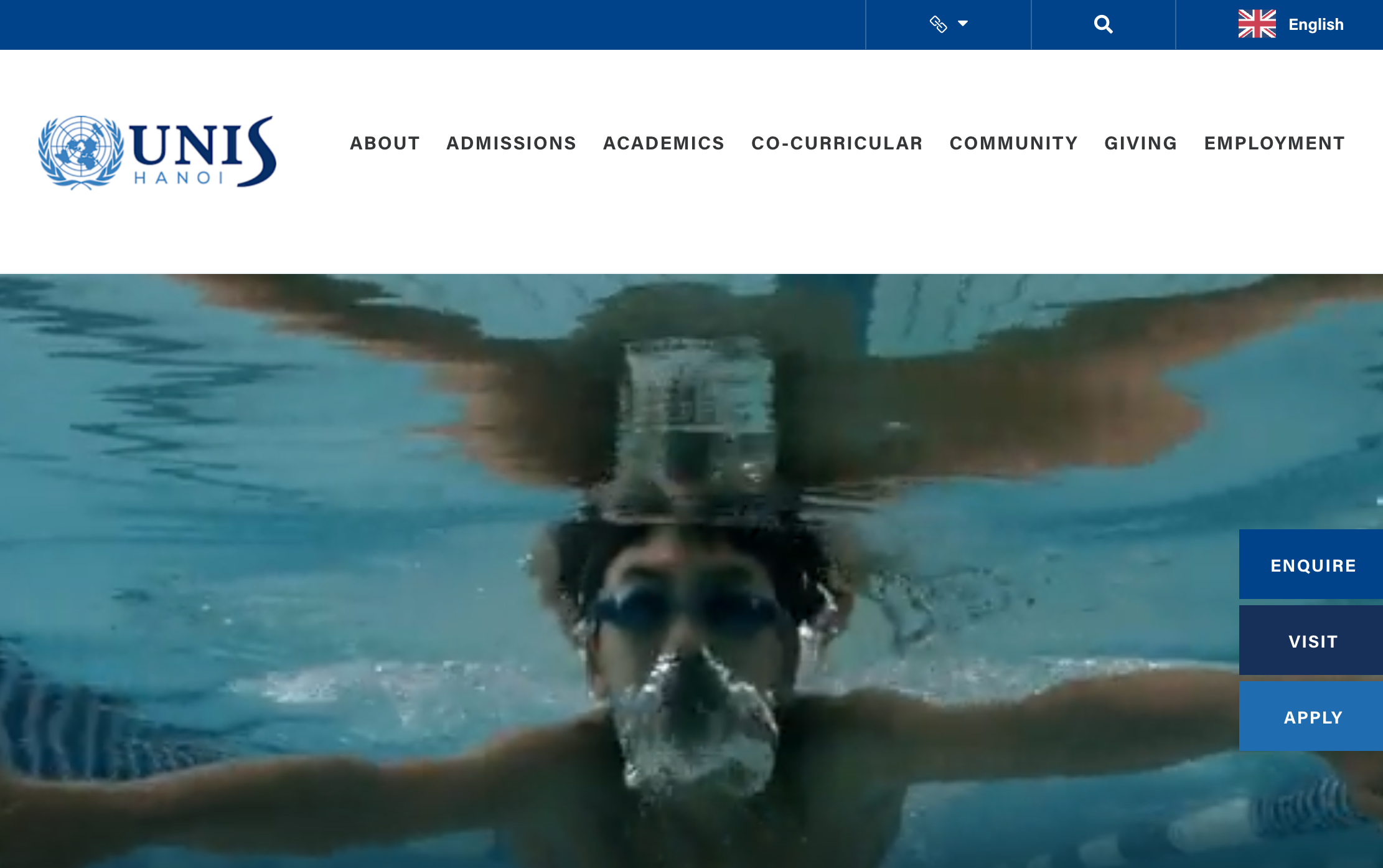
UNIS Hanoi is one of only two United Nations-affiliated schools in the world, and its site leans into that identity with a "#uniquelyUNIS" section listing 65+ nationalities and 37 years of history. What stands out more, though, is the follow-through: alongside the English site, UNIS Hanoi maintains content in Vietnamese, Korean, and Japanese, reflecting the languages its own community actually speaks instead of defaulting to English-only and hoping for the best.
What works: For a school this international, a multilingual website isn't a nice-to-have, it's the difference between a parent understanding your admissions process and giving up halfway through a page they can't read. You don't need 65 nationalities in your own community to justify this; even two or three language groups you serve regularly is reason enough.
Boarding School Leading With Character, Not Just Campus
Website: https://www.worcesteracademy.org/
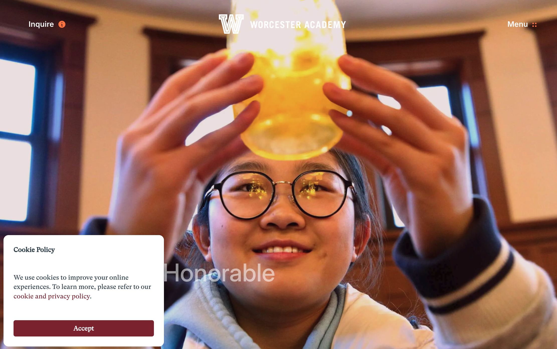
Worcester Academy could easily lead with its 71-acre campus or 190-year history, but the homepage opens with a quote instead: "ability without honor is useless." That line, paired with the tagline "Achieve the Honorable," sets the tone before a single photo of a dorm or classroom shows up. Content blocks for Middle School, Upper School, Athletics, and Arts follow, each with its own short description, and residential life and financial aid links sit right in the main navigation instead of buried in an FAQ.
What works: Leading with a value or a philosophy, instead of a facilities list, gives a boarding school something more memorable to say than "we have nice buildings." If you're a boarding or day school, put your admission-specific pages (financial aid, international students, residential life) in the main nav, not a submenu; those are exactly the pages a family in the decision phase is hunting for.
Wegic Demo - EcoKids
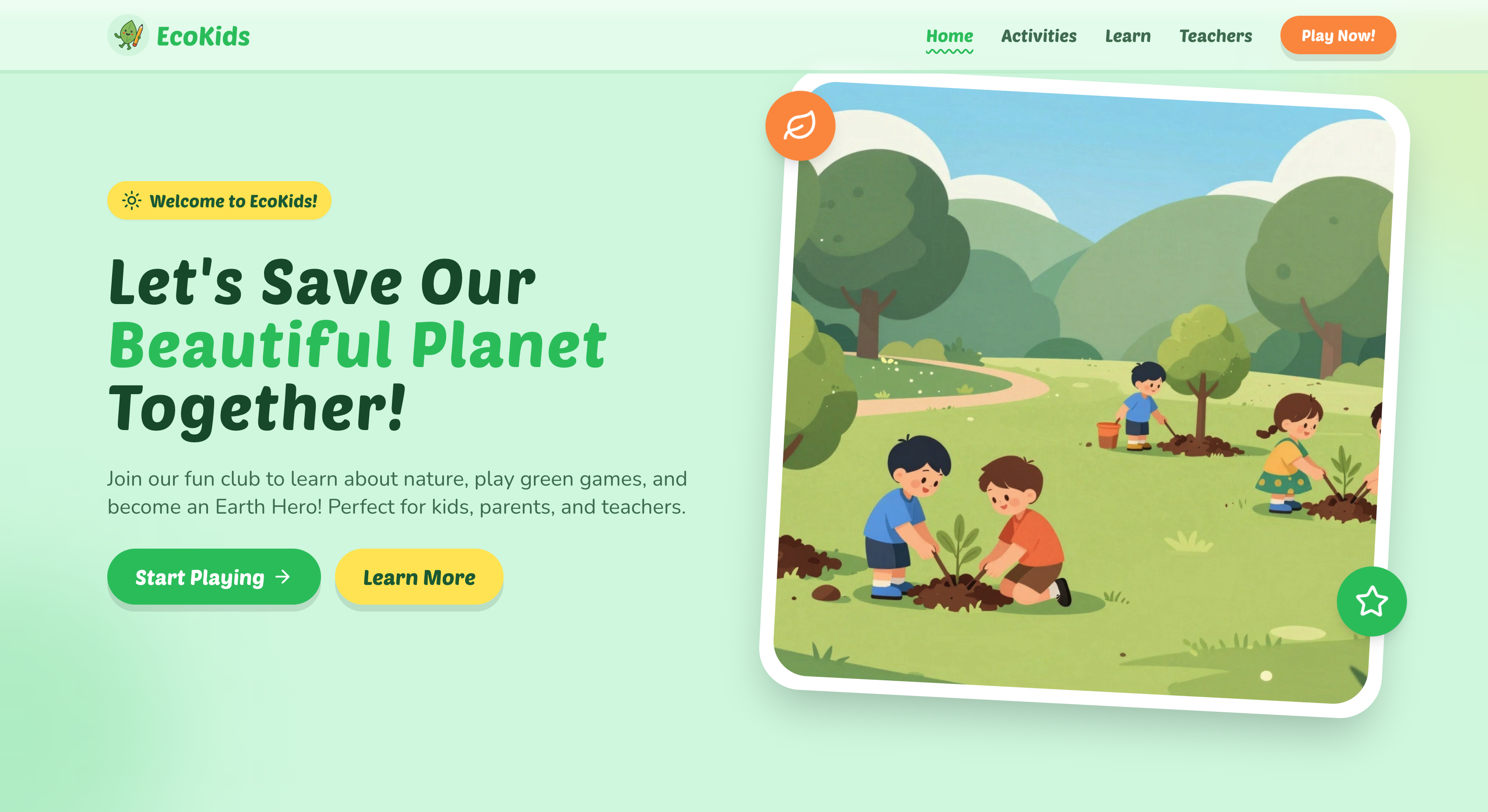
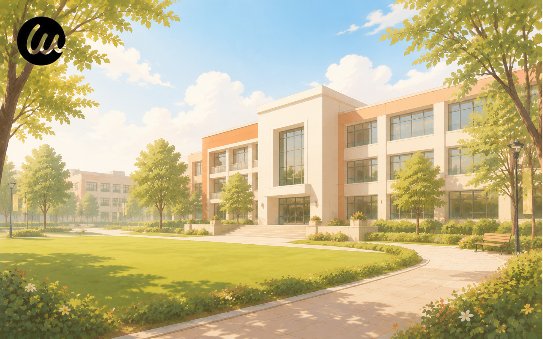
This one's a demo we built directly in Wegic: an eco-education site called EcoKids, aimed at bringing environmental learning into schools. The homepage uses a green, nature-led color palette and kid-friendly framing to introduce sustainability resources schools can use in the classroom, without a single line of custom code behind it.
What works: A themed color palette and a clear "who this is for" message came together fast, exactly what a small school or program needs when the priority is getting something live, not spending weeks on a from-scratch design. Describe your school to Wegic and you get a starting point like this one, ready to customize instead of build from zero.
How to Build Your Own School Website (Without a Dev Team)
Looking back at these examples, the pattern holds up: what makes them work isn't a huge budget or custom code. It's clear navigation, an obvious next step, and proof that backs up the claims. That's all stuff you can build yourself.
That's exactly what Wegic is built for. Describe your school - grade levels, programs, location, whatever makes you different - and Wegic's AI puts together a site with an admissions section, campus info, and contact forms already in place. From there you swap in your own photos, adjust the copy, and connect your own domain, no code required.
Plans start at $2.99, so a small school or training institute can get a site that looks this good without paying agency prices or waiting months for a redesign.
Frequently Asked Questions
Q: What should a school website include?
At minimum: clear info on programs or grade levels, an obvious way to apply or book a tour, real proof points like results or testimonials, and contact details that are easy to find. Everything else, like a blog or an alumni section, is a bonus once those basics are covered.
Q: How much does a school website cost?
A custom-built site from an agency can run into the thousands, plus ongoing maintenance fees. AI website builders are a lot cheaper to start. Wegic starts at $2.99, which matters if you're a small school or training institute without a dedicated web budget.
Q: What's the best platform for a small school or training institute?
If you don't have an in-house developer, an AI website builder like Wegic is worth starting with. You describe your school in plain language and get a working site back, ready to customize, instead of starting from a blank template or briefing an agency.
Q: How long does it take to build a school website?
With an AI builder, a first working version can come together in minutes rather than weeks. You'll still want time to refine copy, add real photos, and review everything before it goes live, but the heavy lifting of laying out the site happens fast.
Q: Can I build a multilingual school website?
Yes. If your school serves international families, a multilingual setup lets parents browse admissions info and campus life in their own language instead of relying on browser translation, which matters a lot for building trust early.
Looking across all these sites, the schools that stand out aren't necessarily the ones with the biggest budgets. They're the ones that made it easy for a parent to find what they needed and take the next step. Get that right, and the rest of the design is just polish.