What Makes a Dropshipping Website Look Like a Real Brand
It Doesn't Look Like Every Other AliExpress Store
A lot of dropshipping stores use the exact same free theme, the exact same supplier photos, and product titles that still read like "2026 New Fashion Women Casual Summer Dress." None of that is fixable with a bigger budget. It just takes someone actually looking at the store before it goes live: cropping photos consistently, writing titles a human would type, adding a real logo instead of default theme text. That's the difference between a store that feels like a brand and one that feels like a folder of products someone imported overnight.
It Has Product Pages That Answer the Real Questions
Shoppers buying from a store they've never heard of have questions the supplier's stock description never answers: how long will this actually take to arrive, what's the return policy, does this run small. A search bar helps once you've got more than a handful of products, but the bigger win is just writing product pages that answer those specific worries instead of copy-pasting whatever came with the listing.
It Makes Checkout Feel Safe
First-time visitors are deciding whether to trust you with their card number, and that decision happens fast. Recognizable payment options like PayPal and major cards do more for that trust than any "secure checkout" badge you can slap on the page. If checkout looks unfamiliar or janky, most people just close the tab instead of risking it.
It Has a Clear Next Step for Visitors
A store that only asks for a purchase loses every visitor who isn't ready to buy today. Capturing an email for a discount code or restock alert through email marketing turns a maybe into a follow-up instead of a lost visitor. The goal isn't five popups. It's one clear ask that doesn't get in the way of browsing.
7 Dropshipping Website Examples We Love
Room-Styled Photography Instead of Product Shots
Website: https://ruggable.com/
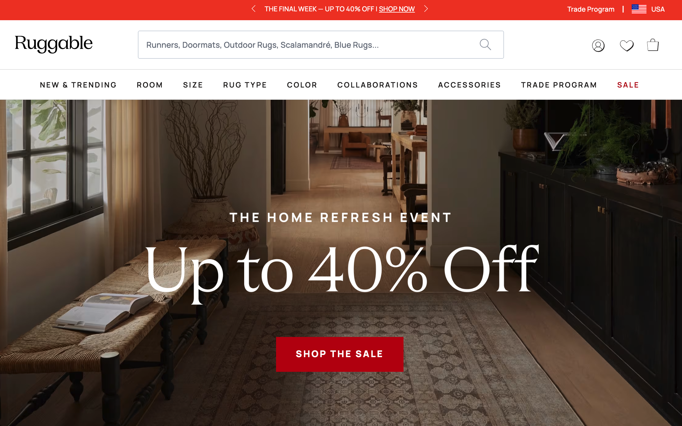
Ruggable sells washable rugs, which sounds like a hard sell until you see how they photograph them. The homepage leans entirely on lifestyle shots: rugs styled into real living rooms, bedrooms, and kitchens, shot the way a design magazine would shoot them, not the way a supplier's product photo looks. Collections are organized by room type and by designer collabs (Jungalow, Jonathan Adler), and free shipping plus a 30-day return guarantee sit right up top.
What works: The photography is doing all the selling here. A rug is hard to picture in your actual home from a plain product shot on white, so Ruggable skips that entirely and shows the product living somewhere real. If you're dropshipping something people need to picture in their own space, room-styled photos will out-convert a clean studio shot every time.
A Customization Option That Turns a Cheap Product Personal
Website: https://www.puravidabracelets.com/
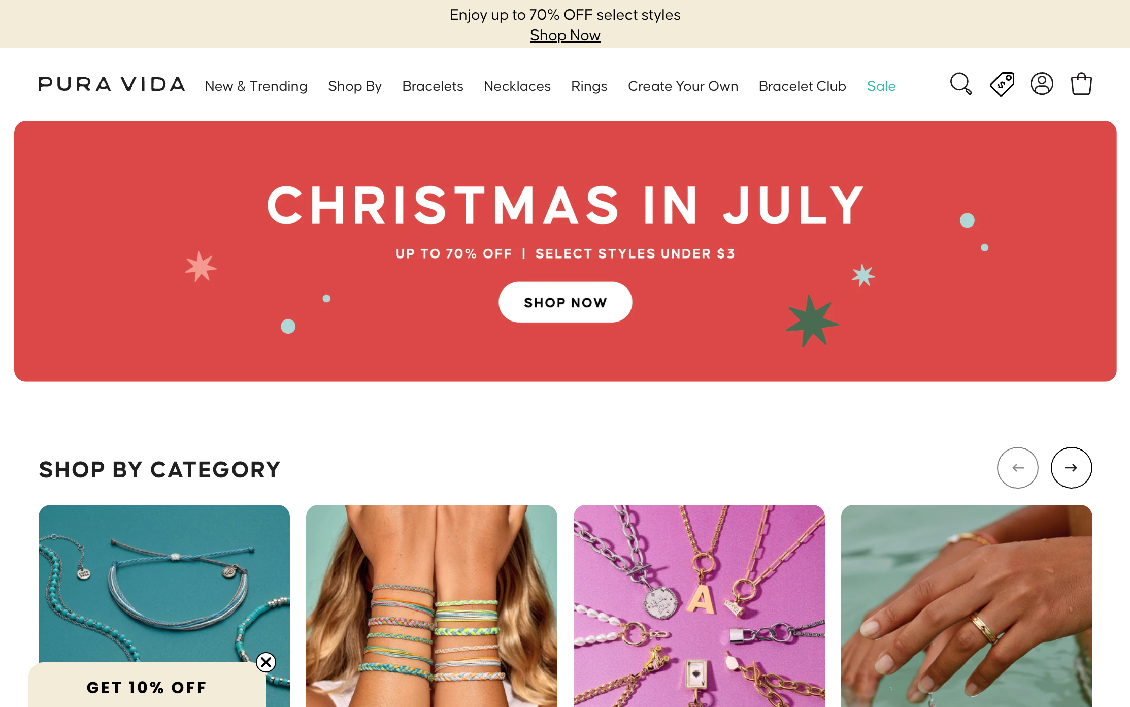
Pura Vida sells friendship bracelets, and the whole site is built around gifting and self-expression instead of just jewelry. Navigation is split by "Shop By" categories and a "Create Your Own" charm bar where you build a custom bracelet. A "Bracelet Club" subscription and rewards program sit alongside the usual sale banners.
What works: The site doesn't just sell a product, it sells a reason to buy one: for a friend, for yourself, to match a group. That "Create Your Own" option turns a low-cost bracelet into something personal, which is a much easier way to justify a purchase than price or quality alone. If your product has any gifting angle, building a customization or bundle option around it does more than another discount code.
Press Logos and Named Reviews Instead of a Generic Trust Badge
Website: https://holstee.com/
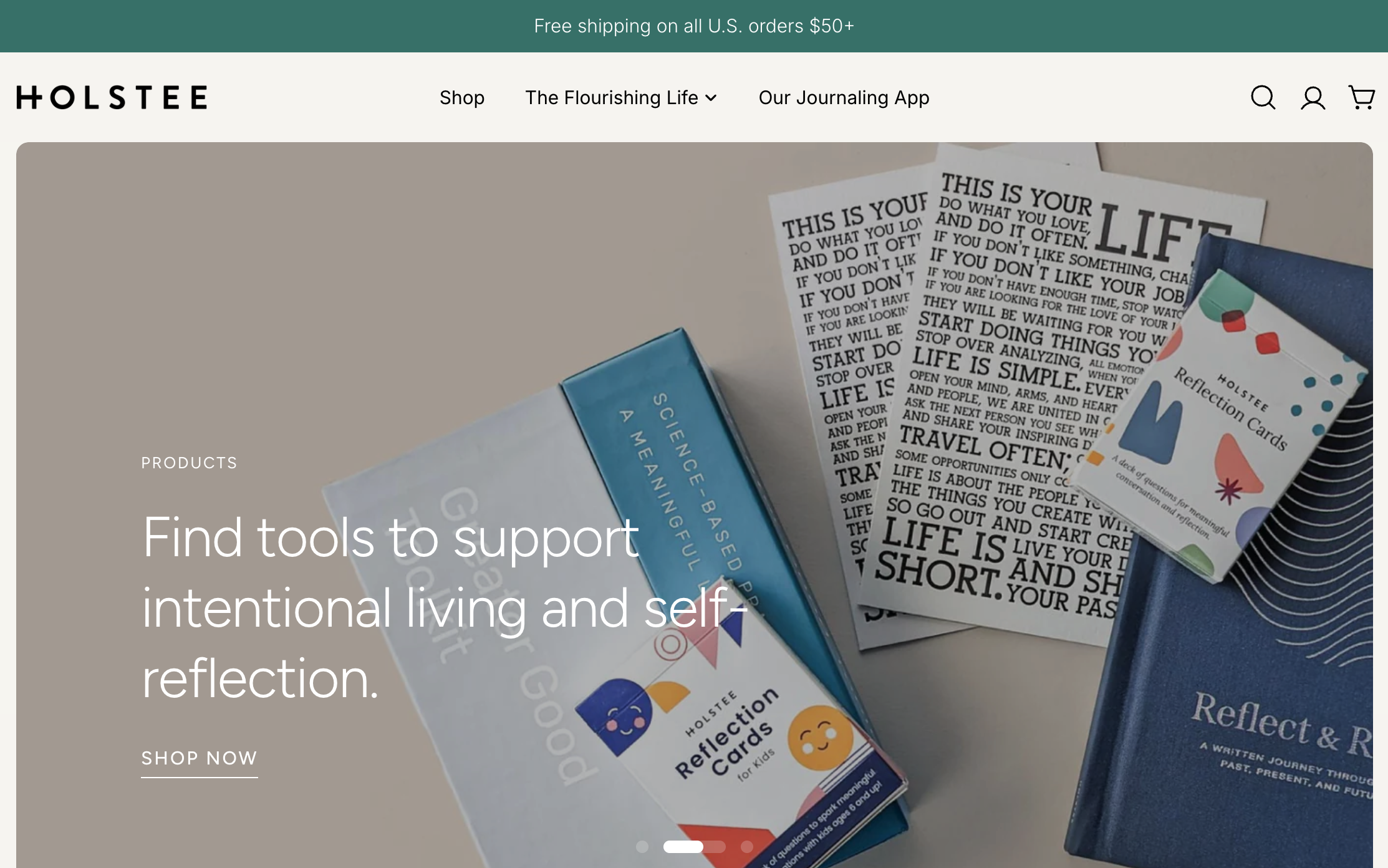
Holstee sells journals, cards, and posters built around "intentional living," and the design matches that pitch: lots of white space, a calm video hero, and copy that reads more like a wellness brand than a product catalog. What stands out is the trust section: logos from WNYC, The Atlantic, and Washington Post sit near six named customer reviews with real details, not just star ratings.
What works: Press logos and named reviews do more for credibility than a generic "as seen on" banner. Holstee didn't just say it's been featured, it showed exactly where and let real customers describe why the product mattered to them. That combination is worth copying if you're selling something people are on the fence about, since it answers "is this actually legit" before they even ask.
Star Ratings on the Product Card, Not Just the Product Page
Website: https://colourpop.com/
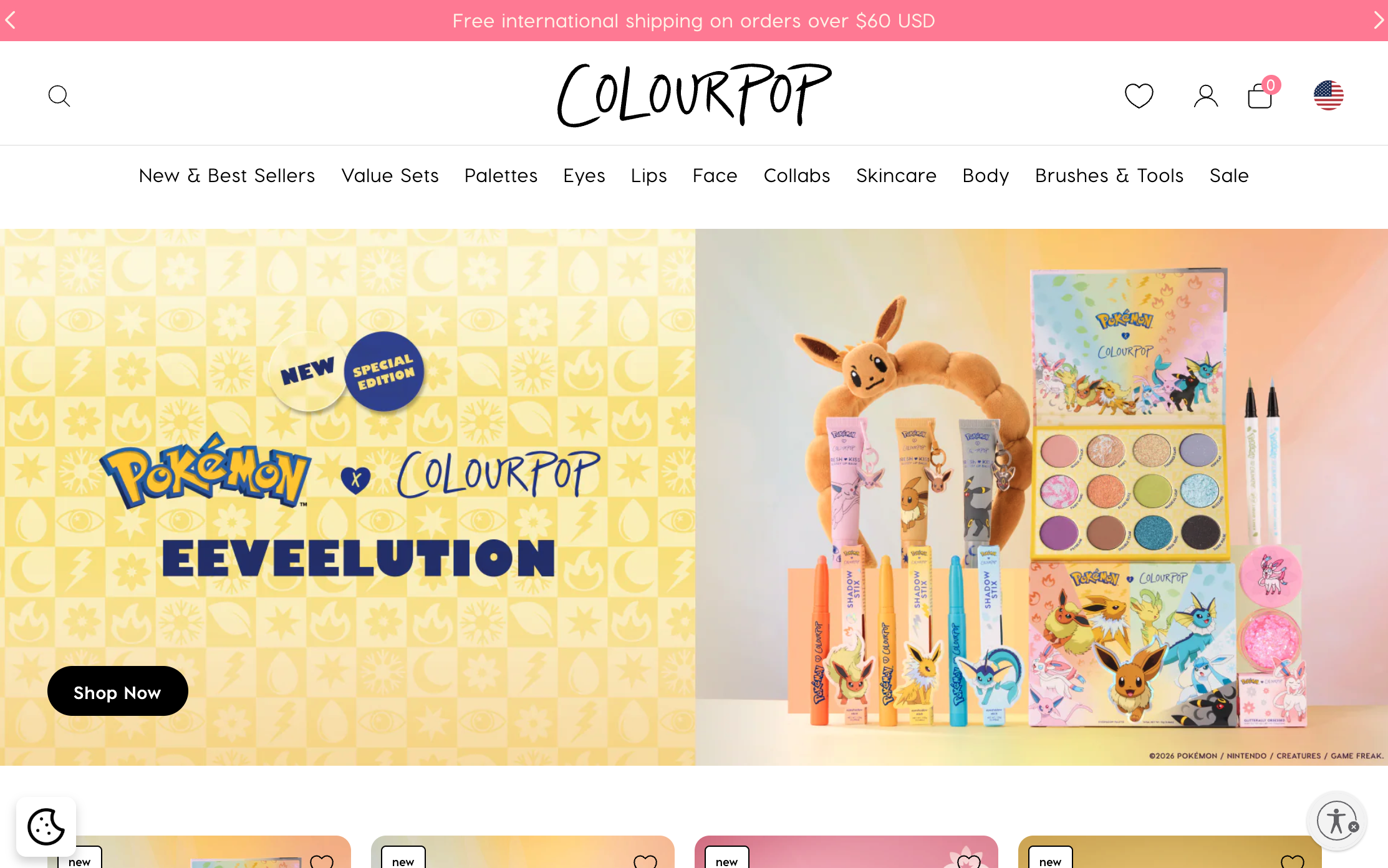
ColourPop is a budget-friendly makeup brand, and the homepage leans hard into collabs, a Pokémon collection was front and center when we looked. Every product card shows a star rating and review count right under the price, and the nav is split cleanly into categories: eyes, lips, face, tools.
What works: Star ratings on the product card, not just the product page, means shoppers see social proof before they even click in. Combined with a collab that gives people a reason to check the site today instead of "eventually," it's a simple way to turn browsing into buying. A rotating limited collection creates urgency without needing a countdown timer.
Stacking Every Trust Signal in One Place
Website: https://glamnetic.com/
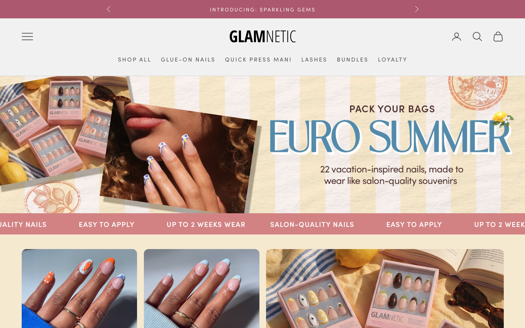
Glamnetic sells magnetic lash and nail products, and the homepage stacks trust signals hard: star ratings on every product card, over 20 press and certification badges, and a loyalty community called "GlamFam." The mega-menu breaks products down by length, shape, and collection, so shoppers browsing for a specific look can get there in one click.
What works: Beauty is a category where shoppers are naturally skeptical of a brand they haven't heard of, so Glamnetic answers that skepticism everywhere at once instead of burying it on an About page. If you're in a trust-sensitive category, spreading your credibility signals (reviews, press, certifications) across the whole homepage works better than one dedicated trust section.
Speaking to a Specific, Informed Buyer
Website: https://modelones.com/
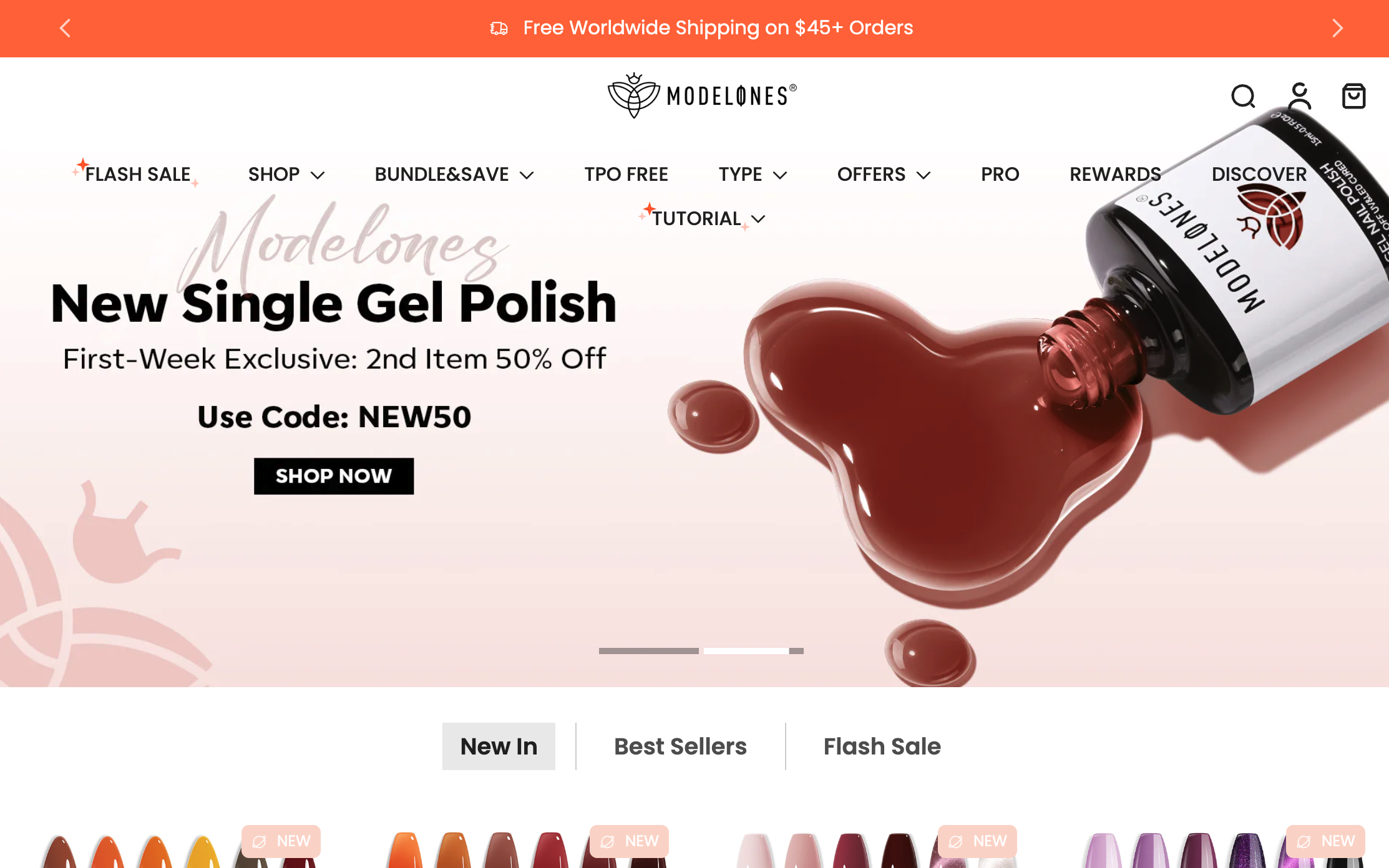
Modelones sells gel polish and nail supplies aimed at both professionals and DIYers, and the site positions itself on specifics: HEMA and TPO-free formulas, an education discount for students, and flash sales priced as low as $0.99. Product cards show a before/after style double image, the polish bottle and the finished manicure.
What works: Calling out a specific technical detail like "HEMA-free" does more for a niche, informed audience than generic marketing language, it signals the brand actually knows the category. The two-image product card also answers the one question every beauty buyer has: what will this actually look like when I use it.
Proof That a Weekend Project Can Still Look Legitimate
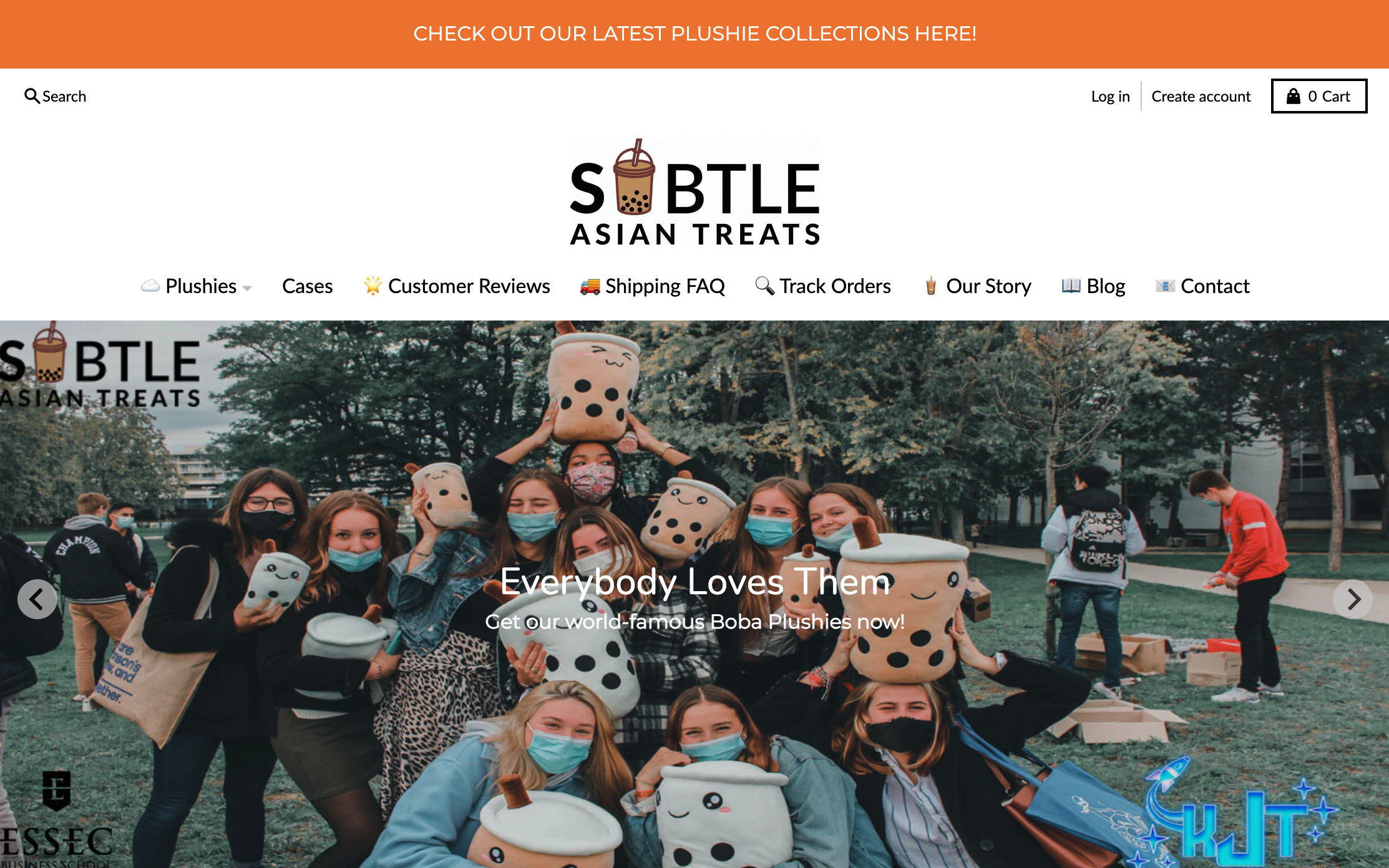
Website: https://subtleasiantreats.com/
Subtle Asian Treats sells kawaii plushies and boba-themed merch, and it started as a spinoff of a Facebook meme group, about as far from a funded startup as you can get. The homepage still holds its own: a warm, on-brand color palette, best-sellers with real review counts, and an embedded Instagram feed showing actual customers with their plushies. The founder's story and a couple of college club partnerships are worked into the page instead of hidden on an About tab.
What works: This is the most useful example on this list if you're starting small, because it proves you don't need a huge budget to look legitimate. A clear niche, consistent color choices, real customer photos instead of stock images, and a founder story that's actually visible are all things you can do with zero budget and a weekend. It's the opposite of the copy-paste theme problem: same tools, completely different result.
How to Build Your Own Dropshipping Website (No Developer Needed)
Looking at these examples, the pattern holds: what makes them work isn't a huge budget or custom development. It's a store that doesn't look copy-pasted, product pages that answer real questions, and a checkout people trust.
That's exactly what Wegic is built for. Describe your store - your niche, your products, your brand - and Wegic's AI puts together a site with product pages, a cart, and checkout already in place. You swap in your own photos, adjust the copy, and connect your own domain, without touching a line of code.
Plans start at $2.99, so you're not stuck paying agency prices to get a site that looks like the examples above.
Frequently Asked Questions
Q: What does a good dropshipping website actually look like?
A: At minimum: a design that isn't a stock theme with nothing changed, product pages that answer real shipping and sizing questions, recognizable payment options at checkout, and a way to capture visitors who aren't ready to buy yet, like an email signup. Everything else is a bonus once those basics are in place.
Q: Do I need to be on Shopify to run a dropshipping store?
A: No. Shopify is common because it's what most tutorials cover, but any website builder that supports a product catalog, a cart, and checkout works. AI builders like Wegic let you set that up by describing your business, without locking you into a platform built specifically around dropshipping apps.
Q: How much does it cost to build a dropshipping website?
A: A custom-designed store from an agency usually runs into the thousands. Website builders are a lot cheaper. Wegic starts at $2.99 and uses AI to speed up setup, which matters when you're running lean on a dropshipping margin.
Q: How do I make my dropshipping store not look like a template?
A: Change the obvious stuff first: real product photography or at least consistently edited supplier photos, product titles you'd actually say out loud, and a logo instead of default theme text. Small, consistent details do more than a complete redesign.
Q: How is a dropshipping website different from a regular online store?
A: Functionally, not much - both need a catalog, cart, and checkout. The real difference is inventory: a dropshipping store doesn't hold stock, so the site needs to set expectations on shipping times clearly, since orders often ship from a supplier rather than a local warehouse.
Looking at all these stores, the pattern is pretty clear: the ones that convert aren't the flashiest, they're the ones that don't feel like a stranger's warehouse. A few consistent details and an easy way to check out will beat a copy-pasted theme every time. If you've got that much figured out, you're already most of the way to a store worth buying from.