Was eine großartige Reise-Website ausmacht
Sie verkauft ein Gefühl, nicht nur ein Reiseziel
Jeder kann "10 Tage in Peru" mit einem Preis versehen auflisten. Was einen Reisenden zum Stoppen bringt, ist eine Seite, die ihn sich dort vorstellen lässt: der ruhige Morgen auf einem Pfad, das Abendessen mit Menschen, die er gerade erst kennengelernt hat, das Gefühl, etwas außerhalb der Komfortzone geschafft zu haben. Die stärksten Reise-Websites führen mit diesem Gefühl in der Fotografie und der Überschrift, nicht mit einer technischen Auflistung von Flugzeiten und Hotel-Sternebewertungen.
Sie macht Buchung oder Anfrage mühelos
Eine schöne Startseite, die in einem Sackgassen-Kontaktformular endet, ist eine verschwendete Reise für Ihren Besucher. Die besten Seiten machen den nächsten Schritt offensichtlich: ein "Ruf an buchen"-Button, ein einfaches Anfrageformular oder ein Terminplanungstool, mit dem jemand 15 Minuten in Ihrem Kalender reservieren kann, ohne eine einzige E-Mail hin und her zu schicken. Besonders für kleinere Betriebe ist die Reduzierung dieser Hürde auf einen Klick oft der Unterschied zwischen einem Lead und einem Absprung.
Sie schafft Vertrauen mit echtem Reisenden-Nachweis
Reiseplanung, besonders mit einem Fremden, ist ein Vertrauensvorschuss. "Unvergessliche Abenteuer" auf einem Homepage-Banner überzeugt niemanden. Was überzeugt: echte Reisefotos von tatsächlichen Kunden, spezifische Testimonials, die einen Guide namentlich erwähnen, oder ein einfacher Zähler wie "200+ Reisen geplant seit 2019." Die Seiten, die am besten konvertieren, behandeln diesen Nachweis wie eine Überschrift, nicht als etwas Verstecktes auf einer Testimonial-Seite, die niemand anklickt.
Sie funktioniert für Reisende überall auf der Welt
Wenn Sie hoffen, Kunden außerhalb Ihres Heimatlandes zu gewinnen, schreckt eine Seite, die nur eine Sprache spricht, einige von ihnen stillschweigend ab, bevor sie überhaupt Kontakt aufnehmen. Eine mehrsprachige Website ermöglicht eine Anfrage von einem Reisenden, der in seiner eigenen Sprache surft, anstatt darauf zu vertrauen, dass er einem Unternehmen vertraut, das er nur halb versteht.
7 Reise-Website-Beispiele, die wir lieben
Boutique-Agentur mit Fokus auf Luxus-Referenzen
Website: https://travelbta.com/
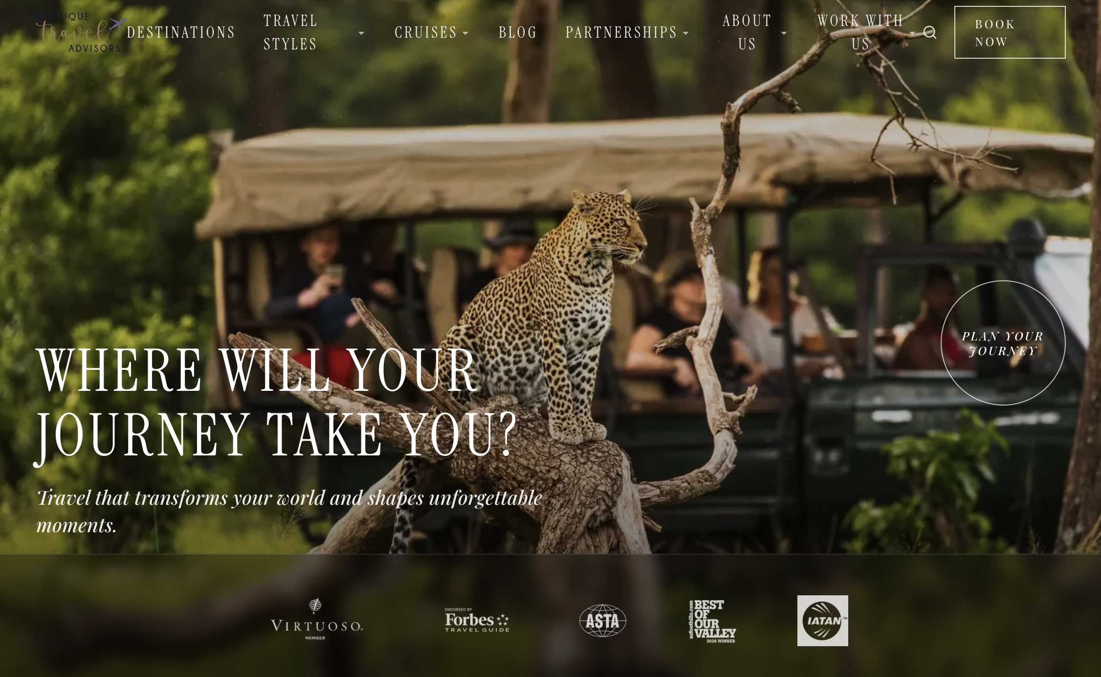
Boutique Travel Advisors führt nicht mit einem Rabatt oder einem Reiseziel, sondern mit einer Frage: "Wohin wird Ihre Reise Sie führen?" über einem eindrucksvollen Safari-Foto eines Leoparden, der auf einem Ast mitten in der Fahrt sitzt. Unterhalb des Sichtbereichs übernimmt eine Reihe von Vertrauensabzeichen die Hauptarbeit: Virtuoso, Forbes Travel Guide, ASTA, IATAN. Ein runder "Planen Sie Ihre Reise"-Button schwebt direkt über dem Hero-Bild, anstatt in der Navigation versteckt zu sein.
Was funktioniert: Diese vier Abzeichen komprimieren jahrelange Branchen-Glaubwürdigkeit in etwa fünf Sekunden Scanzeit, genau das, was ein neuer Besucher braucht, bevor er einem Fremden eine fünfstellige Reise anvertraut. Sie brauchen keine Virtuoso-Zertifizierung, um die Idee zu übernehmen: Schon ein oder zwei echte Referenzen, eine Zertifizierung, ein "wie gesehen in", eine spezifische Anzahl geplanter Reisen leisten denselben vertrauensbildenden Beitrag.
Abenteueranbieter verwandelt Reisesuche in ein Filtertool
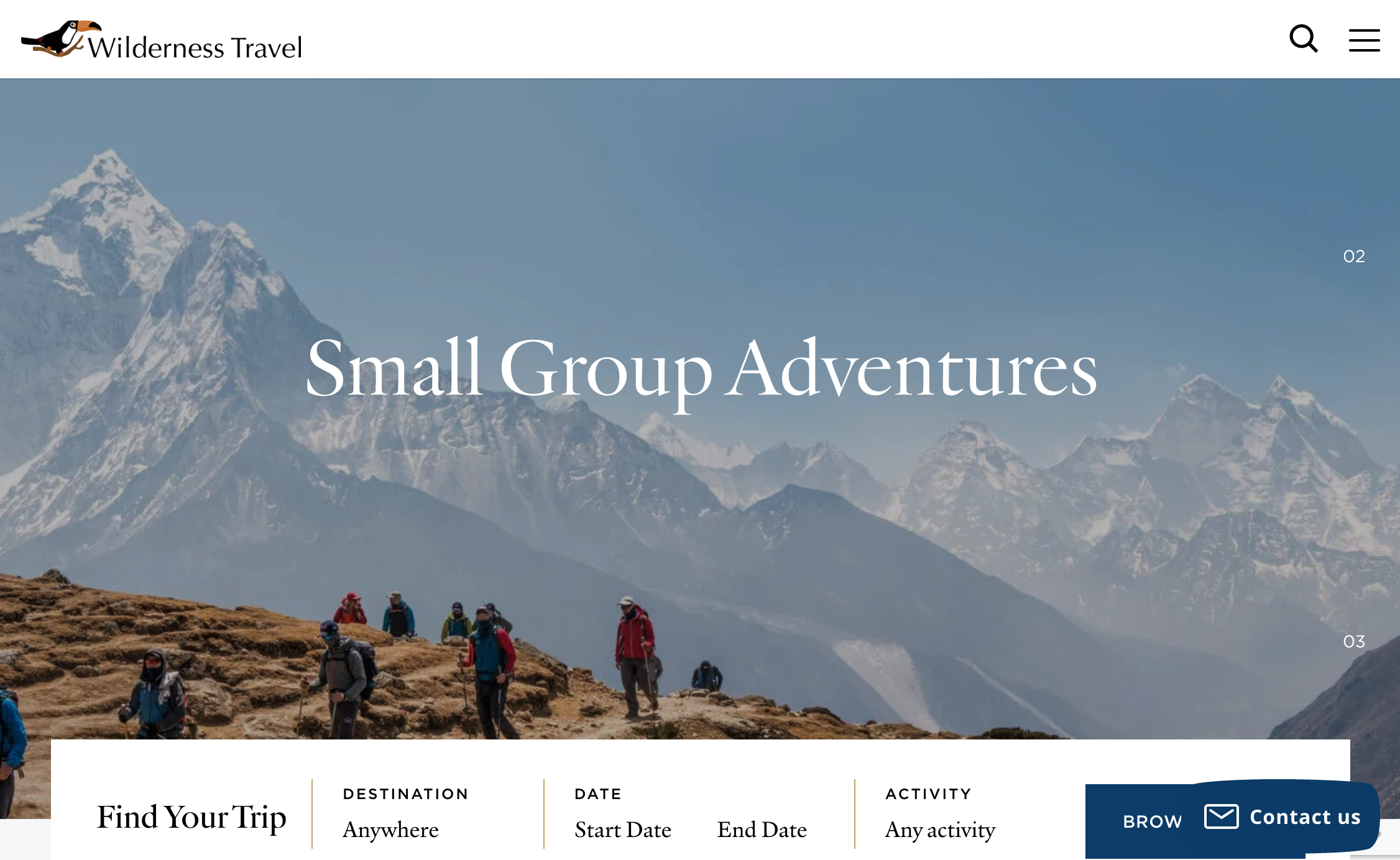
Die Seite für Kleingruppen-Abenteuer von Wilderness Travel beginnt mit Wanderern, die einen Grat im Himalaya erklimmen, und die Überschrift lautet einfach „Small Group Adventures“, Ausrufezeichen sind nicht nötig, wenn das Foto die Wirkung übernimmt. Direkt unter dem Hero-Bild befindet sich eine "Find Your Trip"-Leiste mit Filtern für Zielort, Daten und Aktivität, sodass ein Besucher vom Stöbern zur engeren Auswahl wechseln kann, ohne einen einzigen Absatz zu lesen. Die Seite untermauert das weiter unten mit Details: „über 150 Reisen weltweit“, durchschnittliche Gruppengröße „nur 10 (und nie mehr als 16)."
Was funktioniert: Eine Suchleiste mit Filtern oberhalb des Falzes verwandelt einen großen, bildlastigen Katalog in etwas, das ein Besucher tatsächlich durchsuchen kann, anstatt endlos zu scrollen. Wenn Sie mehr als nur wenige Reisen anbieten, spart selbst ein einfacher Ziel- oder Aktivitätsfilter Besuchern das Abspringen, wenn sie nicht innerhalb von zehn Sekunden finden, wonach sie suchen.
Luxus-Positionierung, die mit einem prägnanten Satz führt
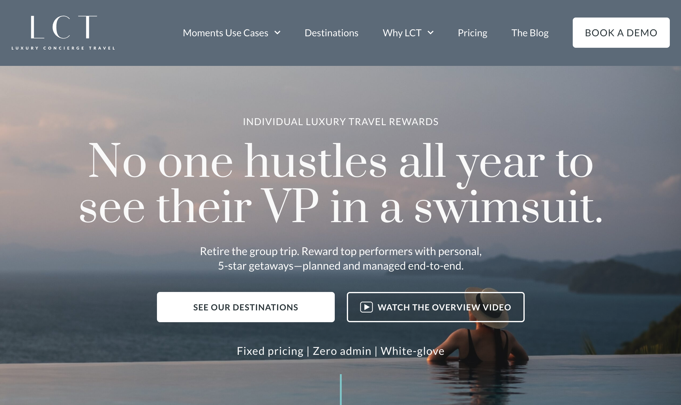
Website: https://luxuryconciergetravel.com/
Wichtig vorweg: LCT ist keine typische Urlaubsplanungsseite, sondern verkauft einzelne Luxusreise-Belohnungen an Unternehmen als Alternative zu Gruppen-Incentive-Reisen. Aber die Startseite ist eine Meisterklasse in einer Sache, die jedes Reiseunternehmen übernehmen kann: eine Überschrift mit echter Persönlichkeit. „Niemand rackert sich das ganze Jahr ab, um seinen VP im Badeanzug zu sehen“ sagt mehr über das Problem aus, das sie lösen, als eine Seite mit Aufzählungspunkten es könnte, unterstützt von drei klaren Versprechen direkt im Hero: „Festpreise. Keine Verwaltung. White-glove.“
Was funktioniert: Eine spezifische, leicht freche Überschrift bleibt eher im Gedächtnis als „Unvergessliche Luxus-Erlebnisse“. Was auch immer Sie verkaufen, eine Überschrift, die die tatsächliche Frustration Ihres Kunden benennt – Planungsmüdigkeit, Entscheidungsparalyse, ein Einheitsreiseplan – schlägt generische Luxusbegriffe jedes Mal.
Allein reisende Familienreiseplanerin, die sich selbst verkauft, nicht nur Pakete
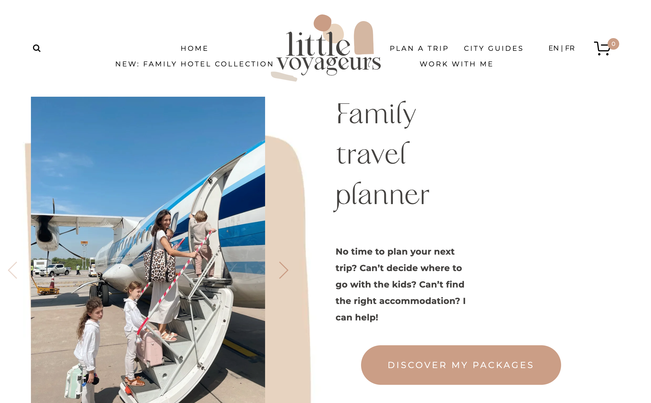
Website: https://www.littlevoyageurs.com/
Charlotte führt Little Voyageurs allein, und die Startseite macht das sofort klar: Ein echtes Foto von ihr beim Einsteigen in ein Flugzeug mit ihren drei eigenen Kindern steht direkt neben der Überschrift „Family travel planner“. Der Text spricht direkt den erschöpften Elternteil an, der sucht: „Keine Zeit, Ihre nächste Reise zu planen? Können Sie sich nicht entscheiden, wohin Sie mit den Kindern fahren sollen?“ Darunter vier klar benannte Pakete, „Pick My Brain“, „I Need a Break“, „Grand Voyage“, „Oh the Places You'll Go“, verwandeln einen vagen Beratungsservice in etwas, das ein Besucher tatsächlich aus einem Menü auswählen kann.
Was funktioniert: Pakete mit Persönlichkeit zu benennen statt „Basic / Premium / Deluxe“ macht die Entscheidung weniger wie eine Tabelle und mehr wie die Wahl der passenden Option. Mit einem echten Foto von sich und ihren Kindern zu führen, schafft mehr Vertrauen in einem Bild als ein Absatz „10 Jahre Erfahrung“ je könnte.
Reiseblog, der monetarisiert, ohne wie Werbung zu wirken
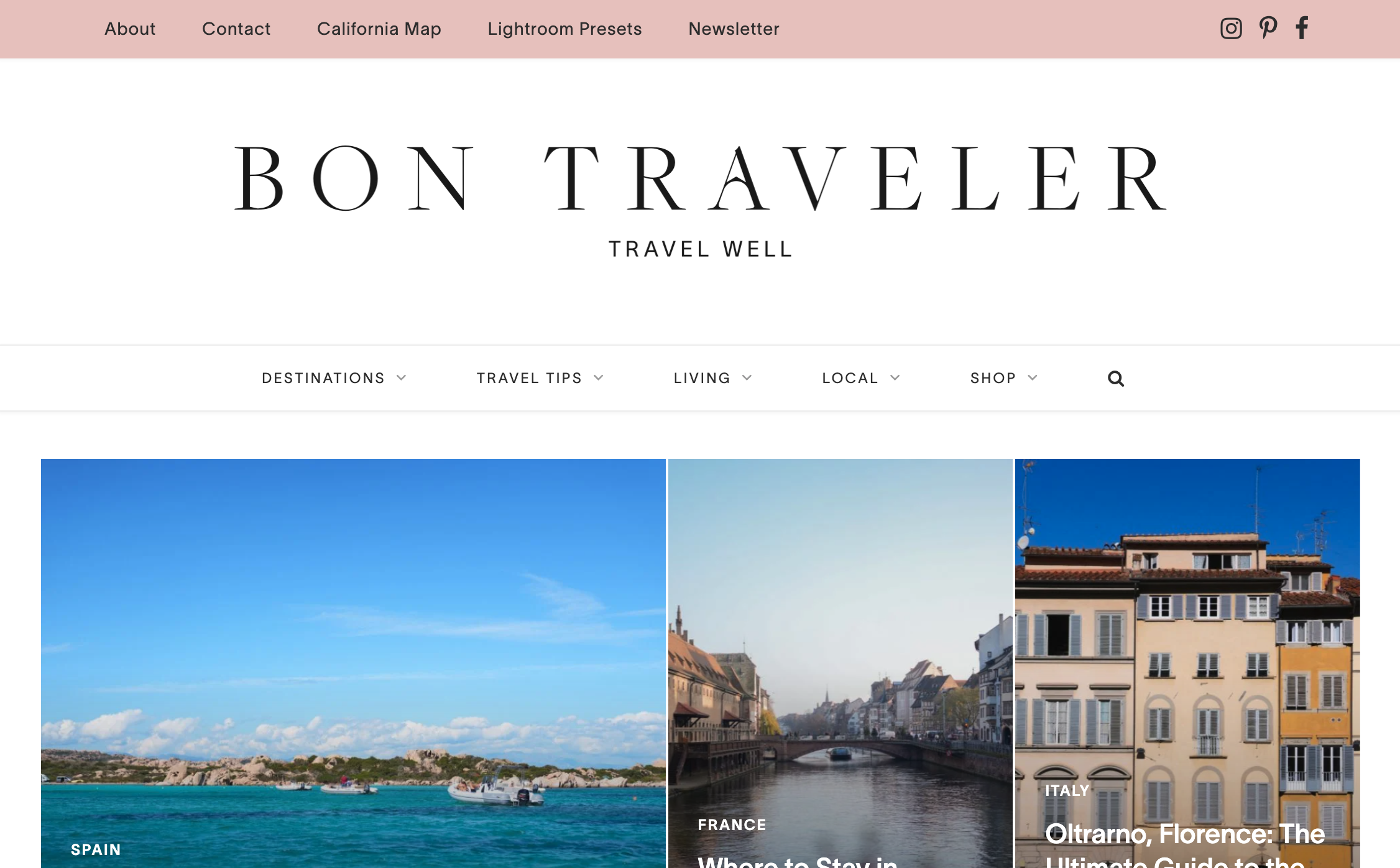
Website: https://www.bontraveler.com/
Bon Traveler liest sich eher wie ein Lifestyle-Magazin als ein typischer "10 beste Orte"-Blog: ein klares Serif-Logo, der Slogan „Travel Well“ und ein Raster mit aktuellen Reisezielgeschichten (Sardinien, Straßburg, Florenz), bei denen die Fotografie am meisten spricht. Die Seite macht ihr Geschäftsmodell im Footer transparent, mit klar offengelegten Affiliate-Links zu Booking.com, Airbnb und Viator sowie eigenen Produkten wie Lightroom-Presets.
Was funktioniert: Wenn Ihre „Website“ eher eine Content-Marke als eine Buchungsmaschine ist, schafft ein sauberes, redaktionelles Layout und ein persönlicher „Meet the Traveler“-Bereich das Vertrauen, das Menschen tatsächlich dazu bringt, Ihre Buchungslinks anzuklicken. Affiliate-Partnerschaften offen zu legen, anstatt sie zu verstecken, wirkt vertrauenswürdiger, nicht weniger.
Zeitungsstil-Layout zur Organisation großer Mengen an Inhalten
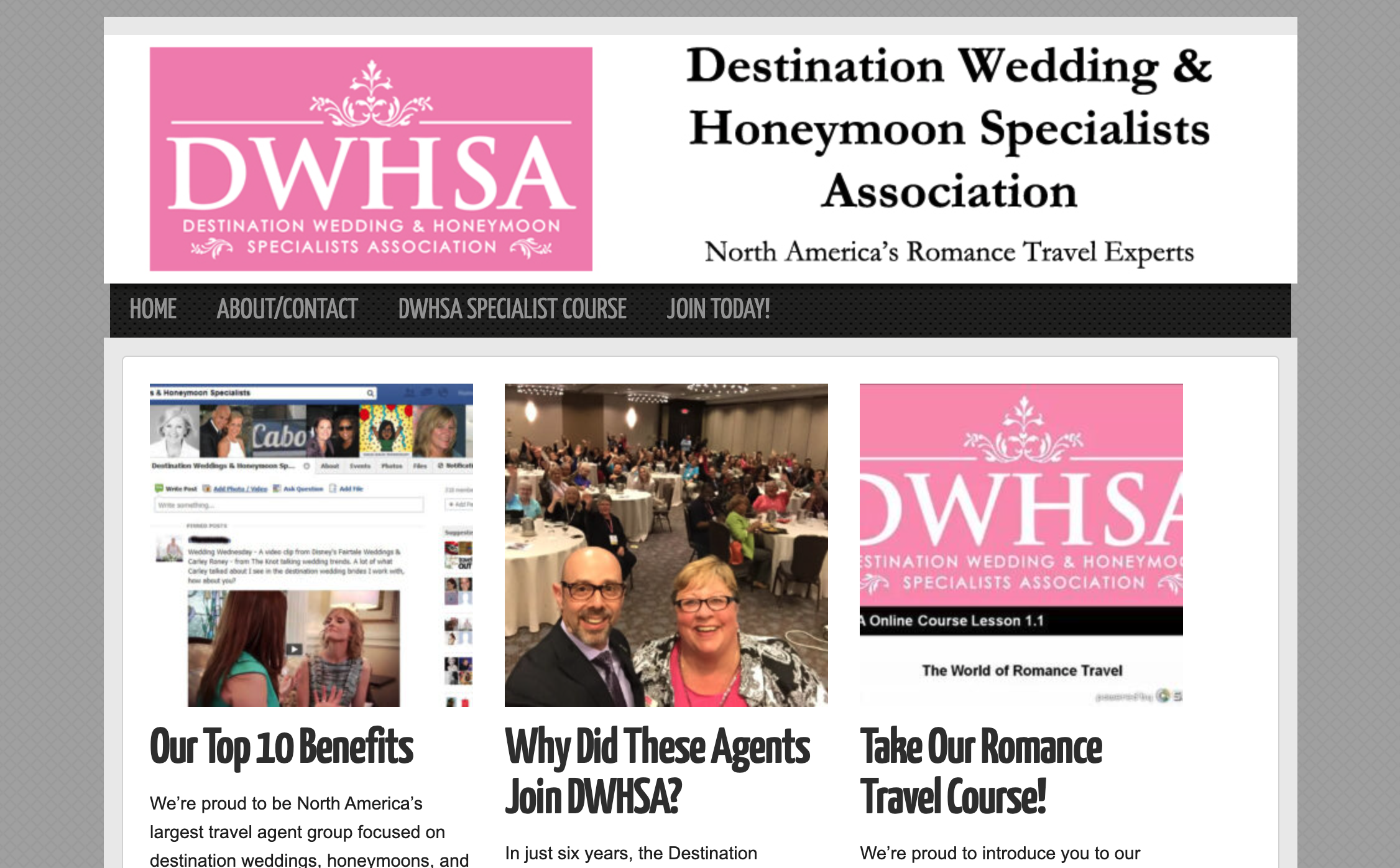
Website: https://www.dwagents.com/
DWHSA ist eigentlich ein Berufsverband, der Reisebüros in sein Netzwerk von Spezialisten für Hochzeitsreisen auf Destinationen rekrutiert, kein verbraucherorientierter Hochzeitsplaner, aber das Layout der Startseite ist für sich allein betrachtet eine Studie wert. Statt einer langen Scrollseite ist es wie eine Zeitungs-Titelseite organisiert: ein Raster quadratischer Vorschaubilder, jeweils mit einer Überschrift, „Unsere Top 10 Vorteile“, „Warum sind diese Agenten DWHSA beigetreten?“ und einem kurzen Auszug.
Was funktioniert: Wenn Sie mehr zu sagen haben, als eine einzelne Startseiten-Erzählung zulässt, ist ein Zeitungsstil-Raster eine saubere Möglichkeit, mehrere Geschichten gleichzeitig zu präsentieren, ohne eine lange Textwand. Für ein Reiseunternehmen funktioniert dasselbe Layout gut für einen Abschnitt „Empfohlene Reisen“ oder „Reisegeschichten“, der Besuchern erlaubt, Überschriften zu überfliegen und die anzuklicken, die sie interessieren.
Wegic Demo - Warm Coral
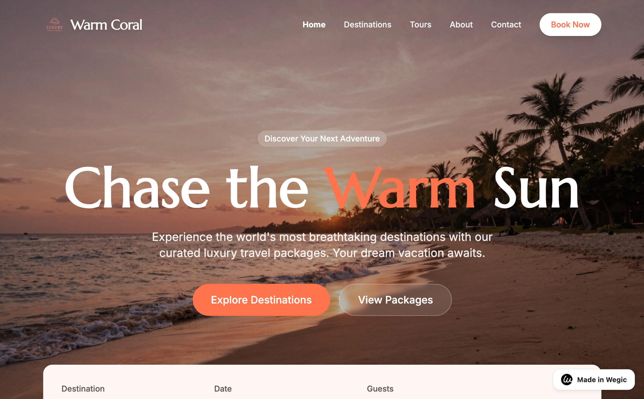
Dies ist eine Demo, die wir direkt in Wegic erstellt haben: eine Luxusreiseagentur namens Warm Coral. Der Hero-Bereich verwendet ein Sonnenuntergangs-Strandfoto mit Palmen, die Überschrift „Chase the Warm Sun“ (wobei „Warm" in Korallenorange hervorgehoben ist, passend zum Namen) und eine Unterüberschrift, die kuratierte Luxusreise-Pakete verspricht. Eine Suchleiste für Ziel, Datum und Gäste befindet sich direkt unter dem Falz, und die Buttons „Explore Destinations“ und „View Packages“ geben Besuchern zwei klare nächste Schritte, je nachdem, ob sie stöbern oder buchen möchten.
Was funktioniert: Der Farbname, der direkt in der Überschrift „Chase the Warm Sun“ auftaucht, ist eine kleine Nuance, die die Marke absichtlich statt generisch wirken lässt, und das Ganze entstand, ohne jemanden dafür zu engagieren. Beschreiben Sie Ihr Reiseunternehmen Wegic und Sie erhalten einen Ausgangspunkt wie diesen, bei dem Farben, Überschrift und Suchleiste bereits zusammenarbeiten, bereit zur Anpassung statt von Null zu beginnen.
Wie Sie Ihre eigene Reise-Website erstellen (ohne Entwicklerteam)
Wenn man sich diese Beispiele anschaut, bestätigt sich das Muster: Was sie erfolgreich macht, ist kein großes Budget oder individueller Code. Es ist ein klares Gefühl, ein einfacher nächster Schritt und echter Beweis, der die Aussagen untermauert. All das können Sie selbst erstellen.
Genau dafür ist Wegic gebaut. Beschreiben Sie Ihr Unternehmen – die Reisen, die Sie anbieten, Ihre Ziele, was Sie von einer generischen OTA unterscheidet – und Wegics KI erstellt eine Seite mit einem Anfrageformular, Reise-Highlights und einem Testimonial-Bereich, die bereits integriert sind. Von dort aus tauschen Sie Ihre eigenen Fotos aus, passen den Text an und verbinden Ihre eigene Domain, ganz ohne Code.
Die Pläne beginnen bei 2,99 $, sodass ein einzelner Guide oder eine kleine Agentur eine Website bekommen kann, die so gut aussieht, ohne Agenturpreise zu zahlen oder Monate mit dem Aufbau zu verbringen.
Häufig gestellte Fragen
F: Was sollte eine Website für ein Reisebüro enthalten?
Mindestens: ein klares Bild davon, welche Reisen oder Dienstleistungen Sie anbieten, echte Fotos und Erfahrungsberichte von früheren Reisenden, eine einfache Möglichkeit zur Anfrage oder Terminvereinbarung und Kontaktdaten, die leicht zu finden sind. Alles andere, wie ein Blog oder eine ausführliche FAQ-Seite, ist ein Bonus, sobald diese Grundlagen abgedeckt sind.
F: Wie viel kostet eine Reise-Website?
Eine maßgeschneiderte Website von einer Agentur kann mehrere Tausend kosten, zuzüglich laufender Wartung. KI-Website-Builder sind zum Start viel günstiger. Wegic beginnt bei 2,99 $, was wichtig ist, wenn Sie Einzelunternehmer oder ein kleines Team ohne Marketingbudget sind.
F: Brauche ich ein Buchungssystem auf meiner Reise-Website?
Nicht unbedingt, besonders am Anfang. Viele erfolgreiche Reiseunternehmen starten mit einem einfachen Anfrageformular und regeln Buchungsdetails per Telefon oder E-Mail. Sie können später immer einen automatisierteren Buchungsablauf hinzufügen, sobald Sie wissen, was Ihre Kunden tatsächlich brauchen.
F: Wie lange dauert es, eine Reise-Website zu erstellen?
Mit einem KI-Builder kann eine erste funktionierende Version in Minuten statt Wochen entstehen. Sie werden trotzdem Zeit brauchen, um echte Fotos hinzuzufügen, Ihre Texte zu verfeinern und alles zu überprüfen, bevor die Seite live geht, aber die Hauptarbeit beim Layout der Seite geht schnell vonstatten.
F: Kann ich eine mehrsprachige Reise-Website für internationale Kunden erstellen?
Ja. Wenn Sie hoffen, Reisende außerhalb Ihres Heimatlandes zu gewinnen, ermöglicht eine mehrsprachige Einrichtung ihnen, Ihre Reisen in ihrer eigenen Sprache zu lesen und Kontakt aufzunehmen, anstatt sich auf eine Browser-Übersetzung zu verlassen, die möglicherweise Details verliert, die eine Reise tatsächlich verkaufen.
Wenn man sich all diese Websites anschaut, sind es nicht unbedingt die mit den größten Budgets, die herausstechen. Es sind die, die beim Besucher etwas ausgelöst und ihm eine klare Handlungsoption gegeben haben. Wenn das stimmt, ist der Rest des Designs nur noch Feinschliff.