Why Every B2B Business Needs a High-Performing Website
A high-performing website is one of the most important assets for any B2B business. It serves as the first point of contact for potential customers, helping them understand your products or services, industry expertise, and unique value proposition before they reach out to your sales team. A professional website also builds trust by showcasing customer success stories, case studies, testimonials, and company credentials. With clear messaging, intuitive navigation, and strategically placed calls to action, a well-designed B2B website can generate qualified leads, support longer buying journeys, and turn visitors into long-term business customers.
What Makes the Best B2B Websites Stand Out
The best B2B websites do more than present products or services—they communicate value clearly and build trust throughout the buyer's journey. They feature compelling value propositions, well-structured product or service pages, and customer success stories that demonstrate real business results. Effective B2B websites also make it easy for visitors to explore solutions, request demos, or contact the sales team through intuitive navigation and conversion-focused calls to action. Combined with fast performance, responsive design, and consistent branding, these elements create a professional user experience that supports lead generation and long-term business growth.
8 Best B2B Website Examples
The best B2B websites do more than showcase products or services—they communicate value, build credibility, and guide potential customers toward taking action. From SaaS platforms and enterprise technology companies to creative businesses and professional service firms, each website below demonstrates a unique approach to user experience, branding, and lead generation. Explore these examples to discover practical ideas you can apply when building or redesigning your own B2B website.
SaaS & Productivity B2B Websites
SaaS and productivity websites are designed to help users quickly understand complex products while encouraging them to explore features, start free trials, or request demos. The best examples combine clear messaging, intuitive navigation, and user-focused design to simplify decision-making and build confidence. The following websites demonstrate how successful SaaS companies use product storytelling, clean interfaces, and conversion-focused experiences to attract and retain business customers.
Notion
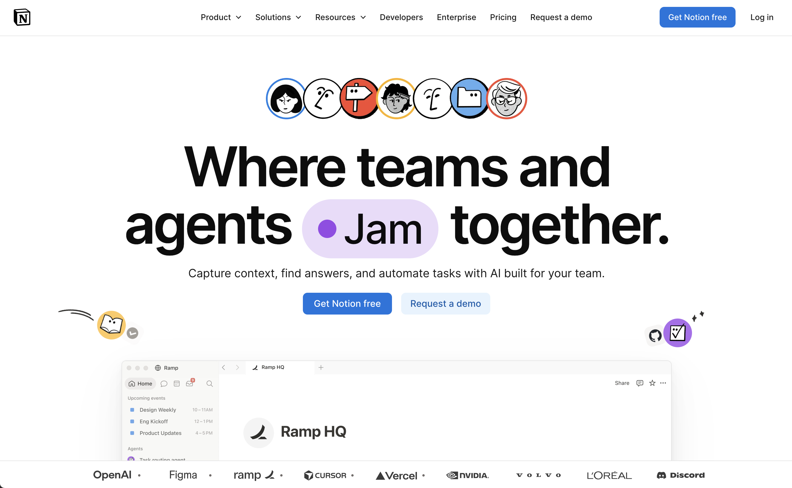
Notion is an all-in-one workspace that helps teams organize projects, documents, knowledge, and collaboration in a single platform. Its website reflects the product's philosophy of simplicity and flexibility, using clean layouts, concise messaging, and interactive product demonstrations to help visitors quickly understand how Notion can improve the way they work.
Why it works:
- The homepage immediately communicates Notion's core value with a clear headline and simple messaging that appeals to both individuals and businesses.
- Interactive product previews and visuals demonstrate real-world use cases, allowing visitors to understand the product before signing up.
- Customer stories, well-known brand logos, and user testimonials build credibility and reinforce trust with potential customers.
- Well-organized navigation makes it easy to explore features, templates, pricing, AI capabilities, and enterprise solutions without overwhelming users.
- Strategic calls to action, including free sign-up options and product demos, encourage visitors to experience the platform with minimal friction.
Best takeaway: Keep your messaging simple and let your product tell the story. Combining clear value propositions with interactive demonstrations and strong social proof can significantly improve user engagement and conversions.
Dovetail
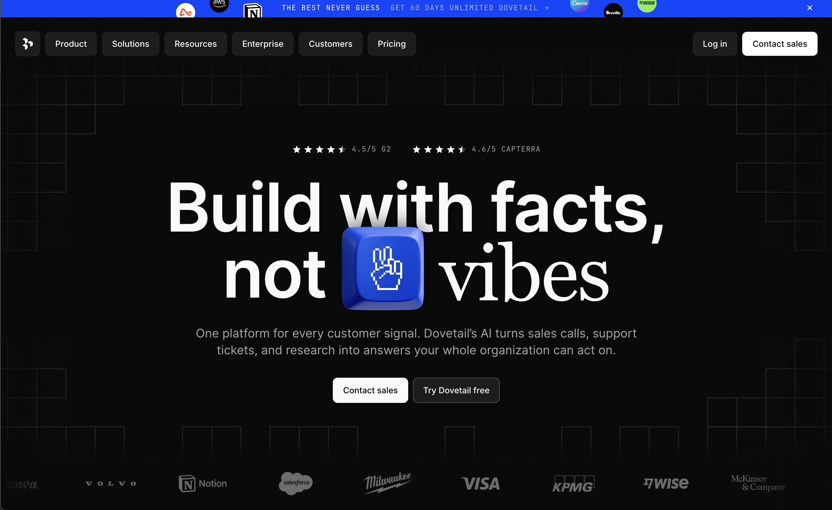
Dovetail is a customer research platform that helps teams collect, organize, and analyze user insights in one collaborative workspace. Its website reflects the product's emphasis on clarity and structure, presenting complex research workflows through clean layouts, thoughtful visuals, and well-organized content that makes the platform feel approachable and easy to understand.
Why it works:
- The website presents complex product capabilities through simple, benefit-focused messaging that quickly explains how Dovetail helps teams turn customer feedback into actionable insights.
- A clean information architecture and intuitive navigation make it easy for visitors to explore features, solutions, integrations, and customer stories.
- Modern typography, generous white space, and a refined visual system create a premium SaaS experience while improving readability.
- Product screenshots and workflow illustrations help visitors visualize how the platform fits into real research and product development processes.
- Educational content, customer success stories, and a well-structured blog strengthen authority while supporting long-term SEO growth.
Best takeaway: Great B2B websites don't just explain what a product does—they demonstrate how it solves real business problems through clear messaging, organized content, and user-focused design.
Enterprise Technology Websites
Enterprise technology websites must communicate trust, reliability, and technical expertise while making complex products easy to understand. The best examples balance detailed product information with intuitive navigation, helping business decision-makers quickly evaluate solutions without feeling overwhelmed. The following websites demonstrate how enterprise brands use clear messaging, strong credibility signals, and user-focused design to support longer B2B buying journeys.
Stripe
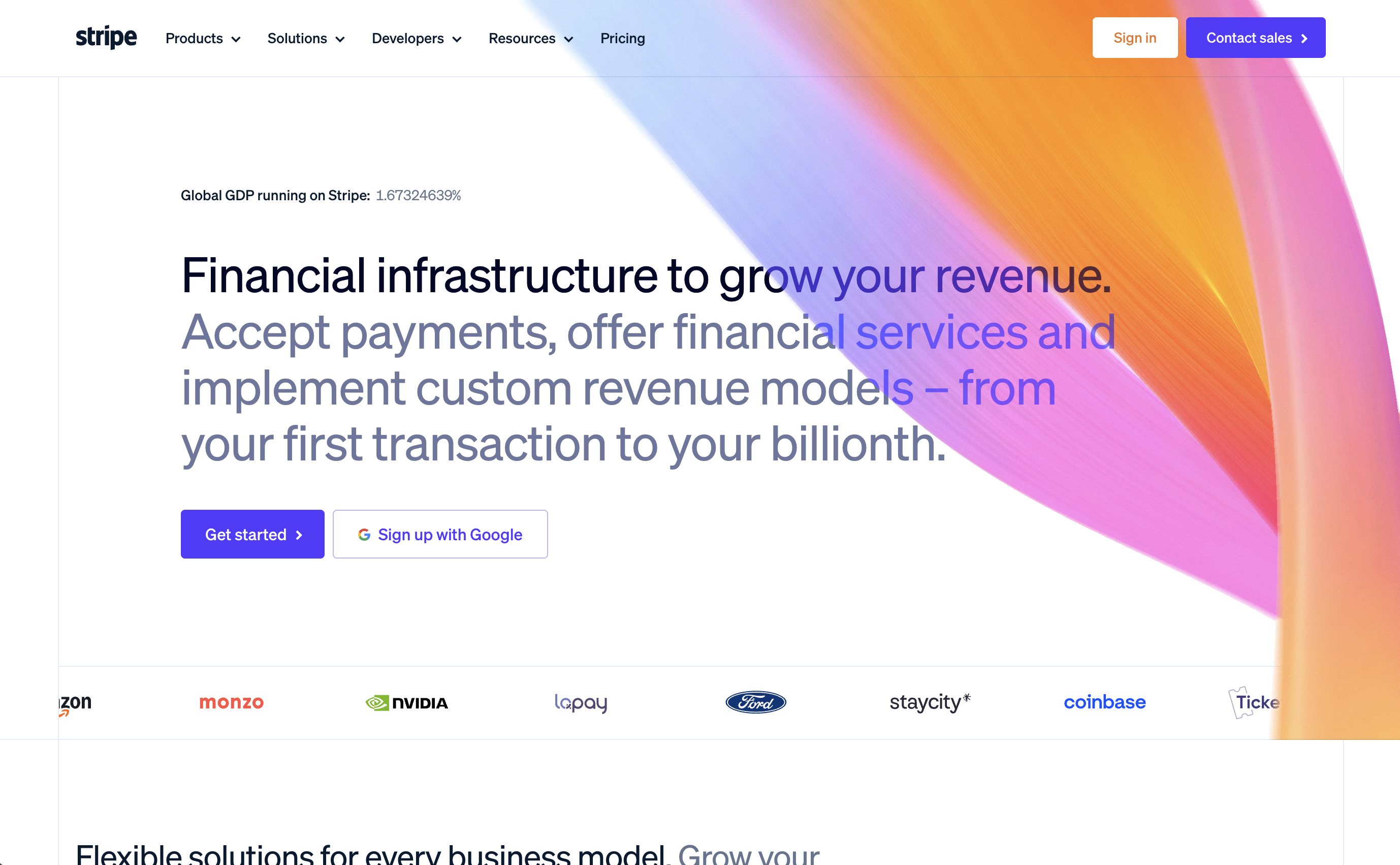
Stripe is a financial infrastructure platform that enables businesses to accept payments, manage revenue, and build online commerce solutions. Its website is widely recognized for combining sophisticated product messaging with elegant design, making complex financial technology feel accessible to developers, startups, and enterprise organizations alike.
Why it works:
- The homepage clearly explains Stripe's value proposition with concise messaging supported by interactive visuals and real product examples.
- Product pages are organized around customer needs, making it easy for businesses to explore payment solutions, financial tools, and developer resources.
- Technical documentation, customer stories, and industry-specific solutions build trust with both developers and enterprise decision-makers.
- Modern animations and clean layouts enhance the browsing experience without distracting from the core message.
- Prominent calls to action encourage visitors to contact sales, explore documentation, or start building with Stripe.
Best takeaway: Even highly technical products can feel approachable. Clear messaging, structured content, and thoughtful visual design help simplify complexity while building confidence with potential customers.
Cloudflare
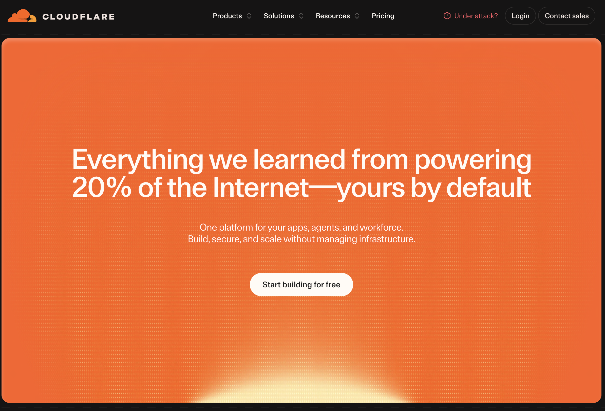
Cloudflare is a global cloud connectivity and cybersecurity platform that helps businesses improve website performance, security, and reliability. Its website successfully presents a broad portfolio of enterprise solutions through clear information architecture, helping visitors quickly understand complex services while reinforcing the company's reputation as a trusted technology leader.
Why it works:
- The website communicates technical expertise through clear, benefit-focused messaging rather than overwhelming visitors with industry jargon.
- Well-structured navigation organizes products, solutions, industries, and learning resources into intuitive categories.
- Customer success stories, global performance statistics, and enterprise partnerships strengthen credibility and demonstrate real-world impact.
- Educational resources, documentation, and reports position Cloudflare as an authority while supporting organic search visibility.
- Strong calls to action guide visitors toward contacting sales, exploring products, or learning more about specific enterprise solutions.
Best takeaway: Enterprise websites should inspire confidence before promoting products. Combining trust signals, educational content, and organized navigation helps visitors understand complex solutions and move forward with confidence.
Creative & Modern B2B Websites
Creative B2B websites prove that professional design and business performance can go hand in hand. Instead of relying on traditional corporate layouts, these websites use modern visuals, minimalist interfaces, and engaging user experiences to communicate their products and brand identity. The following examples demonstrate how thoughtful design, compelling storytelling, and intuitive navigation can help businesses stand out in competitive markets while driving user engagement and conversions.
Linear
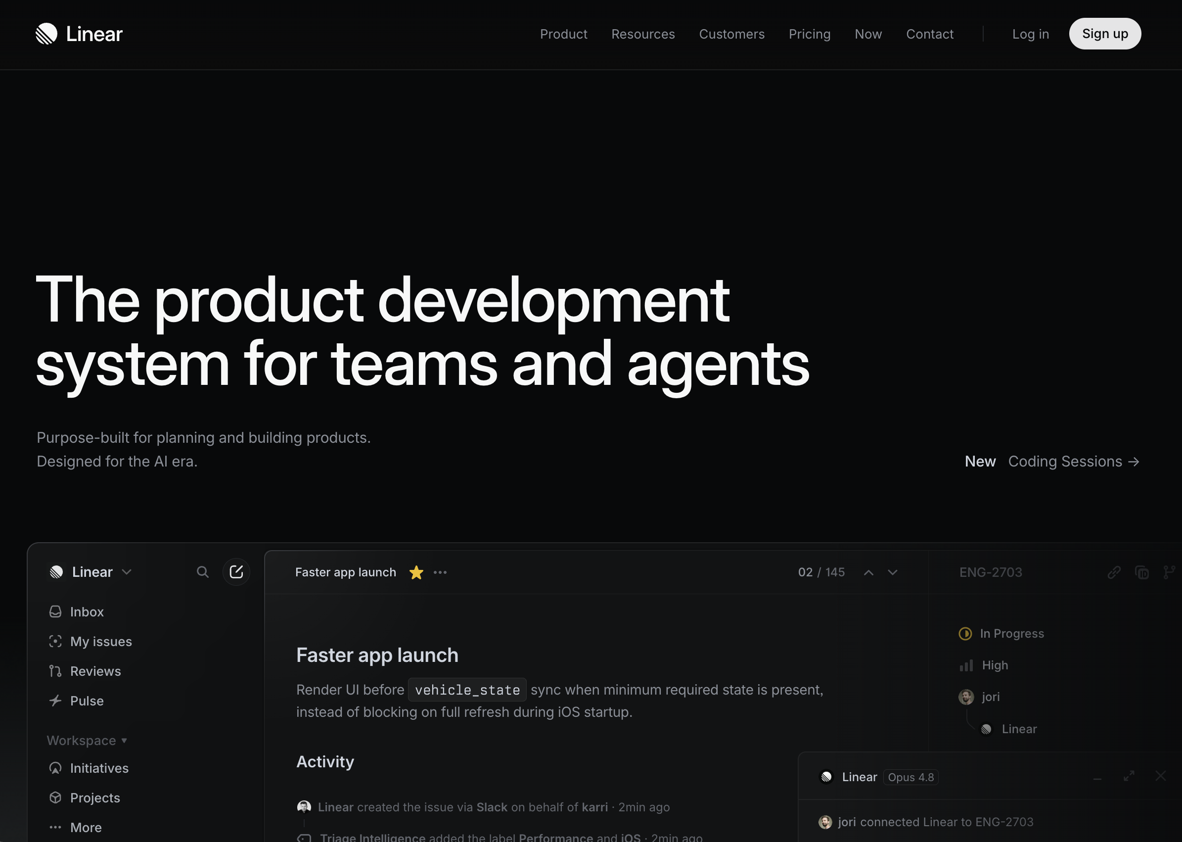
Linear is a project management platform built for modern software teams, and its website perfectly reflects the product's focus on speed, precision, and simplicity. Every element—from the typography and animations to the page layouts—is intentionally minimal, allowing the product itself to take center stage. The result is a polished user experience that feels fast, premium, and highly focused.
Why it works:
- A clean, minimalist interface removes distractions and keeps attention on the product's core value.
- Subtle animations and smooth transitions add personality without affecting usability or performance.
- Product screenshots and interactive demonstrations clearly communicate features instead of relying on lengthy explanations.
- Consistent typography, spacing, and visual hierarchy create a premium, cohesive brand experience.
- Clear calls to action encourage visitors to start using the product while maintaining a simple, uncluttered user journey.
Best takeaway: Simplicity can be a competitive advantage. By removing unnecessary visual elements and focusing on product clarity, B2B websites can create a more engaging and memorable user experience.
Webflow
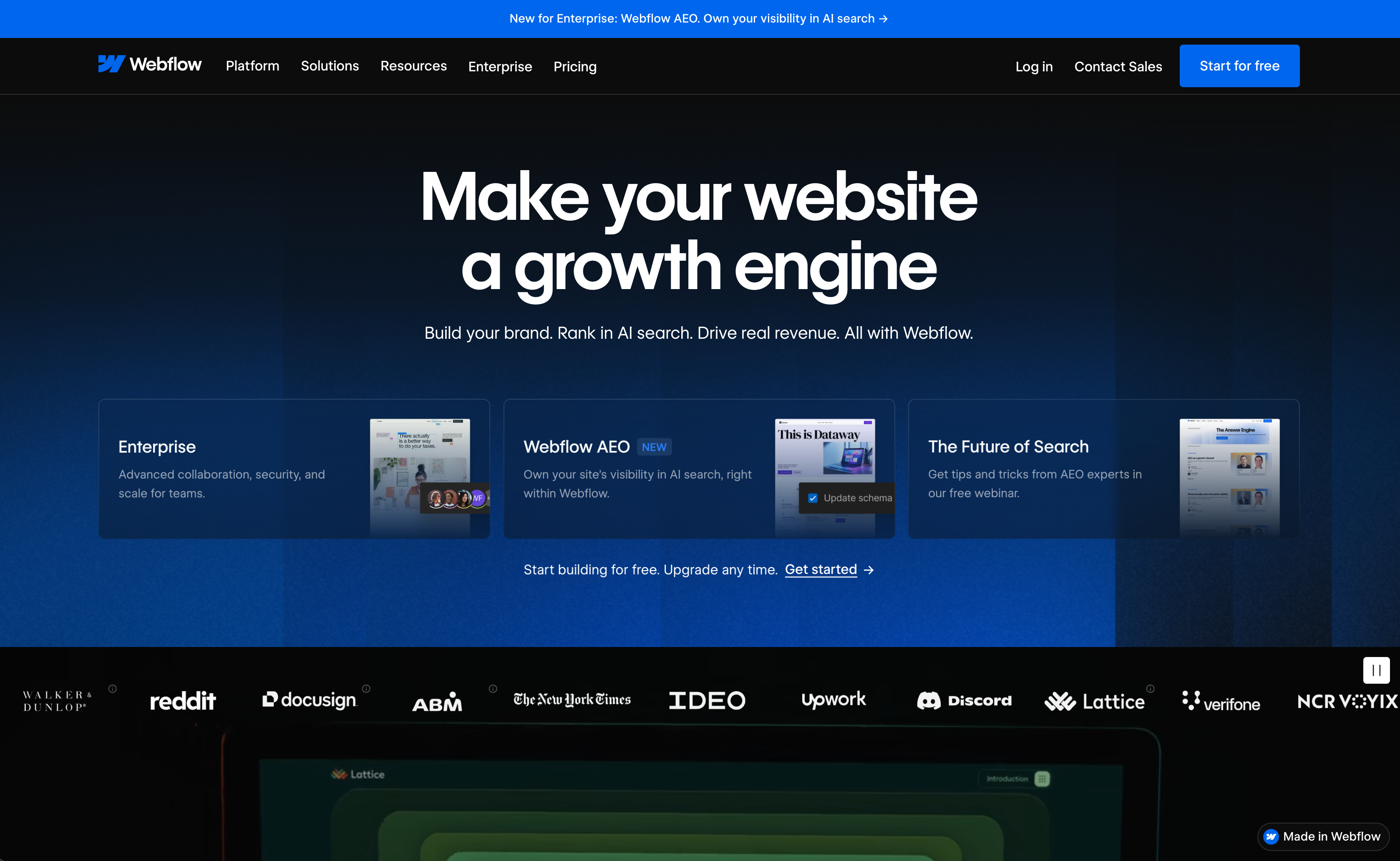
Webflow is a website experience platform that combines visual website building, content management, and hosting into a single solution. Its website is an excellent example of how educational content, community resources, and product marketing can work together to attract, educate, and convert visitors. Rather than simply promoting features, Webflow demonstrates real-world value through templates, customer stories, tutorials, and an extensive learning ecosystem.
Why it works:
- The homepage clearly communicates Webflow's value while directing different audiences to the most relevant products and resources.
- Rich educational content—including the blog, Webflow University, templates, and customer showcases—supports both SEO and long-term audience growth.
- Interactive visuals and product demonstrations make complex website-building capabilities easy to understand.
- Strong social proof, customer success stories, and well-known brand logos reinforce credibility with businesses of all sizes.
- Consistent branding and conversion-focused calls to action guide visitors naturally toward starting a project or exploring the platform.
Best takeaway: Great B2B websites educate before they sell. Combining valuable content, community resources, and product demonstrations helps build trust while creating a sustainable source of organic traffic and qualified leads.
Professional Services Websites
Professional services websites are designed to build credibility long before a client makes contact. Unlike product-focused B2B websites, consulting firms must demonstrate expertise, industry knowledge, and proven results through compelling content, client success stories, and thought leadership. The following examples show how leading professional service firms use strategic messaging, trust signals, and well-structured content to strengthen their brand and attract enterprise clients.
Deloitte
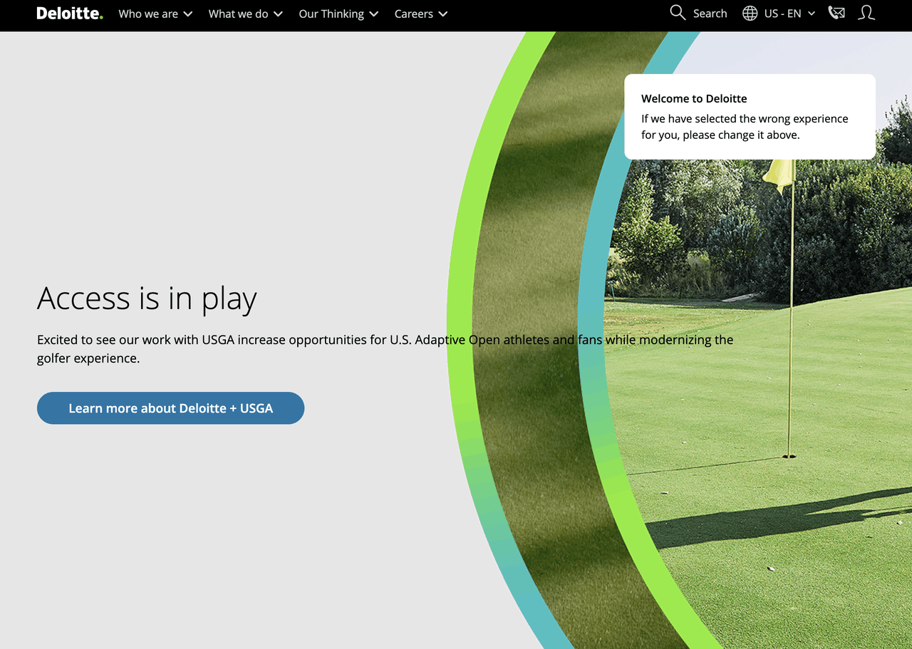
Deloitte is one of the world's leading professional services firms, offering consulting, audit, tax, and advisory solutions to organizations across a wide range of industries. Its website reflects the firm's global reputation by combining authoritative content, industry expertise, and a structured user experience that helps business leaders quickly find relevant insights and services.
Why it works:
- The homepage communicates Deloitte's expertise through industry-focused messaging and thought leadership rather than promotional language.
- Services, industries, and insights are organized into a clear navigation structure, making complex information easy to explore.
- Research reports, case studies, and expert articles position Deloitte as a trusted advisor and reinforce its credibility.
- Consistent branding and professional design create a polished experience that reflects the firm's global presence.
- Well-placed calls to action encourage visitors to explore services, access insights, or connect with Deloitte professionals.
Best takeaway: Professional services websites should establish authority by sharing expertise before promoting services. High-quality content, clear navigation, and strong trust signals help build confidence with potential clients.
Accenture
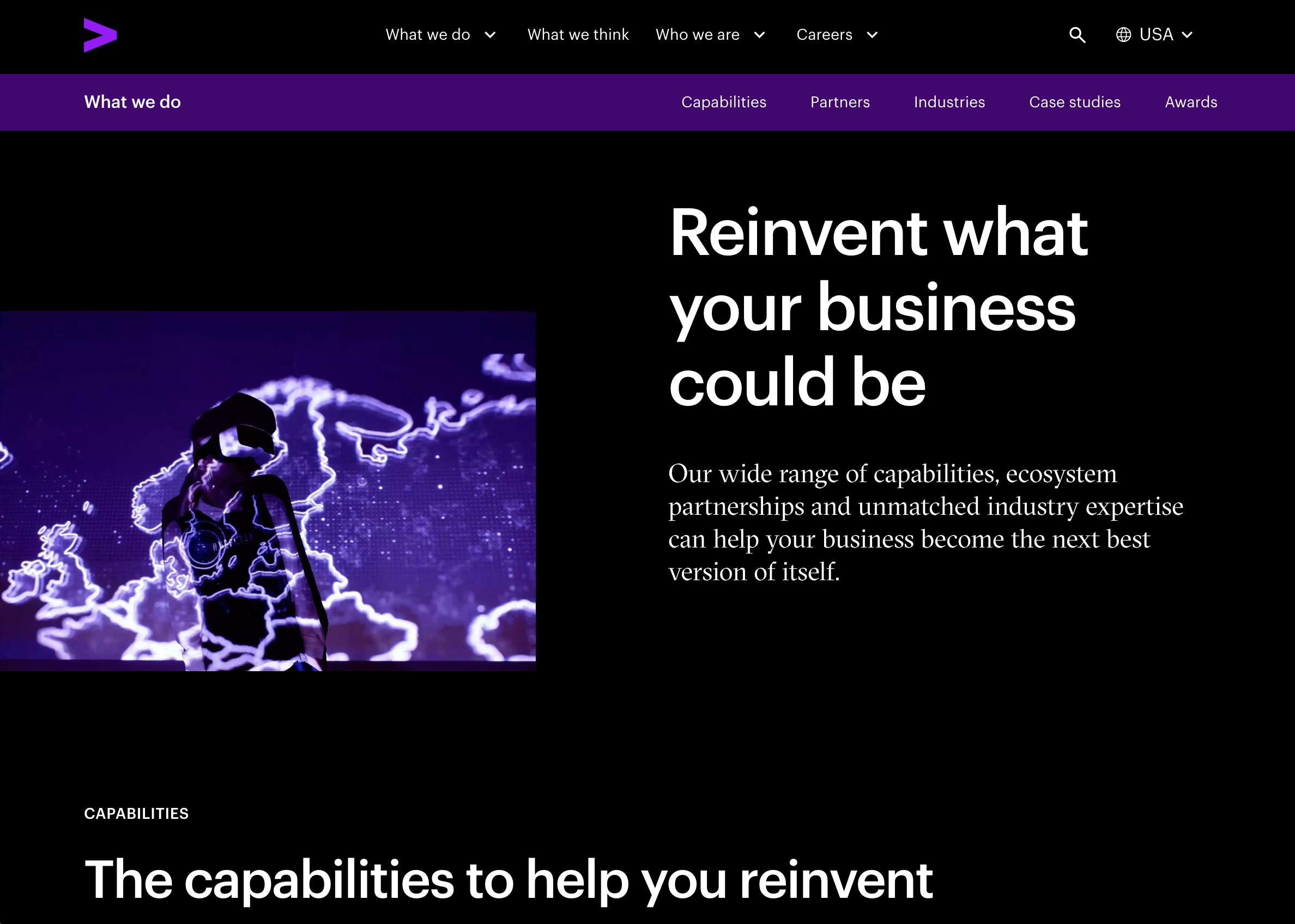
Accenture is a global consulting and technology company that helps organizations transform through digital innovation, cloud computing, AI, and strategy consulting. Its website combines bold storytelling with enterprise-focused messaging to showcase how innovation can solve complex business challenges while reinforcing Accenture's position as a global technology leader.
Why it works:
- Strong headlines and modern visuals communicate innovation while keeping the focus on business outcomes.
- Industry pages, client stories, and solution-focused content help decision-makers quickly discover relevant expertise.
- Interactive content and dynamic layouts create an engaging experience without sacrificing clarity or usability.
- Global research, technology insights, and customer success stories strengthen authority and demonstrate measurable impact.
- Clear pathways to services, case studies, and contact options guide visitors smoothly through the decision-making process.
Best takeaway: Enterprise consulting websites should combine thought leadership with compelling storytelling. Showing real business outcomes through client success stories and industry insights helps transform expertise into trust.
What These B2B Website Examples Can Teach You
Communicate Your Value Proposition Clearly
The best B2B websites make their value proposition clear from the moment visitors land on the homepage. Instead of using vague or overly technical language, they explain what the business offers, who it serves, and how it solves specific customer challenges. A clear message helps visitors quickly understand your products or services and encourages them to continue exploring your website.
Build Trust Through Social Proof
Trust plays a critical role in B2B purchasing decisions. Customer testimonials, case studies, client logos, industry certifications, awards, and measurable results all help demonstrate credibility and reduce uncertainty. By showcasing real customer success and proven outcomes, B2B businesses can strengthen confidence and encourage potential clients to take the next step.
Simplify the User Journey
A successful B2B website guides visitors through a clear and intuitive journey. Well-organized navigation, logical page structures, and easy access to key information help users quickly find what they need. Whether the goal is requesting a demo, contacting the sales team, or exploring product features, reducing friction can significantly improve the overall user experience.
Design for Lead Generation
Every page on a B2B website should support lead generation. Strategic calls to action, contact forms, demo requests, and downloadable resources encourage visitors to engage with your business. By combining compelling content with a conversion-focused design, companies can turn more website visitors into qualified leads and long-term customers.
Frequently Asked Questions
What should a B2B website include?
A successful B2B website should include a clear value proposition, detailed product or service pages, customer testimonials, case studies, and easy-to-find contact information. It should also feature strong calls to action, responsive design, fast loading speeds, and intuitive navigation to help visitors quickly understand your business and take the next step.
What makes a successful B2B website?
The best B2B websites combine clear messaging, professional design, and a seamless user experience. They establish trust through customer success stories, client logos, certifications, and measurable results while making it easy for potential customers to request a demo, schedule a consultation, or contact the sales team. Every page should support both credibility and lead generation.
How can a B2B website generate more leads?
A B2B website can generate more leads by presenting a compelling value proposition, creating high-quality content that addresses customer needs, and using strategically placed calls to action. Offering resources such as case studies, white papers, or product demos can encourage visitors to engage with your business. Optimizing your website through Wegic for SEO, mobile devices, and page speed also helps attract more qualified traffic and improve conversion rates over time.