What Makes a Great Lawyer Website
It Makes the Attorney Feel Like a Real Person, Not a Logo
A visitor doesn't want to hire a building. They want to hire a person. The best lawyer websites lead with a real photo, a real name, and a short, honest bio. Not a stock photo of a gavel. Not a wall of text about "excellence" and "integrity." Just someone a stressed-out visitor can picture sitting across a desk from them.
It Answers "Can I Actually Afford This" Before You Have to Ask
Legal fees are confusing. Most people are too nervous to ask about money on a first call. A free consultation offer, a flat fee for a specific service, or a simple "here's how billing works" page removes that fear early. You don't need exact pricing on every page. You just need to signal that money won't be a scary surprise.
It Makes the Next Step Feel Low-Risk
A visitor in crisis doesn't want to fill out a ten-field form. They want an easy way to reach a human, fast. A WhatsApp button next to the contact form gives them a low-pressure way to ask a quick question first. A scheduling link for a free consultation turns "I should call someday" into an actual appointment on the calendar.
It Shows Real Results Without Overpromising
Case results and testimonials build trust fast. But lawyers can't promise outcomes the way other industries do. The best sites handle this carefully. They show specific past results with a clear disclaimer. Or they use client quotes that talk about how the attorney made them feel, not just what they won. That balance matters for trust, and it matters for bar advertising rules too.
9 Lawyer Website Examples We Love
Leading With the Numbers
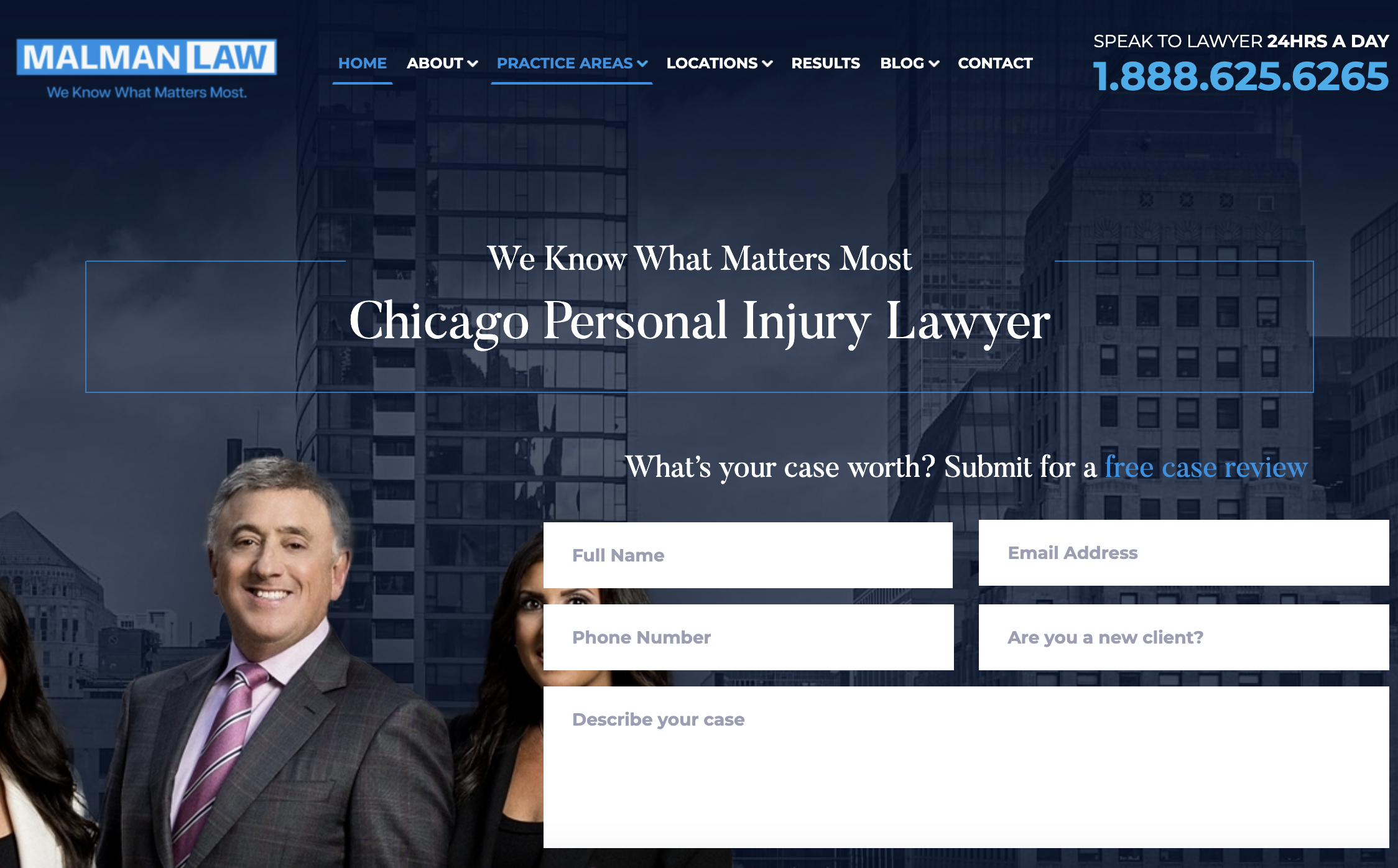
Website: https://www.malmanlaw.com/
Malman Law is a Chicago personal injury firm with over 50 attorneys. The homepage leads with numbers: $750M+ recovered, over 4,000 Google reviews, a 95% success rate. Below that sits a full team page with headshots, from the founder down to associate attorneys. A "Free Case Review" button follows you down the page.
What works: Big numbers build trust fast in personal injury, where clients are comparing firms by track record. The team page also does something subtle. It shows depth. A visitor worried their case will get handed to a junior associate can see the whole bench before they even call. If you have real numbers to show, lead with them. Don't bury them on an about page.
A CTA Written for a Specific Fear
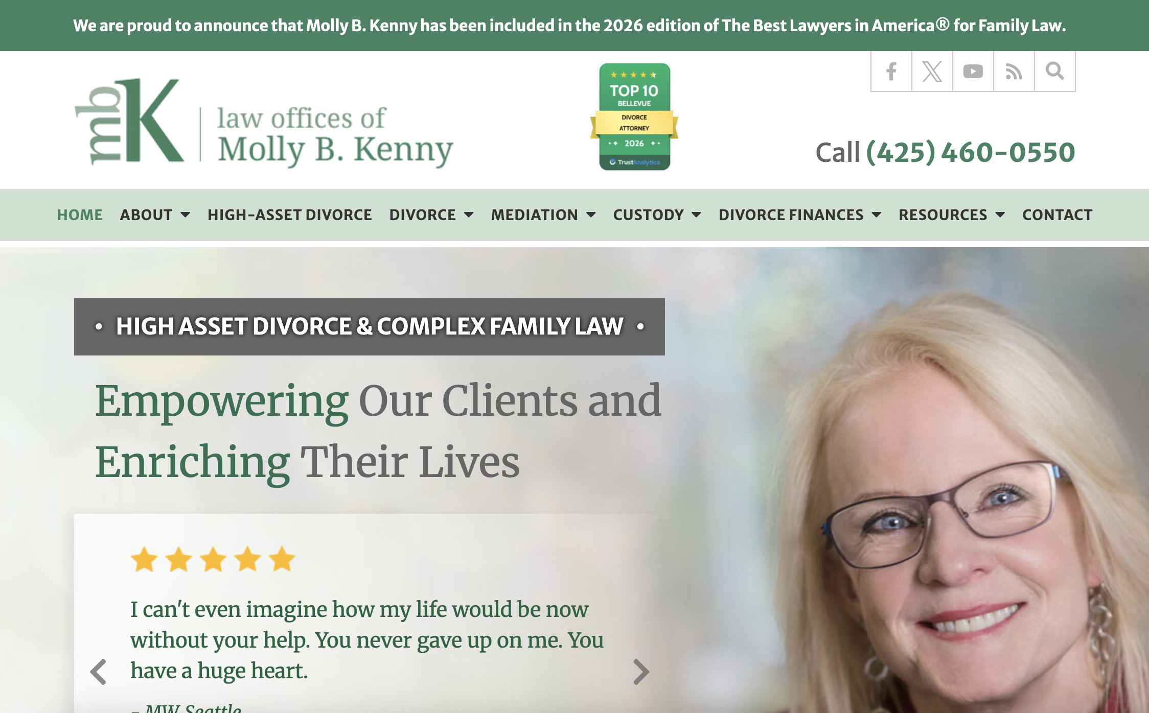
Website: https://www.mollybkenny.com/
Molly B. Kenny runs a family law practice in Bellevue, Washington, focused on high-asset divorce. The homepage opens with an award mention, Best Lawyers in America, not a sales pitch. The main CTA reads "Request Discreet Consult." That word choice says a lot. Client quotes are specific and emotional, not generic five-star blurbs.
What works: "Discreet" is doing a lot of work in that CTA. Divorce clients, especially wealthy ones, are often worried about privacy before anything else. Naming that concern directly, instead of using a generic "Contact Us" button, tells visitors this firm gets it. If your clients have a specific fear around a specific moment, put language for that fear right on the button.
A Personal Brand Built on One Honest Line
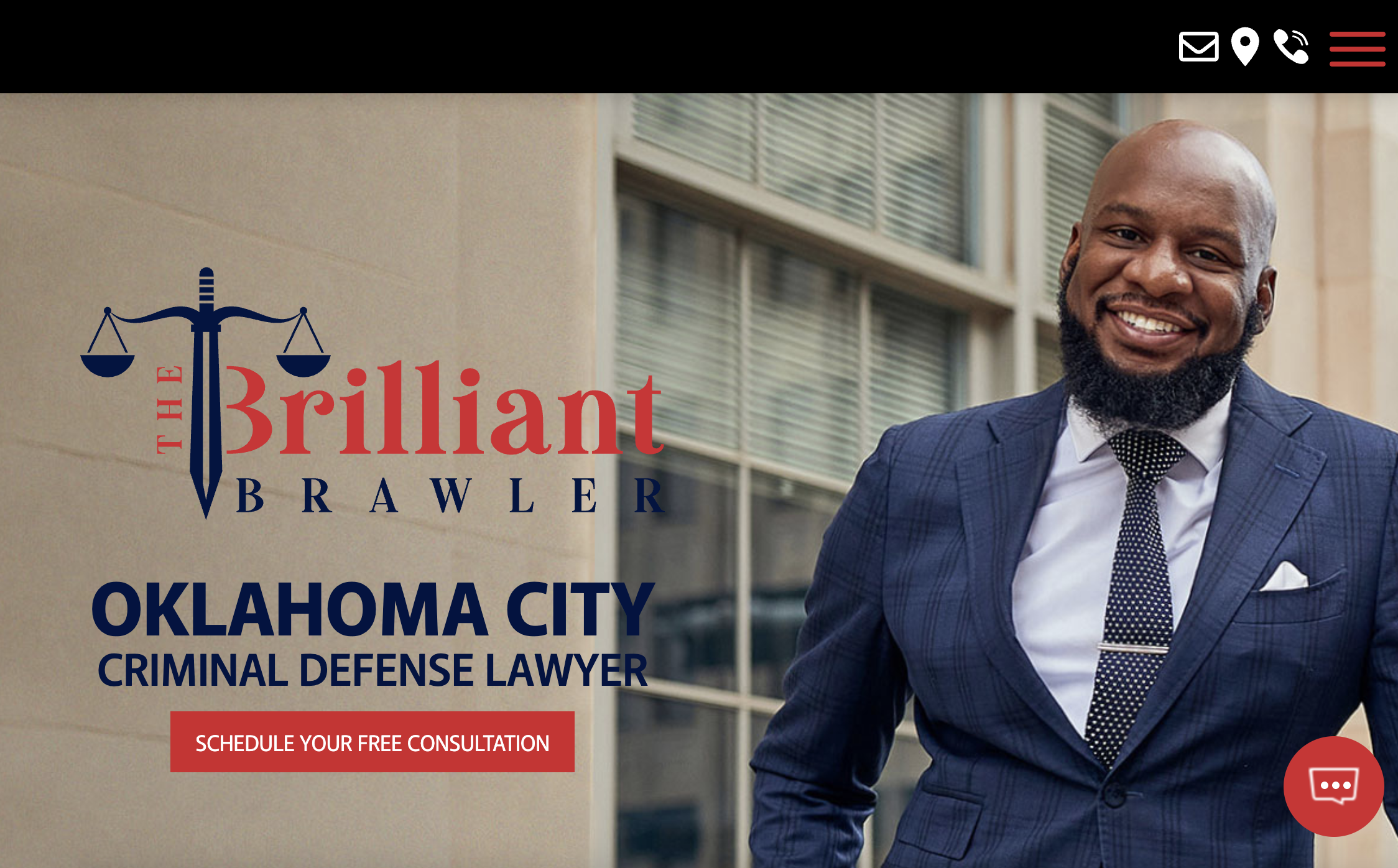
Website: https://www.thebrilliantbrawler.com/
Ron Jones is a solo criminal defense attorney in Oklahoma who branded himself "The Brilliant Brawler." His homepage opens with a personal line. He understands what it's like to face charges, and time is what the system tries to take from clients. The dark, high-contrast design and a sword icon reinforce the fighter positioning. There's no review carousel. The case results speak for themselves instead.
What works: This is the boldest personal brand on this list, and it works because it's specific, not generic. "I fight for you" is a cliché every lawyer site says. Opening with a real, honest line about facing the system yourself is not. If you're a solo attorney, your personality is an asset a big firm can't copy. Use it.
Testimonials With a Name and a Title

Website: https://riziklaw.com/
Rizik & Rizik is a Michigan business law firm serving corporate clients. The homepage tagline, "Representing you when it matters most," is generic on its own. The testimonials underneath aren't. They're quoted from startup CEOs and company VPs, by name and title. Partner logos from title and real estate companies sit nearby.
What works: For a B2B legal practice, the testimonial source matters as much as the quote. A CEO's name and title signals "other serious businesses trust this firm" in a way a five-star rating can't. If your clients are other businesses, ask for a testimonial with a name and title attached, not an anonymous star rating.
A Credential That Removes Two Doubts at Once
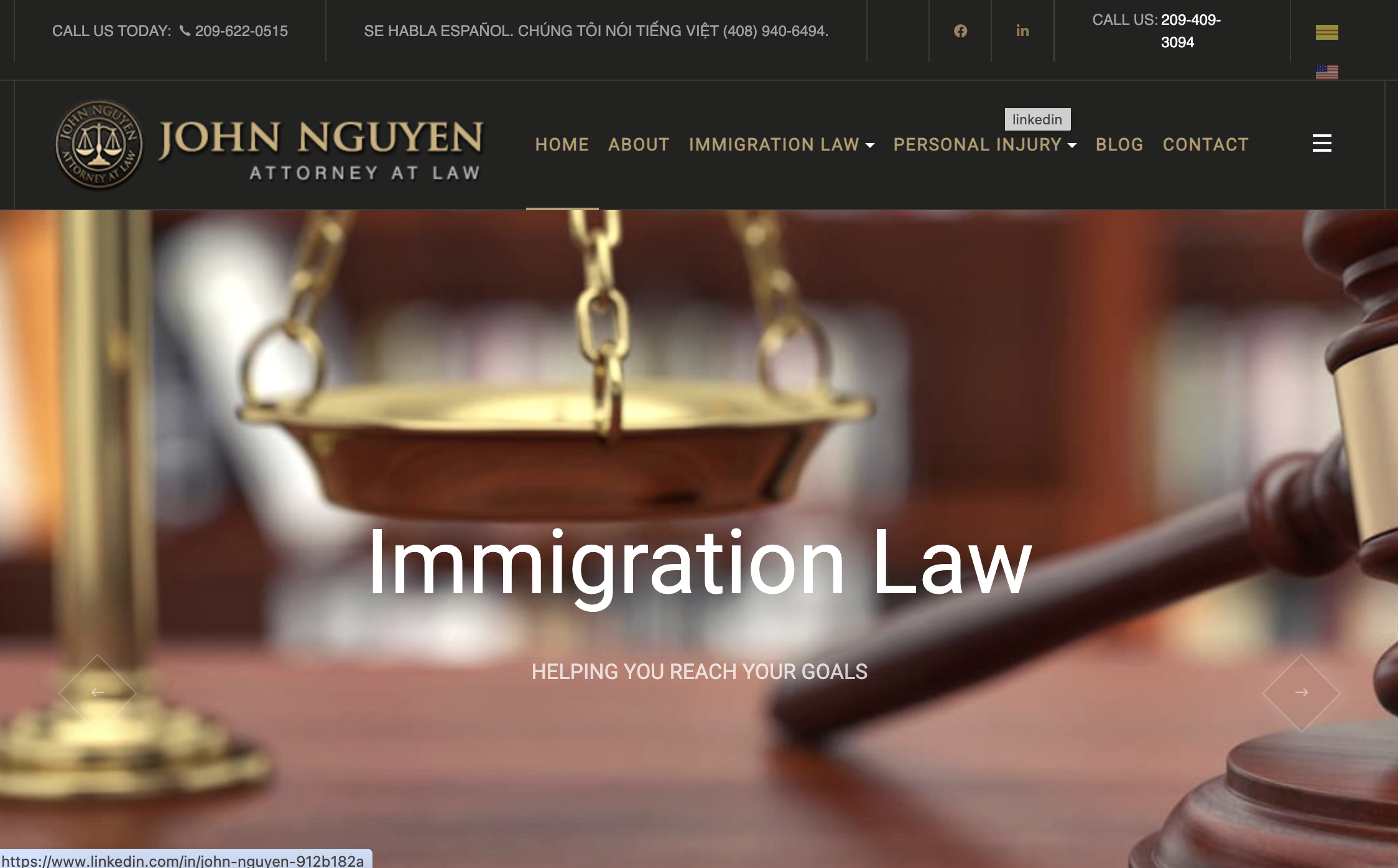
John Nguyen practices immigration and personal injury law across three California cities. His homepage highlights a specific credential. He's certified in immigration law by the California state bar, a status only about 5% of attorneys hold. A language switcher for English and Vietnamese sits in the header, matching the community he serves.
What works: "Certified by the state bar" is a stronger trust signal than "experienced" or "dedicated," because it's verifiable and specific. Combined with a language switcher instead of an English-only site, the homepage removes two real barriers at once: is this person actually qualified, and can I even talk to them. If you serve a specific community, a multilingual site is one of the fastest ways to earn trust before a visitor reads a word of copy.
A Rare Qualification Used as the Headline

Website: https://wszllp.com/
Wolf Solovy & Zivin is a boutique firm in Illinois covering estate planning, business, and tax law. The homepage leads with a specific dual credential. Several attorneys are also CPAs. The tagline "Strategic Planning Makes Life Better" and a Benjamin Franklin quote set a calm, advisory tone rather than an aggressive one.
What works: Estate and tax planning clients aren't looking for a fighter. They're looking for someone careful. The attorney-CPA credential is a genuine differentiator, and the site leads with it instead of hiding it in a bio page. If you have a real, specific qualification that's rare in your field, that's a better headline than another "trusted and experienced" line.
Stacking Every Trust Signal Where Panic Peaks
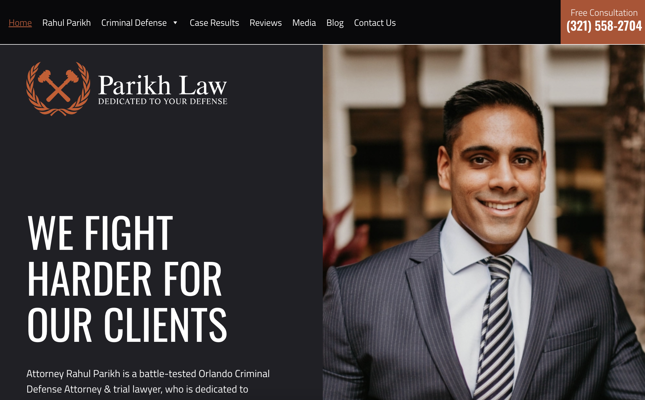
Rahul Parikh is a criminal defense attorney in Orlando. His homepage headline, "We Fight Harder For Our Clients," sits next to his photo. The page stacks trust signals hard underneath: Super Lawyers, Avvo's 10.0 rating, U.S. News rankings, and more than 100 five-star reviews with named quotes.
What works: Criminal defense clients are scared and comparing options fast, often at 2am after an arrest. Stacking every credible badge on the homepage, instead of spreading them across an awards page nobody visits, answers "is this person actually good" before the visitor has to dig for it. If your category is high-anxiety, don't make people hunt for reassurance.
Broad Practice Areas, One Missing Photo
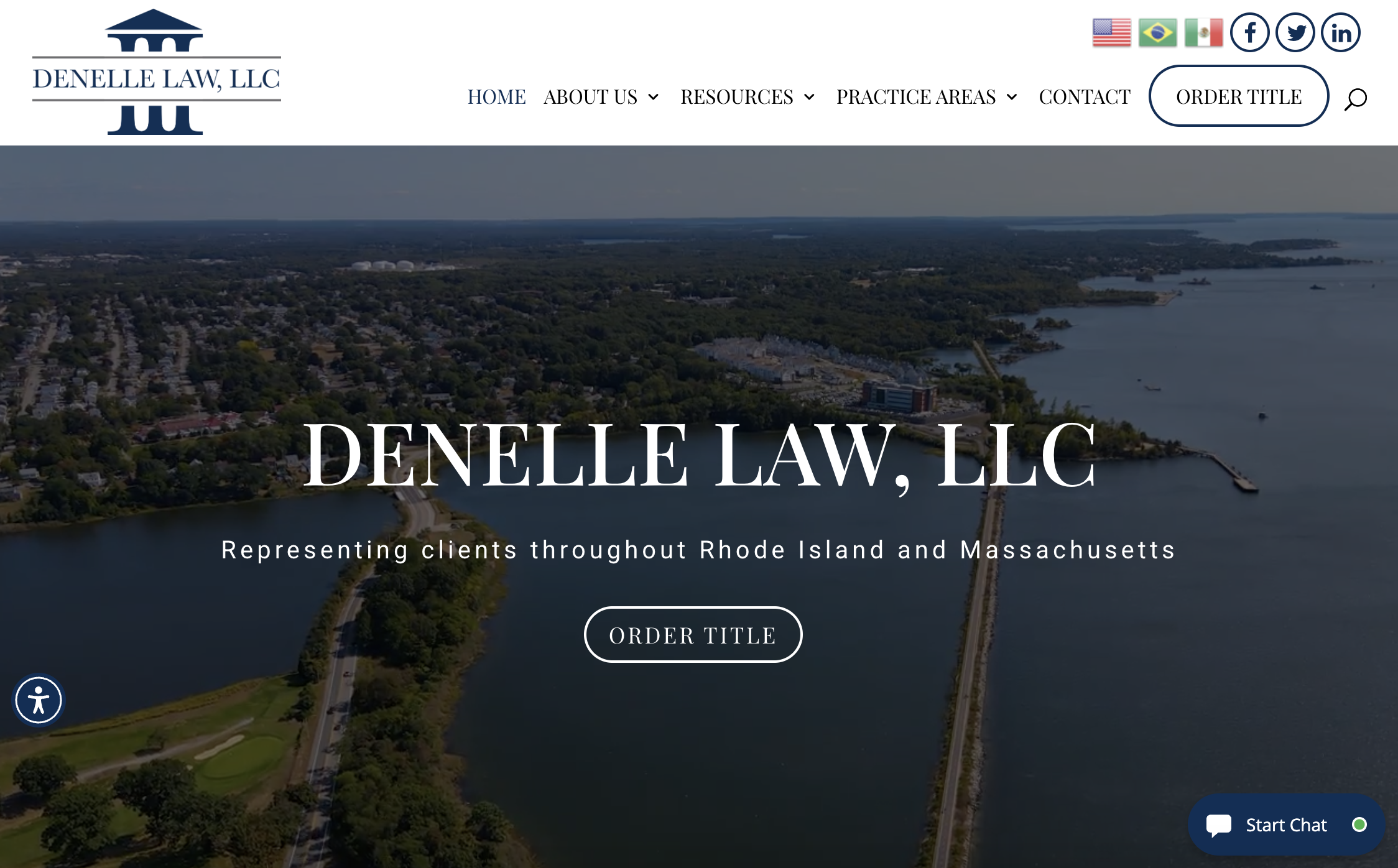
Website: https://denellelaw.com/
Denelle Law is a small general practice firm serving Massachusetts and Rhode Island, covering real estate, estate planning, business law, and more. The homepage keeps things simple: clear practice areas, a couple of client quotes, and partner logos from title and real estate companies.
What works, and what's missing: The broad practice area list makes sense for a small-town general practice, since one firm covers what a client's whole town might need. But the homepage never shows the attorney's face. For a firm this small, that's a missed chance. People hiring a lawyer want to know who they're calling, and a name on a page isn't the same as a photo. If you're small enough that you are the brand, don't skip the photo.
Built With Wegic: A Demo Lawyer Website
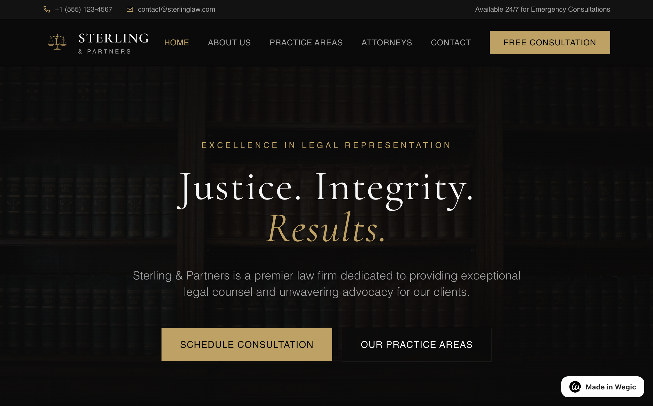
This one's a demo we built directly in Wegic, no manual design work involved. The homepage leads with a dark, moody photo of a law library, paired with a serif headline: "Justice. Integrity. Results." A gold "Free Consultation" button sits in the nav. The top bar lists a phone number, an email, and "Available 24/7 for Emergency Consultations," right up front. Two CTAs sit side by side below the headline: "Schedule Consultation" and "Our Practice Areas."
What works: Everything covered in this article shows up here, and nobody had to hire a designer. A calm, high-end color palette. A headline built on three words instead of a paragraph. A clear next step, twice over. Describe your practice to Wegic and you get a site with these fundamentals already in place. Then you spend your time customizing it, instead of starting from a blank page.
How to Build Your Own Lawyer Website (No Developer Needed)
Looking back at these examples, the pattern is simple. It's not about big budgets or custom code. It's a real photo, clear next steps, and a site that doesn't feel like a template.
That's exactly what Wegic is built for. Describe your practice: your name, your practice areas, your story. Wegic's AI builds a site with your bio, a contact page, and clear calls to action already in place. Swap in your own photos. Adjust the copy. Connect your own domain. No code required.
Plans start at $2.99. You don't need agency prices to get a site like the examples above.
Frequently Asked Questions
Q: What should every lawyer website include?
A: At minimum: a real photo and bio, a clear list of practice areas, an easy way to contact you, and some form of social proof like reviews or case results. Everything else is a bonus once those basics are in place.
Q: Do I need a big budget to have a professional-looking lawyer website?
A: No. Some of the best examples in this list belong to solo attorneys, not big firms with marketing departments. A clear photo, a focused message, and a simple layout go further than a huge budget.
Q: How is a solo attorney's website different from a big law firm's website?
A: A big firm site has to represent many lawyers and practice areas at once. A solo site can go all in on one person and their story. That's an advantage, not a limitation. Visitors get to know exactly who they'd be working with.
Q: Can I mention specific practice areas like personal injury or family law on my homepage?
A: Yes, and you should. Visitors searching for a lawyer usually already know what kind of help they need. Naming your practice areas clearly on the homepage, instead of burying them in a submenu, helps the right clients find you faster.
Q: How much does it cost to build a lawyer website?
A: A custom site from a design agency can run into the thousands. Website builders cost a lot less. Wegic starts at $2.99 and uses AI to speed up setup. That helps if you're a solo practitioner without a marketing budget.
Looking at all these sites, the pattern holds. The ones that convert aren't the flashiest. They're the ones that feel like a real person is on the other side. A clear photo, an honest bio, and an easy way to reach you will beat a generic template every time. If you've got that much figured out, you're most of the way to a site clients will actually trust.