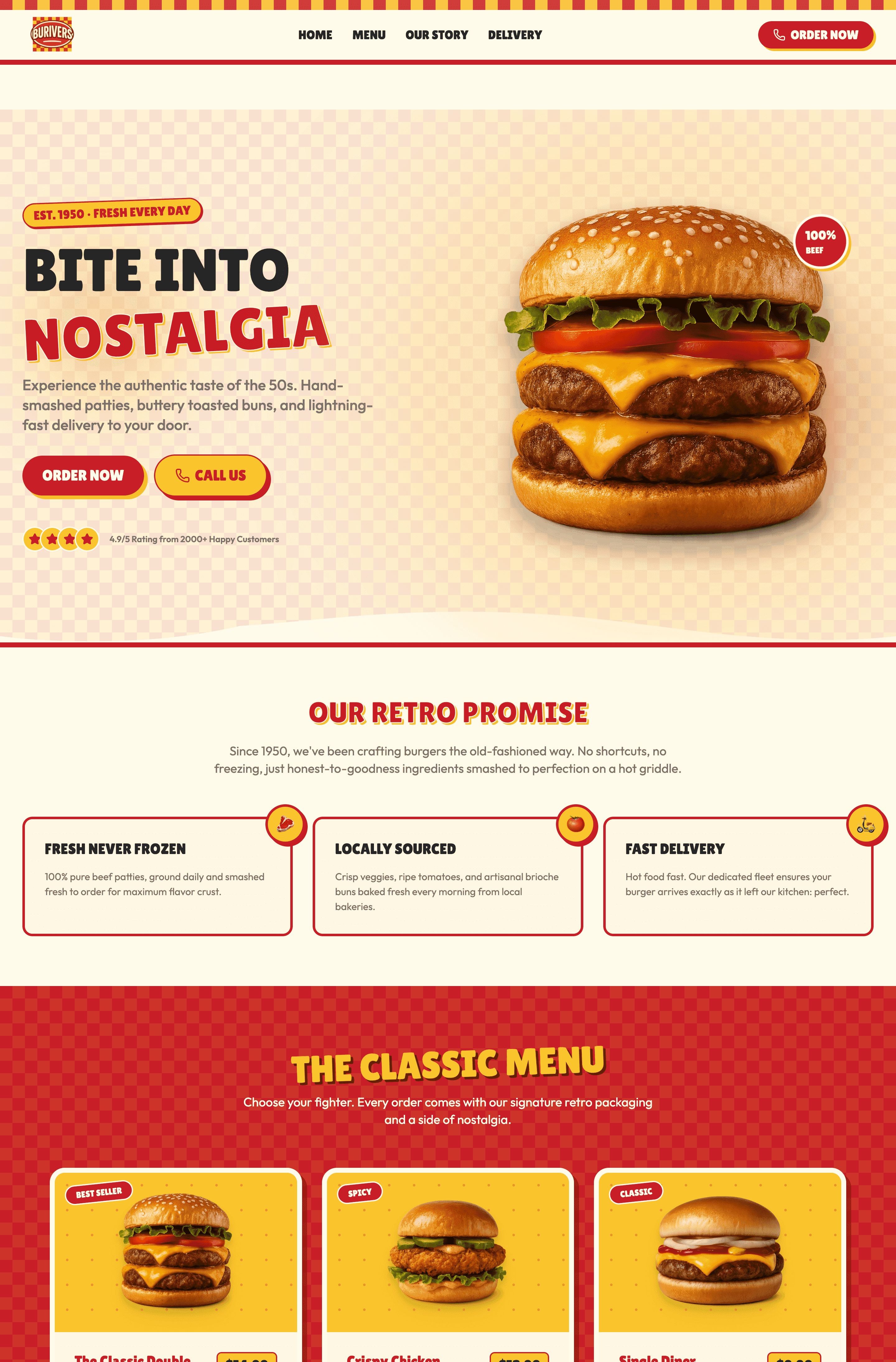
Why Every Conference Needs a Professional Website
A professional conference website is the foundation of a successful event. It serves as the central destination where attendees can learn about the event, explore the agenda, discover keynote speakers, purchase tickets, and access important updates. Beyond providing information, a well-designed website builds excitement, strengthens your event brand, and creates a seamless registration experience that encourages more people to attend.
An effective conference website also helps establish credibility by showcasing sponsors, past events, testimonials, and event highlights. Combined with fast loading speeds, mobile-friendly design, and clear calls to action, it can increase registrations, improve attendee engagement, and deliver a better experience before, during, and after the event.
What Makes the Best Conference Websites Stand Out
The best conference websites combine bold event branding with a user-friendly experience that makes it easy for visitors to find information and register. They feature engaging visuals, clear speaker profiles, well-organized agendas, and intuitive navigation that guide attendees through every stage of the event journey. Whether someone is discovering the conference for the first time or returning to review the schedule, the website should provide a seamless experience across all devices.
Successful conference websites also build anticipation through compelling storytelling, sponsor showcases, and social proof from previous events. Fast performance, mobile responsiveness, and streamlined registration flows help reduce friction, while thoughtful content encourages visitors to become attendees, speakers, sponsors, or community members.
10 Best Conference Website Examples
Technology & Innovation Conferences
Technology conferences are known for bold branding, immersive visuals, and engaging digital experiences. Their websites are designed to generate excitement while making it easy for attendees to explore speakers, sessions, and event details. The best examples combine modern design with intuitive navigation and seamless registration, creating an experience that reflects the innovative nature of the event itself.
Web Summit
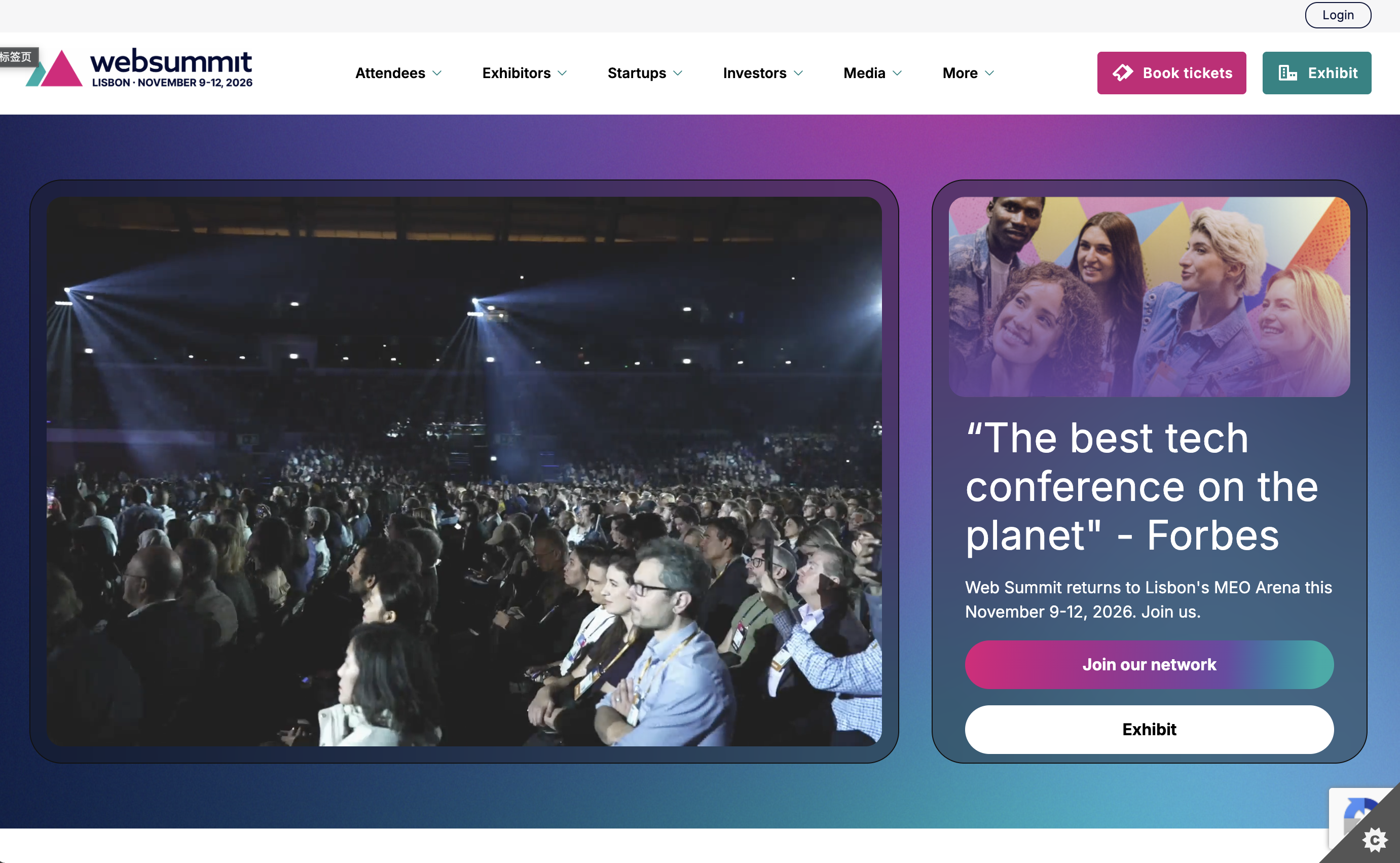
Web Summit is one of the world's largest technology conferences, bringing together startups, investors, entrepreneurs, and global technology leaders. Its website captures the energy of the event through bold branding, dynamic visuals, and a clear information structure that helps visitors quickly discover speakers, schedules, tickets, and networking opportunities.
Why it works:
- Strong visual branding immediately communicates the scale and excitement of the event.
- Speaker pages showcase industry leaders with clear profiles and session information.
- Event schedules are well organized, making it easy for attendees to plan their experience.
- Clear ticket options and registration calls to action reduce friction throughout the sign-up process.
- Modern animations and responsive layouts create an engaging experience across devices.
Best takeaway: Great conference websites combine inspiring branding with practical usability. Visitors should feel excited about the event while being able to register in just a few clicks.
Google I/O
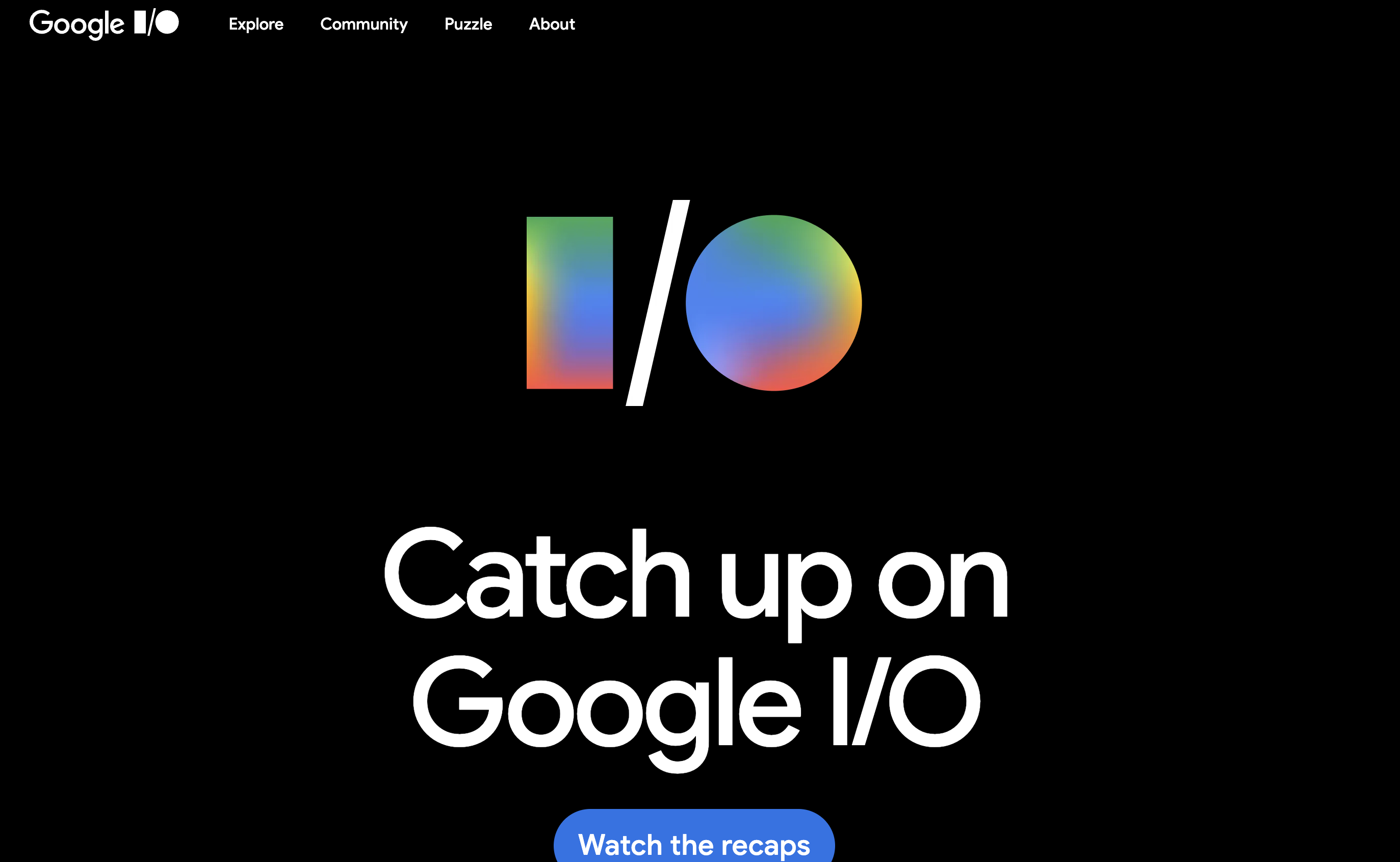
Google I/O is Google's annual developer conference, showcasing the company's latest technologies, products, and developer tools. Its website reflects Google's clean design philosophy, using simple layouts, interactive content, and clear navigation to make complex event information easy to explore.
Why it works:
- A clean homepage highlights keynote sessions and major announcements without overwhelming visitors.
- Session information, livestreams, and developer resources are organized into intuitive categories.
- Modern typography and generous white space improve readability across every page.
- Interactive content encourages attendees to explore sessions and product updates.
- Mobile-friendly layouts ensure a consistent experience before and during the event.
Best takeaway: Simplicity improves usability. Organizing large amounts of information into a clean, intuitive interface helps attendees quickly find what matters most.
Figma Config
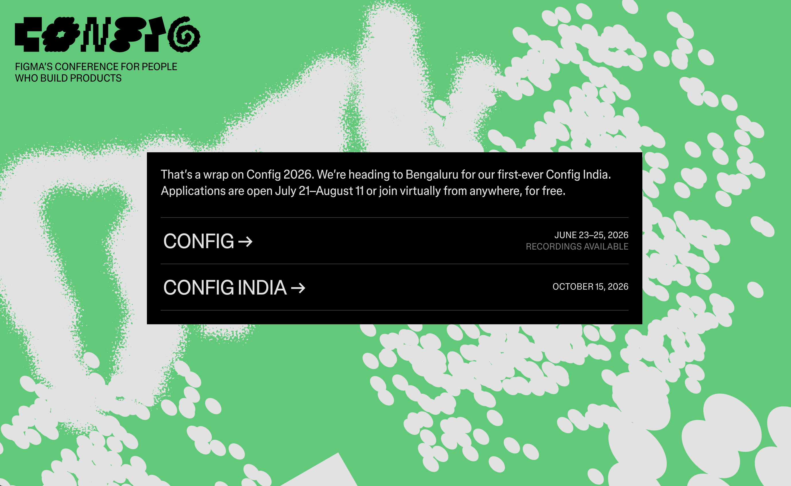
Config is Figma's flagship conference for designers and product teams. Its website reflects the company's creative identity through vibrant visuals, engaging animations, and playful interactions that make browsing the event feel inspiring from the very first click.
Why it works:
- Creative branding immediately captures attention and reflects Figma's design-focused community.
- Session pages, speakers, and workshops are presented in a visually engaging and easy-to-follow format.
- Motion design adds personality without distracting from important information.
- Registration and ticket details are clearly displayed throughout the website.
- Consistent branding creates a memorable experience before attendees even arrive at the event.
Best takeaway: A conference website should reflect the personality of the event itself. Strong visual identity can build anticipation and strengthen brand recognition.
Business & Marketing Conferences
Business and marketing conference websites focus on building credibility, showcasing expert speakers, and driving registrations. They balance professional branding with persuasive content, helping potential attendees understand the value of the event while making it easy to purchase tickets and explore the agenda.
INBOUND
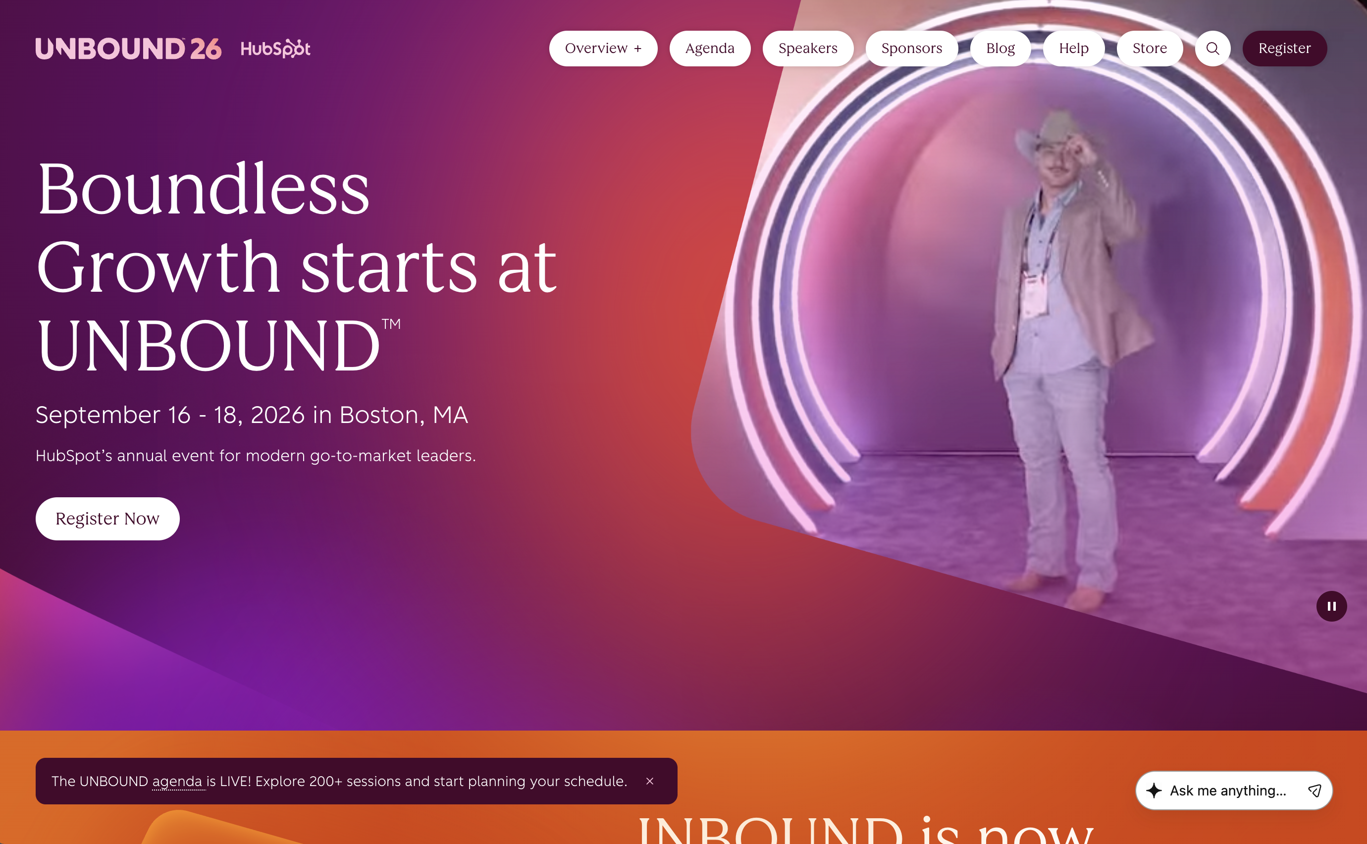
INBOUND is HubSpot's annual marketing, sales, and customer experience conference. Its website combines engaging visuals with well-structured content, making it easy for visitors to browse keynote speakers, conference tracks, ticket options, and networking opportunities.
Why it works:
- Clear messaging explains the event's value proposition from the homepage.
- Speaker profiles highlight industry experts with professional photography and concise biographies.
- Well-organized agendas help visitors quickly explore sessions and event schedules.
- Ticket options and registration buttons remain highly visible throughout the website.
- Customer testimonials and highlights from previous events build trust and excitement.
Best takeaway: Clearly communicating the benefits of attending is just as important as showcasing the event itself. Strong messaging and social proof encourage more registrations.
Adobe Summit
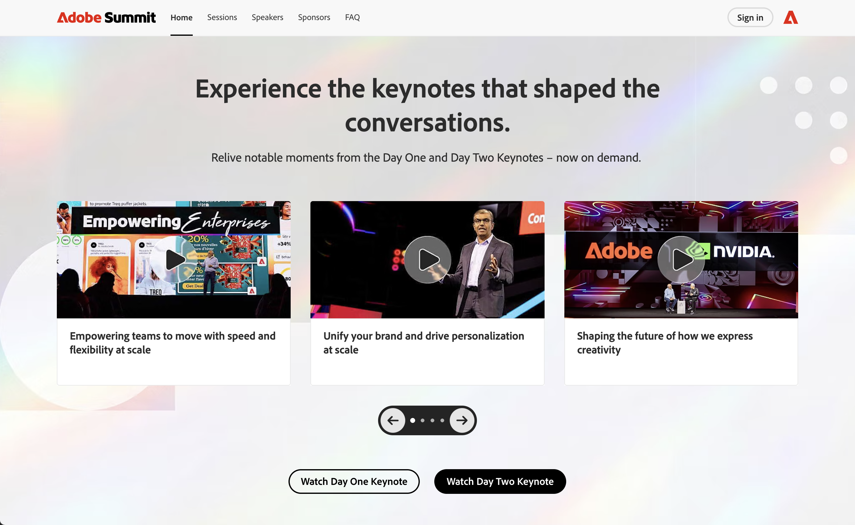
Adobe Summit is a global conference focused on digital experiences, marketing, and customer engagement. Its website combines Adobe's polished visual identity with structured content, making it easy for attendees to explore sessions, speakers, learning opportunities, and event updates.
Why it works:
- Professional branding reinforces Adobe's reputation as an industry leader.
- Session categories help attendees quickly find content relevant to their interests.
- Speaker pages, event highlights, and learning resources provide valuable information before registration.
- A responsive design ensures a seamless browsing experience across desktop and mobile devices.
- Registration calls to action are consistently placed throughout the website.
Best takeaway: Well-structured content makes large conferences easier to navigate. Organizing sessions by topic helps attendees quickly identify the value most relevant to them.
SaaStr Annual
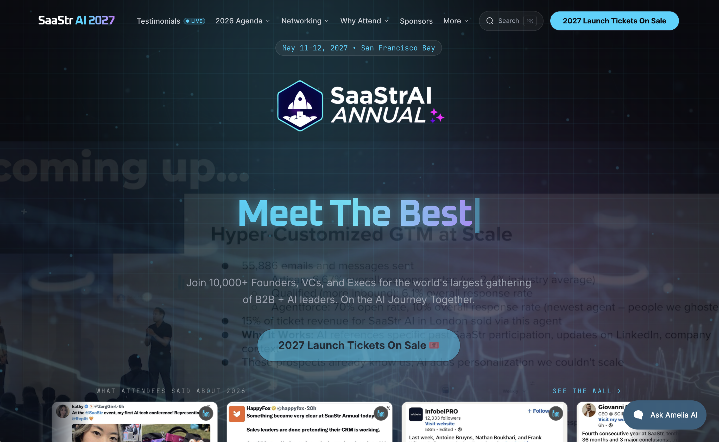
SaaStr Annual is one of the largest conferences dedicated to SaaS founders, executives, and investors. Its website emphasizes practical event information, expert speakers, and networking opportunities through a straightforward, conversion-focused design.
Why it works:
- Bold headlines communicate the event's value immediately.
- Session schedules and speaker information are presented in an easy-to-scan format.
- Community-focused messaging highlights networking and learning opportunities.
- Registration buttons remain visible throughout the browsing experience.
- Testimonials and previous event highlights reinforce credibility.
Design & Creative Conferences
Design and creative conference websites are often the most visually expressive examples in the event industry. They use bold typography, motion graphics, vibrant color palettes, and immersive layouts to reflect the creativity of their communities. The best examples successfully balance artistic expression with usability, ensuring visitors can easily explore speakers, schedules, and registration details while enjoying an engaging visual experience.
OFFF Barcelona
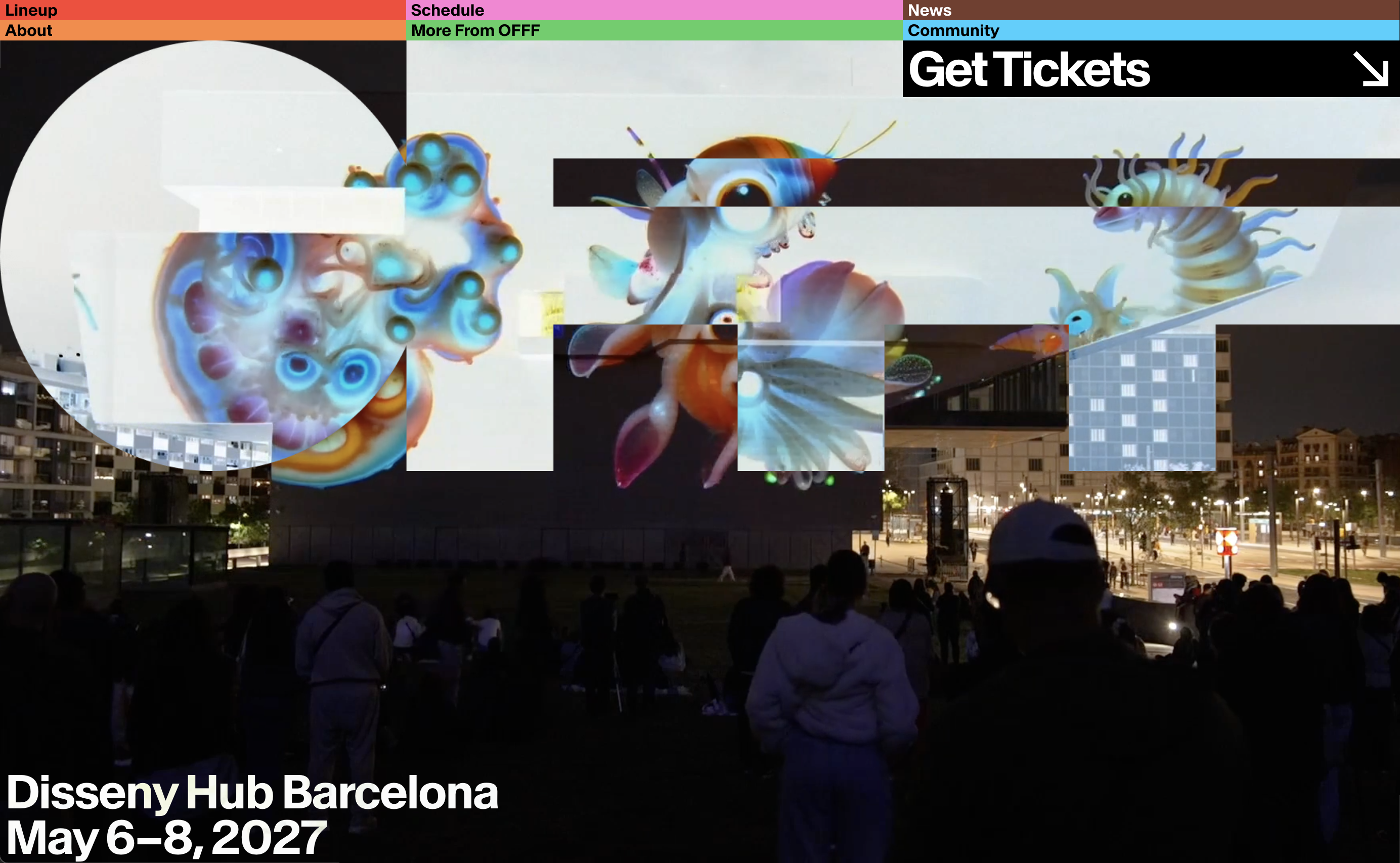
OFFF Barcelona is one of the world's leading festivals for creativity, art, and digital design. Its website embraces experimental visuals, striking typography, and interactive elements that immediately communicate the festival's creative identity while guiding visitors through the event experience.
Why it works:
- Bold branding creates a memorable first impression that reflects the event's artistic personality.
- Dynamic layouts and motion effects make the browsing experience engaging without sacrificing usability.
- Speaker information and event schedules are clearly organized despite the highly creative presentation.
- High-quality visuals and promotional videos generate excitement before the event.
- Registration and ticket information remain easy to access throughout the website.
Best takeaway: Creative conference websites should showcase personality without compromising usability. Strong visual identity is most effective when paired with clear navigation and intuitive event information.
Awwwards Conference
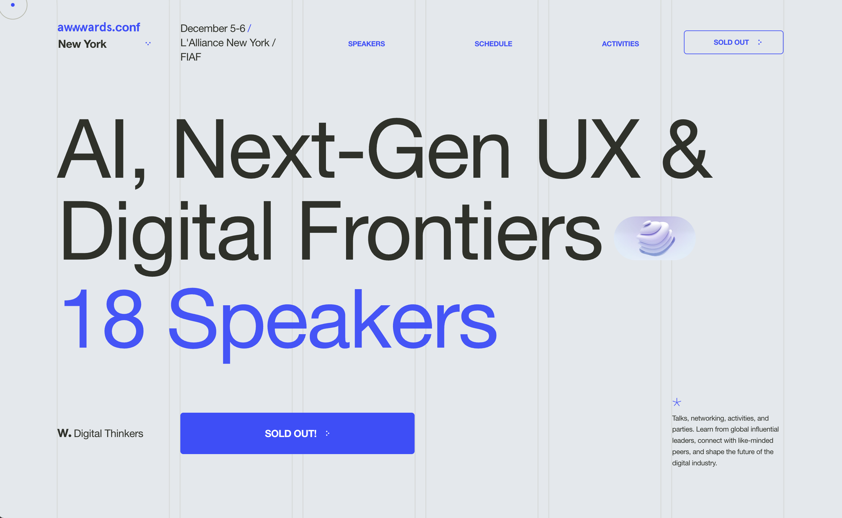
The Awwwards Conference celebrates excellence in web design, digital creativity, and interactive experiences. Its website reflects these values through elegant animations, modern layouts, and visually engaging storytelling that highlights speakers, workshops, and networking opportunities.
Why it works:
- Sophisticated animations enhance the user experience while maintaining fast, intuitive navigation.
- Beautiful typography and generous white space improve readability across content-rich pages.
- Speaker profiles and workshop information are presented in a visually organized format.
- Consistent branding reinforces the conference's reputation within the global design community.
- A streamlined registration flow keeps the focus on encouraging attendance.
Best takeaway: Motion design should enhance the browsing experience rather than distract from it. Thoughtful animations can strengthen storytelling while keeping important information easy to find.
SXSW
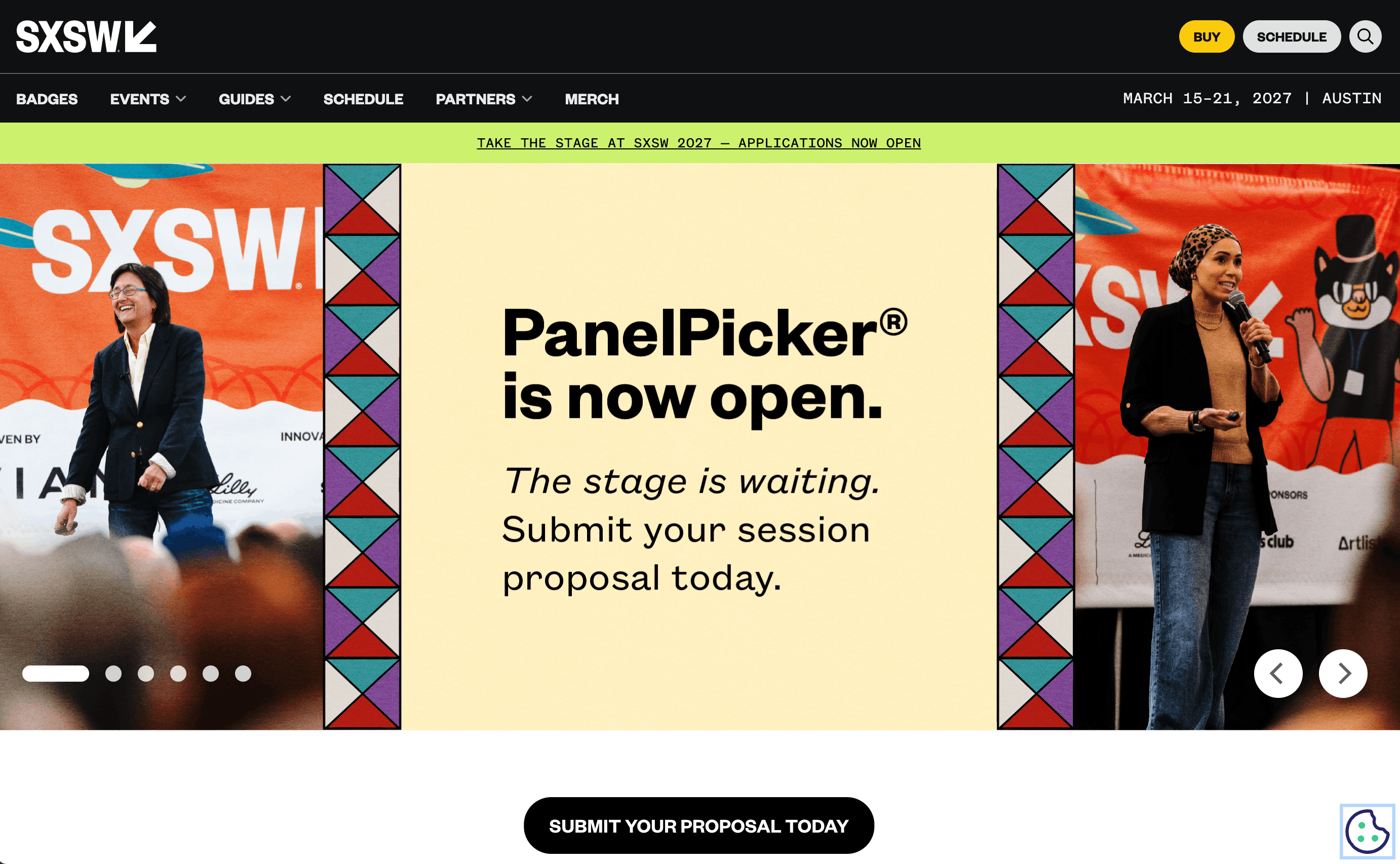
SXSW (South by Southwest) is an internationally recognized festival and conference that brings together professionals from technology, film, music, and culture. Its website manages a vast amount of information through structured navigation, helping attendees explore sessions, performances, exhibitions, and networking events with ease.
Why it works:
- Comprehensive navigation organizes thousands of sessions into an intuitive browsing experience.
- Vibrant branding reflects the festival's energetic and multidisciplinary nature.
- Dedicated pages for speakers, schedules, and venues make planning simple.
- Rich multimedia content builds anticipation before the event begins.
- Clear calls to action encourage visitors to register and stay updated throughout the event.
Best takeaway: Even large-scale event websites can remain user-friendly with strong information architecture and clear navigation.
Global Leadership & Industry Conferences
Global leadership and industry conference websites prioritize credibility, thought leadership, and knowledge sharing. Rather than relying on bold visuals alone, they focus on presenting authoritative content, distinguished speakers, and well-organized event information. The best examples demonstrate how professional branding, clear navigation, and valuable resources can help build trust among attendees, partners, sponsors, and the wider industry community.
World Economic Forum
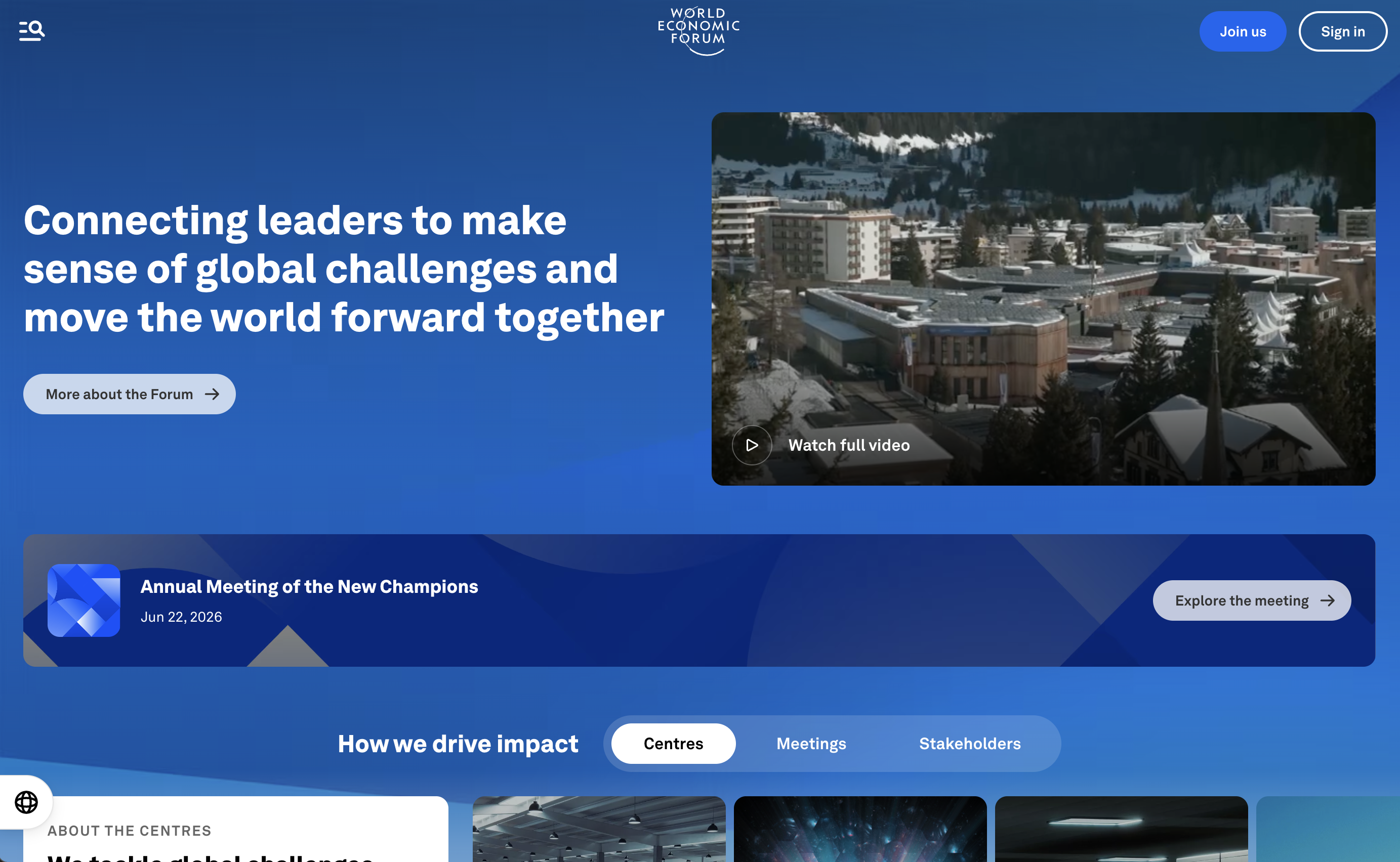
The World Economic Forum hosts global events that bring together leaders from business, government, academia, and civil society. Its website reflects the organization's authority through structured content, professional branding, and comprehensive coverage of events, initiatives, and research.
Why it works:
- Professional layouts establish trust and reinforce the organization's global reputation.
- Event pages provide detailed agendas, speaker information, and related resources.
- Clear navigation helps visitors explore conferences, reports, and ongoing initiatives.
- Strong editorial content extends the website's value beyond individual events.
- Responsive design ensures accessibility across desktop and mobile devices.
Best takeaway: Industry conference websites should position themselves as long-term knowledge hubs, not just event landing pages. Providing valuable resources before and after the event helps strengthen credibility and audience engagement.
What These Conference Website Examples Can Teach You
Create a Strong First Impression with Event Branding
Your conference website should immediately communicate what your event is about and why it matters. A compelling hero section, consistent visual identity, and concise messaging help capture attention and encourage visitors to explore further. Strong branding not only makes your event more memorable but also builds credibility from the very first interaction.
Showcase Speakers and Agendas Clearly
Attendees want to know who will be speaking and what they will learn before committing to an event. Organize speaker profiles, session descriptions, and event schedules in a clear, easy-to-navigate format so visitors can quickly find the information most relevant to them.
Make Registration Simple and Conversion-Focused
A smooth registration process can significantly improve ticket sales and event attendance. Keep registration forms short, display ticket options clearly, and place calls to action throughout the website. Reducing unnecessary steps helps visitors complete their registration with confidence.
Build Excitement Through Community and Social Proof
Conference websites should demonstrate the value of attending beyond the sessions themselves. Showcase testimonials from previous attendees, highlight event photos and videos, feature sponsors and partners, and promote networking opportunities. These trust signals help visitors feel confident that your event is worth their time and investment.
Frequently Asked Questions
What should a conference website include?
A conference website should include essential information such as the event agenda, keynote speakers, venue details, ticket or registration options, sponsor information, FAQs, and contact details. It should also provide clear calls to action and a mobile-friendly experience so attendees can easily access information and register from any device.
How can a conference website increase registrations?
An effective conference website increases registrations by clearly communicating the event's value, showcasing speakers and session topics, simplifying the registration process, and building trust through testimonials, sponsor logos, and highlights from previous events. Fast loading speeds and intuitive navigation also help improve conversions.
Can I build a conference website without coding?
Yes. Modern AI-powered website builders and no-code platforms make it easy to create a professional conference website without coding. With customizable templates, built-in registration features, and intuitive editing tools, you can quickly launch an engaging event website that attracts attendees and promotes your conference effectively.
Build Your Conference Website with Wegic
Design a Professional Event Website
Whether you're organizing a business summit, technology conference, creative festival, or industry forum, Wegic helps you build a polished conference website that reflects your event's unique brand. Create beautiful landing pages, highlight speakers, and showcase your agenda—all without writing a single line of code.
Simplify Registration and Attendee Experience
A successful conference website should make it easy for visitors to register and stay informed. With Wegic, you can create intuitive page layouts, organize event information clearly, and guide attendees through a seamless registration journey that improves engagement and encourages more sign-ups.
Explore More Event Templates and Resources
Looking for more inspiration? Browse Wegic's collection of professionally designed website templates and helpful resources to create engaging conference websites, event landing pages, and promotional sites that leave a lasting impression before, during, and after your event.