Log in
Build Your Site
What Makes a Good Logo? A Designer's Guide
Discover what makes a great logo with this designer's guide. Learn key principles like simplicity, versatility, and timelessness, plus tools like Illustrator and AI generators to create your perfect brand mark.

Have you ever noticed that some brands are memorable with just a simple symbol? Like Apple's bite mark, Nike's hook, McDonald's golden arches? And some companies spend a lot of money designing a logo that is unmemorable and even cheap?
A failed Logo is not only a waste of budget, but it can also make the brand look unprofessional and lose the trust of potential customers. Worse yet, if the logo design is overly complex, difficult to recognize, or doesn't fit the brand's tone, it could even become a marketing stumbling block.
A great logo is not an accident, but a product of specific design principles. In this article, we'll take an in-depth look at “What Makes a Good Logo”, from simplicity to recognizability, to applicability, to psychology, to help designers and brand owners create visual identities that really work.

What Makes a Good Logo? The Core Principles
1. Simple & Memorable
In the age of information explosion, people's attention is becoming more and more scarce. A successful logo must catch the viewer's eye in an instant and leave a deep impression in the mind. That's why simplicity becomes the first principle of a good logo.
Take the world's most valuable brand logos, for example, Apple's Bite, Nike's Swoosh, and McDonald's Golden Arches. What do they have in common? Minimal graphics, clear outlines, and no redundant details. These designs remain legible in the smallest sizes, such as mobile app icons, and are instantly recognizable at a distance (such as outdoor billboards).
Psychological studies show that the human brain processes image information 60,000 times faster than text. While a complex logo may take time for the viewer to “decode”, a simple graphic can be intuitively recognized. That's why so many brands have moved toward simplicity in their logo upgrades: Starbucks gradually simplified its mermaid motif, BMW went from a 3D logo to a flat design, and Microsoft evolved from a complex window pattern to a simple four-color square.
Designer Practice Advice:
-
Try to start a design with a one-color sketch, forcing yourself to express the essence of the brand with the fewest lines.
-
Conduct the “5-second test”: Have people look at the logo for 5 seconds and then recall the details to test memorability.
-
Refer to Japanese “wabi-sabi” aesthetics or Bauhaus minimalist design philosophy.
2. Timeless, Not Trendy
In the field of logo design, chasing trends is often the biggest trap. Looking back at the past 30 years, with the development of websites, we have witnessed the rise and fall of countless design trends: the 3D effect in the 90s, the glossy texture of Web 2.0 in the 2000s, the flat design in the 2010s... Brands that blindly follow the trend often have to change logos frequently, wasting resources and jeopardizing the continuity of brand perception.
Truly great logos have qualities that transcend their time. Coca-Cola's Spencerian handwritten logo has been in use since 1886; Chanel's double-C interlocking logo was born in 1925; Rolls-Royce's flying goddess statue is 110 years old. These designs have endured because they avoid period-specific design language and are rooted in the brand's core values rather than superficial style, at the same time retaining enough uniqueness in simplicity.
Designer Practice Advice:
-
Research the brand's archives for timeless design elements.
-
Ask yourself: Will this design still look modern in 10 years?
-
Create a “time filter”: Imagine if the logo would make sense in a different era.
3. Versatile
In today's omnichannel marketing environment, a logo can appear on both a nanoscale chip and a 100-meter-high billboard, and Adobe's 2023 research shows that 89% of brands have experienced logo adaptation issues, with 37% of them losing business opportunities as a result. Truly adaptive design requires breaking through the following dimensional challenges:
-
Digital scenarios: the same graphic needs to remain recognizable from the Apple Watch's 38mm dial to an 8K Ultra HD screen. Instagram's gradient icon presents a completely different technical solution on the iOS home screen and the web version.
-
Physical applications: Embroidery (e.g. polo shirt pony logo), metal etching (e.g. car face logo), UV printing, and other processes impose strict limits on design details. Starbucks developed a “simplified” mermaid design for small-cup packaging.
-
Dynamic scenarios: Windows' window animation, Android's elastic deformation, etc., require logos to have motion extensibility.
-
Boundary testing: Logo was reduced to 8mm width to test readability; printed on rough paper to test loss of detail; tested through the eyesight of the elderly (simulating the perception of people with vision loss).
Industry benchmark cases: Nike's Swoosh used white-out treatment on a pure black background; MasterCard simplified the overlapping circle into a pure color block version; Twitter's bird icon went through 7 simplifications and finally became a pure outline graphic.

4. Appropriate
Misalignment of brand tone is the most common logo design mistake made by startups. 2024 BrandNew research shows that 62% of consumers question professionalism when a logo does not match industry expectations. Three levels of diagnosis are required to achieve accurate tonal matching.
Industry Genetic Decoding
Finance: square and round graphics, like orange wave for Visa, copper coin pattern for Bank of China, convey a sense of stability, with an average use of 1.3 colors
Technology companies: abstract geometric shapes (Windows four-color window, Huawei flower petals) symbolize innovation, 87% use blue/black primary colors
Luxury goods: emblematic designs (GUCCI interlocking G, Chanel double C) retain a sense of craftsmanship, with a preference for metallic textures.
Brand Personality Mapping
Many companies choose to anthropomorphize their brands through the 'personality dimension scale':
Sincerity (Coca-Cola): rounded font + dynamic ribbon
Energetic (Monster Energy Drink): ripped font + fluorescent colors
Sophisticated (Tiffany's): Slim serifs + exclusive Pantone colors
Cultural Symbol Alchemy
McDonald's transforms church arches into golden M
Huawei's 'Petal' Logo Implicates Math Fractal Aesthetics
Tesla's T-Shaped Logo Incorporates a Cross-Section of an Electric Motor
Designer Practice Advice:
-
Use NLP to Analyze the Emotional Tendencies of Brand Slogans.
-
Build an Industry Color Database.
What Makes a Good Logo? The Psychology
1. The Influence of Color
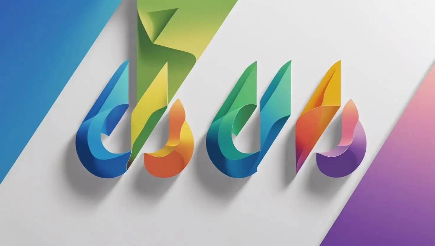
The psychology of color is a decisive element of logo design. Studies have shown that 90% of a consumer's first impression of a product comes from color, and that color can increase brand awareness by up to 80%. Let's analyze the emotional associations of the main colors in depth to better understand what makes a good logo:
Red is the most impactful color, raising the heart rate and stimulating the appetite. That's why fast food brands (McDonald's, KFC), beverages (Coca-Cola), and streaming media (Netflix, YouTube) favor red. However, it should be noted that red also represents a warning and should be used with caution in the financial industry.
Blue conveys a sense of stability and reliability and is the most common color used by Fortune 500 companies, with IBM's “Blue Giant” image, Facebook's social trust, and American Express' financial services all relying on the professionalism it brings. However, overuse may lead to homogenization, and a breakthrough in hue is needed.
The dual attributes of green are interesting: on the one hand, it symbolizes nature (Starbucks' environmental image), and on the other hand, it represents finance (HSBC). The medical industry favors blue-green because it evokes images of health and cleanliness.
Designer experimentation advice:
-
Use the Pantone color system to ensure print consistency
-
Consider cultural differences, e.g., white represents purity in the West and may symbolize mourning in Asia.
-
Test the impact of different brightness/saturation levels on the brand's tonality.

Image by Canva
2. Symbolism of Shapes
Geometric shapes form the grammatical basis of visual language, and research from the MIT Media Lab has found that it takes only 100 milliseconds for people to develop an emotional response to shapes.
The circle is the oldest symbol of all, representing eternity and wholeness. Target's bullseye, BMW's blue sky and white clouds, and the Olympic rings all utilize the circle to create a sense of harmony. Interestingly, the inclusivity of the circle makes it a popular choice for social media (Twitter, WeChat).
The dynamic tension of triangles applies to sports brands (Adidas' three stripes, Mountain Equipment's snowy mountains). But beware: pointed corners facing down can create a sense of instability; use with caution in the financial industry.
The stabilizing feel of the square is widely used by tech companies (Microsoft, LinkedIn). Recent trends show that rounded rectangles are a popular choice for SaaS companies due to their combination of professionalism and approachability.
Designer experimentation advice:
-
Try the golden ratio to build graphics
-
Study the principle of closure in Gestalt psychology
-
Create double imagery with negative space (e.g., FedEx's hidden arrow)
3. Visualization of Fonts
Font choice is the most subtle language system in logo design, and its influence is far beyond most people's imagination. The latest data from Monotype Institute shows that fonts can influence consumers' judgment of brand credibility by 57% and subconsciously shape the brand's personality perception. In the age of algorithmic recommendations, a well-chosen font can help a brand maintain a unique “tone” of voice in the flood of information.
Serif fonts, for example, embody narrative authority and are used by law firms (e.g., Times New Roman conveys rigor), luxury brands (e.g., Vogue's Didot font is elegant), and traditional media (The New York Times' Imperial).
On the other hand, Sans-Serif is more of a modern statement, and the birth of Helvetica was synchronized with the Swiss modernist movement, which encompassed a technological atmosphere.
Script logos are more capable of conveying a brand's emotional temperature, such as Coca-Cola's use of formal handwriting and Disney's use of random graffiti for its logo.
Designer's Font Audit Checklist:
-
Whether to test the display effect of extreme scenarios (4K screen/smartwatch)
-
Whether to create a typeface mood board (a balance between Rational and Emotional)
-
Whether to consider accessible design (ease of reading for the visually impaired)
Practical Logo Design Tools
In the era of digital design, choosing the right tools can dramatically improve the efficiency and professionalism of Logo design. This section will systematically introduce a complete matrix of tools from beginner to master, covering key aspects such as AI-assisted design, vector editing, brand management system, etc. Each type of tool is suitable for different design needs, from rapid prototyping to fine-tuning to brand asset management systems. Every kind of tool is suitable for different design needs, from rapid prototyping to fine-tuning to unified brand asset management. The following is a detailed introduction to each type of tool and representative products. Read and find out what you need to make a good logo.
1. AI Intelligent Generation Tool (Rapid Prototyping)
Suitable for zero-basic users, entrepreneurs, or teams that need to quickly generate logo concepts.
#01 Pixso AI
Core features:
-
Support “text-to-map” and “map-to-map” modes, input brand keywords to generate multiple Logo programs.
-
Provide AI-assisted layout, automatically generate design specifications, and an element checklist.
-
Support PNG, JPG, PDF, SVG, and other formats for export, and can be directly adjusted in the Pixso editor.
Applicable scenarios: startup brands, social media avatar design, and rapid proposal.

Image by Canva
#02 Looka
Core Functions:
-
Based on an AI algorithm, users only need to input the brand name, industry, and style preference to generate a complete Logo program.
-
Provides branding kit, including business cards, social media materials, and over 30+ brand assets.
-
Support color, font, and graphic fine-tuning to ensure that the Logo meets the brand tone.
Applicable scenarios: SME brand upgrading, omnichannel visual unification.
2. Professional vector design software (fine-tuning and advanced design)
Suitable for professional designers, supporting high-precision vector editing and complex graphic design.
#01 Adobe Illustrator
Core features:
-
Industry-standard vector software, supporting precise adjustment of anchor points, path optimization, Boolean operations, and other advanced features.
-
Provide complete CMYK/Pantone color management for print and digital media.
-
Support dynamic symbols, global editing, suitable for large brand visual system design.
Applicable scenarios: brand VI design, complex graphic logos, professional printed materials.
#02 Affinity Designer
Core features:
-
Comparable to Illustrator's non-destructive vector editing capabilities, supports 1 million percent scaling without distortion.
-
One key to switching vector/raster mode, suitable for UI design, icon optimization.
-
Buyout license, no subscription fee, cost-effective.
Applicable scenarios: independent designers, small and medium-sized design teams, and cross-platform collaboration.
3. Brand Management System (Visual Asset Unified Management)
Suitable for corporate branding teams to ensure the consistency of the Logo in different scenarios.
#01 Frontify
Core Functions:
-
Automatically generates brand guidelines, including Logo usage specifications, minimum spacing, disabled versions, etc.
-
Supports collaborative team approvals to ensure design files meet brand standards.
#02 Bynder
Core Functions:
-
Digital Asset Management (DAM) with intelligent categorization and search.
-
Provide a library of brand templates to ensure visual uniformity in social media, print, and other scenarios.
-
Permission hierarchy management to prevent unauthorized use of branded materials.
Applicable scenarios: e-commerce brands, marketing teams, and multi-platform content management.
4. Extension application tools
After completing the Logo design, it is recommended to use Wegic AI website builder to quickly realize the digital presentation of the brand. Its intelligent recognition system can automatically integrate the Logo into the website template and maintain a consistent visual style with the VI manual, which can increase efficiency by 80% compared with traditional website building.
Core functions: main color system extraction, responsive optimization, and fast website building.
Click the picture here to explore more website templates! ⬇️
Conclusion
In this age of visual supremacy, logos have evolved from a simple logo to a strategic asset, so it's really important to know what makes a good logo, whichneeds to strike a balance between the following dimensions:
Time dimension: respect tradition but not old-fashioned, embrace change but not blindly follow it.
Space dimension: pixel limitations of digital media, material considerations of physical applications.
Psychological dimension: rationality conveys professionalism, and sensibility establishes connectivity.
Action guideline: build a branding design system (rather than a single Logo), set a 3-5 year visual evolution path, invest in professional design audit services.
Remember, a good logo is not the end of the road; it's the visual beginning of the brand story. Revisit your design now with these principles!
Written by
Kimmy
Published on
Mar 17, 2026
Share article
Read more
Our latest blog
Webpages in a minute, powered by Wegic!
With Wegic, transform your needs into stunning, functional websites with advanced AI
Free trial with Wegic, build your site in a click!
