Log in
Build Your Site
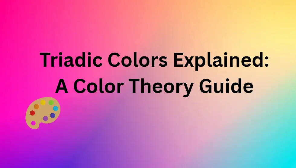
Triadic Colors Explained: A Color Theory Guide
Learn the basics of triadic colours and how they enhance your designs. This colour theory guide breaks down triadic colour schemes with practical examples.

When faced with complex colour choices, many people want a combination that is both visually eye-catching and harmoniously balanced. The phrase “triadic colour scheme” is often mentioned when it comes to creativity, meaning that using triadic colours can make something superior, from “okay” to “awesome”. It provides easy-to-understand instructions for those who want to master the three-colour matching. Understanding the three colours is critical because hue plays a critical role in visual interaction and efficiency. This survey will explain what triads are, explain triadic schemes, explore colour wheel triadic colours, offer examples, introduce useful palette generation tools, and finally give several pieces of advice on how to choose triadic hues and shades. Its purpose is to make the triadic colours simpler so that everyone knows how to use them more practically. Choosing a colour palette can often make it difficult to create effectively; triadic colours provide a structured method, potentially easing creative apprehension and leading to more impactful visual outcomes.
What are Triadic Colours?
The concept of a triad is a set of three specific hues. The key to these three triadic hues is their position on the colour wheel: they are three colours that are equidistant from each other. On the traditional 12-colour wheel, if you connect these three colours with a line, they can form a regular equilateral triangle. This geometric arrangement is not arbitrary; it is the very foundation of why triadic colours are so effective. Triadic colours have become a favourite colour scheme for creators and artists who want to create a unified, vibrant feel. The term “dynamic harmony” accurately captures their influence; triadic colours are not merely about preventing colour clashes but about fostering energetic yet controlled visual experiences. This ability is such as distinguishing and connecting the triadic colours with those softer tones, like similar colour schemes.
What is a Triadic Colour Scheme?
A triadic colour scheme means using three colours to match in design or composition. It not only determines three hues of equal distance, but more importantly, explores how to use these hues to tell an attractive story. The benefit of a three-colour arrangement is that they interact with each other depending on the framework in which they are arranged.
The psychological influence of triadic colour schemes is multifaceted and outstanding:
-
Balance and Harmony: Its three colours are evenly distributed on the colour wheel triadic colours, giving people a sense of peace and stability. This prevents one hue from being too vigorous and overpowering the others, thus creating a holistic and peaceful atmosphere.
-
Vibrancy and Energy: Using three unique and often contrasting colours brings these arrangements to life and vibrancy. This vivid feeling can instantly excite people, catch their attention, and make them want to do something, or inspire their inner mischief and creativity. It makes the triadic colour combination particularly useful in creations that require a striking effect.
-
Visual Contrast: Triadic colour schemes inherently offer bold and engaging visual contrast. This dynamic design makes it more striking, memorable, and can effectively guide the viewer's attention.
Through these characteristics, triadic colour combinations effectively achieve optical contrast and aesthetic balance. This makes the triadic colour arrangement a particularly flexible choice, suitable for use in a variety of design projects and creative work.
The Color Wheel Triadic Colors: Your Map to Finding Triadic Colors
A brief recap of colour wheel fundamentals relevant to triadic colours includes:
-
Primary Colours: These are Red, Yellow, and Blue. They are the foundation of the colour wheel because these three pure hues cannot be obtained by mixing pigments with other hues, and all other hues on the colour wheel are derived from these three colours. This series has finalised the most powerful and basic combination of the three primary colours.
-
Secondary Colours: These are orange, green, and purple (or rather, violet). They are formed by mixing two primary colours in a one-to-one ratio (for example, red and yellow make orange). The secondary hues also form a unique and striking triad.
-
Tertiary Colours: These hues, like red-orange, yellow-green, or blue-violet, are created by mixing a primary colour with the next secondary colour in equal proportions. Tertiary colours provide more nuanced and often sophisticated triadic colour combinations.
This is a very simple trick to find the correct primary colours on the colour wheel. First, it randomly picks a colour from the traditional 12-colour wheel. Next, to identify the second colour in the set of three, count four positions along the circle (or skip three colours). Then use the same approach, starting from the second colour, to find the third colour. The three selected hues form a triad, such as an equilateral triangle drawn on the colour wheel triadic colours.
Common examples of colour wheel triadic colours include:
-
Primary Triad: Red, Yellow, Blue.
-
Secondary Triad: Orange, Green, Violet/Purple.
-
Example 1 of three colour combinations: red-orange with yellow-green and blue-purple.
-
Example 2 of the tertiary colour group: yellow-orange, blue-green, and red-purple.
The colour wheel triadic colours is more than just a theoretical chart; it’s also a useful tool for finding colour combinations that go well together and look pleasing to the eye. The colour wheel triadic colours' equally spaced frame is key for accurately placing the three colours and inspiring total creativity. The primary triads are bold and basic. Studying the secondary and tertiary triads reveals rising nuance and complexity, making triadic combinations even richer.
Common Triadic Colour Combinations at a Glance
| Type | Color 1 | Color 2 | Color 3 |
| Primary | Red | Yellow | Blue |
| Secondary | Orange | Green | Violet |
| Tertiary Example 1 | Red-Orange | Yellow-Green | Blue-Violet |
| Tertiary Example 2 | Yellow-Orange | Blue-Green | Red-Violet |
Inspiring Triadic Colours Examples
The theory lays the foundation, but it’s in practical triadic colour examples that the influence of the triadic palette becomes apparent. It might be interesting to study how these lively and harmonious triadic colour examples can make designs in various disciplines. The tricolour palette is adaptable to a wide variety of areas, proving that this special colour combination is both basic and has broad appeal.
Graphic Design & Branding
When designing graphic layouts, they often use primary colours to design particularly memorable logos and eye-catching promotional materials. A classic example is the early Burger King logo, which used the three primary colours red, yellow, and blue. This triadic colour scheme allows brands to create their own characteristics while ensuring a consistent visual image.
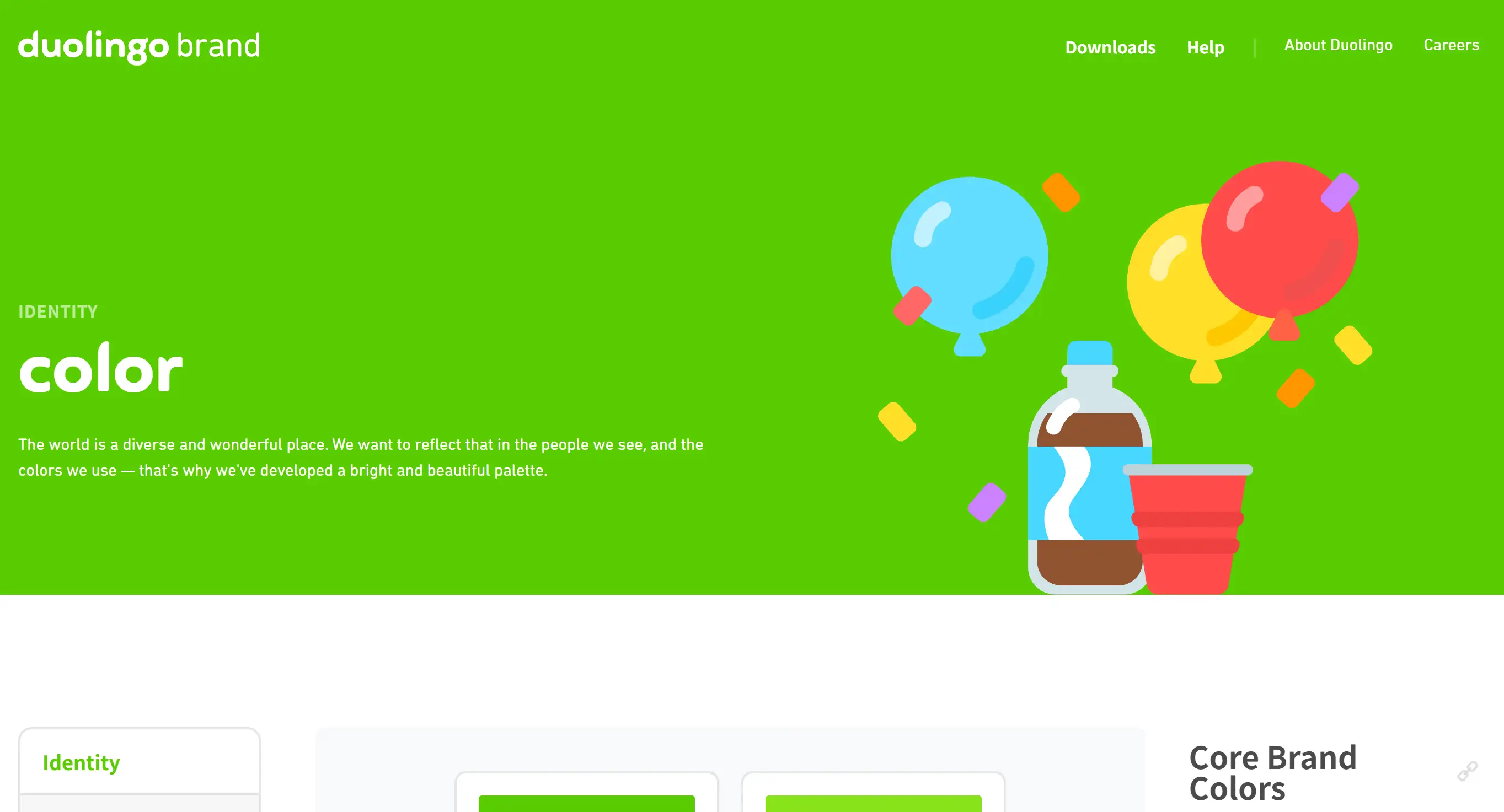
Another convincing example is Duolingo, which uses a triadic colour palette featuring green as dominant, with orange and blue as supporting colours, to make the interface look both eye-catching and easy to use. These triadic colour examples show their power in branding.
Web & UI Design
In web and user interface design, triadic colours are very useful. They can help you rank content and offer necessary contrast, providing users with a user experience that is comfortable and easy to use.
A typical use of a triad is to use one colour for the primary call to action, another for typography, and a third for emphasis or secondary information. This clever use of triadic colours ensures that the critical part captures the audience's attention immediately.
Interior Design
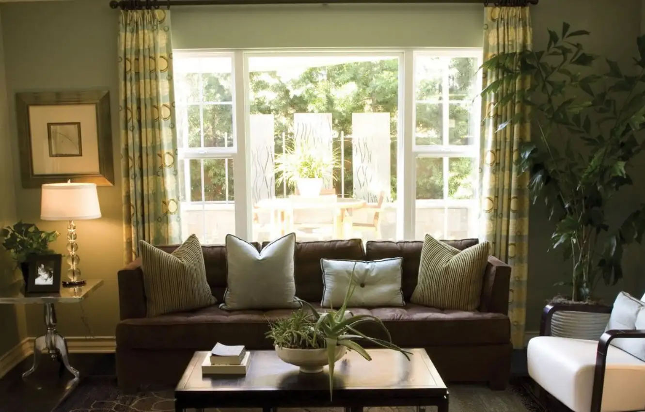
In interior design, triadic colours can create a room that is both bright and harmonious. Take a closer look at this living room. It contains a brown sofa, a particularly eye-catching green decoration and a faint yellow yellow light. These pieces of furniture form a typical combination of the three primary colours. Alternatively, the kitchen can be livened up by using a triad of colours such as lime green, electric blue, and hot pink. Generally, you’ll find that lighter, less vibrant versions of primary colours are particularly well suited to creating a calming and emotional atmosphere, such as using pink, navy, and gold instead of the primary colours red, blue, and yellow. There are various examples of these triadic tones.
Art & Illustration

The artists and illustrators usually use triadic colours in their works to make their images look more layered and contrasting, and to make the audience feel more. An illustration can be a landscape or a photograph, where the green, purple, and yellow make up a triadic colour scheme, which is then enhanced using the tonal grading approach to make them more effective. This example of triadic colouring demonstrates artistic expression.
Fashion
In the fashion world, a combination of triadic colours can make an outfit look bold, stylish, and particularly eye-catching. A set of clothes may combine red, yellow, and blue. Pick one colour as the protagonist and use the rest as embellishments. This way, you can create a look that is both harmonious and eye-catching. In the case of these triadic colour combinations, success requires not only the correct selection of three equally spaced hues but also the skilful control of their intensity, proportion, and background to achieve the desired emotional effect and expressive purpose. Triadic colour, be careful when using it.
Top Triad Colour Palette Generators
Want to easily find your favourite triad colour palette? There are now several super-easy-to-use online triadic colour palette generators that can help you do it easily. There are digital tools that typically allow users to input a starting colour, and then, based on established colour theory principles, they suggest fitting triadic colour combinations and other harmonies.
Quick Guide to Triad Colour Palette Generators:
| Tool Name | Key Feature for Triadic Colors | Best For |
| Adobe Color | Dedicated 'Triad' harmony rule, HSB controls, contrast checker | Designers using Adobe Suite, precise color control, accessibility checks |
| Coolors.co | Fast generation, extensive library of schemes, image color picker | Quick inspiration, ease of use, exploring diverse palettes |
| Colormind.io | AI-powered generation, learns from visual styles, lockable colors | Unique, AI-driven palettes, unconventional inspiration |
#01 Adobe Color
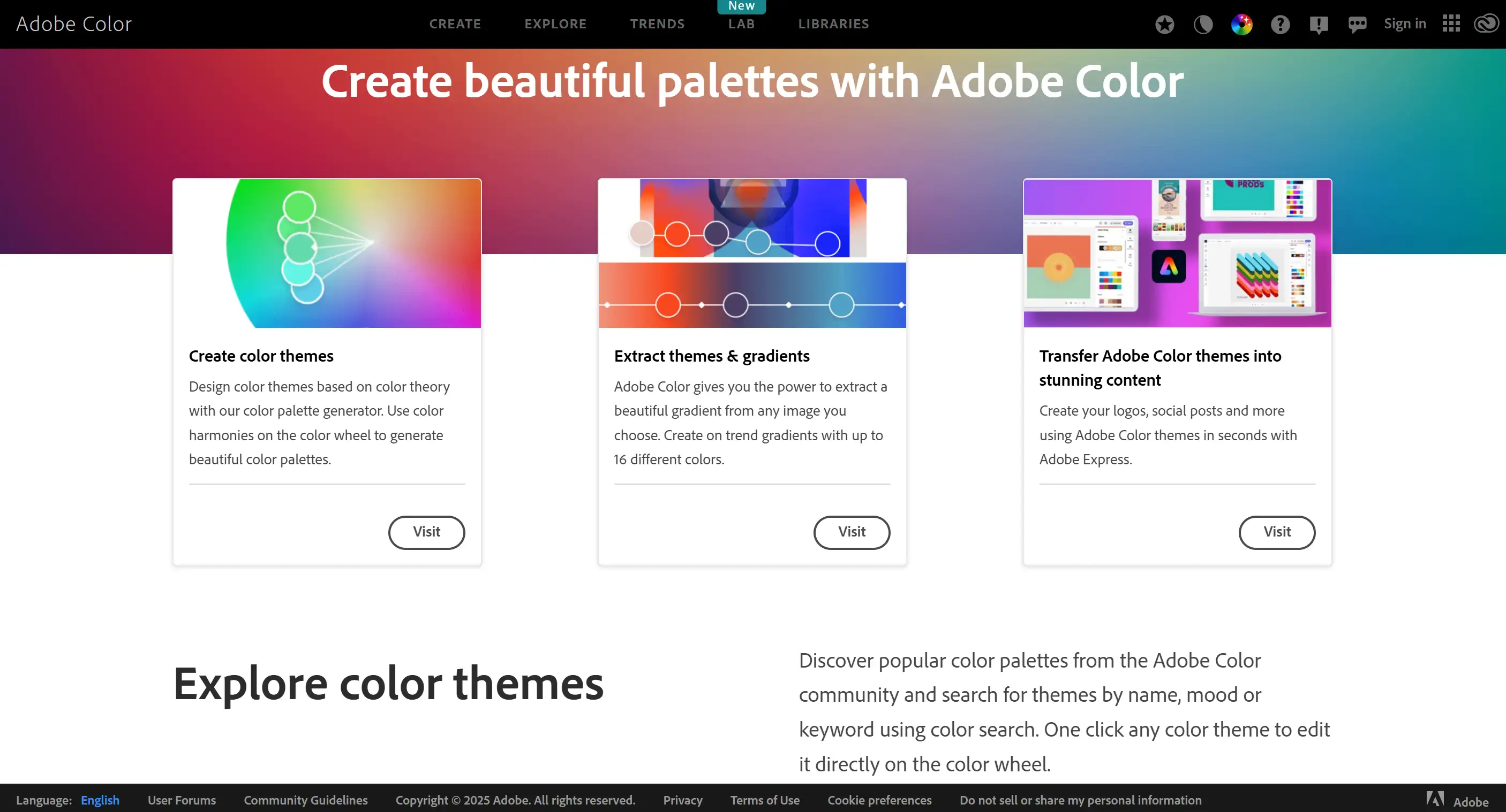
This is a handy tool that designers love to use, especially those who use Adobe Creative Suite. There is a harmony rule called "Triad" in Adobe Colour, which will automatically generate a set of triadic colour combinations for you after you select a basic hue. It also has HSB (Hue, Saturation, Brightness) sliders that allow users to adjust each hue, modify saturation, and brightness to achieve the desired effect.
#02 Coolors.co
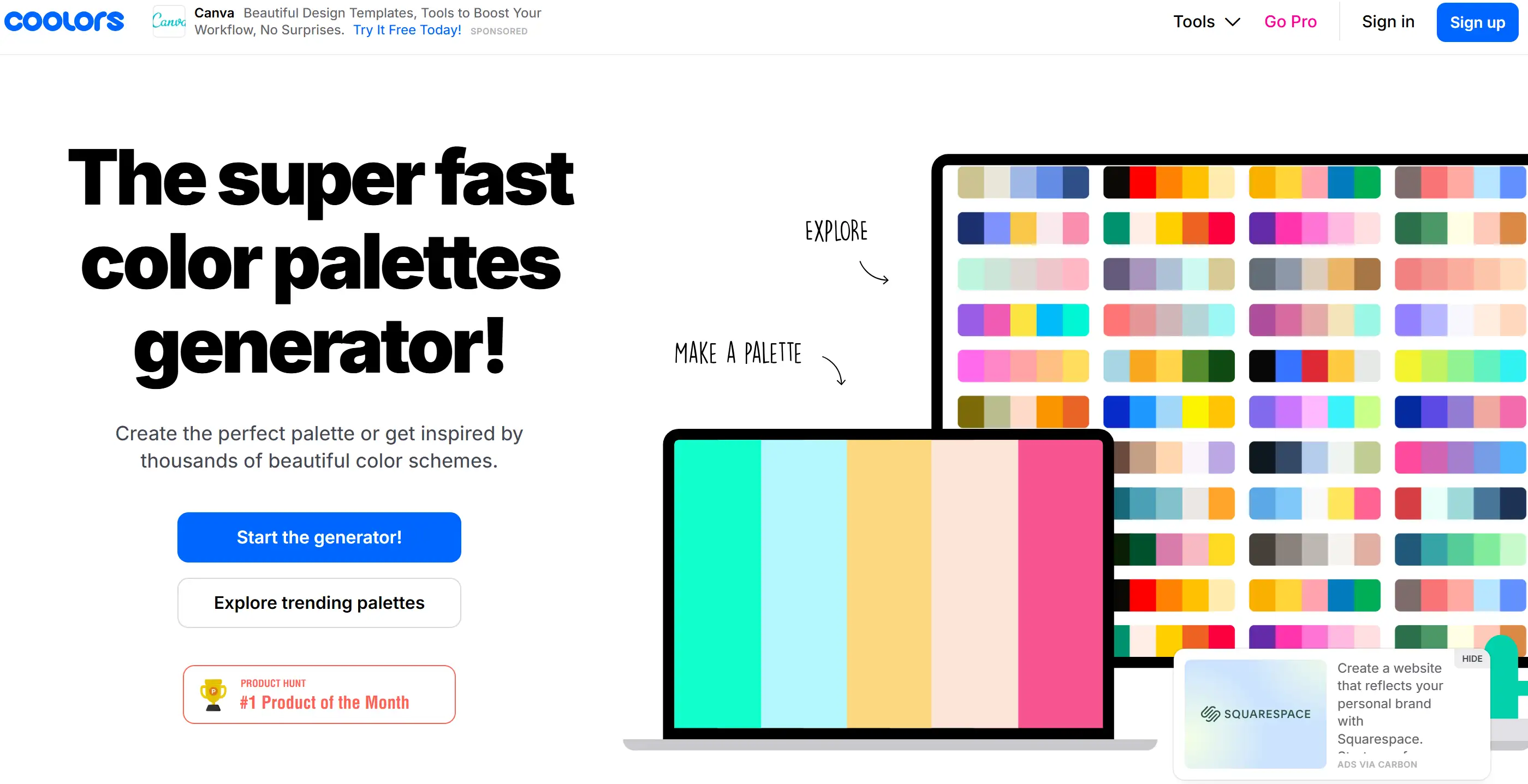
Coolors.co is known for its speed and user-friendly interface, making it perfect for creating colour palettes quickly and viewing a variety of trendy colour combinations. Its ability to pick colours and see contrast makes it handy for finding inspiration for triadic colour schemes, even while “triadic” creations may just be a more technical principle in colour theory, but it can handle that, too.
#03 Colormind.io
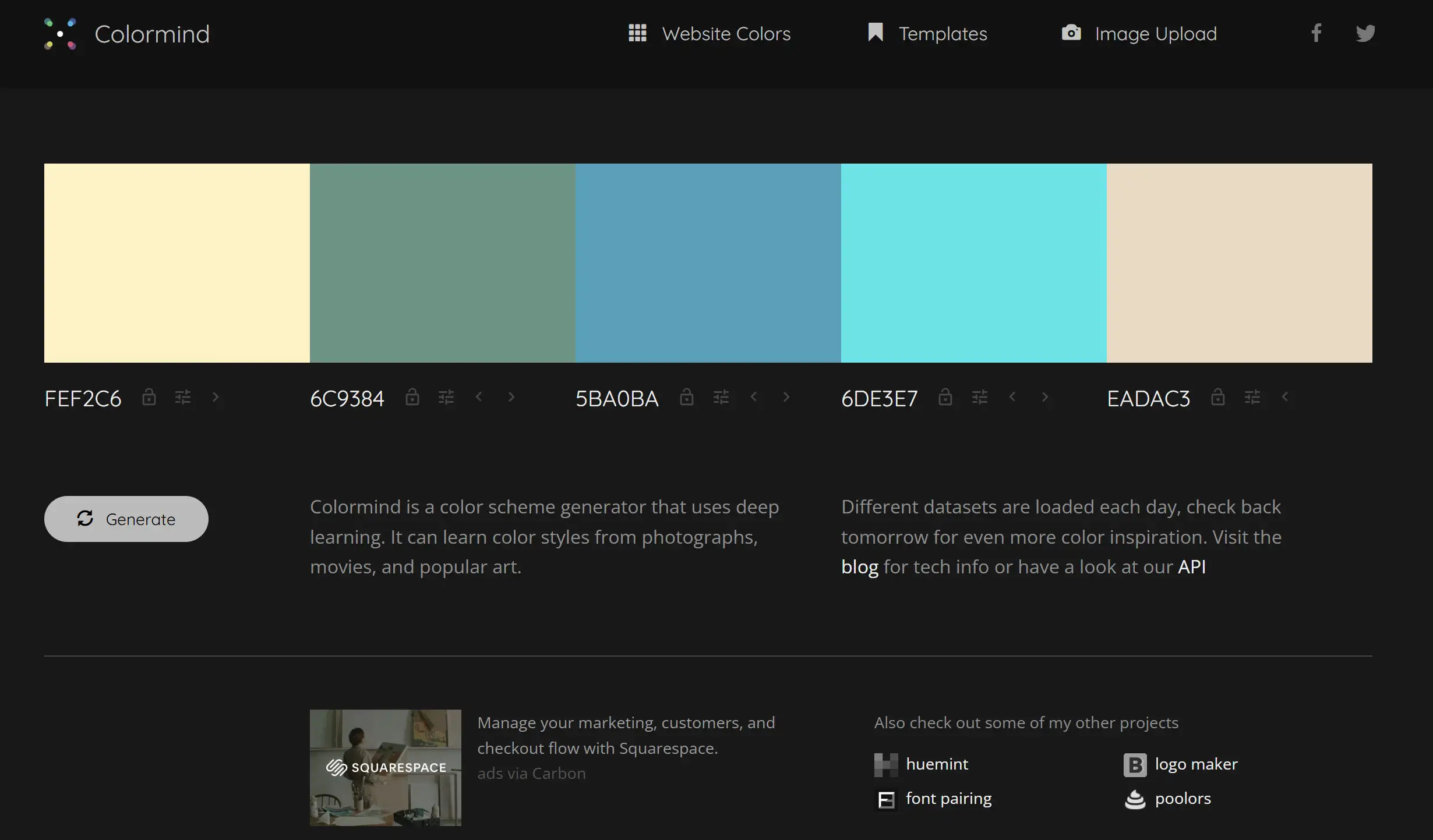
Colormind takes an AI-powered approach to colour palette generation. It can analyse the colour combinations in various pictures, videos and classic works of art, and then create unique and novel triadic colour combination suggestions. Users can select one or some hues and have the AI chatbot generate complementary hues. If you can find the right direction and choose well when generating the colour palette, you can create a good triadic colour mixture.
How to Pick Triadic Colours and Tints Like a Pro
Understanding what triads are and where to find them is just the beginning. The real challenge is to be able to choose and use triadic colours and tints well. This expertise can transform a design from ordinary to preeminent, turning a simple three-colour combination into an eye-catching work of art.
Define Your Project's Intent & Emotional Impact
Before choosing the primary colours, they must first figure out what the project wants to achieve and what kind of emotional resonance they hope to evoke. Is the goal to inspire energy, tranquillity, playfulness, or elegance? This is where colour psychology comes in handy; for example, blue generally represents reliability, although red appears particularly energetic. Via a carefully considered calculation, they ensure that the selected triadic colour combination not only meets technical requirements but also touches people's hearts on an emotional level.
Choose Your Dominant Triadic Colour
When designing, you should choose one of the three recognised colour hues as the main colour. This primary colour will ensure the visual layout and establish the main tone. Generally speaking, this colour will occupy the most space in the design, which determines that it is the leader among the triadic colour combinations.
Identify the Two Supporting Triadic Colors
The remaining two primary colours are used as secondary colours and highlight colours. They need to be used more restrainedly than primary colours. Their role is to assist the primary colour, add visual interest, and offer contrast when the tertiary colours are mixed.
Apply the 60-30-10 Rule for Balanced Triadic Colour Schemes
The 60-30-10 rule provides advice on how to distribute the three colours. It suggests that the main colour should account for about 60% of the design space, the secondary colour should account for 30%, and the remaining 10% should be the highlight colour. This way of colour distribution creates a clear visual hierarchy, though it also prevents the three colours from looking too messy when paired together. This principle provides a psychological framework for dealing with visual focus in a stimulating triadic mix.
The Art of Using Triadic Colours and Tints, Shades, and Tones
-
Tints: Created by adding white to a hue, making it lighter.
-
Shades: Tinting is done by adding a bit of black to a hue to make it appear darker.
-
Tones: A shade is created by adding grey to a colour to decrease its brightness. It is also very critical to switch the vividness and brightness of the selected triads.
Lowering the saturation of accent triadic colours so they blend better with the main colour. Pastel variations (which are essentially triadic colours and tints) create a softer, more cohesive and usually gentler feel. Good at matching and using triadic colours and tones, it can make the triadic colours mix to create a richer sense of layering.
Incorporate Neutrals to Ground Your Triadic Colour Combinations
When matching the three colours, they can add neutral colours like white and black, grey, as well as metallic colours like gold or silver, so that the brightness can be well balanced. Neutrals give the visual "breathing room" so that the three colours can show their brilliance without being overwhelming. They make the colour arrangement of the three primary colours more stable and add a touch of elegance.
Testing Contrast and Ensuring Readability
Especially for online design, graphic design, and anywhere text is used, you must ensure that the text colour and background colour in the selected three-primary colour scheme are obvious enough to be seen. When the contrast is not sufficient, it will make it difficult for people to see the content and will also affect the user experience. Tools like Adobe Colour's Contrast Checker can be very helpful in making sure that your chosen triads and tints meet accessibility regulations.
Ready to Paint the Web with Your Brilliance?
Feel like a tri-colour expert? Really good! Now, imagine bringing that same appealing balance to your internet world. If the idea of creating a website makes your head buzz, more dizzy than looking at a colour wheel, let me tell you about Wegic. Think of it as a super smart and considerate web page layout assistant. Just chat with it and everything will be done! Powered by the latest GPT-4o, Wegic can turn your ideas from ordinary conversations into an awesome multi-page website, no complicated code required, just pure talent, and it assists any language you like. Is it ready to use the three-colour theory to make the website more fun and attractive?
More about color:
Written by
Kimmy
Published on
Mar 17, 2026
Share article
Read more
Our latest blog
Webpages in a minute, powered by Wegic!
With Wegic, transform your needs into stunning, functional websites with advanced AI
Free trial with Wegic, build your site in a click!
What kind of website do you want to build?