Log in
Build Your Site
12 Inspiring Photography Website Examples for 2024
Looking to build your photography portfolio? Explore inspiring photography website examples to spark creativity and design ideas for your online showcase!
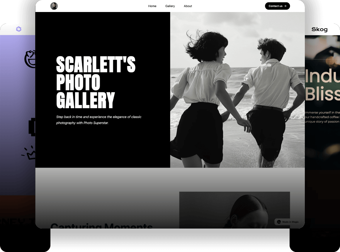
Whether you want to build your portfolio as a photographer or you're looking for a genuine website that blends the power of photography into your company, you'll find this post interesting. Exploring these sites will inspire your mind!
Click here to Build your site
Table of Contents
-
21 Inspiring Photography Website Examples for 2024
-
What Can You Learn from These Photography Website Examples?
-
Photography Website Examples FAQs
-
Which is the best photography website?
-
Do photographers need a website?
-
What should a photography website include?
-
How many photos do you need for a photography website?
-
How can photographers make a photography website?
-
12 Inspiring Photography Website Examples for 2025
1. Almost Real
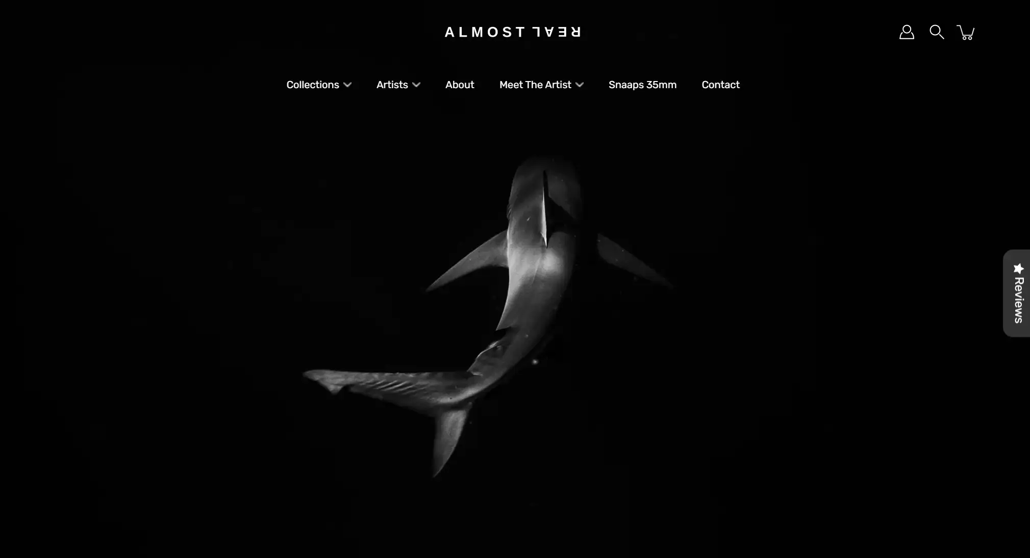
Almost Real is a platform for fine art photography and visual art made by a global community of artists and creators. It offers a dynamic forum for both young and experienced artists to display their work. The website is particularly intriguing since it highlights the artists' tales and high-quality prints, bridging the gap between art lovers and the makers of the works.
-
The main color scheme of the Almost Real website is composed of black and white. The website style is simple and plain. Simple black lines build the main body of the homepage, with sections including new artwork showcase, artist information, popular trends, and featured product selection.
-
Menu bars are set in the header and footer. The images of the art pieces in the exhibition are neatly categorized, with added micro-interactions such as a magnifying glass that appears when browsing specific art items for a closer look at the photos.
Pro Tip: If your website is an e-commerce store selling photography works, the website design of AlmostReal is worth referencing.
2. Peter McKinnon
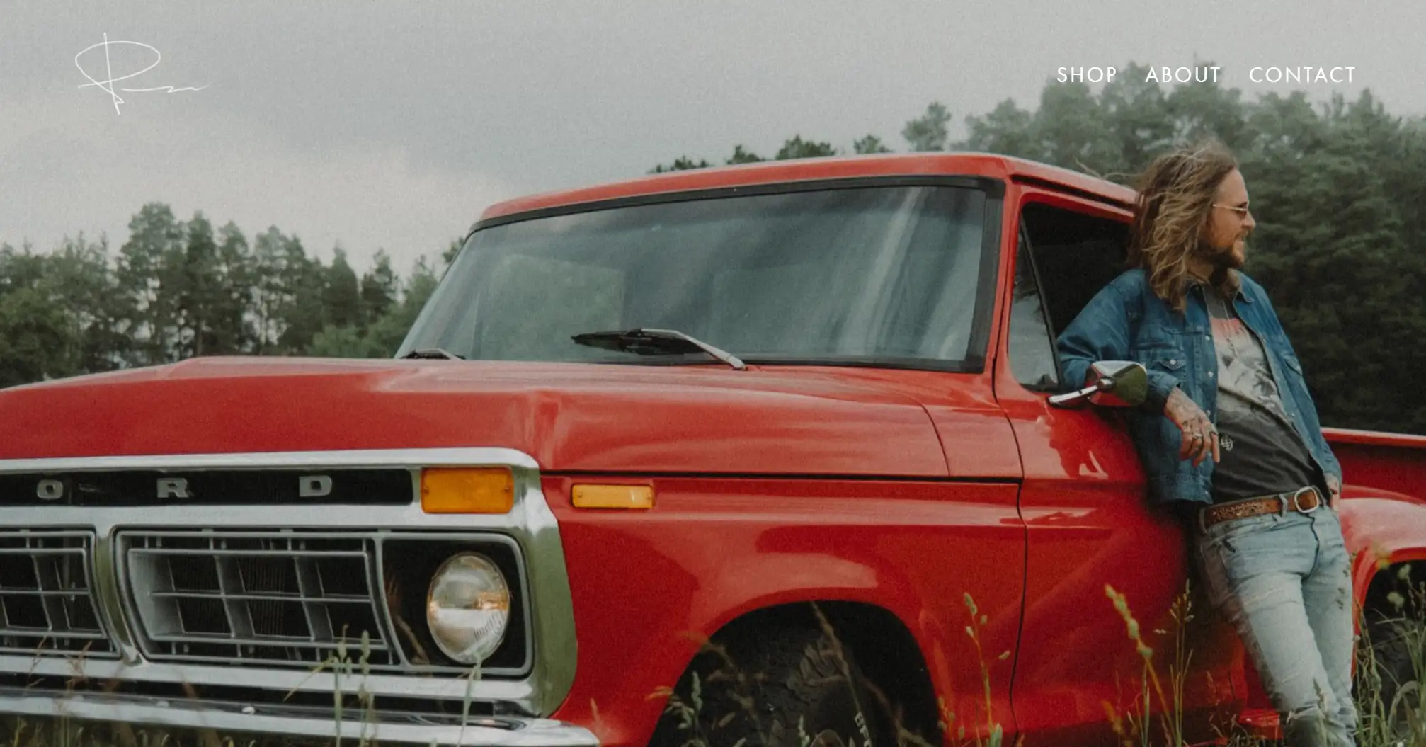
Peter McKinnon is an internationally renowned photographer and director who utilizes his website to facilitate and assist individuals in pursuing the meaning behind photography. The website profits by selling photography photographs, showcasing an audacious pursuit in the field of photography.
-
Upon entering the site, what immediately draws one in is the large and exquisite photographs. The headers and footers were exceptionally clean and tidy, showcasing the store's essential links and contact ways.
-
Peter primarily showcased his abundant photo collections, such as Lightroom Presets, alongside video content.
-
In addition, the website features a link to his YouTube channel, offering visitors guidance tutorials on photography-related matters.
-
The website's user experience is highly comfortable, with an extremely simple navigation page.
Pro Tip: Your website should display with flexibility across any device, captivating audiences with full-screen presentations of images.
3. Mike Kelley
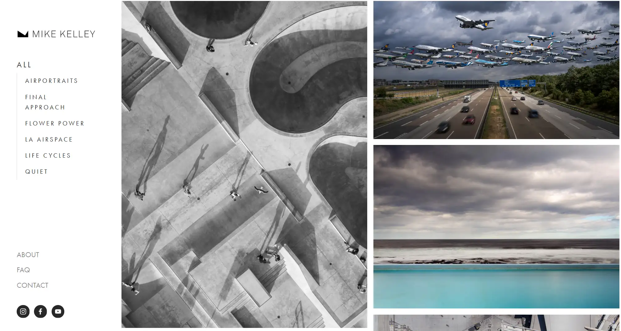
Michael Kelly is a photographer hailing from California. You can see his outstanding works in architecture, as well as his passion for airplanes. He adored the realm of art and design, infusing it into his projects with passion.
-
Mike Kelley's website features a left-hand sidebar and menu that is anchored to the page's left side, allowing users to access it seamlessly regardless of where they scroll down to the bottom of the page.
-
The website page is exquisitely clean, with a white background that sets the tone for a more minimalist look, devoid of any footer that might mar its simplicity.
-
In its "About" page, it adopts an informal yet amusing layout and expression, presenting personal information in a humorous self-introduction style. This arrangement enhanced UX's pleasure.
ProTip: You can keep the menu header fixed on the left side of the page, providing immense convenience for users to navigate.
4. Levon Biss
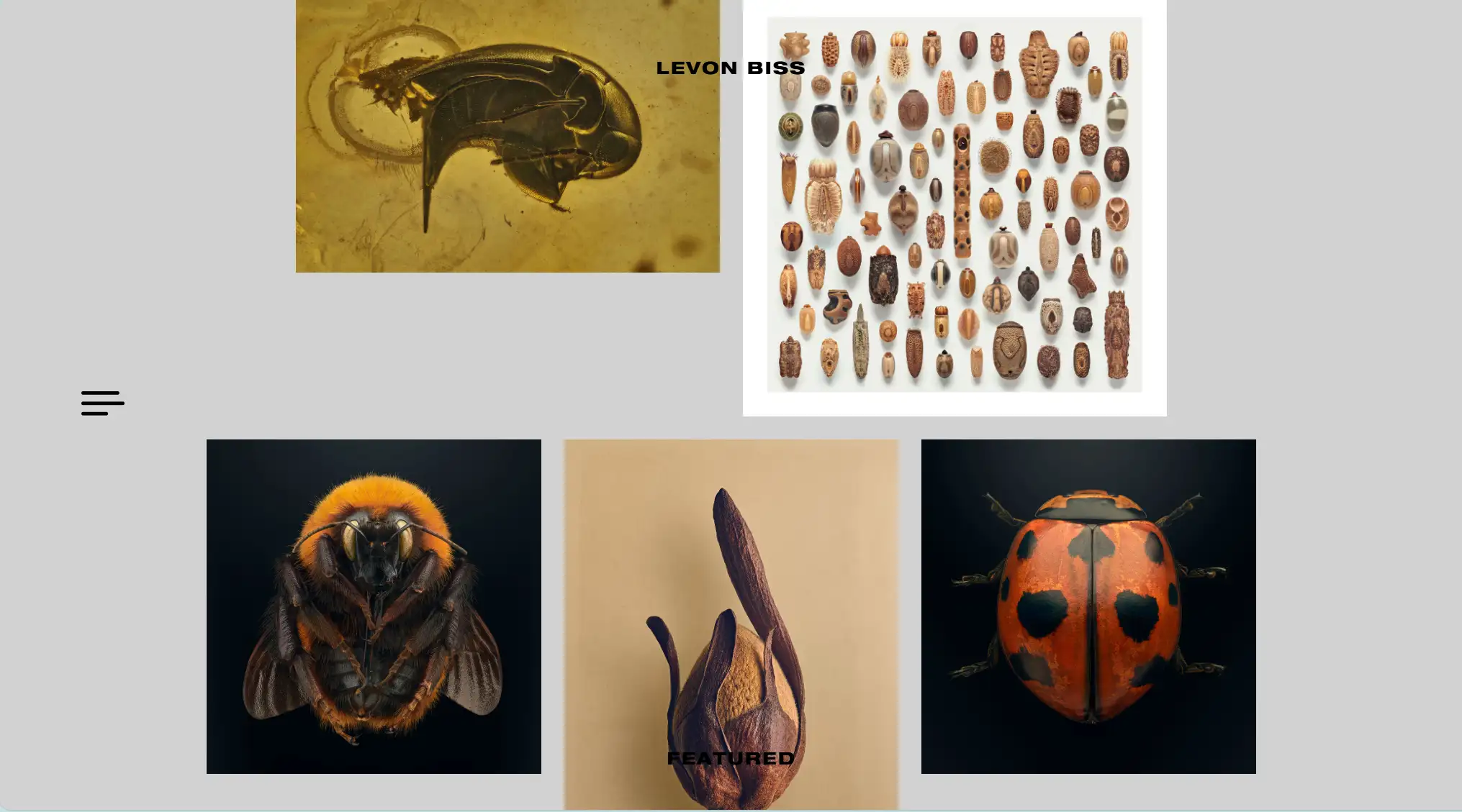
Levon Biss is a British photographer born in London. Throughout his career, Levin's work spanned a wide range of photographic genres, but he is best known for his unique macro photography. His large-scale portraits are regularly showcased across the globe, with his engravings being treasured in numerous museums and private collections.
-
The website primarily showcases photographs with a minimalist navigation bar concealed in responsive navigation on the left side. This aspect might be overlooked when designing a computer-based site, but in this case, it works well since Levon has placed emphasis on displaying his work in full-screen mode.
-
Following single-machine navigation, there will be highly discernible page options available. Examples include projects, publications, exhibitions, and so on. The artwork images do not adhere to a neat arrangement, defying a rigid layout structure.
-
The designer has settled upon a fixed container width and the spacing between the two images. A harmonious irregularity imbues the web page with superior user experience.
5. Meiwen See
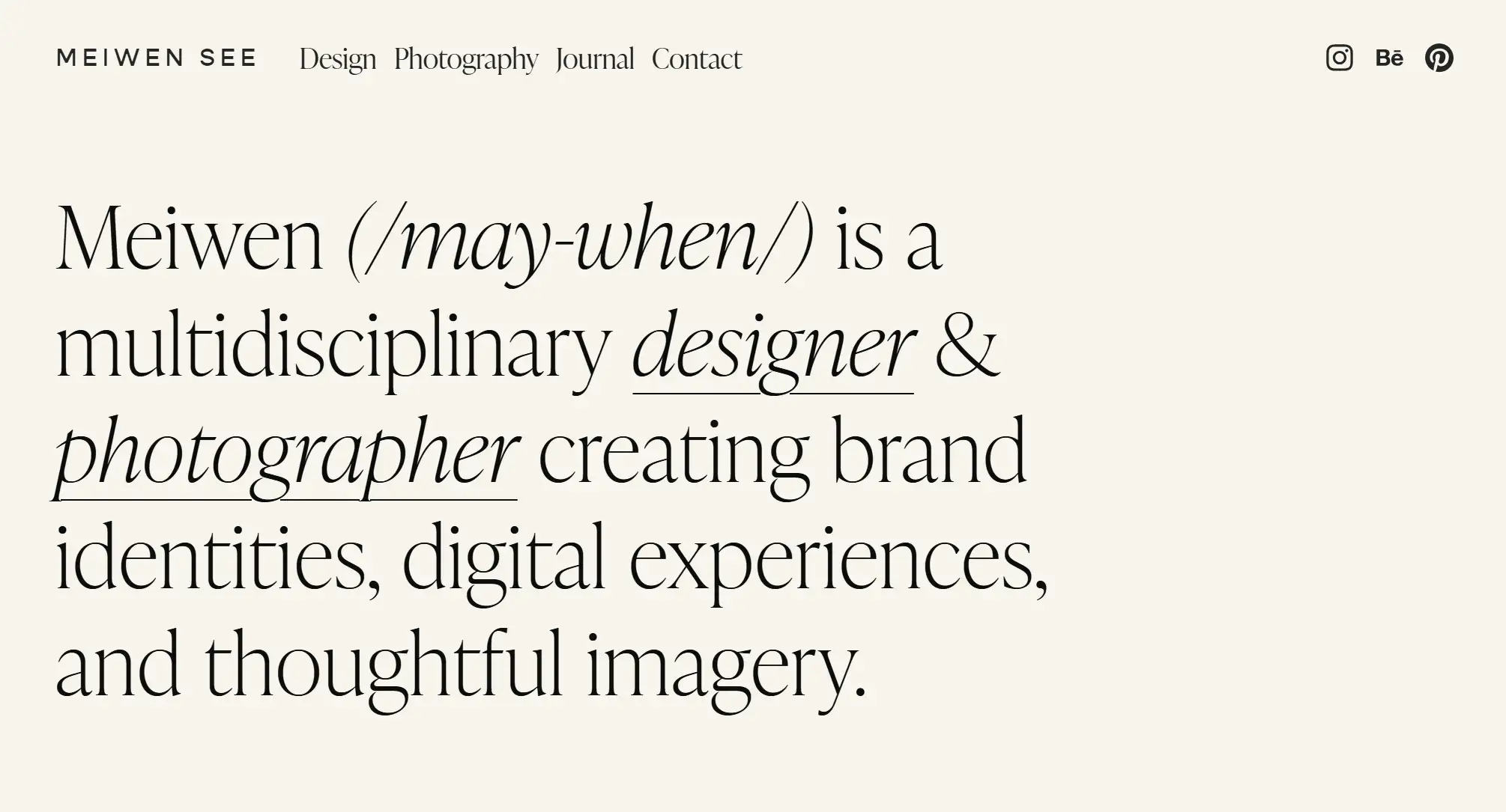
Meiwen See is a multidisciplinary photographer and designer, focusing on creating brand identities, digital experiences, and thoughtful imagery. Right from the homepage, Meiwen opts for a minimalist design that includes a brief personal introduction, a link to her design portfolio, and a captivating showcase of her best photography work.
-
On the homepage, there are primarily two content sections: a concise personal biography, as well as his collection of photography and design works, along with some select projects.
-
Her website boasts a diverse product portfolio encompassing photography, restaurant coffee brands, retail, home decor, hotel branding, and weddings.
-
By keeping users engaged and helping them understand what services and quality they can expect, it serves as one of the best examples of how to enhance brand value.
-
Each image category boasts its own library, meticulously categorized, with an exquisite aesthetic experience. The smallest navigation bar can assist visitors in locating more portfolios and contact forms or social media accounts.
Pro Tip: A photographer's website is not merely a platform to showcase their works of art; it can also serve as an extension of their brand identity or provide pertinent information, thereby expanding their service offerings.
6. Will Bremridge
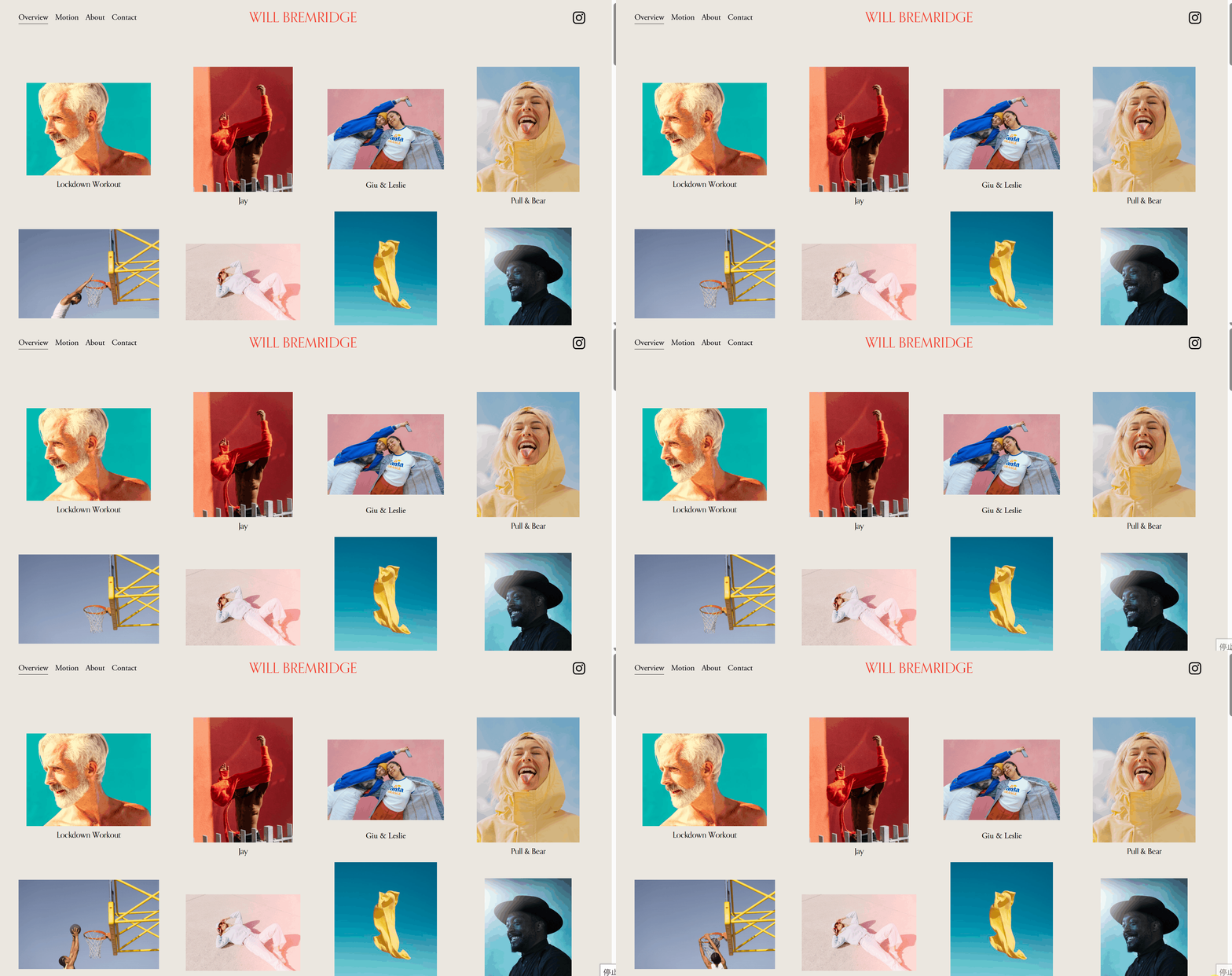
Will Bremridge is a photographer based in London and Lisbon, specializing in portrait, travel, and lifestyle photography for brands, advertising agencies, and magazines. All of Will's projects are characterized by vibrant colors, with a focus on creating energetic, joyful, and youthful work.
-
The images on Will Bremridge's website are vibrant, and the white background of the pages highlights the colors of the photos.
-
Additionally, the spacing between the images is well-controlled, which is beneficial for users to view. Clicking on the images allows for a magnified view.
-
The homepage of the website is filled with various images. You can also find dynamic images on the dynamic page. Using gifs (dynamic) in the website helps attract attention.
Pro Tip: Using animations and GIFs on your photography website can bring it to life and make the content more engaging.
7. Ruud Luijten
RuudLuijten is a self-taught travel photographer born in Belgium, passionate about outdoor activities and wilderness adventures. The website design allows users to experience the breathtaking beauty of nature and Ruud's captures of these unique moments.
-
The website has superb animated interactions and fluid scrolling effects, making navigation enjoyable through subtle animations.
-
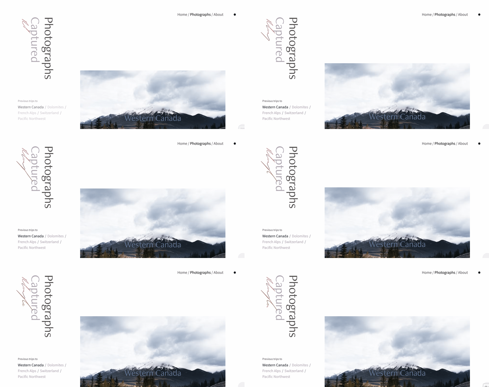
The webpage has a white background and photos placed in an asymmetrical style that is well-spaced. The plethora of photographs and white space emphasizes Ruud Luijten's focus on natural landscapes.
-
The Home/Photographs/About navigation menu can be accessed by hovering your cursor over the black dot in the top right corner.
-
Another innovative design element is the website's logo, which contains Ruud Luijten's name in an animated trademark typeface, increasing the page's engagement.
Pro Tip: Adding animations and interesting effects can be the finishing touch to a website, providing users with a better user experience.
8. Carmen Hunter
Carmen Huter is a world-renowned photographer known for her stunning nature landscape photos that are praised for their beauty and artistry. This photography website uses high-quality images to take visitors on an exciting outdoor adventure visual journey. On this website, you will find content that can inspire your travels, exploration, or the creation of a similar photography website.
-
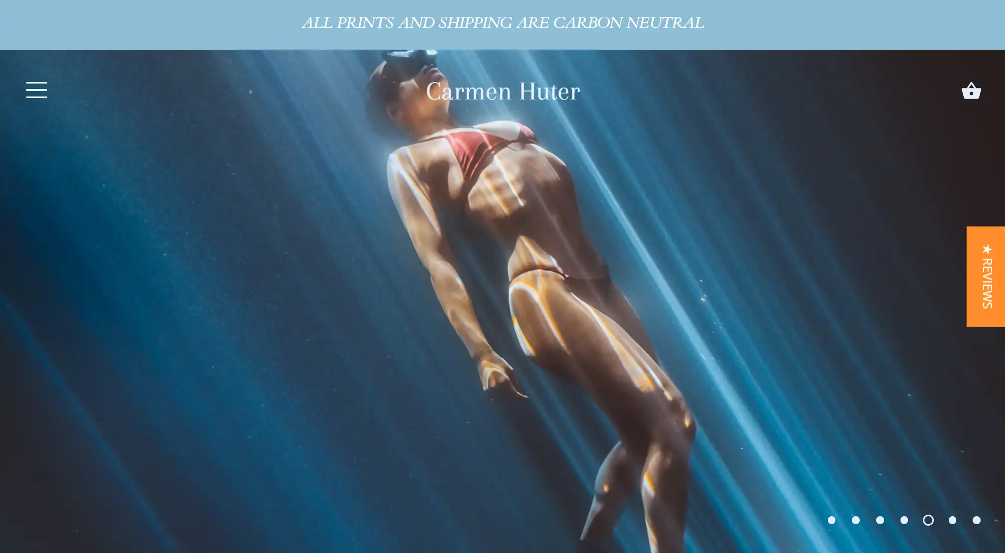
The website features stunning travel photography, with a homepage composed mainly of blue tones showcasing natural landscapes such as glaciers, skies, and oceans. The user experience gives a sense of being immersed in the scenes, which aligns with Carmen's emphasis on environmental themes.
-
The text in the middle of the top of the homepage emphasizes that prints and shipping are carbon-neutral, representing the value proposition of the website and committing to environmental protection. The content on the homepage is very simple, only highlighting the partners she has worked with and many provocative phrases to engage visitors.
-
Two filtering options are implemented on the Preset and Print detail pages to help users filter by date or price, making browsing easier.
Pro Tip: Incorporating the humanistic concept of photography and brand values into website design can bring deeper value.
9. Scott Snyder
Scott Snyder is a product/object photographer from California. From his minimalist portfolio, it is evident that his photography is characterized by clean lines and top-notch quality.
-
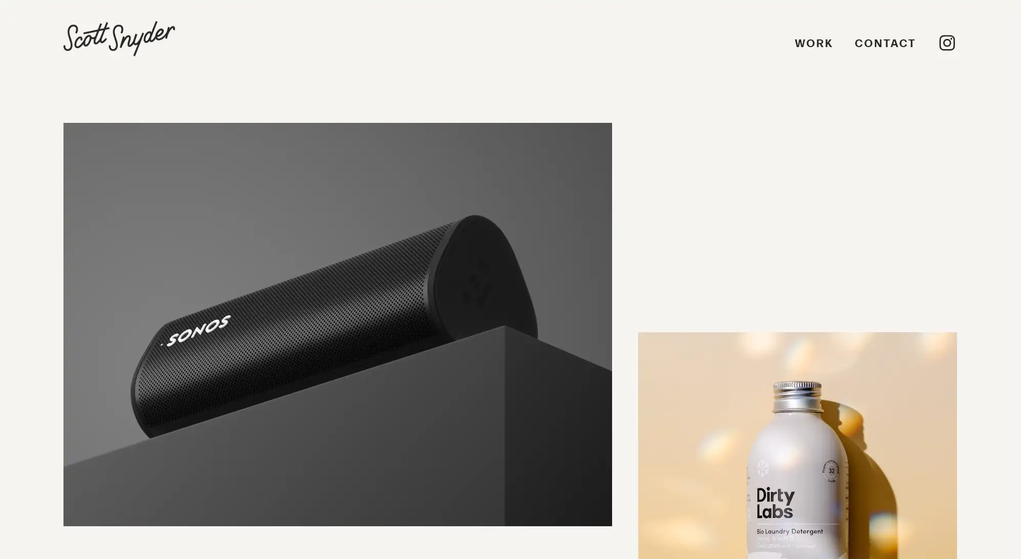
Scott's site is basic and clean, with no specific written introduction, focused on showing the photographer's work.
-
He employs easy-to-read fonts, scrolling animations that are just perfect, a tiny 'About Me' section, and positioned contact information and Instagram.
-
The professional photographer showcases his best photos on the homepage with plenty of negative space. You can find detailed information about each photography project by clicking on the relevant photos.
10. Liller Photo
Lauren is a professional wedding, lifestyle, portrait, and family photographer. With over 14 years of experience and more than 200 weddings under her belt, Lauren is one of the best photographer website examples.
-
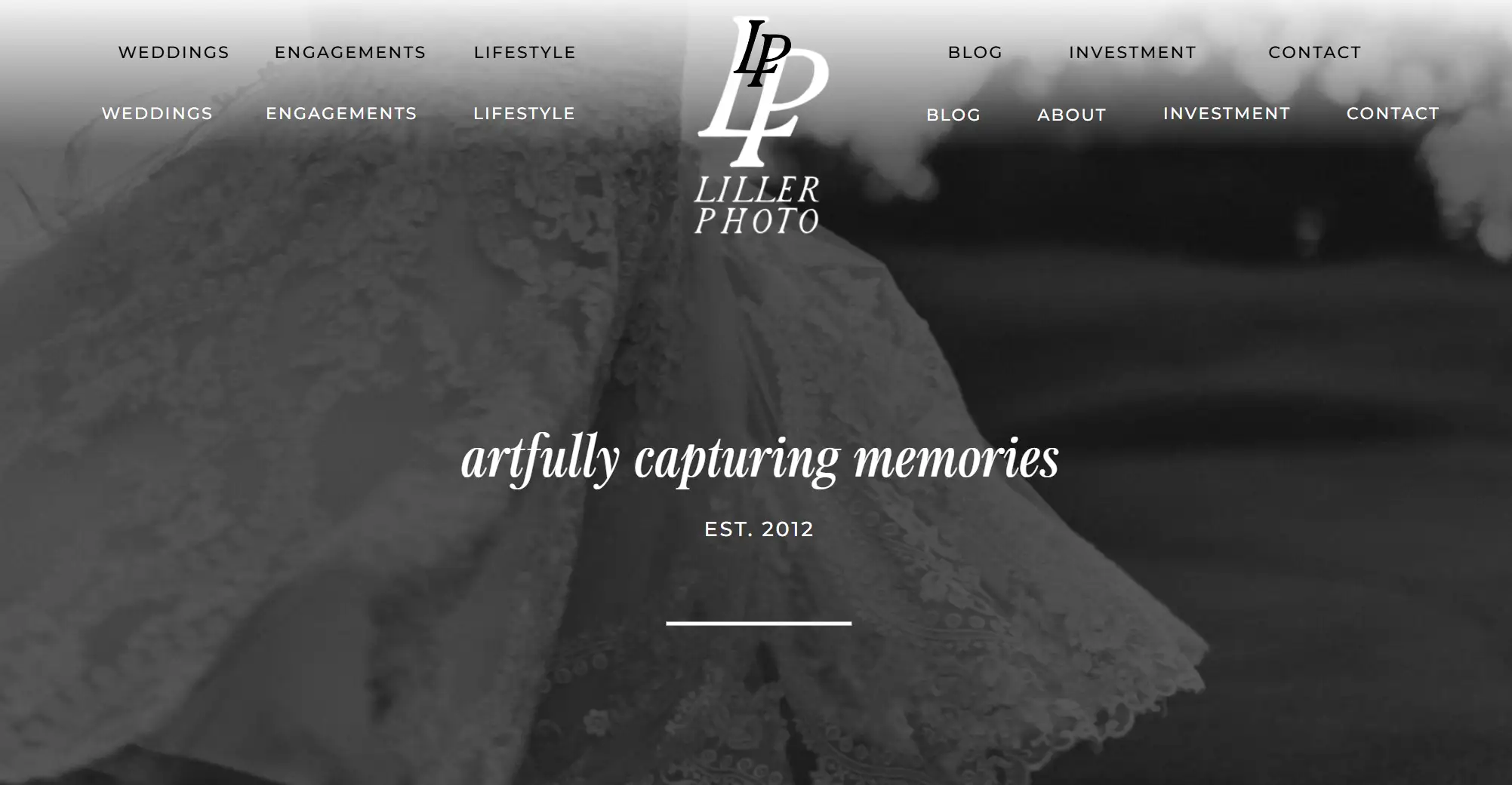
When you scroll the mouse, the bottom color of the title bar on the homepage gradually becomes transparent, the floating title is fixed at the top of the screen, and the footer uses a black background with an added back-to-top button. Therefore, Liller's website layout is very cool.
-
The image section of the website highlights special moments of weddings, capturing the warmth through photography.
-
The website also has blog content, with a large number of wedding photos that provide users with a lot of photography-related knowledge.
Pro Tip: If your website does not have a sticky header, a back-to-top button can be very useful as it will enhance the user experience of your website.
11. Jessica Chou
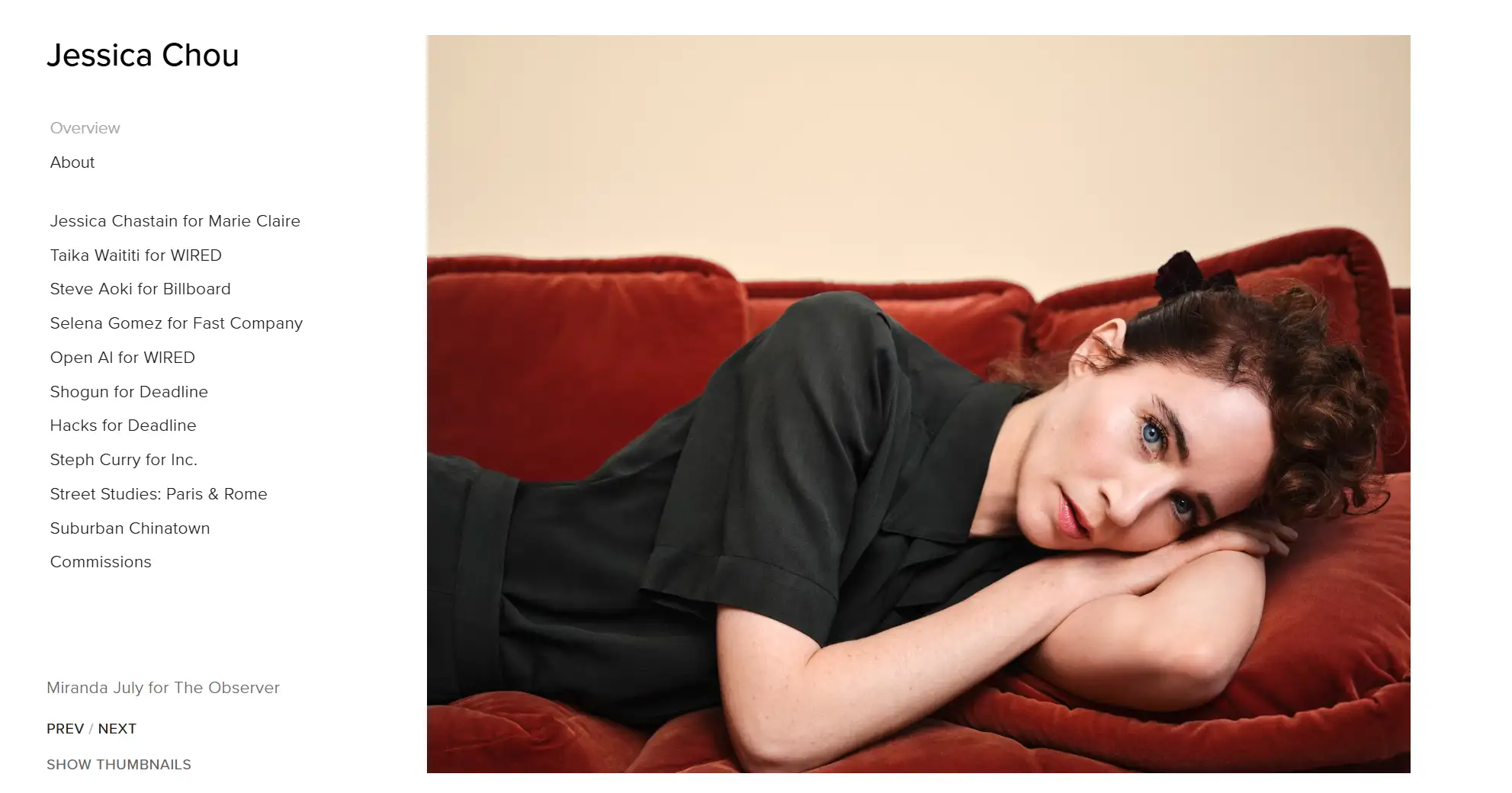
Jessica Chou is a photographer based in Los Angeles and San Francisco. Her images transcend moments with simple elegance, revealing the personality and stories of her subjects. The website is a representation of minimalism, with a very simple layout.
-
The website has a detailed section introducing her availability, awards, recognition, and exhibitions. Her website has minimal text and a very simple navigation bar.
-
The fixed navigation bar on the left effectively integrates information to convey her content. The main section on the right showcases her portfolio with images from various personal projects.
-
However, the length of the homepage is a bit long, and the infinite scrolling may cause aesthetic fatigue for users.
ProTip: Photographers can make photos speak, so website owners can appropriately reduce the length of page scrolling. Otherwise, you can add a footer and a back-to-top button to enhance the user experience.
12. San Pixs Photographie
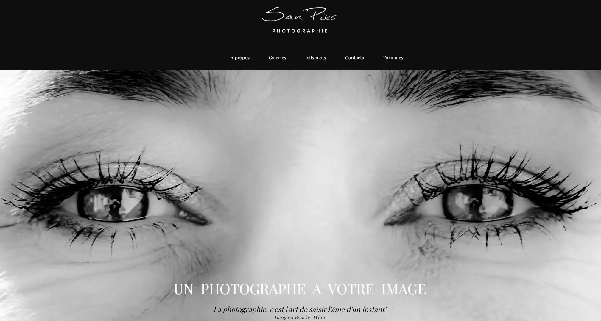
San Pixs Photographie, as a wedding photographer, the website journey for visitors starts with striking homepage images that include brief text and quotes.
-
The website has a black, white, and grey color scheme design, with the menu centered at the top of the page and links to relevant social media at the bottom.
-
The website gallery mainly showcases wedding and birthday photography, but there are also street, nature, architectural, and movie photography.
-
A detailed list of wedding photography packages and their pricing is also displayed, which allows potential clients to understand how much they will be paying and what they can obtain.
What Can You Learn from These Photography Website Examples?
Now that you've got a good grasp of the best practices to focus on what kind of content you should have on your website. Let's take a closer look at some great examples and see what we can learn from them.
-
High-quality static images.
-
A stylish and modern scrolling page design.
-
Some brilliant ideas to make the picture come to life.
-
Concise text with prominent focus.
-
Comfortable navigation interface.
-
A personality rich in brands.
Photography Website Examples FAQs
Which is the best photography website?
Although we can't determine which is the "best" photography website, we have compiled this list of top examples to inspire you. These photography websites come in a variety of types, so you can choose the one that matches your needs for design reference.
Do photographers need a website?
Yes, a photography website is an essential tool for photographers who want to expand their business and online presence. It attracts potential clients, builds their brand image, and offers a central location for clients to view portfolios, contact the photographer, and even book services.
What should a photography website include?
A photographer's website should have a portfolio of curated previous projects, an About Me section that describes their photography background, and contact information, etc.
How many photos do you need for a photography website?
In fact, the quality of photos displayed on the website is more important than the quantity. Our suggestion is to provide around 20-30 of your best works to leave a positive impression on visitors.
How can photographers make a photography website?
Photographers can easily create photography websites using Wegic. This tool allows you to build a professional-looking website in 90 seconds without any coding skills. If you want to create a website with great value for money, this website builder is highly recommended as it provides all the necessary website design needs for you to focus on showcasing your work. Its AI handles the technical aspects of web design, ensuring that your portfolio is beautifully presented and accessible to potential clients.
Click here to Build your site
Conclusion
Photography websites are super helpful for both beginners and experienced photographers. They act as a platform for photographers to tell their visual stories, displaying their amazing works online and showing them off in all their splendor. From wedding to fashion photography, you can learn from these website examples to discover the best design for your own site.
Written by
Kimmy
Published on
Mar 12, 2026
Share article
Read more
Our latest blog
Webpages in a minute, powered by Wegic!
With Wegic, transform your needs into stunning, functional websites with advanced AI
Free trial with Wegic, build your site in a click!