Log in
Build Your Site
How to Design a Child-Friendly Website: Best Practices & Tips
Teach you step by step to create a child-friendly website! In addition, this blog will also tell you how to create a website quickly and efficiently.

There's no doubt that most of the world's websites are designed for adults. After all, adults are a huge potential market, and you can understand and study what they like. And design web pages and products based on these.
Therefore, website design for kids has become a huge problem. What exactly do they like? Web and graphic designer Drew Elrick, once stated, "You have to think even more intuitively when designing for kids. They aren’t always logical in the way they choose to navigate a website.”
To be honest, designing a children's website is not just for children; it is also for adults, that is—their parents. So when creating a website design for kids, you need to consider not only what the children like but also their parents' considerations. This is because, in this day and age, everyone has access to the Internet. The Internet is not just for adults. Every kid uses a phone, a tablet, and a computer. Their parents need to try to screen the best sites to prevent their children from finding things that are not appropriate for their age group.
This article will teach you step-by-step how to create a website design for kids.

5 strategies for website design for kids
Step 1: Design websites for kids of different ages
Website design for kids is a huge potential market just like adults, but it is often ignored by most people. Apple has already created the 'Kids' category in the App Store and has over 80,000 apps. The child market earned a revenue of US $4.84 billion in 2024. The annual growth rate of the child market is expected to reach 3.83 percent.
In this age when everyone has access to the Internet, it is important to design websites for children of different ages. This is because children of different ages often have different needs. According to research, children are often more acutely aware of the age gap and refuse to engage in things they find "childish." Because of this, it's important to have a deep understanding of the age group in which your website is designed for kids.
3-5 years old
Children between the ages of 3 and 5 may prefer bright colors and sounds. In other words, things that are relevant to their daily lives. Nature, lovely people, and animals. For children of this age, you may lose the need to create a web page that can provide both fun and a familiar environment for the child. That's why website design for kids is so important. Website design for kids can help children learn the truth of life when they are having fun, and help them build confidence and curiosity.
6-8 years old
Children at this age are more likely to enjoy challenges than children aged 3-5. They are eager to let the adults around them know that they have grown up. So, for website design for kids In the 6-8 age group, you may need to design more challenging and interactive small games. These interactive designs allow children to identify objects and learn words. If you are a parent or teacher and want to design a fun website for your students or children to play with, you can try Wegic to create a kid-friendly website design for free.
9-12 years old
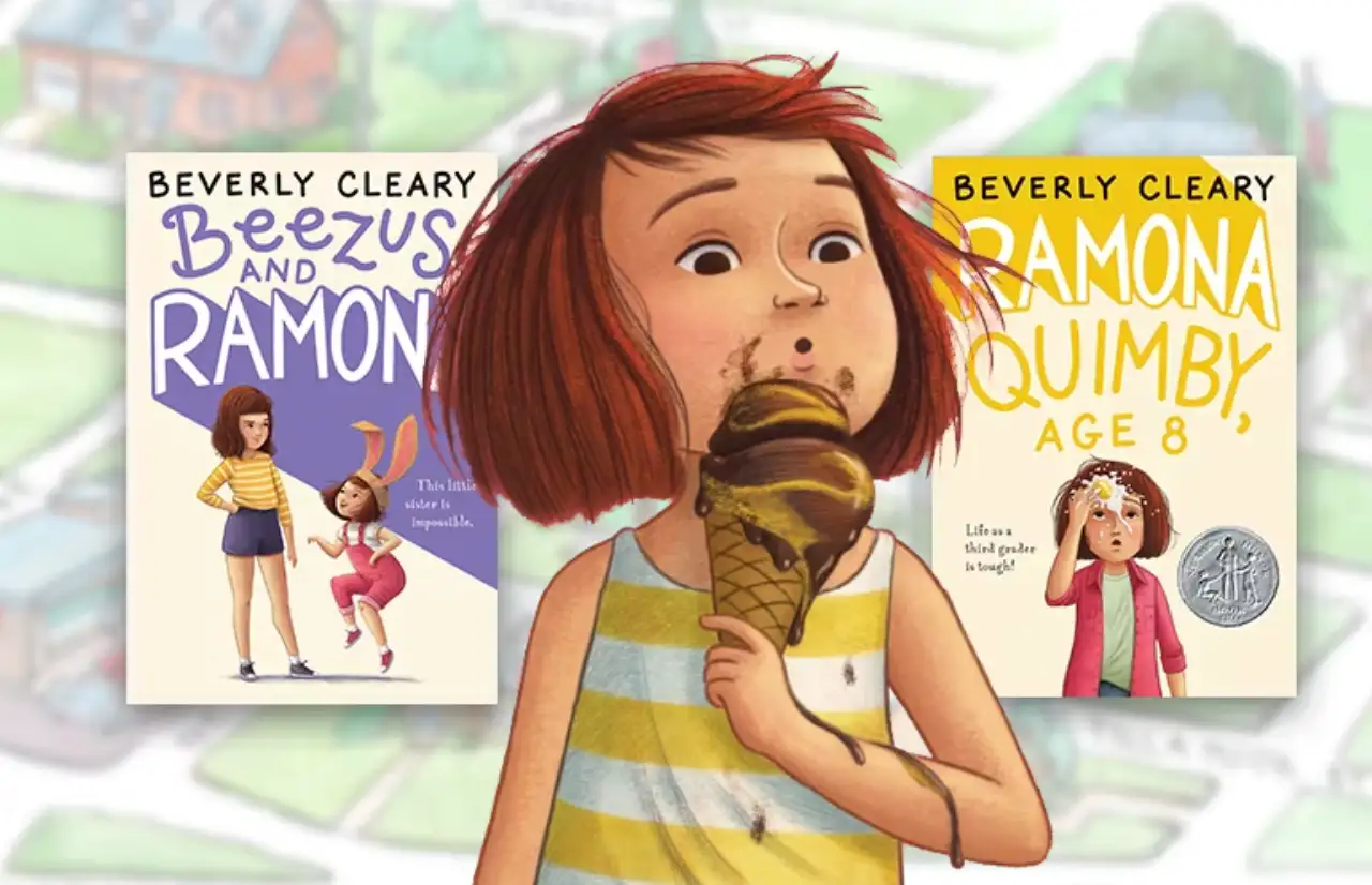
If your website design for kids is for 9-12-year-olds, you should be more careful to make your website feel like an adult's website. We've all been through this age when kids are always eager to prove to adults that they've grown up and are "adults." As a result, your site makes children feel mature and simple compared to the previous ages and is a site that adults will use. Beverly Cleary, for example, provides a good example. Its website color scheme looks very simple. There is no excessive color rendering, but the clever color scheme is carefully designed.

Image by Beverly Cleary
Step 2: Show respect and use plain language
Why put this in step two? It is because it's important to show respect for children. Many websites are designed to be patronizing to children because of the age of the target audience. While parents will pay the bills, what the child likes and whether he or she feels respected by the website designer is very important. They are usually very sensitive to it. Therefore, in the process of website design for kids, straightforward language and respectful tone are very important things. Lego's website, for example, shows respect for both children and parents.
Plain language and a respectful tone can largely prevent children from being distracted by advertisements. While you can make money from advertising on your website, it is important to understand that children are easily attracted to pop-up ads. Your ultimate goal is to drive traffic to your site and ultimately make sales, not to get kids to click on ads and leave your site.
Step 3: Design to stimulate the senses
The first two steps are to make you pay more attention to the psychology of children at different ages so as to better build a website. From this step on, I learned how to create a website design for kids.
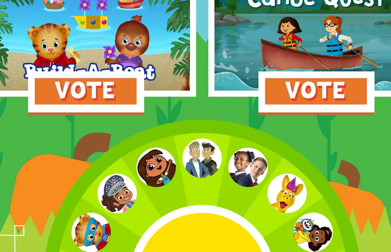
The first must be bright and vivid colors. Unlike adults, the purpose of finding a website is to find useful information. The more colors, the better. The brighter, the better. Pleasant colors like red, blue, yellow, green, purple, and orange. But you should also pay attention to the harmony of the colors. Children are usually more attracted to bright colors and spend a lot of time on the website. This is a fundamental element of children's website design. The color will make a deep impression on children. For example, the PBS KIDS website's color scheme is very bold. If you put the design of such a site on a site viewed by adults, it may be quickly shut down or made fun of. But children are different. They are usually attracted to these colors. Increase your child's browsing time with bold color collisions!
The PBS KIDS is a website designed for kids; it uses bold color schemes and natural elements, as mentioned earlier in this article. So it's not hard to see that this might be a site designed for 3-5-year-olds. If you are interested in this, you can do in-depth research on sites such as PBS KIDS before designing your website.

Image by PBS KID
Just as bright colors make people happy, your website design needs to make children happy. The overall atmosphere of the site should be the same. If kids feel happy at your site, they will remember and come back to the site again. You can incorporate various elements into your website. For example: dogs that play happily in nature, kittens that play with children, and so on are good choices. That will make a good and fun website design for kids!
Or, you can incorporate the elements that are currently most popular among kids. If you go back to when we were kids, it would have been various Disney princesses and Mickey Mouse. So what animated characters do kids like these days? Insert people they like and are familiar with into the site, making them feel familiar and happy at the same time. Do this step and your website design for kids is more than half done. Of course, you should also be aware of the corresponding copyright issues.
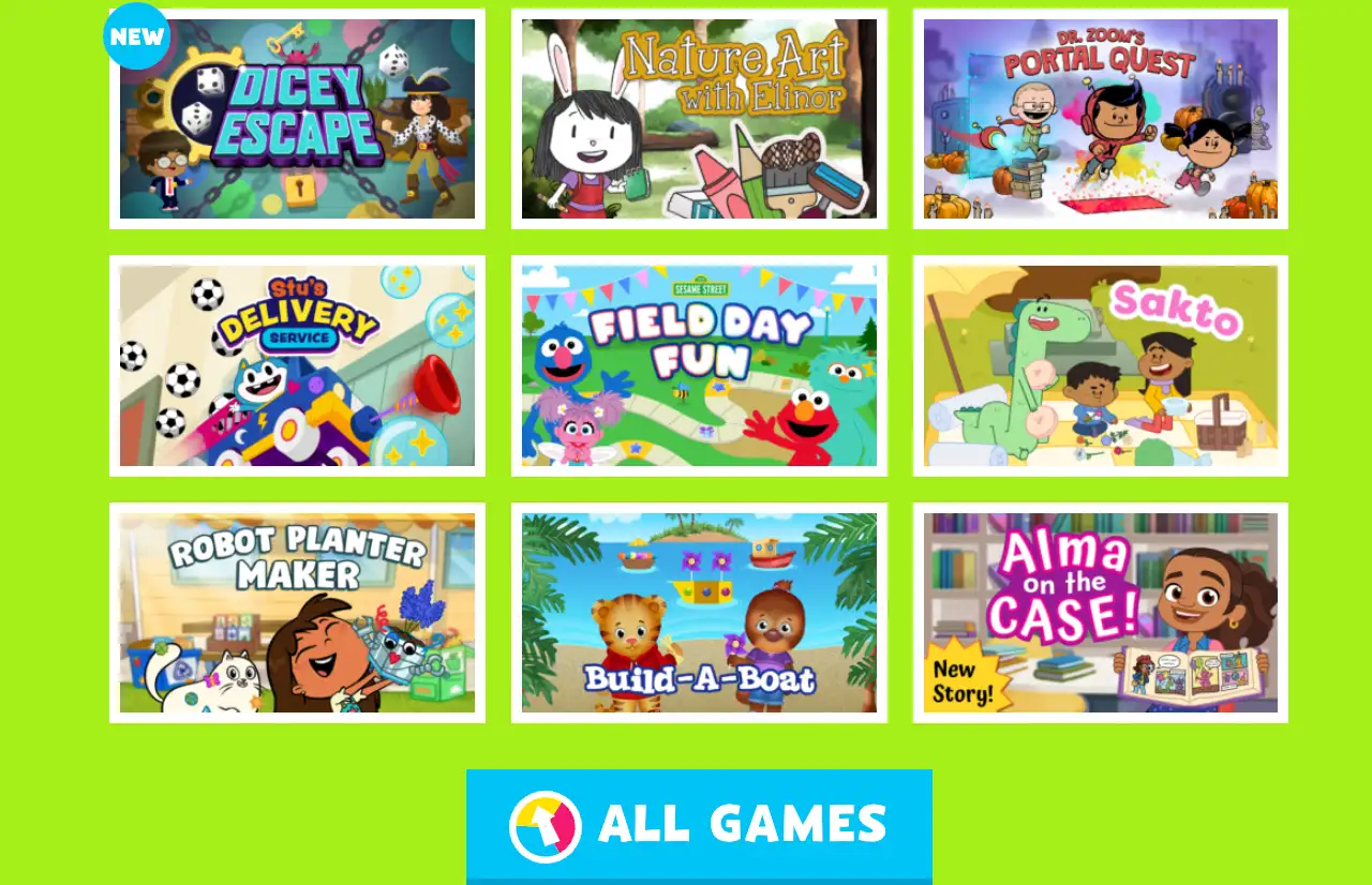
Finally, create a fun world for kids! You can break out of the traditional website structure and try some layouts that do not conform to the conventional web page. For example, something like PBS Kids combines many focal points above and below the screen. You can also create your characters through various forms such as shadows, bevel effects, gradients, and 3D to create more realistic visual effects.
Make your website look more colorful. Together, these features are enough to create a visual 3D world for kids. Website design for kids can be difficult because it requires you to understand the minds of a group with whom you have absolutely nothing in common. The good thing is we all have childhood. When we were young, our favorite games were playing with friends in nature and fighting monsters. Parents always hope that we can learn something from these experiences. This could be knowledge, human truth, or even simpler words and numbers. In short, you can build this into a website. Use the versatility of the Internet to capture the attention of children and let them build confidence and arouse curiosity in play.

Image by PBS KID
Step 4: Give your web page good features
Having said a lot of steps on how to make website design for kids more appealing to children. You may be asking how the web function should be designed.
There is only one answer: simplify.
Websites viewed by adults may have many advanced interactive features, and we can quickly learn how to use them. However, website design for kids can't be so complicated; it also needs to be carefully designed. Each of your buttons should be well thought out. When children first come into contact with the Internet, they do not understand how to use many complex functions. There are many reasons, one is that they don't know enough words, and the other is that they have little access to the Internet. Three, because they are not interested.
It is because children are more concerned about this website having bright colors, fun games, and so on. So, the first thing about website design for kids is you need to make sure that your ICONS are large and clear, and that each icon has simple text and images related to the content. For example: play, games, and then a picture of an animated character. This will lead the child to click. Your button can also make a sound when the child clicks, which makes it funny. The font on your page should also be as clear and easy to understand as possible.
Step 5: Take responsibility
The last thing we need to note is that our target audience is children. Website design for kids will influence people and children's thoughts. You need to make sure that your site does not cause harm to children and that it promotes education to some extent.
In addition to promoting the company's brand and identity through games and other interactive elements, you can also actively help and educate children's minds. As I said before, website design for kids is not just about making websites for kids. Every parent pays close attention to their children's online habits. Although your main target is the child, you also need to pay attention to what their parents are thinking. It might be a good idea to put a "Parent tip" box on the page.
In the end, you can build the site from the perspective of the child. For example, observe how children browse and interact with games and unique features of other website designs for kids. Or, let your children or other children try out your site and improve it according to their ideas.

Image by lifeofpix
Conclusion:
In this article, I have introduced you in detail what should be paid attention to and detailed steps to do a website design for kids. Pay attention to the child's preferences, respect the child's tone, use easy-to-understand buttons, and be full of design color and adventure sense of the game. Not only can children stay on your website for a long time, but you can also help them better understand English words and numbers and build their self-esteem and confidence. In this way, parents will encourage their children to go on your website. I believe that these can help you to provide a lot of ideas and benefits when creating a website.
If you want to try creating a kid-friendly website design for free, You can experience it with Wegic. You can talk to wegic's AI to bring your ideas to life. If you need further AI website creation, take a look at what wegic charges and how to use it. Click here to try!
Or check the amazing websites created by Wegic! (you can click on the picture) ⬇️

Written by
Kimmy
Published on
Mar 17, 2026
Share article
Read more
Our latest blog
Webpages in a minute, powered by Wegic!
With Wegic, transform your needs into stunning, functional websites with advanced AI
Free trial with Wegic, build your site in a click!