Log in
Build Your Site
Pairing Fun Fonts with Different Content: A Guide for Bloggers
Discover the power of fun fonts in blogging! Learn how to create and integrate playful, cute, and coolest fonts into your content for a unique visual appeal.

Language exists as recorded symbols which allow the sharing of information between people. Through their use people can both exchange information and communicate with one another. A word communicates messages through its physical form. When people read blogs, watch ads, posters, videos, or subtitles, they first notice how words look. Words with interesting shapes catch the eye first. This makes them easier to see and remember.
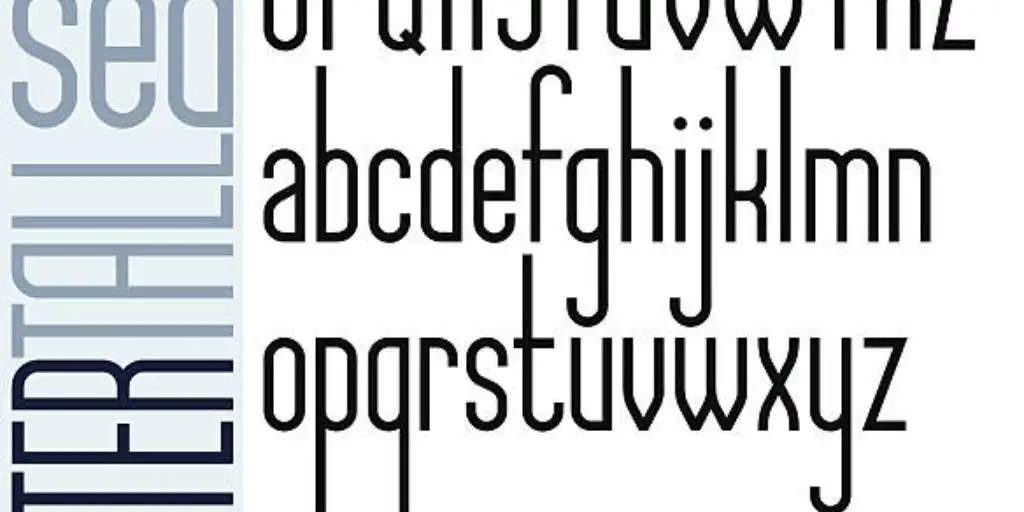
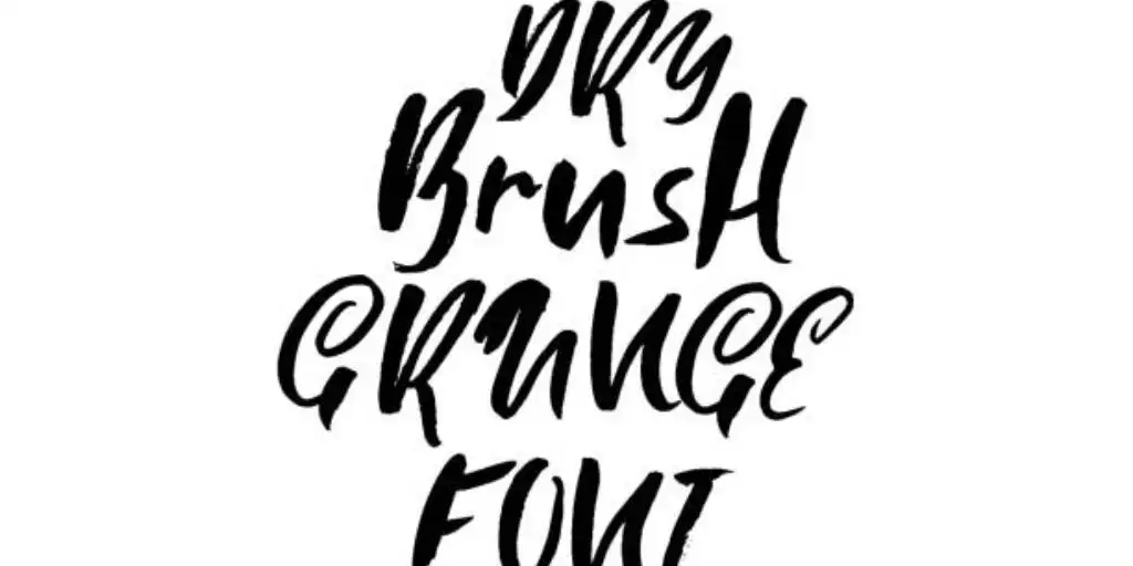
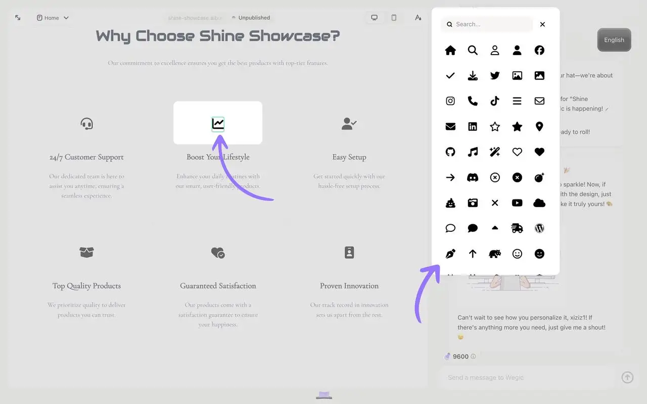
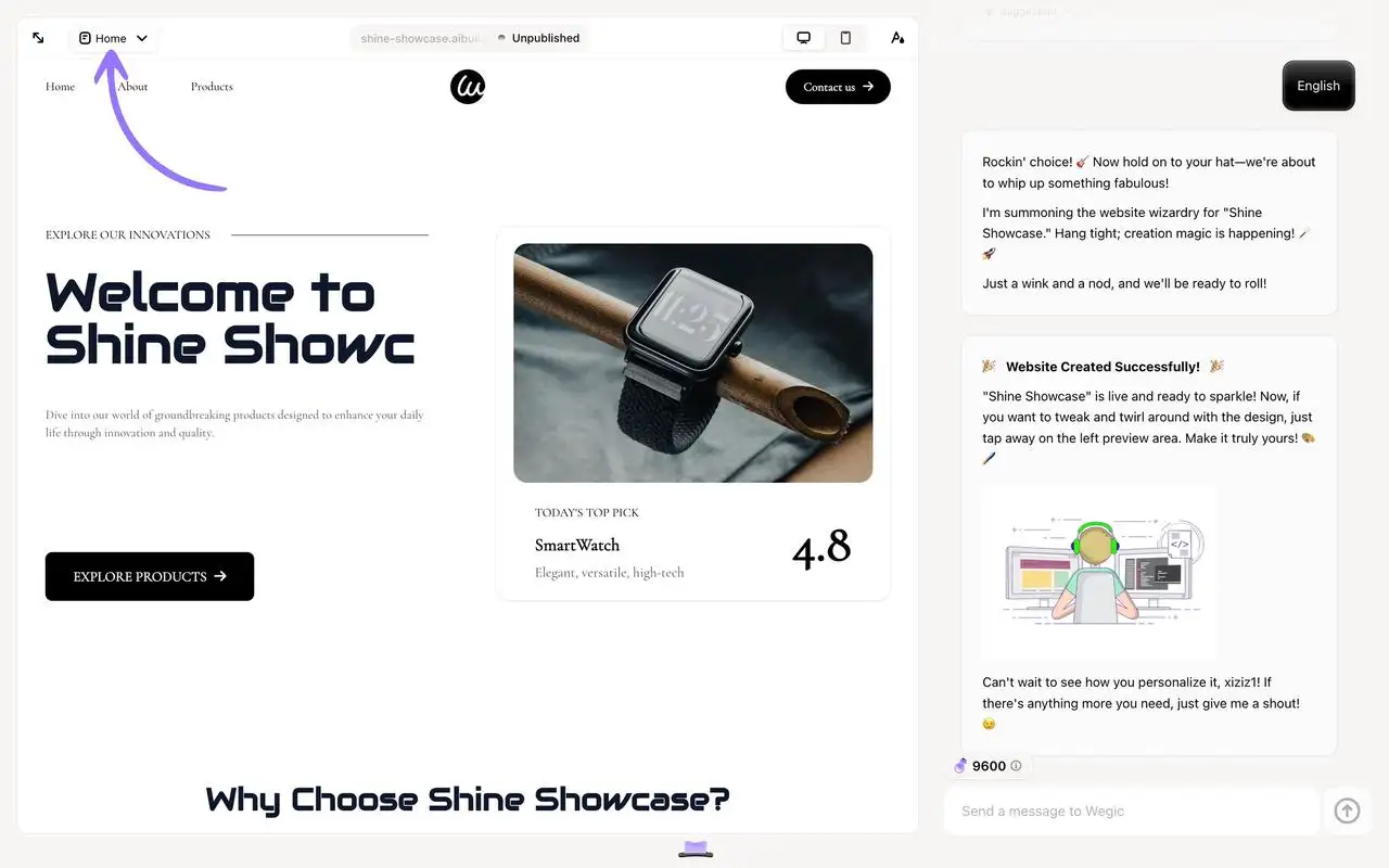
Click on the picture to quickly add fun fonts to your blog! ⬇️
So, what font looks fun? This article looks at how fonts have changed over time. It compares modern and classic fonts. It also shows how different fonts can make blogs more memorable and effective.
What are Fun Fonts?
History
The selection of appropriate fonts strengthens both text content and conceptual ideas. The designs within fonts transform periodically while the basic structures endure forever. The practice of manual book writing existed during ancient times. The process required numerous months while being very expensive. The development of the Gutenberg typeface became possible. The design featured handwritten-like black letters. The letters contained thick vertical strokes and thin horizontal strokes. The printing process revealed an overcrowded appearance because of their easy-carvability. People needed a better option.
Computers display the font Cambria, which followed the Gutenberg typeface. Nicolas Jenson from France developed this font during the 1400s. Jenson obtained his inspiration from the ancient Roman architectural inscriptions. The font design of Cambria includes straight lines combined with basic curved elements. The design of the text improved its readability for readers. European audiences embraced this simple font type during the Renaissance period.
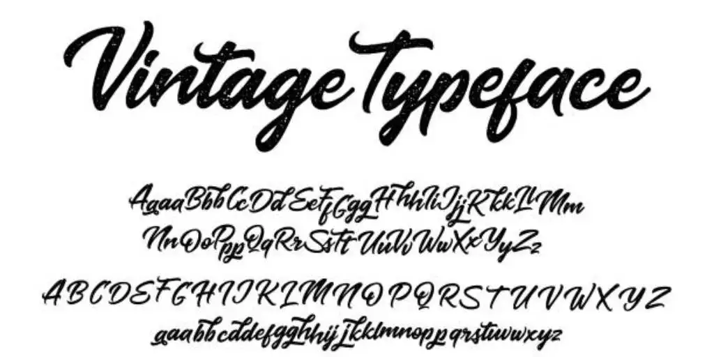
Image by Istock
The invention of italics occurred in the final years of the 1400s. The slanted versions of Roman fonts constitute these types of letterforms. During that time, people employed italics to increase the number of words on a page, thus conserving space. The combination of italic and regular font styles serves today to emphasize crucial words.
The English designed the Caslon font during the 1700s. The font contained small stationary serifs and minimal variation between its heavy and thin lines. John Baskerville designed the Transitional font after the Caslon font approximately several years later. The font possessed thinner serifs together with wider differences between thick and thin lines. The French Didot, along with the Italian Bodoni, designed the Modern font following the Transitional typeface. The font utilized very thin serifs and displayed significant variations between thick and thin lines.
William Caslon IV designed the Helvetica sans serif typeface featuring basic curved shapes which existed in multiple width options. The emergence of new typefaces became necessary during the Second Industrial Revolution because of advertising needs. Text received vertical expansion and horizontal expansion as a result of its primary application in large poster and billboard fonts. Advertising headlines typically relied on slab serifs featuring thick serifs for their design.
Paul Renner from Germany developed Futura as a geometric sans serif typeface which used basic geometric elements. English font designer Eric Gill developed Humanist Sans during the same period as he presented gentler and more natural curvatures to his typeface. With technological advancements, computers enabled users to generate thousands of attractive fonts. People today possess the ability to design their individual style of font. The evolution of fonts continues into present times.
Definition
What font is playful? Playful fonts represent a creative font style which creates a happy appearance in the text. The design purpose of this typeface is to create text that appears cheerful with abundant energy. Playful fonts differ from traditional fonts because their characteristics include rounded shapes and uneven forms that appear hand-drawn. Projects seeking to grab attention while expressing emotions benefit from using these fonts. These fonts find their main applications in branding projects as well as social media platforms and individual design work.
During the 1970s Japan introduced several cute fonts into their typography. The cute fonts displayed circular shapes while maintaining a cute appearance together with delightful characteristics. The fonts carried names which included round, meow, and doll. The text contained hearts alongside stars together with Latin letters and cartoon faces and stars. Japanese products adopted these attractive and cute fonts because they created a friendly atmosphere, leading to their widespread popularity.
The rules of standard fonts do not apply to playful fonts. The irregular shape of these fonts features dissimilar letters together with distinctive elements that add uniqueness to them. These hand-written-looking fonts create a warm personal atmosphere through their appearance. Pacifico and Dancing Script function as popular choices for invitation cards and social media content and greeting cards.
Playful cute fonts serve as an excellent tool to create creative designs while infusing personal character into your work. Playful coolest fonts enable your work to become more noticeable and create emotional connections with viewers when used in blogs, posters, or social media graphics.
Playful Fonts VS Normal Fonts
Playful fonts stand out for their high readability and visual appeal. They are designed to catch the eye and evoke emotion, making them ideal for creative projects. In contrast, regular fonts like Arial or Times New Roman are more formal and suitable for professional or academic use.
Here is a quick comparison:
| Feature | Playful Fonts | Normal Fonts |
| Style | Rounded, irregular | Clean, uniform |
| Use Case | Creative projects | Professional documents |
| Readability | High (in the right context) | High (universal) |
Usages of Funny Fonts
With its unique style and visual appeal, fun fonts are widely used in various scenarios to add personality and vitality to the design.

Image by Istock
-
Advertisements and posters: To quickly grab attention and make ads more friendly, Coca-Cola's summer ad uses the bold and lively "Bungee Shade" font for the main title, "Enjoy the Summer," to show the energy of summer. For the subtitle, "Buy One Get One Free," they use the rounded "Luckiest Guy" font to highlight the offer.
-
Social Media: Using bold 3D stylish fonts and smooth lines in posts, story covers, and limited-time updates can make content more fun and visually appealing. This helps attract users to like, comment, or share, increasing engagement. It also helps social media content stand out and encourages users to stay and interact.
-
Brand Logo and Packaging: Fancy fonts for businesses can give a brand a unique and lively personality. For example, the kids' toy brand HappyKids uses the coolest fonts like "Kidzone" in its logo. The rounded, cartoon-style font shows fun and innocence, attracting kids. The packaging uses the "Crayon Hand" font, which looks like a child's handwriting, along with a playful slogan in the "Bubblegum Sans" font. This helps HappyKids stand out in the market and become a favorite for both kids and parents.
-
Blogs and blog posts: Fun fonts are often used in blog titles, introductions, or key points. They help grab readers' attention and make the content more enjoyable. These fonts add variety to regular fonts and give posts more personality. This is especially true for blogs about lifestyle, creative design, or entertainment.
Fun fonts are used everywhere, making the design more friendly and attractive. But how to choose a suitable fun font? Next, we will unveil the mystery of fun fonts for you and take you to understand different types of fun fonts and their unique charm!
Fonts Types: What Font is Playful?
1. Free Fonts: Google Fonts - Roboto
Roboto is a modern sans serif font designed by Google and widely used in Android and web design. Its simple and clear fonts are suitable for a variety of scenarios, from body text to titles. As one of the free fonts, Roboto is not only easy to obtain, but also supports multiple languages and weights, making it a practical choice for designers.
2. Cute Font: DaFont - KG Primary Penmanship
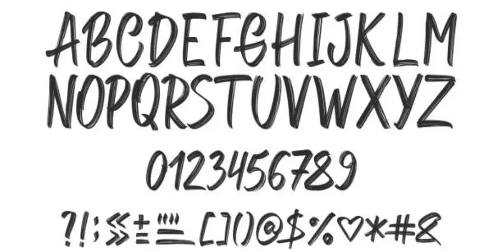
KG Primary Penmanship is a font that imitates the handwriting style of children, with rounded fonts, soft lines, and full of childishness. It is very suitable for children-related websitesor designs, such as kid game websites, educational materials, children's book covers, or promotional posters for parent-child activities. This font can make the design look friendly and cute, attracting the attention of children and parents.
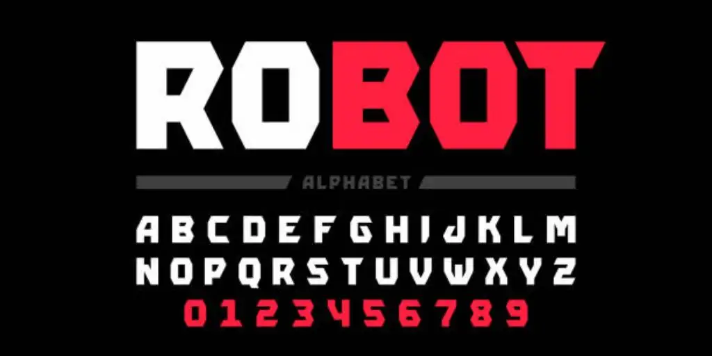
3. Coolest Fonts: Urban Fonts - Bungee
Bungee is one of the coolest fonts with great visual impact. Its letters are compact and arranged vertically, suitable for posters, advertisements, or brand logos. Its cool style can instantly attract attention and is particularly suitable for design scenarios that need to highlight vitality and personality, such as music festival posters or sports brand promotions.
4. Handwriting and Artistic Fonts: Font Squirrel - Pacifico
Pacifico is a handwriting-style font with smooth fonts and a casual artistic feel. It is very suitable for relaxed and natural design scenarios, such as cafe menus, handicraft packaging or blog titles. Pacifico's unique style can add a touch of warmth and personality to the design, making the text more expressive.
How to Choose the Right Font for Different Types of Blog Content?
Choosing the right stylish fonts for your blog content is key to improving the reading experience and visual appeal. Different types of blog content require different styles of fonts to better convey information and emotions. Here are some font selection suggestions for several common blog types:
Lifestyle blogs usually focus on a relaxed and friendly atmosphere. Handwritten-style fonts can convey a warm and personalized feeling. They are suitable for sharing daily stories, travel experiences or food recommendations. Use Pacifico in the title and easy-to-read sans serif fonts such as Open Sans for the body to maintain the coordination of the overall design.
Technology and science blogs
Technology and science blogs require clear and professional visual effects. Sans serif fonts are concise and suitable for presenting complex information and data. Use Roboto for the title and Lato for the body to ensure that the content is easy to read and well-structured.
Fashion and beauty blogs
Fashion and beauty blogs need to convey a sense of sophistication and luxury. The elegant lines of serif fonts can enhance the fashion sense of the design. Use Merriweather for the body, with appropriate white space and pictures to create a high-end atmosphere.
Business and Finance Blogs
Business and finance blogs need to convey a sense of authority and professionalism. Traditional serif fonts can enhance the formality and credibility of the content. Merriweather is used for the title and Georgia is used for the body of the content. Data charts and case studies are used to show professionalism and authority.
Creative and Design Blogs
Creative and design blogs need to highlight personality and artistic sense. Artistic fonts can add uniqueness to the design. Bebas Neue is used for the main title and Raleway is used for the subtitles. Bold colors and typography are used to show creativity and design sense.
How to Incorporate Interesting Fonts into Blogs on the Website?
Using fun fonts in blog posts has many benefits. They make the content look more organized and break up boring text. This helps readers focus on important information and keeps them interested, making their reading experience better. For example, a blog post about "Home Baking Tips" can be both useful and attractive by using fun fonts in the title, introduction, and key sections.

Image by Istock
-
For the blog title, a handwriting-style font like Lobster works well. This font has friendly strokes that catch the eye and fit the themes of "family" and "handmade." A title like "Home Baking Tips: Make Every Bite Full of Love" in Lobster font looks warm and inviting because of its smooth, natural curves.
-
In the introduction, a rounded, friendly font like Quicksand is a good choice. Its soft lines and simple design create a calm and happy feeling, which is perfect for talking about baking and sharing tips. The introduction could start by saying how baking brings joy, whether it's for weekend family gatherings or weekday tea times. We will present basic and useful guidelines today, which will enhance your baking process while making it more enjoyable. The Quicksand font creates a friendly reading experience because of its soft appearance.
-
In the text, fun fonts can make key skills or tips stand out. For example, use Fredoka One to highlight "How to make cakes fluffy" or "How to whip perfect buttercream." This font is bold and lively. It makes important content pop and helps readers quickly see the main points. For example, when sharing tips for fluffy cakes, use Fredoka One for "Use room temperature butter" or "Add eggs one at a time." This makes these steps easy to notice.
-
You can also use Bangers font for key steps. This font is bold and in uppercase. It works well for steps like "Preheat the oven to 180 degrees" or "Mix the batter until smooth." Readers will see these details right away. This design makes the blog post more fun and helps readers remember the important steps. It also makes the post more useful and easy to follow.
With this design, fun fonts make the blog post look nice and help readers enjoy it more. The layout is clear, and the key points stand out. Whether it’s the warm title, the easy intro, or the practical tips, fun fonts make the blog post about "Home Baking Tips" lively, fun, and simple to read.
This manual adjustment of the font and layout of the entire blog is time-consuming, and you need to conceive the blog font design yourself. Want to make your articles both beautiful and practical as quickly as possible, but don't know where to start? The best AI website builder, Wegic, can help you get it done in one step! Whether it is the choice of interesting fonts or the overall design of the website, Wegic can easily meet your needs.
Wegic: Your AI Web Design and Development Partner
As an AI-driven website design and website building tool, Wegic not only supports the flexible application of multiple fonts, but also simplifies the entire process of website design. The following are the advantages of Wegic in font design and website construction:
1. Change theme color
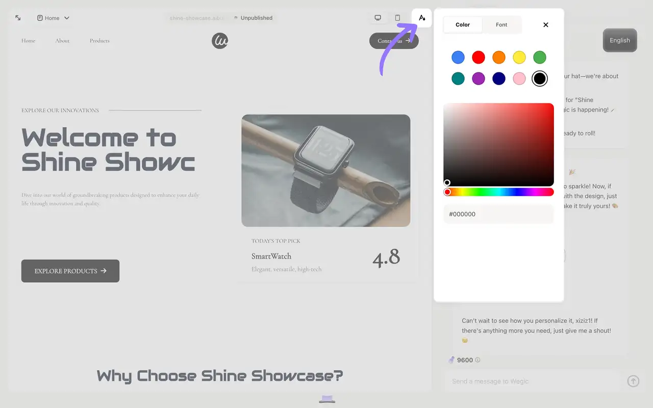
Wegic allows users to easily change the theme color of the website. Users can choose from 10 preset colors, or customize colors through the color palette, or even enter hexadecimal color codes to meet personalized needs.
2. Change fonts
Wegic supports a variety of font options. Users can adjust the font style of the website as needed to make the content more attractive.
3 . Replace images and icons
Wegic provides three ways to replace images: upload local images, search for images using online copyright-free libraries, or select beautiful illustrations from the library. In addition, users can also replace icons through the online icon library to further enrich the website content.
4. Add new pages and rename pages
Wegic supports multi-page design. Users can easily add new pages or rename existing pages, and the top menu bar of the website will automatically update synchronously.
Key Functions of Wegic Tool
-
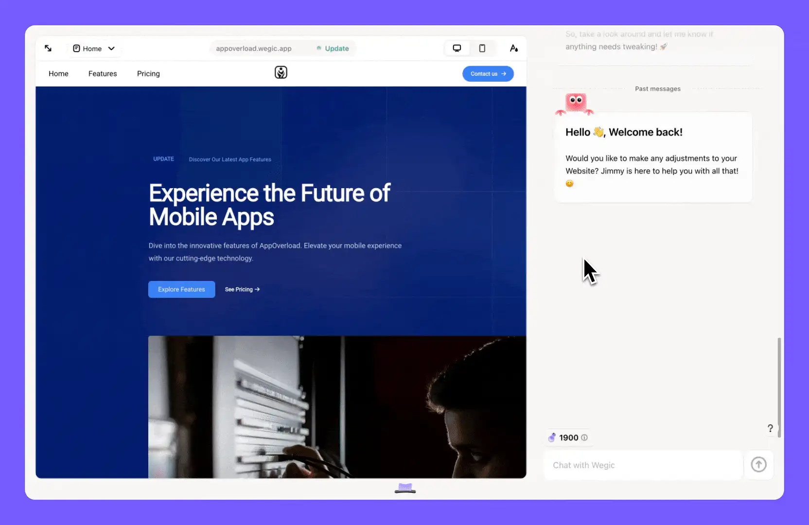
Conversational Design: Users can design websites and change content easily by talking to the system. No technical skills are needed.
-
Multi-language Support: The tool works in many languages, so people around the world can use it.
-
Responsive Design: Websites made with this tool look good on all devices, like phones, tablets, and computers.
-
One-click Publishing and Custom Domains: Users can publish their websites quickly and use their own domain names. This makes the process from design to launch smooth and easy.
Wegic’s blog features fun font designs and a simple website-building tool. These show how creative AI tools can make content and user experience better. With its easy-to-use chat feature and AI help, Wegic makes designing websites process and creating content fast and simple. It’s great for individuals, businesses, and all kinds of creators.
Conclusion
Choosing the right playful font for yourblog contentcan change the way your readers interact with your writing. Fun fonts can make your blog more appealing and easier to read. For a lifestyle blog, they can add warmth and personality. When you choose fonts that match your blog’s style and goals, you create a consistent and memorable experience for your readers.
Ready to take your blog design to the next level? Wegic makes it easy to pair playful fonts with your content to create a high-quality blog. Its intuitive AI-driven tools let you design, customize, and publish your blog in minutes without any technical skills! Start creating with Wegic today and make your blog truly memorable.
Click to learn how Wegic can easily use AI tools to help you design beautiful blog layouts: ⬇️
Written by
Kimmy
Published on
Mar 17, 2026
Share article
Read more
Our latest blog
Webpages in a minute, powered by Wegic!
With Wegic, transform your needs into stunning, functional websites with advanced AI
Free trial with Wegic, build your site in a click!
What kind of website do you want to build?