Log in
Build Your Site
16 Fitness Websites Examples with Engaging Design in 2024
Explore 16 top fitness websites of 2024 with engaging designs. Get insights on the latest trends to inspire your next website project.
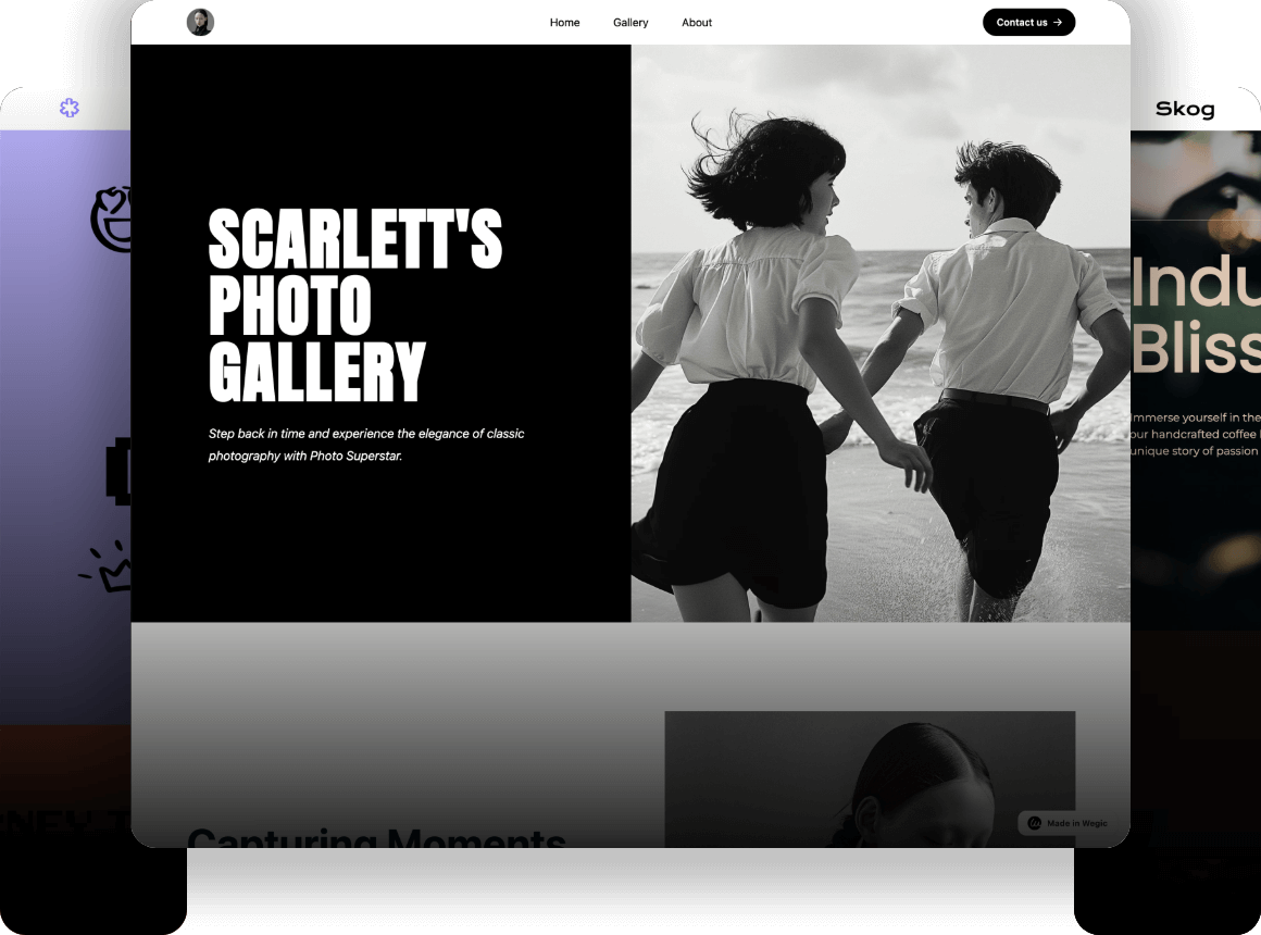
Engaging websites can leave a lasting impression on potential visitors. Having a fitness website with an engaging design is a unique challenge. The fitness industry is highly competitive, and first-time visitors to fitness websites are often looking for ways to get results quickly, which puts the role of website design to the test. So if you want to motivate people to work out and become gym members, you first need visually appealing user interfaces and other well-designed pages.
Below, we will present 16 examples of engaging fitness website design in 2024 to inspire your design.
Click here to Build your site
16 Fitness Websites Examples in 2024
1.BearWolf
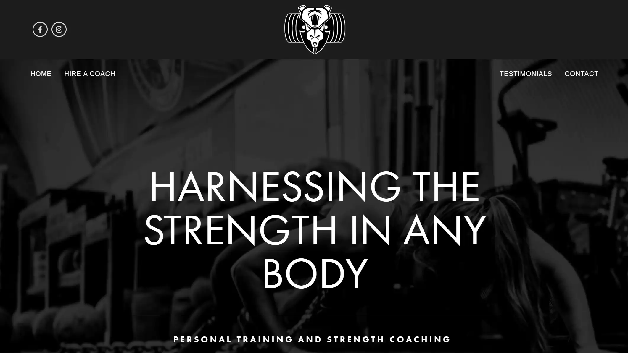
ALT: Black and white style home page of strength fitness website with a title.
The main page uses an image as a background to show a strength training scene, a visual impact that immediately grabs the visitor's attention. A large white header text is used, and the contrast between black and white makes the content stand out giving it a professional and modern feel.
The content of the main page, images and text font sizes and styles are well-designed to convey information effectively and guide the user's reading order. The boards also feature visible CTA buttons. Simple Facebook and Instagram buttons to add social media links to the website can enhance user interaction with the brand and increase brand exposure.
2.Gymbox
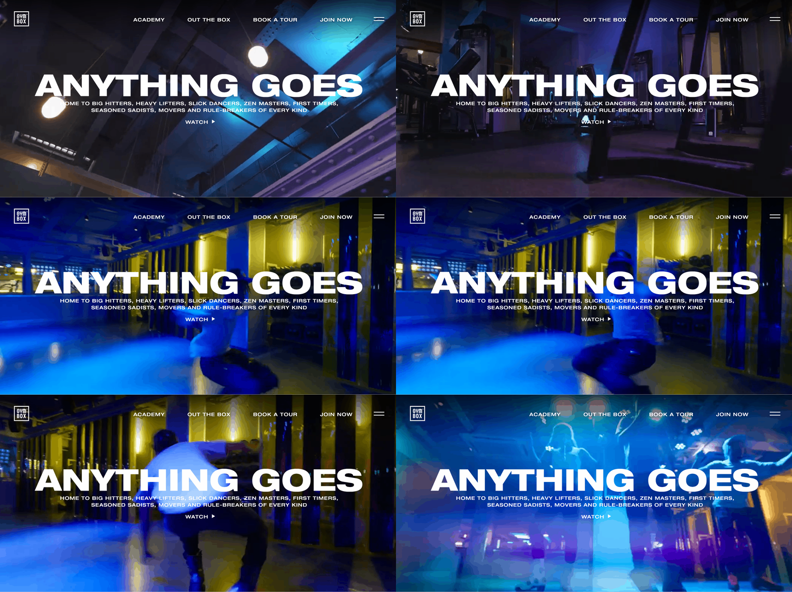
This fitness site is a chain of gyms in London. The website uses bold colors and large images, especially in the banner and course presentation sections of the homepage. This visual impact captures the user's attention quickly.
The design incorporates movement elements and dynamic effects to convey a sense of energy and dynamism that can motivate users to engage. Their fitness website looks powerful and inspiring.
3.Girls Gone Strong
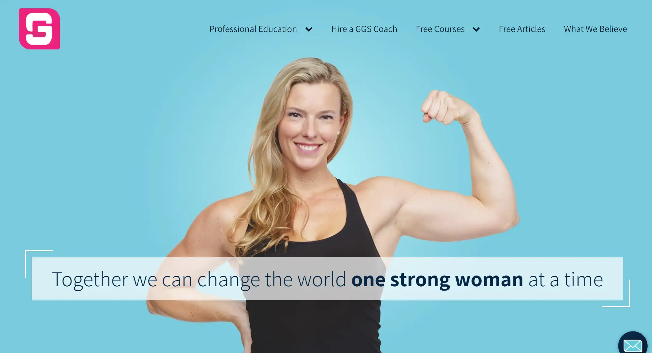
ALT: A confident female fitness instructor shows health and strength.
Girls Gone Strong is a fitness website dedicated to women's health, strength and empowerment. The website uses a bright blue background to give it a fresh, energetic feel. Such a color choice usually conveys positivity and attracts the attention of female users.
The layout of the website is simple and clear, with a clear hierarchy of information so that users can easily find what they need. This design reduces the cognitive burden on the user and makes the browsing experience smoother. The website is also filled with CTA buttons to encourage user participation.
4.YFitnessLab
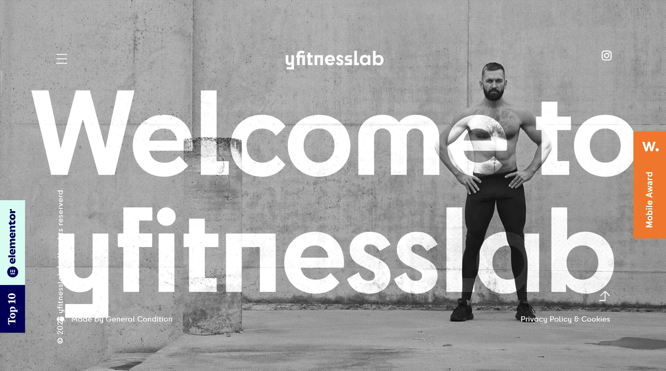
ALT: The front page shows a fitness man interacting with fitness equipment.
The site utilizes a parallax effect that creates a visually compelling experience as the page scrolls. Image changes or text fades add interactivity and interest. Deyan, a physical therapist and Speedfitness EMS instructor builds user trust by demonstrating specialized fitness knowledge and services, such as exercise therapy and physical therapy.
5.Barry's
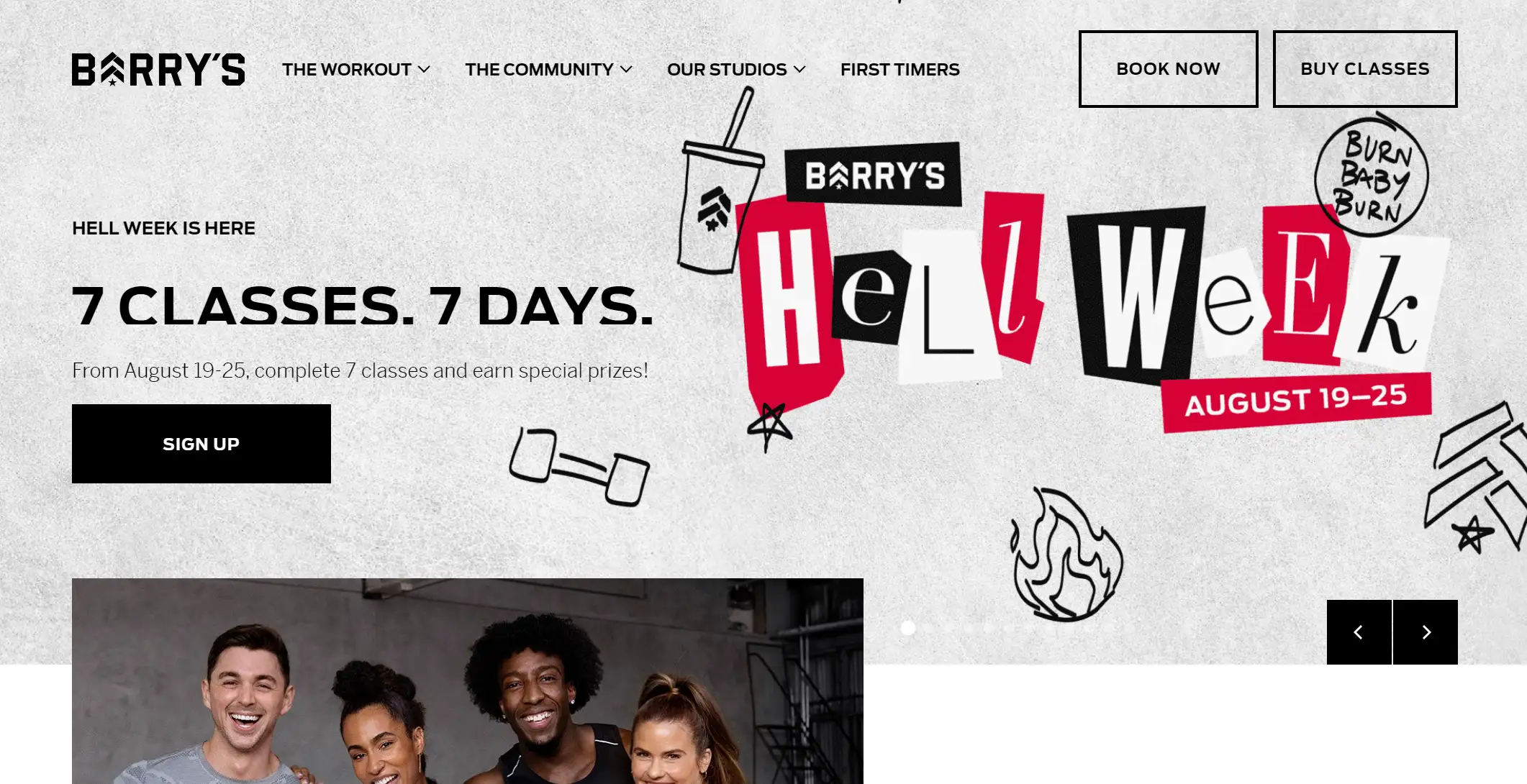
ALT: Barry's website home page fitness campaign promotion.
The fitness site uses stark color contrasts, such as black, red and white, to create a strong visual effect that grabs the user's attention. The typography is bold and easy to read, making the site simple to navigate.
Also, this website is mobile-friendly. Barry also has an APP and has arranged for some contact forms to be filled out at the bottom of the page to encourage users to take action. The integration of social media enhances user engagement and a sense of community.
6.Blue Blairy Fitness
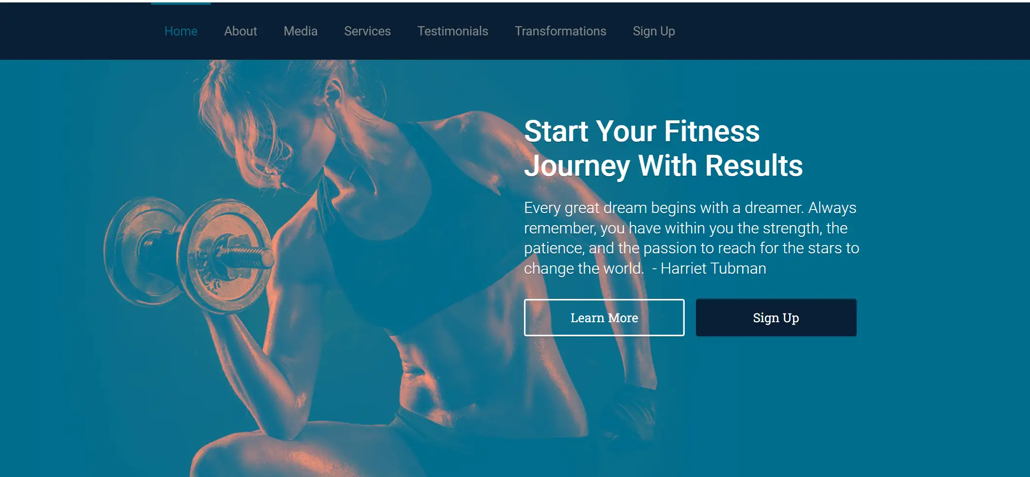
ALT: Woman lifting weights, inspiring fitness journey, call-to-action buttons.
The website design uses vibrant colors, such as dark blues and bright hues, that catch the user's attention and convey energy and movement.
The web page tries to soften the intensity of the metal plates and loads of barbells using a transparent image design to create a welcoming atmosphere.
7.Yoga and Juliet
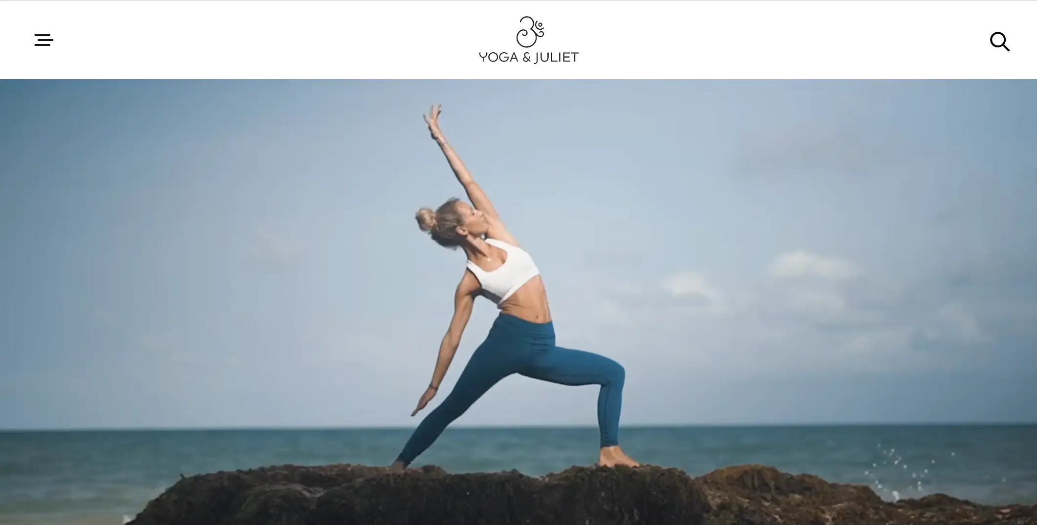
ALT: Juliet practicing yoga on rocks by the sea.
The site begins with a full-width video that immerses the user in the site experience.
The site uses muted tones such as beige, light grey, and natural colours, which convey an atmosphere of serenity and relaxation that is in line with the core philosophy of yoga.
The site's minimalist layout avoids overstuffing the site with information, and the text has a modern, minimalist font, with enticing copy that helps us learn about Juliet, her mission, and where we can sign up to learn more.
8.Kinective Fitness
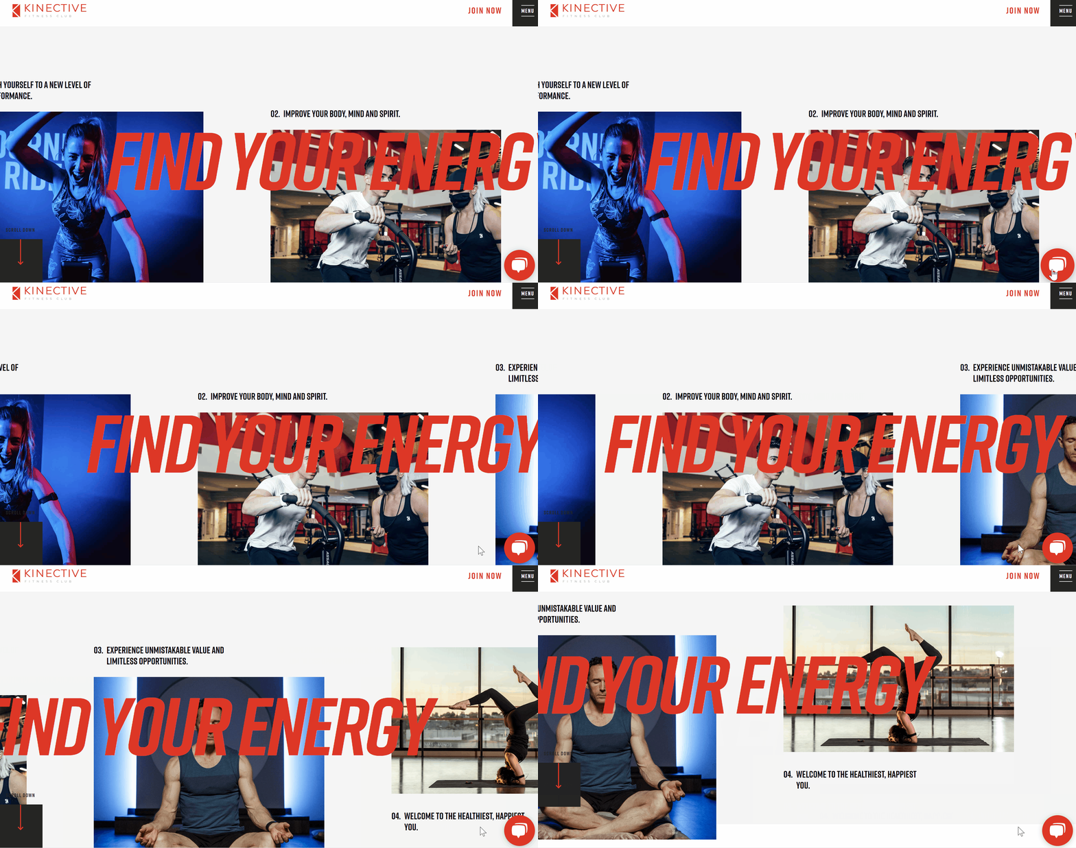
The Kinective Fitness horizontal scrolling effect unfolds to discover the energy of the gym's workouts, and the main content page of the site presents contact information and club hours, giving users quick access to key information.
The image text utilizes a container design scheme, which is a high-definition arrangement of club member athletes staggered with the text, with the CTA button highlighted in red, urging the user to click to read more.
9.innerFlow
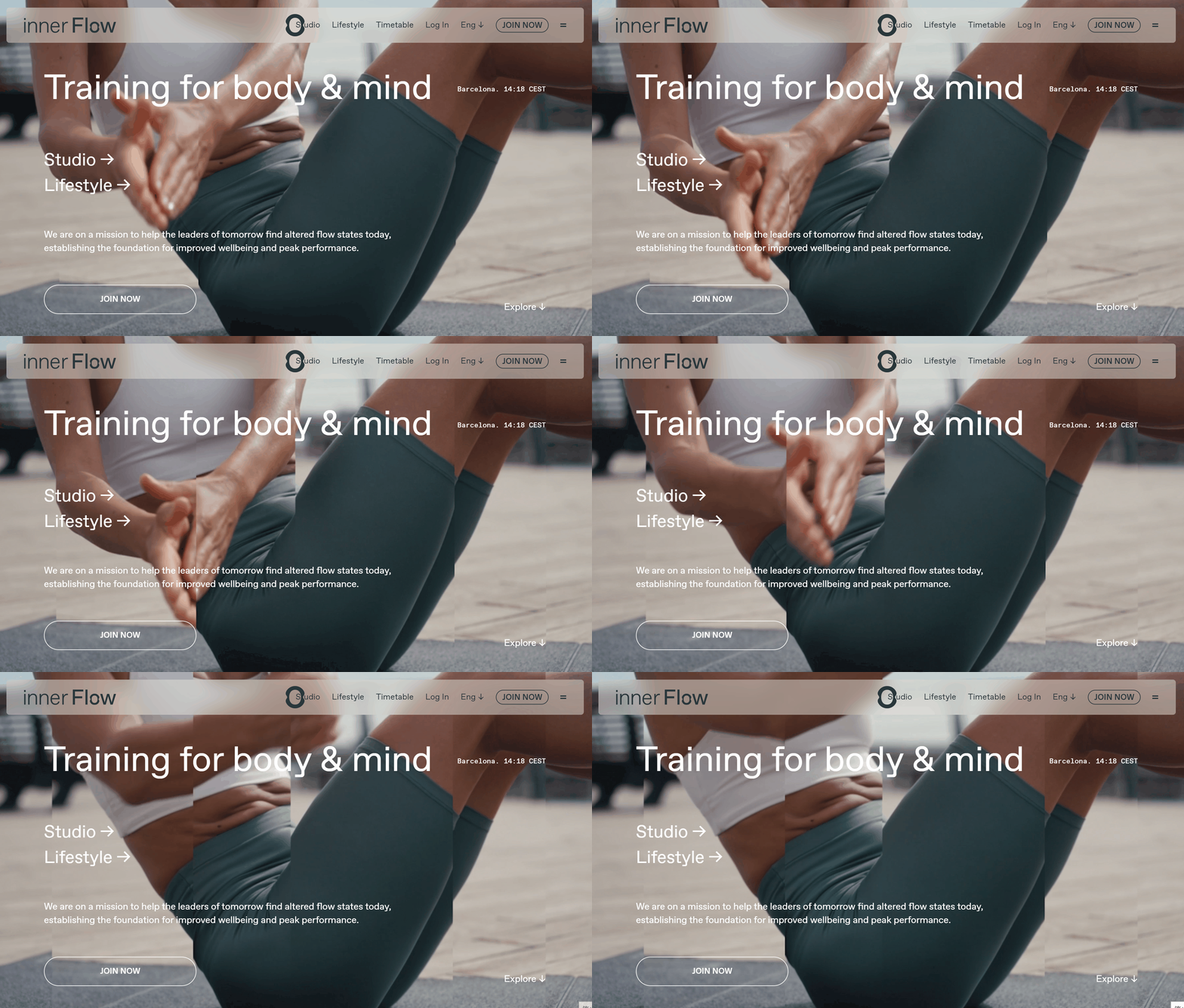
The goal of innerflow is to help leaders achieve an optimal state of mind flow through strength and functional training between work and life. The entire site embodies a sense of simplicity and flow, from the video banner on the homepage to the micro-interactions designed to create interaction between the user and the site, conveying a soothing feeling throughout the site.
No matter how you scroll down the page, there is a sticky menu bar at the top of the screen with a clear navigation bar so that users can always find the information they want to find.
10.Real Steel Fitness
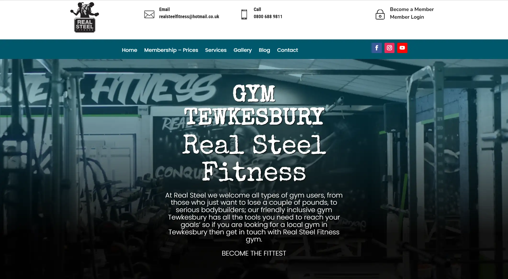
ALT: Gym interior with equipment, promoting fitness and community.
The main colors of the fitness website are a combination of black and dark blue with a nice palette that reflects the gritty and wild nature of the fitness equipment. There is an eye-catching banner image at the top of the page showcasing fitness activities or facilities to grab the user's attention.
The content area is organized in a grid layout into modules, each of which displays different information, such as course descriptions, trainer profiles, client testimonials, and so on.
11.Move Well Eat Well
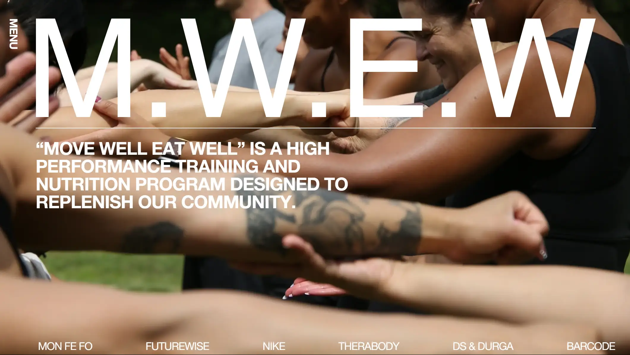
This is a one-page website for a high-performance training and nutrition program in LA. The first picture also demonstrates that their program is a teamwork workout for everyone.
The only function of the page is "SCHEDULE", "ABOUT", "CONTACT" three sections, but it already meets the needs of basic website design, with sans-serif text, headings, allowing first-time visitors to quickly understand the theme and goals of the site.
12.Bionic
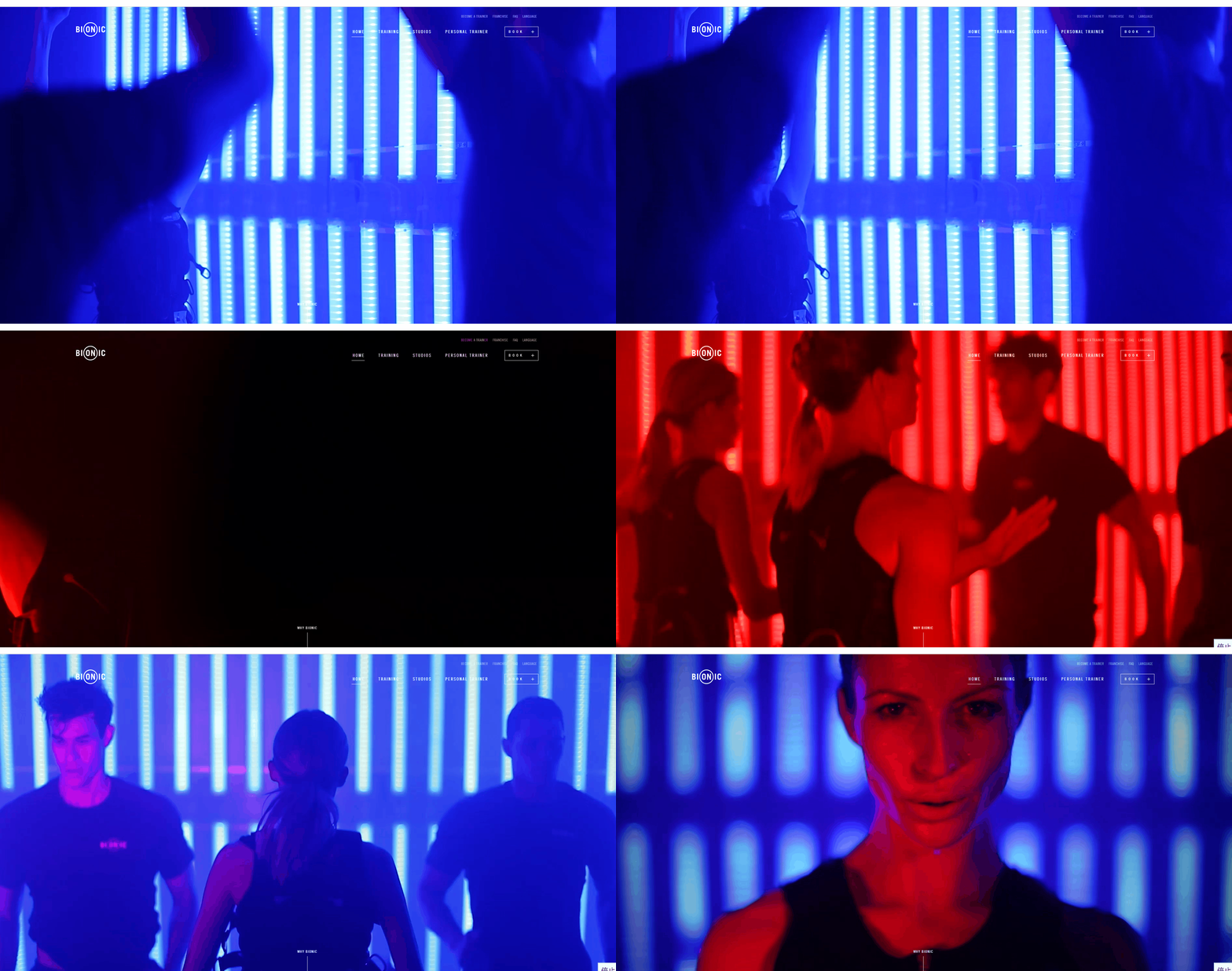
Reflecting the red and blue flashing sports scene, through the full-screen scrolling design, scrolling the page content smoothly, explaining why the choice of Iconic training, which not only gives the user a smooth visual experience but also quickly grabs the attention of the user to experience the bionic service.
The most jaw-dropping design of the site is that Bionic puts a 3D model of the human body on the page, allowing users to interact with the mouse to get an overview of the human muscles, a design that stands out among fitness websites. It has been proven that a good website design will show the professionalism and strength of a fitness brand.
13.KXU
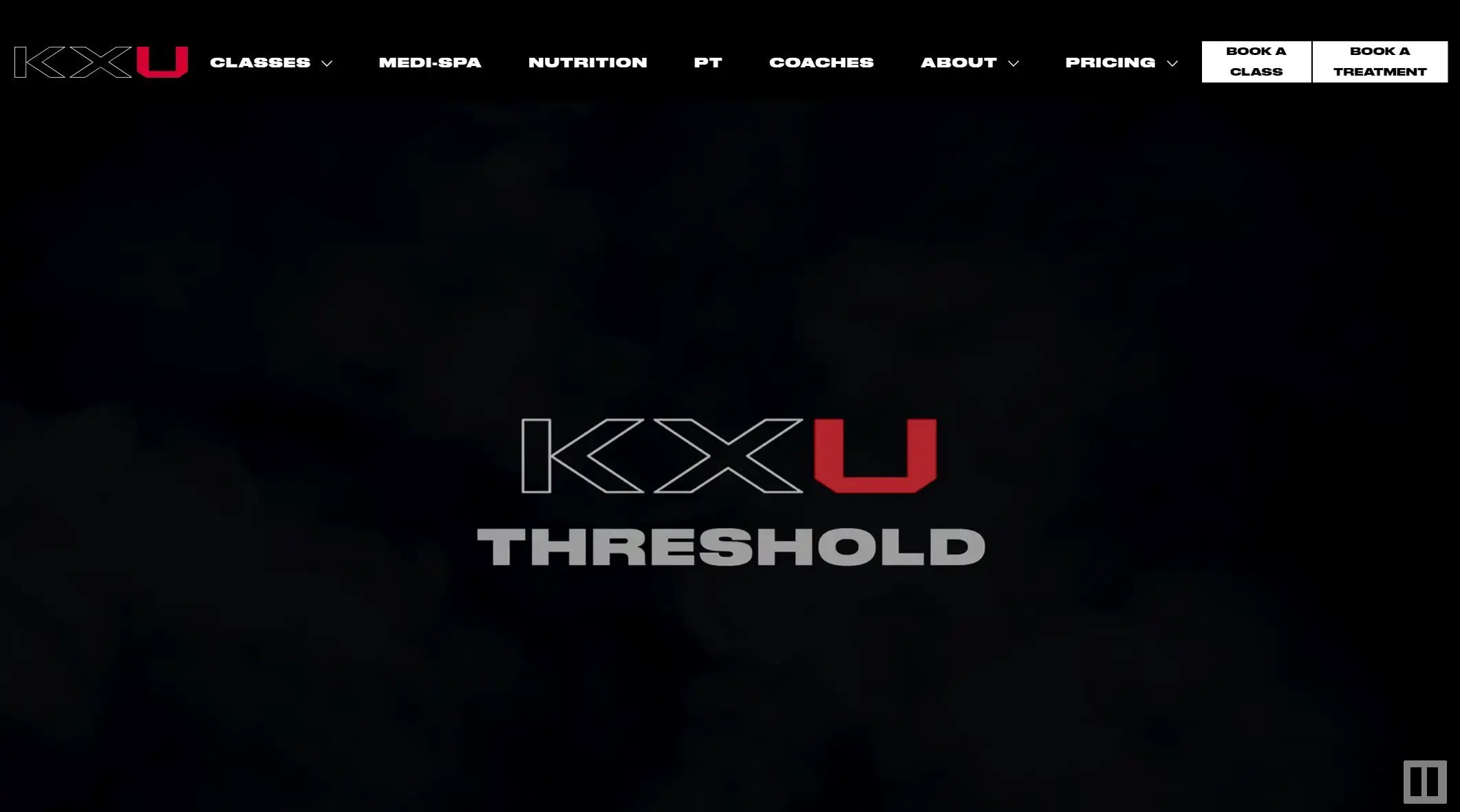
ALT: KXU website with its logo and menu.
KXU uses a concise navigation bar design to allow users to quickly find the information they need. This includes fitness classes, nutrition, trainers, pricing plans and more. With a black headline and white background, the text is all short and punchy.
The website also lists specific gym locations and training schedules in detail, and each coach is photographed in a consistent style to fully appreciate the professionalism of the athletic aspect of the service, increasing the trust of potential customers.
14.Fit & You
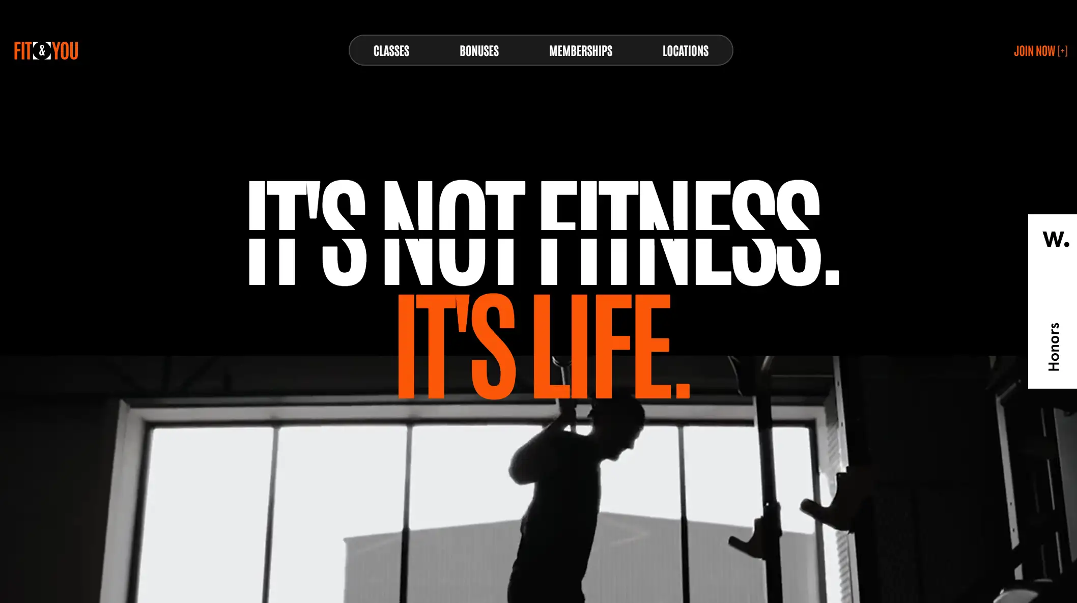
FIT&YOU is a premier fitness club. The website's black and orange color palette and modern typography are appropriately and strikingly designed. In terms of design style, the website features the latest 2024 trend of minimalist design, with an easily accessible and simple main navigation to ensure seamless exploration for users.
Varying fonts and images give the whole site dynamics. The varied fonts and images give the whole site momentum. The broken grid layout allows the user to quickly navigate through all the sections to get to the effective information.
15.Virginie Oltra

Virginie Oltra is a sports coach in France. Virginie Oltra's fitness website has a gradient color palette with reddish brown being the main color of the site, giving it a warm and positive feel. She works as an independent trainer to provide total quality service to clients.
The video running in the background shows the image looking dynamic, and the red contact CTA button increases the click rate of the users.
16.GO180

The coaches at GO180 are from elite clubs in Groningen and Leeuwarden and can assist you in making transformative decisions. They offer individualized lifestyle, fitness, and food recommendations.
Large, high-definition images serve as the backdrop for each panel. These images showcase GO180's various content categories, including designated programs for each fitness workout user, trainer profiles, club interiors and user stories. Most importantly, the site also strongly emphasizes testimonials. They display user ratings and testimonial feedback from Google users on their page, all of which motivate potential customers to exercise.
Top Things to Create an Engaging Fitness Website
Give UX a top priority
Users browsing the web are eager to find ways to get fit and don't want to get lost on your website. Fitness websites that are designed with care are sure to inspire people to take action. So in designing a website, UX is a crucial aspect that both the website owner and the designer have to put at the top of their priority list.
Capture the atmosphere of fitness
Your web design must fit the ambiance of the fitness environment. By choosing the right color version and grid layout, the classroom atmosphere of fitness will be displayed using videos without fail.
Try out some inventive pictures
We can use high-quality photographs to demonstrate the workout and encourage visitors to participate. If a single image is not enough, you can add animations, adjust transparency and act as a background, among other things, to keep the user engaged in the site.
Adopt effective call-to-action strategies
One rule that has been summarized in 16 fitness websites is that strong CTAs get users to act, whether it's clicking to sign up as your user or starting a workout at your gym, and CTAs play a huge role in that.
Conclusion and Next Steps
So, on a fitness website, the design is not just about showing off muscular but also subtly calling users to go out to real-world health clubs to start making changes in the mind and body. The power of a digital website should not be underestimated.
We finished reading about 16 fitness websites with engaging designs in this article. The journey doesn't end here; it's just the beginning, and you need to choose a proper website-building tool to unleash your energy.
Click here to Build your site
Fitness Website Examples FAQ
How do I start my fitness website?
You want to build a website according to your different needs in main three kinds of ways: the first, the custom software development, this method not only requires technical knowledge, and need to spend a long time; the second to find a professional web designer, this method can meet your professional needs, but the budget cost is very high. Third, a website builder; if you do not have the technical knowledge and are a solo business owner, we recommend that you choose a website builder, such as Wegic, that can use AI to build a wonderful in 90 seconds.
What should a fitness website have?
We believe that the location and contact information are a must-have section, and the site needs to be mobile-friendly and intuitive for user experience, with a strong CTA, which we talked about in the article. There's also the fitness schedule and pricing that users need to know about.
How do I monetize my fitness website?
You can sell: workout plans, meal plans, or fitness guides on the platform, and these digital products can be sold to monetize through the fitness niche. Other options include offering online coaching or training services with professional trainers, as well as your ability to host fitness events, competition events, and more.
Written by
Kimmy
Published on
Mar 12, 2026
Share article
Read more
Our latest blog
Webpages in a minute, powered by Wegic!
With Wegic, transform your needs into stunning, functional websites with advanced AI
Free trial with Wegic, build your site in a click!
What kind of website do you want to build?