Log in
Build Your Site
20+ Cool Landing Pages That Will Inspire Your Next Design
Uncover 20+ cool landing page examples that convert. Dive into their design secrets and learn how to build better landing experiences.

As digital advertising costs continue to rise in 2025, businesses are increasingly turning to high-converting landing pages to maximize their return on investment. A well-designed landing page can be the difference between a costly click and a profitable conversion, making it essential for companies to optimize every element of their user experience.
In this article, you will find out about cool landing pages and how to design them. We'll showcase the best landing page examples from 2025, analyze what makes them successful, and provide strategies you can implement immediately.
What is a Landing Page?
Landing pages are designed for individuals who arrive at a page after clicking an ad, following a link, or conducting a search. Most landing pages are different from regular web pages because they do not have a navigation menu. The purpose of a landing page is to guide visitors to take a specific action. Users are encouraged to either buy, register, or type in information using a form on the page.
The following are what you will find in most cool landing pages:
-
Title: made to be short, interesting, and easy to understand what they are promoting.
-
CTA button: The call-to-action button is usually placed in a visible spot, for example, as “Buy Now” or “Free Trial.”
-
Form: Landing pages use such forms to get user information, such as email, phone, address, and so on, to be used in later actions.
-
Image or video: Use images or videos to capture the users’ interest and help them understand the product or service better.
-
Testimonials or recommendations: Trusting and persuasive elements on landing pages are usually customer testimonials, case studies, or certificates.
These cool website landing pages are made for specific groups or purposes. For example:
-
E-commerce promotions, such as special offers and promotions with a time limit.
-
Course registration: As another example, course registration is seen on online education pages.
-
Event recruitment: For example, event recruitment pages are usually created for online seminars and conferences.
Why Landing Page Design Matters?
Effective landing pages help match a brand's message with what people are searching for. For content creators, a landing page is the first opportunity to let people know why their product or service is useful. A clear layout and smart design help direct the user’s attention, making it easier for them to find and get important information. This makes the content easier for people to understand and encourages them to stay. A well-organized page with a simple user journey makes it easier for people to get the most important information about what the creator offers.
Click on the image to design a perfect landing page! ⬇️
https://wegic.ai/

Image by Istock
Things like clear headings, simple layouts, fast loading, and mobile-friendly pages all help search engines rank the site better. If users spend more time on the page, click lots of things, and aren't leaving right away, search engines notice that the page is good. This can help people see the site more often in search results and bring more visitors without paid ads.
20+ Cool Landing Pages of 2025
A well-designed landing page can help visitors determine if they're interested in learning more about your company and whether they'll take action on your site. In 2025, brands across all industries will focus on creating landing pages that are simple, easy to use, and clear, enabling more people to quickly discover their services and take action. They will use bigger, bolder text, simplify things to make them easier to understand, and use clearer writing to help people become interested in their site.
Below, we will give you over 20 landing page examples from different industries so you can get ideas for your own website.
Educational Landing Pages
-
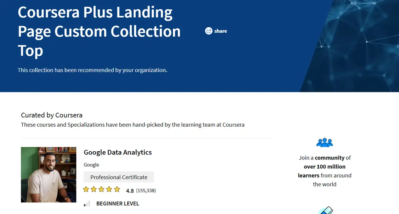
Coursera
Coursera's landing page design is simple and visually appealing, showcasing what you can learn and how the courses benefit real-life applications.The page helps people quickly find out about the professional courses and certificates Coursera offers. The design is focused on helping people, so it encourages them to sign up and explore free courses, ultimately increasing the number of sign-ups.
-
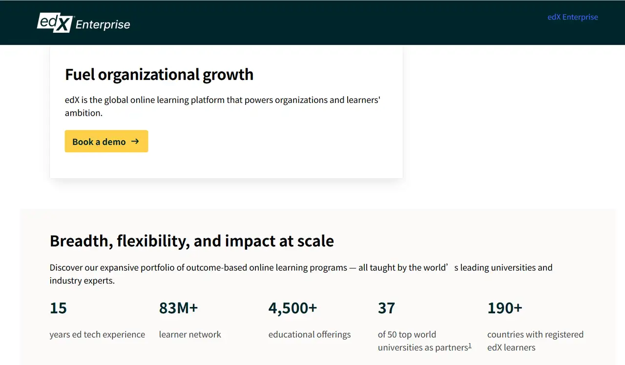
edX
edX's cool landing page shows you lots of certified courses from big universities. The design is clean and clear, and it shows you what the courses and certificates will really do for you. It shows what you’ll get from the courses and how useful the certificates are. This appeals to working professionals and students. The sign-up form is simple, so it's quick and easy for people to start learning.
-
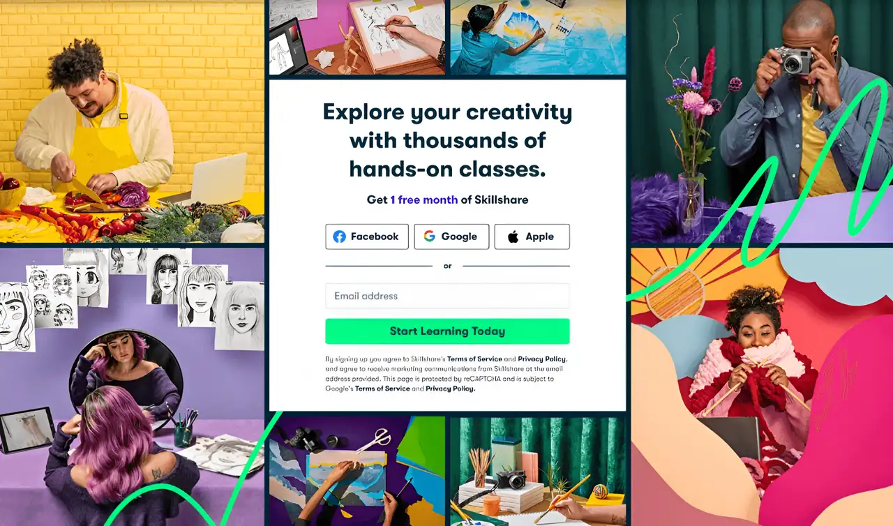
Skillshare
Skillshare's landing page focuses on community learning, showcasing a variety of classes and opportunities for interaction with others. The registration process is easy to use and quick, so people want to give the site a try. The design looks good, and the colors are bright, so it grabs the attention of younger people.
-
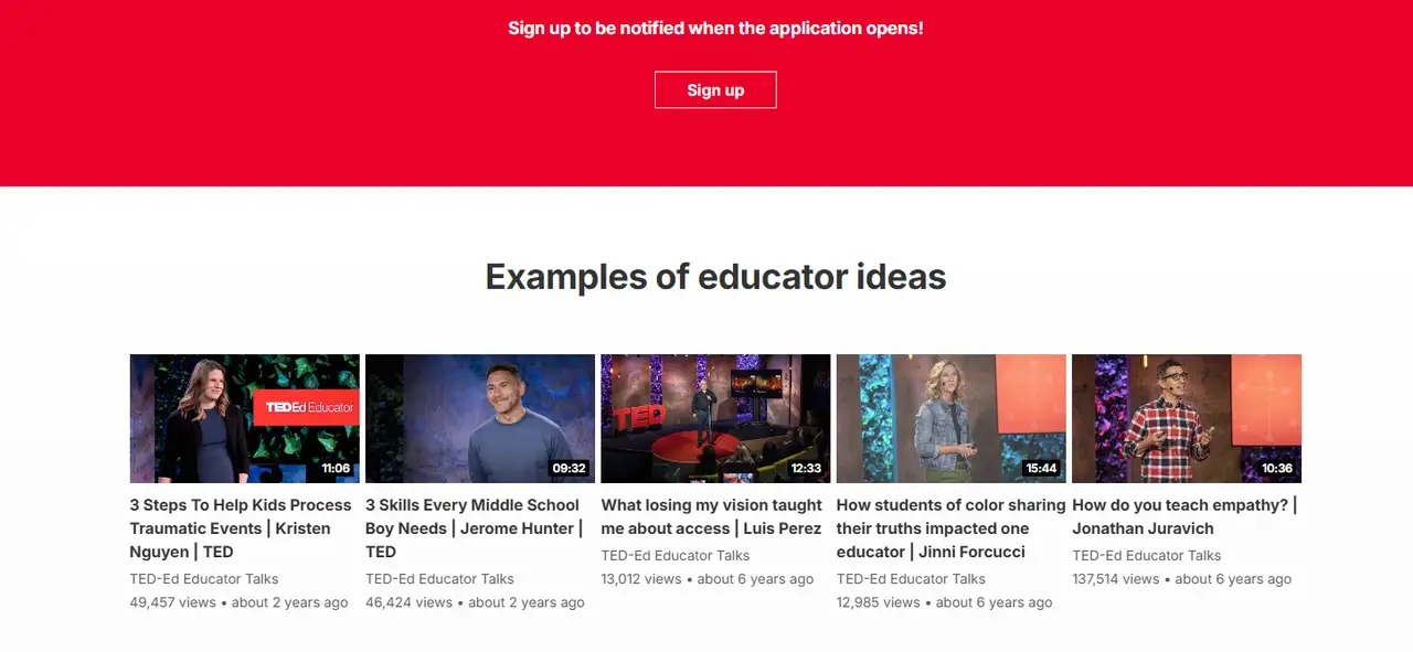
TED-Ed
TED-Ed’s landing page examples are easy to use and look nice, showing a few interesting videos for people to pick from right away. The overall color scheme is soft, the layout is simple, and it's easy for people to see what the site is about at first glance. The action button design is simple, so users can quickly watch a video or join a discussion, which helps them learn better and want to keep coming back.
-
MasterClass
Landing page examples in MasterClass show off well-known teachers, and the page looks nice and easy to use. Show instructor videos and course previews so users can get a better idea of what to expect and want to try more classes. By showing what makes these classes special and interesting, it gets more people who can afford it to sign up.
-
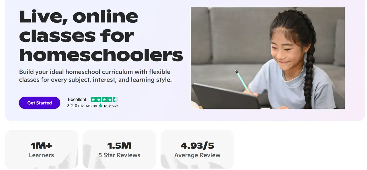
Outschool
Outschool’s "Homeschool" landing page is made for families who teach their kids at home. It has over 100,000 online classes. These classes cover important school subjects and fun topics. The page shows how easy it is to pick class times that work for you.
-
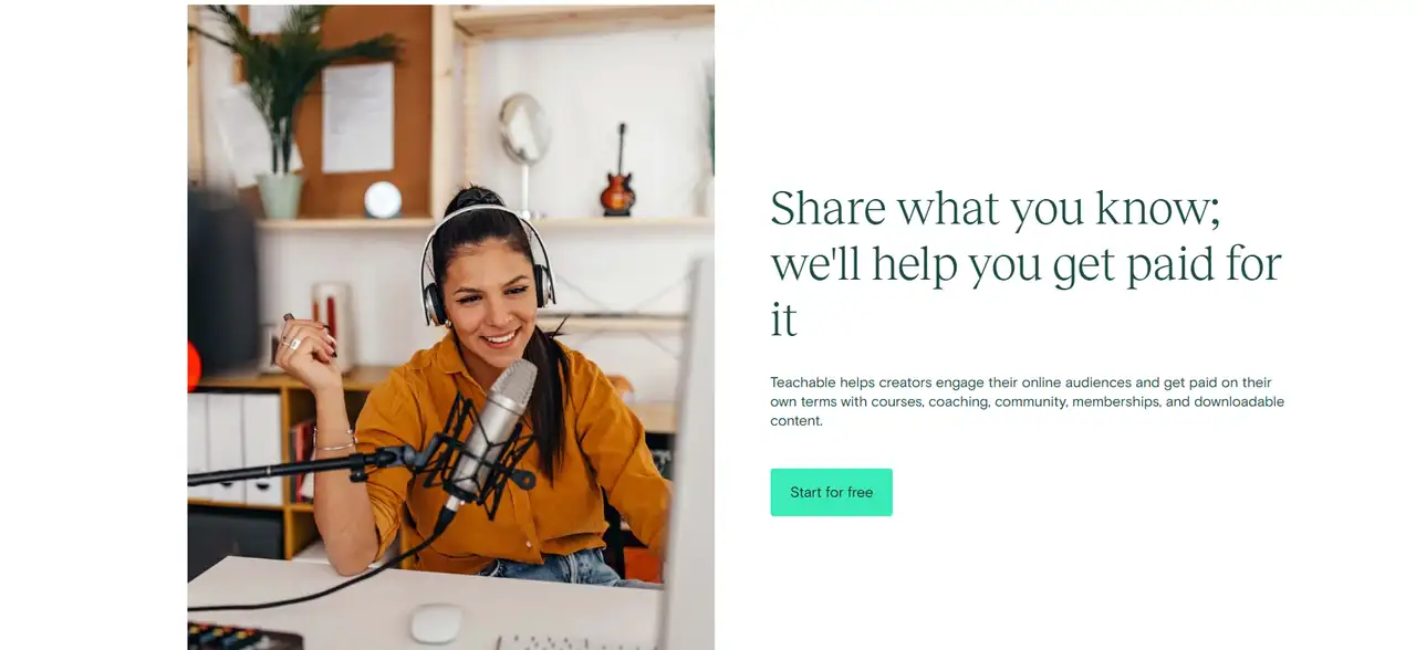
Teachable
The “Teach Online” landing page of Teachable is for creators who want to make money with what they know. It allows them to sell their knowledge and expertise. It is designed to make it clear that no technical skills are required to use the platform. Users can spot several ways to pay, and the pages are easy to use because users manage their own accounts.
Check landing page design to create cool landing pages.
Entertainment Landing Pages
-
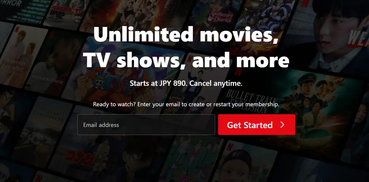
Netflix
The landing page design for Netflix Premium is easy to use and leads people to sign up right away. The page starts with eye-catching discount details at the top. A bright red CTA button is used on the page to draw attention and motivate users to click. The process is very quick, as users only need to send their email to start registering. It also shows some popular movies and shows as background images. As a result, the page is more attractive to look at.
-
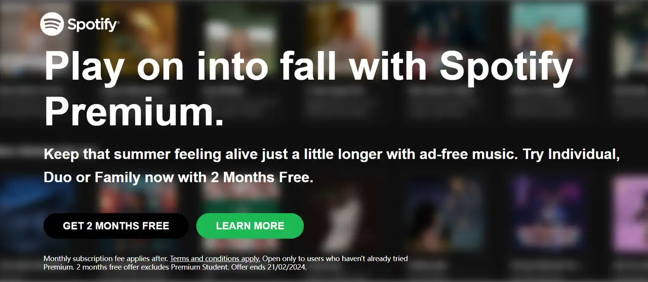
Spotify Premium
The background of the Spotify Premium landing page is made up of movie and TV show pictures. Discount offers are easy to see in the design of the page. There are two bright "click here" buttons on the page to help users click on them. The page is designed to showcase the main benefits of Premium. The benefits listed are no ads, the ability to play music offline, and better sound quality. It also shows users the list of payment plans available. By doing this, people are able to pick the payment plan that matches their requirements.
-
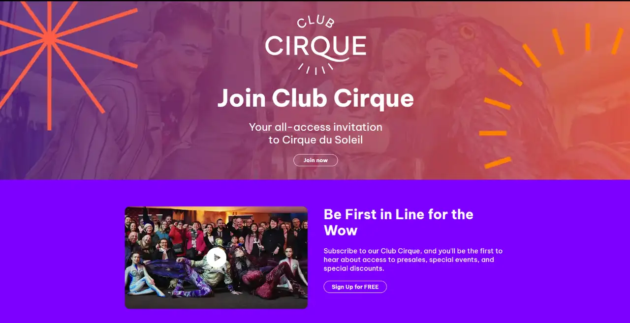
Cirque du Soleil
The landing page of Cirque du Soleil is designed to be very artistic. You’ll notice lots of moving effects, colors, and images on the site. At the top, you find the words “Join Club Cirque and get special deals” with a button that draws attention and makes you want to click. The page is not difficult to use. You can easily see all the upcoming events and find out how to purchase them on the page. On top of that, the page offers special content just for members to keep people engaged.
-
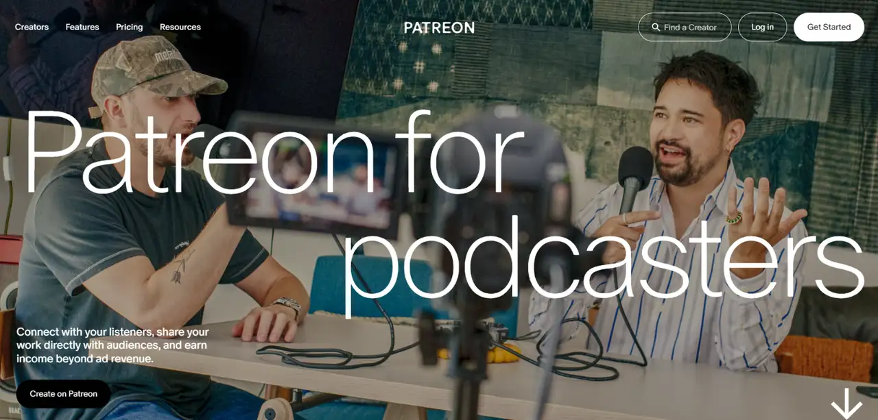
Patreon for Podcasters
Patreon for Podcasters uses its landing page to help podcast creators learn how they can earn money. There is a big CTA button on the landing page to encourage users to act. It is easy to use and highlights the main benefits of the platform, such as handling members and studying revenue.
To earn more money online, click the article: ⬇️
-
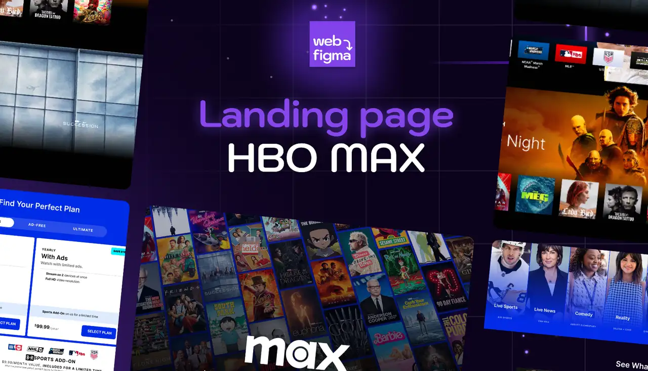
HBO Max
HBO Max’s landing page is designed to make it easy and simple for users. It also uses eye-catching images to make it easy for users to find what they are looking for. The featured show or movie is displayed with a large and easy-to-see picture at the top of the page. The page shows users some of the original programs and different types of programs available on the platform.
Food Landing Pages
-
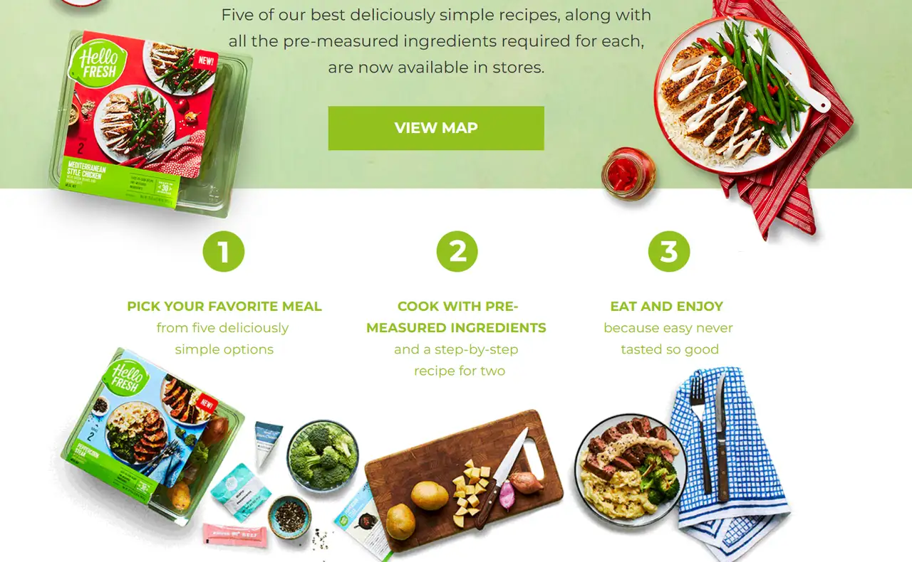
HelloFresh
The HelloFresh landing page is designed to help users sign up quickly and with ease. It features a green CTA button that stands out, encouraging users to click. Users are able to search for meal plans that suit their tastes and needs on the landing page. The page also features well-described recipes and eye-catching images to enhance users’ interest in making a purchase. Moreover, there is a process shown for ordering meal plans, which helps users solve any concerns and increases conversions.
-
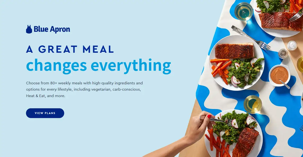
Blue Apron
Blue Apron's landing page design conveys brand value through exquisite dishes. The landing page utilizes colors and food images to create a cozy atmosphere. The page includes the slogan "One meal can change you a lot" to draw in people looking for healthy and good food. The signup form is easy to use and quick to complete. The page lists different benefits of using catering cooking services to make the brand appear more trustworthy.
-
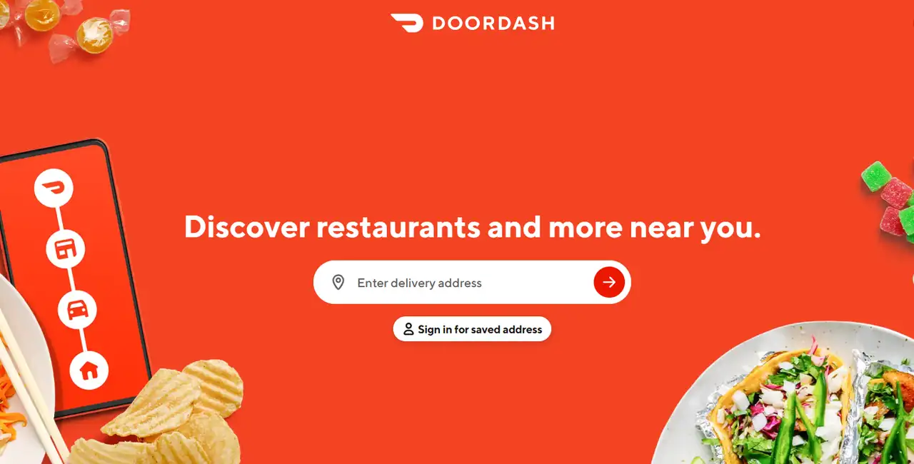
DoorDash
DoorDash's website landing page highlights how easy it is to get fast and convenient delivery of food. The icons and colors on the page are used to clearly advertise the main benefit of ordering quickly. It explains how to use the service for various deliveries, such as fast items, blooms, and meals. It is helpful for users with different needs because of this. This page uses the user’s location to find the closest delivery options with ease. As a result, the page feels customized and is more helpful to the user.
-
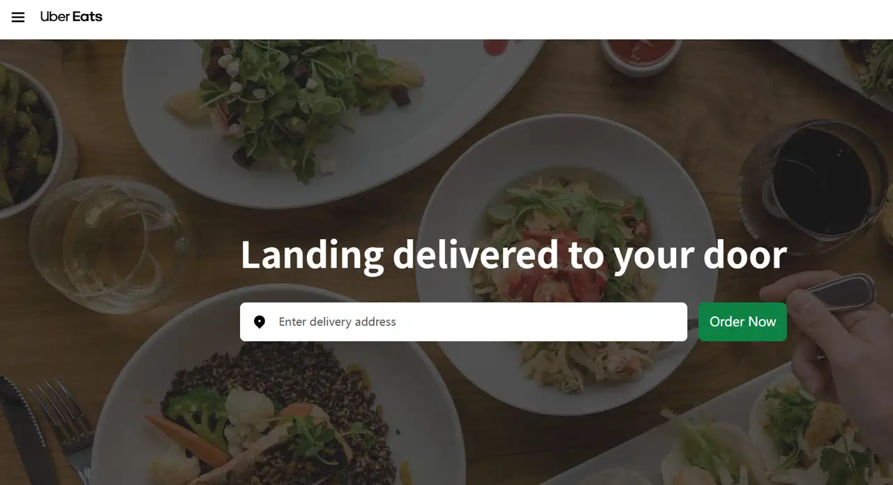
Uber Eats
Uber Eats’ landing page is designed in a modern and stylish way. The design uses pictures of food and a few words to explain the benefits of the service. The CTA button is easy to see, attracting users to want to order immediately. It is easy to use Just Eat on mobile, so the site looks good on all devices. The design is both stylish and easy to use.
-
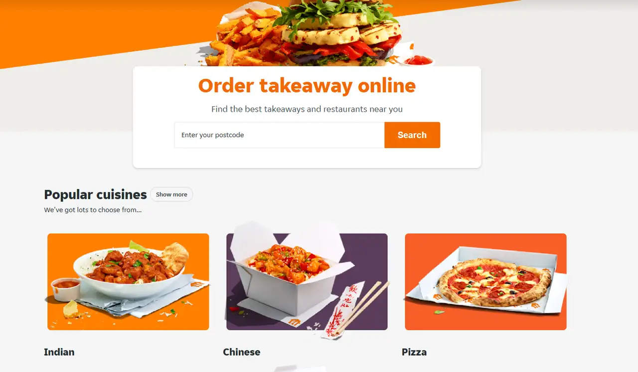
Just Eat
Due to the bright colors and food photos, Just Eat’s landing page gives off a friendly vibe. The website highlights the main idea of Postmates: The website promises that your food will come fast and be delicious, enticing users. Just Eat makes it easy for users to search for restaurants near their home by entering the address. There are many different food types and top-rated restaurants featured to encourage users to use the site.
-
Postmates
The landing page of Postmates puts emphasis on "delivery any time, anywhere," highlighting that the company is quick and takes care of its customers. The page includes an easy-to-use search box for entering addresses to get started quickly. Special dishes and many types of restaurants are displayed to make users trust and like the brand more.
To attract more diners, click the article: ⬇️
Real Estate Landing Pages
-
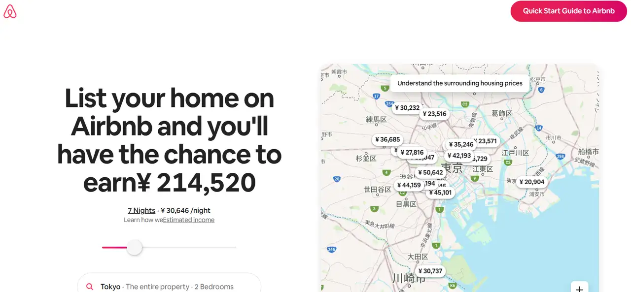
Airbnb
Airbnb has created its host recruitment page to draw in those who want to become hosts. It highlights the way to "rent out your home and make extra money". The page guides users step by step through the process of renting their home. It introduces the role of the housing consultant. This increases the visit’s trust in the service. You can use the income tool to find out how much you can earn. They choose the type of place and rooms they wish to rent. It also shows them the potential monthly income they could make.
-
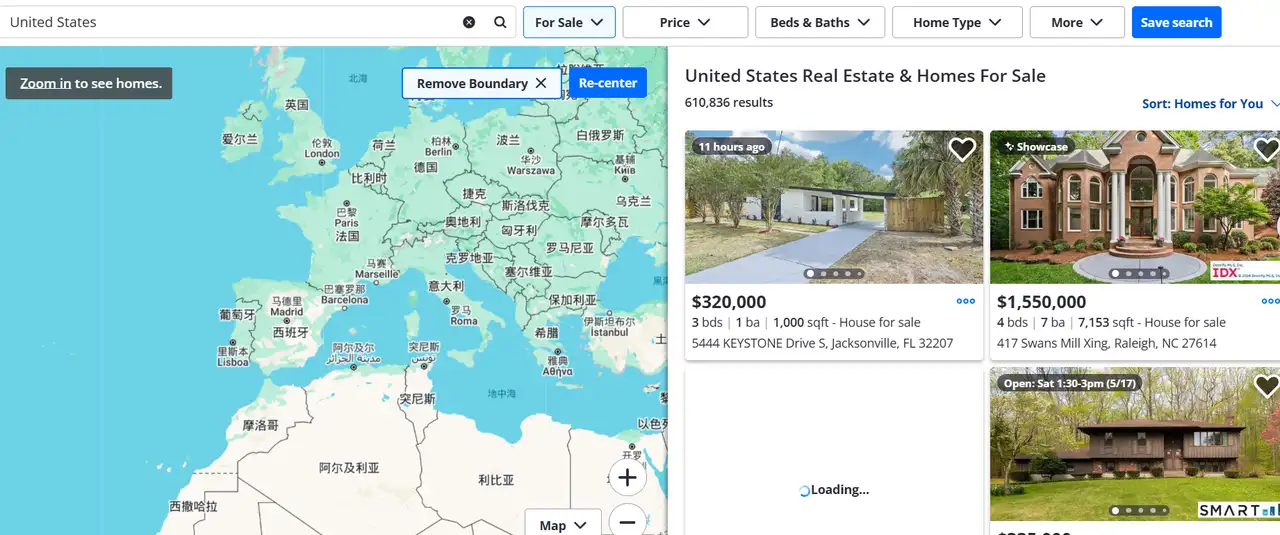
Zillow
The cool website landing page of Zillow have a search box in the middle. Typing in the area, price, and type of home allows users to make a quick search. It displays the newest listings and the most popular ones. The listings on Zillow display pictures, the price history, and details about the house's location. Visitors can easily find their way through the menu at the top. You can select buying, selling, renting, or getting a loan from the menu. It informs users about the housing market.
-
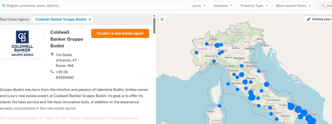
Coldwell Banker
The cool landing pages of Coldwell Banker show the brand’s background, the team of brokers, and some outstanding property listings. The website gives users a tool that allows them to quickly contact the right agent. Coldwell Banker's landing page has a detailed description of buying and selling to increase users' trust in the company.
Tips for Designing Cool Landing Pages
If your goal is to have a cool website landing page with a good style, these design points deserve attention.
-
Make sure the goal of your landing page is very clear. For example, "download white paper", "book a house viewing" or "buy a course". Don’t give people too many options on your page. Any unnecessary content will take the focus away from your main goal and reduce the number of conversions.
-
Using real images and video on your page will make the design more attractive for users. This will help your page to catch the audience’s attention. It is important that the page is easy to use on phones. The page should load fast. The content should be short and clear for the visitors. The layout should not be messy, and important information should not be written in small print.
-
You can build more trust with customers by including customer reviews, logos of brands you are involved with, examples of past work, and news articles. At the end of the page, add your contact information and a privacy policy to look professional.
-
A good headline, a short description, and a clear button for actions will help the most. As an example, "Book a personal fitness coach in just 3 minutes" is far better than "Welcome to our website." Try to shorten forms. Auto-fill and preset options will help make your forms less complicated to complete.
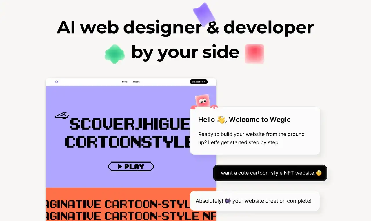
If designing is not your thing, you can use Wegic, an AI tool that acts as your personal design and development assistant. This landing page builder helps you create a useful landing page just by talking to it. No code is required. You can express yourself freely by interacting with its AI helper. You can add forms or pictures by dragging and dropping them. No matter what you do, Wegic can help you easily create your landing page. All design and development occur in one location.
Conclusion
A landing page is the first step where a brand interacts with its users. It’s also the main step to get new customers and increase sales. A cool website landing page is the best way to go. As a result, users stay interested and keep browsing the page. If you’re selling online, running a school, or offering services, a clear explanation of what you do on your landing page often helps visitors make a choice.
Making a great landing page is hard work. It should cater to the user's reading habits and also be visually appealing. Good landing pages need to be quick, accessible from mobiles, and interactive, with data tracking. Creating a landing page with a landing page builder like Wegic will save you from constantly dealing with design and development issues. You can use this landing page builder to create professional and effective landing pages by simply interacting with it and dragging elements around. If you want your own personalized landing page, go to Wegic and register for an account to start your website building!
Written by
Kimmy
Published on
Mar 17, 2026
Share article
Read more
Our latest blog
Webpages in a minute, powered by Wegic!
With Wegic, transform your needs into stunning, functional websites with advanced AI
Free trial with Wegic, build your site in a click!
What kind of website do you want to build?