Log in
Build Your Site
Top Consulting Website Designs to Fuel Your Inspiration
A consulting website is undoubtedly a crucial instrument for your business career. Dive into these top examples to inspire you design.
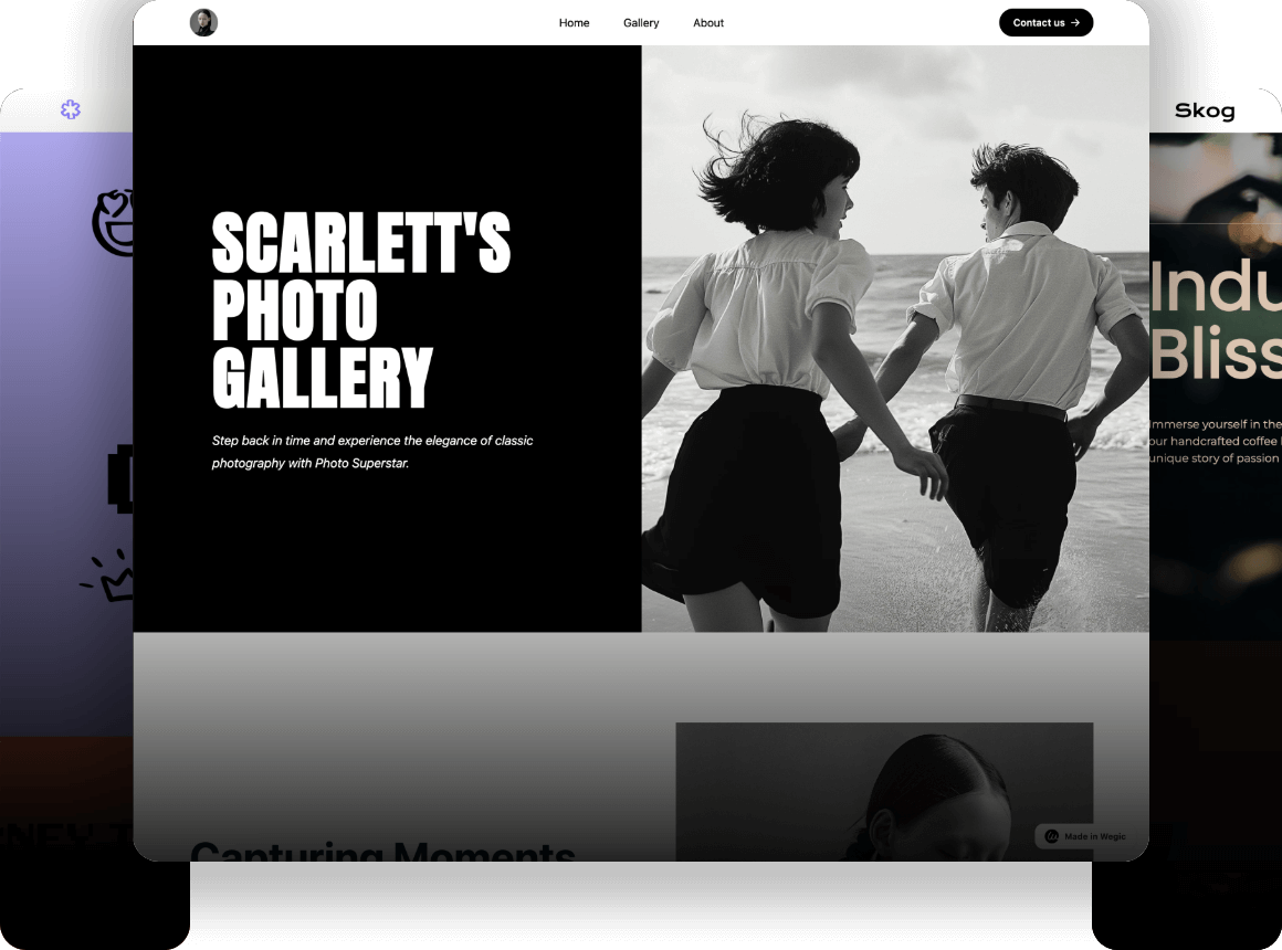
A consulting website is an online venue where consulting companies or individual consultants can exhibit their resources, services, and areas of expertise. It is a crucial instrument for drawing in new customers, disseminating details about consulting services, and building authority and competence.
So you're opening the website builder wanting to create a consultancy for your company and thinking about how to make a website that stands out, then you can get website ideas and design inspiration from this side of the blog, where we'll present you with top examples of consulting websites to inspire your design!
Table of Contents
-
What Makes the Top Consulting Website Design?
-
Top Consulting Website Designs of 2024
-
How to Build a Consulting Website
-
Consulting Websites FAQs
Click here to Build your site
What Makes the Top Consulting Website Design?
Quality consulting website design is not just a visual treat, it is also an important tool for companies to demonstrate their professional competence, attract customers and enhance their brand influence.
So, if you would like to build an outstanding consulting website design, you should consider some key elements:
-
01 Clear and Professional Design
An outstanding well-received website design needs to have a clean aesthetic design that uses clean page layouts, avoids clutter, and ensures that users can easily find the information they need.
Note that using colors, fonts and images that are consistent with the brand better reflects the company's professionalism.
-
02 User-Friendly Navigation
Navigation menus should be structured in a clear and easy-to-understand manner so that users can quickly find the information they need. The navigation bar is fixed at the top of the page and remains visible when the user scrolls the page, making it easy to access at any time.
Breadcrumb navigation shows the user's current location and access path, making it easy for users to return to the previous page or home page.
-
03 Responsive Design
Due to the expanding number of mobile devices nowadays, we need to enable the layout of our website to automatically adjust to the screen size. For example, a three-column layout on a desktop may become a single-column layout for display on a cell phone.
-
04 Engaging and Informative Content
For example, we have clear CTA buttons on our web pages (e.g., "Contact Us,""Schedule a Consultation,"or "Get a Quote") that direct the user to the next step.
The site can add some interactive design, such as questionnaires, comments and likes, to understand the user needs and respond to the needs of such a site can increase customer retention rate!
Top Consulting Website Designs of 2024
After we briefly understand the success factors of great websites, we can take a closer look at how the great websites on the list made it to this point. What we like about their designs is that we were able to mimic their design principles on our own site.
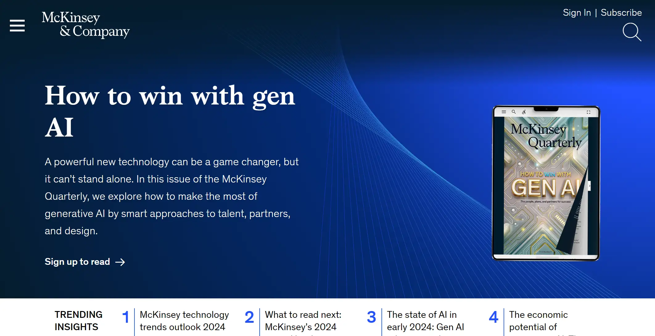
McKinsey & Company
McKinsey & Company is a global management consulting firm. It is a trusted advisor to the world's leading businesses, governments and institutions.
What we can learn from it:
-
Its website uses dark blue as its primary color, keeping colors and typography consistent to enhance brand recognition.
-
McKinsey's home page uses a clean layout that provides clear menu options to make it easy for users to quickly find the information they need.
-
Simple text, such as headlines and subheadings, are superimposed on large image backgrounds to make their message stand out.

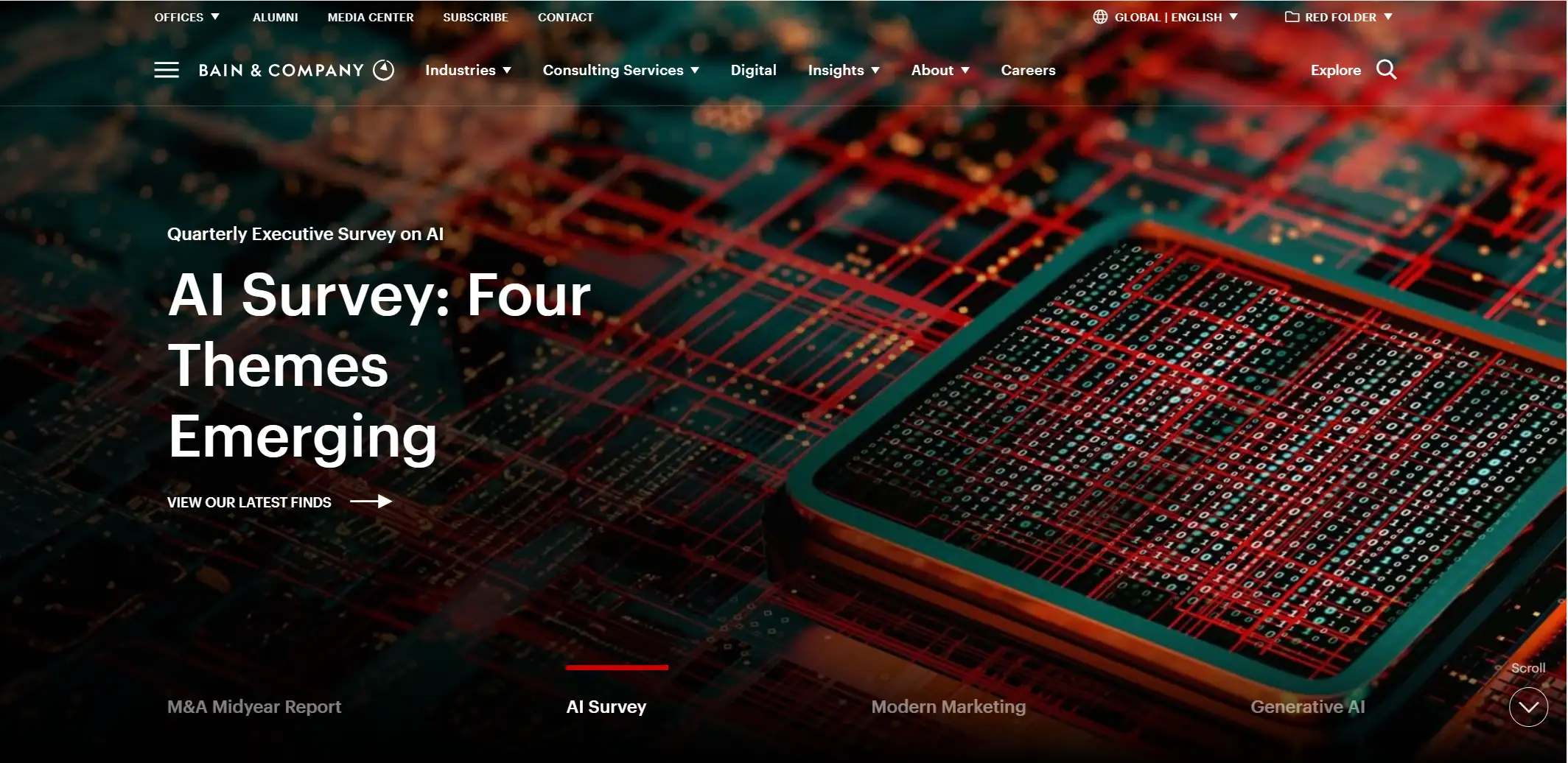
Bain & Company
Bain & Company is a top-tier management consulting firm. We advise leaders across all industries on strategy, marketing, organization, operations, IT and M&A.
What we can learn from it:
-
The Bain & Company website enhances the user experience with smooth and natural content loading and transition effects as the page scrolls.
-
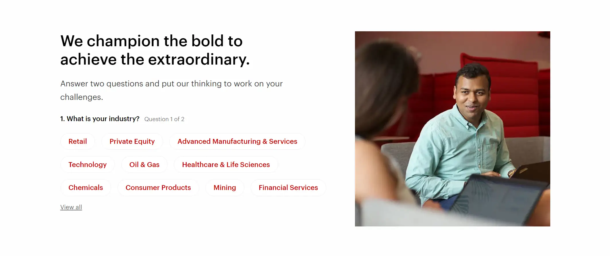
On the home page, you can take a simple two-question quiz where you simply select your industry and business needs. The quiz then provides you with three service options that may fit your needs.
Boston Consulting Group
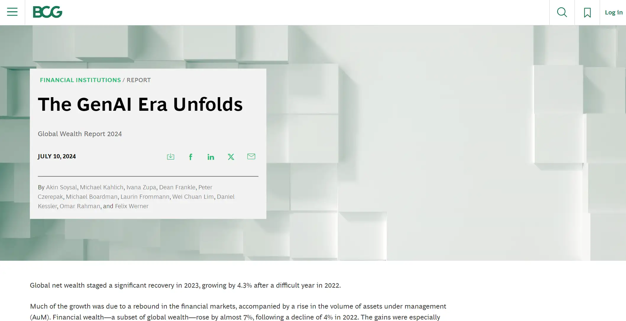
Utilizing deep domain and industry expertise to enhance the firm's competitiveness, BCG works with technology, media, and telecommunications companies to solve problems and pursue new strategies as they continue to shape the future.

What we can learn from it:
-
Boston Consulting Group has set up a clever idea in the large image of the homepage, which unfolds from the center to reveal the company's leadership development and agenda for the business, a process that increases the interactivity between the page and the user.
-
When the mouse hovers, the text or icon will change. This design not only lets the user perceive that the button is clickable but also enhances the visual appeal and user experience through the animation effect.
-
BCG's pages are green, gray, and white, reflecting the company's branding philosophy. The text is comfortably laid out and easy to read.
Deloitte
Deloitte provides industry-leading audit, consulting, tax and advisory services to many of the world's most respected brands.
What we can learn from it:
-
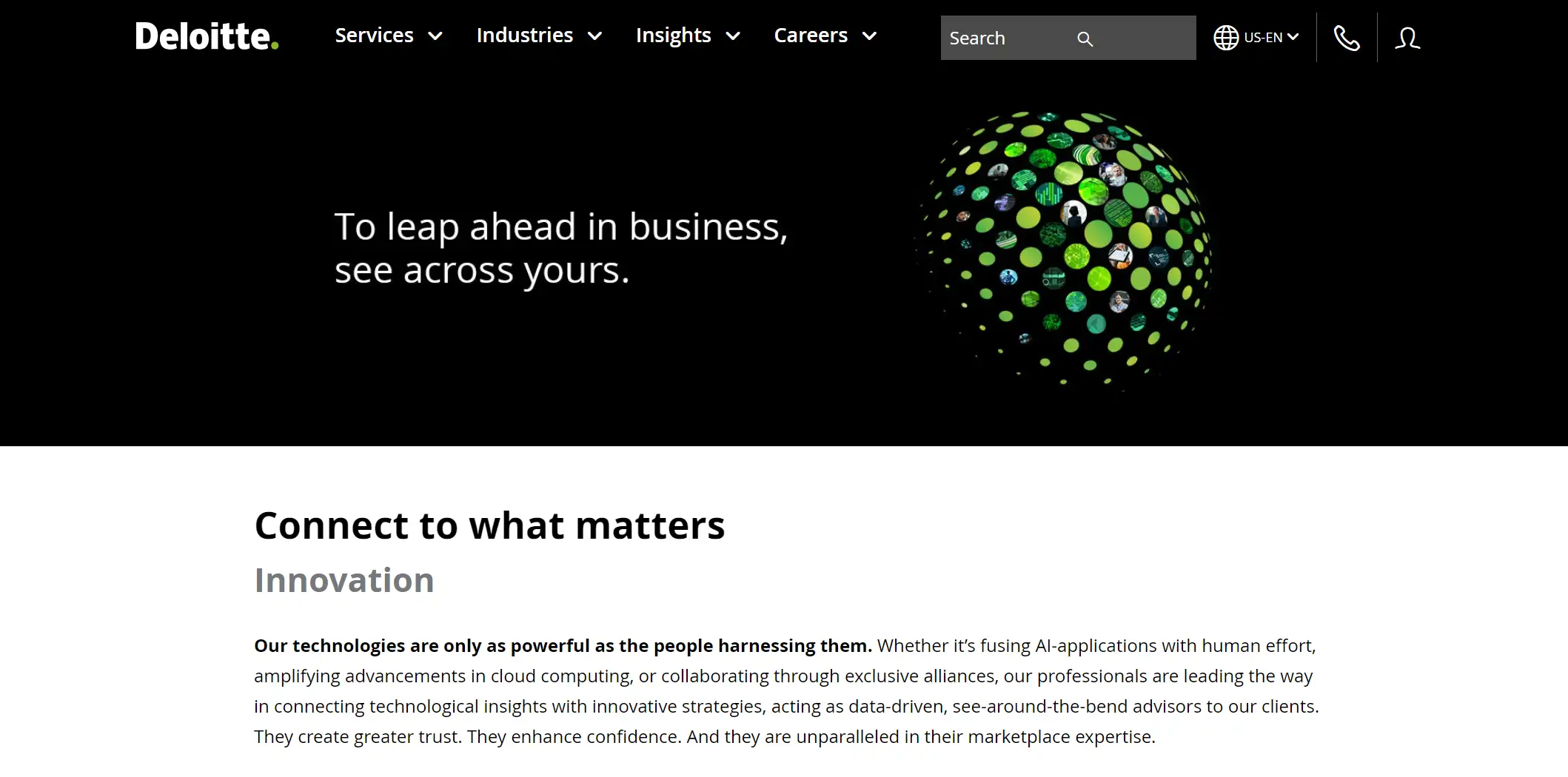
The Deloitte website showcases a wide range of consulting services. Its intuitive navigation and detailed service descriptions make it easy for visitors to find relevant offerings.
-
Deloitte's website implemented sticky navigation to provide continuous access to important sections without requiring users to scroll back to the top. Drop-down menus were made to effectively organize subcategories, reducing clutter and improving usability.
-
The website features a robust "Insights" section with articles, reports, and case studies that showcase Deloitte’s thought leadership and industry expertise.
-
Highlighting practical applications of Deloitte's services through case studies and client stories enhances credibility and provides real-world examples of its work.
Frog Design
Frog Design is a global creative consulting firm specializing in the design of a variety of product manufacturing.
What we can learn from it:
-
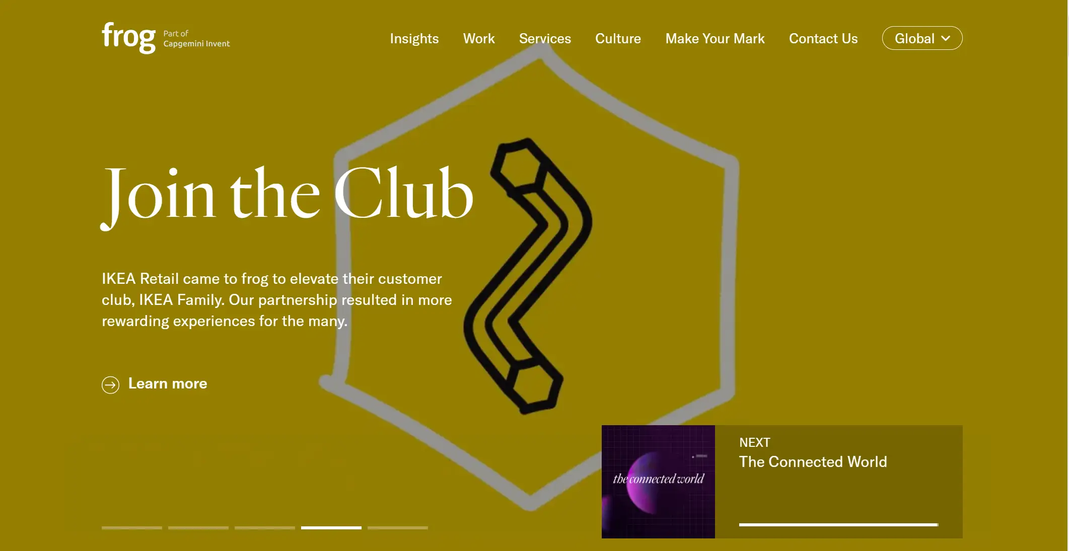
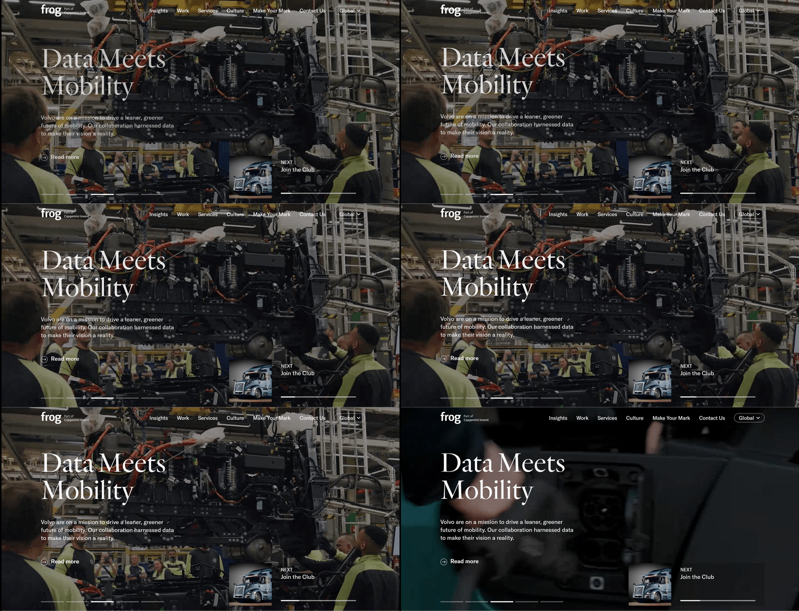
The site is visually strong. Most impressive is the bold use of color on the site. As the user scrolls down the page, the background images remain fixed while the foreground content scrolls. This visual effect creates a sense of depth and movement.
-
The Frog website utilizes a bold visual design that attracts users to the site, making everything vibrant and dynamic.
IDEO
IDEO is one of the world's leading innovation and design consulting firms, specializing in product development and innovation.
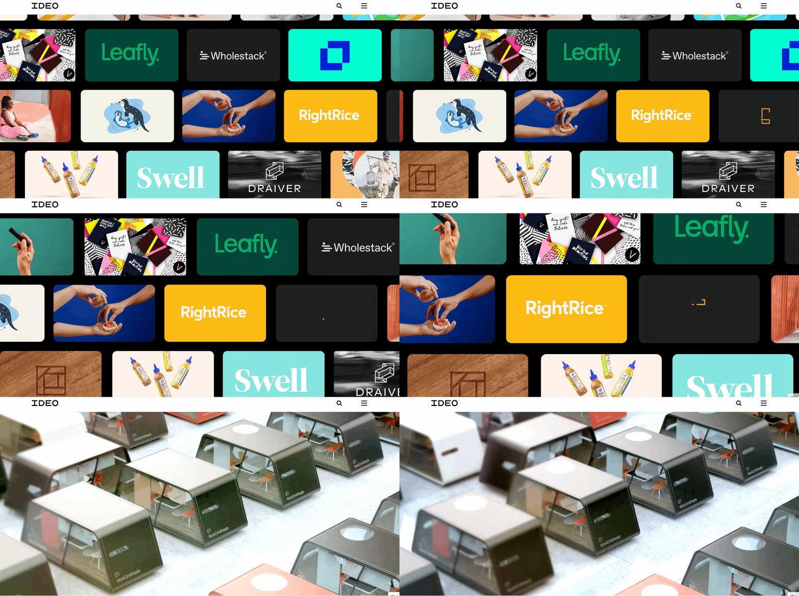
What we can learn from it:
-
The site emphasizes user-friendly design and innovative solutions. It highlights IDEO's innovative projects and achievements, reinforcing its leadership in the field of design.
-
They also use high-definition images and videos to showcase projects and stories, making the content more engaging and immersive.
Capgemini
Capgemini is a service-based company that provides consulting, digital transformation and outsourcing services to many organizations.
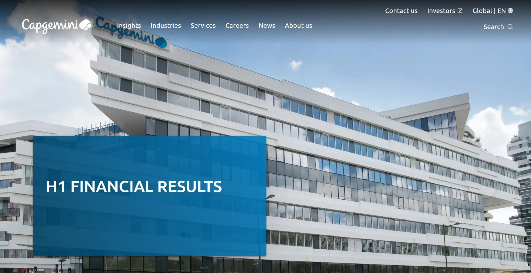
What we can learn from it:
-
A clean logo is strategically placed in the upper left corner. An easy-to-read list of services and clearly labeled "Contact us" and "investors " sections say everything to potential customers or investors.
-
The color palette is also very simple, with a blue color, in line with the brand's philosophy.
-
The navigation of this business type of consulting firm is very clearly categorized, allowing each visitor to read and find the business they want.
Plan London
Plan London is a product strategy consultant to the world's leading mobile and consumer technology companies.
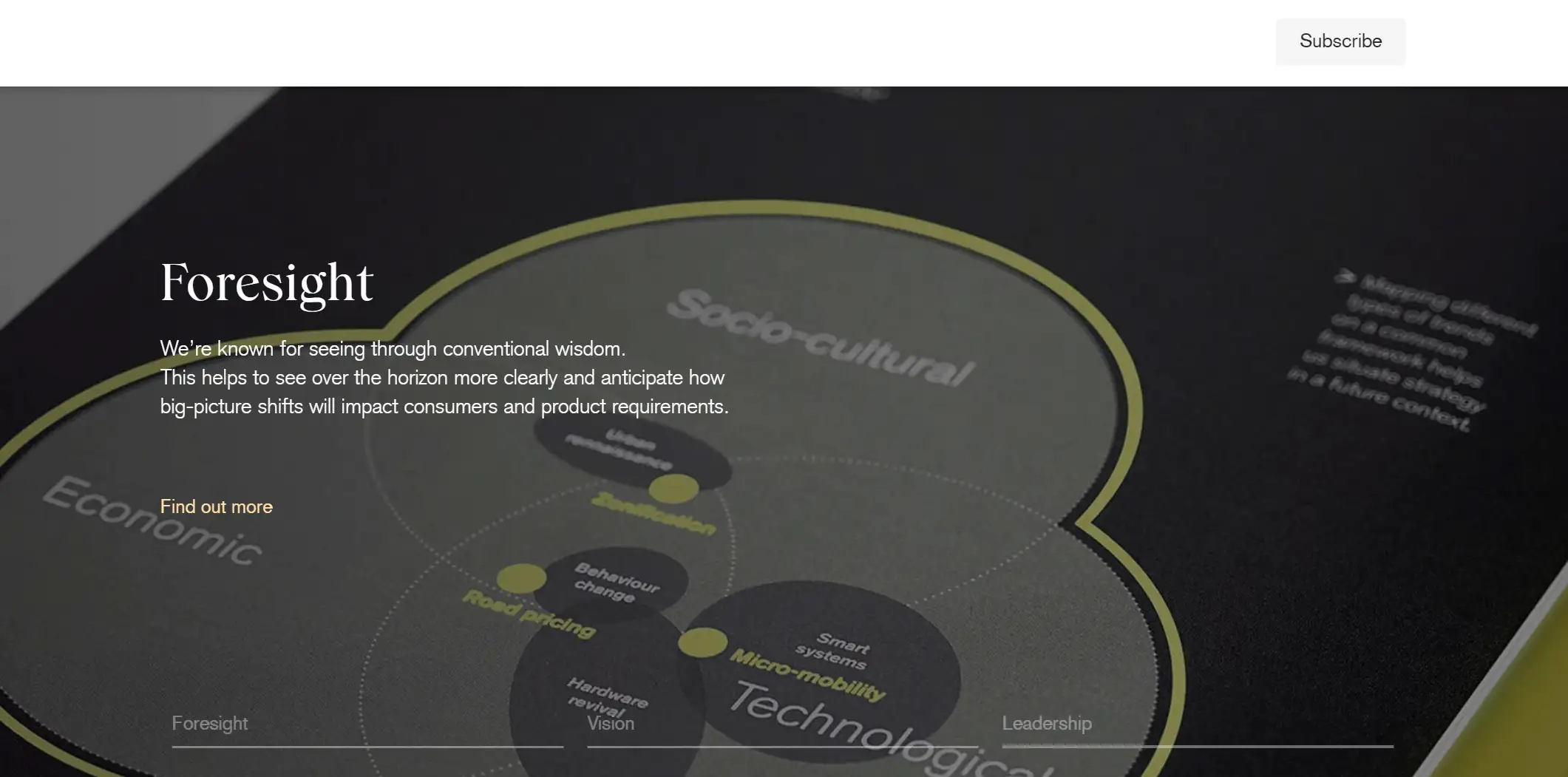
What we can learn from it:
-
The homepage is very simple to navigate, with only a “subscribe” button. As you scroll down the page, the menu bar appears!
-
The color palette is conservative, with a concentration on monochrome tones that convey professionalism and seriousness.
-
The website is simple and easy. While the site is not packed with flashy features, it does include enough modern web design aspects to keep it current.
-
The site combines elegance and simplicity in order to deliver a smooth user experience. The visual design is modest but effective. It mixes visual appeal with practicality, making it an excellent resource for anybody looking for product strategy consulting services.
How to Build a Consulting Website
If you want to build a consulting website, here are the steps through the website builder:
1.Plan Your Website
You need to define your objectives and determine what you want your website to accomplish (e.g., attract customers, showcase services). Understand who your target customers are and what their needs are. This is very important and is the foundation on which you build your website.
2.Choose a Domain Name and Hosting
Choose a domain name that reflects your business and is easy to remember. It's all about the starting point for users to be able to find your website!
3.Select a Website Platform
You need to choose a website building tool that is right for you. A user-friendly website builder can help you with content management and user experience enhancement.
4.Design Key Pages
If you are a beginner with no background in coding, Wegic can help you design personalized pages, such as a consulting site that can be built using natural language, which is extraordinary.
5.Launch and Promote Your Website
Start with a soft launch, testing your website first with a small audience to spot any issues, followed by a full launch: announcing the launch of your website via email, social media and other marketing channels.
Click here to Build your site
Consulting Websites FAQs
What should be included on a consulting website?
A consulting website should include:
-
Home Page: An overview of your services and value proposition.
-
About Page: Information about your background, experience, and expertise.
-
Services Page: Detailed descriptions of the services you offer.
-
Case Studies/Portfolio: Examples of your work and success stories.
-
Testimonials: Client feedback and reviews to build credibility.
-
Blog: Regular updates, insights, and thought leadership articles.
-
Contact Page: Easy ways for potential clients to get in touch, including a contact form, email address, and phone number.
How do I choose the right platform for my consulting website?
When choosing a platform, consider:
-
Ease of Use: Choose a platform that is easy to use and update, such as WordPress or Wix.
-
Customization: Ensure the platform allows for customization to match your brand.
-
SEO Features: Look for built-in SEO tools and features.
-
Support and Resources: Consider the availability of customer support and community resources.
-
Cost: Ensure the platform fits within your budget.
Where should I start when creating a consulting website for my small business agency?
It actually depends on your budget and if you are new to this and don't have enough budget cost, it is recommended that you should start with website building tools.
Is there a free web builder to build a consulting website?
Yes, Wegic is a free AI website builder that you can use to build consulting firm websites, personalize them with AI chat conversations, and design unique websites using the examples in this blog as inspiration.
Written by
Kimmy
Published on
Mar 12, 2026
Share article
Read more
Our latest blog
Webpages in a minute, powered by Wegic!
With Wegic, transform your needs into stunning, functional websites with advanced AI
Free trial with Wegic, build your site in a click!