Log in
Build Your Site
Creative 404 Error Pages: 11 Examples of 2024
Explore 11 creative 404 error pages for 2024 and learn why these pages are crucial to user experience, providing you with 404 page design inspiration.
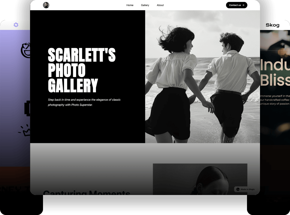
When you think about a website's user experience, the first things that come to mind are likely the homepage, product pages, or even the checkout process. However, there’s one page that’s often overlooked but incredibly important—the 404 error page.
This seemingly minor detail can make or break a user’s experience on your site. In this blog, we’ll explore why 404 error pages matter so much and dive into 11 creative examples from 2024 and we can learn how to turn a potential dead-end into an engaging user interaction.
Why Are 404 Error Pages So Important?
The 404 error page plays an important role in the user's browsing experience. Though it may not be the most prominent or frequently visited page on a website, its importance is often overlooked. It should not be just a useless page with a simple "404 Not Found" message. A well-designed 404 error page can greatly impact your website’s brand image and user experience.
A well-crafted 404 error page improves user experience by minimizing frustration. If your 404 error page contains nothing but a "404 Not Found" message, your audience will be disappointed and frustrated. What's more, they may question your professionalism and reliability. But if your 404 error page is visually appealing and functional, it can ease confusion, redirect attention, and keep users engaged.
In addition, a well-designed 404 error page also helps reduce bounce rates. The 404 error page is the last chance to retain users, guiding users toward alternative actions.
For example, if your 404 error page offers links to several related popular articles, users are likely to explore other parts of your site rather than leaving the website immediately. This not only solves their confusion but also enhances their willingness to stay, improving both user engagement and your brand’s reputation.
Creative 404 Error Pages: 11 Examples of 2024
01.Slack
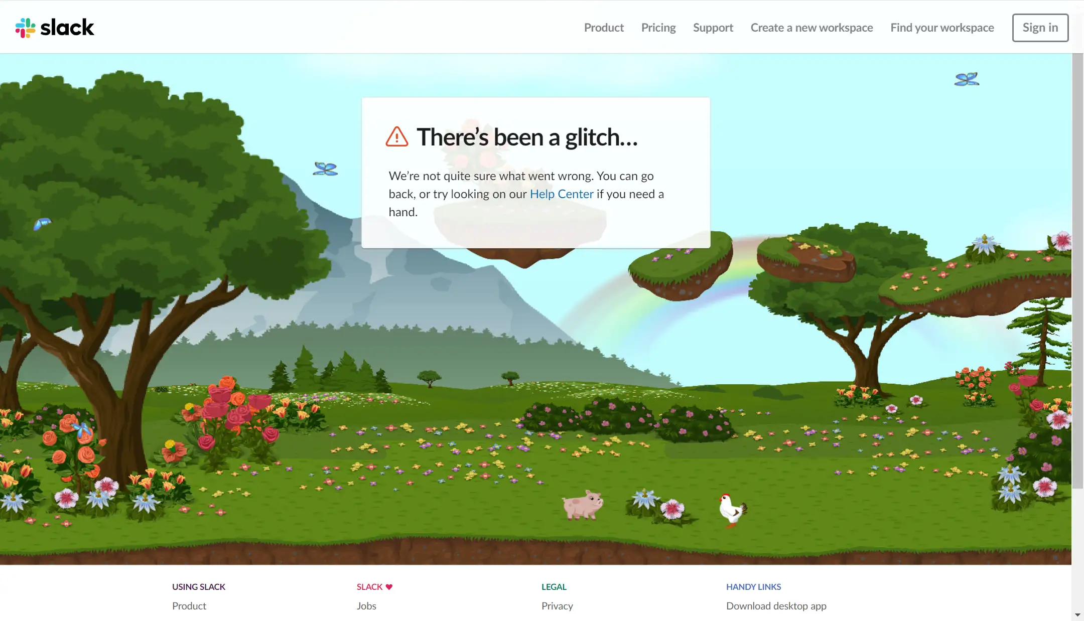
Slack's 404 error page features an engaging animation of forest animals living in harmony. The scene moves automatically, but users can also interact with the animals using their mouse, creating a playful and relaxing atmosphere. In the center, text offers explanations and suggestions, along with links to guide users. The navigation bar is clear and intuitive, helping to resolve user confusion, offer solutions, and ultimately enhance both the user experience and conversion rates.
02.Airtable
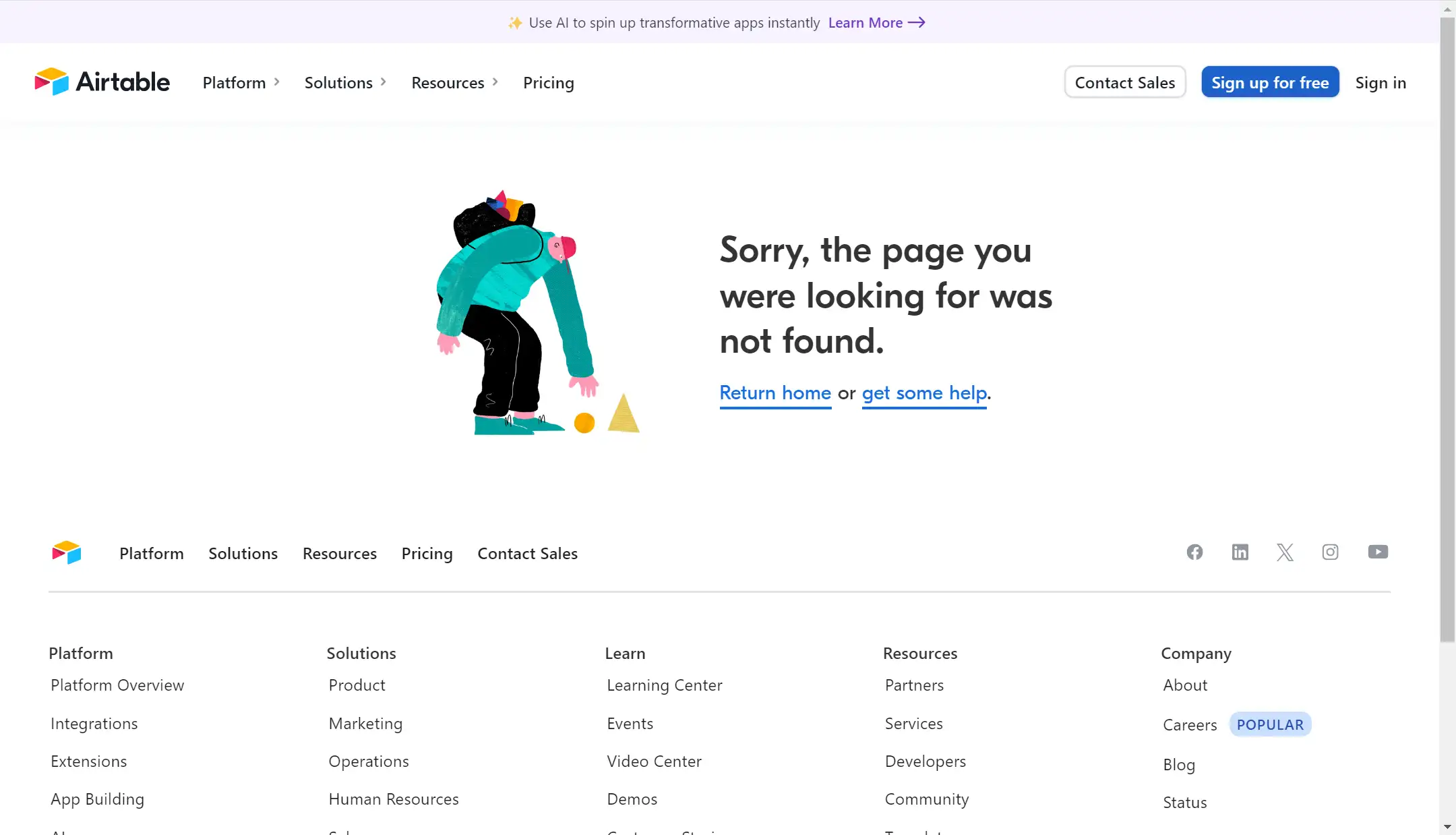
Airtable's 404 page is equally delightful. It shows an illustration of a person bending over to pick something up, with a friendly apology message next to it. The tone is approachable and warm, conveying emotion. More importantly, the page offers clear navigation and links, encouraging users to return to the homepage or seek support, solving their issues. Airtable also makes optimal use of space by providing a more detailed navigation menu at the bottom, making it easier for users to find help.
03.Hello Big Idea
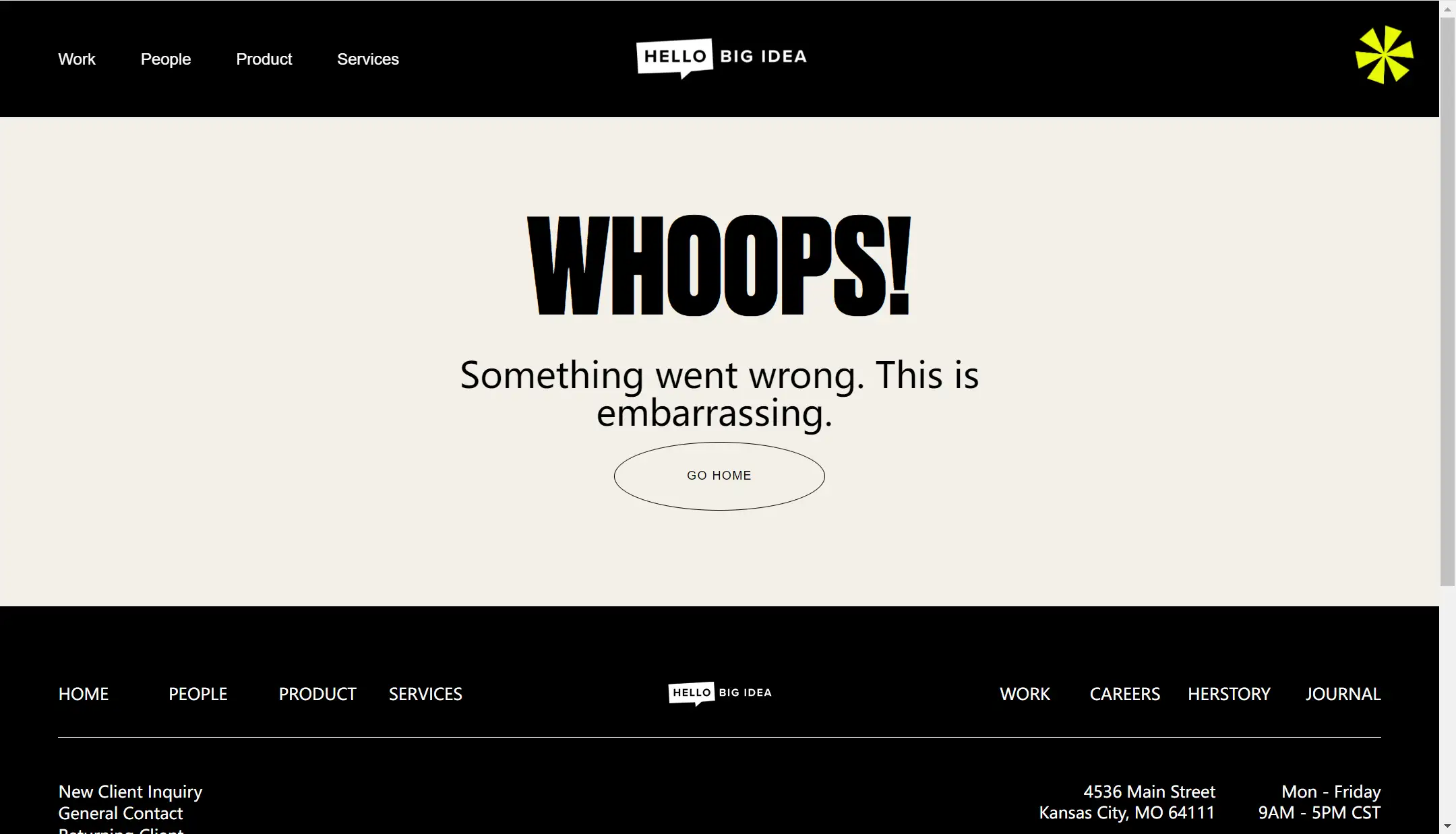
Hello Big Idea opts for a minimalist approach to its 404 page, avoiding excessive visuals or animations. The page simply displays bold, large text guiding the audience directly. The tone is intimate and humorous, helping to connect with users on a personal level. Like other well-designed 404 pages, Hello Big Idea includes clear navigation bars at the top and bottom to help users quickly find what they need, reducing any frustration.
04.Lego
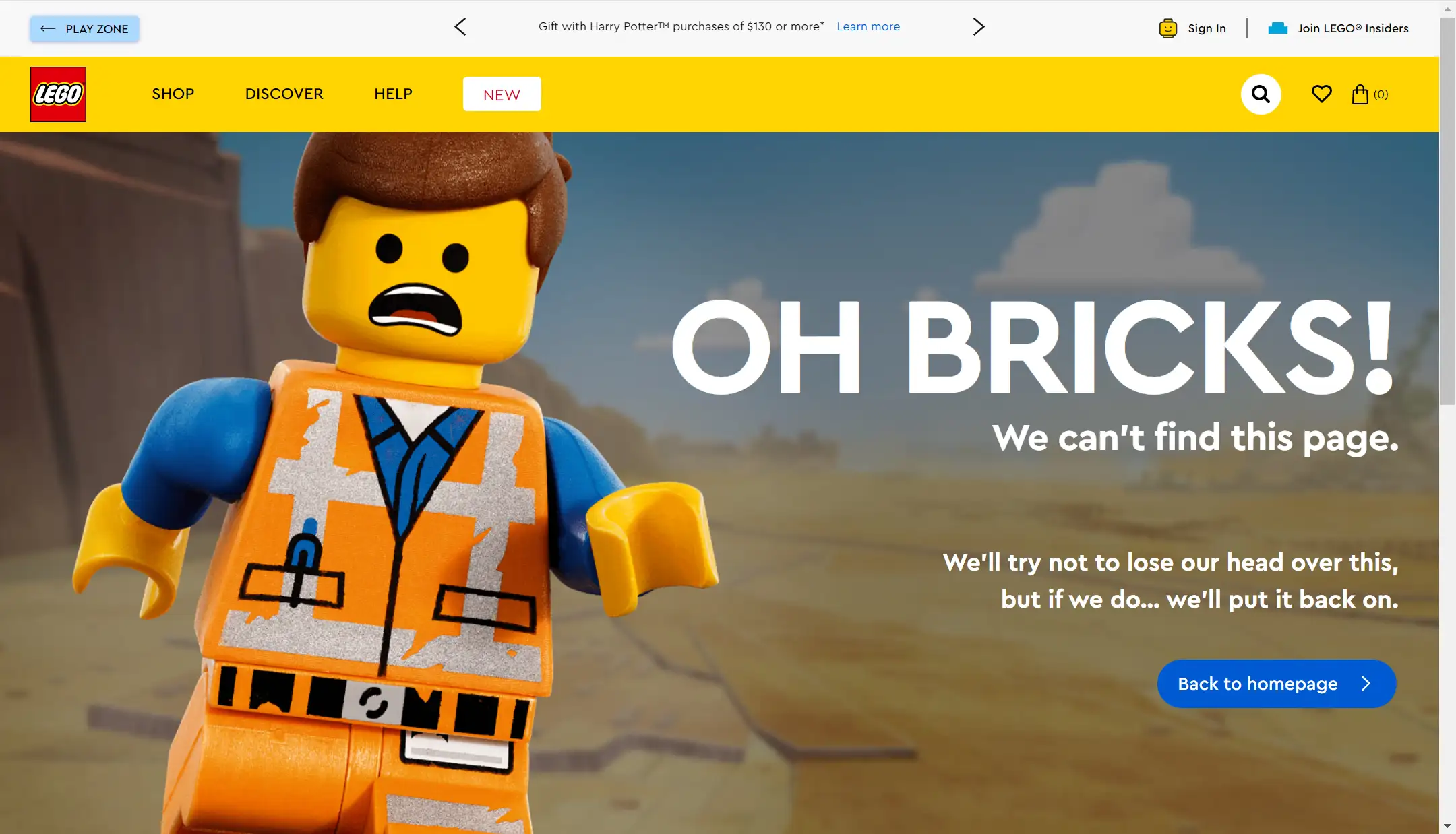
Lego's 404 error page is charming and playful. It showcases an image of a Lego figure with a nervous, frightened expression, reinforcing the brand’s playful image. The accompanying text is humorous, adding a lighthearted tone. Key elements such as the search bar and call-to-action buttons are prominently placed, making it easy to guide users and keep them engaged.
05.Nextiva
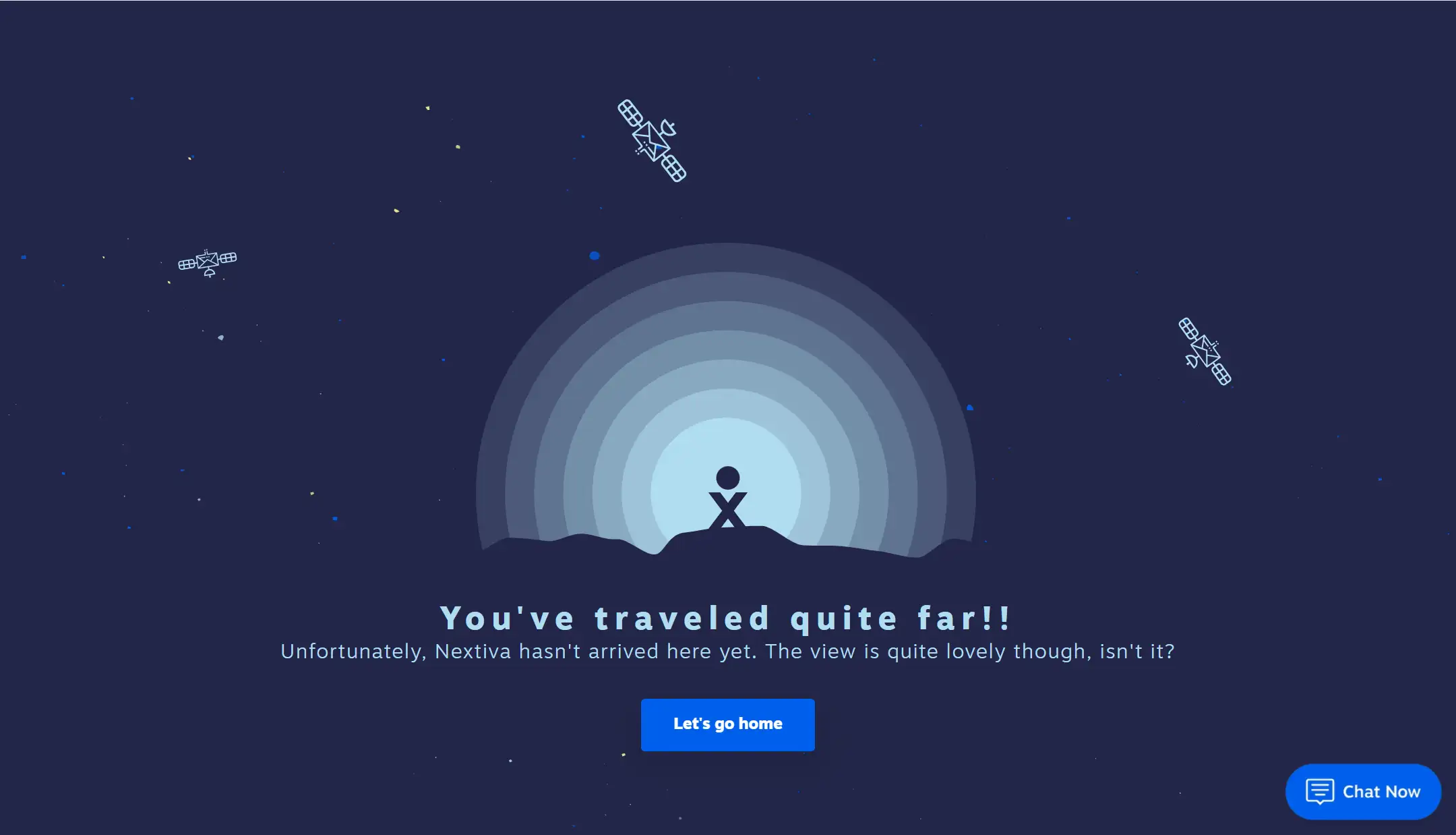
Nextiva is a cloud-based communication platform offering voice, video, and messaging solutions for businesses, focusing on streamlining communication and customer service.
Their 404 error page features an illustration of a person wandering through space, accompanied by the playful text, "You’ve traveled quite far!!" and "Let’s get home." This humorous language helps reduce user frustration and creates a more personal connection with the audience. A CTA button guides users back to the homepage, reducing bounce rates, while the "Chat Now" feature offers real-time support, enhancing the overall user experience and fostering trust in the platform.
06.DayCloud Studios
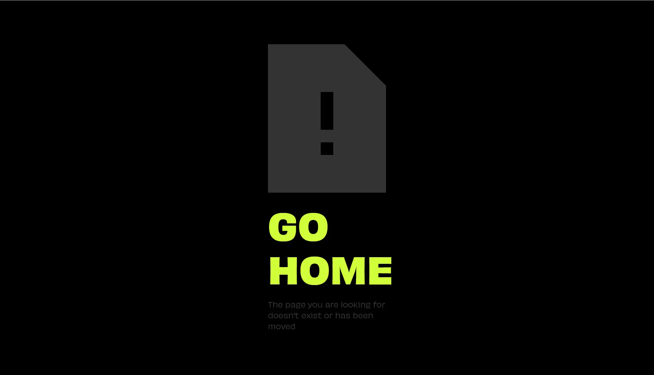
DayCloud Studios’ 404 error page is the most straightforward one yet. A sharp contrast between the black background and green text allows users to quickly find their way. In fact, no user action is needed—before you even have a chance to click, the page automatically redirects to the homepage. This direct approach prevents users from leaving the site, offering a seamless recovery from the error.
07.Ervin & Smith
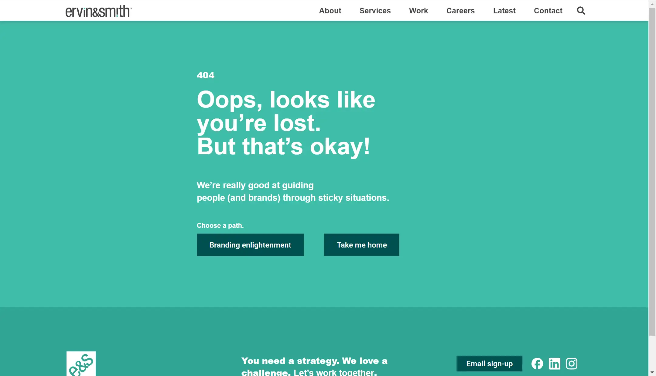
Ervin & Smith takes a creative approach to their 404 error page. Instead of simply redirecting users, it guides them to a new page that introduces the brand, showcasing its philosophy and vision.
By turning the 404 page into an opportunity for deeper engagement, they effectively transform an error into a chance to highlight their strengths and improve conversion rates.
08.NASA
NASA’s 404 error page perfectly aligns with its cosmic theme and professional image. The design features an image of a lost space scene, reinforcing the brand’s connection to the universe. Although the brand maintains a serious tone, the humorous message, "The cosmic object you are looking for has disappeared beyond the event horizon," adds a playful touch. The CTA invites users to explore other NASA projects, encouraging further browsing of space-related content.

09.Myriad
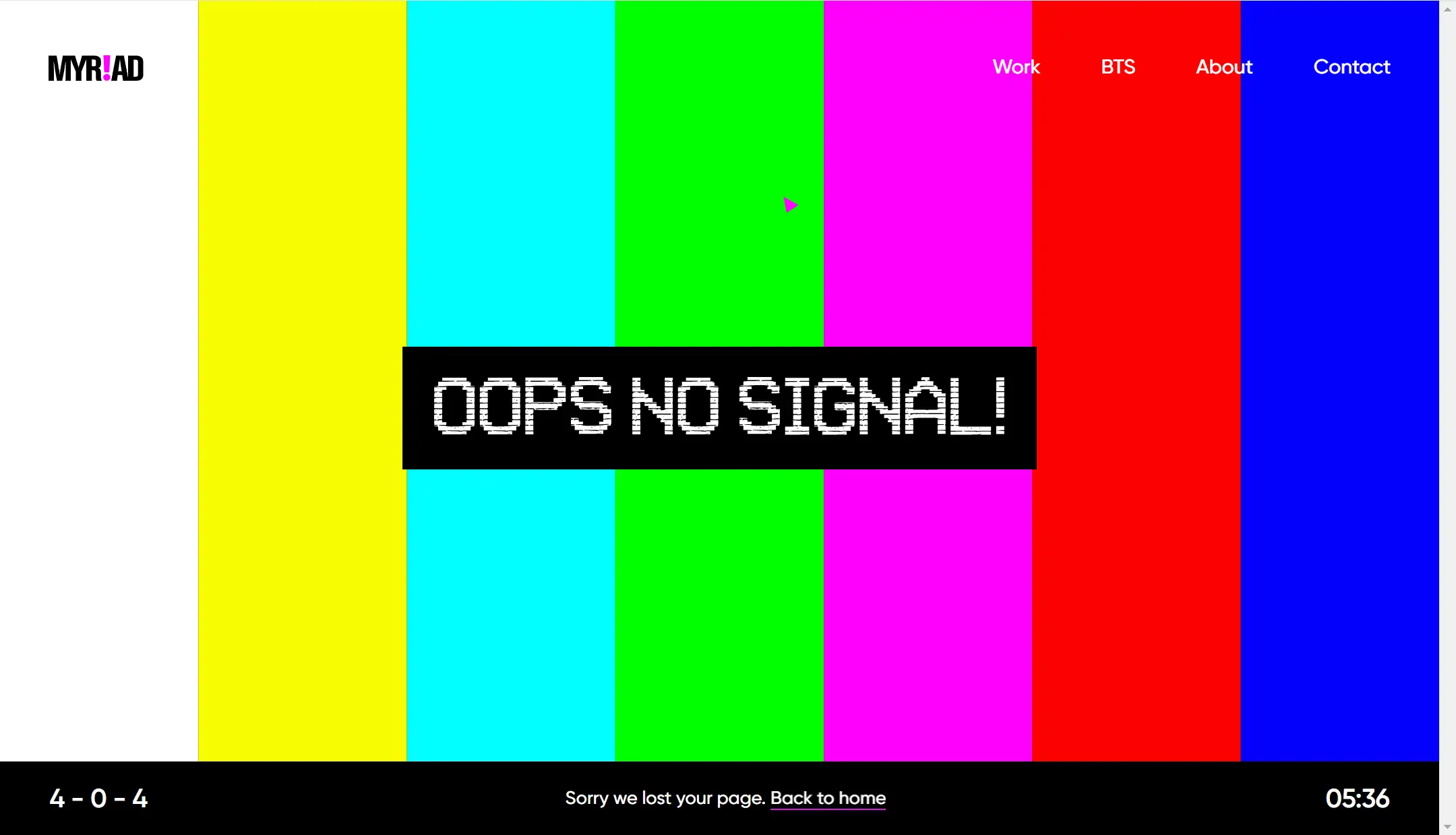
Myriad’s 404 error page immediately grabs attention with its bold, vibrant colors. The design references the classic SMPTE color bars seen on old TVs, with the playful message, "Oops! No Signal," mimicking a TV signal interruption. This fun, retro theme adds personality, while clear navigation at the top and interactive elements at the bottom guide users through the site.
10.IKEA
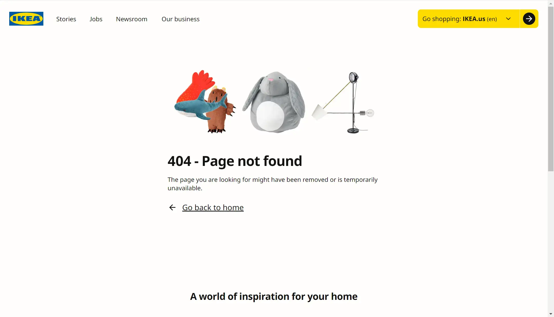
IKEA’s 404 error page is a perfect example of minimalism, staying consistent with the brand’s image. The number "404" is creatively designed using IKEA products, reinforcing the brand identity. In fact, the entire 404 error page, especially the bottom of the page, is consistent with the style of the IKEA brand. The clean design, combined with a prominent yellow CTA button and top navigation bar, makes it easy for users to take action, boosting engagement and conversion rates.
11.Sopify
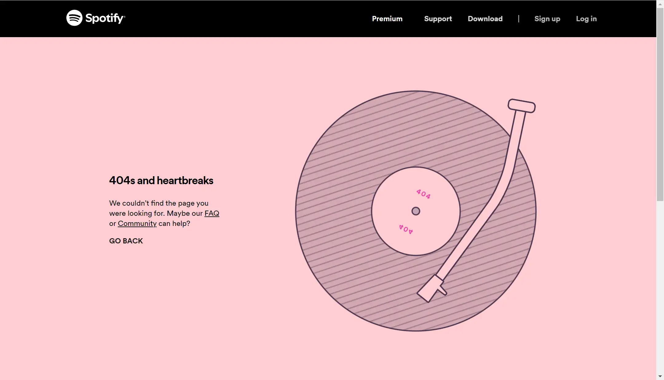
As a music platform, Sopify’s 404 error page reflects its brand’s character and follows a minimalist design. The left side features text prompts and links to the community and FAQ pages, clearly guiding users. On the right, an animated record player spins, adding a playful, dynamic touch. The peach-pink and black color scheme creates a calming effect, reducing user frustration, while the navigation on the top right ensures quick access to key information.
What Makes a Good 404 Error Page?
After exploring so many impressive 404 error pages, do you now have a clearer idea of what makes a great one? Are you ready to revamp your own 404 page and make it stand out? Don’t worry. Let’s break down the key elements that successful 404 pages share.
By following these principles, you can enhance your own design. A good 404 error page typically includes the following key factors: design and brand consistency, humorous text, clear navigation, user engagement, increased interactivity, and ongoing monitoring and optimization.
01.Design and Brand Consistency
A good 404 page should be consistent with the brand image and the overall design style of the website, including your color schemes, fonts, and visual style. Consistency in design reinforces brand identity, even on error pages, ensuring users feel connected to your brand across every touchpoint.
02.Humorous Text
An effective 404 error page should never simply display "404 Not Found." This not only fails to alleviate the negative emotions of users but also greatly wastes valuable space and a prime opportunity to communicate with users and retain them.
The copy should be friendly, and empathetic, and ideally include a touch of humor. Through humor or light-hearted language, you can alleviate the negative emotions users have about not being able to find the page. For example, “Oops! It looks like this adventure is off the map. But don’t worry, there are plenty more to explore!”
03.Clear Navigation
Clear and intuitive navigation is essential for a well-designed 404 page. If a user lands on this page by mistake, simple navigation options should allow them to easily continue browsing or return to where they were.
Make sure your 404 error page provides clear navigation options to help users find what they need quickly. You can add a "Return to Homepage" button, a search bar, or links to popular content on your 404 error page. These elements can well improve user experience, guide users, and even increase conversion and retention rates.
04.User Engagement
A good 404 error page should have a clear call to action. You can place links or buttons on the 404 error page to let your users check out the latest products or encourage users to subscribe to your newsletter. This transforms a frustrating experience into an opportunity for engagement, potentially converting lost users into new customers
05.Increased Interactivity
404 error pages are also a great opportunity to increase user interaction. You can add creative elements such as mini-games, amusing illustrations, or animations to enhance the user experience. These touches don’t just ease frustration—they can leave a lasting positive impression.
06.Monitoring and Optimization
404 error pages are not static. You can use analysis tools to monitor visits to the 404 error page, understand where users enter the 404 page, and then optimize the page to further improve the user experience.
For instance, if you find that many users are entering the 404 page through the same broken link, you can update the 404 page with more helpful links or repair the broken one to improve the user experience.
Conclusion
A 404 error page may seem like just a small detail on your website, but its impact on the overall user experience cannot be ignored. By taking inspiration from the creative examples we've discussed and implementing best practices, you can transform your 404 error page into a valuable part of your website’s overall experience.
A well-designed and fully functional 404 page can not only regain potential lost users but also further enhance the brand image. With friendly design and clear navigation, you can turn this “error” page into a positive experience in the user journey. So, the next time you think about your website’s user experience, don’t forget to give your 404 error page a little more thought and creativity. Don’t let this small but significant page become an afterthought—make it work for your users and your brand.
FAQs
01.Can a 404 error page impact SEO?
Yes, a 404 error page can impact SEO if it’s not handled correctly. A custom 404 page helps retain users on your site and can reduce bounce rates, which is beneficial for SEO. Additionally, it prevents search engines from indexing non-existent pages.
02.How can I make my 404 error page more engaging?
To make your 404 error page more engaging, you can add interactive elements, incorporate humor or branded visuals, and provide clear calls to action that guide users to other parts of your site.
03.Why is it called a 404 page?
A 404 page is named after the HTTP status code "404," which indicates that a server cannot find the webpage requested by the user. It essentially means the page is "not found." The term comes from the way web servers communicate errors, and "404" specifically refers to a missing or unavailable resource.
Additional Article on 404 Error Page
Written by
Kimmy
Published on
Mar 17, 2026
Share article
Read more
Our latest blog
Webpages in a minute, powered by Wegic!
With Wegic, transform your needs into stunning, functional websites with advanced AI
Free trial with Wegic, build your site in a click!
What kind of website do you want to build?