Connectez-vous
Créez Votre Site
Best Google Font-Family Combos That Just Work
Explore top font-family Google Fonts combinations and proven Google Font Pairings to create legible, fast-loading typography aligned with your brand's tone.
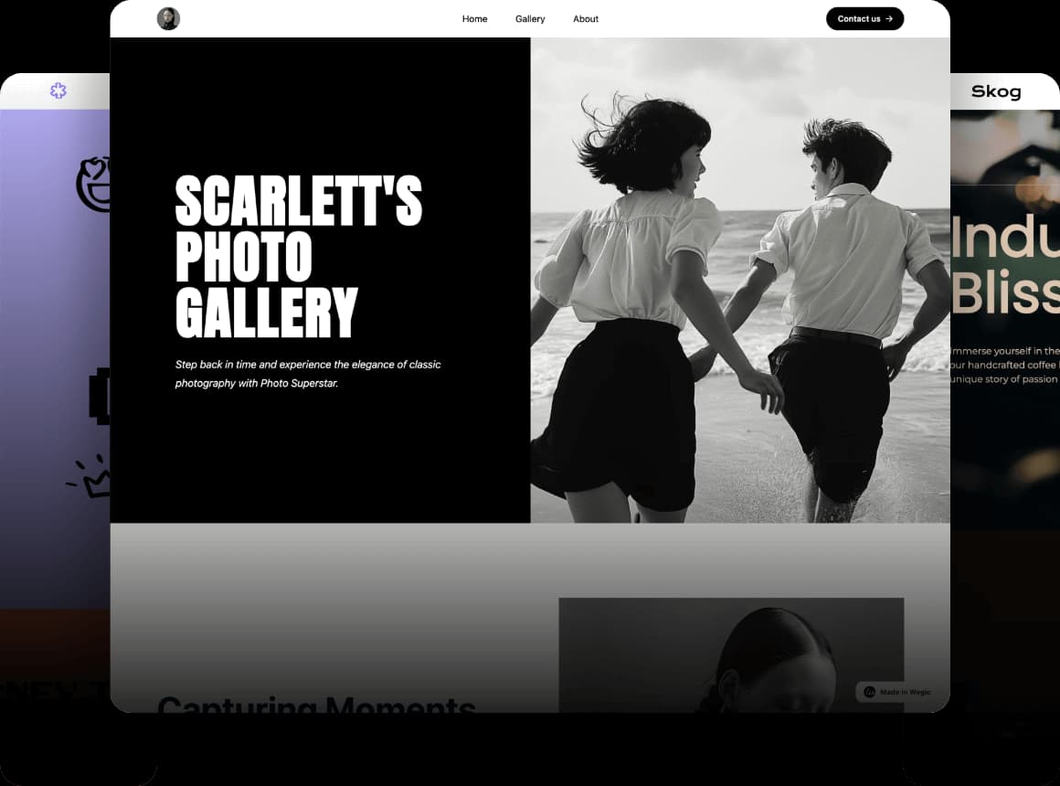
In web design, font-family Google Fonts is a core CSS property that determines not just how typefaces are rendered, but how they influence your entire visual system—from branding to performance. It not only determines the visual style of the text but also directly affects the page's readability, information hierarchy, brand tone, and even SEO rankings and load performance. The fonts you choose affect everything from readability and visual hierarchy to brand tone, SEO, and even page speed. By choosing the right Popular Google Font and combining it with thoughtful Google Font Pairings, designers can build interfaces that are both functional and emotionally resonant.
Pairing Google Fonts the right way lets your typography do more than look good—it builds trust, guides attention, and strengthens your message. But when the wrong fonts are combined? The result is often a site that feels inconsistent, overwhelming, or cheap, pushing users away before your content even gets a chance. People treat Google Fonts like a visual buffet—picking what looks good in isolation and ignoring consistency, hierarchy, or loading strategy. That's how you end up with sites that look full but feel empty.
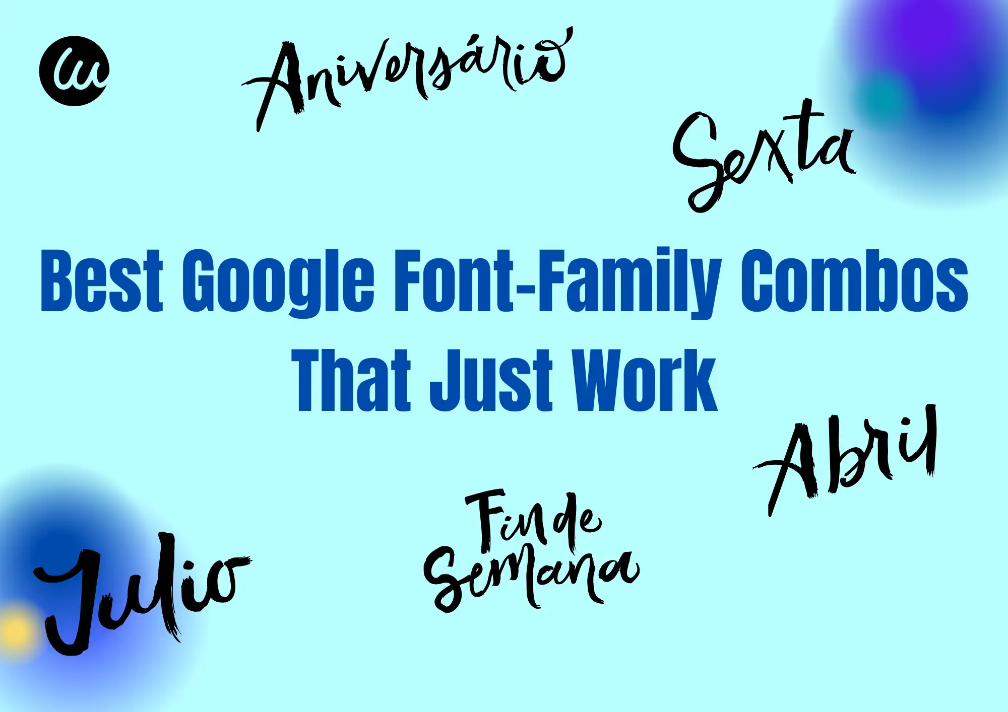
In this article, we'll break down the design principles behind what makes a font pairing "work"—without naming specific fonts—so you can build your own scalable, thoughtful font system using Google Fonts.
The Core Principles Behind Smart Font Pairing
Good typography isn't just about picking fonts that "look nice." A strong font system balances clear structure, brand personality, and user comfort, so your website feels polished and performs flawlessly. Here's how to get it right:
1.Contrast Meets Consistency
Headings and body text should feel related, but not identical. The trick is to create visual rhythm through differences in size, weight, and thickness, without making them clash. A page where the heading feels too light and the body text feels too heavy? It looks like a bad outfit—awkward and unprofessional.
2.Build a Natural Reading Flow
Size isn't the only way to guide the eye. Changes in weight, color, and line spacing can establish hierarchy even when fonts are the same size. The best font systems lead visitors naturally from headline → subhead → paragraph, like reading a well-structured article—instead of dumping them into a wall of text. This kind of flow is easier to build when you use a well-considered font-family Google Fonts system that prioritizes readability.
3.Match the Right Tone to Your Brand
Fonts speak just like voices. Some sound sleek and technical, others scholarly, playful, or bold. If the tone your typography conveys doesn't align with your brand's personality, visitors will feel a subtle disconnect. The right combinations make the spacing, weight, and flow of every letter echo your brand's character.
When building a font system, it's tempting to choose based on aesthetics alone. But a truly effective font-family Google Fonts strategy requires structure. You need to consider technical load, visual pacing, and voice. That's why designers often rely on a Popular Google Font that pairs well with others, creating contrast and flow. Whether you're designing for editorial, e-commerce, or SaaS products, smart Google Font Pairings can make the difference between visual harmony and design chaos. Rather than relying on gut instinct, use proven principles to find fonts that communicate your brand's identity at every touchpoint.
4.Make It Easy to Read—and Fast to Load
A professional font system also performs well. That means:
- Skip hairline weights (they blur on lower-resolution screens).
- Use a generous line height, so long-form content doesn't strain the eyes.
- Adjust letter spacing for clean, easy-to-scan paragraphs.
- Enable font-display: swap so your fonts don't block the first screen when loading.
These details may feel small, but they're what separate a site that feels premium and effortless from one that feels clunky or fatiguing to read.
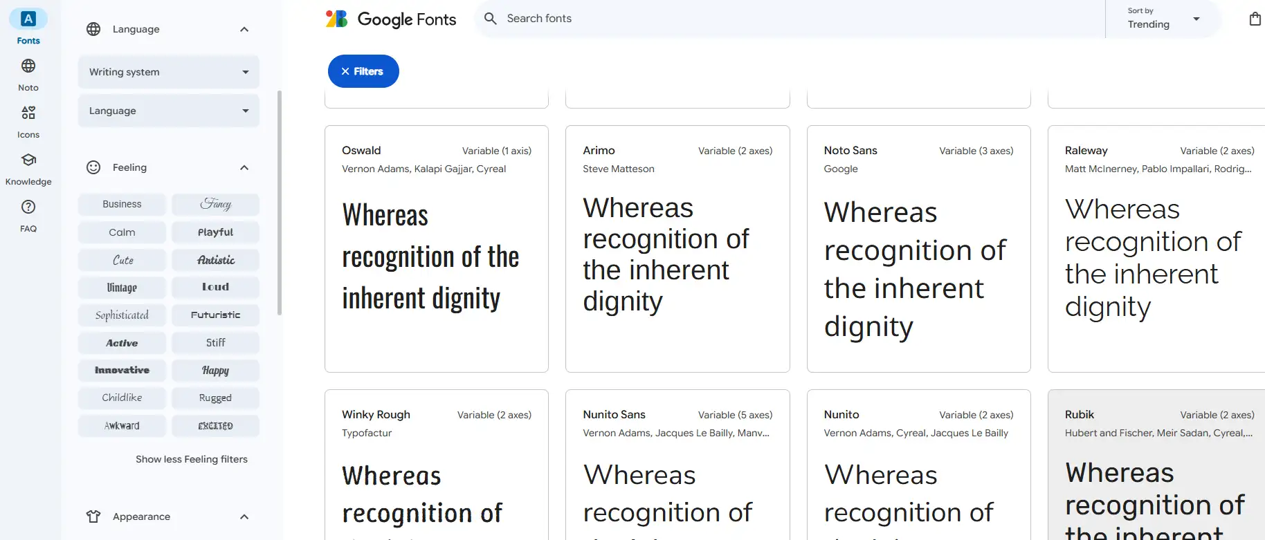
How to Build a Scalable Google Fonts System (6 Steps)
Most websites get typography wrong because they treat it like decoration, just picking two fonts that "look nice." But a professional font system needs to work on every level: visual appeal, readability, brand alignment, technical performance, and responsive behavior. A thoughtfully planned font-family setup with Google Fonts ensures your type remains consistent while loading quickly on all devices.

Follow these six steps to create a typography system that feels polished and performs flawlessly:
1.Start with Your Brand Voice
Fonts speak. Before selecting a Popular Google Font, decide what your website should sound like:
- Sleek and rational for tech?
- Soft and friendly for parenting content?
- Minimal and refined for luxury?
- Bold and expressive for creative portfolios?
Your tone will guide every decision—weights, sizes, and pairings.
2.Build a Clear Hierarchy (Three Font Groups)
Divide your type into three core groups:
- Headings (H1/H2): impactful and attention-grabbing.
- Subheads & Navigation (H3/CTA): supportive but distinct.
- Body text (P): neutral and highly readable.
Don't rely on a single font for everything. Consistency doesn't mean uniformity—it means orderly contrast.
3.Check Structural Compatibility
Not all fonts play nicely together. Compare:
- x-height: big differences make layouts feel disjointed.
- Stroke style: avoid clashing geometric sans with a handwritten font.
- Serif strategy: keep heading and body either both serif or both sans, unless you're intentionally using contrast.
- Curves and corners: Rounded headings work best with rounded body fonts.
Your font system should feel stable, not chaotic.
4.Set a Scale for Size, Weight & Spacing
Typography isn't just about picking fonts. It's about scale and rhythm within a responsive font-family Google Fonts framework. Use this as a starting guide:
- H1: 36–48px
- H2: 28–36px
- H3: 20–24px
- Body: 16–18px
- Small text: 14px or less
Line height:
- Headings: ~1.2×
- Body: 1.5–1.8× for easy reading
- Long-form: even looser for comfort
Always use responsive units (
rem/em) so text scales cleanly across devices.5.Add a Reliable Fallback Stack
If Google Fonts fail to load, don't let your site default to Times New Roman or other system fonts. Define backup typefaces that work across platforms so your design stays intact, even with poor connections.
6.Optimize for Speed & SEO
Before anything else, streamline your font-family Google Fonts selection to avoid unnecessary bulk and improve load speed. Fonts are as much a performance factor as they are a design choice. To keep your site fast:
- Load only the weights and styles you use.
- Use font-display: swap to avoid invisible text.
- Compress fonts with Gzip or Brotli.
- Combine requests with optimized CSS links.
- Cache fonts via a CDN for global delivery.
These tweaks cut load time, improve SEO, and stop fonts from slowing down your user experience.
A good font system isn't just a visual asset—it's a structural, functional, and performance engine for your site. When done right, it creates a consistent reading experience across languages, cultures, and devices, while keeping your site fast and professional.
10 Common Font Mistakes and How to Fix Them
Even with abundant font resources, many websites still make recurring mistakes in practice. Below are ten typical fonts for website usage pitfalls, along with actionable optimization strategies.
Mistake 1: Too many font types, no system
Many sites use 4–5 different font styles to make the page feel "richer," but the result is the opposite. Users struggle to form a unified visual impression and instead feel overwhelmed.
Fix: Limit yourself to 2–3 fonts for key levels like headings, body, and navigation. Visual consistency builds professionalism far better than "variety."
Mistake 2: Subheadings are too thin, hard to read on small screens
Thin-weight subheadings may work on desktops but become blurry and illegible on phones, making it hard for users to see important information.
Fix: Use medium weights and larger sizes for subheadings. Test across devices to ensure legibility on phones and tablets.
Mistake 3: Decorative fonts for body text, poor reading experience
Some designers use overly complex or irregular fonts for body text in the name of "personality," making long reading sessions uncomfortable.
Fix: Choose clear, stable-stroke fonts for body copy to ensure easy reading on any screen, ideally from a balanced font-family Google Fonts set.
Mistake 4: Slow font loading, hurting first-screen experience
If web fonts load too slowly, pages may appear blank or textless for a moment, making users think the page is frozen or broken, leading them to leave.
Fix: Prioritize fallback font strategies during load, optimize file size, and load only the weights and character sets you need.
Mistake 5: No fallback fonts, leading to layout breaks
When primary fonts fail due to network or platform issues, pages fall back to default system fonts, breaking layout and disrupting visual style.
Fix: Configure a proper fallback font stack for every
font-family, ensuring your page maintains its style even if the primary font doesn't load.Mistake 6: Inconsistent look in mixed Chinese-English text
On many sites, English fonts and default Chinese fonts clash visually, causing a jarring "tear" effect that disrupts the reading flow.
Fix: Use font families that support both Chinese and English in a unified design, or select stylistically similar fonts for each language to ensure seamless blending.
Mistake 7: Inconsistent type scale, no reading rhythm
Titles are too small, body text too large, leaving users unsure what's important or what to follow, breaking the natural reading path.
Fix: Set clear size ratios so each level has a distinct, logical size difference. Users should be able to identify headings and body text in under a second.
Mistake 8: Poor responsive adaptation, hard to read on small screens
On mobile phones, fonts are often too small, lines too tight, or layouts too cramped, forcing users to zoom in and out, ruining the experience.
Fix: Use relative units for font sizing, and test on common devices to ensure readability across all screen sizes.
Many designers overlook how the right font family from Google Fonts can solve legibility and consistency issues. Choosing from verified Google Font Pairings ensures better adaptability across screen sizes and devices. For example, a blog that uses mismatched fonts for headers and body text may confuse users and disrupt the visual hierarchy. Opting for curated Popular Google Font sets makes your text not only more visually appealing but also more functional, reducing bounce rates and increasing time on site.
Mistake 9: Fonts don't match brand tone
Tech sites using playful fonts, financial platforms using handwritten scripts, or kids' sites with ultra-thin text—all create trust issues and brand dissonance.
Fix: Match your font style to your brand's voice. Mismatched styles don't just look bad—they can send the wrong message and hurt your brand's credibility.
Mistake 10: Copying "popular font pairings" without customization
Many people apply "Top 10 Font Pairings" templates blindly, ignoring their own site's structure and content. The fonts may be "trendy" but fail in practice.
Fix: Use intelligent layout tools like Wegic, which auto-generates tailored font combinations based on brand tone and site structure, with real-time preview and customization, freeing you from cookie-cutter templates.
Four Recommended Scenarios for Font Pairing
Instead of memorizing font names, think about where and how your type will be used. Here are four practical pairing strategies you can apply across different website types:
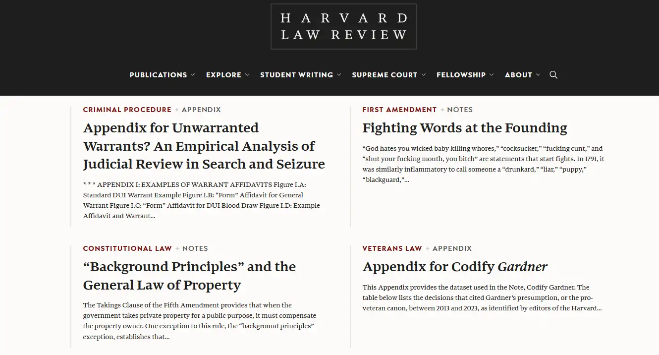
1. For Business Websites
Corporate sites need to feel professional and dependable. Your fonts should strike a neutral tone—friendly enough to be approachable but formal enough to inspire confidence.
- Headings: clean, high-legibility sans-serif.
- Body: traditional serif or rounded sans-serif for a balanced, readable feel.
- Sizing & spacing: keep size ratios around 1.25–1.5, limit yourself to two weights, and add slightly more line spacing so pages don't feel crowded.
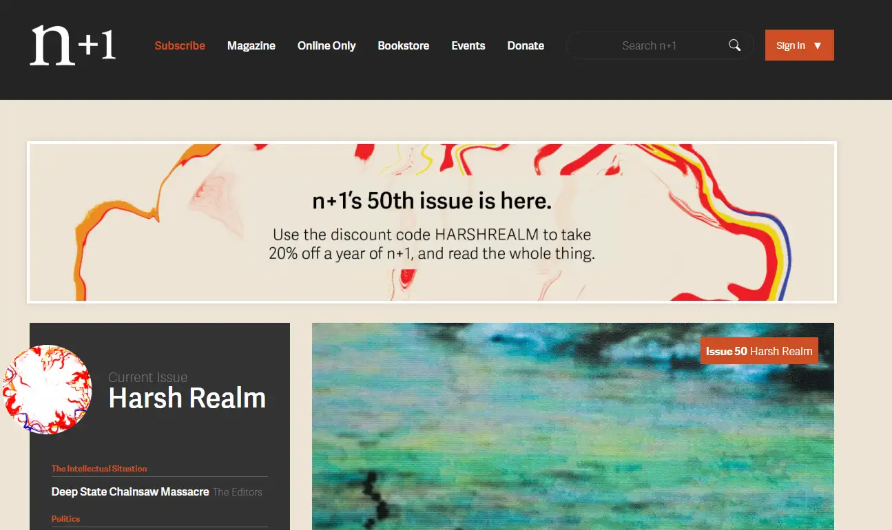
2. For Blogs & Media
This setup works best when your font-family Google Fonts selection supports both legibility and tone consistency across platforms. On content-heavy sites, typography needs to make reading effortless.
- Headings: elegant serif to set a refined tone.
- Body: smooth sans-serif or soft-serif for comfort.
- Spacing: line height around 1.6–1.8 with moderate font sizes, tuned for both desktop and mobile.
This pairing keeps readers engaged for longer sessions without tiring their eyes.
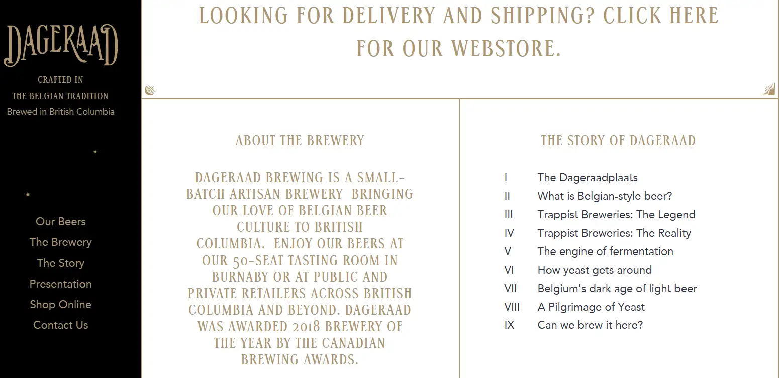
3. For Creative Portfolios
Your portfolio should reflect your style without turning into a visual circus.
- Headings: bold, design-driven typefaces—decorative or geometric.
- Body & details: simple, neutral sans-serif to balance the flair.
- Spacing: slightly tighter line height and tracking to create visual rhythm.
This approach prioritizes vibe and cadence over perfect readability, giving your site an edge while staying navigable.
4. For Product & Landing Pages
Here, every font decision supports conversion.
- Headings & CTAs: bold, sturdy serif fonts to command attention.
- Buttons & body: clean, medium-weight sans-serif for easy scanning.
- Goal: create impact, guide attention, and make it effortless for users to read, recognize, and click.
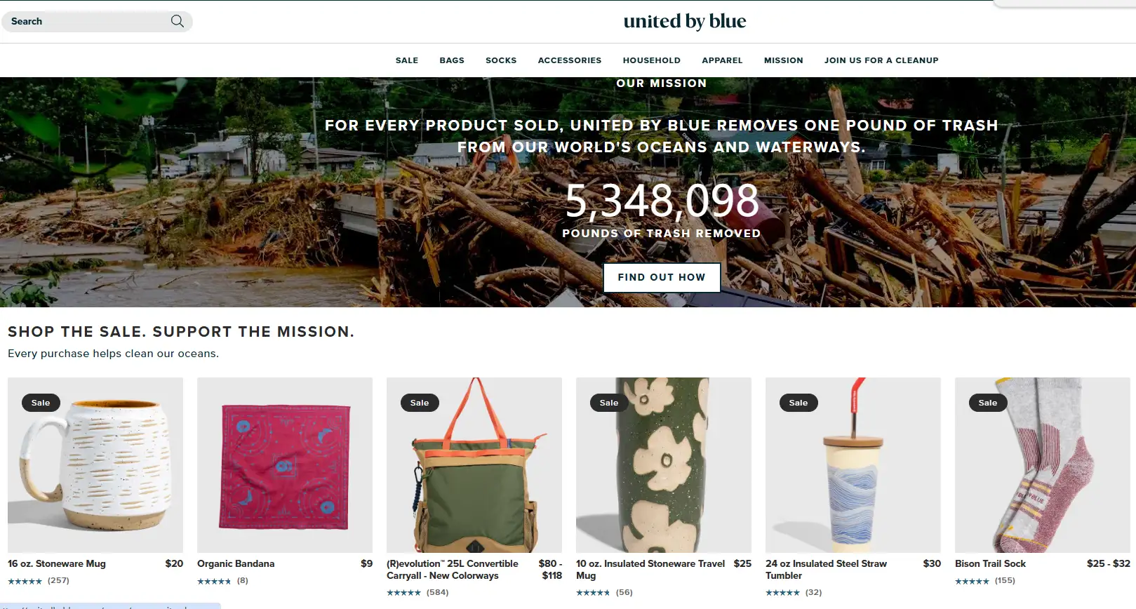
Use this scenario-based approach to design a font system that adapts to different site types. Instead of copying trendy pairings, you'll understand why each choice works—and how to create one system that scales everywhere.
AI Meets Google Fonts
When it comes to building a font-family Google Fonts system, the real challenge isn't finding fonts—it's choosing, pairing, and refining them so they work together. That's exactly what Wegic was built to solve. Powered by AI, Wegic analyzes your page structure, brand tone, and content semantics, then delivers a polished, ready-to-use typography system with almost zero effort.
Here's how Wegic transforms font selection from trial-and-error to instant clarity:
| What It Does | Why It Matters | What You Get |
| Reads your brand & builds a full hierarchy | Scans your site's content and tone, then pulls matching styles from Google Fonts—automatically creating coordinated heading, subhead, and body styles. | A complete type system in under 3 minutes. |
| Lets you preview & tweak visually | Compare weights, sizes, spacing, and fallbacks in a live board, switching between options instantly. | See and adjust everything in real time. |
| Keeps mixed-language sites consistent | Auto-assigns fallbacks for Chinese/English text and uses variable fonts to reduce load times. | Seamless style across languages, faster pages. |
| Improves readability as users browse | Tracks scroll speed and dwell time to adjust line height and weight dynamically, keeping content smooth and buttons clear. | Typography that adapts to your readers. |
And this is just the start. Typography is shifting away from manual, static settings toward a world where semantic tags and data-driven algorithms handle everything for you. Every content block will carry "mood" or "function" labels, and the system will map the best font structure automatically.
AI will keep refining those choices over time, learning from how users read, scroll, and click, and click—delivering a truly personalized typography experience. The result? A no-code, fully AI-powered era for web fonts. Designers, creators, and even non-technical users can simply set their brand tone or audience goals, and Wegic generates a professional, optimized font-family stack, ready to launch. With AI doing the heavy lifting, typography stops being a headache and becomes a strategic asset, amplifying your brand message and improving the way users experience your site.
Click here to try Wegic👇
Conclusion
Great typography isn't just about looks—it's a strategy for creating better user experiences and telling your brand's story. We've walked you through the core principles, the step-by-step process to build a font system, the most common pitfalls to avoid, and how AI tools can make it all effortless. With this foundation, you can craft a website that feels clear, polished, and unmistakably yours.
Ready to see it in action? Start using Wegic now to automatically generate your first professional font-family Google Fonts system, and build your brand's typographic asset, so every visit delivers a seamless, professional experience.
Écrit par
Kimmy
Publié le
Aug 6, 2025
Partager l'Article
Lire Plus
Notre Dernier Blog
Pages Web en une minute, propulsées par Wegic!
Avec Wegic, transformez vos besoins en sites Web époustouflants et fonctionnels grâce à une IA avancée
Essai gratuit avec Wegic, construisez votre site en un clic!
